How to Use Analogous Colors in Digital Art?
In digital painting, using colors that sit next to each other on the color wheel makes your work feel more harmonious and soft, while still maintaining richness and layering. If you struggle with choosing colors or feel like your pieces lack atmosphere, working with these "neighboring" hues is a solid, easy strategy.
Now, we'll walk you through a few simple steps to apply analogous colors in your digital art. No fluff — let's get started!

In this article, you will learn:
What Are Analogous Colors?
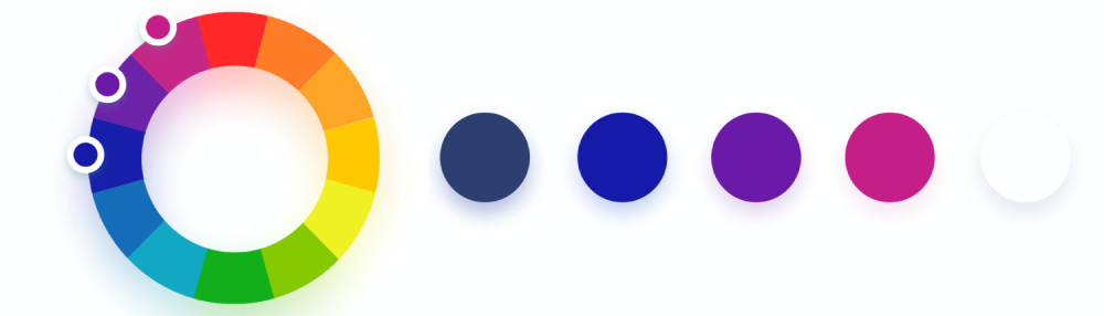
Analogous colors are groups of three to five hues that sit side by side on the color wheel. They're very close in hue. Common examples include red – red‑orange – orange and green – yellow‑green – yellow.
Further Reading:
In the examples that follow, we'll create art using the set of analogous colors marked in the figure below.
How to Use Analogous Colors in Digital Art?
Start by picking a main color. Say you want to paint a sunset and you'd choose orange as your base hue.
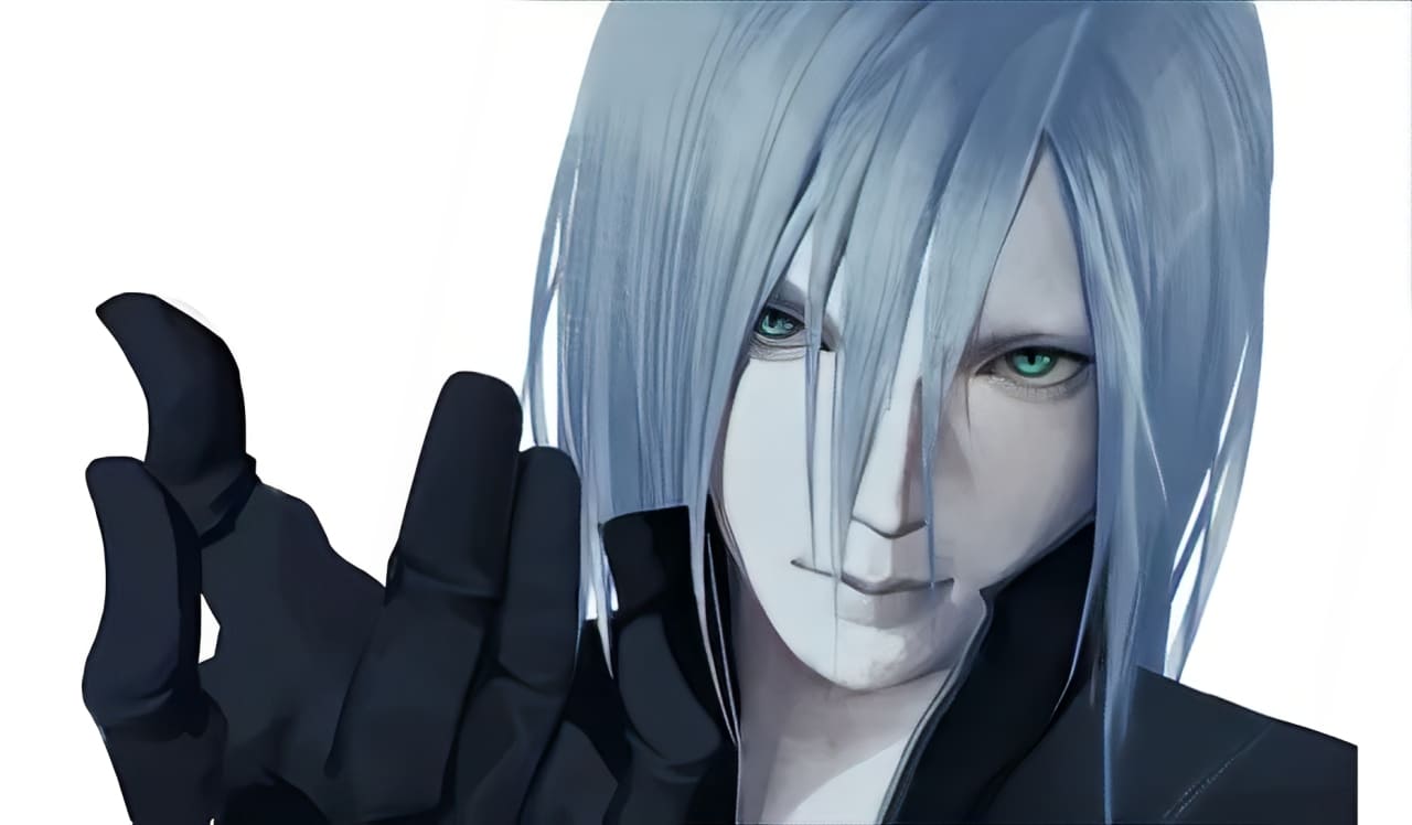
In our example, we've picked blue as the main tone. That means even the character in your scene will lean toward blue.
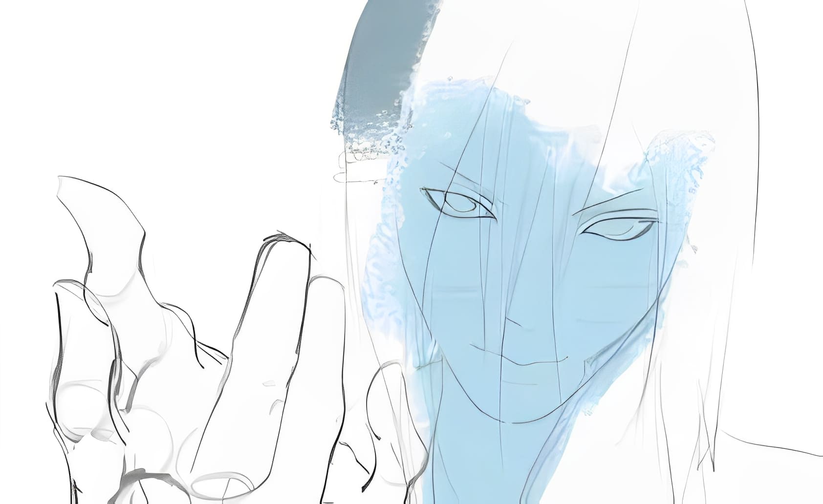
Next, create a new layer set to "Multiply" and paint all the shadow areas with a slightly darker blue.
This trick helps your subject blend quickly into the scene and gives your piece that moody feel.
Coloring line art is a bit like doing a monochrome sketch. Even though we're working in blue tones, each area still has its own subtle hue differences.
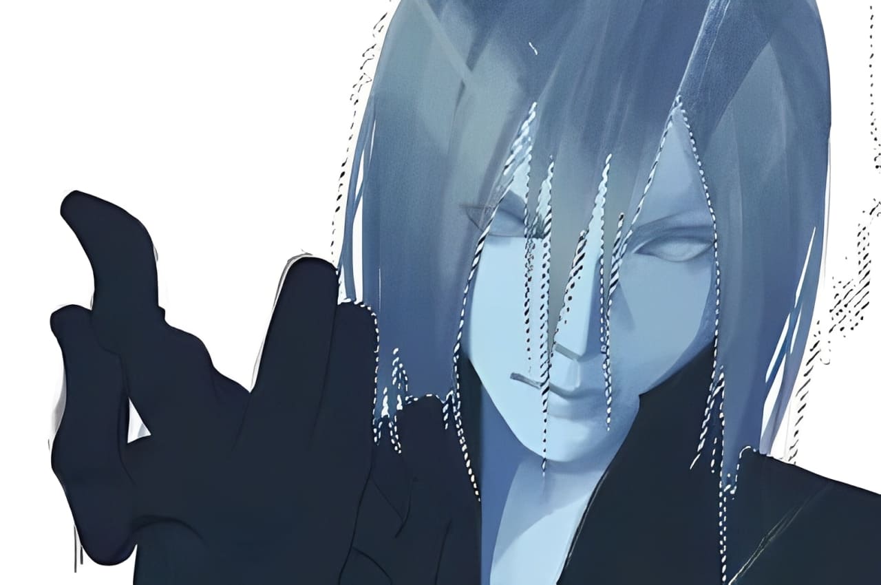
First, lock in your light and shadow correctly. We're using blue for both lights and darks, but we keep the contrast in value clear.
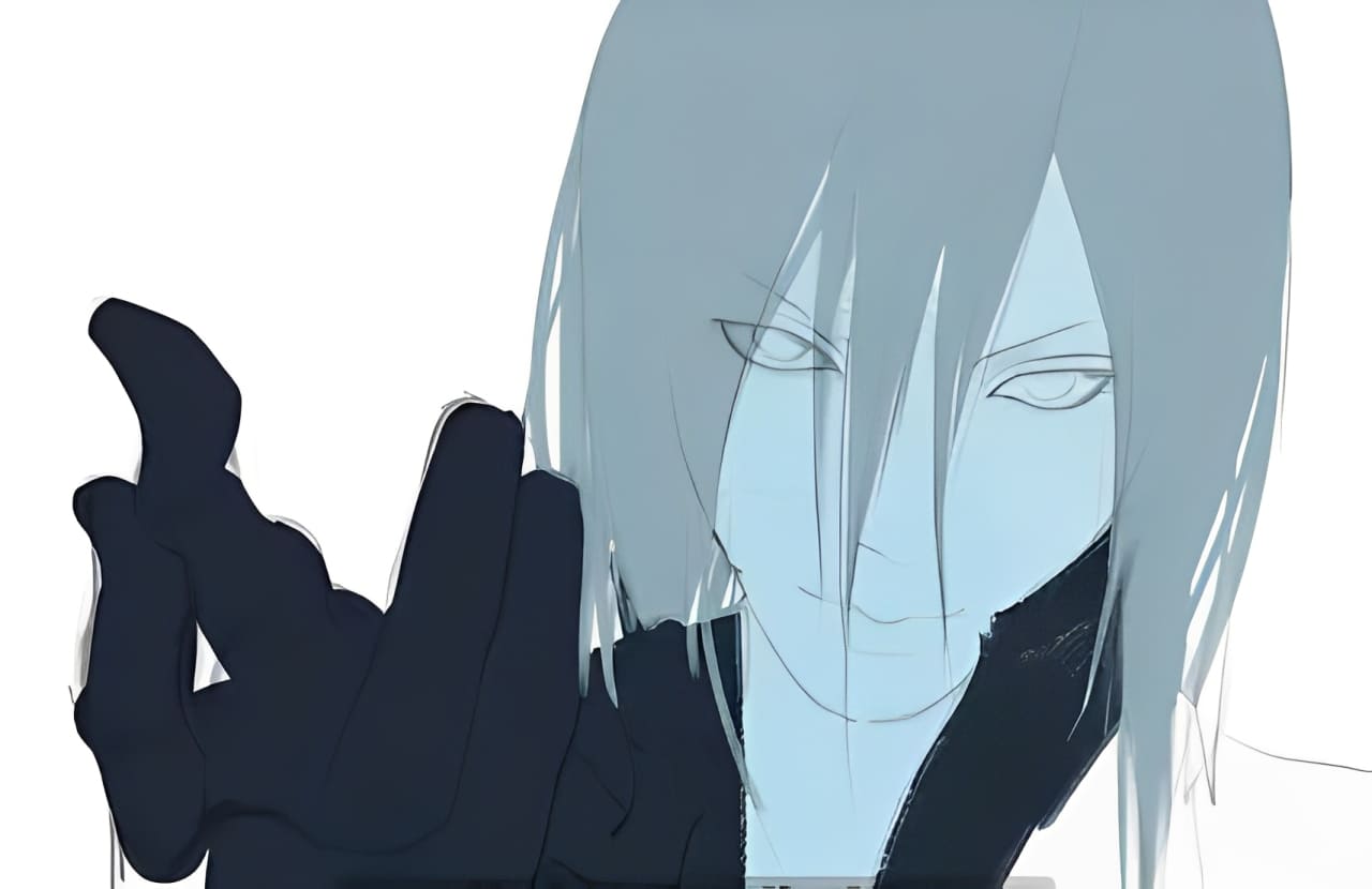
For instance, hair usually reads cooler than skin, so its shadows will be an even cooler blue than the skin shadows. Remember, "cool" and "warm" are relative, so tweak as you go. You can always push the warmth or coolness more in later steps.
For highlights, paint with a light gray‑blue. In the shadows, use a deeper, darker blue.
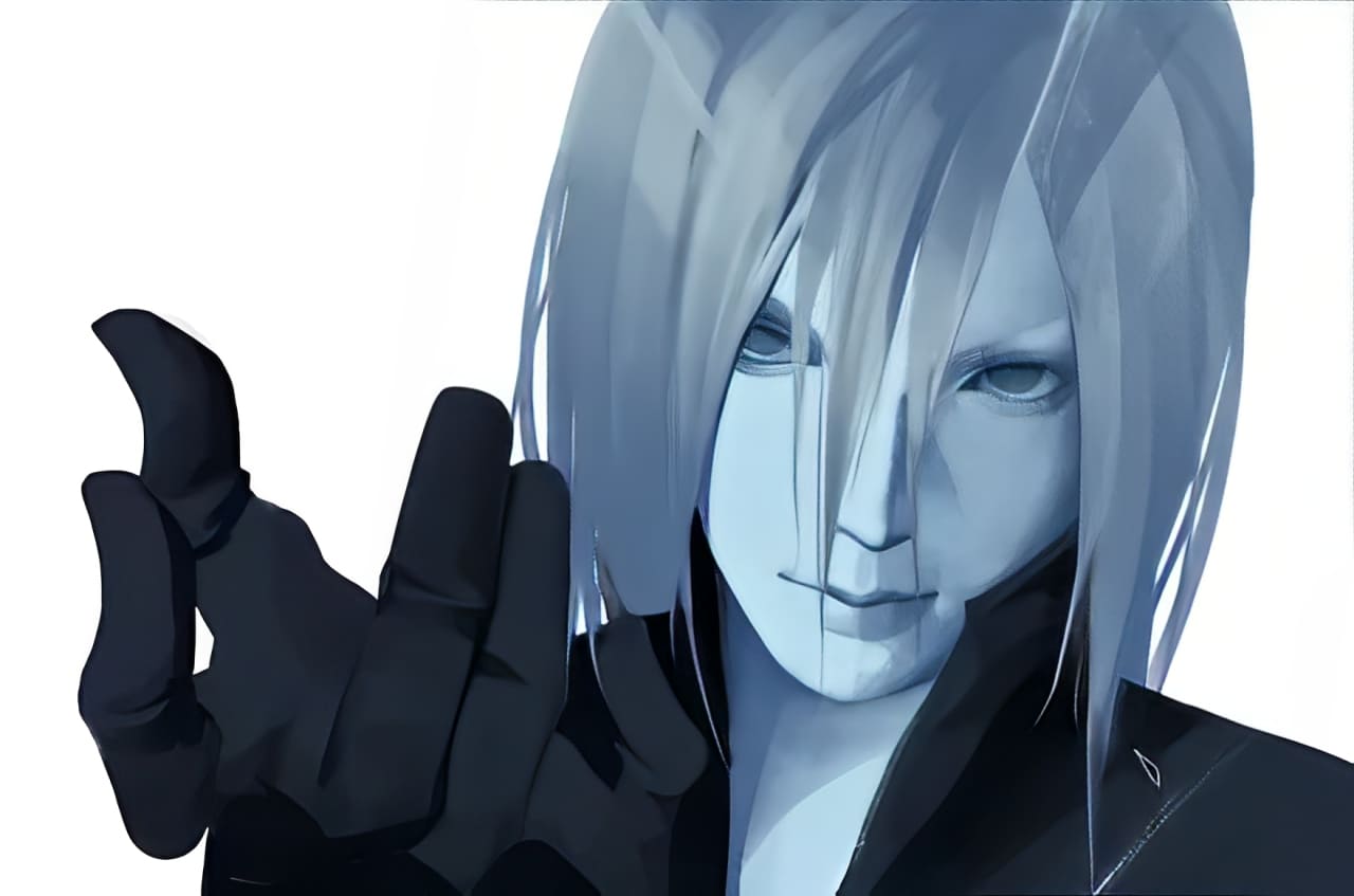
Next, create a new layer and set its blend mode to Soft Light. Choose a warm orange for your brush, dial down the opacity, then paint over the skin. This warms up the face and pushes the hair into a cooler contrast.
Even after this, the skin will still read within that blue color family we chose. It won't pop out of the scene.
When you bring in a highly saturated color, reserve it for the most important part of the image and keep it to about 10–20% of your overall palette.
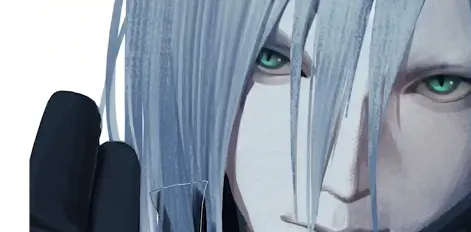
In our piece, the eyes are the focal point, so we'll dot them with the brightest, most saturated hue right at the edge of our analogous range.
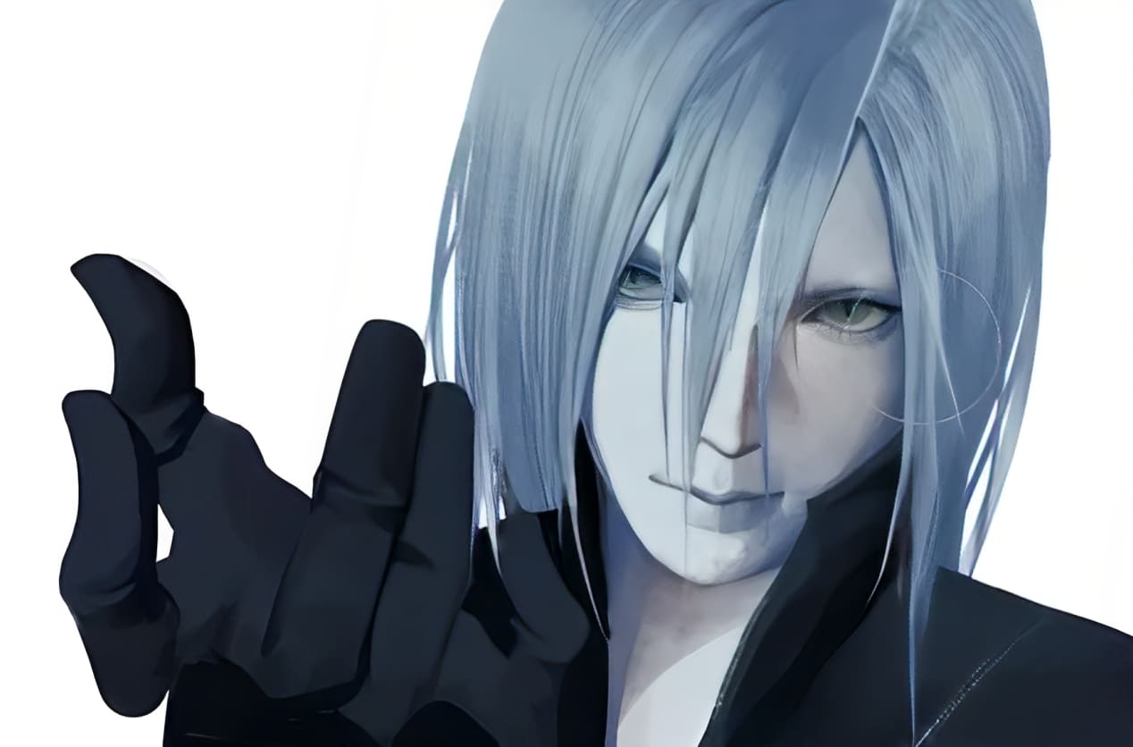
Next, keep building the character's form by deepening the shadows and boosting the highlights.
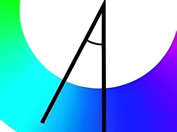
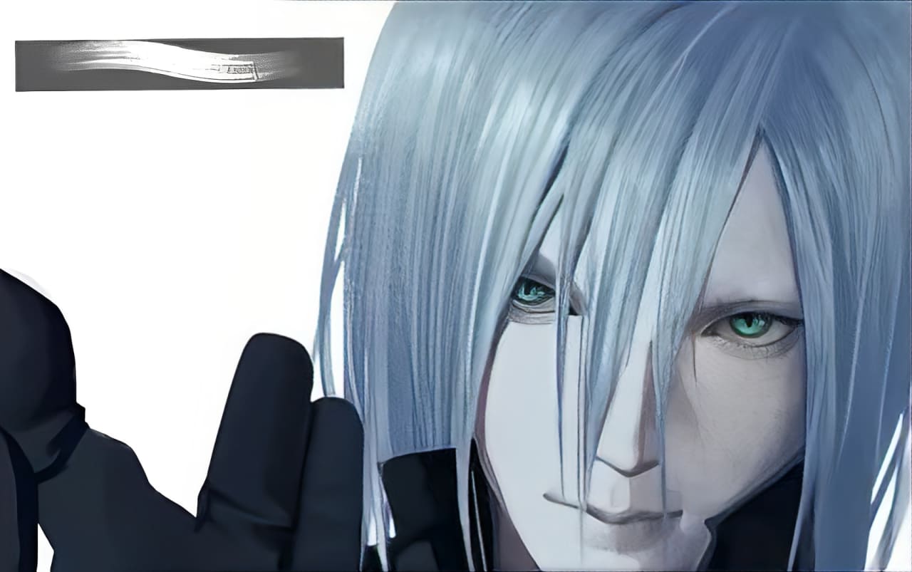
For example, on the hair's lit side, add a new layer set to "Screen" blending mode. With a bright blue brush, paint in the hair highlights. Try a brush like the one below to bring out the strand details.
Then switch to a grainy brush and work on the skin's surface. This adds a bit of realistic texture.
Further Reading:
Make any final tweaks to the overall piece, and you're done! Let's take a look at the final result.

Conclusion
In this tutorial, we've shown you how to use analogous colors in digital painting. Our example is just a starting point. To master harmonious, comfortable color schemes in your own work, you'll need to build your color sense through regular practice.
That's why we want to recommend the TourBox creative console to support your long painting sessions. Its ergonomic design helps cut down on hand fatigue, even after hours of work.

Best of all, TourBox can speed up your creative process by up to 170%. You won't have to memorize dozens of shortcuts or hunt through menus. It's as intuitive as a gaming controller, streamlining even your most complex workflows.

Want to learn more? Check out our Digital Painting page. And if you create on an iPad, you might love our Elite Plus model — feel free to take a look!