7 Beautiful Colors and Their Stunning Palettes You'll Adore
When it comes to beautiful colors, you might instinctively think of the Morandi hues. Morandi colors are hailed as some of the most soothing palettes in the world.
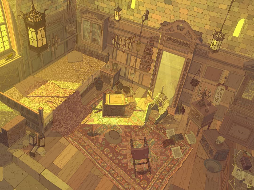
However, the world is filled with countless colors, and there's definitely more than just the Morandi hues when it comes to beautiful color schemes. For digital artists, beautiful colors can ignite your creativity in color matching, bringing a sense of sophistication to your work.
In this article, we will share seven globally renowned beautiful colors. Let's dive in and explore them together.

In this article, you will learn:
- Marrs Green
- Schönbrunner Gelb
- International Klein Blue
- Burgundy Red
- Prussian Blue
- Van Dyke Brown
- Titian Red
- Conclusion
Marrs Green
Marrs Green is a deep blue-green hue that falls between blue and green tones. It won the title of "World's Favorite Color" in a global survey conducted by the British paper company G.F Smith in 2017.

Submitted by UNESCO worker Annie Marrs, Marrs Green draws its inspiration from the reflections on the surface of the Taylor River.
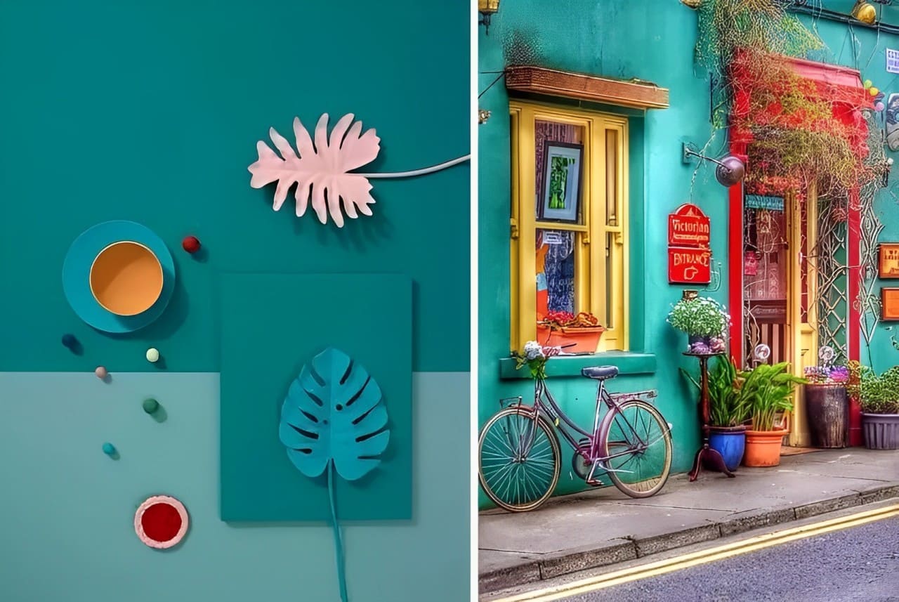
Vibrant and lively, Marrs Green is a color full of vitality.
Color Palette Reference:

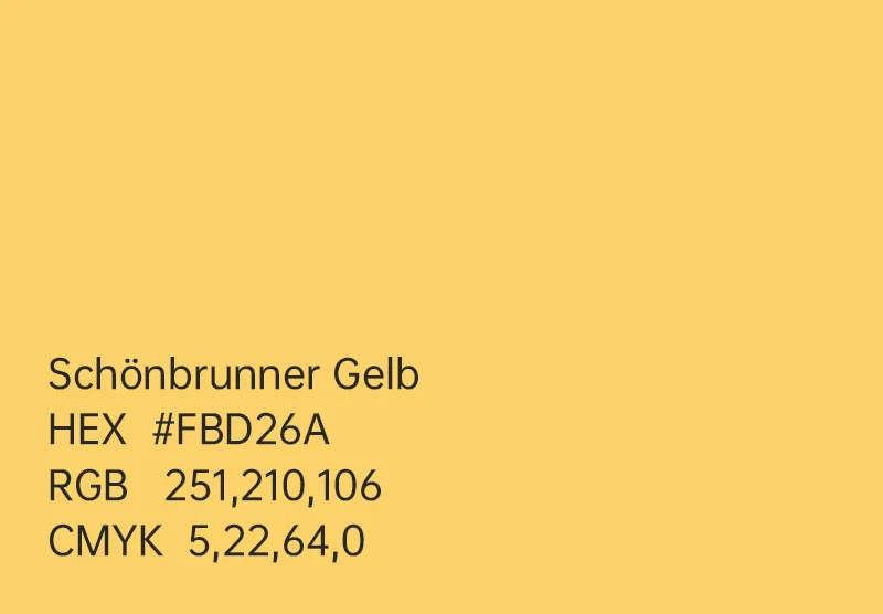
Schönbrunner Gelb
In the 1770s, Emperor Joseph II of the Haus Habsburg dynasty ordered that all buildings in Austria and Hungary be painted with Schönbrunner Gelb, especially the fronts of imperial structures.
Since then, Schönbrunner Gelb has become a symbol of the aesthetic of Schönbrunn Palace and the Habsburg monarchy.
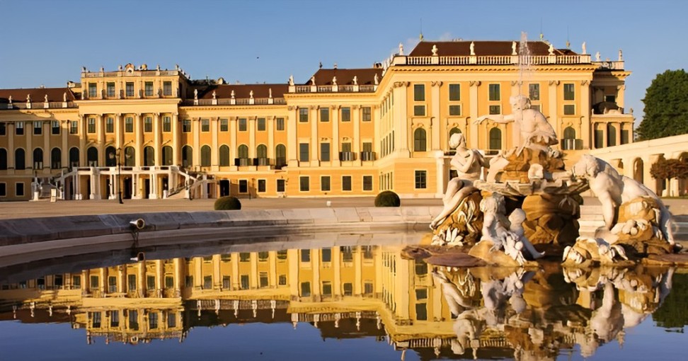
This color, also known as Baroque Yellow, was favored by many court architects during the Baroque era.
The digital artist izaccim loves incorporating the beautiful color scheme of Schönbrunner Gelb into his own artworks.
Color Palette Reference:

International Klein Blue
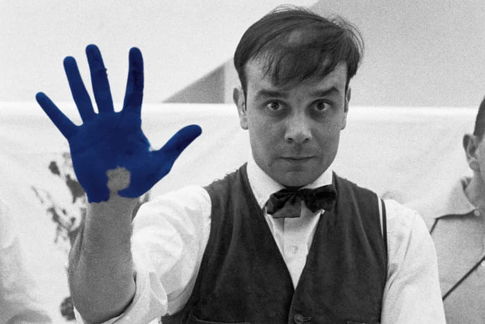
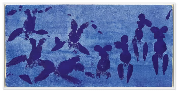
International Klein Blue, known as the "Absolute Blue," is a blue color named after the artist Yves Klein.
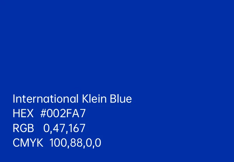
Klein believed that only the purest colors could evoke the strongest emotional responses. While some artists use a variety of colors to infuse life into their art, Klein preferred simplicity.
To Klein, blue symbolizes the sky, the sea, and the air—it represents freedom and life.
Because International Klein Blue is so pure, it's challenging to find colors that can complement it effectively. This purity gives it a particularly intense visual impact.
Color Palette Reference:

Burgundy Red
The color Burgundy Red symbolizes passion and freedom.
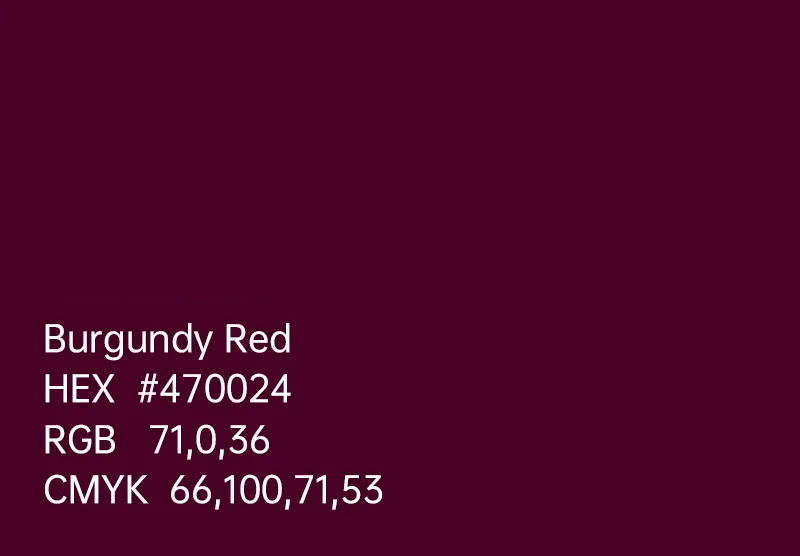
Burgundy Red is a shade of red named after the wine produced in the Burgundy region of France due to its resemblance to the color of Burgundy wine.
Color Palette Reference:

Prussian Blue
In the 18th century, a German named Johann Jacob Diesbach accidentally discovered Prussian Blue while researching and making pigment.
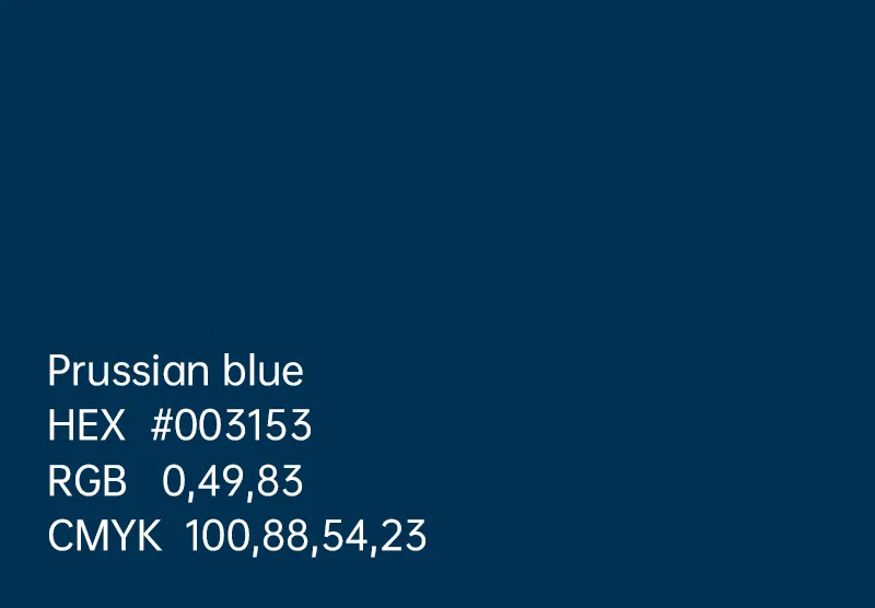
Diesbach's boss saw this as a lucrative opportunity. He kept the production method of this paint strictly confidential and named the pigment Prussian Blue to sell it at a high price.
Japanese ukiyo-e artists and the famous painter Picasso also extensively used Prussian Blue.

Color Palette Reference:

Van Dyke Brown
Van Dyke Brown is a color named after the Flemish Baroque artist Antoon Van Dyck, known for his representation in the Flemish Art movement.
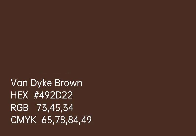
Van Dyck boldly employed this color in his creations. This deep, warm, and transparent brown derives from highly concentrated organic materials, essentially real earth.
Van Dyke Brown is often seen as a color full of historical and classical connotations, conveying a sense of stability, tradition, and reliability.
Its tone is typically dark yet offers a hint of warmth.
Color Palette Reference:

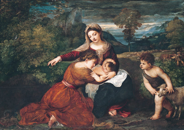
Titian Red
Titian Red is a color named after the father of Western oil painting, Tiziano Vecelli (known in English as Titian).
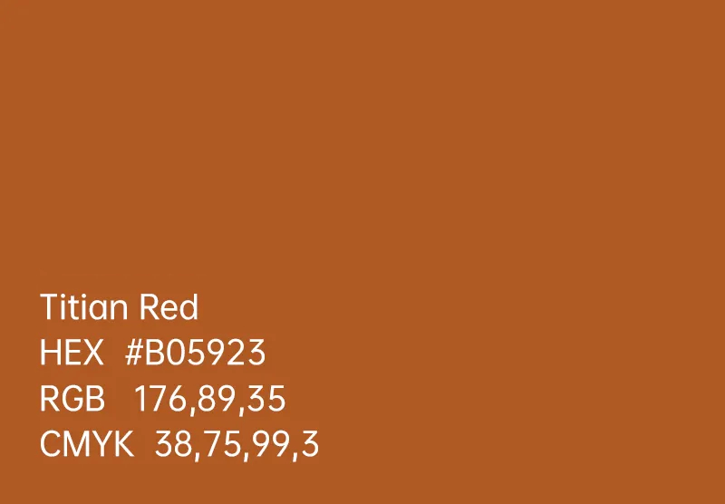
Titian was a prominent figure of the Venetian school of the Renaissance and a renowned master of color in the art world.
He was skilled at handling color and light, creating rich and vibrant hues in his paintings.
Titian often applied a base coat of red before adding other colors, giving his oil paintings a subtle reddish tone, a technique now known as "Titian Red."
Color Palette Reference:

Conclusion
In this article, we've shared seven beautiful colors along with their color schemes. You must be eager to try these colors in your own work now.
For designers and digital artists, color coordination is one of the most crucial aspects of the creative process.
The color palette of a piece determines whether it can captivate viewers visually, but colors themselves are not inherently superior or inferior.
The perceived "sophistication" or "beauty" of any color combination is a result of our own color-mixing skills and the overall sense of tonal harmony.
Here, we'd like to recommend a color grading tool, TourBox. Whether you're working on photo editing, digital painting, or video editing, TourBox can greatly streamline your color grading workflow.

In digital art creation, the trickiest part is mastering color. TourBox allows you to achieve precise control with a simple +1 or -1 adjustment in digital creative software.
It's like using a game controller to play video games—color changes are at your fingertips, giving you total command over your artistic vision.

Give TourBox a try and discover more beautiful colors on your creative journey.