How to Design a Character: A Step-by-Step Guide for Digital Artists
When it comes to character design, one term always comes up: OC — short for Original Character. For many artists, an OC is a key part of the creative process.
Most artists have one or two original characters. These characters not only spark ideas, but they also carry rich backstories and carefully designed looks that show the artist's creativity.
So, how to design your own original character? Read this article to find out.

In this article, you will learn:
- Character Shape: the Core of Visual Design
- A Character's Inner Life: How Backstory and Personality Shape Them
- Showing a Character's Traits: Make the Character More Concrete
- Conclusion
Character Shape: the Core of Visual Design
Our eyes only read surface information. A strong shape helps viewers quickly tell a character's personality and story. A character's look is also tied to the artist's style and taste. There is no "right" or "wrong" style.
1. Outline Design: the Key to Defining Visual Boundaries
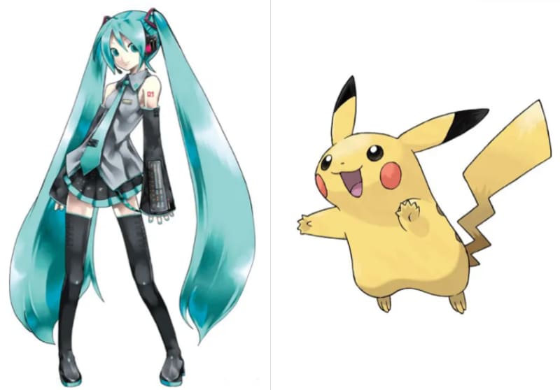
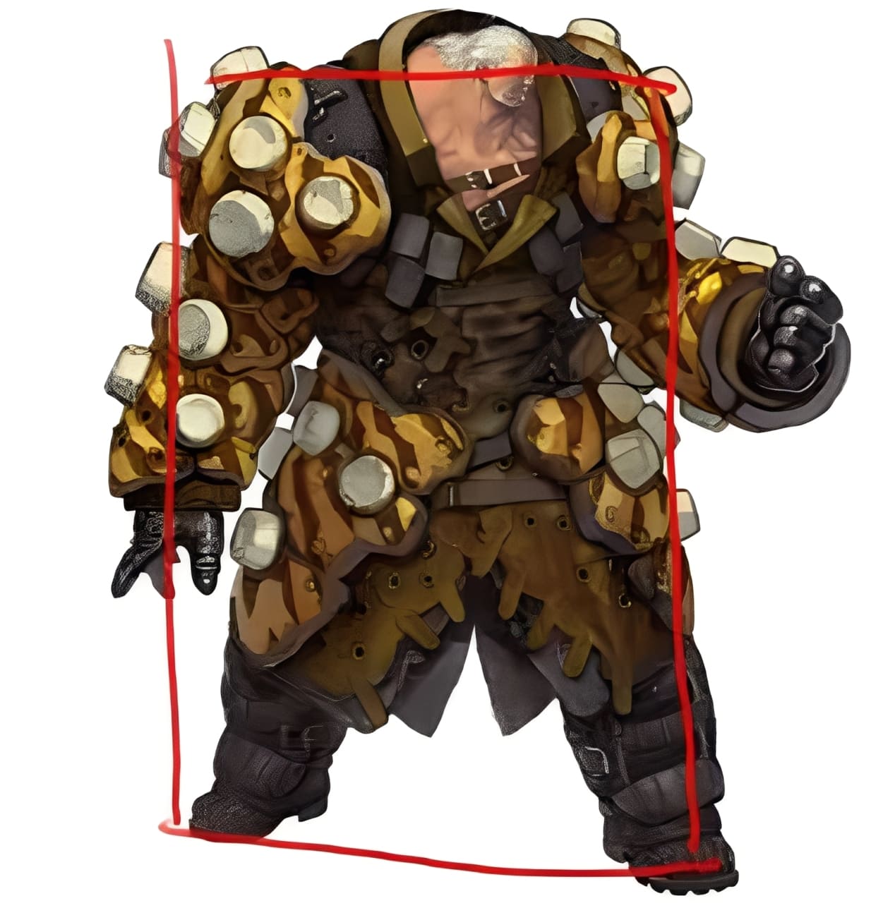
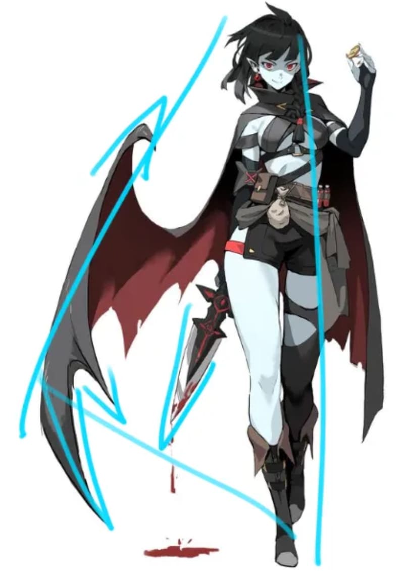
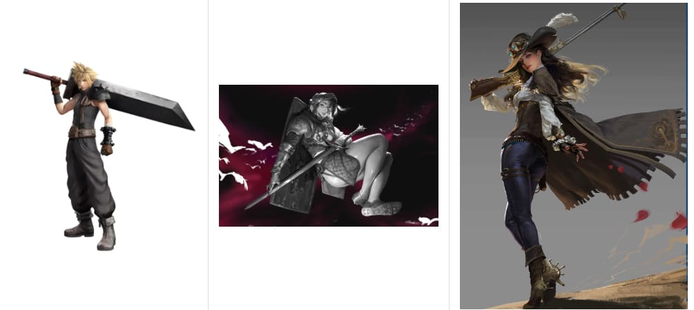
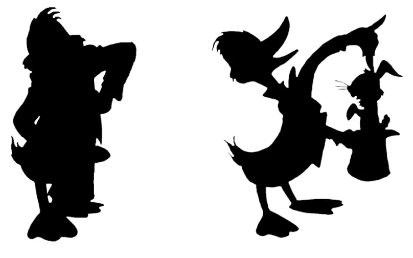
When a character loses color and line work and becomes a black silhouette, the outline is what people use to recognize them. Can you tell who a character is just from the silhouette in the image below?
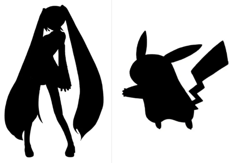
Memorable characters often have clear, distinctive silhouettes. A strong outline makes a character recognizable at a glance. Boosting silhouette clarity makes your design more effective and easier to remember.
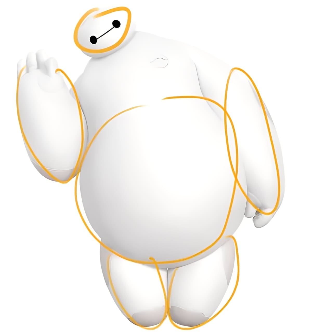
2. Basic Forms of a Character
Every character has a basic overall shape that makes it easy to read.
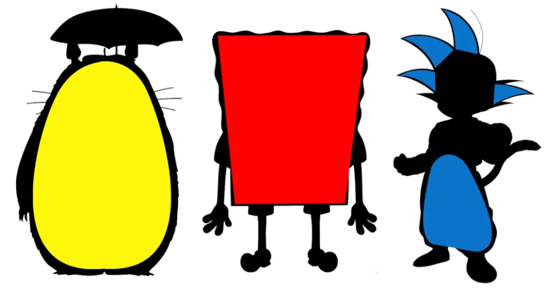
These basic shapes usually come from three forms: square, triangle, and circle.
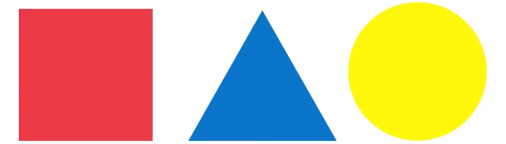
These shapes communicate different personalities through visual language. Here are the common feelings each shape gives:
(1) Square
Squares often feel stable, solid, and heavy. You'll see them in designs for sturdy or dependable characters.
(2) Triangle
Triangles tend to feel tense, aggressive, or dangerous. They work well for assassins, warriors, or other threatening characters.
(3) Circle
Circles feel soft, friendly, warm, and happy. They're common in cute or approachable character designs.
If you want to create a threatening character, use triangles as your main shape. Different shapes give different vibes. Since triangles are linked to aggression and tension, they help sell a character's dangerous nature.
In the design process, try to limit other shapes like squares or circles so they don't dilute the main idea. Repeating the key shapes will strengthen the emotion you want to convey and make the design more striking. (That doesn't mean never use other shapes — just avoid mixing shapes that confuse the main design.)
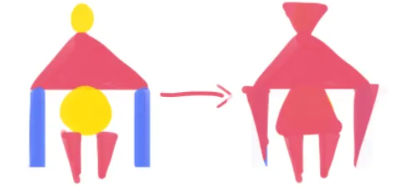
3. Shape Design: Strategies from Cartoon to Realism
You might think shapes only matter in cartoon styles, but they're used a lot in realistic work too.
Artists cut the overall form into basic shapes to suggest the outline of clothes, the flow of hair, or the form of a weapon, instead of drawing every small detail.
This approach is common in realism and helps create a strong primary shape. Emphasizing a main shape makes the overall structure clearer and gives the piece more visual impact.
Silhouettes matter not just in character design but in any drawing. If a piece feels off, switch it to black-and-white and check the shapes. Then adjust the shapes to make the design more iconic and easier to read.
4. HSL Color: a Character's First Impression
After you finish a character's basic shape, the next step is to give it color. The right colors bring a character to life. Good color choices can show personality and make the design stronger.
Below, we'll look at how to pick and combine colors based on a character's traits so your design feels more vivid and attractive.
When you think of a character, the first thing that often comes to mind is their color. That shows how important color is. A well-chosen palette can let people recognize a character from a simple color strip. A clear silhouette plus a strong color scheme usually equals a memorable character.
In character design, you don't pick colors one by one. You choose them as a set, so the character stands out. The key is the contrast between colors. Color contrast comes from three main factors: saturation, hue, and luminance (lightness).
Further Reading:
An Ultimate Guide to Understanding Hue & Saturation & Luminance
(1) Luminance: the Key to Depth in Character Design
Luminance is how light or dark a color looks. White has the highest value; black has the lowest.
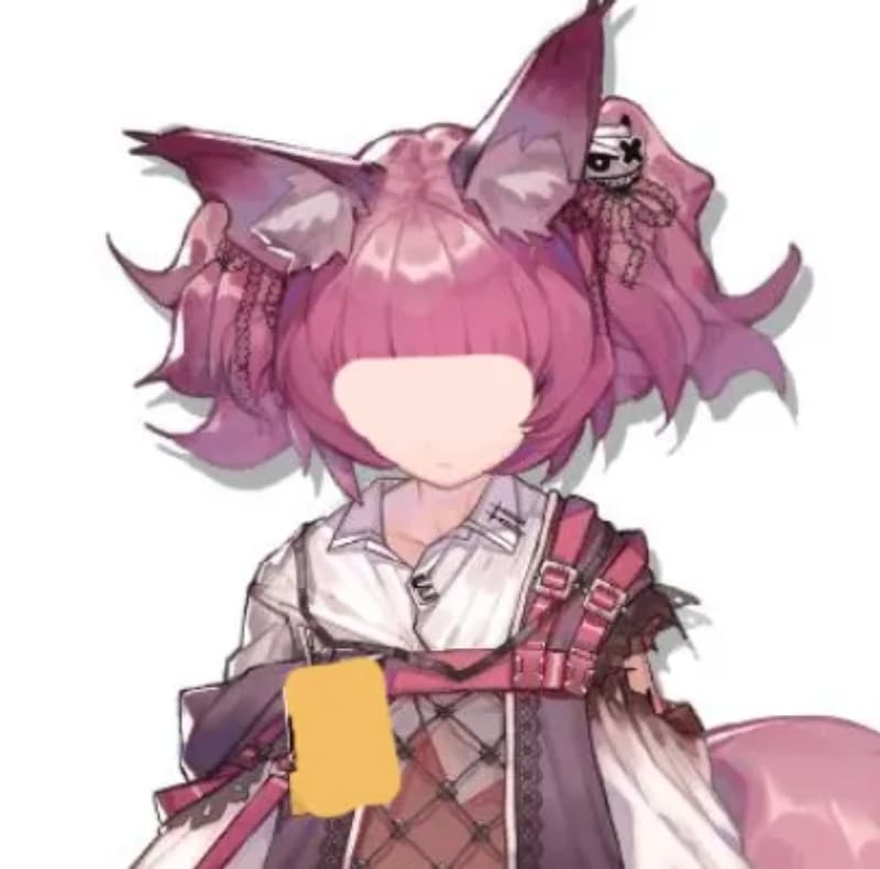
Look at the character sketch below. If you change it to black-and-white, it still reads well and looks finished.
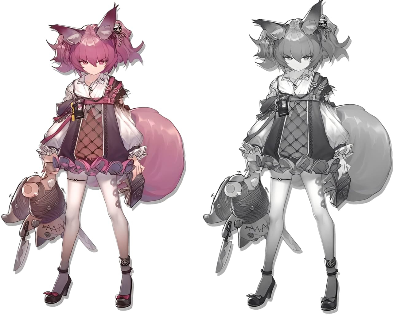
Like a good drawing, strong luminance relationships make a piece feel complete. So when you start choosing colors, think about luminance first.
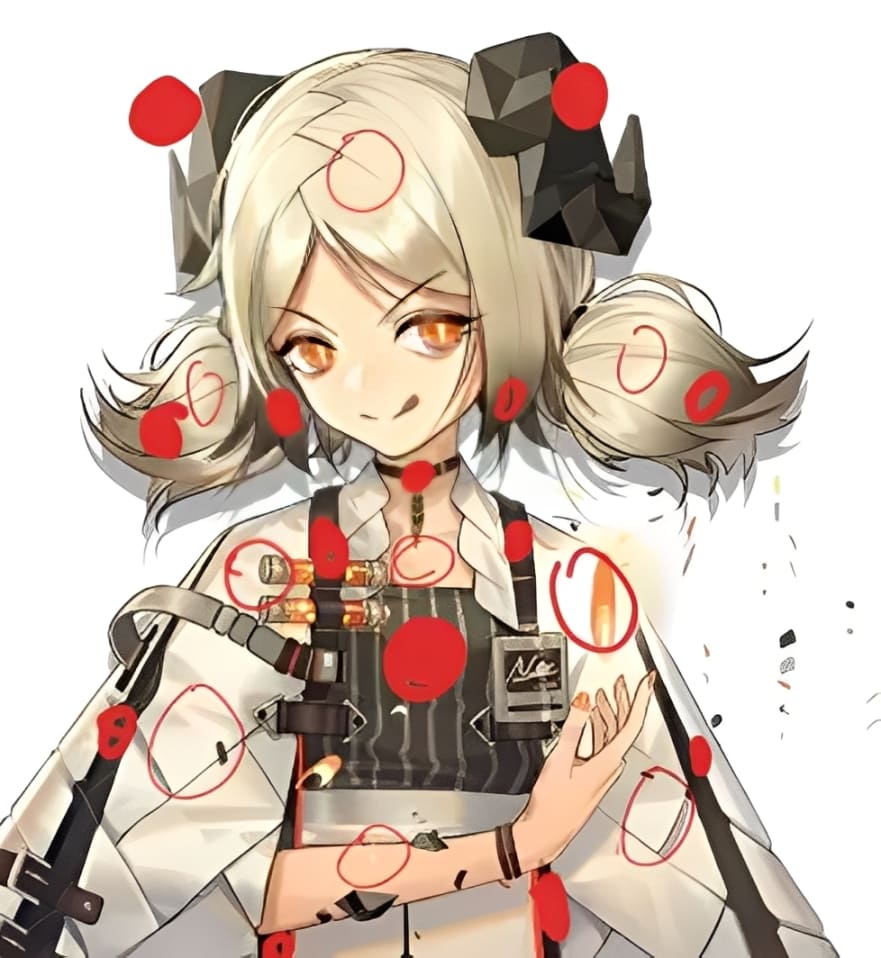
When you look at the image, what draws your eye first?
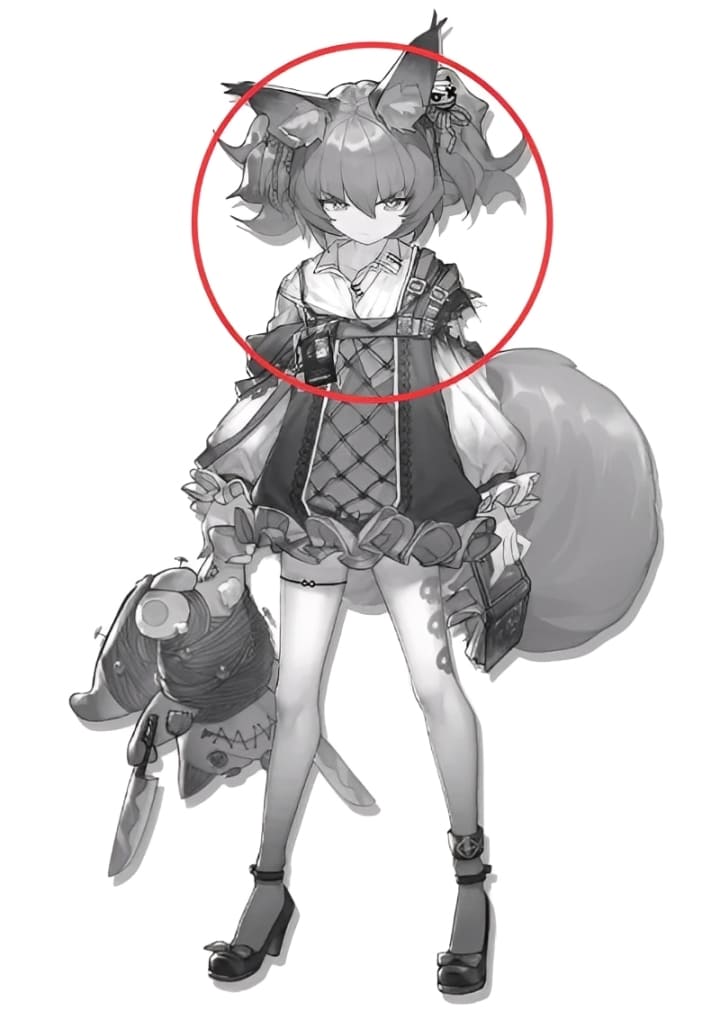
Besides being a face, that spot has the strongest light-dark contrast compared to the rest of the image. People naturally notice facial features, so those areas are often bumped up as visual focal points. Even without the face, that region would still stand out because of the luminance contrast.
A visual focal point doesn't have to be the brightest area. It can be a darker area if that darker value contrasts with the rest of the design. Experienced artists use luminance contrast to build depth and guide the viewer's eye.
(2) Saturation Contrast: the Second Priority — Visual Punch
Saturation is how pure or vivid a color is. Bright, saturated colors stand out next to dull, desaturated ones. When choosing colors, split them into main color, secondary color, and accent color.
In our example, pink takes up about 40% of the design. The other 60% is made of low-saturation tones or white. Even though the pink covers less area than white, its high saturation makes it the main color. A small, highly saturated area usually becomes the focal color.
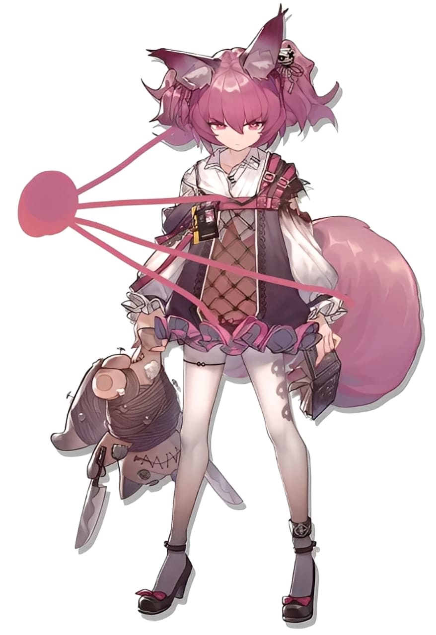
There's also a small yellow patch in the pink area. It's very saturated but covers very little space, so it acts as an accent.
If we made that yellow area bigger, viewers might notice it first instead of the face. So saturation strongly affects visual focus. Lowering the area or intensity of a saturated color keeps attention where you want it.
You'll often place saturated colors around less saturated areas. This contrast creates layers and helps guide the eye. Put saturated spots near your focal point. If a saturated color must appear away from the focal point, reduce its size or lower its saturation.
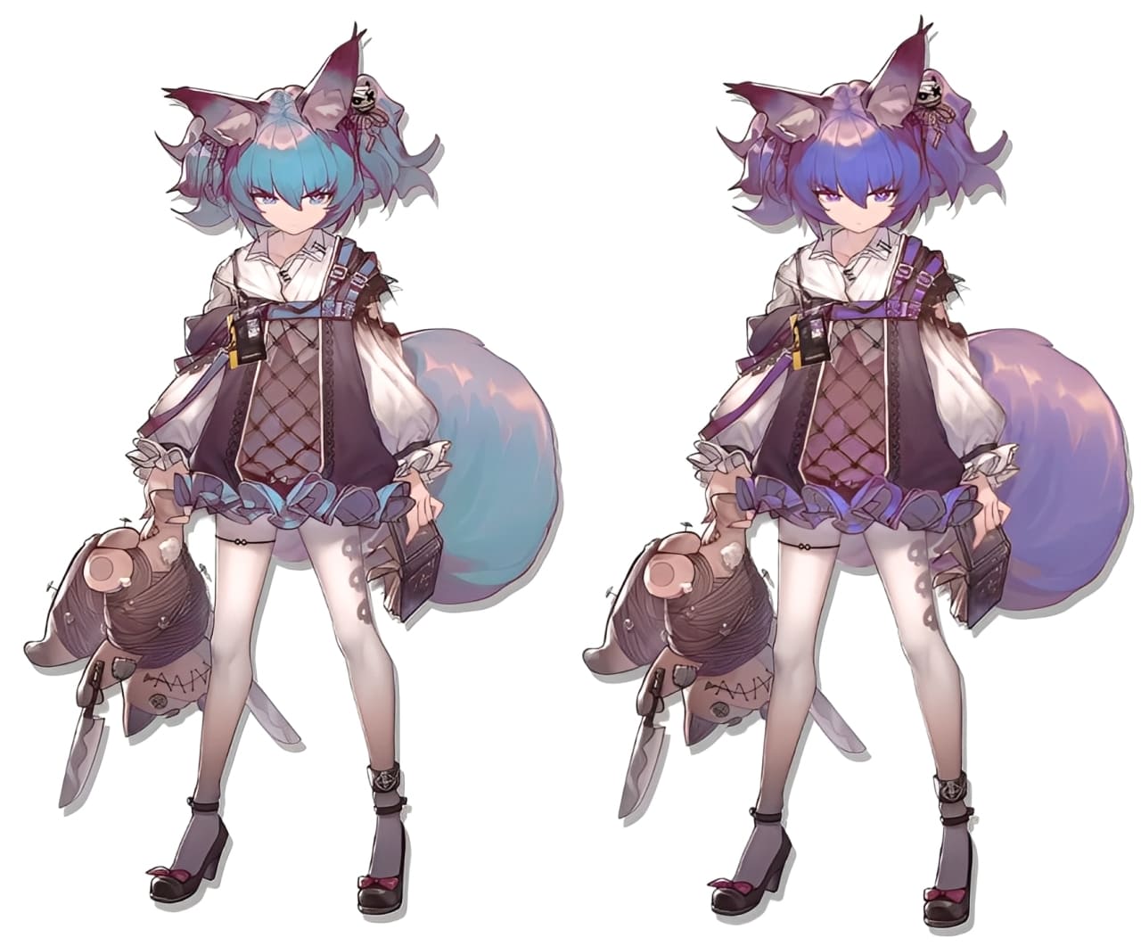
(3) Hue: the Emotional Tone a Color Gives
Hue is the color family (red, blue, yellow, etc.). Hue affects mood and emotion. Warm hues feel close and friendly. Cool hues can feel distant or mysterious.
Color choices help express a character's personality and feelings. For example:
- Red can mean celebration, danger, or sensuality.
- Blue can mean freedom or calm.
- Yellow can mean sunshine or nobility.
- Green can mean nature or freshness.
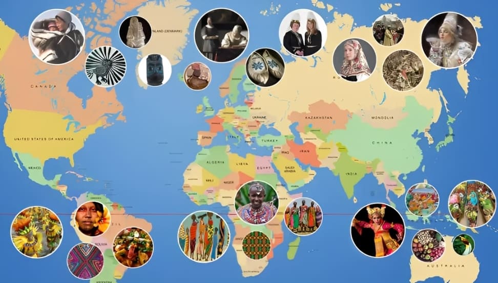
Hue is less strict than shape language. The same color can mean different things to different people. Culture and geography also matter: countries near the equator often use brighter clothing and art, while places farther from the equator tend to favor softer tones. So a character's palette can be influenced by their region.
Hue mainly affects feeling. Once you set the value and saturation, changing the hue usually won't break the overall look. Hue is there to express mood, not to fix the structure. There's no absolute "right" or "wrong" hue — pick what matches the emotion you want.
Our eyes have two kinds of cells: cones and rods. Cones detect color. Rods detect light and dark (value). There are many more rods than cones — roughly twenty times more. That's why people read value first and color second. So get the value and saturation right, and then use hue to set the mood.
5. How to Pick Colors: Handling Color Relationships the Right Way?
Look at the piece below. The brightest or most saturated color in it isn't actually very bright by itself. But because of the colors around it, it stands out more.

If you pull a color out on its own, you might find it's not very pretty. On a white background, it can even feel harsh.

Now try changing the background to a warm gray. See how the color becomes softer and more pleasant? In that warm-gray context, the high saturation doesn't feel as sharp, so the overall look is nicer.

So a color doesn't have to be "pretty" on its own. What matters is how it works with the other colors. This idea applies to any painting. You're always working with color relationships, whether you notice it or not.
Once you understand these rules, you don't have to invent color contrasts from scratch. You can study strong color palettes from other artists and adapt what works. That's a fast way to build good contrasts and improve your designs.
When you look for color references, avoid works where the colors are mostly driven by lighting. Lighting changes color a lot and isn't as useful when you're choosing a palette. Instead, look for illustrations where the color relationships themselves create contrast.
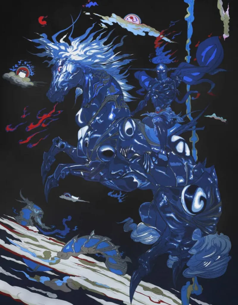
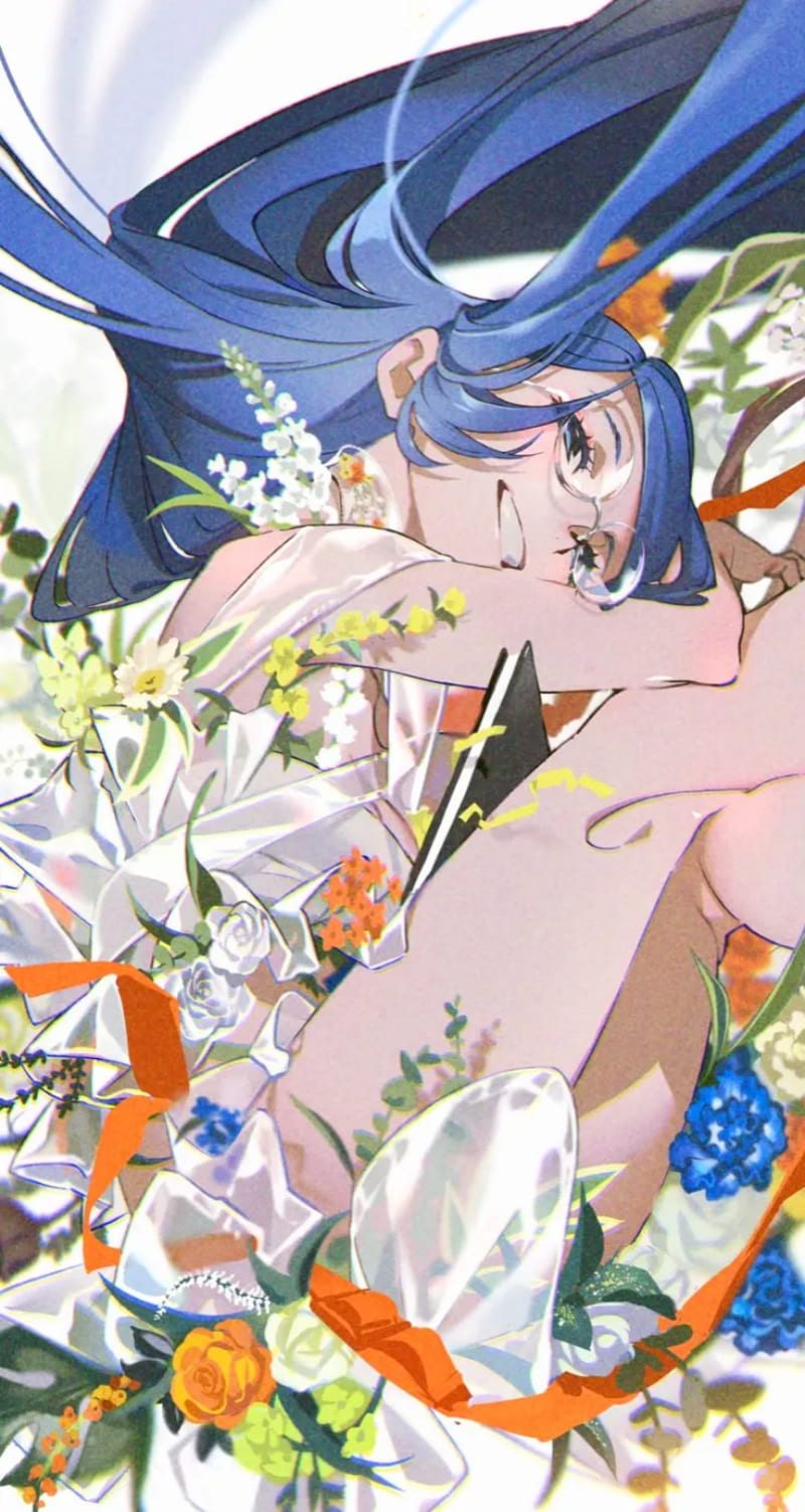
Two artists worth studying:
- Yoshitaka Amano: his work leans toward a ukiyo-e style. There's almost no rendered light, so the composition depends on color relationships and shapes.
- Mai Yoneyama: her work has a strong "film photography" feel. It uses dramatic light and shadow and bold, fashion-forward colors.
Also, don't limit your references to artists who share your style. Study different styles too. That widens your visual vocabulary and gives you more palette options. The more palettes you know, the more you'll understand where and how to use a color, useful whether you're painting for fun or for work.
A Character's Inner Life: How Backstory and Personality Shape Them
Everything above focused on making your character look layered on the outside. To give your character real depth, you need to build their inner world.
1. Personality and Story
A good backstory sparks the reader's interest. It's a key part of creative character work.
Beginners should know every character needs a basic "personality." If someone asks, "Who is this character?" you might answer, "He's a sneaky guy." That label only explains part of how the character acts. The same character can act differently in different situations.
So when you design a character, dig into their inner life. These details help you predict how they'll behave in a given scene. Try sketching out parts of their life to make them feel real. Ask things like:
- Where did they grow up?
- What were their parents like?
- What was the best thing that happened to them? The worst?
- Who do they admire or look up to?
- What are their goals or struggles?
These questions help you shape a believable character. You can also think about your own life and how your experiences changed you. Finding overlaps between your life and the audience's life builds emotional connection.
But don't overdo it. Backgrounds don't need to be overly complex — especially for minor characters. A common beginner mistake is getting lost in too many small details.
Keep in mind factors that change how a character sees the world. These might help or block how they understand others. Things like nationality or religious belief can affect behavior.
2. Keep Your Characters Diverse
Scott McCloud, in his book Making Comics, points out that many artists put a bit of themselves into each character. That adds warmth and believability. But if you put too much of yourself into every character, you lose variety.
One way to keep diversity is to give each character a clear, separate mindset. If you know what each character thinks and feels, you can predict how they'll react in different situations.
Showing a Character's Traits: Make the Character More Concrete
Most artists can't tell a character's whole backstory by drawing a full comic chapter. Instead, you show who they are through design choices. Use pose, clothing, props, and small details to hint at their job, personality, or beliefs.
1. Job Traits
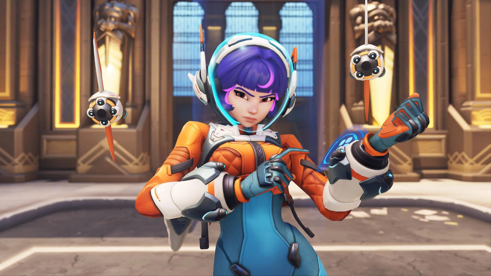
Take the unique features of real-world jobs and put them in your character to show what they do. For example, in the Overwatch character Juno, the space helmet, fish-shaped drones, and tail-like decorations make her read as an astronaut who moves like a fish.
2. Personality Traits
A character's personality comes through in their movement and poses. Use body language and gestures to show whether they’re confident, shy, playful, or tense.
3. Cultural Traits
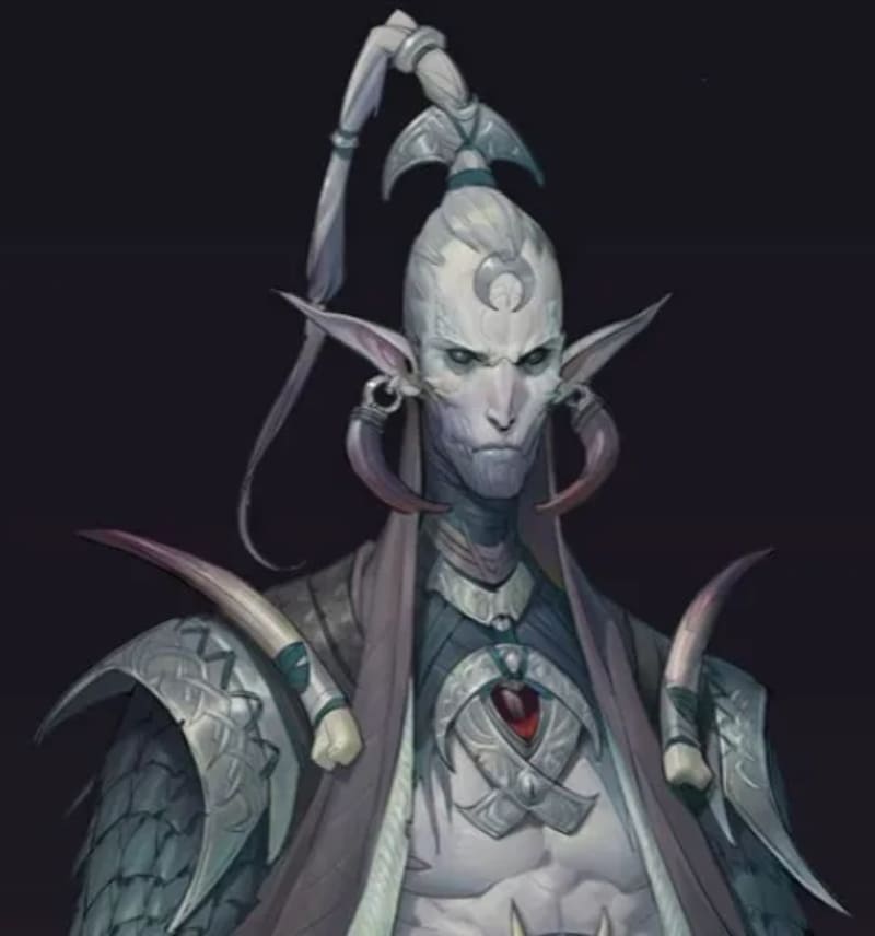
Add cultural or religious elements to suggest background or beliefs. For example, repeating moon-shaped ornaments, snake-scale patterns, and specific motifs can create the image of a moon-and-snake-worshipping elf priestess. Small repeating details help make the story feel believable.
All these elements give viewers clues about the character's life. They shape how people imagine the character.
4. Unique Small Details
Give the character one or two small, unique features — like a little tuft of hair (a cowlick), a special ear shape, or a tiny mark on the forehead. These small marks make the character easy to spot in a crowd.
Why the head? Because the face is where people look first. Things around the head and face are seen more quickly, so they're great places for distinct details.

Conclusion
After you learn the steps, do some small practice before you start your design. Make a simple table listing design points like impression, personality, body type, clothing, and color.
Use those words to imagine how the character should feel. You can also find similar characters as references, but be sure to add enough original elements.
Finally, we recommend a controller called TourBox that can speed up your digital art workflow. In digital painting, artists often need to reach for lots of tools and shortcuts.

With TourBox, you can map your favorite shortcuts and functions to the device and use it like a gamepad for faster, smoother work. If you like working on an iPad, you might prefer the TourBox Elite Plus — it works with both iPad and PC.

For more details on using TourBox in digital painting, check our Digital Painting page.