Mastering Color Grading in Post-Processing: A Guide for Photographers
In the pursuit of capturing the essence of a compelling photograph, we often find ourselves mesmerized by the rich interplay of light and shadow, along with the narrative intrigue it evokes. The ability to recreate such imagery through post-processing is rooted in an understanding of the underlying techniques and the tools at one's disposal.
In this article, we aim to elucidate some techniques and misconceptions about color grading, that can help you navigate this complex process more effectively.
Our goal is to assist you in mastering the art of color grading in post-processing. So, let's get started!

In this article, you will learn:
- Basic Knowledge of Color Grading in Post-photography
- Color Grading Techniques in Photo Editing
- Final Thoughts About Color Grading in Photography
Basic Knowledge of Color Grading in Post-photography
To embark on this journey, the first step is to familiarize oneself with post-processing software. Photoshop and Lightroom are the frontrunners in this regard. However, given the vast expanse of knowledge, these tools encompass, a detailed discussion of them will not be a part of this article.
Subsequently, one must delve into the realms of light, shadow, and color - the fundamental building blocks of a photograph.
Light and shadow are often referred to as the soul of a photograph, representing the essence or "spirit" of an image. Contrary to popular belief, it is not color but tonality that predominantly determines the quality of an image.
In the context of photography, 'tonality', also known as the 'key' or 'tone' of an image, refers to the relationship between the degrees of lightness and darkness, the contrast between the real and the virtual, and the brightness of colors. It is through this interrelation that the viewer experiences the dynamics and transformation of light.
A photograph with rich tonality not only enhances its visual appeal but also conveys a wealth of information. In the post-processing phase, color grading plays a pivotal role.
(Related Article: What is Color Grading)
Color Grading Techniques in Photo Editing
Contrary to popular belief, color grading is not the key factor that makes a photo visually pleasing. There is a common misconception among photographers that no matter how a photo is taken, it can be made good simply by doing good color grading.
It's important to remember that color grading is closely tied to the photography process and cannot be separated from it.
1. Landscape and Lighting Determine the Texture of a Picture
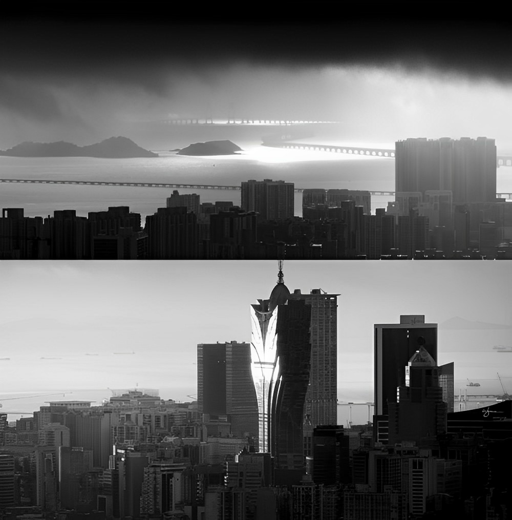
When we look at a photograph, it's important to understand that the texture of the image comes from the landscape and lighting, not just the colors.
Let's see the following photo. The photo has a strong quality, mainly due to the interaction between the glass building, the horizon, and the lighting.

Even if we adjust the colors, the texture will remain similar. So, the quality of the texture in a photo is determined by the landscape and lighting, rather than just the colors.
2. Don't Rely Too Much on Impactful Color
A common mistake in color grading is to rely solely on high color contrast to create impact. While this style may seem visually striking at first, it can quickly lead to visual fatigue when overused.
Take a look at the photo below. A blue sky like this is actually quite rare in real life, so it's not commonly used in documentaries or films. Even in the Transformers movie series, which used a blue-orange color palette, the sky was made to be a more subdued color.

To create better colors, it's important to follow the laws of physics. What are the laws of physics? For example, a sunny sky rarely appears yellow, and this is a physical law. The sky on a cloudy or rainy day is usually light gray or deep blue, and this is also a physical law. These color rules come from observing and accumulating materials from real life.
3. Adhere to the Laws of Physics in Color Grading
Let's continue to use the same photo for explanation purposes. This photo has not yet undergone any post-processing adjustments.

When it comes to photo color grading, we aim to avoid making the image look poor in quality or have strange colors. The challenge is to create a natural and visually pleasing photo that satisfies these requirements.
Let's analyze the thought process - what makes a photo feel comfortable to look at?
For this photo, we want to avoid making the shadows too dark and lacking detail, as this can make the photo appear unattractive. Additionally, we want to bring out the warm colors since the photo was taken at dusk.
We will be using Lightroom as our color-grading software.
Firstly, we will adjust the tone. We brighten the shadows to bring out more detail and adjust the black slider to restore contrast. Overall exposure may need slight adjustments, but since the initial exposure was already normal, it won't require many adjustments.
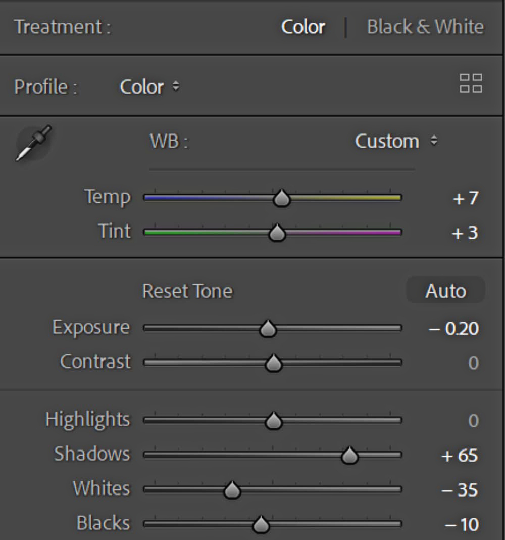
The adjusted parameters are as follows:
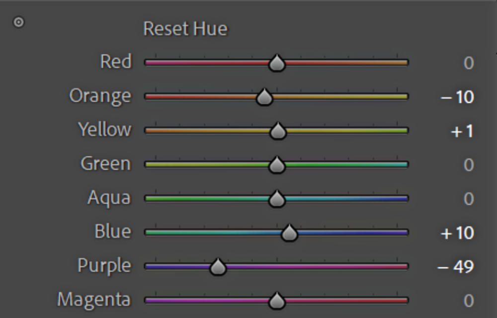
We will continue to adjust the saturation by increasing the warmth of the colors in the image, making them stand out more prominently.
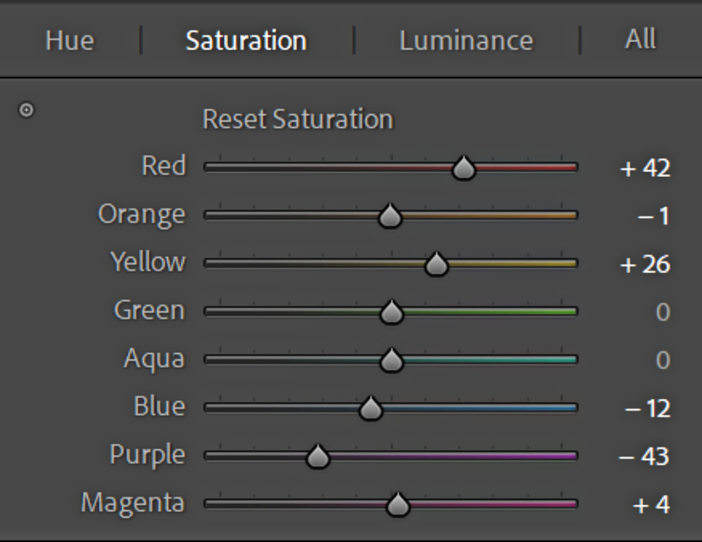
Next, some adjustments need to be made in the color grading. The adjusted parameters are as follows.
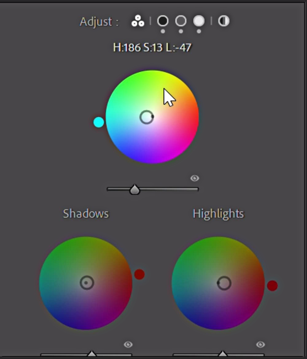
The photo after the adjustments is shown below. We can compare it with the original photo before any adjustments.

4. The Use of Saturation
Out of these four photos, which one catches your eye the most? Which one is more visually appealing?

Everyone has different aesthetics and preferences when it comes to photos. You may like all of the photos or only one of them. However, there are popular and niche aesthetics, and if you want your photo to be appealing to the majority, you must cater to popular aesthetics.
In the post-production phase of photography, saturation is one of the most important parameters that can be modified to control the visual impact of an image. Regarding saturation, we only need to remember the following 2 rules:
- Low saturation does not easily cause visual fatigue
- High saturation is more eye-catching
Low Saturation and Visual Fatigue
When we look at images with low saturation for an extended period, they are less likely to cause visual fatigue. This is because less vibrant colors are gentler in our eyes. They are less stimulating, therefore less challenging to process, and easier to handle over long periods.
This can be particularly beneficial in contexts where subtlety and nuance are appreciated, such as in fine art prints or atmospheric photography.
High Saturation and Attraction
high saturation can be more eye-catching. This is partly because our eyes are naturally drawn to vibrant colors. High saturation can create a more dramatic, exciting image that immediately grabs our attention.
For example, advertisers often use high saturation to make their products stand out and attract potential customers.
In post-production, you can adjust the saturation to achieve different effects. Before adjusting saturation, you need to first decide what you want to achieve. If you want to create a soothing, relaxed atmosphere, consider reducing the saturation. If you want to grab attention, consider increasing it.
Final Thoughts About Color Grading in Photography
Color is a way of expressing oneself. Through post-processing, photographers can create emotional atmospheres that align with their creative intentions.
The reason why so many people imitate color grading styles like the one used by the famous Japanese photographer "rkrkrk" is because he captures the emotions expressed through color and has developed his own style.
Post-processing does not mean completely changing the content of a photo or creating a fictional scene. It is simply refining and optimizing existing materials to present better artistic effects. Therefore, post-processing is not equivalent to falsifying a photo, but rather a part of the photographic creative process.
In photo editing, there are many software tools available to assist photographers, such as Adobe Lightroom, Adobe Photoshop, and more. These tools provide a wide range of adjustment options and functions.
In addition to software, the importance of hardware peripherals in post-processing work is gradually becoming more apparent. Of course, a good operating device cannot immediately drastically improve your shooting and editing abilities, but it is definitely not superfluous.
Especially when facing a large amount of repetitive, tedious, and imprecise mouse adjustments, dedicated operating devices play a significant role in improving workflow coherence and enjoyment.

Here, we recommend TourBox as a product that can enhance your post-processing efficiency, make your work smoother, and add more pleasure and enjoyment to the process.
In summary, color grading is an essential part of photo editing that should be approached with an understanding of the laws of physics and an eye for aesthetic appeal.
With the help of software tools like Adobe Lightroom and Photoshop, and hardware peripherals like TourBox, photographers can adjust the color, contrast, exposure, and other aspects of their photos to create artistic effects that enhance the emotional atmosphere of their work.
By applying these techniques for color grading, photographers can create photos that are well-crafted and captivating.