How to Improve Color Matching in Design?
Color matching has always been a key topic in the design world. A strong piece needs colors that work well together. Different colors send different messages. Even the same hue can feel different depending on its brightness and saturation.
Choosing colors is often intuitive, but people's sensitivity to color varies. That means skill levels differ. That's when simple color rules help — they improve your sense of color and make color matching easier.
Commercial designers are not the same as artists. You must consider what regular users will accept and understand. Clear communication is the top priority. In commercial work, being more "artistic" isn't always better — harmony and practical color matching matter most.
In this article, we'll share four simple color matching methods to help you pick colors that work well in commercial design.

In this article, you will learn:
- Method 1: Same-Hue Color Matching
- Method 2: Brightness-Consistent Color Matching
- Method 3: Saturation-Consistent Color Matching
- Method 4: Find Color Schemes in Nature
- Conclusion
Method 1: Same-Hue Color Matching
Put simply: if you use blue, stick with blue. This kind of color scheme feels more cohesive, calm, and easy to accept.
We know color has three properties: hue, brightness (value), and saturation (chroma). If you keep one property fixed, the other two become variables — usually brightness and saturation.

As the images above show, both examples look balanced and not boring. That's the direct feeling a same-hue scheme gives.
Here's a similar design example:
As the example shows, same-hue color schemes usually give a very harmonious, peaceful look. But if you use this scheme over a large area, the lack of strong color changes can make the design feel monotonous. How do we fix that?
Let's compare it to food. Look at the roasted chicken pictures below — which plate would you pick at first glance?

Most people choose the one on the right. For the same price, it just looks like you get more.
When a color scheme feels flat, add some "seasoning." In design terms, that means adding an accent color. An accent color can easily break up the monotony caused by a single main hue.
So, whether you're designing a page or a poster, try not to use one exact hue across the whole layout.
Note: Using hues that are next to each other on the color wheel keeps the overall harmony and unity. It just adds a subtle change in hue — for example, yellow and orange.
Method 2: Brightness-Consistent Color Matching
Even when you mix different hues, keeping their brightness similar makes the design feel balanced and harmonious. It also helps avoid a flat, monotonous look.
Compared to hue and saturation, brightness is the color property our eyes pick up most easily. When brightness is consistent, nothing jumps out too strongly — the overall look stays even.
Lower brightness means a color looks darker and closer to black.
Note that each color has its own perceived brightness. Even if two colors have the same numeric brightness, they can still look different — for example, blue usually reads darker than yellow to our eyes.

A quick way to check perceived brightness is to remove the color (convert to grayscale). If the grays look similar, the original colors have similar brightness:
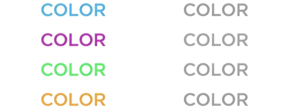
Because brightness controls how much the eye notices change, brightness-consistent schemes keep all hues from competing visually. That makes them calm and balanced, but it also limits how dramatic the design can be.
You can still create a strong contrast with a brightness-consistent palette. One easy method is to pair color with achromatic (grayscale) elements. Color next to black/white or gray can produce a strong visual impact even when brightness is matched. The poster below is a good example:
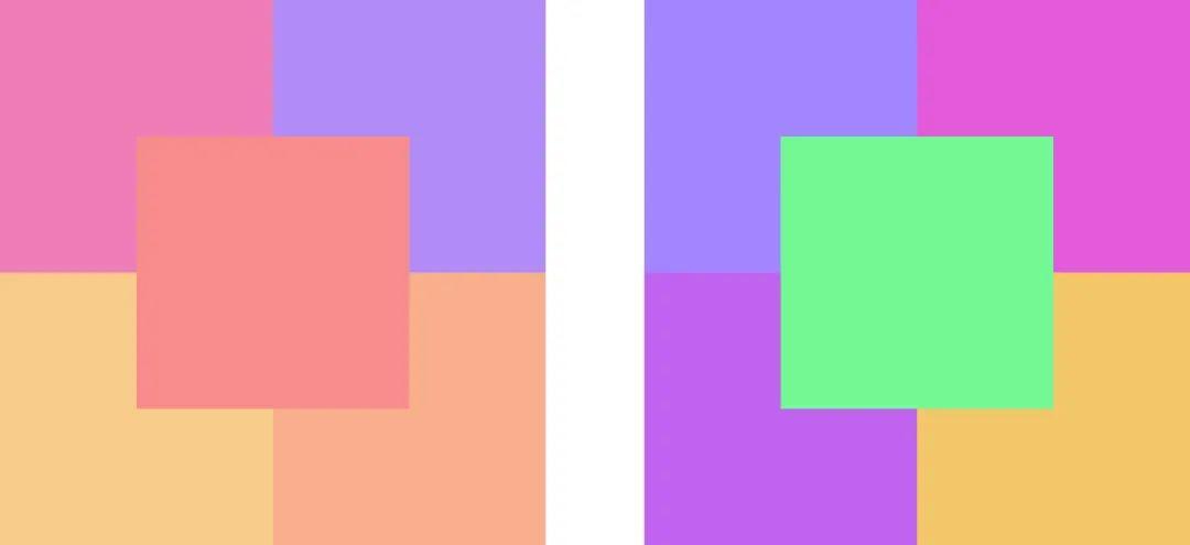
Method 3: Saturation-Consistent Color Matching
Saturation — simply put — is how vivid or intense a color looks. Compared with hue and brightness, keeping saturation consistent changes the feel a lot, because saturation affects how people respond to color.
When you use many different hues but mix their saturation levels, the design can feel less unified and less harmonious.
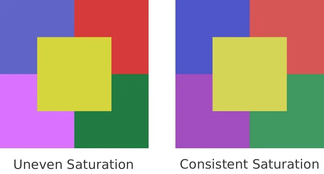
From the image above, you can see that matching saturation gives a stronger sense of unity and balance. High-saturation palettes feel lively and energetic. Low-saturation palettes feel calm, steady, and trustworthy.
In real design projects, strictly keeping saturation the same isn't very common. It's enough to understand the idea.
Remember: keeping hue, brightness, or saturation the same is not a strict rule. Color techniques aren't math answers — they're ways to guide your choices.
You can also combine two properties and let the third vary. For example, keep saturation and brightness consistent while changing hue.
Method 4: Find Color Matching in Nature
In real work, color choices don't come from nowhere. You can base them on things around you to make the whole design feel coordinated and unified.
Put simply, natural scenes already have balanced color combos. Trees make you think of green. The ocean makes you think of blue. Flowers bring pinks and reds. When you pick a theme, try pulling colors from nature or from a familiar landscape.
Here's a simple example: how do you create a palette that fits an autumn theme?
When you think of autumn, you probably picture golden yellow. But you might not know exactly how to build a full palette. A quick way is to download a photo of an autumn scene and use it for inspiration.

After you have the photo, how do you extract colors from it? In Photoshop, you can use Filter > Pixelate > Mosaic to get this effect:

Once the image is pixelated, it becomes large color blocks. You can sample colors from those blocks and mix them into a color palette. That gives you a swatch like this, which you can use in your design:
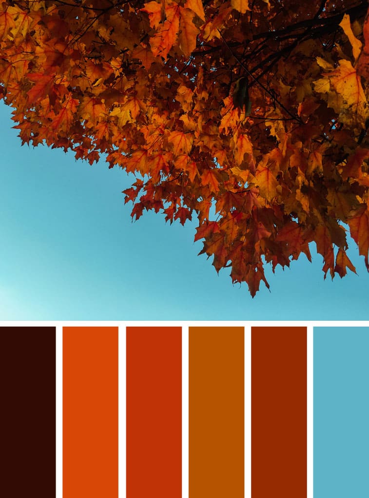
Doesn't that palette feel coordinated and unified?
This mosaic sampling method is a great way to find color ideas. With a little tweaking and smoothing, the colors will work well together in a layout. You can use this trick to make many different kinds of color palettes.
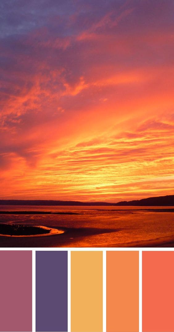
Pixelating a nature photo and sampling its colors gives cohesive palettes that work well in commercial design.
Conclusion
Today's article is about making color matching more harmonious. Why stress harmony? It's simple: that doesn't mean disharmonious color choices are wrong. But harmonious color matching is easier for most people to accept, and it makes everyday design work smoother.
No matter which method you use, try to keep the number of main hues in a layout to three or fewer. Too many colors in one composition can quickly break the balance and make the design feel messy.
One more thing: color choices are never a single right answer. Think of them like a multiple-choice question. Color theory just gives you a way in — a method to help you decide, not a final rule.
If you use tools like Photoshop or Illustrator every day, you've probably had enough of clunky menus and remembering lots of shortcuts. Try the TourBox controller.

You can map your most-used shortcuts and tools to TourBox's physical buttons and knobs. It works like a gamepad for your creative software and helps you work faster and cleaner.

TourBox also includes built-in features to simplify workflows, and its ergonomic design keeps your wrists comfortable during long sessions. If you're interested, click the link to learn more.