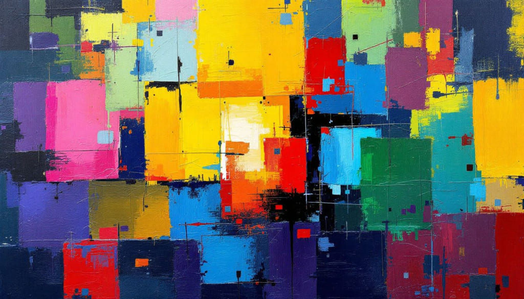
Color Meanings: A Simple Guide to What Each Hue Represents
On Komodo Island in Indonesia, local people still paint totems with ochre. These rock paintings, worn by thousands of years, show people knew about color long before writing existed.
Color isn't just something you see. It's a cultural code that spans time, carving our shared memories and feelings like DNA.
Colors carry powerful meanings. They can shape our moods and choices. The same color might make one person feel happy and another feel sad.
In design, picking colors is very personal. But in color psychology, every hue has its own meaning. In this article, we'll look at common colors from cultural and psychological views, helping you use colors more accurately and effectively in your designs and daily life.

In this article, you will learn:
- Color Psychology and Cultural Symbolism
- The Meaning of Common Color
- How to Pick Colors in Your Design?
- In Summary
Color Psychology and Cultural Symbolism
1. What Is Color Psychology?
Color psychology studies how color affects our feelings, thoughts, and actions. It shows how color enters our eyes, reaches the brain, and triggers physical and emotional responses.
According to the Embodied and Referential Theory, colors have two kinds of meaning:
- Embodied Meaning: The body's direct reaction to color. For example, red light's longer waves can speed up your heart rate and raise blood pressure.
- Referential Meaning: The ideas we learn from culture and context. For example, the caramel color in cola makes us think of its unique taste.
Embodied meanings are mostly the same across cultures and come from our biology. Referential meanings depend on cultural background and the situation.
Further Reading:
2. What Is Color Symbolism?
Color symbolism looks at the messages colors carry in different cultures and times.
In the West, white often means purity, holiness, and a new start. Ancient Egyptian priests wore white to show purity, and medieval Europeans linked white unicorns to virginity.
In China, Japan, and other parts of Asia, white usually stands for mourning and funerals. You'll see white clothes and flowers at services to mark grief.
Red in Chinese culture means happiness, good luck, and wealth. It's everywhere at weddings, festivals, and celebrations. In the U.S. and Europe, though, red is a warning color — think stop signs, traffic lights, and danger flags.
In short, color psychology and color symbolism go hand in hand. Color psychology explains how hues affect our bodies and minds. Color symbolism shows how colors build meaning in culture. Using both views helps your designs hit the right emotional tone and look just right.
The Meaning of Common Color
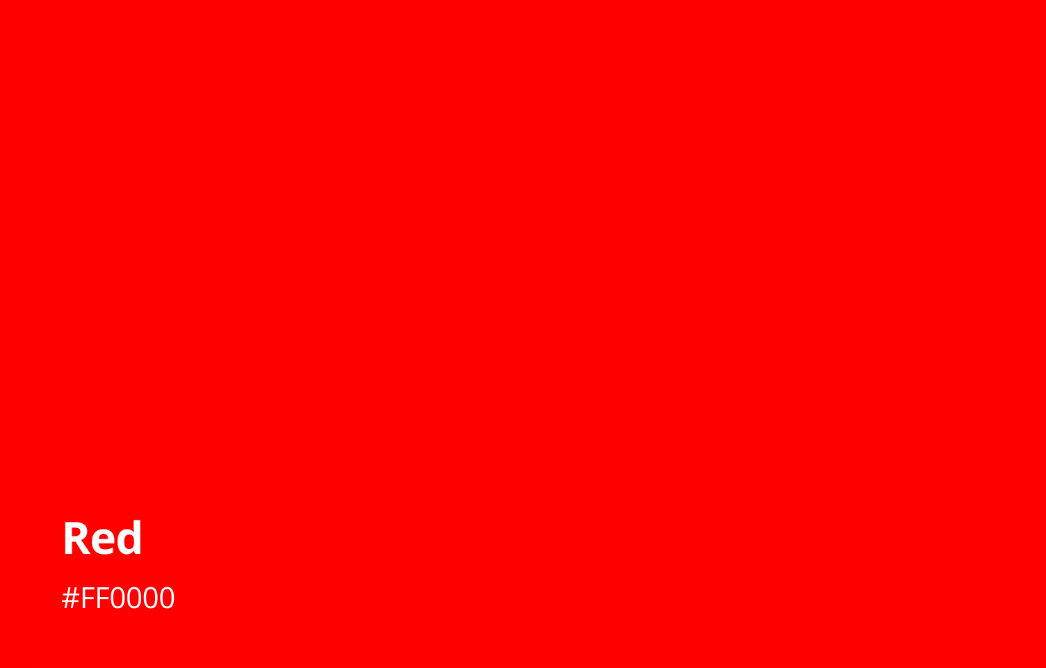
1. Red
Red is the color that wakes you up and gets your blood pumping. It stands for passion and power, charging any design or space with bold energy.
When you see red, your heart beats faster and your appetite awakens. So it's no wonder restaurants paint their walls or plates with a touch of crimson. At the same time, red shouts "stop" and "danger," making it perfect for warning signs, flashing lights, and emergency buttons.
Across cultures, red wears many hats. In China, it's the ultimate lucky color: bright red lanterns hang at New Year, and brides wear red dresses to invite good fortune. Families paint their doors red to keep bad spirits away and deck out their streets for weddings and festivals.
In the West, red carries a mix of meanings: red flags signal risk, while red roses whisper romance. On Valentine's Day, hearts glow scarlet to express deep love, yet on the roadside, red lights and stop signs keep us safe by demanding instant attention.
Beyond symbols, red has a primal pull on our senses. It sits at the top of what we notice first. Our eyes are drawn to red faster than to any other color.
Brands harness this urgency in sale tags, clearance ads, and flash deals that make us lean in and act now. Even sports teams choose red to appear more dominant and fearless on the field.
When you use red in your design, you tap into its fiery drive. A dash of red can inject excitement and focus. A sweep of red can raise the stakes and demand attention. And a soft, muted red can warm up a space, adding a touch of human warmth and emotion.
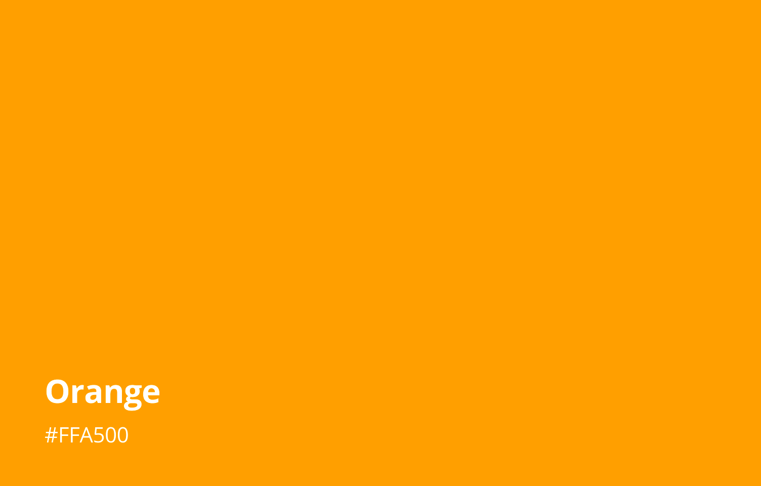
2. Orange
Orange blends red's spark with yellow's sunshine, giving designs a warm, creative vibe. In digital art, artists use orange accents to draw the eye and make scenes feel alive without the intensity of pure red.
In apps and websites, orange buttons and alerts feel friendly and invite clicks more gently than a harsh red.
Beyond design, orange carries deep cultural meaning. In Southeast Asia, Buddhist monks wear saffron robes as a sign of simplicity and letting go of worldly wants.
Using orange in your work can tap into that same sense of warmth, balance, and mindful calm.
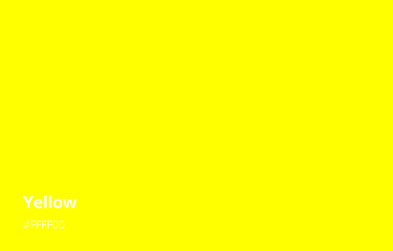
3. Yellow
Yellow feels like sunshine in a design—bright, optimistic, and full of energy. In design, you might use yellow highlights to draw the eye and lift the mood of a scene. It works great for callouts, tooltips, or any element you want people to notice right away.
Because it's so visible, yellow is the go-to for caution signs, school buses, and safety gear, anything that needs instant attention.
But in a layout, too much yellow can feel overwhelming, so it often shines best as an accent against darker or cooler tones.
Yellow also carries rich cultural stories. In ancient China, emperors wore bright yellow silk to signal their supreme power and divine right to rule. Across Europe, golden-hued stained-glass windows in cathedrals spoke of heavenly light and divine wisdom.
But yellow's history has a flip side, too. Medieval stories sometimes painted traitors in yellow cloaks, linking the color with betrayal.
When you weave yellow into your designs, you tap into all these layers: the warmth of sunshine, the pull of high visibility, and the weight of centuries of symbolic meaning.
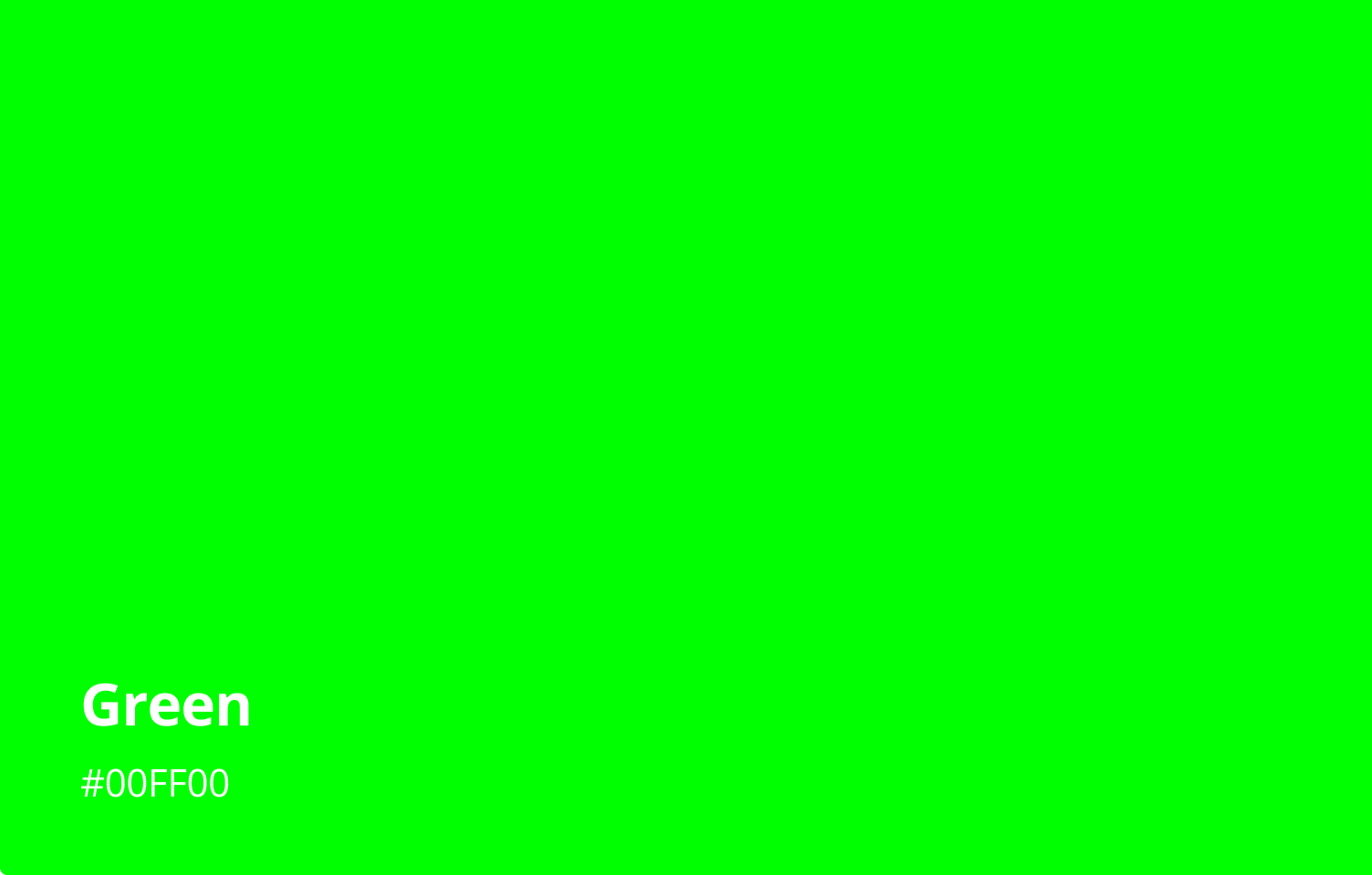
4. Green
Green brings a calm, natural vibe to any design. Soft greens can make landscapes feel lush and peaceful, while brighter greens work as gentle accents that guide the eye without startling it.
Because green sits in the middle of the spectrum, it's easy on the eyes. It is perfect for backgrounds, web pages, or apps where people spend a lot of time looking.
Brands love green for its links to health, renewal, and eco-friendly values. A fresh "mint" green can hint at new ideas, while a deeper "forest" shade suggests stability and trust. In finance apps and stock tickers, green means profit and upward movement, giving users quick, positive feedback.
Green also carries cultural weight. In Islam, it's sacred, seen in mosque domes and national flags as a symbol of life, paradise, and spiritual renewal. When you weave green into your work, you tap into its soothing power, its promise of growth, and its timeless cultural resonance.
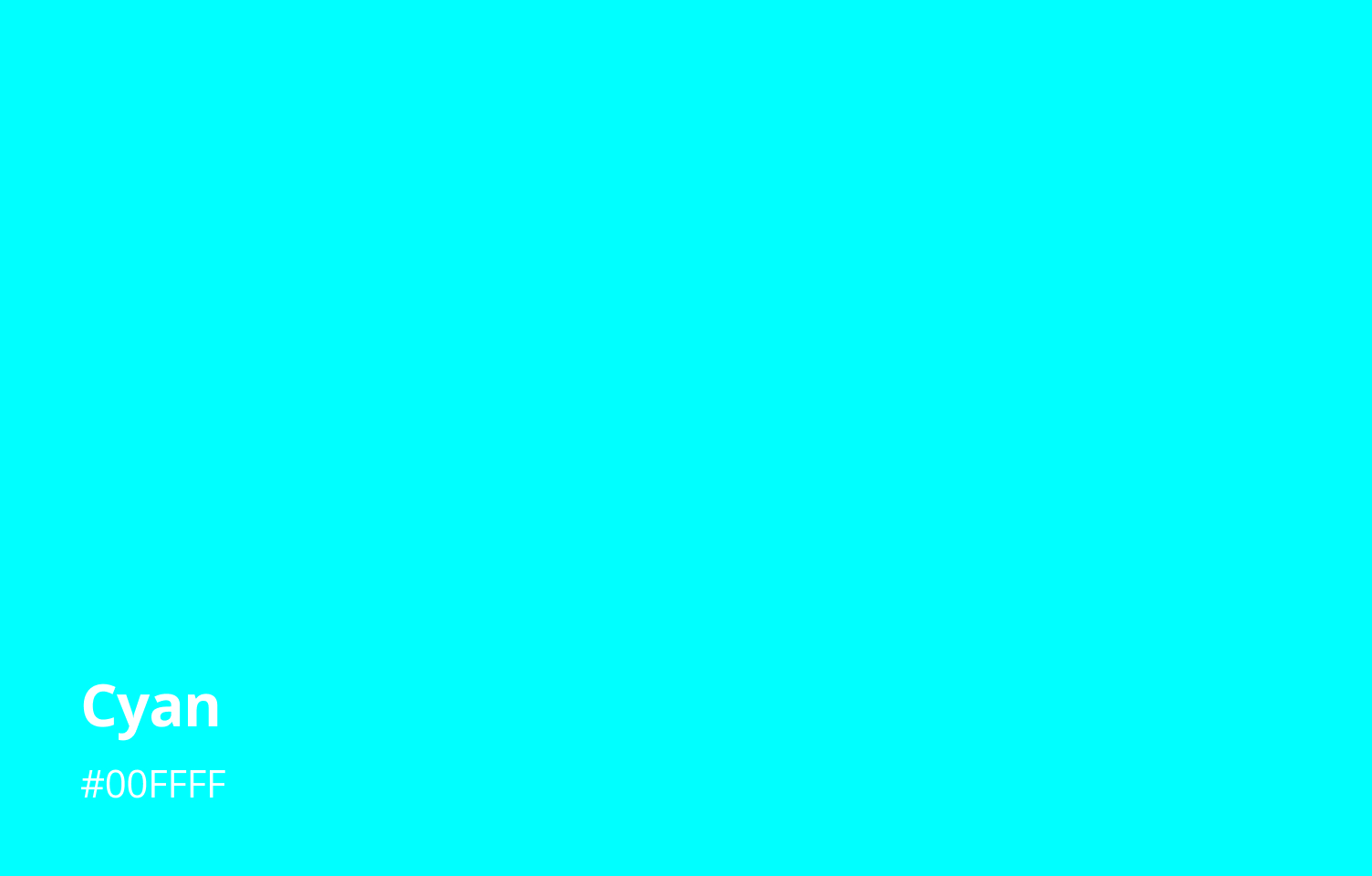
5. Cyan
Cyan sits between blue and green and is prized for its calming, clarity-boosting effects. Studies show it can lower blood pressure, slow heart rate, and ease anxiety to help you focus and think clearly.
This blend of serenity and gentle energy also makes cyan a go-to for creative environments, where it keeps you relaxed without losing mental sharpness.
Culturally, cyan has a rich history: In ancient Egypt, the turquoise stone (a natural cyan hue) stood for life, fertility, and protection and was used in pharaohs' tombs to ensure safe passage into the afterlife. In Tibet, it's known as the "sky stone," believed to bring heavenly protection, love, and good fortune. Its changing shade even warns wearers of incoming danger.
Today, brands like Tiffany & Co. harness cyan's fresh elegance in their trademarked "Tiffany Blue" to convey luxury, trust, and instant recognition.
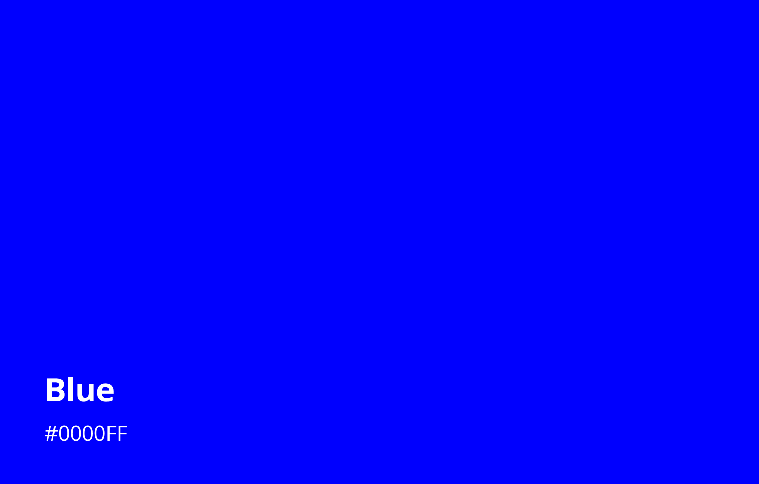
6. Blue
Blue makes you think of the ocean and sky. It stands for trust, calm, and professionalism. It can bring order and peace, and even help lower your blood pressure and slow your heart rate.
Blue has long been used in royal clothes and religious buildings. Today, tech companies and global groups still use it. Just look at the United Nations and European Union flags.
Here's a fun fact: Facebook's founder, Mark Zuckerberg, is color blind. He sees blue best, so Facebook's brand leans heavily on that color.
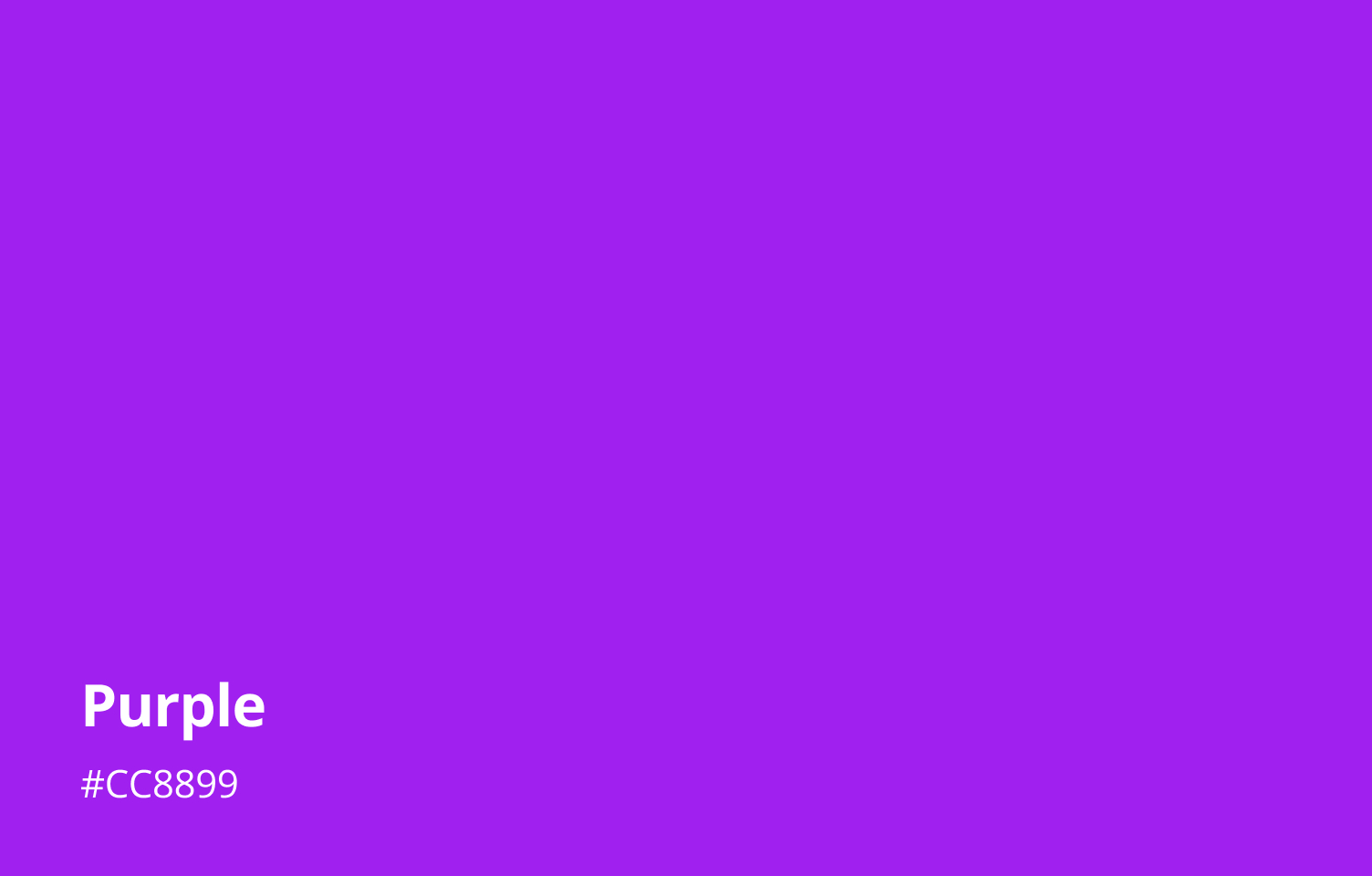
7. Purple
Purple blends calm blue and energetic red, making it a color that sparks creativity, introspection, and imagination.
Psychologists link purple to wisdom, luxury, and ambition — feelings tied to its rarity and historical cost, which can inspire a sense of prestige and encourage deep, creative thinking.
Culturally, purple's royal roots stretch back to Tyrian dye in antiquity, when only emperors and high priests could afford its rich hue. In Western religious traditions, purple marks penitence and royalty during Lent and Advent, symbolizing both solemnity and Christ's sovereignty
In Chinese feng shui, purple represents prosperity and spiritual abundance, used to invite wealth and positive energy into a space.
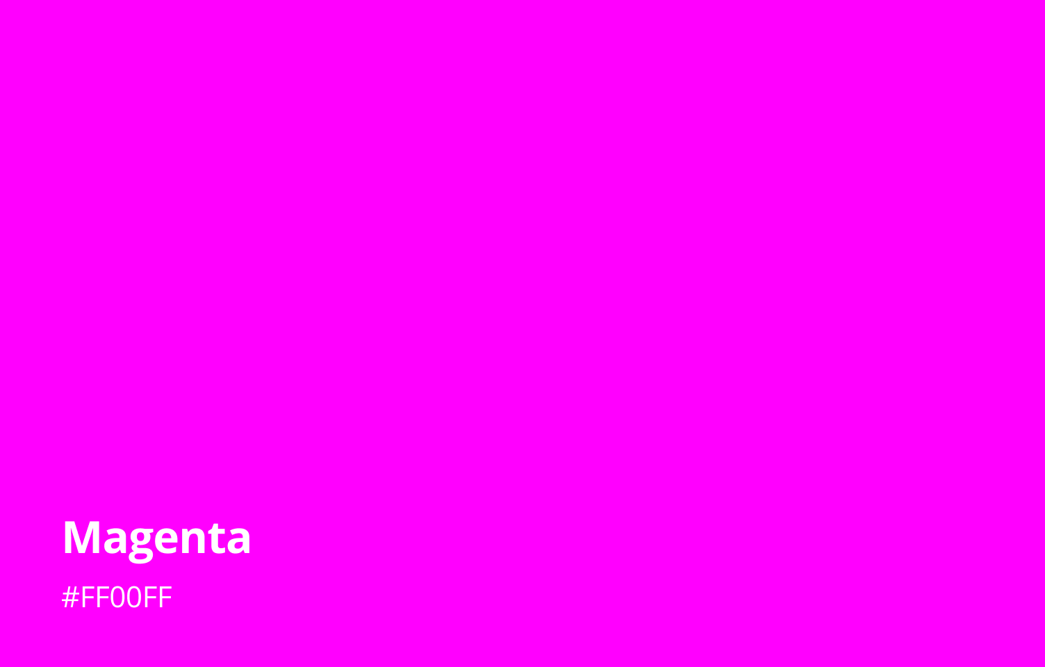
8. Magenta
Magenta mixes the passion of red with the calm of blue. It looks dreamy and eye-catching, yet also creates inner peace and balance.
In color psychology, magenta stands for creativity and change. It helps people break old thinking patterns and sparks fresh ideas and imagination. At the same time, it brings warm acceptance and optimism, giving comfort and encouragement when things feel uncertain.
In modern design and pop culture, magenta means bold self-expression and breaking the rules. Many designers and brands use it to signal innovation and uniqueness.
For example, Pantone named Viva Magenta its 2023 Color of the Year, calling it "a color that is audacious, full of wit, and inclusive of all."
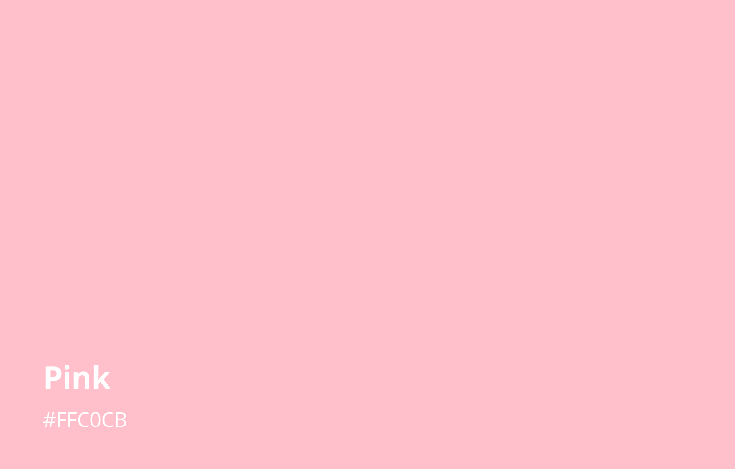
9. Pink
Pink is often seen as warm and soothing. Unlike fiery red, pink helps calm feelings and brings a sense of care. Studies even showed that painting rooms in a soft pink can lower anxiety and anger.
In color psychology, pink stands for innocence, love, and closeness. It makes you think of first-love sweetness or a rosy sunrise. In modern Western culture, pink is tied to romance and girlish charm (think Barbie's playful vibe), and it's also become a symbol of inclusion and pride in the LGBTQ+ community.
Pink's meaning hasn't always been so singular. In the past, it was seen as a bold color for men, and in Renaissance art, pink flowers stood for purity and offerings.
In Eastern traditions, pink links to nature's fleeting beauty, like Japan's cherry blossoms and the idea of "mono no aware" (the bittersweet beauty of impermanence).
Today, designers use pink in digital art and branding to create dreamy, sweet visuals, whether it's a highlighted button or a soft gradient background, pink adds a burst of youthful energy.
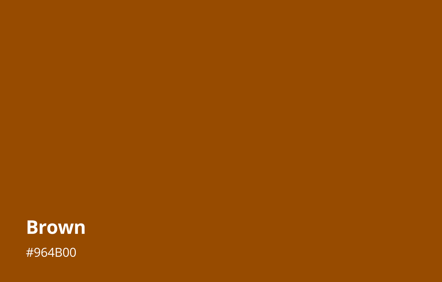
10. Brown
Brown is an earthy, warm tone that feels solid and welcoming. It's tied to earth and wood, so it stands for stability and reliability, much like firm ground under your feet. It also brings a cozy sense of security.
Darker browns can sometimes feel lonely or heavy. Still, in general, brown makes us think of steadiness, friendliness, and lasting comfort.
Culturally, brown is often called the "earth color." It reminds us of land, trees, and autumn's harvest, linking it to nature, abundance, and tradition.
In many cultures, brown also stands for humility and simplicity. Monks wear plain brown robes to show a down-to-earth, humble life. And in folk customs, brown brings to mind harvest season and warm, homey memories.
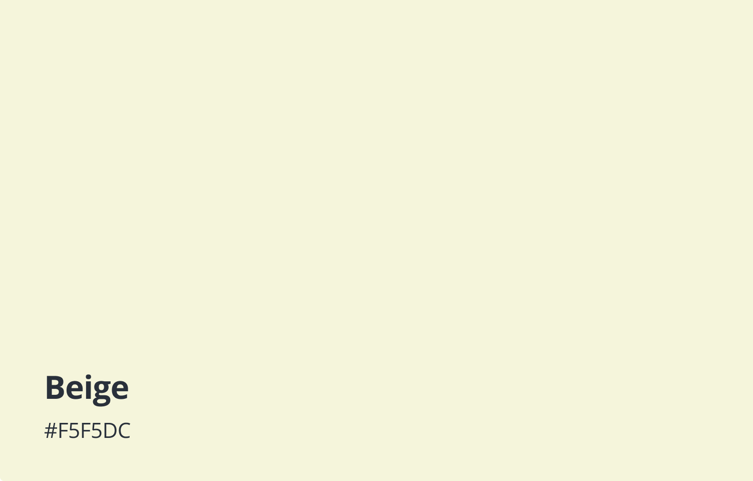
11. Beige
Beige sits between white and brown as one of the softest neutrals. It gives off calm, balance, and simplicity, perfect for rooms or brands that need a peaceful, focused vibe.
Darker beiges feel mature and refined, while lighter beiges feel bright and inviting. Overall, beige is understated yet stylish, imagine a classic leather-bound book that never goes out of style.
In Western design, beige stands for simple, quiet elegance and is a staple in minimalism and high-end fashion. In Japan, natural beige tones, like those in tatami mats and bamboo accents, shape Zen spaces that honor simplicity, balance, and harmony.
Because of its gentle, reliable feel, beige is also a top choice for brands in luxury, eco-friendly, and wellness markets. It helps them project a timeless, harmonious image that customers can trust.
12. Cream
Cream is a soft, warm shade that makes you think of comfort and calm. Studies show it brings a sense of peace and safety, so it's perfect for bedrooms or cozy lounge areas.
This hue combines the purity of white with the simplicity of beige, giving off a humble, dependable vibe. Brands often use it to signal elegance and refinement.
Overall, cream feels like a soft hug. It invites you to relax and connect with others.
In Western culture, it stands for classic elegance. In Eastern traditions, it often means purity and quiet.
Artists love using cream as a base color, pairing it with richer tones or textures to keep designs clean, warm, and low-key.
13. Gold
Gold has been linked to wealth and brilliance since ancient times. It brings to mind success, honor, and victory. Psychologically, gold makes us feel abundant and confident, often creating an atmosphere of prosperity and triumph.
Its warm, radiant hue also hints at wisdom and tradition, giving a sense of maturity and lasting value.
Across cultures and art traditions, gold carries deep symbolism. In ancient Egypt, it symbolized the flesh of the gods and the sun god's power, used in royal tombs to signify divine life and authority. In many religions, gold represents holiness and prestige, appearing in sacred ceremonies and royal regalia to evoke light and glory.
In design, gold's shiny sheen makes a bold visual statement. It grabs attention and stirs emotion, so it's perfect for accents that highlight key elements. But too much gold can feel showy, so designers usually use it sparingly to keep things balanced and elegant.
14. Silver
Silver is known for its cool elegance and futuristic vibe. It calls to mind moonlight and sleek tech finishes. Psychologically, it feels calm and balanced, while also hinting at wisdom and forward thinking, giving an impression of innovation.
Its reflective shine makes silver look clear and mysterious, eye-catching without being over-the-top, so it’s often used as an accent in high-end designs.
Across cultures, silver links to nobility and mystery. In ancient Egypt and Greece, it was seen as a sacred metal tied to moon goddesses and holy rituals. In Eastern traditions, silver often stands for balance and harmony, carrying a solemn, dignified air.
In branding and design, silver bridges tech and luxury. Big names like Apple and Mercedes use silver to suggest innovation, elegance, and precision. As a neutral in digital art, it fits with many colors to create a crisp, futuristic look.

15. Black
Black is often seen as a symbol of power, authority, and mystery. Visually, it creates a strong, dramatic look and adds depth, giving a sense of strength and solemnity while also feeding a captivating, mysterious vibe.
That's why black is a top pick in high-end fashion, brand logos, and architecture. It shows off clean, timeless style and can instantly add a refined, upscale mood.
Black also links to the unknown and a bit of rebellion. In art and media, it's used to explore deep, edgy, or avant-garde themes that feel both serious and boundary-pushing.
Across cultures, black carries different meanings. In many Western traditions, it's tied to mourning and death. In Chinese thought, black represents the water element, symbolizing depth, flow, and even wealth. Many African cultures see black as a color of maturity and wisdom, reflecting life experience and strength.
These cultural layers give black a rich, multi-faceted meaning: it can express solemnity and mystery, but also power, authority, and deep wisdom.
In design, black adapts to any style or setting. Yet using pure black (#000000) can be controversial. Pure black offers the highest contrast, but that stark difference can lead to eye strain and hurt readability. Many designers prefer dark grays instead to keep contrast high, but comfortable.

16. White
White is often seen as a symbol of purity and new beginnings, like a blank canvas full of possibilities. Psychologically, white brings calm and clarity, helping you focus and stay cool-headed.
It also has a clean, pure feel. That's why minimalist and modern designs use white to make spaces look bright, fresh, and elegant.
Across cultures, white means different things. In Western traditions, it's tied to weddings, birth, and the sacred. In China, Japan, and other Eastern cultures, white often stands for funerals and sorrow, symbolizing endings and letting go.
Today, designers still love white. Tech brands like Apple use it to convey modern style and innovation. Designers also leave plenty of blank space to highlight key information and add visual depth.

How to Pick Colors in Your Design?
In the last section, we looked at what common colors mean. Now, how do you mix those colors in a real design project?
One handy way is to use the color wheel and its classic rules — like complementary, analogous, and triadic schemes. To dive deeper into these methods, check out our linked article below.
Further Reading:
That said, many artists bend or break these rules on purpose. Color theory often sums up what works after the fact, but in practice, you might choose colors by feel.
You'll see illustrators pick two hues far apart on the wheel or add a neutral tone to balance the contrast, creating a unique rhythm in their work.
Want a faster, more intuitive way to find your perfect palette? Try the TourBox creative console.

With a few simple settings, you can turn a knob to shift your hues. No more dragging sliders or clicking menus. Just one hand on TourBox, a little trial and error, and you'll land on the ideal color tones in no time.
If you're more comfortable creating on an iPad, check out the TourBox Elite Plus. It works with both PC and iPad, and you'll love how it speeds up your workflow.

In Summary
This article might be a lot to take in at once. So, here's a quick reference guide to what these colors usually mean:
- Red: passion, power, warning
- Orange: energy, warmth, creativity
- Yellow: happiness, optimism, caution
- Green: nature, peace, growth
- Cyan: soothing, clarity, calm
- Blue: trust, stability, tranquility
- Purple: royalty, mystery, creativity
- Magenta: harmony, balance, imagination
- Pink: soft, romantic, soothing
- Brown: reliable, resilient, warm
- Beige: calm, simple, comfortable
- Cream: elegant, refined, serene
- Gold: luxury, success, prestige
- Silver: modern, elegant, balanced
- Black: authority, mystery, solidity
- White: purity, simplicity, brightness