Color Palettes for Digital Painting: 4 Simple Rules
If your colors often feel off, or the overall palette just doesn't sit right. Don't worry. Below are a few easy, practical rules. They'll help your pieces read clearer, feel more unified, and look more professional. Short, friendly, and ready to apply.

In this article, you will learn:
- Use Light Vs. Dark Contrast to Add Depth
- Make Hue Contrast Intentional
- Let Colors Echo Each Other for Unity
- Fill in the Color Wheel
- Conclusion
Use Light Vs. Dark Contrast to Add Depth
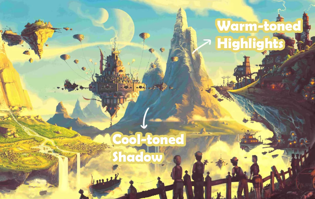
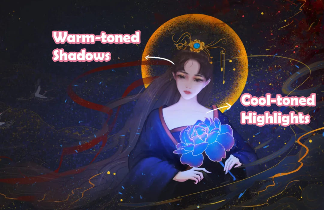
Light–dark contrast gives your piece depth and punch. Try pairing bright warm tones with cool shadows (or the other way around), or use saturated lights against muted darks. Different brightness and saturation levels create layered, interesting visuals.
For example, in the piece below, the bright areas are warm and the shadows are cool. (see image)
In this other piece, the bright areas are cool and the shadows are warm. (see image)
Make Hue Contrast Intentional
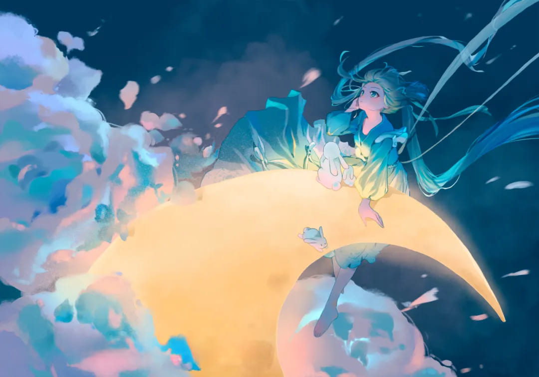
Hue contrast changes the mood. You can use analogous (neighboring) colors for harmony, complementary colors for tension, or high-contrast hues for drama. Don't split colors evenly. Give each color a role.
A common and reliable rule is: 60% main, 30% secondary, 10% accent.
The example below uses roughly 60% teal/blue-green + 30% yellow + 10% pink-purple.
Let Colors Echo Each Other for Unity
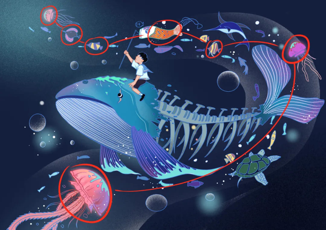
When a piece has many elements, keep the palette connected. Don't let colors sit alone. Repeating the same or similar hues across different parts ties everything together and prevents visual dissonance.
Mini tip: If you have multiple subjects, give each one a shared color family or a small matching accent to create links across the image.
See image — colors in the red box are neighboring hues that echo each other.
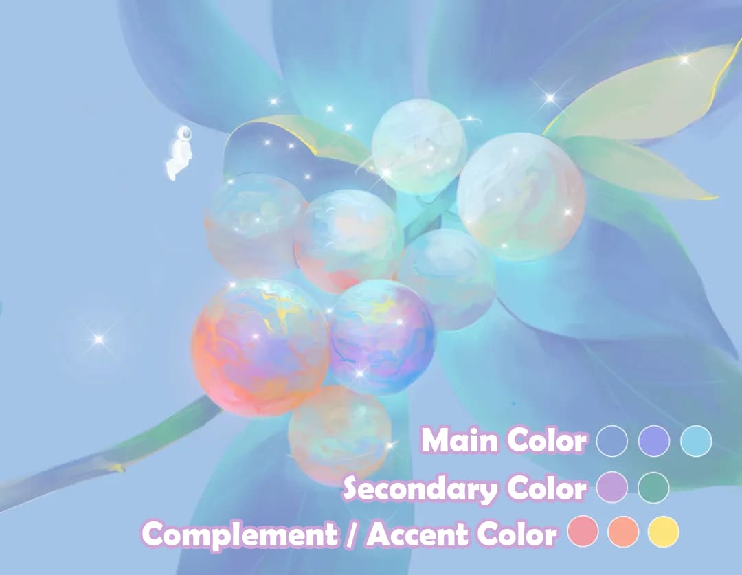
Fill in the Color Wheel
After you pick your main tone, add nearby or opposite colors to complete the palette. You can put a contrasting complementary color at the visual center and use analogous colors elsewhere.
This makes the color wheel feel whole and avoids sudden jumps in hue, so transitions look natural.
For example, adding purple between red and blue helps balance the clash between warm and cool tones.
Conclusion
In this article, we cover four easy color rules for digital art. Want color to be part of your creative flow instead of a roadblock? Try adding a TourBox to your workflow — it often makes working faster and more enjoyable than you expect.

The physical knobs, dials, and customizable buttons let you map common color commands to a single control. Any fiddly task can be done right at your fingertips, so you don't have to dig through menus.

For artists who want a smooth color workflow, saving time on controls means more time for ideas. And if you like painting on an iPad, you'll probably enjoy the TourBox Elite Plus — it works on both PC and iPad.