What Are Complementary Colors | How to Use Them in Design
Colors surround us everywhere. We often think of them as separate things: the sky is blue, plants are green, and flowers are red.
But colors are like musical notes. You need many notes together to make a beautiful song. No single color stands alone, and no color is always "good" or "bad."
Instead, a color works or doesn't work based on the group it's in. We say a color is "in harmony" or "clashing," "a good fit" or "not a good fit" only when we see it with other colors.
One popular way to mix colors is to use complementary colors. It pairs that sit opposite each other on the color wheel. What exactly are complementary colors, and which pairs look best together? Let's find out.

In this article, you will learn:
- What Are Complementary Colors?
- How Are Complementary and Contrasting Colors Different?
- How to Use Complementary Colors in Your Design?
- 12-Color Wheel Quick Complementary Reference
- Complementary Color Alternatives: 6 Classic Contrasting Color Pairs
- Conclusion
What Are Complementary Colors?
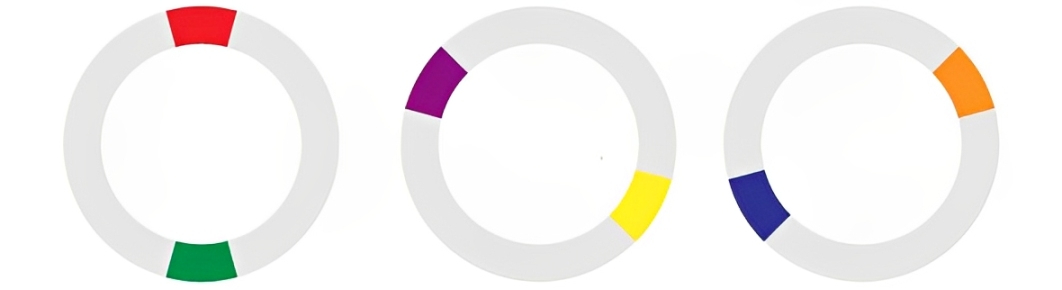
On the color wheel, colors that sit 180° apart are called complementary.
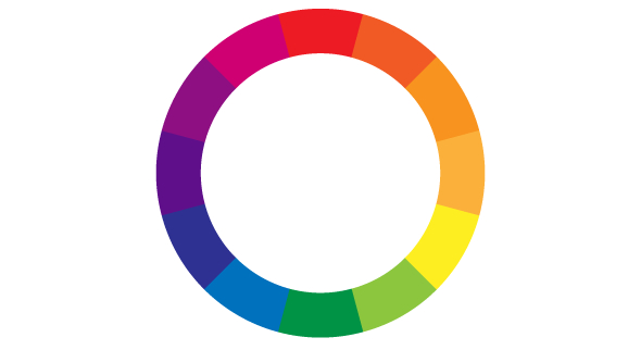
For example, red pairs with green, yellow pairs with purple, and blue pairs with orange. Putting complementary colors side by side gives the strongest contrast and a real "pop" of color.
How Are Complementary and Contrasting Colors Different?
People often mix up complementary and contrasting colors.
Complementary colors are the exact opposites on the wheel (180° apart).
Contrasting colors is a broader term. Any two colors that look clearly different, whether they're 120° apart on the wheel or even differ in lightness, saturation, or warm vs. cool, can be called contrasting.
How to Use Complementary Colors in Your Design?
Complementary colors have a strong separation, so they're great for boosting contrast and creating a sense of depth. When used well, they make your design feel lively and full of energy.
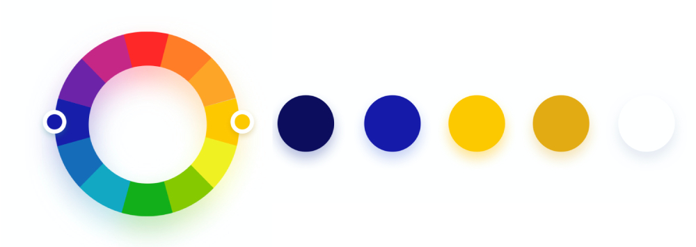
If you expand your palette to include colors just next to those 180° opposites, you'll have even more options and richer combinations.
Because the contrast between complementary hues is so intense, you need to balance their proportions carefully. Use one color in a large area and its complement in a smaller area.
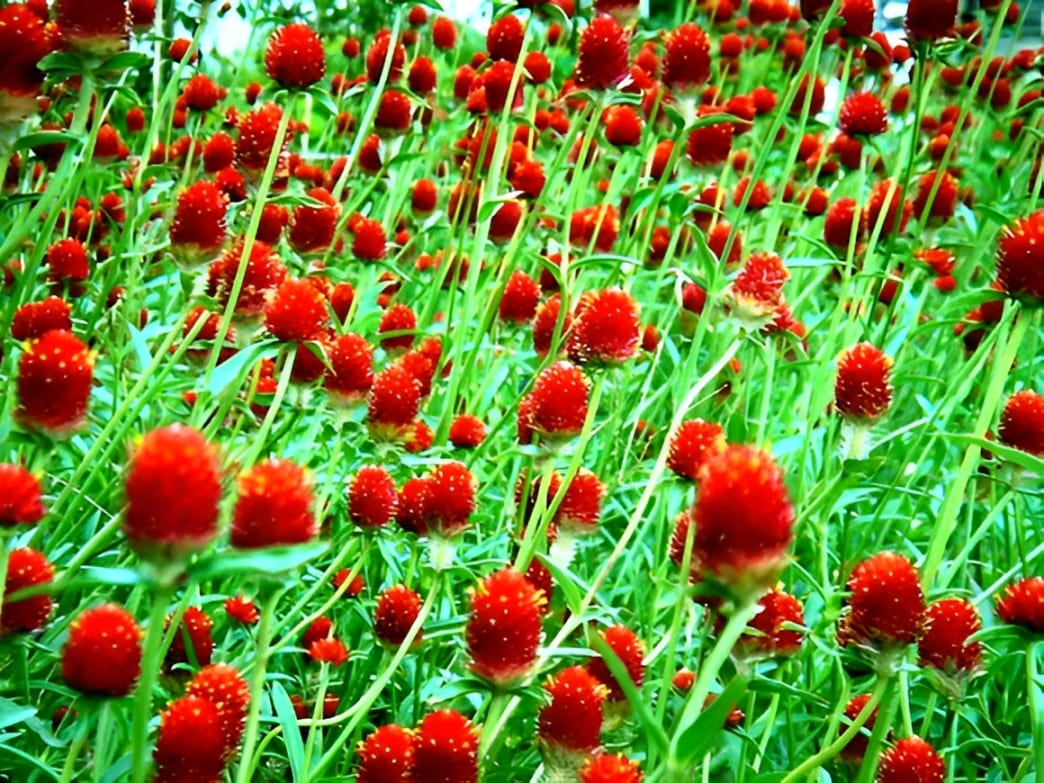
If you use them equally, the contrast can feel too harsh, like red and green covering the same space can make your eyes spin.
For example, try staring at the photo below for a while. How does it feel? Your eyes will get really tired.
A good rule of thumb is a 70/30 or 80/20 split.
Japanese designer Mariko Yamaguchi suggests a 75%–25%–5% ratio:
- 75% large-area base color
- 25% main accent color (complement)
- 5% highlight color (another complement or pop)
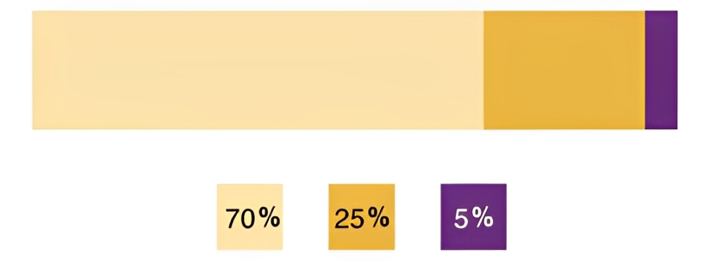
This way, the base color grounds your design, the main accent draws attention, and the tiny highlight adds just the right spark.
Complementary colors are like a double-edged sword. On one hand, they pack a powerful punch. On the other, that strong contrast can quickly strain the eyes.
So, in real-world designs, use complementary colors sparingly. Here are two tips:
- Pick colors with saturation under about 85%.
- Keep the main color and its complement in a balanced ratio to maintain harmony.
12-Color Wheel Quick Complementary Reference
On a standard 12-color wheel (RYB model), the hues are divided into these twelve segments:
Red, Red-Orange, Orange, Yellow-Orange, Yellow, Yellow-Green, Green, Blue-Green, Blue, Blue-Violet, Violet, Red-Violet.
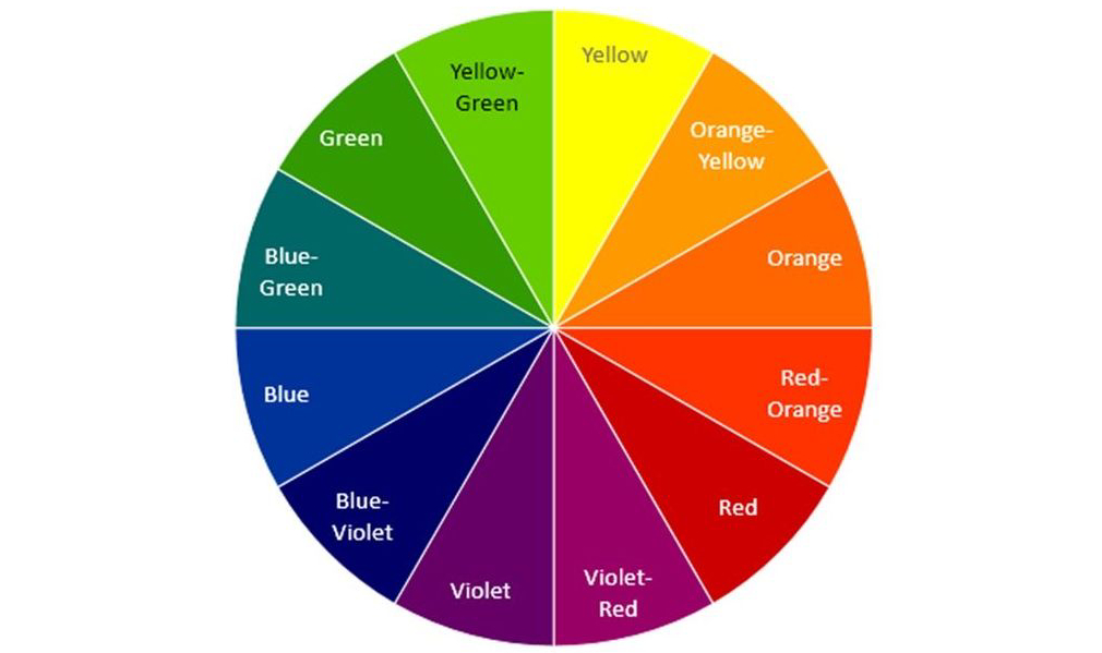
Here are each hue with its 180° opposite (its complementary color):
- Red ↔ Green
- Red-Orange ↔ Blue-Green
- Orange ↔ Blue
- Yellow-Orange ↔ Blue-Violet
- Yellow ↔ Violet
- Yellow-Green ↔ Red-Violet
Complementary Color Alternatives: 6 Classic Contrasting Color Pairs
Here are six classic, eye-catching color combos you can try. They're not as intense as exact complements, so they won't tire out your viewers' eyes:
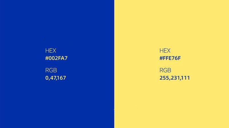
1. Klein Blue ↔ Mustard Yellow
Deep, pure Klein Blue feels almost endless. Pair it with warm, retro mustard yellow, and you instantly brighten the scene, like a stylish stroll down a Paris street.
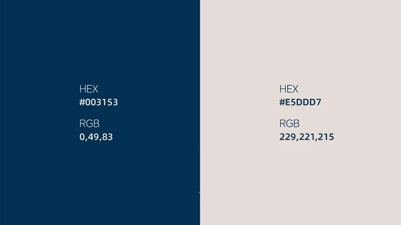
2. Prussian Blue ↔ Misty Gray
Prussian Blue has a calm, mysterious vibe. Misty Gray adds a soft, sophisticated haze. Together, they feel like an unfinished oil painting full of untold stories.
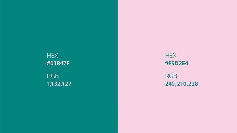
3. Mars Green ↔ Rose Pink
Mars Green bursts with life and energy. Rose Pink brings tenderness and romance. Side by side, they're like a sweet springtime date.
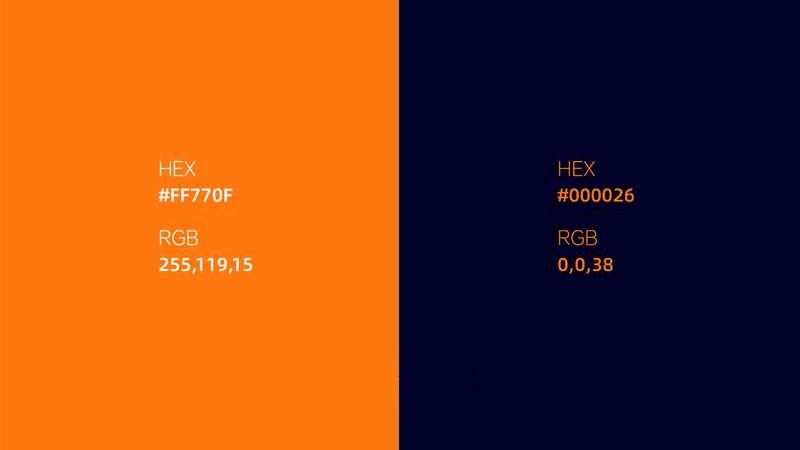
4. Hermès Orange ↔ Midnight Blue
Hermès Orange screams luxury and passion. Midnight Blue stands for elegance and depth. When they meet, it's like fiery flames dancing on a deep ocean, totally dramatic.
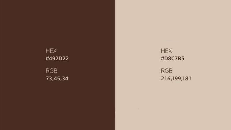
5. Vandyke Brown ↔ Light Khaki
Vandyke Brown has a vintage, earthy warmth. Light Khaki feels cozy and inviting. Together, they're as comforting as a rich cup of coffee on a lazy afternoon.
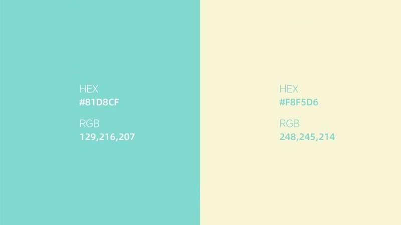
6. Tiffany Blue ↔ Cream
Tiffany Blue is fresh, romantic, and dreamy. Cream adds a soft, warm touch. Paired up, it's like sipping sweet milk tea, pure happiness.
Conclusion
At the end of this article, we'd like to show you how to put complementary color theory into practice with a creative controller that can really speed up your color work: TourBox.

By mapping your most-used color tools — like the Color Picker, blend modes, and brush settings — to its buttons, Knobs, and Dial, TourBox lets you trigger them with a single turn or click. No more hunting through menus or memorizing tricky shortcuts.
With TourBox, designers and digital artists can stay in the flow, mixing colors and creating without interruption. Whether you're doing graphic design, illustration, or color grading, it's the perfect partner to boost your color workflow.

If you work on an iPad, check out the TourBox Elite Plus. It gives you the same intuitive, hands-on control on both iPad and PC.