12 Gradient Effects to Try: Beyond Simple Linear Gradients
There are many kinds of gradient effects. Do you usually only use simple linear gradients in your projects? Today, we're sharing 12 gradient effects that work great for backgrounds and other visuals. Give them a try!

In this article, you will learn:
- Gradient Mesh Gradient
- Radial Ramp Gradient
- Blurred Gradient
- Silhouette Gradient
- Landscape Gradient
- Non-Regular Blending Gradient
- Bending Gradient
- Retro Style Gradient
- 3D Mapping Gradient
- Duotone Gradient
- Tri-color Gradient
- Multi-color Gradient
- Conclusion
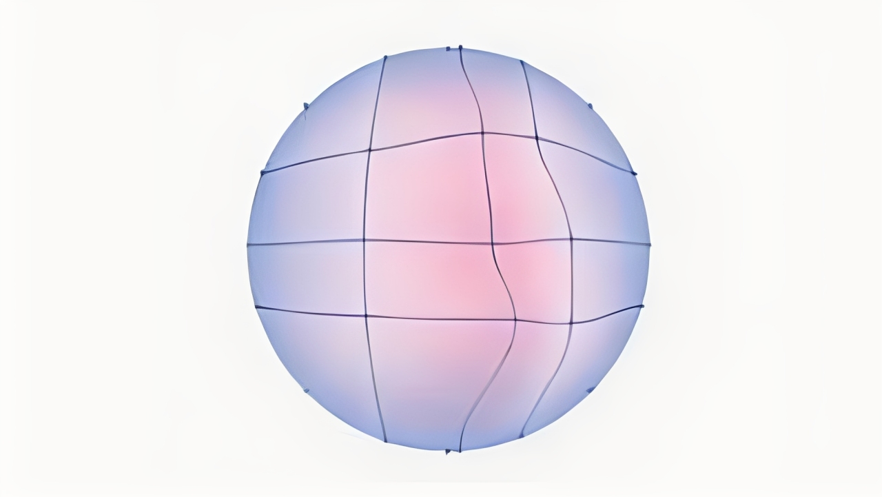
1. Gradient Mesh Gradient
A grid of control points lets you set different colors at each spot. The result is soft, flowing transitions that look very natural. Great for detailed illustrations and realistic backgrounds.
Tip: tweak a few nearby points for subtle shifts, not big jumps.
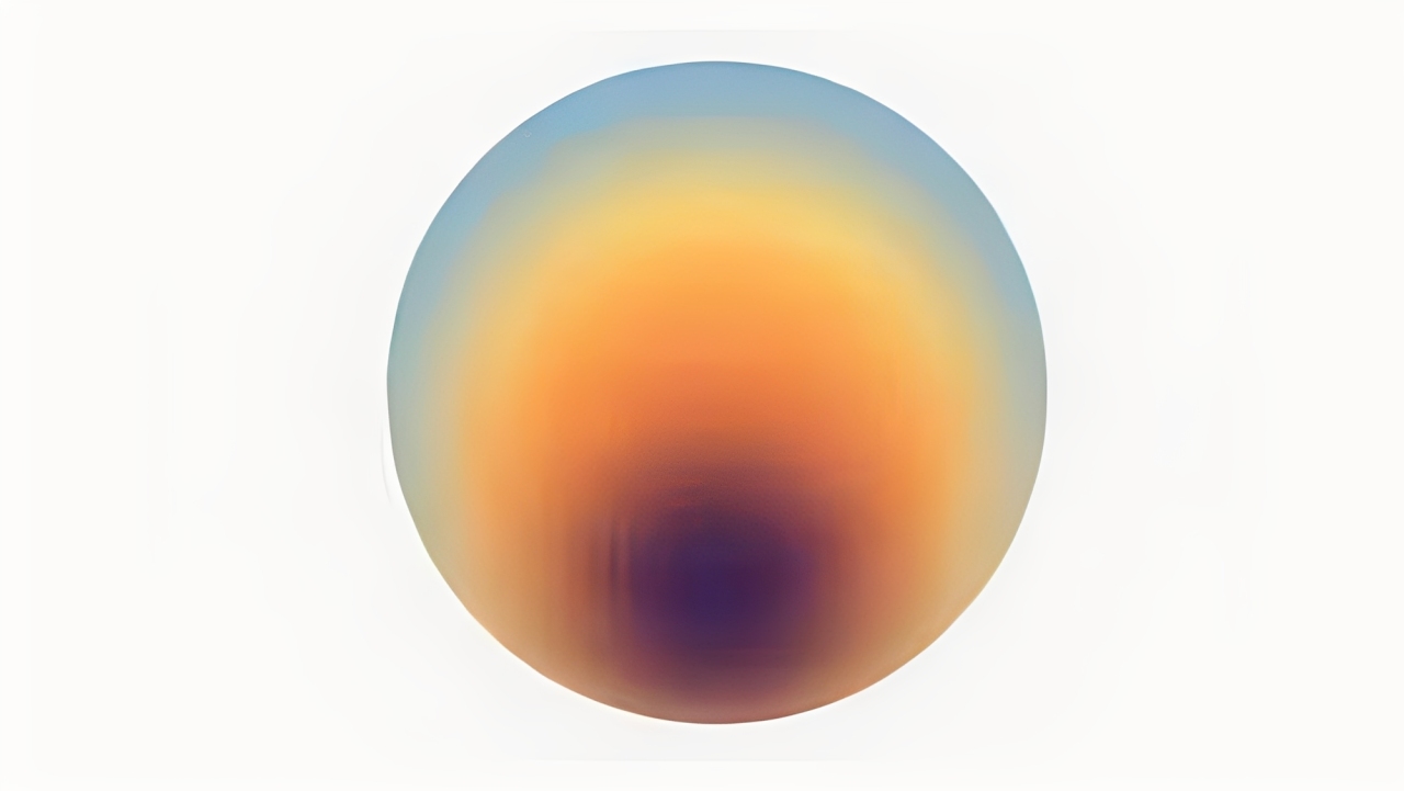
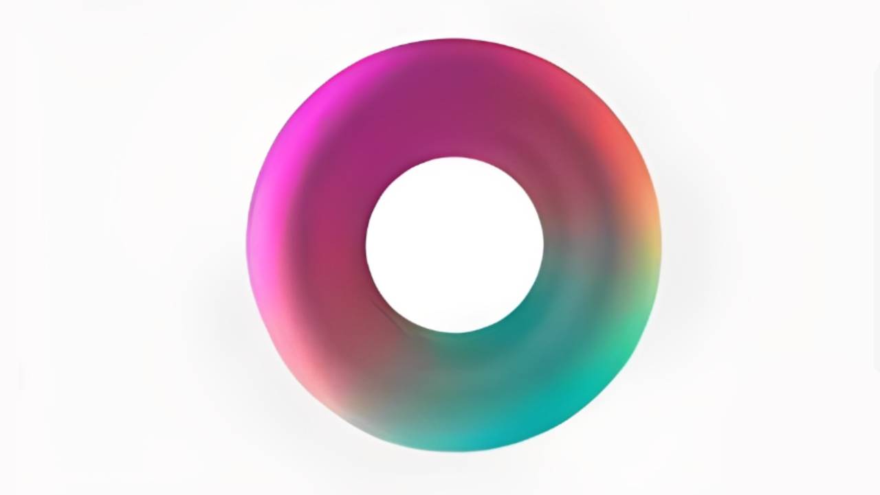
2. Radial Ramp Gradient
A circular gradient that looks like a glow or halo. Use it to draw the eye to a center spot or suggest a light source. Works well for buttons, spotlights, and subtle vignettes.
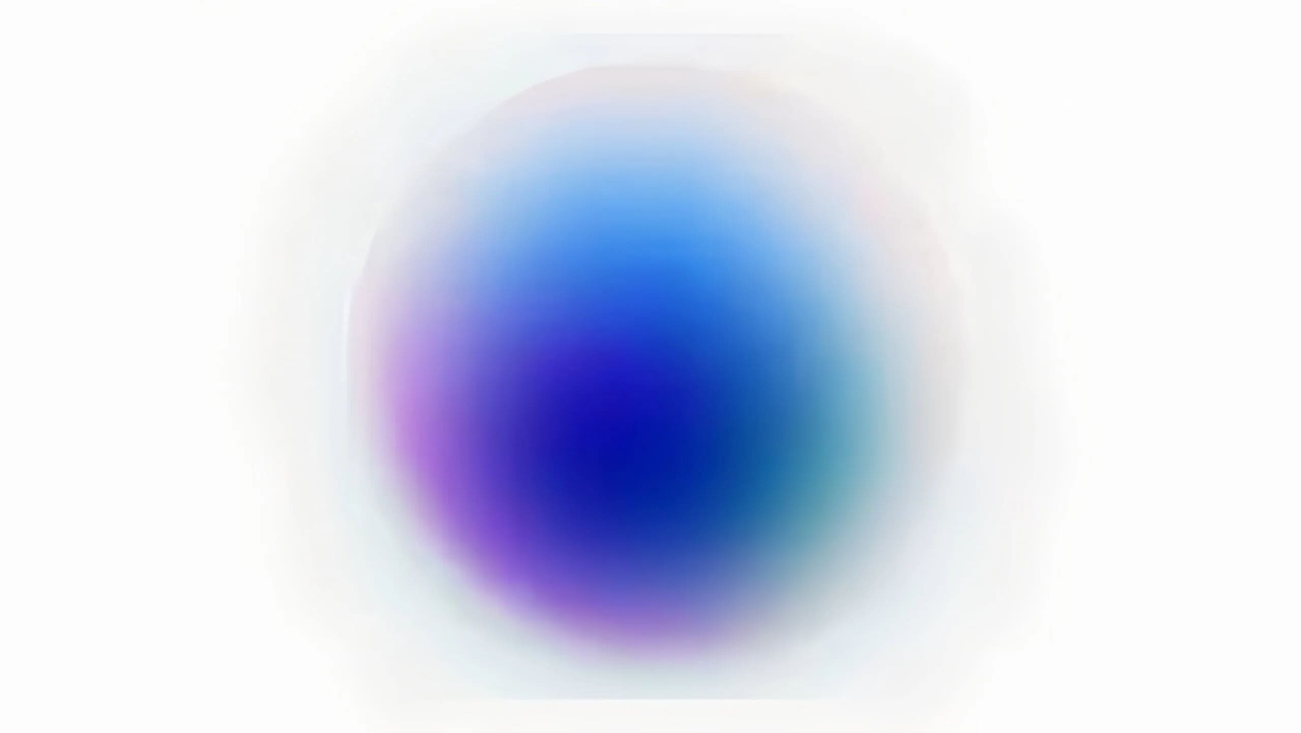
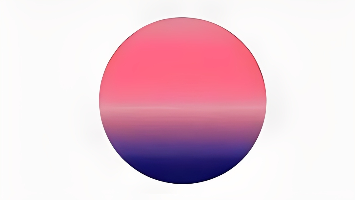
3. Blurred Gradient
Borders between colors are softened for a dreamy, out-of-focus look. This gradient effect is a go-to for web hero backgrounds, modern UIs, and fashion visuals. Tip: add slight grain so it doesn't feel too flat.
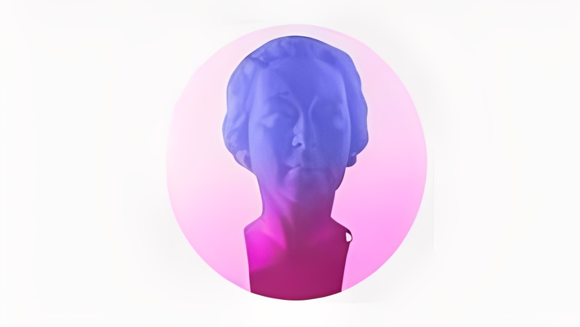
4. Silhouette Gradient
Apply a gradient inside a silhouette or shape to emphasize its outline and mood. A well-placed color shift can make the subject pop. Great for covers, ads, and minimalist layouts.
5. Landscape Gradient
Mimics natural transitions — sky to horizon, warm light on hills, cool shadows in valleys. Use this when you need depth and a sense of temperature in a scene. Ideal for posters and hero images.
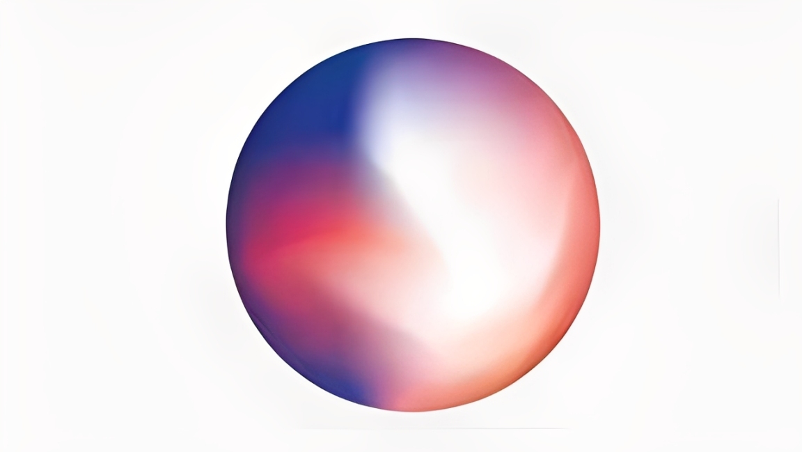
6. Non-Regular Blending Gradient
Colors mix in an unpredictable, non-linear way instead of a straight path. It feels organic and experimental — good for abstract or tech-forward designs.
7. Bending Gradient
The gradient follows curves or the shape's arc, creating a flowing, bent look. Use it to suggest motion or a 3D surface — think liquid, silk, or ripples. Great for dynamic UI accents.
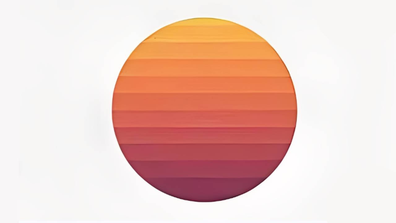
8. Retro Style Gradient
Bold, vintage palettes — burnt orange, pastel blue, neon purple — give a nostalgic vibe. This gradient effect works well for music covers and streetwear branding. High contrast sells the retro feel.
9. 3D Mapping Gradient
Map the gradient onto a 3D surface or text to mimic real light and volume. It turns flat shapes into something with depth. Use it for 3D type, icons, or metaverse-style assets.
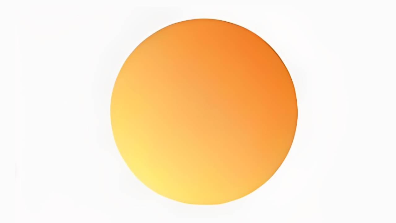
10. Duotone Gradient
Two colors create a high-contrast, striking look. Simple but powerful — popular for photo filters, brand posters, and app hero graphics. Try pairing warm + cool for instant drama.
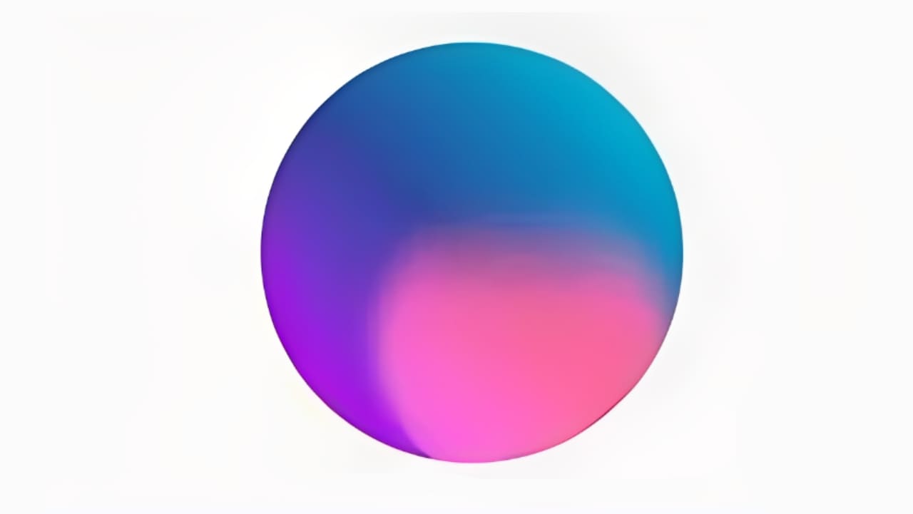
11. Tri-color Gradient
Three colors blend for richer layering without getting chaotic. It's a balanced way to add complexity — useful for extending brand palettes or tech visuals.
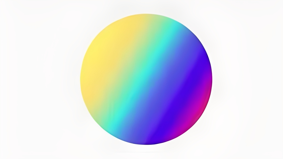
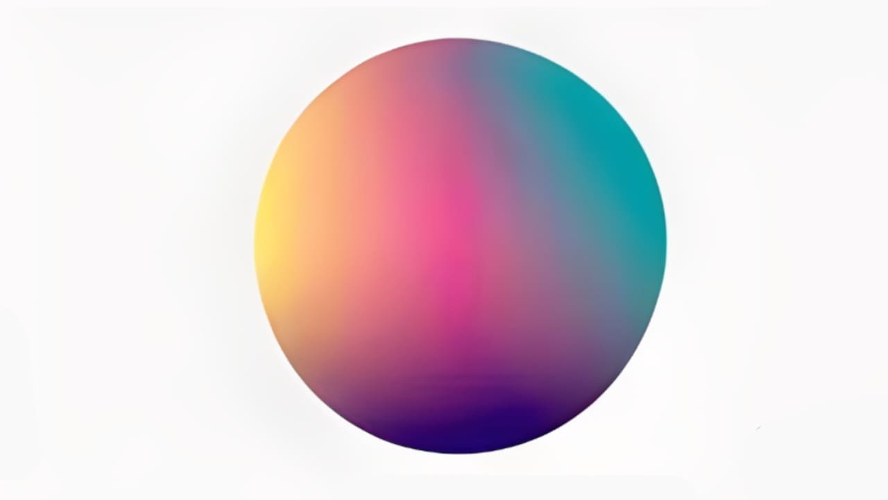
12. Multi-Color Gradient
Many colors flow together for a vivid, energetic result. This gradient effect is common in creative and AI-related designs. Keep contrast and balance in mind so it stays lively, not noisy.
Conclusion
What do you think of these 12 gradient effects? Either way, save this design tip — next time you want to use a gradient, you won't just default to a linear one.
We'd also like to recommend a favorite creative controller among designers and digital artists: TourBox. When you use Photoshop, Illustrator, or any other app, memorizing shortcuts is a pain. TourBox lets you map your most-used tools to its physical knobs and buttons. That gives you a more tactile way to speed up your workflow.

TourBox isn't just a shortcut mapper. It also has handy built-in features that are easy to set up. Once it's set, you can work like you'd use a game controller — intuitive and fast. Its ergonomic design also helps reduce hand fatigue during long sessions.

If you often work on an iPad, check out the TourBox Elite Plus. It gives a different, focused creative experience on the iPad — you might really like it.