How to Draw Landscapes in Digital Art: A Beginner's Guide
When we enjoy illustrations, movie trailers, or game art, we are often drawn to landscapes that feel soft and beautiful, grand and wide, or full of imagination. A landscape does more than show the space in a scene. It can also shape the mood, strengthen the atmosphere, and even help move the story forward.
For many beginners, though, landscapes can seem especially complex. Even the first visual impression can feel overwhelming. In fact, just like figure drawing, landscape painting is not as hard as it may seem. What it really needs is a solid basic foundation.
That is why this blog brings together the basic knowledge needed for landscape art in digital painting. We hope it helps anyone interested in landscape scenes take that first step with more confidence and ease.

In this article, you will learn:
- How to Create a Sense of Depth in Landscape Painting?
- How to Make Your Composition Feel More Rhythmic?
- How to Use Color to Create Mood in Landscape Art?
- Conclusion
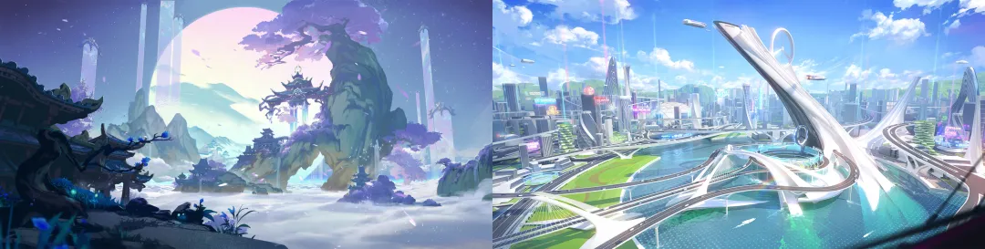
How to Create a Sense of Depth in Landscape Painting?
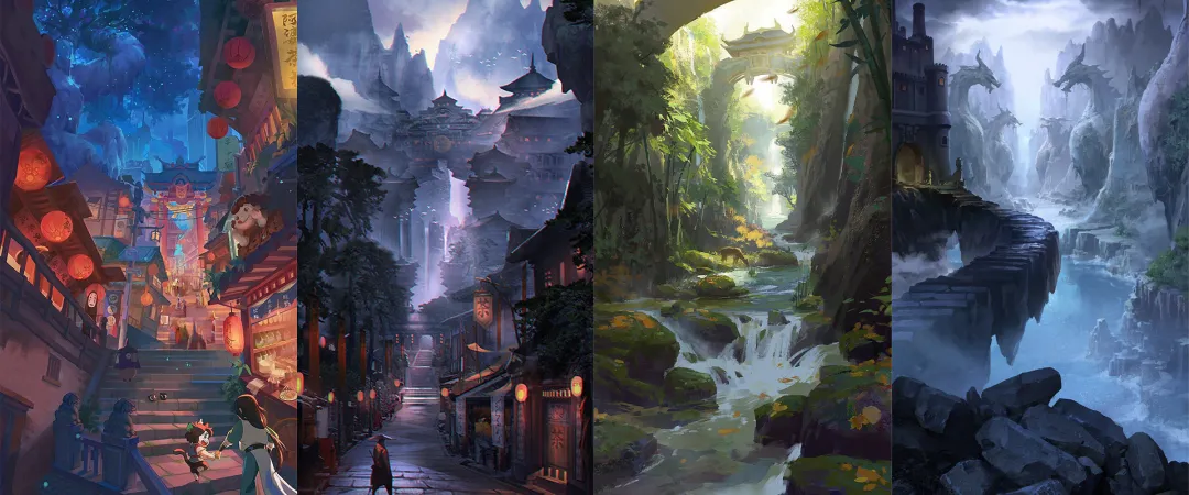
One reason landscape art can create such a strong sense of a "world" is that it builds a virtual 3D space on a flat canvas.
Most people are familiar with basic perspective. In simple terms, it means arranging the scale of each part of the image according to the rule that things look bigger when they are closer and smaller when they are farther away. This helps the viewer feel the change in distance and the depth of the scene.
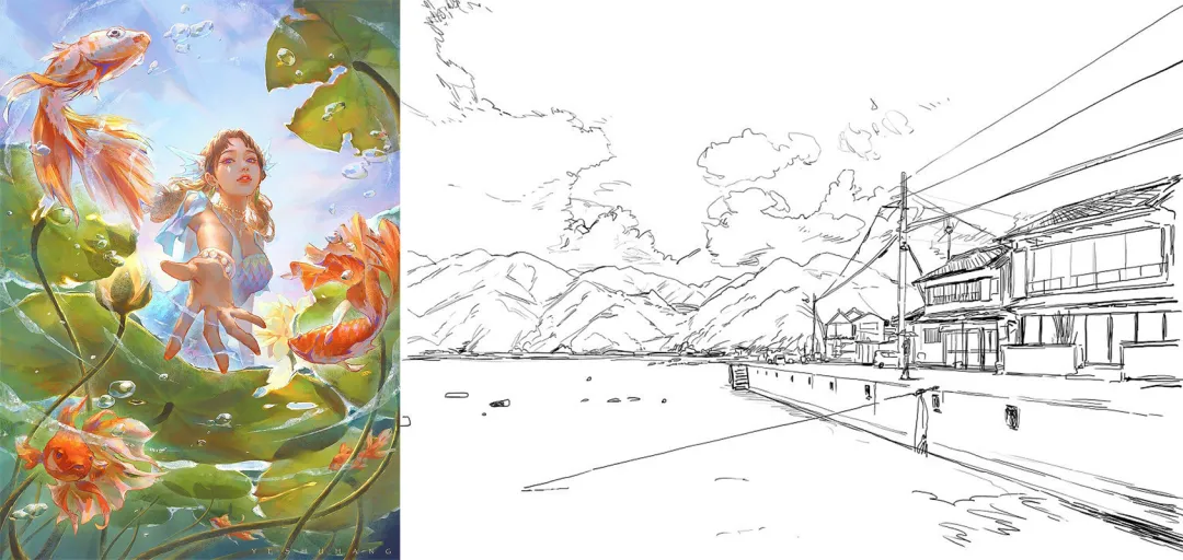
Compared with natural landscapes, scenes that include many man-made buildings require a higher level of perspective accuracy. In most cases, the composition needs to follow perspective lines very closely.
When we draw a scene based on natural landscapes, there are usually two main things we need to focus on:
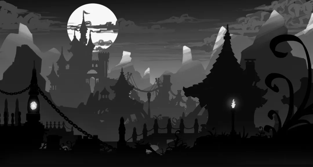
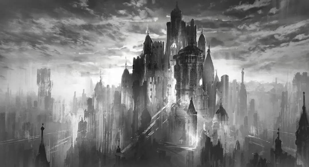
[Light and Dark Contrast]
As you can clearly see in the black-and-white sketch, the different layers in the image, such as the foreground, middle ground, background, and sky, are often separated by clear changes in light and shadow. This helps make the spatial relationship easier to read.
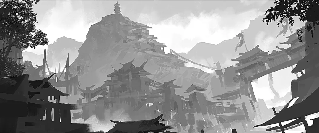
[Soft and Sharp Contrast]
The relationship between sharp and soft focus is mainly affected by two things: one is where the visual center is, meaning where you want the viewer to look; the other is atmospheric perspective.
First, the most important part of the image should usually be the clearest. So it is not true that the farther something is, the blurrier it must be. Instead, you should decide which area needs to stay sharp and which area can be softer based on the focal point of the image. That is how you make the visual focus clearer.
Second, since air is not completely clear, distant objects often start to look softer and blurrier, especially in places with more humidity or lower visibility. This gradual softening from near to far is also an important part of the feeling of depth in space.
How to Make Your Composition Feel More Rhythmic?
In art basics, the idea of "rhythm" comes up a lot. To make it easier to understand, let's start with a simple example:
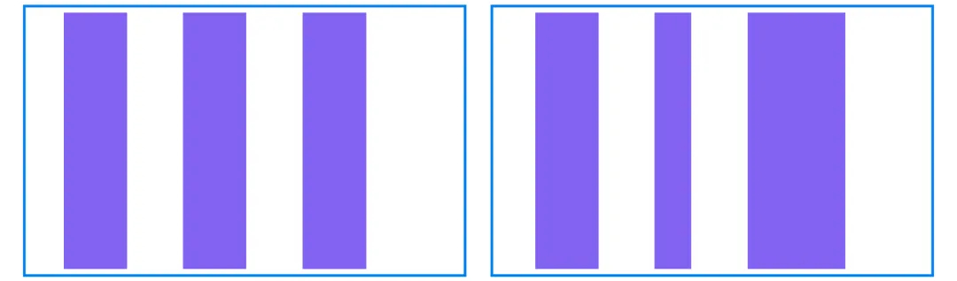
In the image above, both the left and right boxes contain three rectangles. But in the right box, the rectangles vary in width, so the overall look feels more dynamic and more interesting to look at.
Now look at the next set of images. The top and bottom boxes also contain several rectangles, but in the bottom box, the rectangles not only vary in width, but the spaces between them also change. As a result, the rhythm feels even stronger, and the image looks more natural and layered.
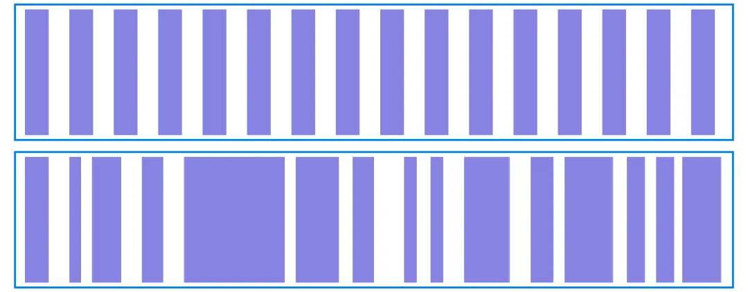
This is one way to use rhythm in composition. Whether you are drawing man-made buildings or natural landscapes, you should try to avoid patterns that feel too rigid or too even. Instead, use changes in size, spacing, length, and strength to create a composition that feels more comfortable and has a better sense of rhythm.
How to Use Color to Create Mood in Landscape Art?
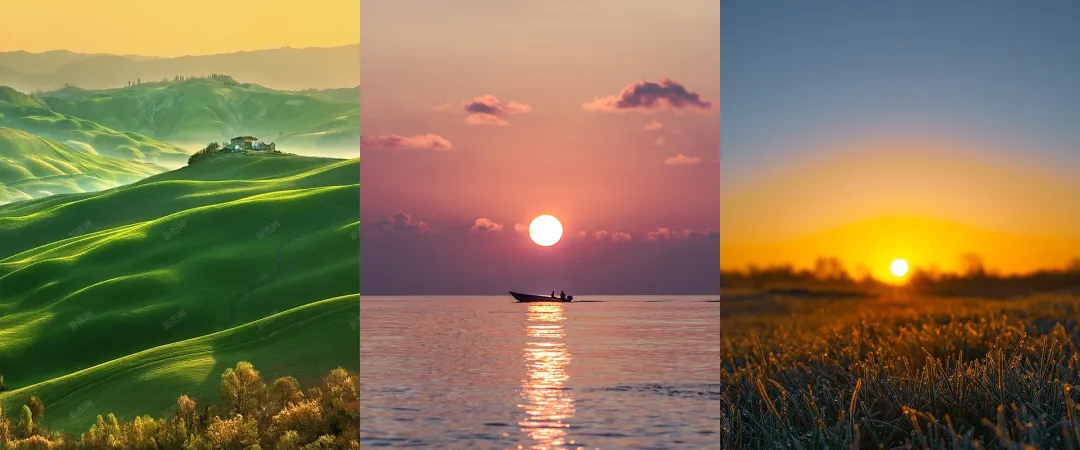
As we mentioned earlier, different light and shadow values can help separate the foreground, middle ground, and background in a scene. Color also needs to be arranged carefully if you want a landscape painting to feel layered and atmospheric.
In fact, if you pay attention to great landscape photos, it is easy to see that nature itself is an excellent color artist. Blue skies, clouds, trees, mountains, and changes in light and shadow all give us rich color ideas. Based on these natural references, and with the help of basic color contrast, it becomes much easier to build a visual effect that feels unified and alive.
When it comes to color contrast, the first and most important step is still to handle the light and dark values well. That is why many landscape paintings start with a black-and-white sketch before any color is added. This helps make sure the light, shadow, and overall structure are clear.
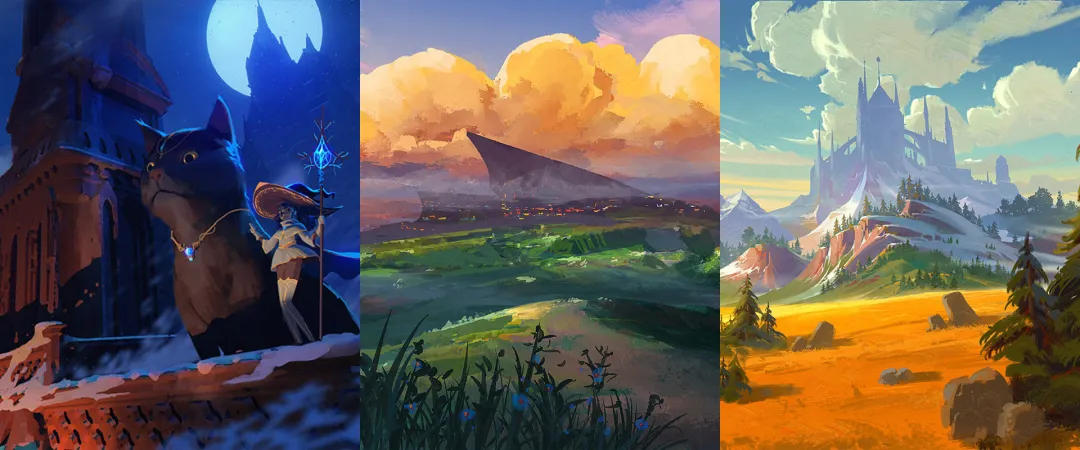
Once the light and dark values are in place, you can add hue contrast, such as warm and cool changes, as well as contrast in saturation. Different color combinations can directly change the mood of the image. Some feel cooler and quieter, some feel warmer and brighter, and others feel more dreamy or dramatic.
In other words, color is not just about painting things in. It also helps build the mood and express emotion in the scene.
Also, do not assume that a landscape with rich colors and complex layers must be hard to handle. In digital painting, we do not always need to adjust every color by hand, one stroke at a time. Most of the time, we can use the color tools built into painting software to work more efficiently.
For example, most painting programs include a Curves tool. It can help widen the contrast between light and dark areas, which makes the image feel deeper and more layered. Another example is the Color Balance tool. It lets us adjust the overall tone of the image from different color directions, so the color changes feel clearer, more direct, and easier to control.
On top of that, painting software usually offers a wide range of filters. You can choose the right one based on the needs of the image and use it to fine-tune the result, so the final look feels closer to the mood and style you want.
Here is a quick ad break. If you want a more efficient digital painting workflow, TourBox is a great fit. With its physical buttons and dials, you can control brushes, the canvas, layers, and a wide range of color tools. It feels a bit like using a game controller to play a video game.

TourBox also comes with many useful built-in features that can greatly improve your workflow. For example, in CLIP STUDIO PAINT, when you use the eyedropper tool to pick a color, TourBox's Dynamic Color Picker appears near the tip of your brush. Then you can quickly adjust the color with your brush or by turning the TourBox dial, which helps reduce hand movement.

Conclusion
Landscape painting may look complicated at first, but once you break it down, you will see that it is not out of reach. As long as you start with the basics, like spatial depth, composition rhythm, and color relationships, and keep observing, practicing, and reviewing your work, anyone can gradually create landscape paintings that feel more complete and atmospheric.
We hope this article gives you a clearer understanding of landscape painting and helps you feel less lost and more focused when you create. Next, try starting with a small scene and slowly put these basic ideas into your own work.