What Is Hue Shifting & How to Use It in Digital Art?
Have you ever wondered why some artists' work looks so natural and beautiful in color? The reason is that they use hue-shifting. So what is hue shifting, and how can you use it in digital art? Let's take a closer look at this article.

In this article, you will learn:
What Is Hue Shift?
Let us first look at these images. Which flame feels hotter to you? The one on the left, or the one on the right?
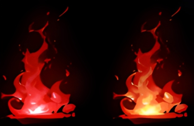
We're sure you would choose the one on the right. The flame on the right feels more real and more convincing. If you look closely at its colors, you will see a clear change from the outer edge to the center: dark red, red, orange, yellow, and white.
This color change follows the pattern of Kelvin color temperature.
What Is Kelvin Color Temperature?
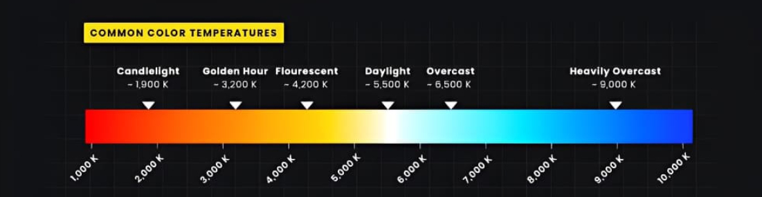
The Kelvin scale is a unit of temperature in the International System of Units, and it is often shown as K. You may also see it in the pro mode on cameras and phones. In that case, it refers to temperature.
Put simply, when an object heats up and glows, its color changes with the temperature. As shown here, the higher the temperature goes from left to right, the lower values look more red, and the higher values look more blue. But it is worth noting that the Kelvin scale is based on an idealized model.
At this point, you may wonder: what does Kelvin color temperature have to do with color? Well, it has a lot to do with it.
Let us look back at the flame on the right. From the outside to the inside, did it change from red to orange, then yellow, then white? Does that match the color changes in the Kelvin scale?
Exactly. That is why the flame on the right feels more real and hotter.
So, does this theory only apply to glowing effects and similar color changes? No. In the natural world, color also follows this kind of pattern.
Take this photo as an example. If you sample the colors, you can see that the pumpkin is brighter and whiter where the light hits it, and the saturation is lower there. As it moves into the shadows, the saturation gets stronger. The colors shift from white to yellow to orange, and then to red in the dark areas.
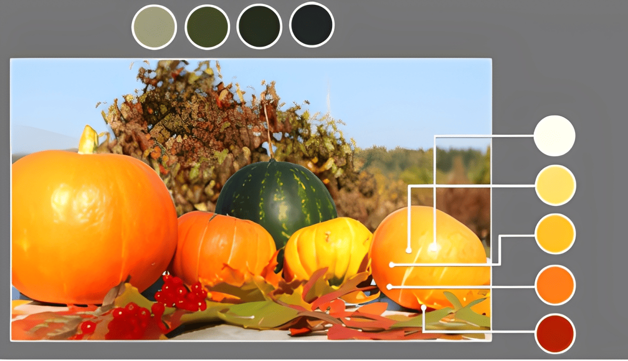
The pumpkin's base color is orange, but its colors change from the highlights to the shadows. In color theory, this is called hue shift. The green watermelon beside it follows the same kind of hue shift.
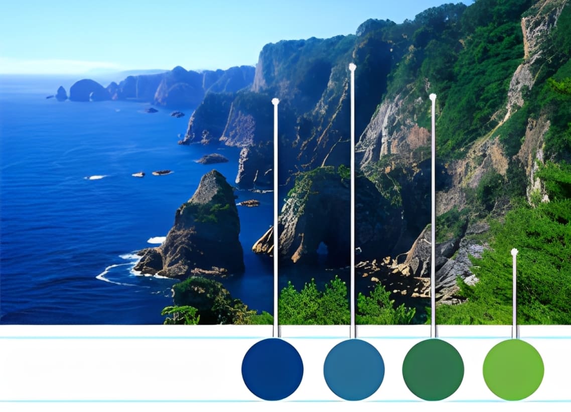
Look at this landscape photo too. In the same group of trees on the mountain, the colors shift from farther away to closer up: yellow-green, green, and blue-green.
We can see that hue shift is not just for special effects or high heat. The world we see with our eyes is full of rich hue shifts. In the real world, when an object is lit, its light and shadow areas also follow the same hue-shift pattern described by Kelvin color temperature.
Based on these examples, let us try to define hue shift.
Hue shift refers to the way the same color appears with different tones in different parts of an image. Simply put, an object's base color shifts in hue in its bright and dark areas because of light and its surroundings. For example, under a light source, the highlights may look warmer, with more red or yellow, while the shadows may look cooler, with more cyan or blue.
How to Use Hue Shifting in Digital Painting?
So, in digital art, how do professional artists create such a rich color world?
Take a look at the image below and focus on the grass. From the distance to the foreground, the grass slowly changes from yellow-green to a warmer, slightly orange olive green. This creates a strong sense of space. The buildings also show hue shifting between near and far, as well as in their light and shadow areas.
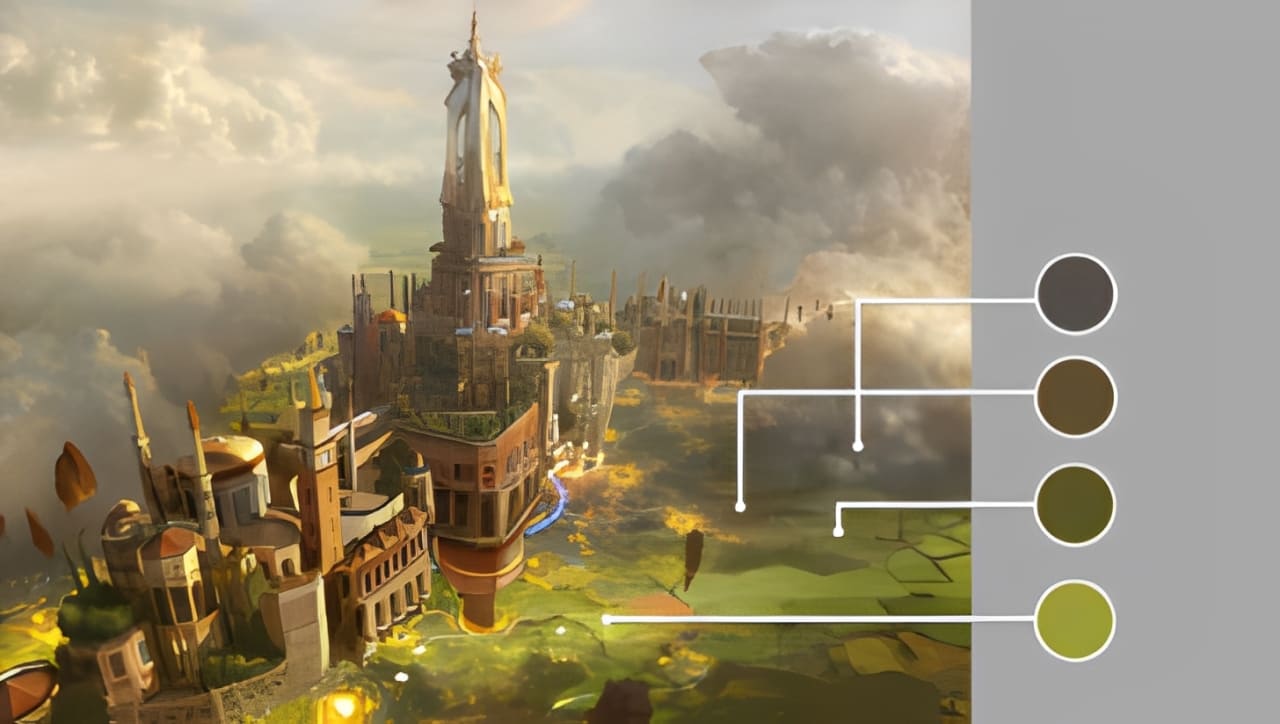
So, whether it is a real photo or a professional artist's painting, you can see that color often follows the rules of hue shifting. This is what gives color warmth, and creates cool and warm changes.
So how do you bring this into your own work? It is simple. You can treat the whole image as one unit. While keeping the overall color tone consistent, let the light and shadow areas of each object follow their own hue shift patterns. That way, your colors will feel both unified and rich.
Of course, in real practice, everyone sees color a little differently, so it is not always easy to notice the exact hue shifts. But at least when painting, artists often use color in a very instinctive way. That is why Impressionist color is often seen as a major breakthrough in art history. In the world of color, personal feeling comes first.
If you are naturally very good with color, then even if you do not know the theory of hue shifting, your colors can still look beautiful, with clear warm and cool changes, and a sense of richness and unity. Good color intuition helps you know what looks right.
However, not every artist is lucky enough to have that natural sense of color. If color does not come to you easily, then it is worth learning hue shifting well and using your painting software's color picker to choose and match colors more carefully.
Of course, if you have a TourBox, it can make color picking in art much easier and faster. In CLIP STUDIO PAINT, when you use the eyedropper tool to sample a color, TourBox's Dynamic Color Picker will appear near your pen tip. You can then use the brush or turn the TourBox dial to quickly adjust the color, with less hand movement.

The Dynamic Color Picker also offers two modes: Color Wheel and Luma-Based Palette:
- The Color Wheel follows the same layout as CLIP STUDIO PAINT's native color panel, so you can quickly pick and adjust colors using a color control method you are already familiar with.
- The Luma-Based Palette shows other colors with a similar brightness to the one you selected, helping you explore different hues at the same brightness and avoid repeated color matching.
If you are interested, feel free to click our link to learn more.

Conclusion
Hue shifting is a powerful and practical color technique in digital painting. By using the color wheel and the right software tools, you can give your work more depth and a stronger mood.
Of course, understanding color basics like color space, changes in hue, saturation, and brightness, and the contrast between warm and cool tones is the foundation for using this technique well.
Now that you understand hue shifting, it is time to put it into your own art.