The Color Controversy: Is Pink Really a Warm Color?
When we think of pink, we often associate it with femininity, romance, and sweetness. But when it comes to the debate over whether pink is a warm or cool color, opinions are divided.
Some argue that pink is a cool color due to its pastel shades and proximity to purple on the color wheel. Others contend that pink is a warm color due to its hue and psychological effects.
In this article, we'll delve into the question of whether is pink a warm color, exploring the scientific and psychological basis of color theory and examining the arguments for and against pink as a warm color.
By the end of this article, you'll have a clearer understanding of the complex nature of color perception and the role of pink in the color spectrum.

In this article, you will learn:
What Is a Warm Color?
In the world of color theory, warm colors are defined as hues that are associated with warmth, energy, and excitement. But what exactly makes a color "warm," and how do we perceive warm colors?
In this section, we'll explore the scientific basis of warm colors, their psychological effects, and some examples of warm colors that you may be familiar with.
(Related article: From Red to Blue: Exploring the World of Primary Colors)
Warm colors are defined as hues that have a red, orange, or yellow undertone. These colors are often associated with warmth, energy, and excitement, and are said to stimulate the senses and evoke feelings of passion and intensity.
In contrast, cool colors have a blue, green, or purple undertone, and are associated with calmness, relaxation, and tranquility.
The scientific basis of warm colors lies in the way that they are perceived by the human eye. Warm colors have longer wavelengths than cool colors, which means that they are more likely to be scattered by the atmosphere and reach our eyes more easily.
This is why warm colors appear more vibrant and intense than cool colors. Additionally, warm colors tend to advance toward the viewer, creating a sense of depth and energy in a painting or photograph.
Check out this YouTube video (made by Riekreate) about color theory.
Is Pink a Warm Color?
When it comes to the debate over whether pink is a warm or cool color, opinions are divided.
Some argue that pink is a cool color due to its pastel shades and proximity to purple on the color wheel. Others contend that pink is a warm color due to its hue and psychological effects.
In this section, we'll explore both sides of the argument and delve into the complex nature of color perception. By the end of this section, you'll have a clearer understanding of the controversy surrounding pink and its place in the color spectrum.
Arguments That Pink Is a Cool Color
When we think of pink, we often associate it with warmth, sweetness, and femininity. However, some argue that pink is actually a cool color, due to its pastel shades and proximity to purple on the color wheel.
One argument for why pink is a cool color is its association with pastel shades. Pastel colors are generally considered cool colors, due to their soft and muted tones. Pink is often used in pastel shades, such as baby pink or blush, which can create a calming and relaxing effect.
Pastel pink can be used in interior design to create a peaceful and tranquil atmosphere, or in fashion to create a delicate and understated look.
Another argument for why pink is a cool color is its proximity to purple on the color wheel. Purple is a cool color, due to its association with royalty, sophistication, and mystery.
Pink, as a lighter and softer version of purple, can sometimes take on these cool characteristics as well. This is especially true for darker shades of pink, such as magenta or fuchsia, which can have a cooler undertone than lighter shades of pink.
Pink can also be used effectively as a cool color in fashion, design, and art:
- In fashion, pink can be paired with cooler colors such as blue or green to create a harmonious and balanced look.
- In design, pink can be used to create a cool and modern atmosphere in a space, especially when paired with metallic accents or white accents.
- In art, pink can be used to create a sense of calm or serenity, especially when paired with cooler tones like blue or green.
In conclusion, while pink is often associated with warmth and femininity, some argue that it is actually a cool color.
This is due to its association with pastel shades, its proximity to purple on the color wheel, and its ability to be used effectively in fashion, design, and art as a cool color.
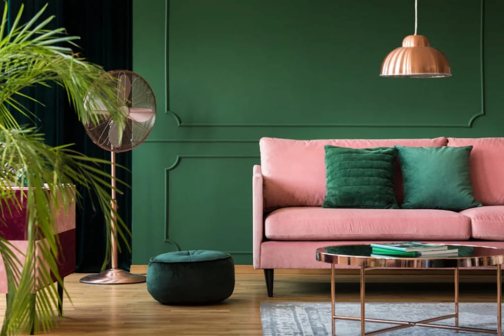
Pink and Green in Interior Design
Arguments That Pink Is a Warm Color
When we think of pink, we often associate it with warmth, passion, and energy. Most people consider pink a warm color, due to its hue and saturation, as well as its psychological effects.
One argument for why pink is a warm color is its hue and saturation. Pink is closer to red on the color spectrum than to blue or green, which are considered cool colors. Red is the warmest color on the spectrum, with associations of passion, love, and energy.
Pink, as a lighter and softer version of red, can often take on these warm characteristics as well. The saturation of pink can also play a role in its warmth; brighter and more vibrant pinks can appear even warmer than pastel pinks.
Another argument for why pink is a warm color is its psychological effects. Pink is often associated with love, romance, and femininity, which can create a sense of warmth and comfort.
In color psychology, pink is said to have a calming effect on the mind and body, which can evoke feelings of relaxation and contentment.
Pink is also associated with passion and energy, making it a popular choice in branding and advertising aimed at a younger or feminine audience.
Pink can also be used effectively as a warm color in fashion, design, and art:
- In fashion, pink can be paired with warm colors such as orange or yellow to create a vibrant and energetic look.
- In design, pink can be used to create a warm and inviting atmosphere in a space, especially when paired with earthy tones or natural materials.
- In art, pink can be used to create a sense of emotion or passion, especially when paired with warm tones like red or orange.
In conclusion, pink is generally considered a warm color due to its hue and saturation, as well as its psychological effects.
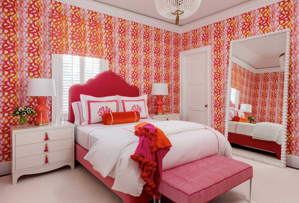
Pink and Orange in Interior Design
Final Thoughts About Whether Pink Is a Warm Color
In this article, we have explored the debate over whether pink is a warm or cool color. We have presented arguments for both sides of the debate, but ultimately tend to argue that pink is generally considered a warm color in color theory.
Pink's association with red on the color spectrum is one argument for its warmth. Pink is closer to red than to blue or green, which are considered cool colors. This association with red, the warmest color on the spectrum, gives pink warm characteristics.
Additionally, pink's psychological effects, such as its association with love, passion, and energy, contribute to its warmth.
While some argue that pastel shades of pink can be considered cool colors due to their soft and muted tones, we have presented evidence that even pastel pinks can evoke a sense of warmth and comfort.
When it comes to finding the best pink color for your work in post-software color mixing, it can be a tedious process that requires constant experimentation. This is where TourBox can be a valuable assistant for post-production software such as Photoshop, Lightroom Classic, and Capture One.

With TourBox, you can quickly and easily adjust colors and settings to achieve your desired results.
Overall, the significance of pink as a warm color cannot be understated. Its ability to evoke strong emotions and moods makes it a valuable tool in design, art, and culture.
Understanding the complex nature of color perception and the different ways in which pink can be used can lead to more thoughtful and effective designs.