Lavender Color: What Color Is Lavender and How to Make it?
Whether you're designing a whimsical webpage, fine-tuning the color grading of your photography masterpiece, or seeking inspiration for your own designs, lavender is the key to unlocking a world of creativity.
In this article, we will not only delve into what color lavender is and what colors complement it, but we will also provide a step-by-step tutorial on how to create Lavender Color in digital art.
Let's explore together how to harness the enchanting qualities of lavender to create visually stunning and emotionally resonant designs.

In this article, you will learn:
- Exploring the Lavender Color
- What Colors Go With Lavender?
- How to Make a Lavender Color in Digital Art?
Exploring the Lavender Color
Understanding subtle differences in color can significantly impact your decision-making process.
Whether you're selecting a color scheme for your photography compositions or choosing the perfect palette for your design projects, Lavender Color is an excellent choice.
But do you truly understand this color called Lavender? Let's embark on a journey together to unveil its mysterious allure.
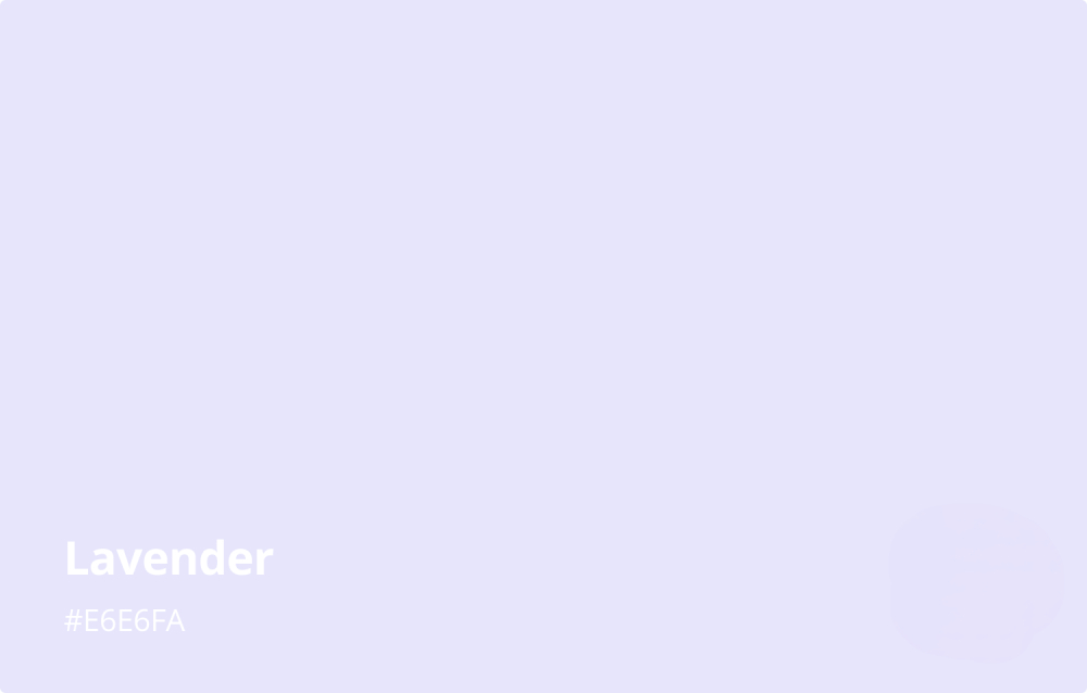
1. What Color Is Lavender?
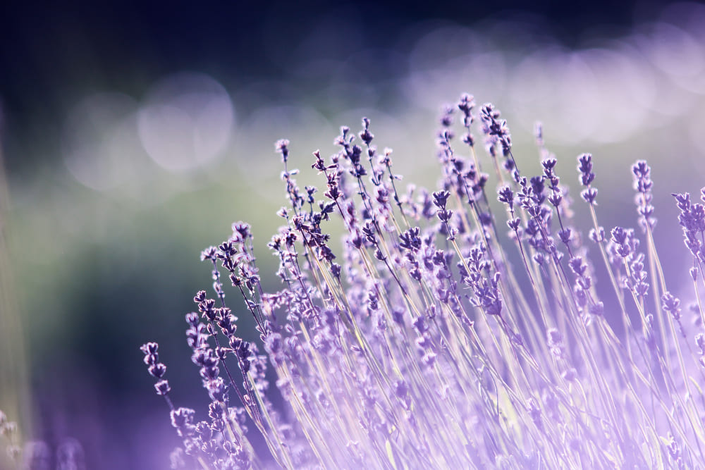
Lavender (color code: #E6E6FA) is a light, subtle shade of purple, often described as a pale violet with a slightly blue undertone. Named after the lavender flower, this color embodies the soft and serene hues of the plant's delicate blossoms.
While variations exist, the typical lavender color sits on the cooler end of the color spectrum, marrying the calm stability of blue with the fierce energy of red to create a sense of tranquil balance.
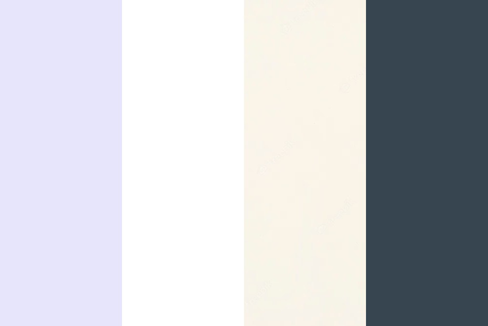
Describing colors in words can sometimes be challenging. Take a look at the image below:
2. Lavender Color Meaning
Lavender carries with it a rich tapestry of symbolism and associations. It is most commonly associated with femininity due to its soft, delicate hue. In addition, the lavender color is often linked to qualities such as grace, elegance, and refinement.
In color psychology, lavender represents tranquility, purity, and calmness. It's also associated with spirituality, encouraging a deeper sense of self-awareness and promoting calmness of mind and body.
This makes it a popular choice in environments intended for relaxation, meditation, or creative exploration.
Furthermore, lavender is often linked to romance and nostalgia. Its soft, dreamy quality can stir feelings of wistfulness or whimsy, making it a popular choice in design and decor.
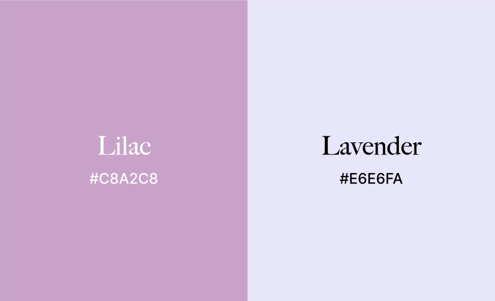
3. Lilac VS Lavender: the Same Color?
Lilac color and Lavender color are two hues that are often confused with each other. However, they are not the same color.
While both lilac and lavender are shades of purple, they have distinct differences. The primary difference between the two lies in their respective undertones and the feelings they evoke.
Lilac is named after the lilac flower and, like lavender, has floral origins. It's a muted shade of purple with a slightly pinkish hue, lending it a warmer undertone. Because of this warmth, lilac is often associated with feelings of love, passion, and youthful exuberance.
On the other hand, lavender, with its blue undertones, has a cooler, more tranquil presence. It's seen as more mature and sophisticated than the youthful energy of lilac.
While both lilac and lavender are derived from purple, their unique undertones and corresponding associations set them apart.
Lilac, with its warm, pink undertones, evokes a sense of youthful passion, while lavender, with its cooler, bluish undertones, promotes a feeling of calm sophistication.
What Colors Go With Lavender?
The versatility of Lavender makes it a favorite among designers and creators, and it can be paired with a wide range of colors for various effects.
Let's dive into the world of color combinations to see what colors go best with lavender.
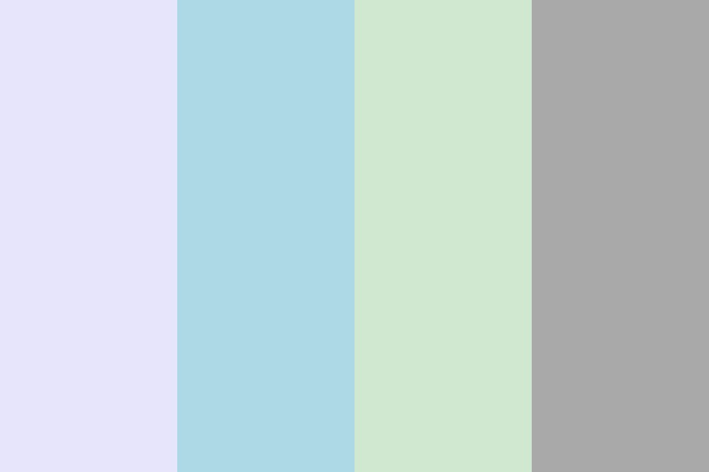
1. Cool Color Combinations
- Lavender and Light Blue: Both being cool colors, lavender and light blue can create a soothing and harmonious atmosphere.
- Lavender and Mint Green: Lavender pairs beautifully with mint green, another cool, pastel shade. The contrast between these two colors is striking yet gentle, creating a youthful and refreshing aesthetic.
- Lavender and Gray: For a chic, modern look, consider pairing lavender with various shades of gray. The gray adds a sleek, contemporary feel while the lavender introduces a touch of warmth and softness.
2. Warm Color Combinations
- Lavender and Peach: On the warm side of the color spectrum, lavender and peach create a sweet, romantic vibe.
- Lavender and Coral: If you're looking for a bold, vibrant contrast, consider pairing lavender with coral. This combination is lively and energetic.
- Lavender and Mustard Yellow: Lavender and mustard yellow can create a unique, eclectic vibe. The deep, warm mustard color provides a strong contrast to the soft lavender, adding depth and interest to the space.

3. Neutral Color Combinations
- Lavender and White: For a crisp, clean look, pair lavender with white. This combination is light, airy, and refreshing.
- Lavender and Cream: If you're aiming for a more cozy, warm feel, consider pairing lavender with cream or beige. This combination of pastel lavender and a soft neutral creates a calm, inviting atmosphere.
- Lavender and Charcoal: For a sophisticated, modern look, try pairing lavender with charcoal. The deep, rich charcoal sets off the light, delicate lavender, creating a striking contrast.
When pairing lavender with other colors, it's all about the mood you want to evoke. For a calming, tranquil feel, opt for cool or neutral colors. For a more vibrant, energetic look, consider pairing lavender with warm hues.
Whether you're photo editing or digital designing, knowing how to effectively pair colors can make your designs stand out from the crowd.
How to Make a Lavender Color in Digital Art?
Creating the perfect color palette can significantly enhance the quality of your digital art. Lavender, with its soothing and calming hues, is a color that can add a touch of elegance and tranquility to your art.
In this section, we will walk you through how to create a lavender color in your digital art software.
What You'll Need:
- A digital art software (such as Adobe Photoshop, Procreate, or GIMP)
- A basic understanding of color adjustment tools in your chosen software
- A desire to learn and experiment with colors
Step 1: Start with Basic Colors
Begin by creating a new layer for your color mixing. Select the base color tool in your software and choose a pure violet color. Violet will serve as the foundation for our lavender.
Step 2: Add White
Lavender is a light or pale shade of violet. To achieve this, we will need to add white to our base violet color. Select your brush tool, switch the color to white, and gently mix it with the violet.
Be cautious with the amount of white you add; too much can wash out the violet color.
Step 3: Adjust the Hue
After mixing the white and violet, you might need to adjust the hue slightly to get the perfect lavender. Go to your color adjustment settings, and experiment with shifting the hue slightly toward blue.
Remember, subtle changes can make a big difference, so adjust gradually.
Step 4: Add a Touch of Blue (Optional)
Depending on the exact shade of lavender you're aiming for, you might want to add a slight touch of blue. This creates a cooler shade of lavender. As with the white, add the blue sparingly to prevent overpowering the violet base.
Step 5: Fine-Tune Your Lavender
Everyone's perception of color is slightly different, and the perfect lavender can vary from person to person. Spend some time fine-tuning your color until it matches the lavender you envision.
You can adjust the lightness, saturation, and hue until you're happy with the result.
Conclusion
Creating the perfect lavender color in digital art can take some practice, but with patience and a keen eye for color, you can achieve beautiful results.
In the realm of digital art, mastering color grading techniques is essential for creating captivating visuals.
If you've been exploring how to make a mesmerizing lavender color in your digital artwork, there's a game-changing tool that can revolutionize your color grading workflow—TourBox.

Its customizable dials, knobs, and buttons provide effortless control over key color grading parameters, allowing you to fine-tune hues, saturation, and luminance with ease. With TourBox, adjusting curves, applying selective color corrections, and creating harmonious gradients become a seamless and intuitive experience.
Say goodbye to repetitive mouse clicks and tedious keyboard shortcuts – TourBox puts the power of precise color grading at your fingertips.
Happy coloring, and may your digital art, photographs, and designs be filled with the most beautiful shades of lavender color!