Elevate Your Logo Design: Color Palette Tips to Break the Monotony
In branding, a logo often incorporates various visual elements such as shapes, symbols, numbers, and text. However, it is often the visual aspect of color that people remember the most.
Whether you are a designer or an entrepreneur, understanding the meanings and symbolism behind colors can be beneficial in making informed decisions. For instance, choosing a color that signifies "tranquility" for a logo representing extreme sports may convey the wrong message.
But how do you choose the right colors for your logo? In this article, we will explore the use of color in logos and help you select the most appropriate colors for your brand identity.

In this article, you will learn:
- Meanings and Symbolism of Colors in Logo Design
- 6 Color Schemes to Make Your Logo Colors Less Monotonous
- How to Choose the Right Colors in Logo Design?
- Final Thoughts About Logo Colors
Meanings and Symbolism of Colors in Logo Design
Before delving into selecting attractive colors for your logo, it is essential to understand the meanings and symbolism behind each color. Here, we will provide a brief overview of four commonly used colors in design, hoping to inspire your decision-making process.
1. Red: Danger, Passion, Excitement, Energy
Meaning:
Red holds different meanings in various contexts and can provide a powerful visual impact in logo design. It can ignite hope and represent a bold, vibrant, and lively color. Red can symbolize power, love, and passion. However, it also represents fire, danger, and blood.
Usage Tips:
Due to its strong associations, it is best to use red cautiously. However, if other brands in your industry avoid using red in their logos, it might be a good way for you to stand out.
Design Example:
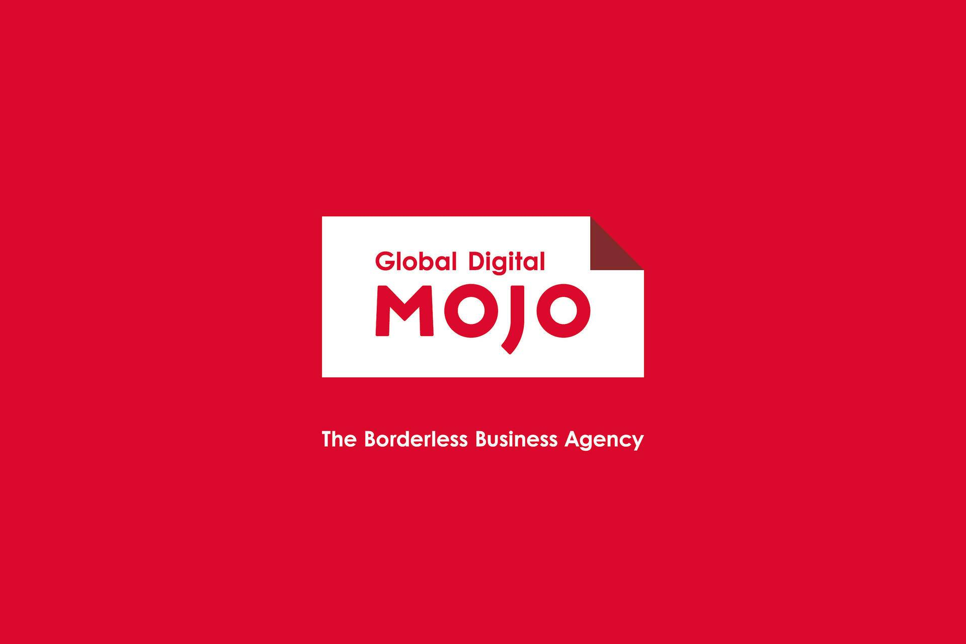
Global Digital MOJO, an international digital strategy and production agency, utilizes red as the primary color in their logo, combined with white. The color choice effectively conveys their strength and passion, leaving a strong impression.
2. Orange: Fresh, Youthful, Creative, Adventurous
Meaning:
Orange combines the warmth of red with the optimism of yellow, conveying vibrancy and energy. For example, the color of oranges and all products rich in vitamin C immediately evokes freshness and health.
Usage Tips:
Because orange is associated with fun and vitality, it works well for youthful and energetic brands. Luxury, traditional, or serious brands are better off avoiding it.
Design Example:
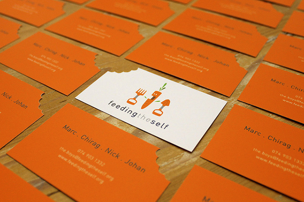
Feeding The Self is a nonprofit organization that empowers African youth through African cuisine and herbal gardens. Here, the use of orange conveys youthfulness and a fresh, healthy feeling brought by the garden.
3. Green: Natural, Vibrant, Prestige, Wealth
Meaning:
Green has two very common yet contradictory meanings. One is associated with nature and the environment, while the other is related to finance and wealth.
On one hand, green represents the life and growth of plants, thus used to express eco-friendliness, sustainability, organic, and natural concepts. On the other hand, green is also associated with wealth and stability, making it an important element in the design of US dollars.
Usage Tips:
Bright greens signify growth, vitality, and renewal. Meanwhile, darker shades of green, with richer color variations, symbolize prestige and wealth.
Design Example:
When it comes to branding and color choices, green is a classic option that is unlikely to go out of style in the short term.
From Starbucks to Spotify, some of the world's largest and most well-known brands incorporate green into their logos. Green not only pairs beautifully with many other colors but also exhibits different personalities depending on its shade and depth.

4. Blue: Communication, Trustworthiness, Calmness, Sadness
Meaning:
Blue is one of the most popular colors in logo design for companies that want to convey reliability, trustworthiness, and communicativeness, as well as for organizations aiming to express authority and official status.
It is also favored for its associations with the calmness and harmony of the sea and sky. However, blue is also emotionally used to express sadness or melancholy.
Usage Tips:
When used in corporate logos, blue generally represents professionalism and trustworthiness. It can also be utilized in logos for art organizations, conveying a sense of freedom, romance, and artistic perception.
Design Example:
In the tech industry, blue logos have become a standard. Companies like Meta, LinkedIn, PayPal, and many others incorporate blue as a prominent element in their designs.

6 Color Schemes to Make Your Logo Colors Less Monotonous
For designers, there are times when it's challenging to find the right colors for a logo design. Even if you understand the meanings and symbolism of each color, often your logo color scheme can still feel dull.
In this section, we will share 6 logo color schemes that can make your logo design more stylish and lively. Let's get started!
1. Multicolor Logo Color Scheme
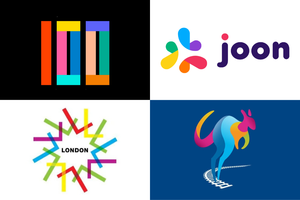
Multicolor refers to using more than three colors in a color scheme. To play it safe, we often limit the number of colors in a logo to three or fewer. However, some logos and industries benefit from using a multicolor combination.
A multicolor combination can make a logo visually and conceptually richer, as well as more lively and fashionable.
It typically includes both cool and warm colors, such as red, yellow, blue, green, etc., and is commonly used in logo designs for the entertainment industry and children's brands.
2. Analogous Logo Color Scheme
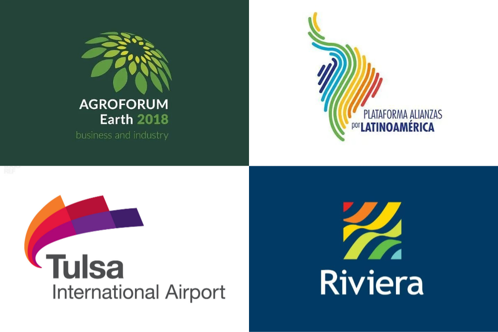
Analogous colors are colors that are adjacent to each other on the color wheel, such as orange and yellow, yellow and green, green and cyan.
Using two or more analogous colors in a logo can make it visually richer, convey more meaning, and create a harmonious effect. Analogous color combinations are particularly suitable for brands with a humanistic, health-oriented, or natural tone.
Extra Tips:
- When using more than two colors, arrange them in the order of their analogous relationship.
- If the shapes in the logo are composed of lines or dots, this color combination style is also well-suited.
3. Complementary Logo Color Scheme
Complementary colors are two colors that are opposite each other on the color wheel, with an angle between 120 and 180 degrees. For example, red and blue, green and purple, yellow and blue, and so on.
Using this color combination can enhance the visual impact of a logo and add depth to its meaning. Additionally, the contrast created by complementary colors gives a trendy visual effect, making it commonly used in the tech industry.
4. Gradient Overlay Logo Color Scheme
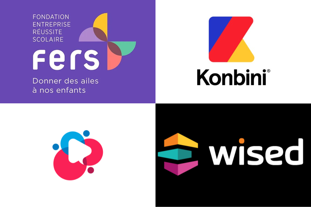
Gradient overlay is similar to the Multicolor Combination mentioned above, with the only difference being the use of gradients versus solid colors.
The color scheme in gradient overlay offers a wider range of variations, more natural transitions, and finer details. Due to the dual effect of gradients and overlays, logos with this color scheme often have a sense of dimensionality and a stylish and appealing visual effect.
5. 3D Gradient Logo Color Scheme
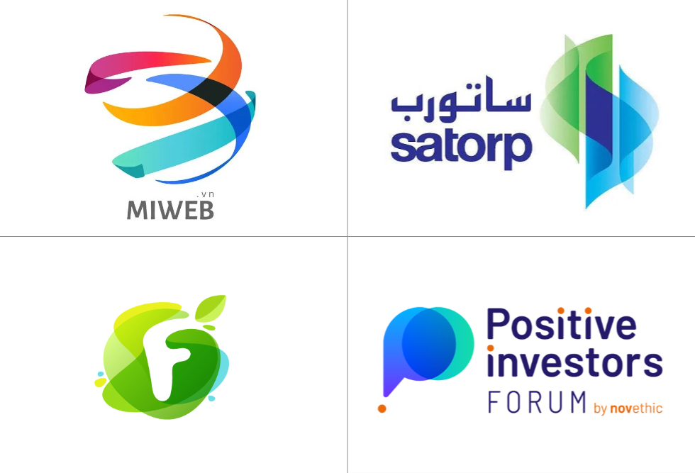
3D gradient refers to using color hue gradients and light/dark gradients to create a visual illusion of depth in a two-dimensional graphic.
This color scheme for logos is characterized by its aesthetic appeal, strong visual impact, and a sense of quality. It is particularly suitable for curved shapes and often used in logo designs for the tech industry.
6. Solid Color Overlay Logo Color Scheme
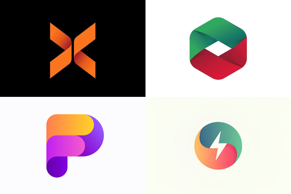
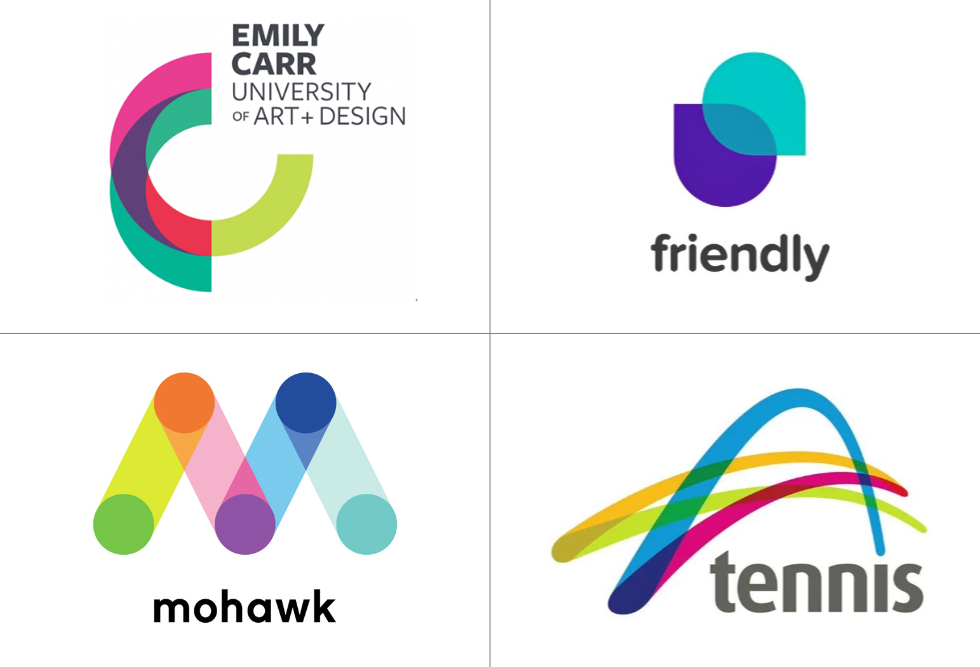
Logos designed using this color scheme typically consist of multiple intersecting shapes.
If each shape is filled with a different color, and the intersection points between shapes are filled with the effect of two colors overlaying or blending together, it creates a visual effect as if two thin, slightly transparent color blocks are stacked on top of each other.
This logo color style effectively enhances the visual beauty and depth of the logo, while also allowing the logo's form to remain clear and retain more details through the color scheme. It is suitable for brands with a youthful tone.
How to Choose the Right Colors in Logo Design?
After understanding the meanings and symbolism of colors in logo design, as well as the six logo color schemes, in this section, we would like to share some basic guidelines for using colors in logo design.
Of course, these guidelines are not strict rules, but rather suggestions and references for choosing logo colors.
1. Legibility
The purpose of colors is to vividly convey the brand image, making colors an effective way to improve the legibility of a logo. Therefore, it is recommended to limit the number of colors in a logo to three at most.
Too many colors can overshadow the main brand image. Colors should strive to be simple, vibrant, and eye-catching, while also paying attention to the contrast between the logo color and the background.
2. Identity
In addition to considering commonality in color design, logo colors should also have a certain level of uniqueness, forming a distinctive color scheme that cleverly integrates with the graphic elements and typography.
A personalized color scheme helps target audiences recognize the colors, promotes visual memory, and makes the logo more readable and memorable.
3. Expressiveness
Colors themselves have symbolic meanings and influence emotions and psychology. The colors chosen for a logo should align with the logo's essence and emotions, creating expressive characteristics.
For example, red represents passion and power, yellow represents brightness and hope, green represents hope and peace, and blue represents rationality and technology.
4. Differentiation
Logo color design should consider the cultural traditions, stylistic habits, and beliefs of diverse target audiences from different ethnicities and regions.
For example, traditional colors in East Asia include red, yellow, cyan, and white, while traditional African colors consist of red, black, and yellow. Latin ethnicities have traditional colors like orange, yellow, red, black, and gray.
Different religious beliefs also have a significant impact on colors. For instance, yellow and white are symbolic colors in Buddhism, Islam emphasizes blue, green, and white, and Christianity favors white and black, which is particularly evident in formal attire and wedding dresses.

Final Thoughts About Logo Colors
In the previous sections, we explored the importance of color in logo design and discussed various logo color schemes. However, when it comes to implementing those color choices in digital design software, we often encounter challenges and inconveniences.
One of the hurdles we face in digital design is the difficulty of accurately selecting and adjusting colors using traditional input devices. Fortunately, there is a solution that can streamline this process and enhance your creative workflow – TourBox.

With TourBox, a powerful and intuitive creative controller, you can easily navigate through the color picker, adjust saturation, brightness, and hue effortlessly. Its ergonomic design and customizable buttons allow for precise and efficient color selection, saving you valuable time and effort.
No more wasting time searching through menus or struggling with complicated keyboard shortcuts. With TourBox, you have all the tools you need at your fingertips, enabling you to focus on unleashing your creativity and bringing your logo designs to life.