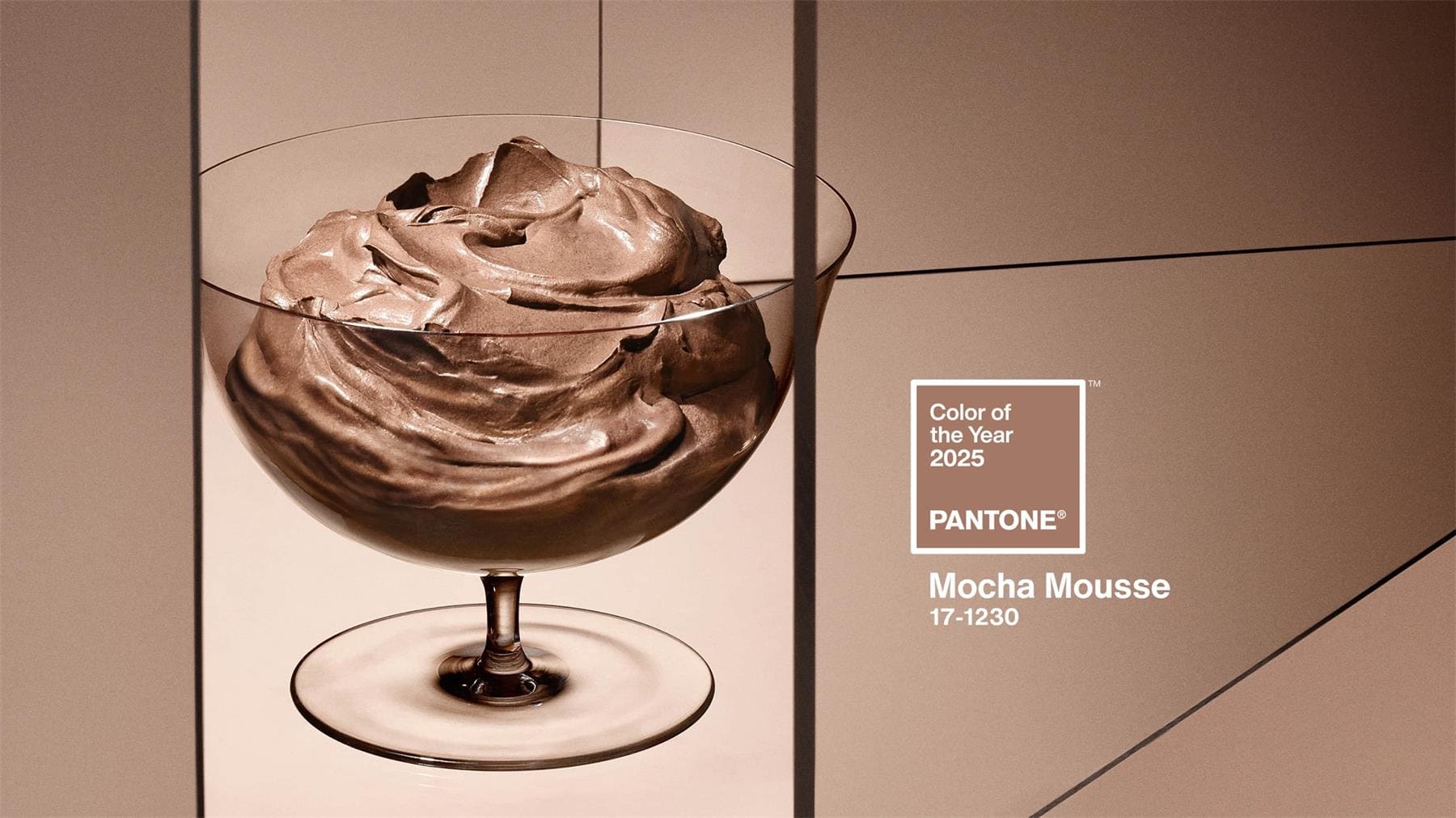
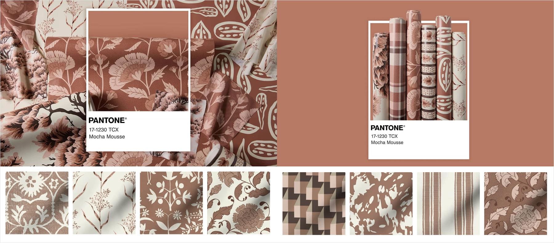
Pantone Color of the Year 2025: Mocha Mousse
With the release of Pantone's Color of the Year for 2025, Mocha Mousse color has taken center stage. This warm, neutral shade strikes the perfect balance between understated luxury and unmatched comfort.
Its arrival couldn't be more timely, reflecting today's growing desire for both quality living and inner peace. But what makes Mocha Mousse the 2025 Pantone color of the year?

In this article, you will learn:
- Pantone Color of the Year 2025: Mocha Mousse
- The Versatile Charm of Pantone Color Mocha Mousse
- The Psychology of Pantone Color Mocha Mousse
- Mocha Mousse Color Palette Ideas
- How to Use Mocha Mousse in Your Work?
- Final Thoughts on Pantone Color Mocha Mousse
Pantone Color of the Year 2025: Mocha Mousse
Mocha Mousse is a warm, deep brown with a subtle gray undertone that exudes stability and elegance. More than just a color, it's a mood. Its inviting tones create a feeling of coziness and calm, while its understated luxurious vibe adds a touch of indulgence.
It's like savoring the quiet beauty of life, one moment at a time.
In a world that moves too fast, the need for personal peace and comfort has never been greater. Mocha Mousse answers that call perfectly, symbolizing the pursuit of life's little joys and simple pleasures.
No wonder this hue has been embraced as the Pantone Color of the Year 2025, a choice that captures the spirit of balance and understated luxury.
Pantone's description of Mocha Mousse captures this beautifully:
"It nurtures us with its suggestion of the delectable qualities of chocolate and coffee, answering our desire for comfort."
Interestingly, this marks the first time in 25 years that Pantone has chosen a brown shade as its Color of the Year.
The Versatile Charm of Pantone Color Mocha Mousse
From home decor to fashion, industrial design to digital interfaces, Mocha Mousse proves its versatility and unique design appeal.
Whether it's adding warmth to a space or lending understated luxury to an outfit, this shade effortlessly brings a sense of relaxed elegance to any setting.
What truly sets Mocha Mousse apart is its ability to harmonize with different environments, creating atmospheres that are both cozy and refined.
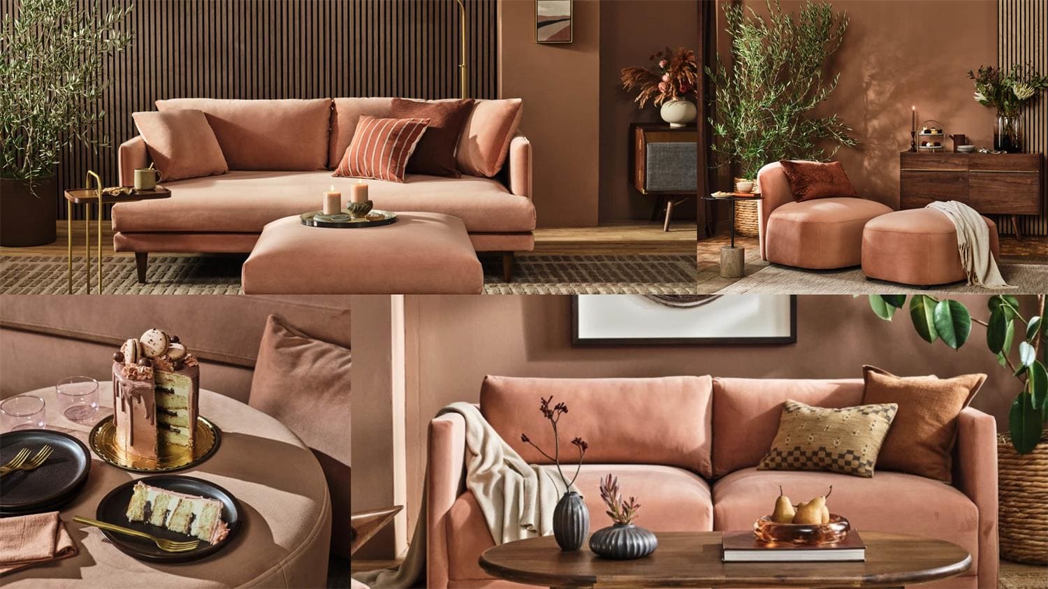
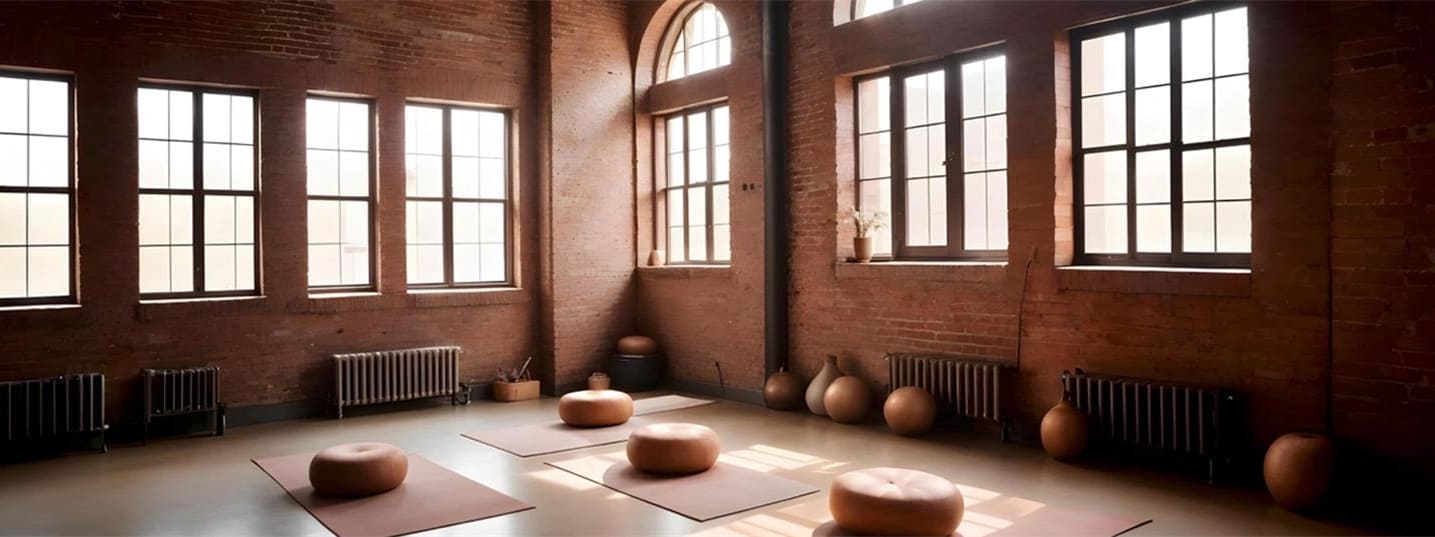
1. Home Design: A Balance of Warmth and Elegance
Mocha Mousse is widely used in home decor, delivering a welcoming vibe without feeling heavy:
- In living rooms, it works beautifully as a main wall color or in soft furnishings like sofas and curtains, adding comfort without overwhelming the space.
- In bedrooms, it creates a peaceful and elegant retreat, filling the room with a sense of calm and relaxation.
- For dining areas, Mocha Mousse can enhance the ambiance with its warm yet sophisticated tone, making gatherings feel even more inviting.
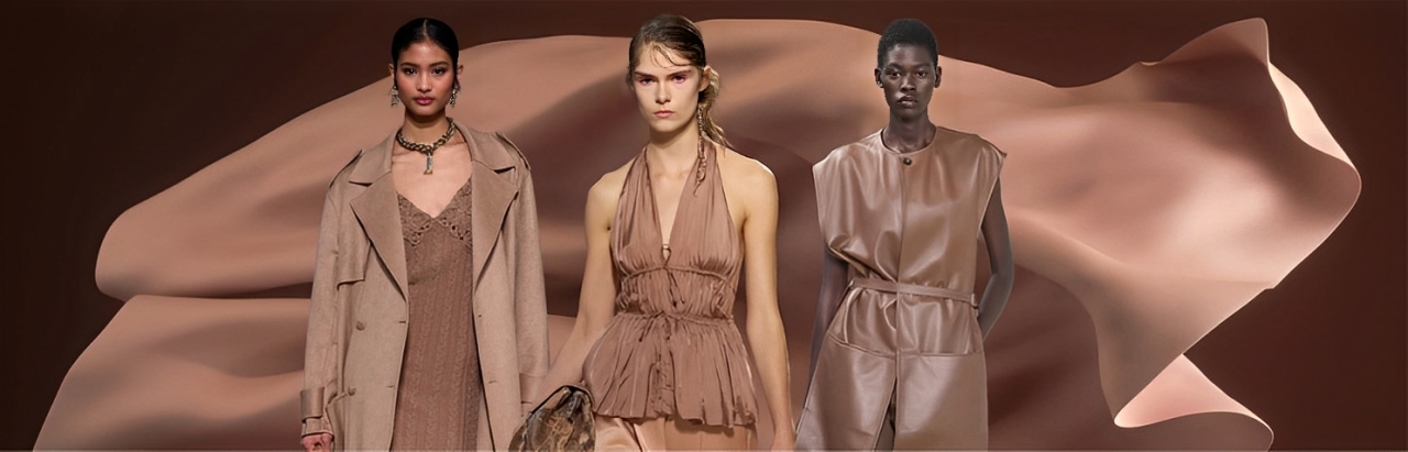
2. Fashion: Subtle Luxury with Warmth
Mocha Mousse shines in the fashion world, especially during fall and winter.
It's a go-to choice for coats, pants, skirts, and other wardrobe staples, bringing a polished yet cozy vibe to outfits. Pair it with olive green, muted blues, or neutral tones for a chic, understated look.
This shade is also stunning in accessories like handbags, shoes, and scarves. It adds depth and refinement, elevating any ensemble with effortless sophistication.
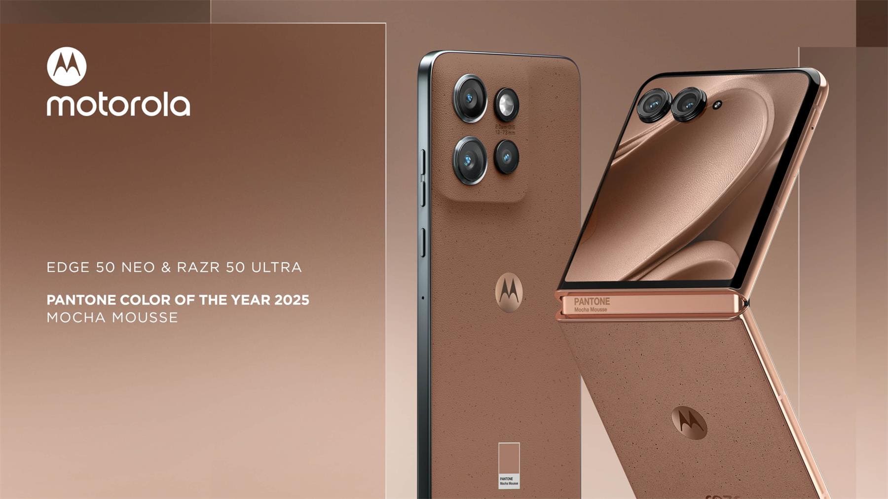
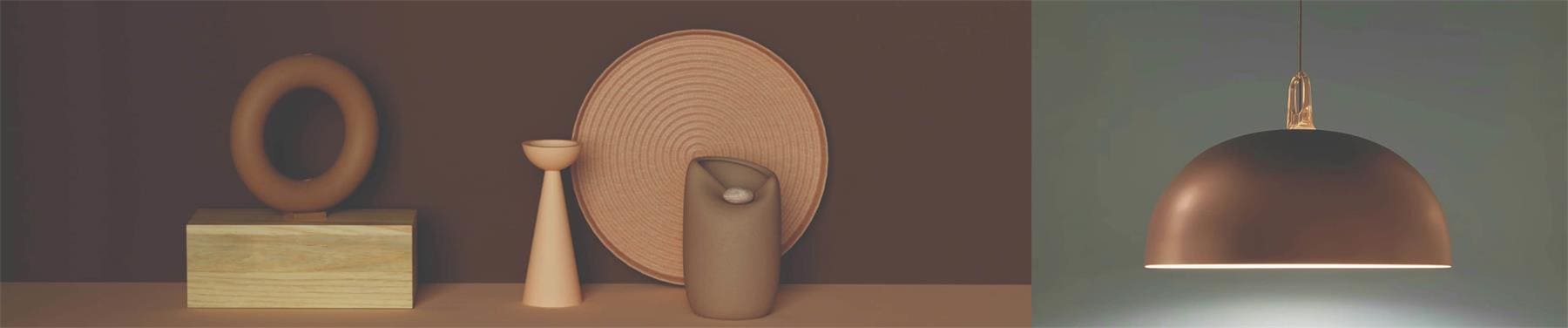
3. Industrial Product Design: A Blend of Warmth and Technology
Beyond home and fashion design, Mocha Mousse is making waves in industrial product design.
This color adds a soft, welcoming touch to high-tech gadgets like smartphones, headphones, and smartwatches. It breaks away from the cold, mechanical feel of traditional tech products and introduces a modern, humanized warmth.
4. UI/UX Design: A Cozy Touch for Digital Experiences
In digital interface design, Mocha Mousse enhances visual depth while reducing eye strain. It creates a focused and pleasant user experience, making digital interactions more enjoyable.
Whether in finance, technology, healthcare, or other industries, this color provides users with a warm and clear interface, fostering a more comfortable digital environment.
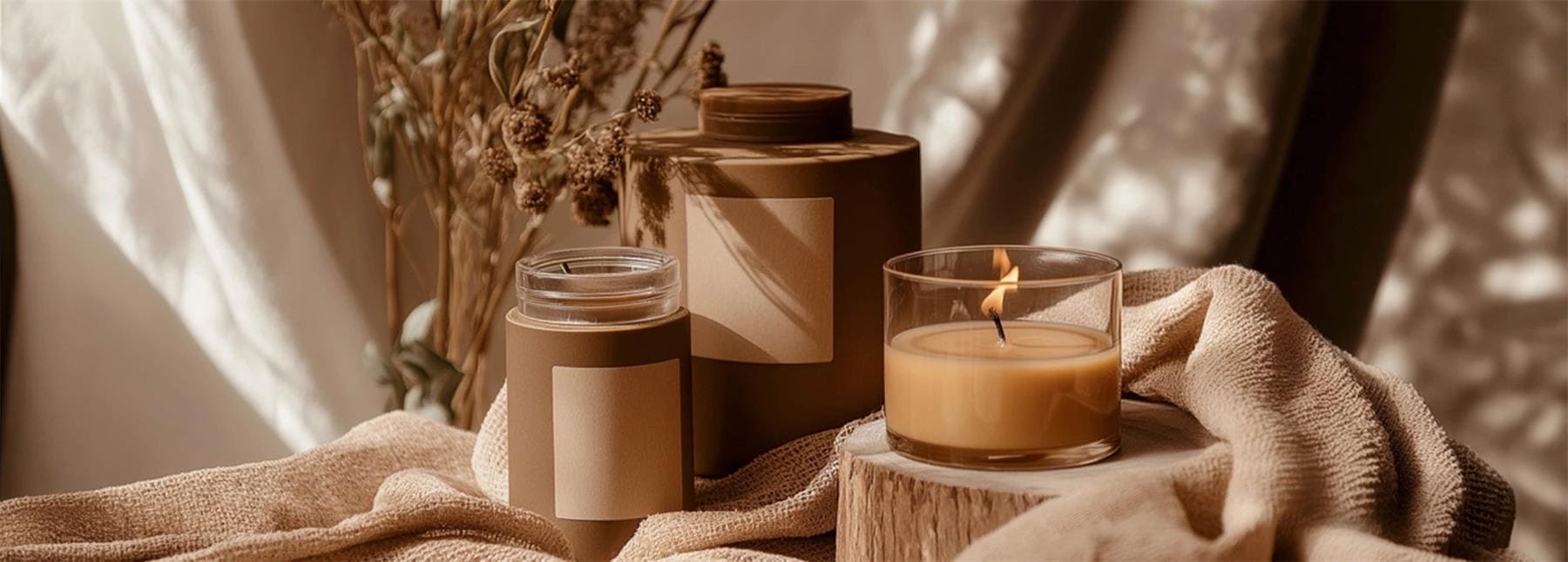
5. Packaging Design: Elegance and Refinement
Mocha Mousse is a natural fit for packaging, especially in industries like food, beverages, and skincare.
Its warm and luxurious look elevates the sense of quality and sophistication in products. It also enhances the consumer experience, offering visual and tactile delight that feels both premium and approachable.
6. Art and Culture: A Color for Emotional Connection
Mocha Mousse isn't just for commercial use; it also plays a significant role in modern art and cultural events.
Its warm and grounding tones make it ideal for public art, exhibition spaces, and cultural designs. It helps create emotional connections in spaces and adds a striking visual impact that resonates with audiences.
The Psychology of Pantone Color Mocha Mousse
Mocha Mousse isn't just visually appealing — it has a unique calming effect on our minds.
Shades of brown are often associated with stability, trust, and security. That's why Mocha Mousse is ideal for home and work environments, where it helps reduce stress, elevate moods, and create a peaceful, comfortable atmosphere.
It's particularly effective in spaces where focus and calm are essential.
Besides, Mocha Mousse carries deep symbolic value across cultures.
In Western culture, brown is linked to the earth, harvest, and the steady rhythm of nature, symbolizing stability and rootedness. In Eastern culture, it aligns with minimalist aesthetics, representing understated luxury and elegance.
This universal appeal makes Mocha Mousse a versatile choice for global design, evoking a sense of harmony and beauty across different cultural contexts.
Moreover, Mocha Mousse naturally complements modern minimalist design.
With its emphasis on functionality and simplicity, modern minimalism benefits from Mocha Mousse's neutral tone, which pairs effortlessly with a variety of colors and materials. It strikes a balance between understated luxury and elegance, blending seamlessly into any setting.
The warm tones of Mocha Mousse enhance clean lines and structures, bringing both balance and comfort to spaces. While maintaining a contemporary vibe, it adds a touch of warmth and coziness.
Mocha Mousse undeniably enriches modern minimalist design, offering subtle sophistication that feels both modern and inviting.
Mocha Mousse Color Palette Ideas
Mocha Mousse is a soft, warm light brown that feels understated yet rich in texture. It's a versatile choice for designers, digital artists, and photographers, adding a sense of sophistication and harmony to various creative projects.
Whether you're working on branding, illustration, or photo editing, Mocha Mousse can elevate your work with its refined and balanced aesthetic. Here are some pairing suggestions:
1. Warm and Natural Tones
Recommended Colors: Off-white, Cream, Taupe
Pairing Mocha Mousse with soft shades like off-white or cream creates a cozy and natural atmosphere.
This combination works beautifully for home design projects, warm-themed illustrations, or soft-toned photo edits. It draws attention while offering a comfortable and inviting visual experience.
2. Sophistication with Dark Shades
Recommended Colors: Dark brown, Black, Charcoal Gray
For a more polished and professional look, combine Mocha Mousse with deeper colors.
In branding, dark brown or black can emphasize Mocha Mousse's softness while adding depth and gravity. In portrait photography, dark backgrounds can make subjects pop and enhance the narrative feel of the image.
3. Fresh and Vibrant Contrasts
Recommended Colors: Mint green, Olive Green, Light Blue
To bring energy to your design, try contrasting Mocha Mousse with fresh greens or blues.
In digital art, mint green accents on a Mocha Mousse backdrop create subtle cool-warm contrasts, adding life to the composition. In fashion photography, pairing light blue props or clothing with Mocha Mousse creates a breezy, modern aesthetic.
4. Elegant and Neutral Combinations
Recommended Colors: Gray-white, Smoky Pink, Muted Lavender
When paired with neutral tones, Mocha Mousse exudes understated elegance.
Gray-white and smoky pink enhance its softness, while muted lavender adds a playful yet sophisticated touch. These pairings are great for illustrations, UI backgrounds, or subtle filler elements in your designs.
5. Bold Accents for Drama
Recommended Colors: Bright Red, Deep Burgundy, Vibrant Orange
Mocha Mousse's neutral nature makes it an ideal backdrop for striking accent colors.
Add bold hues like bright red or burgundy to make your design stand out. In advertising or photo editing, incorporating these accents through props, logos, or lighting adjustments can create dramatic visuals that grab attention.
How to Use Mocha Mousse in Your Work?
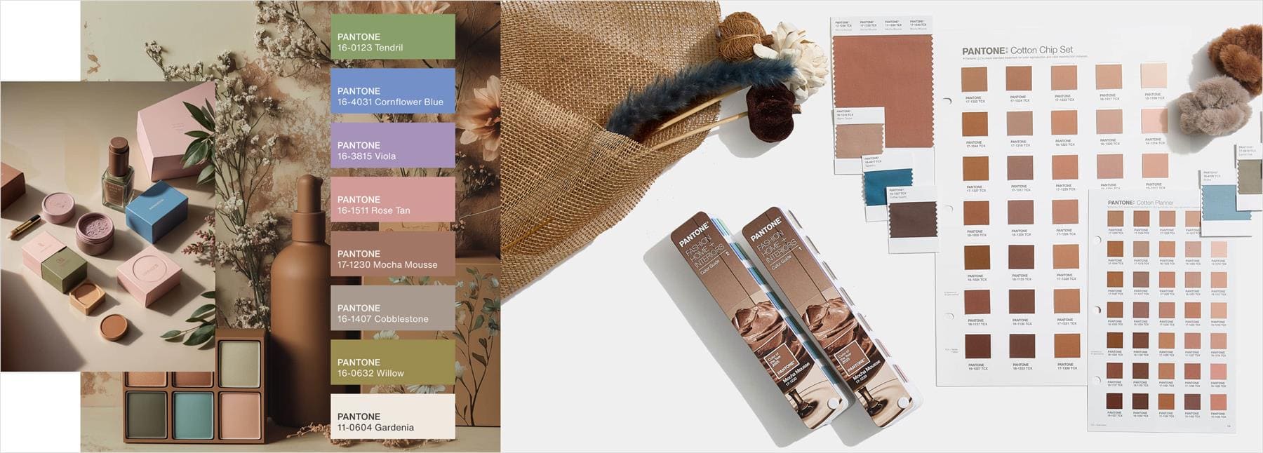
According to official Pantone sources and some design websites, the 2025 Color of the Year, Mocha Mousse, is labeled as PANTONE 17-1230. Its RGB values are (163,119,98), and its Hex code is #A37762.
However, it should be noted that Pantone's color system is based on spot colors and physical swatches. The RGB values are just an approximation for screens, so the color might look a little different in print or on digital designs.
For an exact match, we suggest using an official Pantone swatch or a professional color management tool.
The beauty of Mocha Mousse lies in its versatility and inclusivity. It works well as a standalone color or as part of a palette, making it a favorite among designers, digital artists, and photographers.
Here are some practical ideas for incorporating Mocha Mousse into your creative projects:
- Branding Design: Use Mocha Mousse as a primary color paired with clean typography and gradient accents. This creates a brand image that feels both modern and approachable.
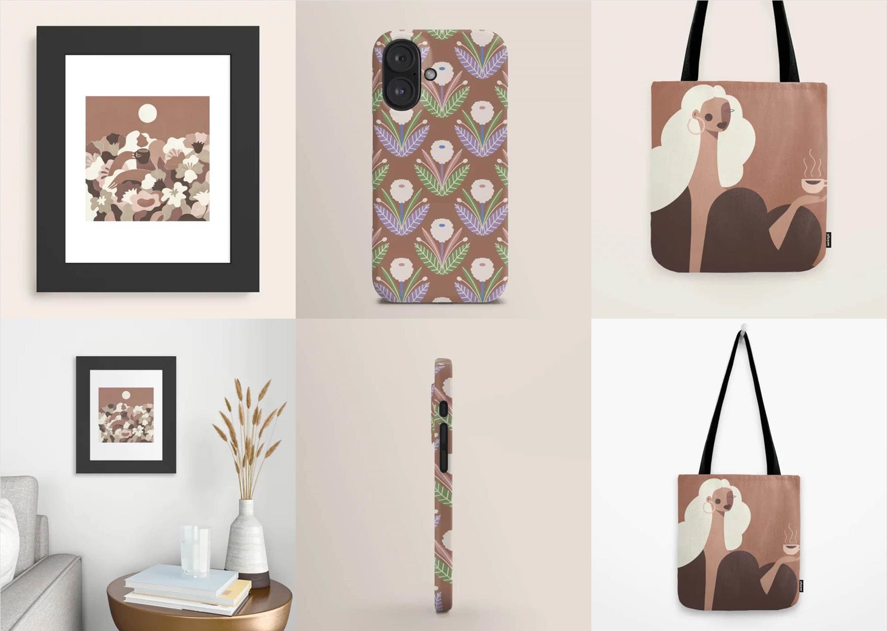
- Illustration and Digital Art: Incorporate Mocha Mousse as a main background or supporting color in your palette. Its soft and muted tone adds a unique sense of warmth to your artwork.
- Photo Editing: Apply Mocha Mousse tones in post-processing for portraits or interior photography. This warm hue enhances the image with a subtle, upscale atmosphere.
In design, digital art, and photo editing, color adjustments are often the most time-consuming and patience-testing part of the process.
This is especially true when working with subtle tones like Mocha Mousse, where even small tweaks may require repeated trials. If you've faced this challenge, consider trying TourBox.

TourBox is a creative console designed specifically for artists and creators. It simplifies precise color adjustments with customizable buttons and dials, making it a game-changer for software like Photoshop, Lightroom, and more.

With TourBox, you can focus on your art instead of being bogged down by complex operations. If you're aiming for higher standards in color work, TourBox is the perfect companion to elevate your creative process!
Final Thoughts on Pantone Color Mocha Mousse
While we've highlighted a few ways to use Mocha Mousse in this article, we believe these so-called "Color of the Year" predictions by experts often lack real significance.
Take Pantone's 2024 Color of the Year, "Peach Fuzz," or 2023's "Viva Magenta." Both sparked some buzz when they were first announced, but after that, they faded into obscurity.
It's the same on social media. Colors hyped up through hashtag stacking and marketing campaigns rarely have staying power. Just in 2024, we've seen over a dozen "trend colors" come and go.
Each one had its moment of glory online — maybe for a month — but none left a lasting impact.
That said, one color did manage to break through in 2024, and it wasn't from any influential color authority or boosted by big social media campaigns. Its rise was a complete fluke.
In June 2024, British pop star Charli XCX dropped an album called brat. The cover featured an eye-popping, almost obnoxious green. She intentionally chose the color for its unappealing vibe, perfectly matching her bold, quirky music style.

What happened next likely surprised even Charli XCX. Within days, "brat green" became a viral symbol for youth, rebellion, and hedonism. The color spread like wildfire across social media.
Charli XCX's choice brought her attention far beyond her usual fan base. On Instagram alone, nearly 3 million posts carried the #brat tag.
Maybe the real Color of the Year is like a roll of God's dice — completely random, with no rhyme or reason.