Monet Art Style: Mastering Impressionist Color Techniques
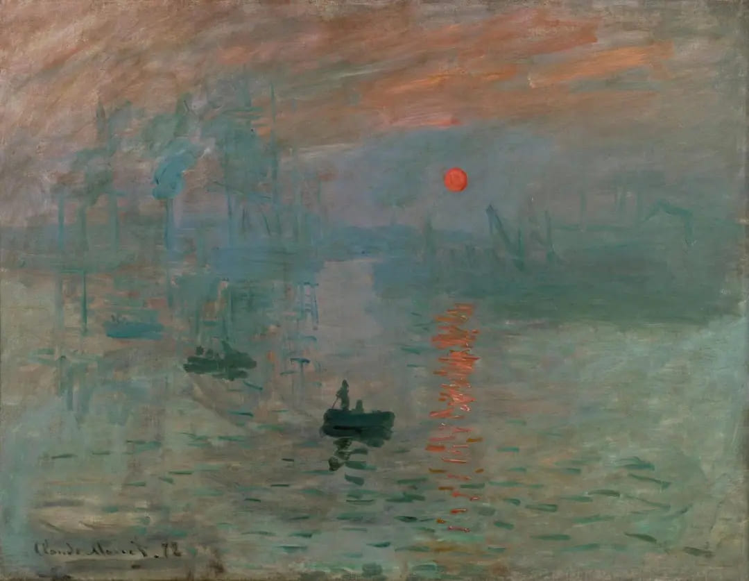
"A wallpaper design in its embryonic state is more finished than that seascape."
Can you believe it? That's what critic Louis Leroy said when Monet's Impression, Sunrise was first shown in Paris. He complained that paintings in that style looked like unfinished wallpaper.
But was Impression, Sunrise really that bad? Of course not. Today, Monet's way of painting still teaches artists a lot. In this article, we'll take a closer look at the art style of the Impressionist master Claude Monet.

In this article, you will learn:
- The Origins and Core of Impressionism
- Monet's Art Style: Light and Color
- Monet's Technique: Color Division
- How Digital Artists Can Borrow from Monet?
The Origins and Core of Impressionism
In 1874, the first modern art movement quietly began. A group of artists who had been turned down by the official Paris Salon decided to put on their own show. That group included Monet, Manet, Degas, Morisot, Cézanne — names we all know today.
Because their work looked very different from the strict academic art of the time, a critic named Louis Leroy mocked the show in a magazine and called it the "Impressionist" exhibition. The word "impression" came from Monet's painting Impression, Sunrise. So Impressionism was born amid a lot of ridicule.
What is the heart of Impressionism? Impressionist artists saw the world in a different way.
They focused more on light than on the subject itself. That's why Impressionist paintings often don't have sharp outlines.
They weren't trying to show exactly what was there. They wanted to capture a feeling. Impressionism is a bit like an alien visiting Earth for the first time — it doesn't know anything about what it sees, but it records the visual sensations. As Monet put it: "Work from impulse, not from calculation."
Monet's Art Style: Light and Color
In Monet's day, most artists painted serious subjects. They focused on history or myths. They worked slowly in studios.
Monet wanted to capture how natural light changed a landscape at different times of day. To do that, he often painted outdoors. This is what we call painting en plein air.
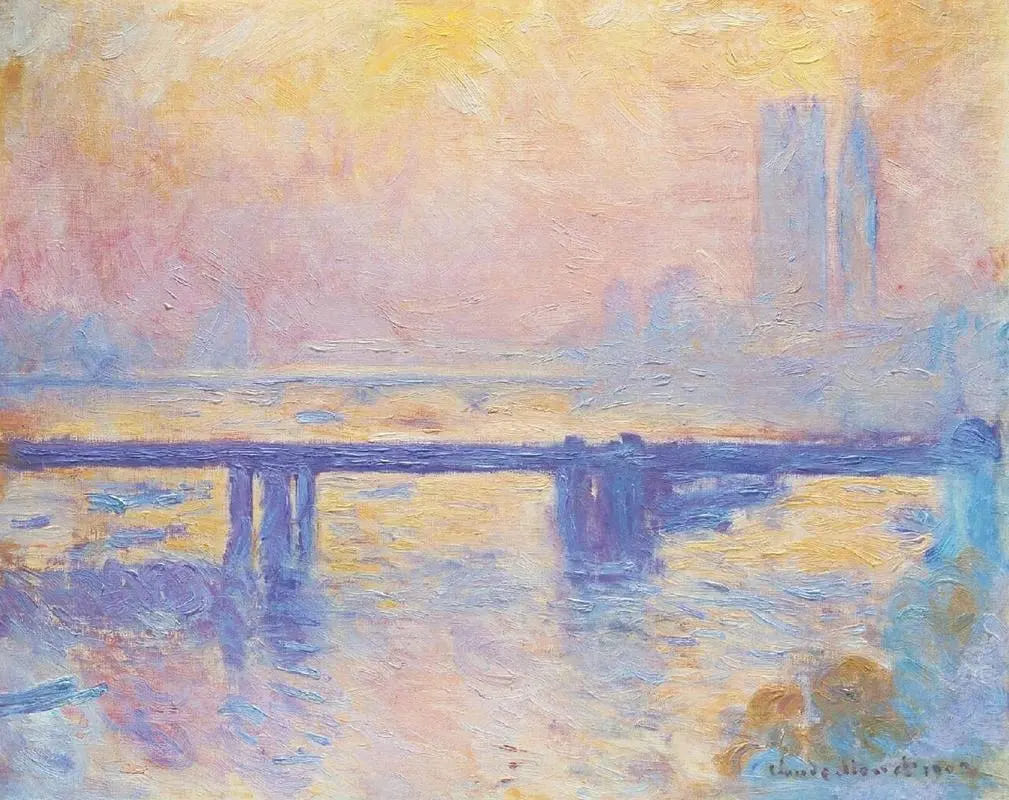
His look is very different from the smooth, academic style. Monet's brushstrokes are clear and visible. They are short, quick, loose, and expressive. That makes the painted forms look broken and slightly out of focus.
After many outdoor sessions, Monet came to believe that color is fluid. To really understand light, he had to capture its constant changes faster.
Cameras then were not what they are now. How could he catch each instant quickly?
He set up several easels outdoors at once. When the light changed, he moved to the next canvas. Sometimes he worked on as many as eight canvases in one sitting. He usually spent about an hour on each canvas.
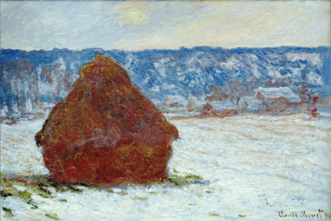
That's how his series method was born — works like the Haystacks and the Rouen Cathedral series.
Monet used color very differently from the art rules of his time. Back then, artists often painted shadows with black or brown. They treated shadows as simply the absence of light.
Monet saw shadows differently. He knew shadows also pick up colors reflected from nearby objects. Today, we might call this ambient color. Monet found that shadows can be colorful under different lights and surroundings.
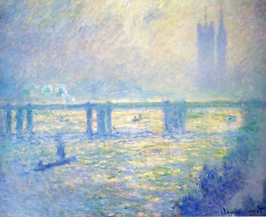
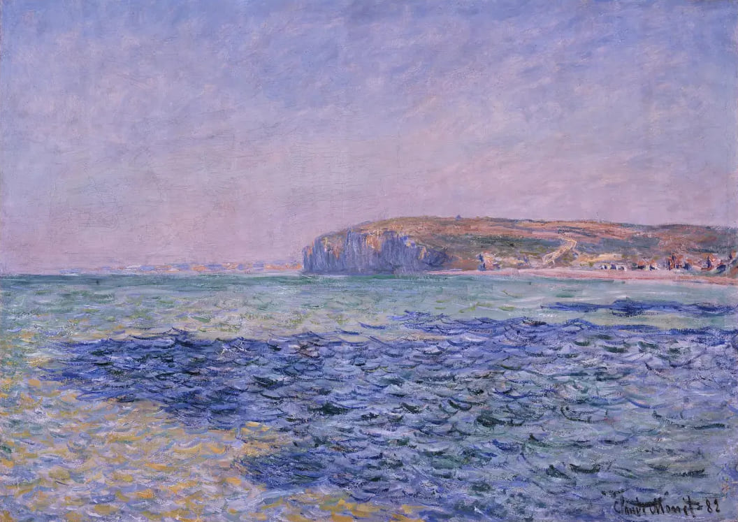
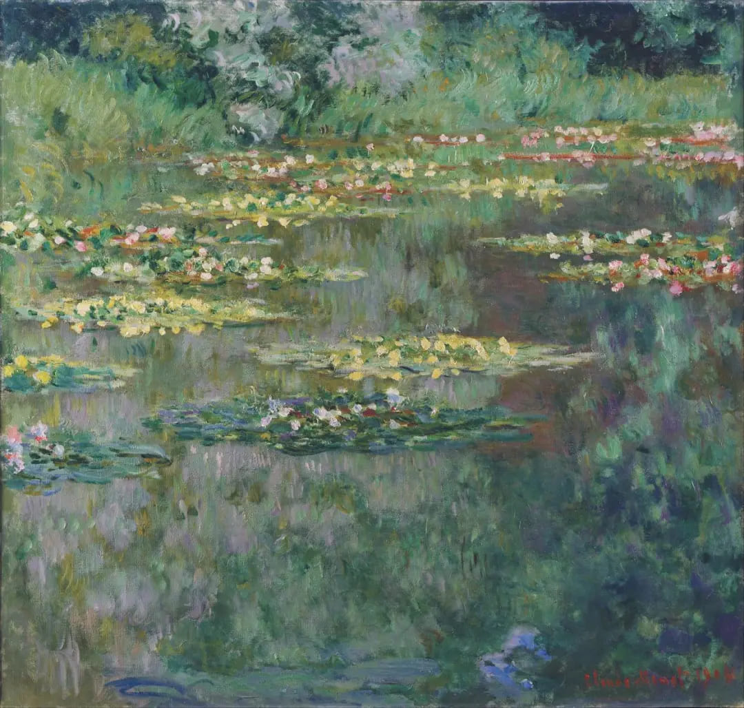
Look at these two Monet paintings. You can see the shadow areas are full of rich color. For beginner artists, studying Monet's work helps you learn how to paint colorful shadows.
Because he painted outside, Monet often used cool tones — blues, purples, and greens — for shadows. Which color he used depended on the surrounding environment and how light and shadow interacted.
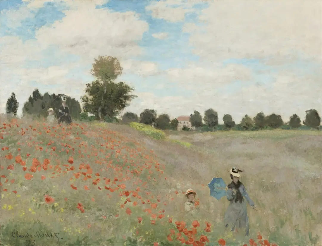
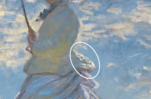
Let's use Monet's well-known painting Woman with a Parasol as an example to see how he handled color.
Look at the blue areas. Most of the shaded side is blue because the ground reflects cool sky tones into the shadow.
Also, notice the three spots inside the white box. They look yellow-green and face downward. That makes sense — they pick up color reflected from the grass below.
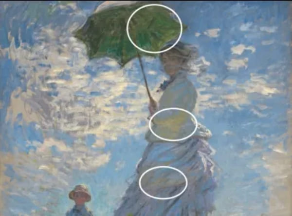
The bright yellow patch below is a warm reflection from sunlight.
Monet's use of color broke the rules of his day. It showed a deeper, more physical understanding of light and color. His work helped shape 19th-century color theory.
Monet's Technique: Color Division
When you look closely at Monet's paintings, you see countless small colored brushstrokes. Up close, the scene looks fuzzy and dreamlike. From far away, the colors read as clear and natural.
This trick was essential for Impressionists who wanted to capture quick changes in light and color. It's called the color division technique.
Monet didn't mix colors on the palette as much as he let them sit side by side on the canvas. He painted pure dots or strokes of color next to each other. From a distance, the eye mixes those marks. That visual mixing makes colors appear brighter and more lively than if the paints were physically mixed.
For example, we often make purple by mixing blue and red into one brush stroke.
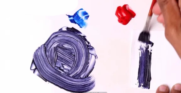
With color division, purple is split into two or more colors — for instance, blue and red placed next to each other. Seen from afar, those colors blend in the viewer's eye and read as purple.
Why use this method? First, it creates stronger, brighter color. That helps show small changes in light and the natural world. Second, it gives the painting a sense of movement and sparkle. Light and color seem to shimmer. You can see this effect clearly in Monet's water and skies.
How Digital Artists Can Borrow from Monet?
Monet gives us a way to see light, not just objects. For digital artists, that idea is more useful than copying his exact brushstrokes. You can translate his approach into simple steps that make your work feel more alive.
Start by thinking in patches of color instead of smooth gradients. Block in broad, pure colors on separate layers. Use short, varied brushstrokes or textured brushes — don't overblend.
Let shadows carry color from the scene. Sample nearby colors and drop them into shadow areas with low-opacity brushes or layer blending modes (Overlay/Soft Light work well). Use cool tones for shaded planes and warm tones for sunlit planes, but don't be literal — experiment with splits of color (for example, place blue and red strokes next to each other instead of one mixed purple stroke).
Work fast and make small studies. Try two or three quick versions of the same scene at different times or light angles. Duplicate layers and push hue shifts or contrast to test how color vibration changes.
Above all, keep it playful: Monet's power comes from curiosity about light. Let your experiments guide you more than rules.
Finally, we'd like to introduce you to TourBox, a creative controller loved by digital artists. With TourBox, you can handle all those repetitive tasks with one hand.

TourBox not only speeds up your workflow, but its ergonomic design also feels great to hold. It's like using a game controller: no digging through menus or memorizing complex shortcuts. Just turn a knob or press a button, and you're good to go.

If you're curious, visit our Digital Painting page to learn more.