Pantone Color of the Year 2026: Is Cloud Dancer a Bad Choice?
When Pantone announced its Color of the Year for 2026, it landed like a bombshell and quickly became a hot topic. But not all the reactions were positive. So why did Pantone choose white as the 2026 Color of the Year? Why do some people think it was a bad choice?
In this article, we'll take a closer look at Pantone's 2026 Color of the Year and the color combinations that work well with it. Without further ado, let's get started.

In this article, you will learn:
- What Is Pantone Color of the Year for 2026?
- Is Pantone 2026 Color of the Year a Bad Choice?
- Color Palettes for the 2026 Color of the Year
- Conclusion
What Is Pantone Color of the Year for 2026?
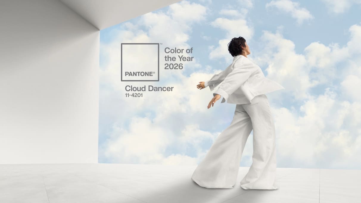
Pantone's Color of the Year for 2026 is PANTONE 11-4201, "Cloud Dancer." It's not a stark, cold white. Instead, it's a soft white with a slight warm cast, sitting between ivory and light gray. It feels clean and restrained, yet still has a touch of warmth.
Pantone's official interpretation stresses people's craving for "breathing room," quiet, and emotional balance in an age of heavy information, fast pace, and visual overload. Cloud Dancer is light like a cloud and carries a calming quality. The company describes it as a symbol of seeking calm and a reset in a noisy world.
However, once this "light, airy" warm white was announced, the design community and public debate quickly heated up. Many people were surprised or even disappointed. On social media, some mocked it as "just white," and others joked that it can't really be called a "color."
Is Pantone 2026 Color of the Year a Bad Choice?
Our view is that Cloud Dancer feels too monotonous, bland, and unimaginative in today's color trends. As a Color of the Year that so many people pay attention to, it can be seen as a poor choice. But the color itself can act as a base for other colors. It makes designs more flexible and can help other colors stand out. So the color itself is not a bad color.
So why do people think Pantone's 2026 Color of the Year was a poor choice?
From a professional design perspective, this neutral, soft white did not meet many designers' expectations. In recent years, most trending colors have carried rich emotions. Choosing a blank-canvas white feels like a step back into the safe zone. It even feels like Pantone could not decide, so they picked Cloud Dancer as the safest option.
Cloud Dancer is like a glass of plain water. It can complement other colors well. Of course, everyone needs a glass of water. But using it as the Color of the Year still feels unexpectedly bland. It does not point to a new color direction, nor does it define a clear style.
Not only has Cloud Dancer itself been criticized for lacking imagination, but the meaning behind the choice has also been widely questioned.
Does white really stand for ease and calm? White can feel cold and sterile, even fake. It is not lacking stimulus so much as feeling like a room that is too bright but has no warmth.
Looking back at Pantone's recent picks, 2024's Peach Fuzz was a gentle tone between pink and orange and was given meanings like "gentleness, warmth, and unity." 2025's Mocha Mousse was a warm, earthy brown that symbolized stability and comfort. Those Colors of the Year echoed the social mood at the time and carried rich emotions.
Compared to them, Cloud Dancer lacks a strong color identity and emotional theme.
Today's popular color trends are shifting toward warmer, more textured palettes. People favor earth tones, warm browns, and deep greens. Choosing white as the Color of the Year feels culturally and psychologically out of step with everyday life.
The public, and especially the design community, who mocked Cloud Dancer are, in a way, reflecting the contemporary design world's sensitivity and expectations about color meaning. People want the Color of the Year to meet aesthetic needs and to respond to social moods and emotions.
Color Palettes for the 2026 Color of the Year
Though Cloud Dancer may feel like a weak pick for Color of the Year, it's still an important structural color. It's close to HEX #F0EEE9. In design, it can help build a sense of luxury, breathing room, and spatial clarity.
Pantone has also carefully paired Cloud Dancer with seven color palettes to suit a variety of settings and to give designers and color enthusiasts some inspiration. Below are the color palettes Pantone shared for the 2026 Color of the Year.
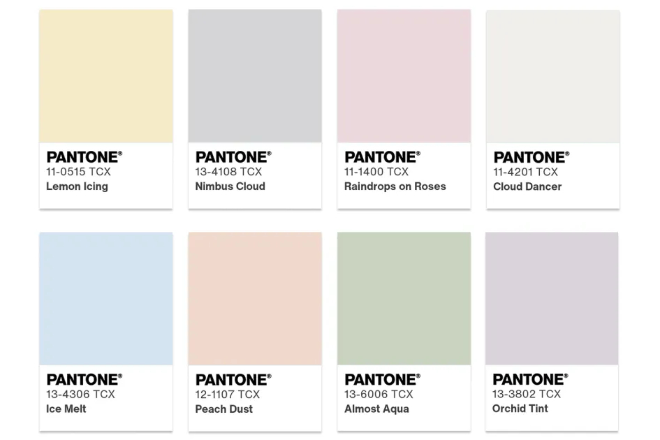
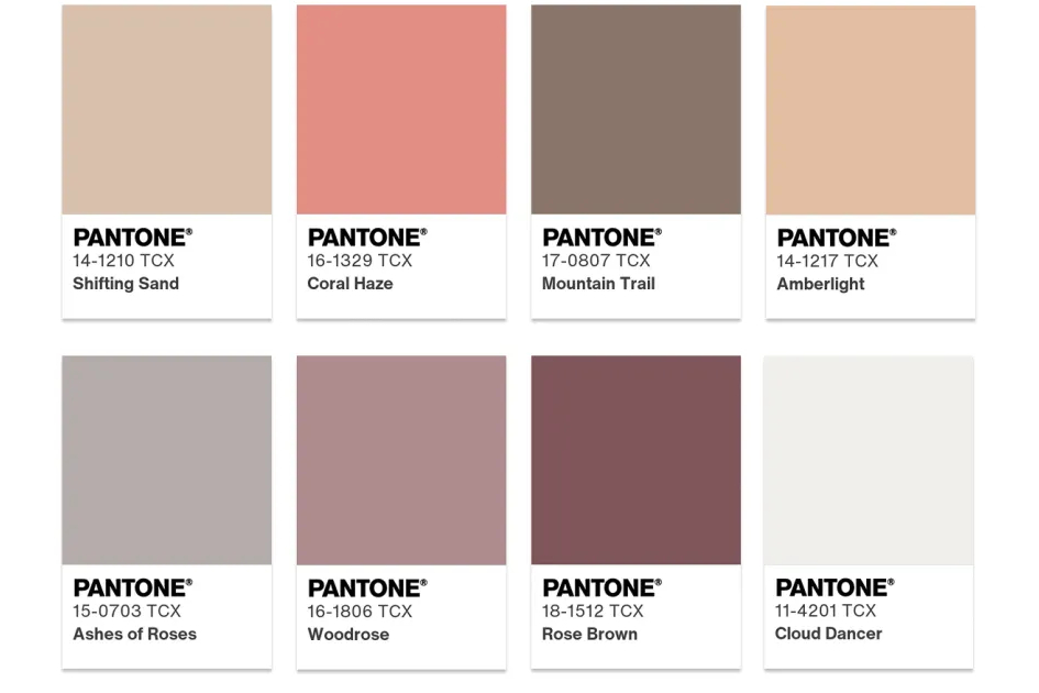
1. Powdered Pastels
Soft pastels and neutral tones blend well with Cloud Dancer. They create subtle, pleasing shifts in hue that feel delicate and restrained.
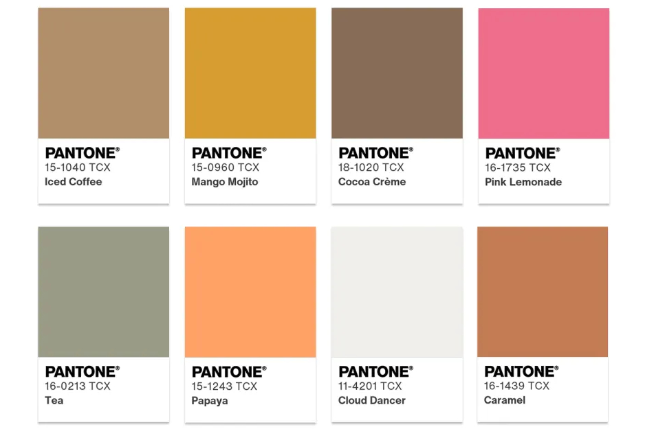
2. Take a Break
Cloud Dancer invites us to pause and savor small pleasures: fizzy pink lemonade, ripe papaya, caramel or cocoa cream, a cup of tea, or a mango mojito. These playful colors make a lively, tasty palette.
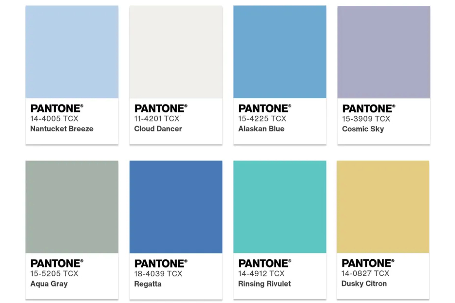
3. Atmospheric
Cloud Dancer lifts the palette upward. This thin, translucent white breaks through a grey sky to reveal clear, fresh blues. Aquamarine hues emerge like light from deep water.
4. Comfort Zone
Everyone needs a comfort zone — a place to unplug, relax, and let go. Natural, organic tones around Cloud Dancer feel warm and embracing. They create a calm, reassuring atmosphere.
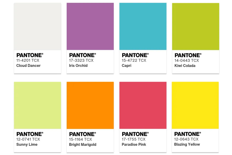
5. Tropical Tonalities
Tropical palettes bring bright, lively colors to mind: turquoise seas, zesty citrus, vivid flowers, and exotic birds. If a cloud floated in that sunny paradise, it would be a light, rolling Cloud Dancer.
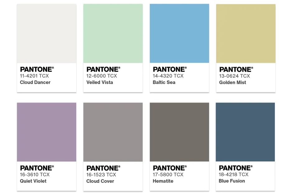
6. Light & Shadow
Cloud Dancer fits gracefully into a set of soft, hazy tones and can fade into neutral shades. The result is an easy, natural contrast of light and shadow.
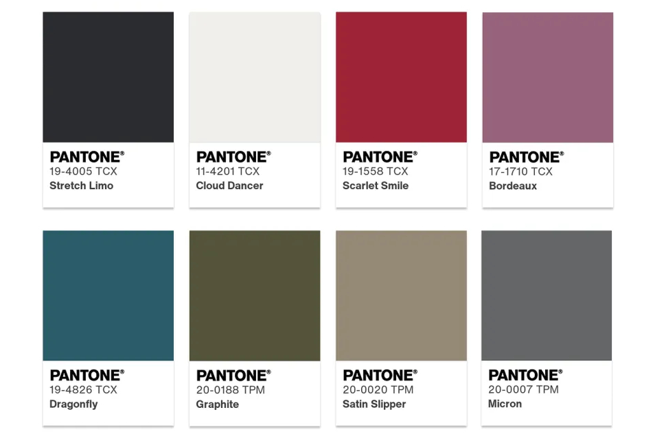
7. Glamour & Gleam
Black and white meet as yin and yang, and a pop of lipstick red adds allure. Vintage burgundy, teal, a hint of graphite shimmer, flickering greys, and satin silver metals raise the drama and give the palette a glowing finish.
Quick ad break. If you are a designer, you know color tweaking is often the most time-consuming and patience-testing part of a project. This is especially true with subtle tones like Cloud Dancer: even tiny adjustments can require many tries. If you've run into that problem, consider trying TourBox.

TourBox is a creative console made for artists and creators. It simplifies precise color adjustments with customizable buttons and knobs.

With TourBox, you can focus on design and art instead of getting bogged down in clumsy controls. If you want to raise your color work to a higher standard, TourBox can be a great companion for your creative process.
Conclusion
Pantone's 2026 Color of the Year, Cloud Dancer, has sparked a wide and complex reaction. Many designers may feel this choice is too safe and too bland, lacking surprise and emotional depth, and not really living up to the name "Color of the Year." There is some truth to that view.
That said, it's hard to deny that Cloud Dancer, as a key structural color, can add a sense of lightness and movement to many products and applications, whether used on its own or paired with other hues.
Cloud Dancer is a very versatile color in design. In this blog, we also shared Pantone's seven palette suggestions. So in your projects, try adding this color and see if it gives you a different result.