RGB VS CMYK: An Ultimate Guide to Mastering Color Modes
RGB and CMYK are two color modes commonly used in design. As designers and creative artists, it's essential to understand these color modes as they form the basis of color pairing and color theory.
You've likely encountered situations where a design piece created in RGB mode turns darker when converted to CMYK mode. Worse still, the colors can appear significantly distorted when previewed on a mobile device.
If you're not aware of the differences between RGB vs CMYK, and don't choose the appropriate color mode for different mediums, you may run into unnecessary misunderstandings and complications.
Therefore, in this tutorial, we'll introduce you to the distinctions and uses of the RGB and CMYK color modes. Let's get started!

In this article, you will learn:
- What Is the Color Mode?
- What Is RGB?
- What Is CMYK?
- What Is Adobe RGB Color Space?
- How to Minimize Color Deviation in Design?
What Is the Color Mode?
Color modes refer to the methods of categorizing and describing the color representation in an image. Each color mode has a unique definition and value, with a specific range of values. Different colors are composed of these numerical combinations.
In design, the most common color modes are RGB vs CMYK. But what's the difference between these two?
What Is RGB?
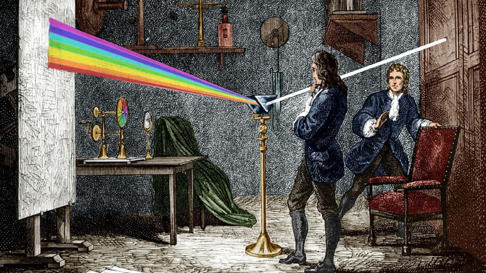
The mystery of color in light was discovered by Newton in his prism refraction experiment.
When a beam of white light passes through a prism, it undergoes two refractions, resulting in the white light being split into seven orderly colored rays: red, orange, yellow, green, blue, indigo, and violet.
Through his calculations, Newton concluded that only red, green, and blue among these seven colors cannot be decomposed, and thus cannot be synthesized.
The other four colors can be created by combining these three colors in different proportions. Hence, red, green, and blue are referred to as the "three primary colors of light".
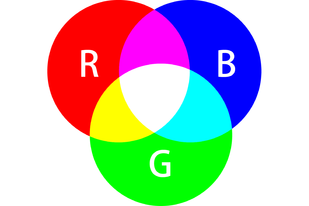
RGB is a color mode that's based on the three primary colors of light. An RGB image uses only these three colors, and when they overlap in varying amounts, they can reproduce a wide array of colors on your screen.
The RGB mode is the optimal color mode for screens such as computers, smartphones, projectors, TVs, and so on.
However, due to material and process limitations, even screens that are produced by the same brand, from the same factory, and from the same product line, the colors they display will not be identical.
Red, green, and blue each have 256 levels of brightness, represented numerically from 0, 1, 2... all the way up to 255.
These 256 levels of RGB colors can be combined to create approximately 16.78 million different colors. When these three colors overlap, countless colors can be created, with numerical values ranging from 0 to 255.
When all components are 0, the result is pure black, and when all values are 255, it is pure white. Thus, the more colors that overlap, the brighter the result.
If your chosen medium for design is a screen, then the color mode will automatically be in RGB.
What Is CMYK?
When the RGB mode is used to describe color, it is meant for display screens. However, when a designed work is printed, the medium it addresses is ink.
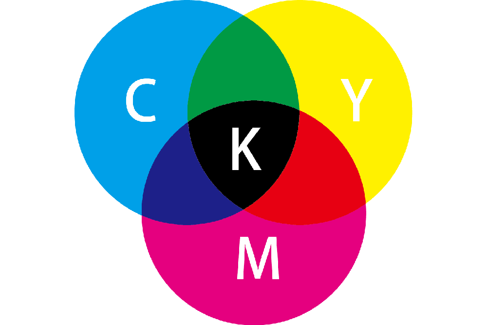
Through long-term observation, it has been found that there are three colors in the ink that, when mixed in different proportions, can generate many colors.
These colors cannot be replicated by mixing other colors. They are Cyan, Magenta, and Yellow, known as the primary colors of ink.
Similar to RGB, CMY is the initial letters of the names of three printing inks: Cyan, Magenta, and Yellow.
The range of CMYK values is 0-100%, and the colors in printing are mixed according to these colors. In CMYK, the more the colors overlap, the darker they become, because the more the ink colors overlap, the more they turn into black.
Theoretically, only the three inks, CMY, should be enough, and combining them should yield black. However, due to current manufacturing processes, high-purity ink cannot be made.
The result of adding CMY is actually a dark gray color, which is not enough to represent the darkest parts of the image, hence the need to add black. Moreover, black can make the details in the darker parts more clear, and the mid-tones and dark sections clearer.
The ink color black is not abbreviated as B (Black) to distinguish it from B in RGB. So why was K chosen as the abbreviation? It is also said that K stands for "Key Part". It indicates that the K plate plays a key role in printing, serving as a kind of "skeleton" in the image.
Traditional four-color printers have four printing drums, each responsible for printing Cyan, Magenta, Yellow, and Black. After a sheet of white paper enters the printer, it needs to be printed with the four types of ink to get the final printed product.
If you use a magnifying glass to look at the printed product, you will find that the darker areas are filled with a large number of black dots. On a printed product, from the highlights to the mid-tones to the dark parts, the black ink becomes denser.
What Is Adobe RGB Color Space?
sRGB is currently the most commonly used color language protocol, representing the standard (S) red (R), green (G), and blue (B) primary elements.
The Adobe RGB color space is a professional color gamut standard that evolved with photographic technology. It offers a richer palette than sRGB, including the CMYK color space that sRGB lacks.
It was developed by Adobe Systems in 1998, with the aim of encompassing as many colors as possible on the RGB color mode of devices such as computer monitors for use in CMYK color printing.
For professional users in fields such as printing, photography, and design, who need to make precise color adjustments to images, choosing the Adobe RGB color space is more suitable.
Further Reading:
Let's take a look at the YouTube video about sRGB and Adobe RGB Color Space, produced by Adorama.
For professional users in fields such as printing, photography, and design, who need to make precise color adjustments to images, choosing the Adobe RGB color space is more suitable.
Generally, the colors displayed on a monitor (RGB) are brighter and more vivid than those of printed materials (CMYK). This is because the RGB color space can represent a wider range of colors than CMYK can.
It can also be understood that many bright colors displayed on the monitor (RGB) cannot be reproduced by ink printing (CMYK).
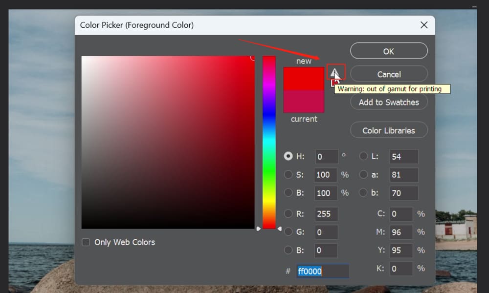
All color images in printing must be in CMYK mode, not RGB mode, because the RGB mode may display colors that cannot be printed, leading to serious misdirection in design and printing.
When we select colors in the Photoshop Color Picker, if the current color exceeds the range of the CMYK system, a color gamut warning box will pop up.
Clicking on the warning triangle icon will automatically select a print-safe color that is closest to the current color and within the CMYK color gamut.
How to Minimize Color Deviation in Design?
In design, we inevitably encounter some sensitive colors, such as skin tones, which can seem unrealistic if they deviate slightly.
Color inaccuracies in design can be quite frustrating. We painstakingly adjust the colors of the image in the editing software, but they change after printing.
Too red, too blue, too light, too dark... this means that even the best creative ideas cannot be fully realized, after all, what we ultimately want is not the screen display but the printed product.
So, how should we minimize color deviation in design? Here are some effective methods.
Method 1: Calibrate Monitor Color Range
Calibrating the color range of your computer screen according to CMYK is a common method.
We match the design draft with the printed product and adjust the screen colors so that the various colors on the screen are as close as possible to the various colors on the printed product.
This makes the designer feel as if they are controlling the final printed product when adjusting colors on the computer.
To make the colors on the display screen as close as possible to the color range that can be represented by the printed product, professional designers must calibrate their monitors.
However, as we mentioned above, due to factors such as color gamut and hardware, the colors on the monitor and the printed colors cannot be 100% matched.
Method 2: Use a Print Color Spectrum
The colors on a monitor cannot serve as the standard for print colors. To obtain an objective color representation, some specific colors can be determined using the print color spectrum as a standard.
The color spectrum, with its intuitiveness and practicality, has become the most commonly used color representation method in the printing industry and is a color reference tool with guiding significance.
The print color spectrum basically covers all commonly used print color ranges, and you can choose and set color values according to color samples to meet the needs of color design.
However, the reference color spectrum and the final print color representation cannot be 100% matched.

Method 3: Proof before Printing
Making a small number of sample sheets before printing to preview the effect of bulk printing is the best way to reduce risk.
Proofing allows you to see the printed colors more intuitively, and if you are not satisfied, you can continue to modify the file.
Method 4: Use TourBox
If you're looking to streamline your design process and take your color correction to the next level, we highly recommend checking out TourBox.
This gem of a tool is a game-changer when paired with your post-production software of choice. It’s designed to optimize your workflow and make color adjustments a breeze, saving you precious time while enhancing the precision of your work.

Whether you're a seasoned professional or just starting out in design, TourBox can help you work more efficiently and achieve a higher standard of color accuracy. Give it a spin, and we bet you'll wonder how you ever managed without it!
In wrapping up this comprehensive tutorial on RGB vs CMYK, we've traversed the landscape of these two pivotal color modes. Understanding their differences and knowing when to use each is crucial in the realm of digital and print design.
Be it the vivacious scope of RGB for digital displays, or the practical limitations yet print-fidelity of CMYK, each has its own place and purpose in a designer's toolkit.
As we close this tutorial, we hope that you're now more equipped to navigate this colorful journey of RGB vs CMYK. Keep experimenting, keep learning, and most importantly, keep creating.