What Colors Go Well with Pink?
Pink is a soft, expressive color that often shows up in design. From illustrations and brand logos to user interfaces and cover art, pink can convey distinctive moods and images.
This article digs into what pink means in color psychology. Then we'll use color theory to suggest several pink-pairing ideas and real, practical examples. Our goal is to help designers and content creators understand what colors go well with pink and choose clearer, more striking pink color combinations.

In this article, you will learn:
The Color Psychology of Pink
Pink is often seen as a symbol of gentleness, sweetness, and romance. In popular view, pink is tied to a youthful, romantic, and friendly vibe.
In branding, pink is especially common for women's products, beauty, and fashion. It brings to mind feelings of romance, happiness, and warmth. For example, toy brand Barbie and lingerie brand Victoria's Secret use a lot of pink to create a dreamy, girlish feel.
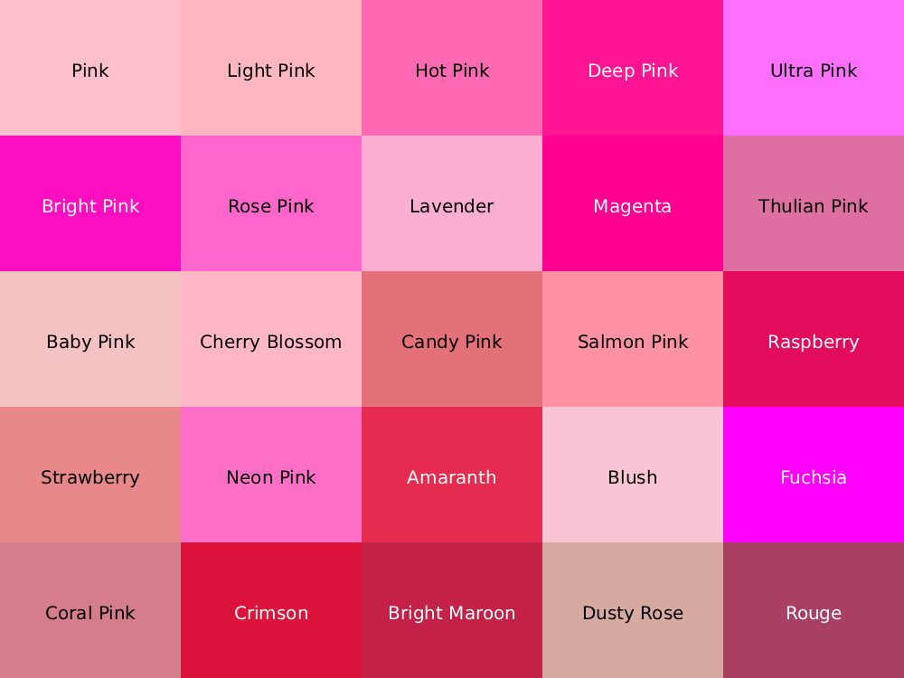
Different shades of pink bring different emotions. Pale pink feels soft, calm, and soothing. Bright pinks — like neon pink — feel bold, energetic, and visually striking.
So the exact pink you choose affects what people associate with it. This two-sided nature lets designers create rich emotional shifts: pale pink can build a dreamy, romantic mood, while bright pink is good for highlighting passion and movement.
The Cultural History of Pink
Pink often feels soft and romantic. But its history is richer and more varied than that.
1. Before the 18th Century — a Color for Boys
In older religious ideas, red stood for manly strength and vigor. Pink, a diluted red, was sometimes seen as a color for boys.

Giotto, The Ognissanti Madonna and Child Enthroned, 1306–10
2. 18th Century — an Aristocratic Color
In the Rococo era, pink became fashionable in art and clothing. Because certain pink shades were hard to mix, they became a sign of wealth. Pink garments were often worn by the nobility and the church.
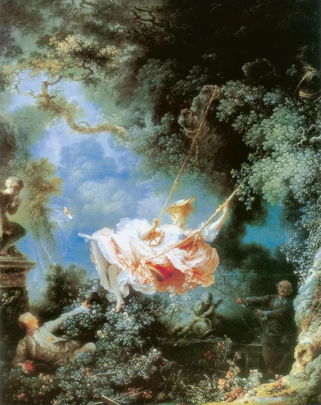
Jean-Honoré Fragonard's famous Rococo painting, "The Swing."
3. After World War II — Linked to Femininity
After WWII, many women adopted pink as a way to celebrate men returning from war. That helped pink become tied to feminine charm and style.
4. 20th Century — a Staple of Women's Fashion
Hollywood icons like Audrey Hepburn often wore pink in films and fashion photos. Pink became a clear part of women's fashion and glamour.
5. 21st Century — a Modern Fashion and Design Color
Today, pink is widely used to signal sweetness and romance. It appears across fashion, branding, and design as a popular trend.
What Colors Go Well with Pink?
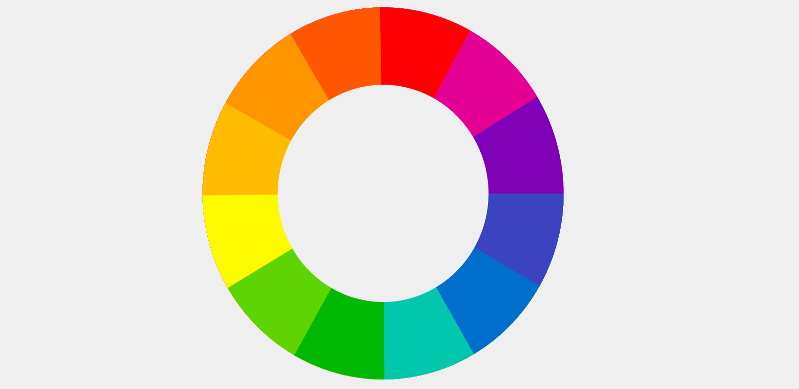
After you understand pink's feelings and symbolism, use color theory to find colors that match it. On the color wheel, pink is a tint of red. Its complementary color is usually green. Neighboring colors include red and purple. A triadic (three-part) scheme can bring in blue and yellow.
Specifically:
- Complementary: Pink's complementary colors are green tones, like mint or pale green. This pairing gives a strong contrast and makes pink feel more lively.
- Analogous: Pink's similar colors are red and purplish-red. Using neighboring colors keeps the palette harmonious. For example, pink with rose red or lavender creates a unified, soft look.
- Split-complementary / Triadic: A triadic scheme for pink can include blue and warm yellow. For example, pairing pink with indigo (or sky blue) and warm gold gives a bright, balanced contrast.
Based on these ideas, here are a few practical palettes and when to use them:
1. Soft Look
Examples: Light Pink #FFC0CB + Beige #F5F5DC, or Light Pink + Light Gray #D3D3D3, or Light Pink + Lavender #E6E6FA.
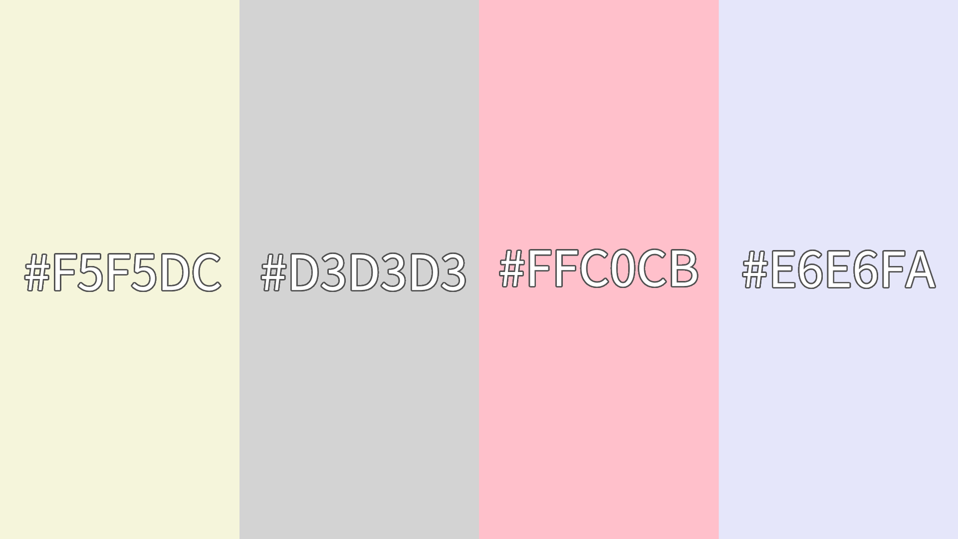
These soft palettes feel warm and soothing. They work well for modern-minimal designs, fashion brands, or products aimed at women. Use them for illustrations, dessert shops, or beauty product packaging when you want a gentle, dreamy vibe.
2. Bold Contrast
Examples: Pink #EE9CCF + Navy #1E66EB, or Pink + Dark Green #83D37F, or Pink + Black #000000.
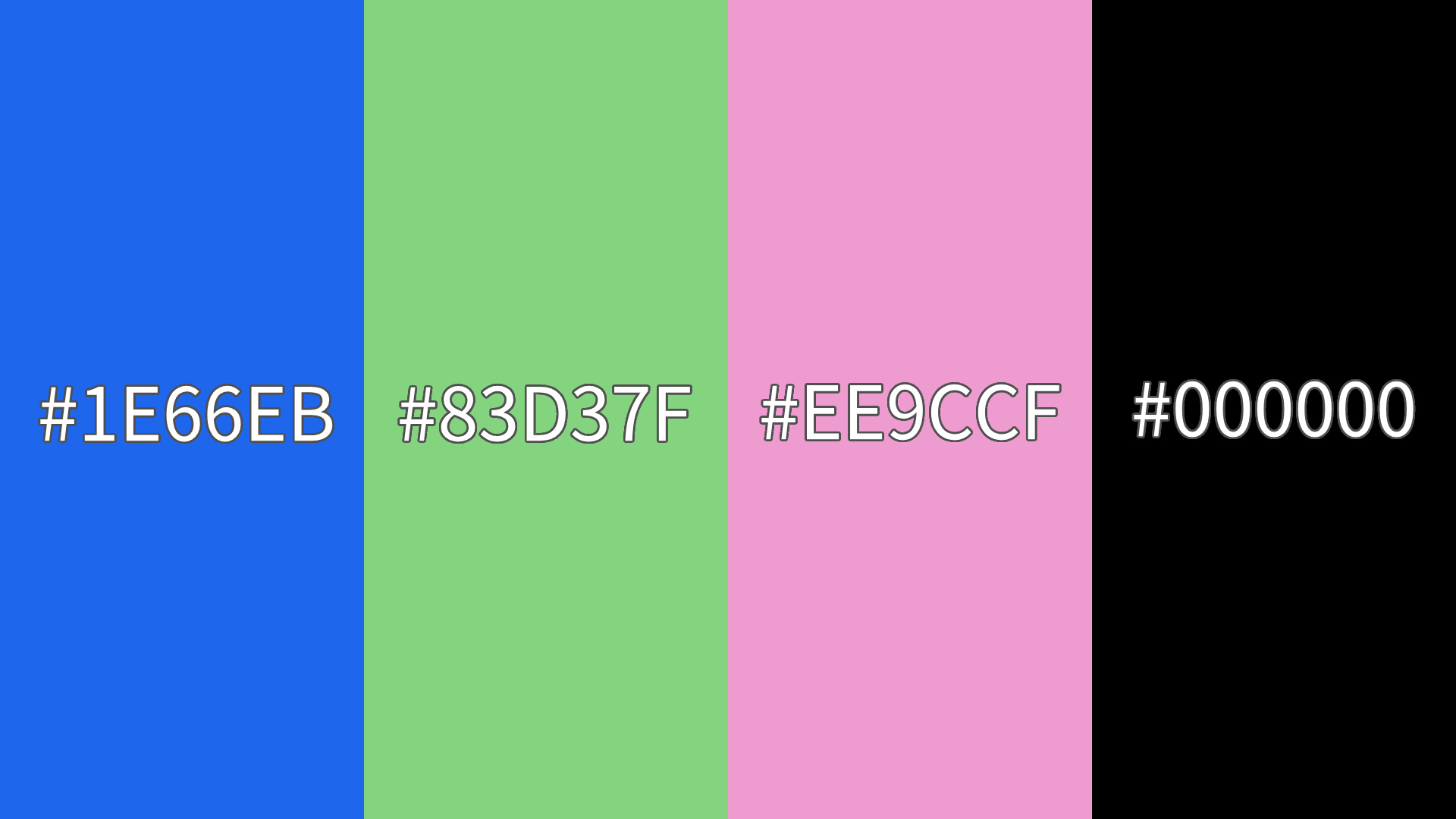
Deep or saturated colors create high impact. Navy and dark green give a strong contrast and visual energy. Black adds a modern, powerful touch. These pairs suit sports brands, tech designs, or edgy visual identities.
For instance, pink + dark green can feel energetic and natural (good for outdoor or health themes), while pink + navy leans more techy or game-related.
3. Bright & Cheerful
Examples: Pink #FF69B4 + Lemon Yellow #FFF700, or Pink + Mint Green #98FF98, or Pink + Sky Blue #87CEEB.
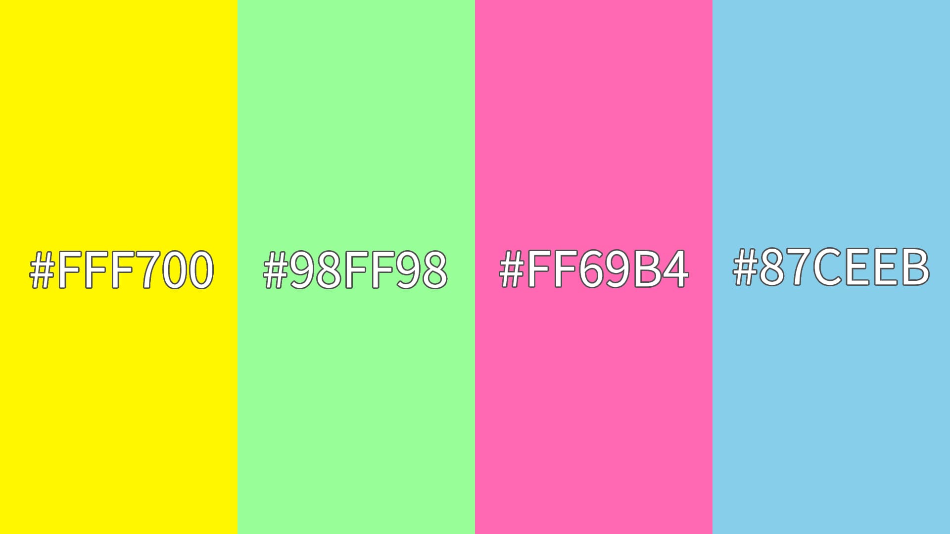
Lemon yellow and sky blue fit the triadic idea and make lively, balanced palettes. These combos feel youthful and upbeat. They're great for kids' products, spring/summer illustrations, or any design that needs to feel optimistic and fun.
Pink + mint green feels fresh like spring. Pink + lemon yellow is warm and sunny — good for bakeries, floral themes, or cheerful branding.
You can change saturation to control how bright the colors feel. That lets you make a palette lively without it being too harsh.
Conclusion
Different pink palettes can create very different moods and looks. As mentioned earlier, pale pink feels soft, while bright pink feels bold and exciting. Once you know the basics of color psychology and pairing, you can pick pink combinations based on a project's tone and your audience's taste.
In design, there are no absolute rules. Try different options and consider the specific context. That will help you find the most suitable and expressive palette so pink can deliver the right visual and emotional impact.
If you want to turn your color ideas into reality faster, a good creative tool can really speed things up. We recommend TourBox — a versatile creative controller made for designers and digital artists.

You can map your commonly used shortcuts and tools to TourBox's physical buttons and knobs. TourBox also has built-in functions that simplify your workflow. With a simple setup, you can start working right away.

When you're handling complex color combos or detailed design tasks, TourBox becomes a reliable helper. It helps your ideas come to life faster and with more accuracy.