What Colors Go Well with Yellow: A Beginner's Guide to Color Harmony
Have you ever noticed how yellow, despite being such a bright and lively color, can easily "miss the mark" in color matching? A slight misstep, and your design might feel either too harsh or out of balance.
But here's the thing: yellow is a hidden gem in design. When paired with the right colors, it can instantly steal the spotlight and create an unforgettable visual impact.
In this article, we'll explore what colors go well with yellow and uncover the secrets to flawless color harmony—helping you take your designs to a whole new level!

In this article, you will learn:
The Color Psychology of Yellow
Yellow is the brightest hue in the color spectrum. Yellow is the go-to choice when you want to brighten up an entire scene. The presence of bright yellow infuses the scene with more energy.
Yellow is also commonly used as an accent color to highlight important information, making it a staple in design.
Because yellow is so bright, it's quite unstable in character and can easily lose its original look with the addition of other colors.
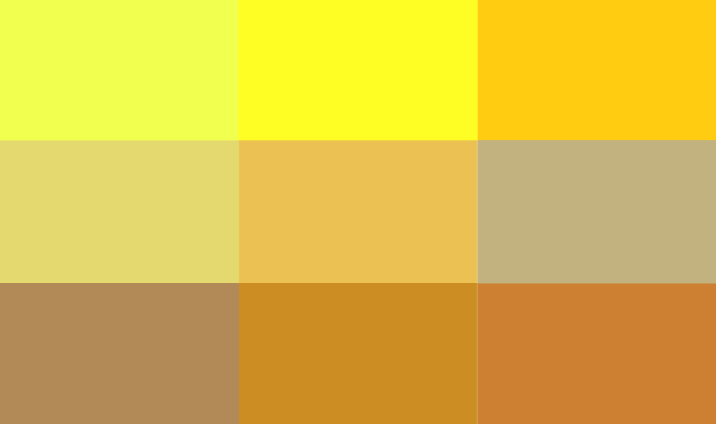
Different shades of yellow convey different emotional tones. For instance, vibrant yellows like Lemon Yellow evoke a lively and cheerful feeling, while darker yellows give off a vintage and nostalgic vibe.
Our use of yellow inevitably needs to delve into its emotional space to better grasp the different charms that various shades of yellow bring.
While people's color associations may differ for various reasons, there is a considerable degree of commonality as well.
Before incorporating a particular color into your work, understanding some color psychology can help you better express the emotions or feelings you want to convey through color in your creations.
Let's take a look at the color psychology of yellow as an example.
1. Sunshine and Hope
Yellow, like the sun, is nature's color of hope, carrying a positive and uplifting energy. It has the power to instantly brighten our mood, making us feel cheerful and joyful.
When a design incorporates bright yellow as the primary color scheme, it effectively portrays a youthful, sunny, and positively energetic image. It's an ideal choice for spreading positive emotions.
2. Trends and Fashion
As a color with striking visual impact, yellow is often seen as a symbol of boldness and avant-garde due to its vivid personality. Its unique boldness makes it unforgettable.
Due to its strong sense of fashion, yellow has become an indispensable element in trendy designs. Whether in avant-garde art, brand marketing, or popular trends, you'll always find a touch of yellow.
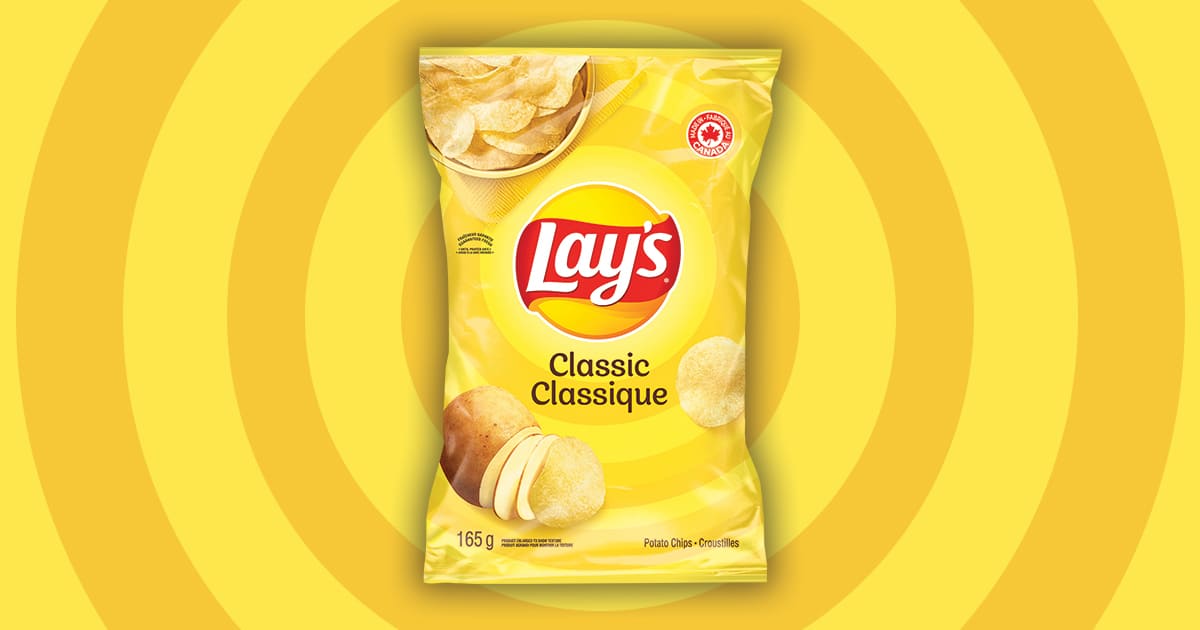
3. Deliciousness and Pleasure
Yellow not only whets the appetite but is also closely linked to many tempting foods like oranges, honey, bread, and cakes.
Moreover, the high brightness of yellow can trigger a slight sense of psychological tension, speeding up decision-making.
This is why many food packages choose yellow as their primary color. It exudes happiness and allure, making it a marketing weapon in the food and beverage industry.
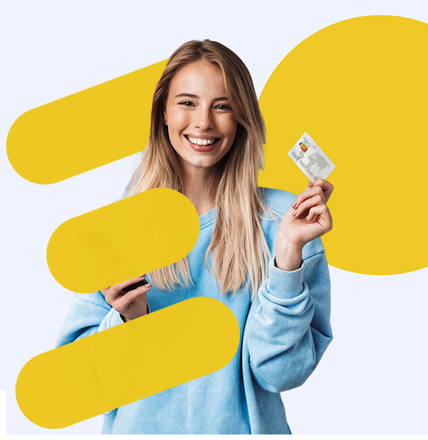
4. Youthfulness and Fun
The vibrant yellow naturally embodies qualities of youthfulness and vitality, effortlessly creating an atmosphere of playfulness, dreaminess, or high energy.
It is particularly suitable for designs that emphasize fun, liveliness, and a relaxed vibe, quickly capturing the attention of younger audiences.
5. Prestige and Splendor
In many cultures, yellow symbolizes nobility and glory. Take, for example, the golden decorations of the Musikverein Wien in Vienna. Here, yellow perfectly embodies a sense of splendor.
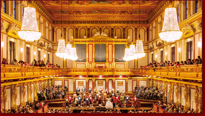
Especially in the form of gold, yellow is synonymous with prestige. It is often used in designs for luxury brands, celebratory events, and upscale settings, imbuing works with an undeniable sense of sophistication.
What Colors Go Well with Yellow?
Having grasped the color psychology of yellow and its rich symbolic meanings in design, we can better understand how to make the most of yellow in combinations.
In this section, let's explore the combinations of yellow with other colors, discovering how clever color pairings can create designs that are both harmonious and visually striking.
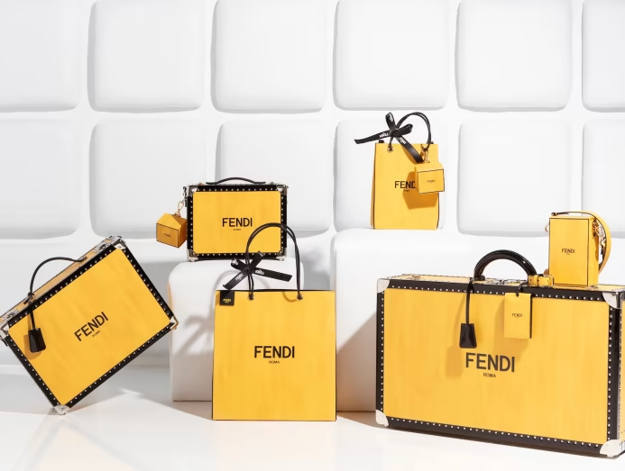
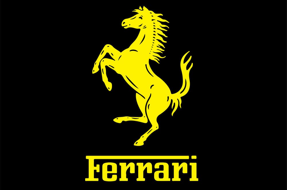
1. Yellow + Black
Yellow and black form a classic high-contrast color pairing. The bright and warm yellow collides with the deep and cool black, creating not only a sharp contrast of light and shadow but also infusing the entire scene with dynamism and visual tension.
This color combination is often used in designs that need to convey power and vitality, such as in sports brands or warning signs, because it can quickly grab the audience's attention while also exuding a firm and rhythmic atmosphere.
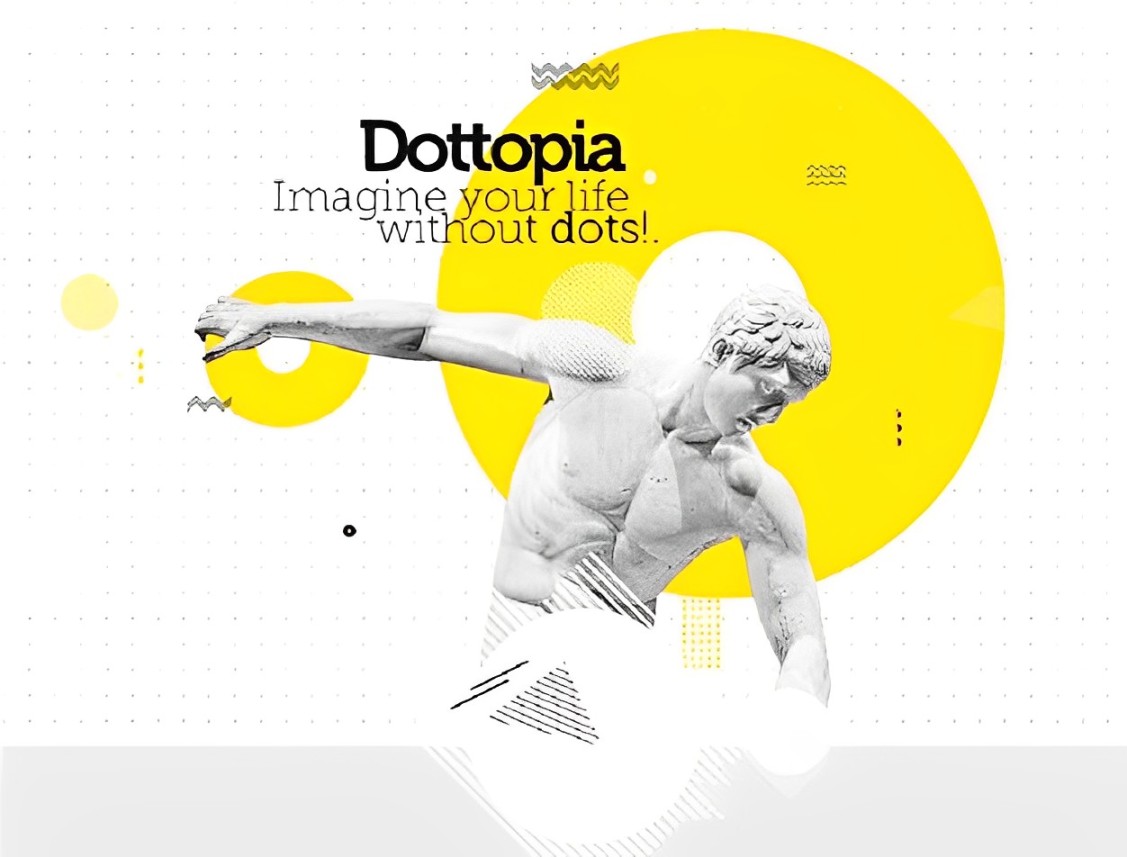
2. Yellow + White
The combination of yellow and white is fresh and bright, creating a clean, transparent visual effect. This pairing evokes images of sunlight streaming through white curtains, imparting a sense of lightness and modernity.
However, due to the high brightness of both colors, the image may appear overly glaring and lack depth.
Therefore, when using this color combination, introducing some darker tones (such as deep gray or light brown) as accent colors can help balance the visual brightness and add a sense of harmony to the composition.
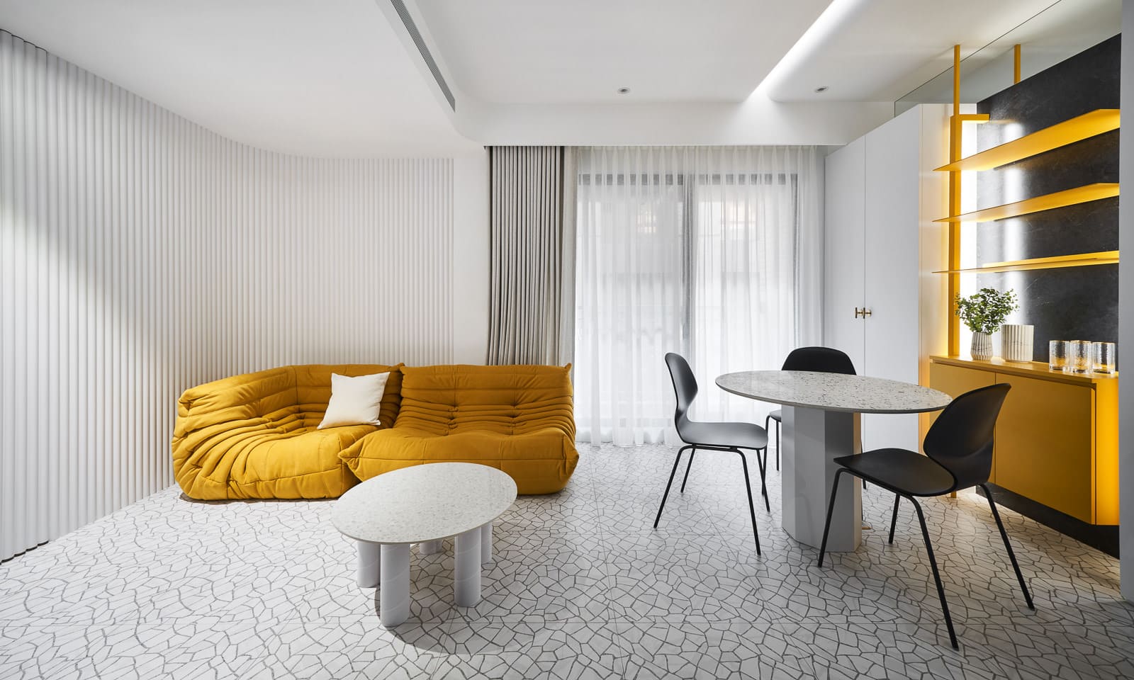
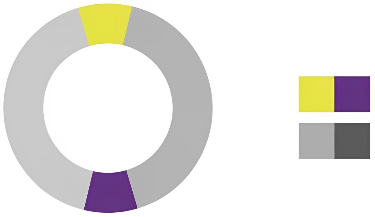
3. Yellow + Gray
Yellow and gray make an elegant and understated pairing. The softness of gray can effectively balance the brightness and boldness of yellow, allowing the composition to retain the liveliness of yellow while adding a touch of composure and restraint.
This combination is ideal for home decor or brand identity design, especially in settings that emphasize a modern and minimalist style.
Gray provides a tranquil backdrop for the composition, while yellow serves as a bright accent. Together, they complement each other, creating a vibrant yet not overpowering visual appeal.
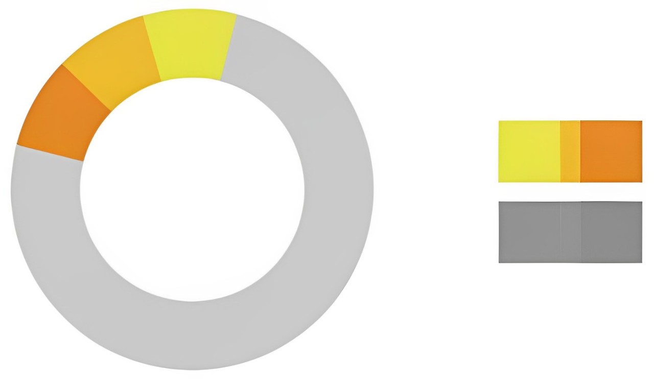
4. Yellow + Orange
The combination of yellow and orange falls within the same color family, creating a relaxed and cheerful atmosphere.
Both colors have high brightness and saturation, and when combined, they exude a vibrant and sunny energy, evoking images of orchards in summer, lively parties, or the joy of a bountiful harvest.
The brightness of yellow complements the warmth of orange, making it suitable for creating a light-hearted, positive design style. This pairing can emphasize vitality in various settings, such as brand packaging or visual representations for festive themes.
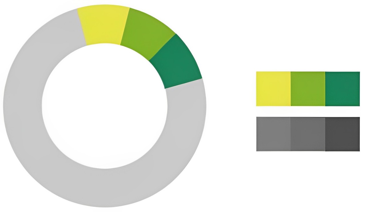
5. Yellow + Green
Yellow and green, positioned next to each other on the color wheel, create a harmonious and lively color combination. The brightness of yellow enhances the freshness of green, while the stability of green helps balance the high energy of yellow.
This pairing is commonly found in nature, from tender shoots basking in sunlight to fields and rice paddies, giving off a healthy and vibrant visual impression.
In design, the combination of yellow and green is well-suited for visual expressions related to environmental themes, health products, or children's goods.
For a more harmonious composition, opt for soft pastel yellow and light green to evoke a warm and natural feeling. On the other hand, combining bright yellow with deep green can convey a modern and energetic vibe.
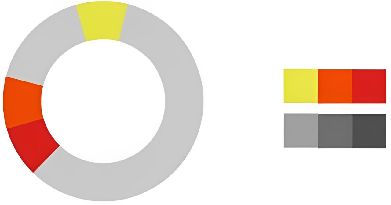
6. Yellow + Red
Yellow and red, both warm colors, create a high-energy and intensely attractive combination. The brightness of yellow and the intensity of red form a striking contrast, infusing the entire composition with passion and dynamism.
This color pairing can quickly capture people's attention, making it popular in designs for product promotions, sports brands, or festive events.
It's important to note that using large areas of yellow and red may lead to visual fatigue. Therefore, in design, you can adjust the proportions or introduce neutral tones like gray or white to maintain a sense of balance and prevent overwhelming the viewer.
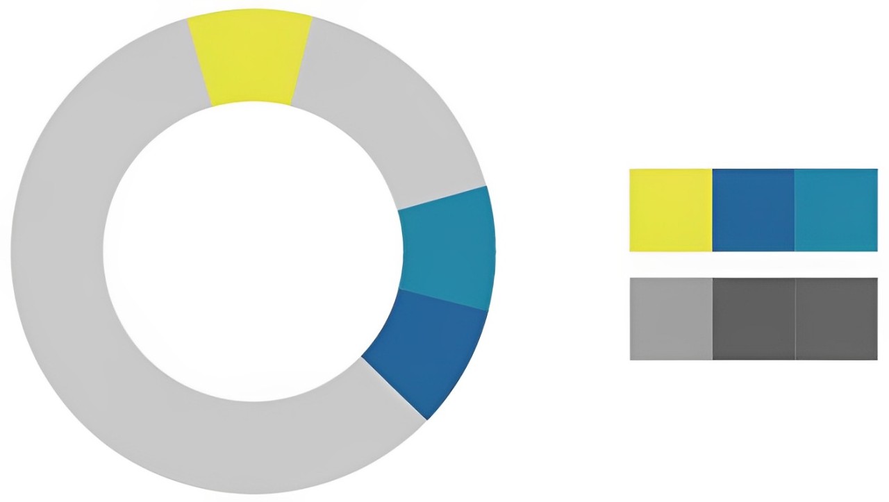
7. Yellow + Blue
Yellow and blue are contrasting colors, positioned 120 degrees apart on the color wheel, creating a sharp visual impact when paired together.
This combination is full of drama. The cheerfulness of yellow contrasts with the calm depth of blue, highlighting each color's characteristics while also complementing one another.
From a psychological perspective, this pairing embodies a contradictory beauty of optimism and serenity, making it ideal for emphasizing creativity or conveying a sense of freedom and exploration in design contexts, such as in technology, travel, or modern art themes.
By adjusting the saturation of blue or the brightness of yellow, you can create a softer or more intense visual effect.
8. Yellow + Purple
Yellow and purple are complementary colors, creating a striking contrast that generates high visual tension.
The brightness of yellow and the mystery of purple form a conflicting beauty, often seen in luxury brands, high-end fashion, and artistic designs, conveying a sense of sophistication and individuality.
Due to the strong contrast between these two colors, it's crucial to pay attention to the color proportions when using them together. You can choose one color as the dominant hue and the other as an accent, or tone down the saturation and brightness of both colors to create a softer effect.
This pairing not only captures attention but also communicates a unique aesthetic style.
Conclusion
Yellow is a vibrant and expressive color in design, known for its ability to showcase endless possibilities through combinations with other colors.
From exploring the color psychology in the first part to delving into what colors go well with yellow in the second part, we have together explored the diverse applications of yellow in design and how color combinations can enhance the visual impact and emotional conveyance of your work.
Of course, there are no strict rules in color pairing, but with keen observation and practice, you can discover the most suitable combinations that allow yellow to truly make your work "shine."
If you want to efficiently bring these color ideas to life, a great design tool can significantly boost your productivity. Here, we'd like to recommend TourBox — a multifunctional creative controller designed specifically for designers and digital artists.
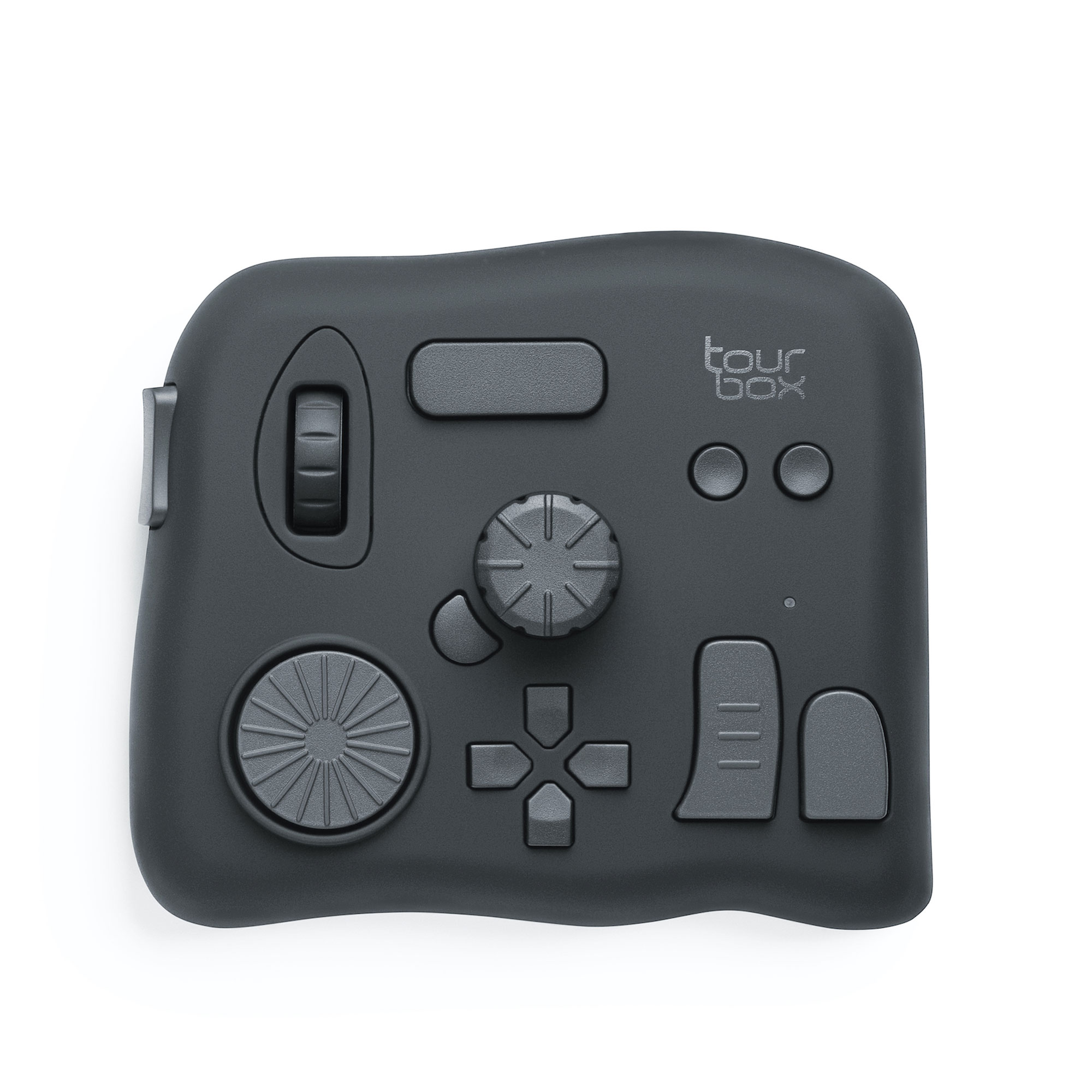
It helps you swiftly adjust colors, precisely control brush settings, and even customize shortcuts to optimize your workflow.
When dealing with intricate color combinations and complex design tasks, TourBox becomes your reliable assistant, enabling your inspirations to materialize more quickly and accurately.

We hope this article not only sparks your color inspiration but also makes your design process more efficient and enjoyable!