What Colors Make Pink: A Simple Guide
Pink is widely used in digital art and design. For example, interior design, fashion, and UI color schemes often use pink to create a soft, dreamy atmosphere. In recent years, the "Millennial Pink" trend has made these gentle pink tones a popular color. For example, Pantone named pink tones as the Color of the Year in both 2016 and 2017.
In this article, we'll explore what colors make pink and the psychological and cultural meanings related to pink.

In this article, you will learn:
What Colors Make Pink?
Pink is essentially a light red. It's made by mixing red and white. So pink is a warm color, not a cool one.
You can simply think of pink as a lighter version of red — it's just expressed differently in additive and subtractive color systems.
In RGB (additive) mode, the pink you see on a screen can be thought of as mixing red with white light (white means all three RGB channels at full). But that doesn't mean you literally set pure red and pure white to maximum and add them — doing that would overflow or just turn white.
Instead, you move the red toward white (dilute it) by adding green and blue. In other words, you increase the green and blue components on top of the red so the color becomes lighter and less saturated, which appears as pink.
For example, the web-standard pink #FFC0CB has RGB values (255, 192, 203) — that is 100% red, 75% green, and 80% blue. This produces a soft pink.

In CMYK (subtractive) mode for printing, pink is usually made with 0% cyan, 25% magenta, 20% yellow, and 0% black (mainly magenta with a little yellow, plus the white of the paper).
If you mix paint, the simplest way to get pink is to add red pigment to white to make the red lighter.
If you want to make pink in image software, adjust hue, saturation, and lightness. Generally, move the hue toward the red area (near 350°), increase lightness, and keep saturation fairly high to get a vivid pink. If the hue moves away from red or you lower the saturation, the pink will look dull or muddy.
Of course, using the eyedropper tool to sample an existing pink is the easiest way in image software. If you need precise color for a project, use a color swatch as a reference and then adjust saturation and lightness as needed.
Common pink samples are #FFB6C1 (RGB 255,182,193), #FFC0CB (RGB 255,192,203), and #FF69B4 (RGB 255,105,180). In Photoshop or Procreate, you can type these RGB/Hex values directly, or start with pure red and drag toward a lighter, whiter area to get different pinks.
The Color Psychology of Pink
Pink is often associated with gentle, romantic feelings. Studies show pink can soothe emotions, lower anxiety, and reduce aggression, making people feel calm and relaxed. Pink is also commonly linked with youth and femininity, and it stands for warmth, care, and hope.
Because of this, pink is often used to express themes like love, sweetness, or positive energy. Among different shades, pale pink usually feels soft and sweet, while deeper or brighter pinks feel more intense and lively.
Digital artists and designers can pick pink tones based on the mood they want. For example, use soft pale pink for a romantic, dreamy scene, or use high-saturation pink to boost visual impact.
The Cultural Meaning of Pink
No color carries as complex a set of meanings as pink. Pink is often seen as sincere, gentle, and feminine. In commercialization, it has been used on almost every product meant for women. From birth, girls are tied to pink. That first cry can make people think: pink equals girl, and girl equals pink.
But pink was not always only for women. In 18th– and 19th-century Europe, pink was viewed as a color for male aristocrats, a sign of courage and strength. It wasn't until the mid-20th century, when the idea "pink for girls, blue for boys" became common, that pink slowly became linked with girls and young women.
Pink is so closely linked to female roles that the color picked up the same stereotypes: childish, shallow, not authoritative, and not serious. People instinctively pair pink with women. At the same time, many women grow tired of pink. After being bombarded with pink in childhood, many develop some resistance to it — to look strong, they stop wearing pink.
Color consultants often tell women entering the workforce to avoid pink in government, finance, or negotiation settings, because wearing pink may keep them from being taken seriously. Men often avoid pink because they fear they will "look like a girl." Pink thus became a social pressure for women and helped create a widespread aversion to the color.
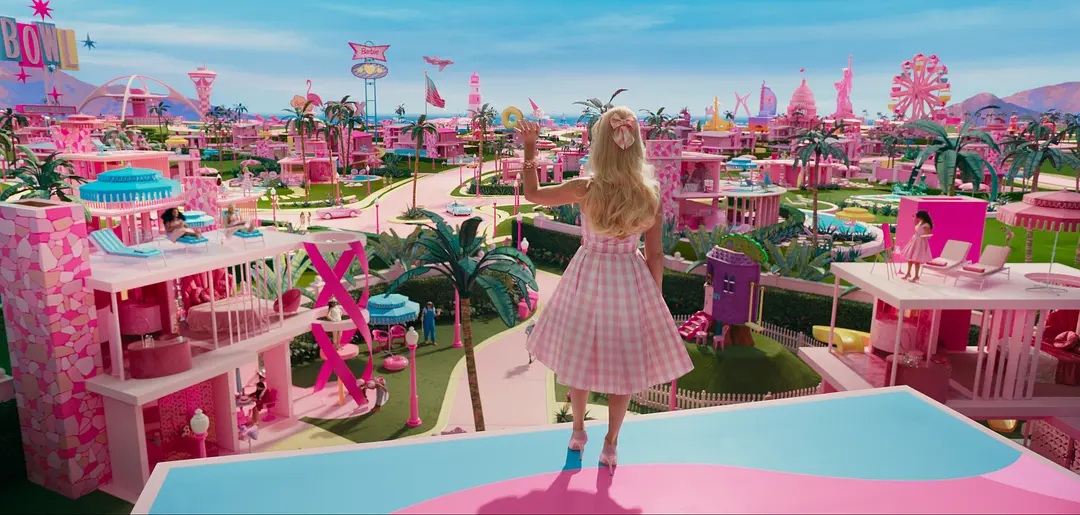
But when the movie Barbie came out, people's view of pink seemed to turn quickly. A global wave of embracing pink swept across cultures. Men and women, sports brands and everyday products — choosing pink suddenly became a way to show confidence and strength.
In modern design, pink is actually used in many different ways. In fashion, there is the soft, understated Millennial Pink. In street art and pop culture, bright neon pink creates a strong visual impact. Many designers have also given pink a rebellious meaning, with ideas like "Pink Is Punk" that show pink can be edgy and avant-garde.
In short, from romantic and gentle to bold and loud, pink plays many roles in contemporary design. Creators can use different pink tones to express a wide range of feelings and ideas.
Conclusion
In this article, we have explained what colors make pink and explored pink's meanings in color psychology and culture. In your creative or design projects, you might consider adding some pink — a color that's gentle and romantic, with a touch of rebellion.

Finally, we'd like to recommend TourBox, a controller loved by creative professionals. No matter which creative software you use, you can map shortcuts and tools to TourBox's physical buttons and knobs — like using a game controller to play a video game. It makes your workflow faster and simpler.

TourBox is easy to learn and comes with many built-in features that make customization simple. If you're interested, take a look.