What Is Minimalist Design: A Simple Guide
Have you heard of the minimalist design style? In web, brand, and UI design, minimalism is a very popular style. Adobe also named "bold minimalism" one of the key design trends for 2025.
So, what is minimalist design? What are its main features? And how can you use this style in real design projects? Let's take a closer look in this article.

In this article, you will learn:
- What Is Minimalist Design?
- Key Characteristics of Minimalist Design
- Core Tips for Minimalist Design
- Conclusion
What Is Minimalist Design?
John Pawson, a well-known British architect and spatial designer, once defined minimalism as this: the perfect feeling that comes from reducing a work to its very lowest form. When every part of an object, every detail, and every connection is compressed down to what matters most, it gains this quality. In other words, it is the result of removing everything that is not essential.
That may sound complicated and hard to understand, so let us put it in simpler words: minimalist design uses the fewest elements to create the strongest visual impact and emotional effect.
It is not just about removing unnecessary elements. It is about careful choices and smart placement so that every element does its job as well as possible.
Minimalism emerged in the 1960s and became one of the major movements in modern art in the 20th century. Its design follows the idea that "less is more." It has had a deep influence on many creative fields, including architecture, interior design, fashion, and painting.
Modern life moves fast and puts a lot of pressure on people. At the same time, we are flooded with endless bits of information. This makes many people feel more and more anxious. People want peace of mind, relief from stress, and a break from visual fatigue.
Minimalism fits these needs well with its practical, clean, simple, easy-to-understand, and elegant style. That is why it quickly became popular and widely loved.
For example, the Nordic style, flat design, and the Japanese "danshari" lifestyle that many people admire today are all rooted in minimalism.
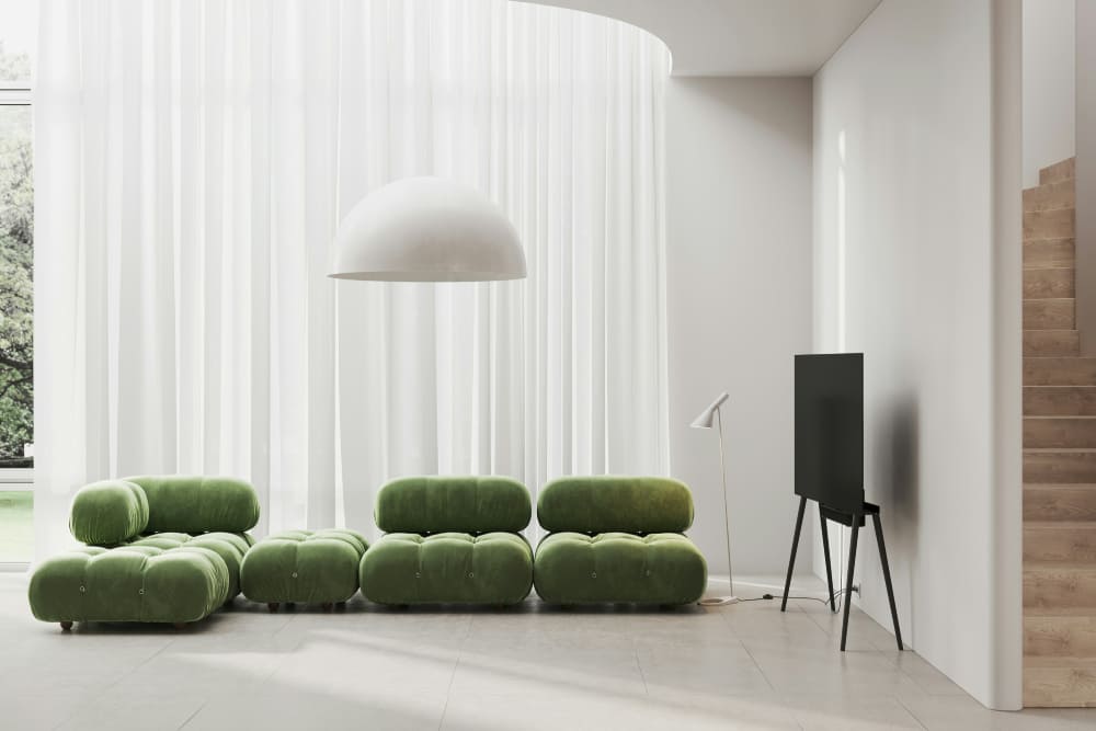
Even though minimalist design is known for being simple, it is not about stripping design down at random. It is really about finding the right balance between form and function.
In other words, while meeting the needs of the design, you remove unnecessary decoration and use clean, smooth shapes. This gives the design a sense of elegance and purity, reduces mental effort for the user, and makes it easier to use and enjoy.
As famous designer Dieter Rams said, “Less, but better.” That idea is also at the heart of minimalist design. The goal is to create a better user experience through simplicity.
To do that, minimalist design is not just about removing elements. It is about making clear, exact choices about function. So behind the clean surface of minimalist design, there is often a very careful and complex design process.
Apple is a good example of this approach. Its products use simple colors, clean shapes, and clear functions. They all look light, thin, strong, and powerful.
Behind that simple look, though, there are many carefully designed systems and features. Apple's products look simple, and they are easy to use. That is exactly what minimalist design is all about.

Key Characteristics of Minimalist Design
- Function first: Be clear about what the design is for, then decide the form.
- User-focused: The design should not only look good, but also be easy to use and match how people naturally interact.
- Limited colors: Use fewer colors and keep the overall look clean, controlled, and consistent.
- Simple shapes: Use basic lines and geometric forms, and remove extra decoration.
- Use white space: Let empty space highlight the key points and make the layout feel more open and natural.
- Clear typography: Text should be easy to read and direct. Avoid overly complex fonts.
Core Tips for Minimalist Design
In ads, posters, websites, and many other design settings, minimalism can create a clean, elegant, and powerful look. So, how do you create a minimalist style in graphic or UI design? Or, more simply, what are the key techniques of minimalism? Let's take a look at this section.
1. Cut Out Unnecessary Elements
The first rule of minimal design is to remove anything extra and keep only the essentials. That does not mean the design should feel empty. It means getting rid of details and decorations that do not add value, so the design feels cleaner and more direct.
- Avoid visual clutter: every element should support the overall design. Remove anything that does not help, such as extra graphics, text, or colors.
- Keep the focus clear: by removing what is unnecessary, you can guide the viewer's attention to the main message or theme.
When you are designing, ask yourself whether each new element makes the design better. If it does not, remove it.
2. Improve Interaction and User Experience
In website and app design, minimalism is not just about looking clean. It can also make the experience smoother and easier to use. A simple, clear interface helps people interact with it more naturally.
- Easy navigation: simplify menus and avoid too many choices so users can find what they need faster.
- Simple actions: avoid complicated interactions and keep the flow clear and easy to follow.
In UI design, minimalism helps users find the most important features in less time, which improves the overall experience.

3. Use White Space Well
White space is one of the most important tools in minimalist design. It is not just empty space. It gives the design room to breathe and helps the viewer rest their eyes, so they can focus better on the important parts. It also adds depth and makes the message clearer.
- Creates balance: enough white space can make a design feel more balanced and orderly.
- Highlights key content: white space helps the most important part stand out.
White space is not just about leaving areas blank. It is about using space in the right way, with the right size, position, and relationship to other elements.
4. Keep Brand Consistency
For brand design, minimalism can improve recognition and create a more professional look. It helps show the brand's core value more clearly.
- Keep colors and fonts consistent: make sure the colors and typefaces match your brand style so people can recognize it more easily.
- Use a simple brand mark: many successful brands use minimalist logos because they are easier to remember and identify.
In minimalist design, brand consistency matters. Every design element should help communicate the brand's core value clearly.
5. Simple Color Palettes
In minimalist design, color should be used with care. A simple color palette often creates a stronger visual impact. Too many colors can make a design feel messy, so minimalist work usually uses one or two main colors.
- One main tone: Use a single tone or colors from the same color family to keep the design visually consistent and avoid distraction.
- Classic black, white, and gray: Black, white, and gray are the most common colors in minimalist design. They help the main elements stand out and keep color from pulling attention away.
- Small accent colors: Sometimes, a small accent color like gold or red can add a nice highlight. It makes the design feel more layered and more interesting.
In minimalist design, color is usually reduced to a few basic choices. The goal is not to use more color, but to use limited color in a smarter way to create a stronger look.
Minimalism is not just about leaving things blank. It is about removing the extra parts and using simple combinations to say more with less. Whether it is layout, color, shapes, or small details, minimalist design asks the designer to make things simpler, but also more refined.
6. Choose Fonts and Layout Carefully
Typography is one of the most important parts of minimalist design. Too many font styles, or a layout that feels inconsistent, can ruin the clean look. In minimalist design, both font choice and layout should stay simple, clear, and easy to read.
- Keep the font style consistent: Minimalist design usually uses one or two fonts and keeps the style consistent. Common choices include clean sans-serif fonts like Helvetica or Arial, or simple serif fonts like Georgia.
- Create a clear visual order: You can adjust letter spacing, line spacing, and font weight to build a clear sense of hierarchy. This helps people see the most important information right away.
- Avoid too much decoration: Minimalist layouts usually stay away from heavy styling, such as shadows or italics. Instead, they share information in a direct and simple way.
Keep the layout neat and organized, and make sure the message is easy to follow. If possible, let the text become part of the design itself, so every word and every line feels intentional and meaningful.
7. Focus on the Main Message
In minimalist design, the most important thing is to know the main goal of the design and build everything around it. Every element should support that core message, so the idea comes through quickly and clearly.
- Make the message clear: Every part of the design should help support the main message. Avoid extra elements or overly complex visuals.
- Use less text: Keep the copy as short as possible. Simplify the message so it is easier to read and understand.
- Keep the visuals simple: Every image and design element should serve the main theme. Leave out anything that does not add value.
Before you start designing, make sure you know exactly what you want to say. Then build around that idea and remove everything that is not needed.
8. Simplify Shapes and Images
In minimalist design, images and graphics should be clear and simple. They do not need to be flashy or overly detailed. Clean visuals can make the design feel more refined and professional.
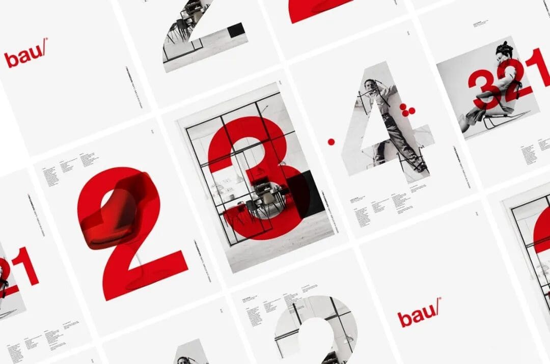
- Geometric shapes: Minimalist design often uses simple shapes like circles, squares, and triangles to communicate ideas. These shapes make the design look clean, modern, and easy to recognize.
- Simple illustrations or photos: Choose images with clean composition, and avoid too much editing or decoration. The image should support the main message, not pull attention away from it.
When you use images, make sure they match the overall style and theme of the design. Avoid anything that adds unnecessary complexity.
9. Careful Use of Proportion and Contrast
In minimalist design, proportion and contrast matter a lot. By adjusting the size relationship between elements and using contrast well, you can create a design that feels strong and visually engaging.
- Control the proportions: Make sure the elements have a balanced size relationship. This helps the design feel more stable and also makes the most important parts stand out.
- Use color contrast: Minimalist design often uses strong contrast, like black and white or dark and light, to highlight key points and improve the visual effect.
Using ideas like the golden ratio can also help. When proportions and contrast are planned carefully, the whole design feels more balanced and more attractive.
Conclusion
Although minimalism has been around for a long time, it still has a strong impact on design and remains one of the main trends. It is still evolving today. It is no longer just about making things "less." It now puts more emphasis on clear information, visual order, and a better user experience.
Many brands and design projects now build on minimalism by adding bolder colors, more flexible layouts, and even a few subtle personal touches. This keeps the design clean while still making it stand out.
So when you use a minimalist style in your own project, do not follow the rules too rigidly. Try adding some of your own ideas so the final work feels more distinctive.
Finally, we would like to recommend TourBox, a tool that can greatly improve your design workflow. You can map your most used shortcuts and functions from your design software to TourBox's physical buttons and dials.

That means you do not need to remember complex shortcuts anymore, and you do not need to keep reaching for the mouse to open tools or adjust settings. With TourBox, you can do all kinds of tasks easily with just one hand.

For designers who work long hours or need to stay creative all the time, TourBox can really improve the workflow, speed up the creative process, and help raise the quality of the final work. If you are interested in TourBox, click our link to learn more.