Pantone Color Unveiled: Essentials & Usage
Ever nodded along when someone raves about the "Pantone Color of the Year," while secretly thinking: "What the heck is a Pantone Color anyway?"
In this article, let's talk about this name you hear so much in design, fashion, and everyday life.

In this article, you will learn:
- What Is Pantone Color?
- Why Is Pantone So Important?
- What Is the Pantone Color of the Year?
- How to Use Pantone Colors?
What Is Pantone Color?
Pantone is a company that started in 1963 and specializes in standardizing colors. They're even nicknamed the "Color Empire."
Their most famous creation is the Pantone Matching System (PMS).
Simply put, Pantone organizes colors into groups and gives each a unique number. This way, no matter where you are or what material or device you use, the colors will look the same. It helps avoid the problem of images or products not matching what you expect.
We all know that the same red can look different on your TV, my phone, or an office printer.
Because everyone sees color a bit differently, colors can look different when designers, manufacturers, retailers, and clients talk about them. They might use different tools or methods, which can change how a color appears.
Thanks to the Pantone system, everyone can match colors using the same standard. That's the real value of Pantone: making color consistent everywhere.
So, how does Pantone standardize colors?
Pantone created uniform color guides for various industries. Each color is given a unique number. This means that if everyone uses the same Pantone number, the color will match as closely as possible.
By doing this, Pantone has become a leader in the world of color and now has the power to influence popular colors around the globe.
Why Is Pantone So Important?
Simply put, Pantone acts as a universal language for designers. Whether you work in graphic design, interior decorating, or fashion, Pantone is the bridge that helps you avoid miscommunication with manufacturers.
Imagine this: You're a designer who creates a product with a dominant purple color for a client. But when it reaches the factory, the color comes out as bright Barbie pink! That would be a disaster.
With Pantone color, you can simply specify a Pantone number, and the factory can match that perfect purple. This avoids any embarrassing mistakes.
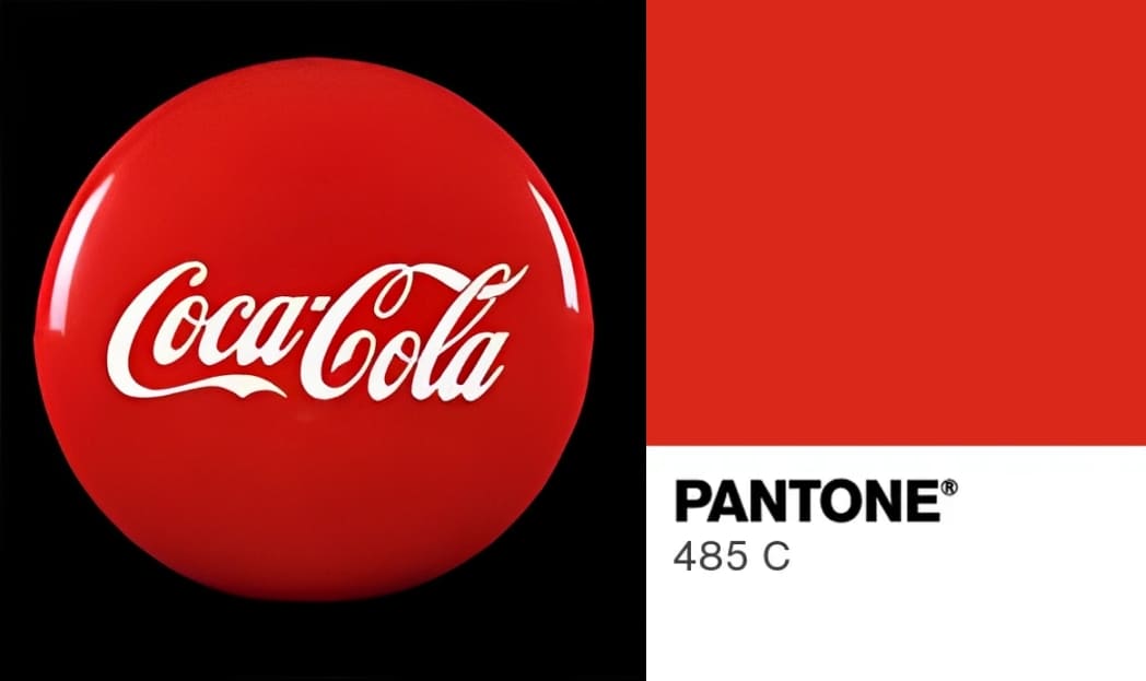
Even though Pantone color sounds very technical, it has long been a part of our everyday lives, subtly influencing us. For example, familiar colors like Coca-Cola red, Starbucks green, and Tiffany blue are all part of the Pantone system.
By using Pantone, colors remain consistent no matter the printing, lighting, or screen display differences, keeping a brand's look steady. In fact, you encounter Pantone colors every day without even noticing.
Plus, every year, Pantone unveils a "Color of the Year," setting the trend for design, fashion, and home decor.
What Is the Pantone Color of the Year?
When we talk about Pantone, we can't ignore their annual "Color of the Year."
Every year at the end of December, Pantone studies global trends, politics, the economy, and culture to pick one color for the coming year.
This color influences not just fashion and home decor but also tech, film, and more.
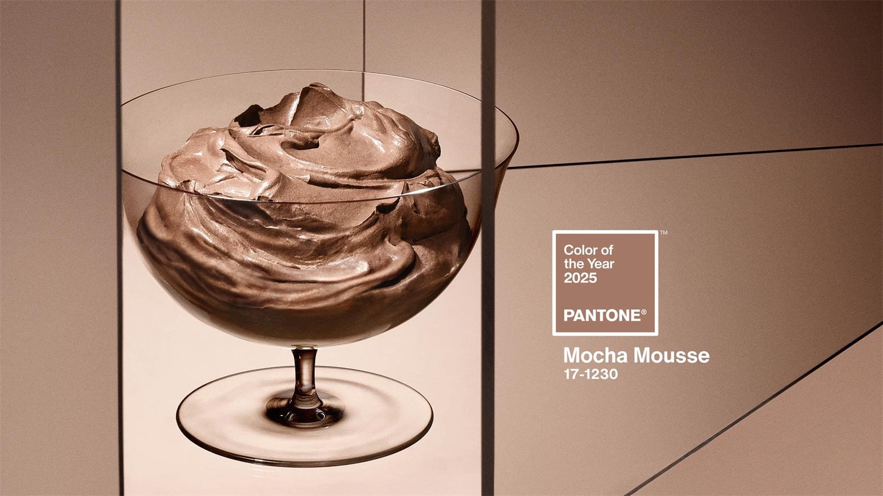
For example, the Color of the Year for 2025 is Mocha Mousse. It's a warm, deep brown with a hint of gray that feels both steady and elegant.
Further Reading:
Once the color is announced, many fashion and home brands quickly launch products in that shade. It's like a big style test. When you know the color, keep an eye out — you might see it pop up in lots of designs.
You might wonder: who picks the Color of the Year? Are there color fairies working at Pantone? Well, not exactly. They have a talented team of color experts.
Every year, these experts travel the world, watching trends in different places. They get inspiration from fashion, movies, travel, and even tech products. After many discussions, they select a color that they believe will lead future trends.
This choice isn't random — it's a careful look at what's coming next.
How to Use Pantone Colors?
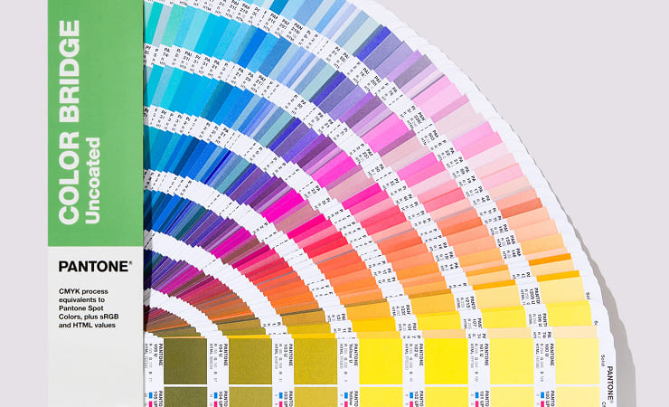
The easiest way is to use the Pantone Color Guides sold by Pantone (see image below).
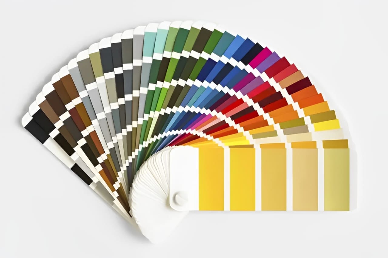
The downside is that these guides aren't cheap. However, because Pantone uses a standardized system that is updated only occasionally, the guides stay accurate for many years.
These guides are very useful for graphic design, product design, and fashion or textile design.
Besides buying the Pantone Color Guides, you can also find Pantone colors in Photoshop. If you use an older version of Photoshop, open the Color Picker and click on the Color Library to see the Pantone options.
But starting in November 2022, Adobe Photoshop, InDesign, and Illustrator no longer offer free access to the Pantone color libraries. The reason is that both companies couldn't reach an agreement.
Pantone felt that Adobe's preset Pantone libraries were too outdated and did not keep up with the official updates, leading to inaccurate colors. They wanted to manage the colors themselves. Adobe said that Pantone's request was driven by their desire to charge customers directly.
If you really need the official Pantone Color Guides in Adobe software, you can install the Adobe Pantone Connect plugin from Adobe Exchange.
The Adobe Pantone Connect plugin is free to download and install, but the full Pantone library isn't free. Usually, you get a 30-day trial. After that, you must subscribe to use all the features.
It costs $15 per month or $90 per year for a Pantone license subscription.
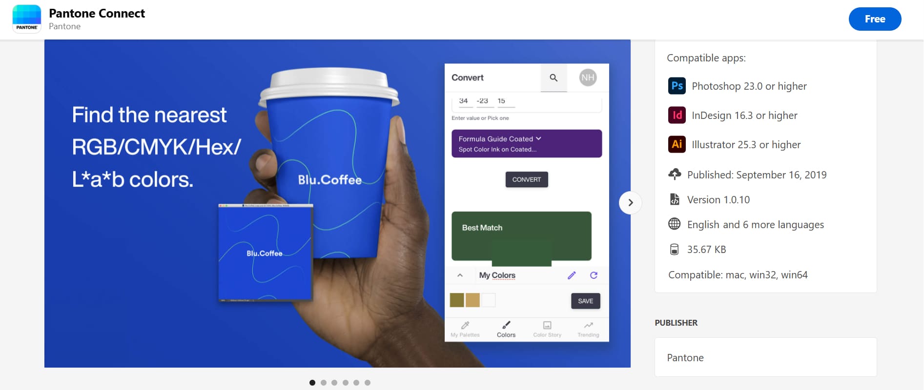
When you check out the plugin's download page, you'll notice its ratings are very low. One review even asks, "Why pay $90 just to pick a color?"
Intellectual property is in an interesting phase right now. Owners are shifting from charging for physical products to digital ones, meaning users now pay for services that used to be free.
So, if your design project doesn't require super precise color matching, there's no need to strictly stick to the Pantone guides. Even the Color of the Year only makes a splash when it's first announced before gradually fading from view.
In design, colors shouldn't be trapped by rigid rules. They are a way to express creativity and emotion. For projects where perfect color accuracy isn't critical, sticking too closely to Pantone guides can limit your creative freedom.
The true beauty of color is that we can give each shade its own life and feeling based on our own instincts. In this process, having a tool that makes adjusting colors both precise and fun is key.
TourBox is exactly that tool, built for creative professionals. It speeds up your work and lets you feel free and lively with every color tweak.

Choosing TourBox means choosing a more flexible and personal approach to design, letting color be the bridge to express your inner world.

Are Pantone colors completely useless? Of course not. Besides, when you need a perfect color match, you can use Pantone colors to try new ideas.
For example, you might use the Color of the Year as inspiration or pick a favorite shade from the Pantone guides. Who knows? That color might spark an idea that leads to an amazing design.