Why Is Labubu So Popular: Insights for Designers and Artists
Recently, in a shopping mall in London, a few big scalpers fought over LABUBU dolls. Videos of the brawl blew up on social media.
After that, the toy's maker and seller, China's trendy toy company Pop Mart, said they would pause LABUBU sales in the UK. They explained that lines had stretched up to five hours, and safety was at risk.
For a month now, LABUBU has been sweeping the global trend scene like a virus. As the newest top hit in the collectible toy world, why is this sharp-toothed, ugly-cute elf doll so popular? Let's take a look at it from a design perspective.

In this article, you will learn:
- What Is Labubu?
- The Making of Labubu: A Design Timeline
- Why Is Labubu So Popular: Insights for Designers and Artists
- Conclusion
What Is Labubu?
You might not know the name Labubu, but you've probably seen this little guy somewhere.
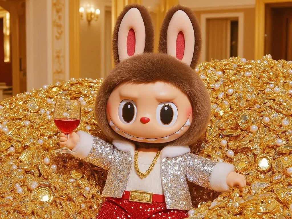
She has long, pointy ears and a chubby, round face. When she smiles, you see a row of sharp teeth — kind of mischievous, yet still cute. That mix of spooky and sweet is exactly what makes him so addictive to look at.
In fact, "playful contradiction" could be Labubu's trademark.
Labubu was created by Kasing Lung, a Belgian artist born in Hong Kong. In 2015, inspired by Nordic myths, he started a series called "The Monsters." Labubu first appeared in Kasing Lung's picture book.
Labubu was the artist's very first character, so she has a special place in Kasing's heart. At first, Kasing saw Labubu as weird and unfriendly. But over time, through life changes and new experiences, Labubu has grown on him. Now, Kasing sees Labubu as both cute and grounded, and her look has softened a bit from the early days.
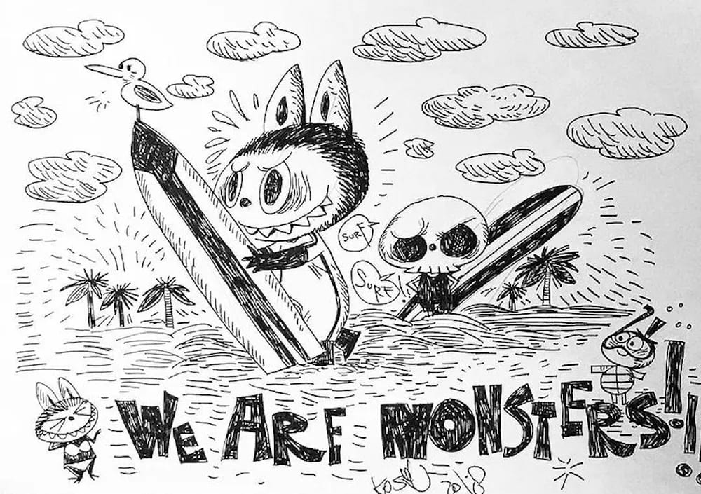
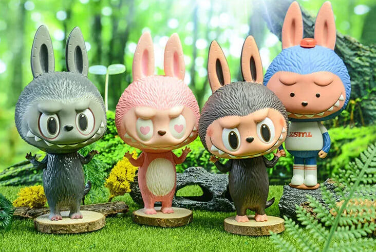
The Monsters are a mysterious tribe living deep in a Nordic forest. Besides Labubu, there's Zimomo, who protects and leads the group; Tycoco, the skull-headed friend; Mokoko; Spooky; Pippo; and even a Monster Boy who loves chasing Labubu.

It's less like Kasing just designed Labubu and more like Labubu became a way for him to express his own feelings.
That hidden, heartfelt side of Labubu has a special kind of healing power. It touches fans all over the world and lets them find their own joy and innocence in Labubu's world.
In 2019, Kasing signed an exclusive deal with the Chinese toy company Pop Mart. They made The Monsters into an official IP and launched lots of products.
The Making of Labubu: A Design Timeline
We don't need to belabor how big Labubu is right now. Fashion insiders and celebrities love Labubu, and that pushed it into the mainstream. Today, it's a household name in the world of style.
But Labubu's craze isn't just about social-media buzz. It lit a fire under the market, too. A report from J.P. Morgan shows Labubu is speeding toward "super-IP" status. In May, global searches for Labubu even passed Hello Kitty.
There are many marketing and product reasons for Labubu's rise. But let's talk design.
If we look back at Labubu's design history, we see it wasn't an overnight miracle. So what design moves did Labubu make?
1. Initial Prototype: Starting the Style
Labubu's first spark came from artist Kasing Lung's 2015 picture book. It showed a tribe of elves living in a forest.
They had big eyes, pointy ears, and nine sharp teeth. They were part naughty, part kind. The look was all black-and-white lines and wild strokes.
In 2019, Pop Mart teamed up with Kasing Lung for the first Labubu blind box: the Little Monsters Mini Series 1.
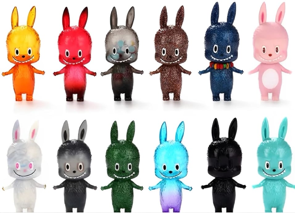
This early Labubu had a square face, narrow eyes, and a sly, slightly creepy vibe. Its facial features were neatly spaced, and its body was slim and tall. Overall, it still felt "ugly-cute."
At a time when blind-box fans wanted super-cute and polished designs, this Labubu stood out — some even said it was a little scary.
2. Transition Phase: Moving to a Mass-Appeal Style
In 2020, Labubu's Mini Series 3 brought the first design change. It marked the shift from niche "ugly-cute" to broad "quirky-cute."
Colors got much brighter, with soft pastels that felt fresh and dreamy.
The face went from square to round. The eyes grew big and circular. The expression turned from sly to silly-cute. Features were exaggerated to fill the whole face.
The body became shorter, more cartoonish, and way friendlier. By this point, Labubu's signature look was basically locked in.
3. Mainstream Stage: Becoming a Fashion Accessory
After Mini Series 3, Labubu's face stayed mostly the same. But the real jump from collectible to mass-hit came from materials and product forms.
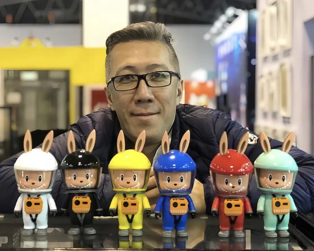
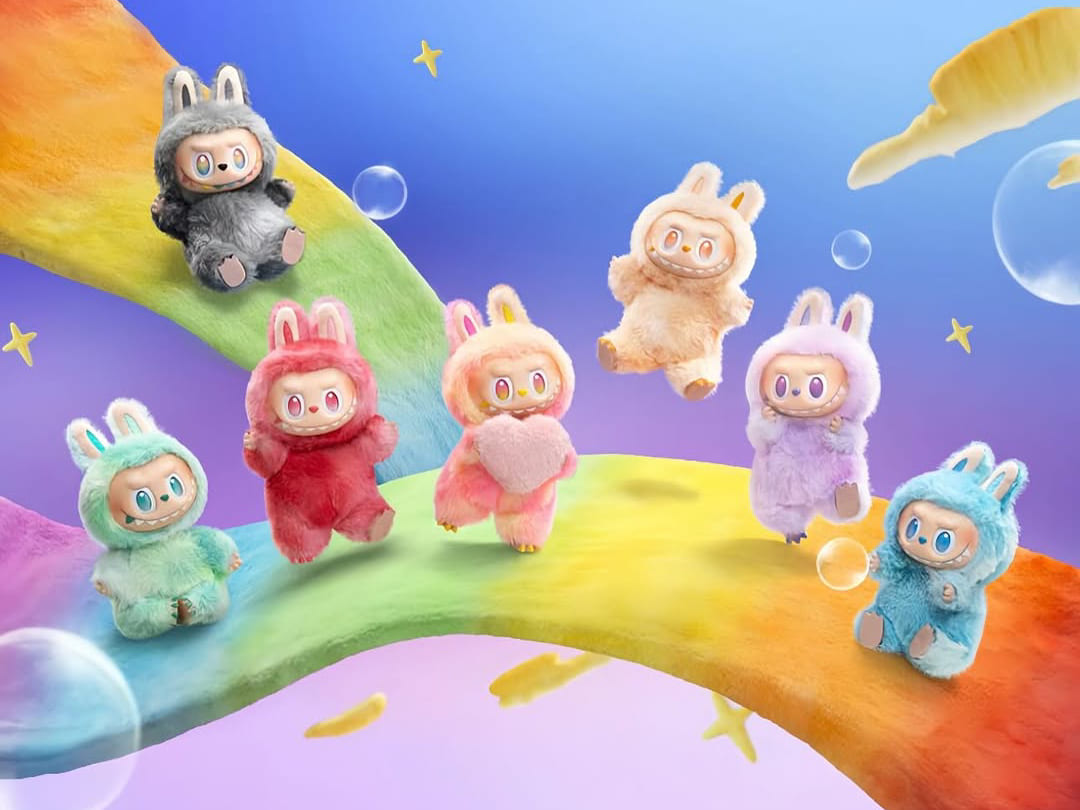
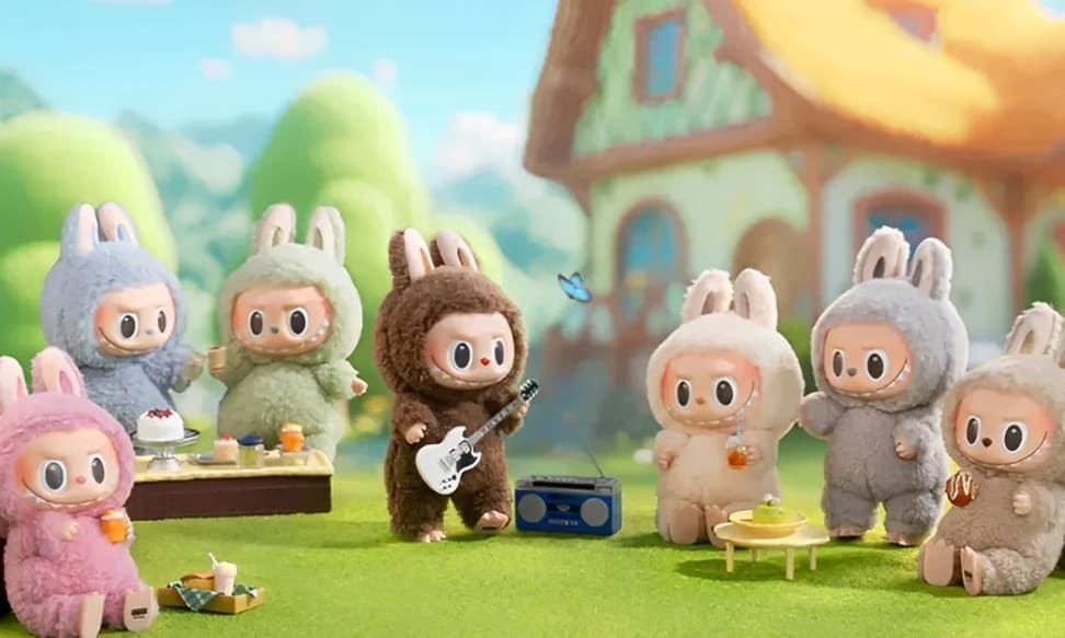
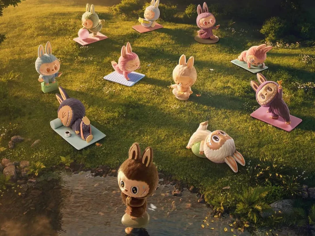
Labubu moved beyond vinyl figures into plush-and-vinyl combos. It also showed up as charms and keychains. No longer just shelf décor, Labubu joined young people's daily outfits and bags.
At the same time, Labubu got more story scenes and action poses. This added depth and personality, making the character feel more alive.
The features also got more balanced. Early exaggeration was toned down. The body rounded out like a baby, soft and approachable.
Color choices went even dreamier, with lots of macaron-style palettes. This pushed the "soft + cute" vibe all the way home.
Why Is Labubu So Popular: Insights for Designers and Artists
For designers and artists, Labubu's popularity offers plenty of takeaways.
1. Find the Visual Balance Point
Labubu's first look was a bit "weird." It had pointy teeth, big ears, a goofy grin, and monkey-like limbs — classic monster traits.
As it evolved, its eyes got bigger, its shapes got rounder, and its colors turned soft and pink. The only monster detail left? Those nine pointy teeth.
This is exactly why Labubu's design is so appealing. If it's too cute, it feels ordinary and bland. If it's too ugly, people will turn away.
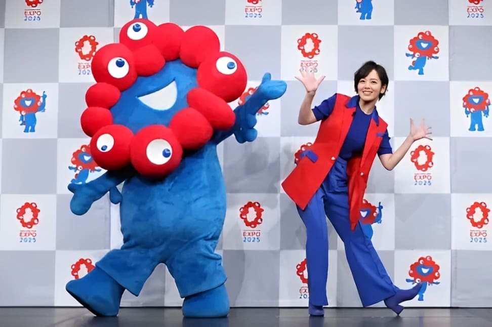
Take the 2025 Osaka Expo mascot — also "ugly-cute." Its bold style drew attention but also lots of hate online.
Labubu's smart move was balance. The sharp teeth give it a unique edge. The big eyes, round face, and plush feel make it friendly. Roughly 80% cute + 20% weird hits the sweet spot of what people like.
If you want to create a character that makes people stop and stare, yet doesn't slip into the same old cute template, an "ugly-cute" design approach like Labubu's is a great choice.
Of course, you'll need to test and tweak to find your own "ugly" vs "cute" balance.
2. Respect Popular Taste
Lots of designers fall into a trap: believing that a design or character they love, even if most people don't, must be great art.
But Labubu wasn't an instant hit. It took ten years, from the first sketches in 2015 to today, to win over the masses. Along the way, its look was refined again and again.
If you're creating for a broad audience, you have to respect what they like. Your work can be unique, but the best creations are the ones people actually enjoy.
3. Stick to Your Passion
Compared to Labubu's fame, its creator, Kasing Lung spent 30 years in the shadows.
Born in Hong Kong in 1972, Kasing Lung moved to the Netherlands with his family when he was six. He didn't know the language or culture and felt lost. So he picked up a paintbrush and made his own world.
But Europe's art scene was tough on newcomers. Publishers rejected him again and again. His big break came when he entered a European picture-book contest and won gold with his Nordic-elf–inspired work. He was the first Chinese artist to earn that honor.
In 2015, at age 43, Kasing Lung turned those characters into 3D toys with The Monsters series. That same year, a Hong Kong designer-toy brand saw Labubu's potential and made it into a toy. But sales were a flop.
Kasing Lung had almost no income. His wife even paid for his plane tickets to Hong Kong.
As he said in an interview, "I didn't succeed right away. I struggled for a long, long time. I never expected my work to be so unpopular and to not sell after all that time."
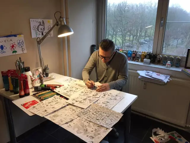
Still, he never gave up.
To make Labubu more charming, Kasing Lung spent three months sleeping just four hours a night. He finally perfected the look we know today, and then met the one person who really saw Labubu's value: the founder of Pop Mart.
Kasing Lung went from a broke artist to a licensing billionaire.
He said, "I never dreamed Labubu would blow up. I just stayed focused on my art."
For thirty years, he held fast to his brush and fought loneliness with passion: when the whole world says no, only your passion can keep you going.
Conclusion
Labubu's rise to fame involved a lot of chance, and its visual design ideas won't fit every designer or artist. Still, they offer a path worth exploring.
At the end of this article, we'd like to recommend a controller that can seriously boost your workflow: TourBox.

All those endless hotkeys and tool palettes in design and painting software can really break your focus. With TourBox, you map your most-used commands to physical dials, buttons, and knobs, making your workflow 2–3 times smoother.
Beyond basic hotkey mapping, TourBox lets you tailor your whole creative process. Its unique algorithms unlock advanced features like built-in functions, the TourMenu, and custom macros, so every artist and designer can craft a setup that's truly their own.

Check out our digital painting page to see more TourBox tricks. And if you like working on an iPad, take a look at the TourBox Elite Plus. It can transform your workflow on both PC and iPad.