The Power of the 60-30-10 Rule in Design: Harmonious Color Scheme
Color plays a vital role in design, evoking emotions, setting the mood, and delivering visual impact. As designers, we often strive to create harmonious color schemes that captivate and engage the viewer.
One tried and true method that can help achieve this balance is the 60 30 10 rule.
In this article, we will explore the concept behind this rule and learn how to effectively use three different colors to divide and conquer a cohesive color palette. So, let's dive in and discover the art of mastering color harmony in design.

In this article, you will learn:
- What Is the 60 30 10 Rule?
- How to Use 60 30 10 Rule in Design?
- How to Choose Colors for the 60 30 10 Rule?
What Is the 60 30 10 Rule?
Ever admired those beautifully designed pieces with stunning color palettes you see in magazines or on social media? But maybe you hesitate because you feel like you just don't know how to use colors effectively.
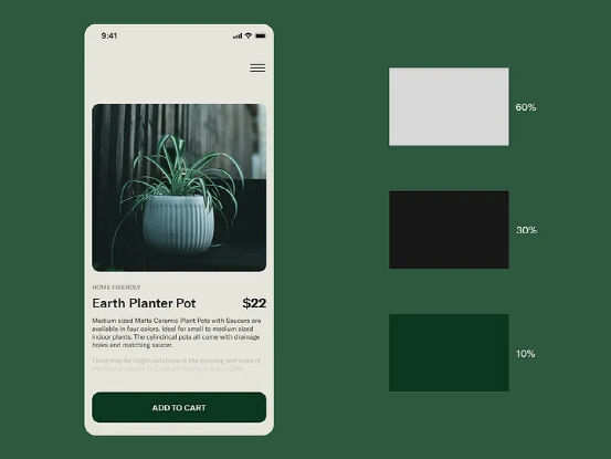
Well, there's a simple color application rule that can help you overcome your fear of colors: the 60 30 10 rule. Simply put, it involves dividing a color scheme into three different colors, with proportions of 60%, 30%, and 10% respectively.
This straightforward rule can help you rediscover your innate sense of color. With the 60 30 10 rule, you can freely choose your favorite colors and create designs that you enjoy and others appreciate.
The essence of this rule is to create a visually pleasing and balanced appearance in your design. The basic approach is as follows:
- Decorate 60% of the space with a dominant color.
- Use a secondary color to accent 30% of the space.
- Add a pop of color with the third color, using it in 10% of the space.
Like all design guidelines, this rule is not set in stone, meaning you don't need to measure spaces and percentages accurately. You don't need to be a mathematician to use the 60 30 10 rule in your designs, nor do you need a ruler or calculator to measure precisely.
Just follow these basic principles: use a dominant color that occupies the majority of the space, a secondary color that takes up half the dominant color's space, and a third color as an accent (if you want to use two accent colors, let each occupy 5% of the space).

How to Use 60 30 10 Rule in Design?
In this section, we will share three steps on how to use the 60 30 10 rule in design.
Step 1: Determine Your 60% Dominant Color
First, you need to determine the 60% proportion color, which is the dominant color. When choosing the 60% hue, it's important to understand the meaning behind that particular color.
If you're unsure about what color to choose as the dominant color, you can refer to color psychology, which explores the meanings and emotional associations people have with different colors.
Here are a few common colors and their meanings in color psychology:
- Red: Red is a vibrant, lively, and powerful color. It represents emotions like love, passion, power, and impulsiveness. It can evoke strong emotions and enthusiasm but also create a sense of tension and unease.
- Blue: Blue is a stable, calm, and refreshing color. It symbolizes emotions like tranquility, serenity, focus, and trust. It can help alleviate stress and create a sense of calmness and relaxation.
- Yellow: Yellow is an energetic and passionate color. It represents emotions like happiness, warmth, excitement, and creativity. It can inspire optimism and a positive mindset but may also create feelings of restlessness and irritability when used excessively.
- Green: Green is a peaceful, quiet, and stable color. It represents emotions like tranquility, health, growth, and nature. It can create a sense of peace and safety but may feel dull if used excessively.
- Purple: Purple is a mysterious, noble, and romantic color. It represents emotions related to balance, creativity, and imagination. It can stimulate creativity and imagination but may also evoke feelings of loneliness and melancholy.
In addition to considering color psychology, you can also take into account your design concept and target audience.
Generally, the dominant color, which makes up the majority of the design at 60%, is often used for the background. Since it covers a large area, it's common to use neutral colors or low saturation colors more frequently.
Step 2: Determine Your 30% Complementary Color
This color should be used in half the amount of the dominant color. The 30% proportion color is primarily used for key elements in the design, such as text, sliders, or other important features.
The secondary color, at 30% proportion, serves to support the dominant color at 60%. However, it's important to ensure there is enough contrast to create a noticeable difference between the two colors.
Step 3: Determine Your 10% Accent Color
The 10% proportion color is the accent color in the design. This color can be used for buttons, pop-up windows, and elements that you want to highlight.
Bright and vibrant colors are a great way to add visual interest. They can help draw attention to specific areas of your work or make the overall page feel more dynamic.
Once you've chosen the 60% dominant color, you can balance it with the other two colors to create a design similar to the example shown below:
How to Choose Colors for the 60 30 10 Rule?
After understanding how to use the 60-30-10 rule in design, your next challenge may be deciding on the final color scheme due to the numerous possibilities.
One convenient method is to use online color palette tools, such as the following three:
- ColorSpace: A palette generator and color gradient tool. Just provide one color, and it will generate multiple excellent color schemes for you to choose from.
- Paletton: You don't need to know any color theory to use this website. Simply select basic colors from the simple color wheel provided, and it will inspire you.
- Coolors: This website is all about quickly generating color schemes. You don't even need to provide any colors yourself, just keep pressing the spacebar, and the website will generate one color scheme after another.
Of course, besides using online color palette tools, it's also important to have an understanding of color theory. We shared how to choose suitable color schemes based on color theory. If you're interested, you can click to read: Seven Color Schemes to Make Your Designs More Appealing.
Applying colors to design projects is closely related to balance. The more colors you use, the harder it is to achieve this balance.
In design, it's not always better to have more colors. Simple color combinations with two or three colors may produce better results, and the 60-30-10 rule is an extension of this design concept.
Avoid Using Pure Black
In real life, pure black almost doesn't exist. All objects around us that appear "black" have some amount of reflected light, which means they are not truly black but rather a deep gray.
When you place pure black next to a carefully selected group of colors, the black will overwhelm everything else. That can end up looking very unnatural. It's best to avoid using pure black in your design and opt for a deep gray instead.
Product Recommendation:
If you are looking for a way to enhance your design and color workflow, you might want to check out TourBox, a custom editing controller that works with almost all creative software.
TourBox is designed for content creators, including illustrators, photographers, and video and audio editors. You can customize it to whatever you need, whether it is complicated keyboard shortcuts, mouse actions, or the built-in features that TourBox offers.
This concludes our tutorial on the 60 30 10 rule. We hope it helps you on your design and creative journey.