Calibration Tool in Post-Photography: Angel or Demon?
In this article, we'll delve into a feature that tends to evoke extreme reactions: Calibration. You can locate this feature in the final adjustment category panel in Adobe Camera Raw and Lightroom Classic.
Calibration is often dubbed as a "difficult-to-master magic trick" by some and dismissed as useless by others, with some never touching it in their lifetime.
So, is Calibration an angel or a demon? Let's find out.

In this article, you will learn:
- What Is the Principle Behind the Calibration Tool?
- Detailed Explanation of the Calibration Tool Panel
- How to Use Calibration Tool?
- Why Use Calibration Tool?
- Summary of Using the Calibration Tool
What Is the Principle Behind the Calibration Tool?
To fully grasp the Calibration tool's concept, we must understand why it exists; this forms the foundation for comprehending its functionality.
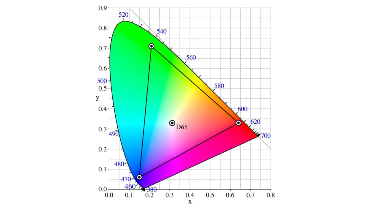
In digital cameras, the Bayer sensor utilizes red, green, and blue to produce a vast array of colors, defining a triangle in the color space known as RGB.
Further Reading:
Let's simplify with an image to prevent interference from other colors for better understanding.
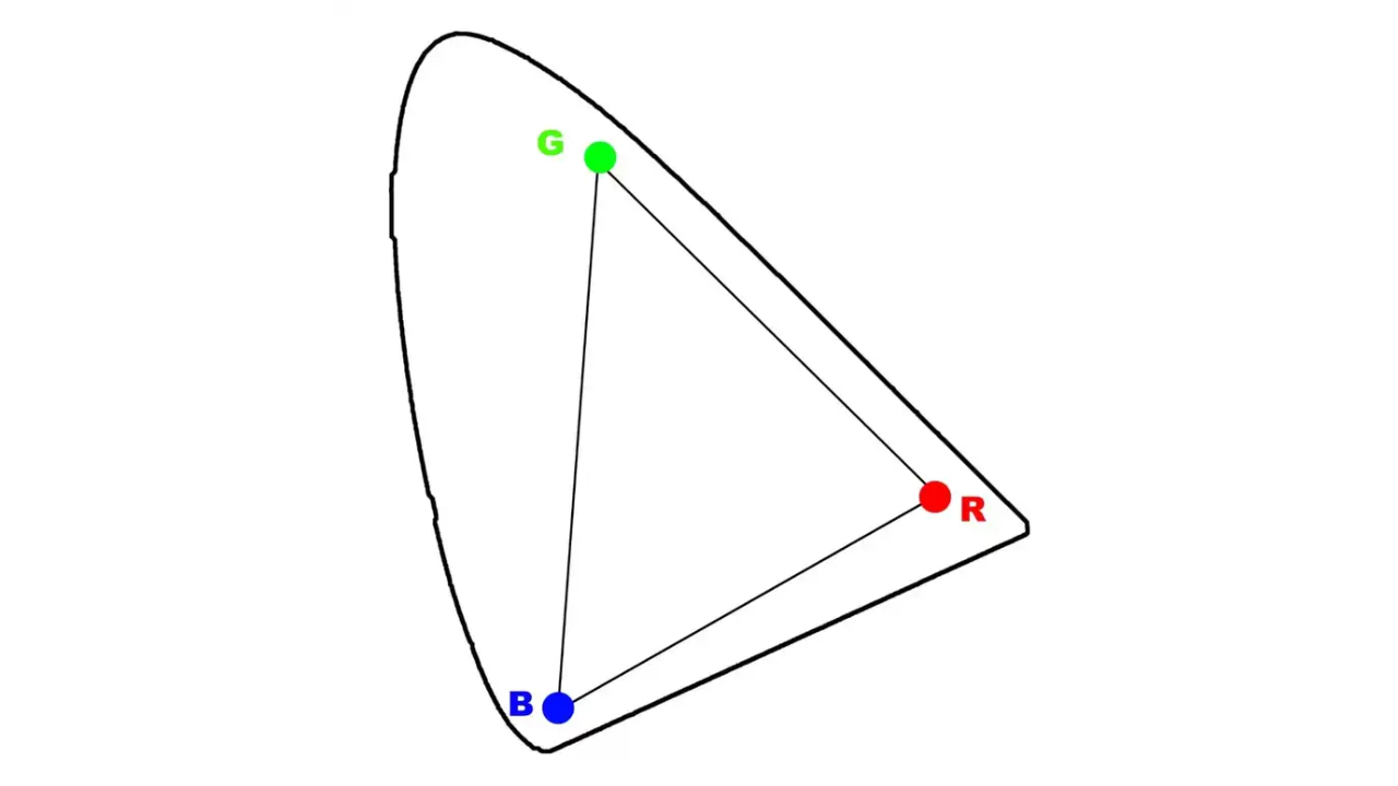
The outer region represents the overall color space, with the triangle formed by the RGB points encapsulating the colors found in Adobe RGB. In theory, setting your camera to Adobe RGB allows you to capture colors within this range.
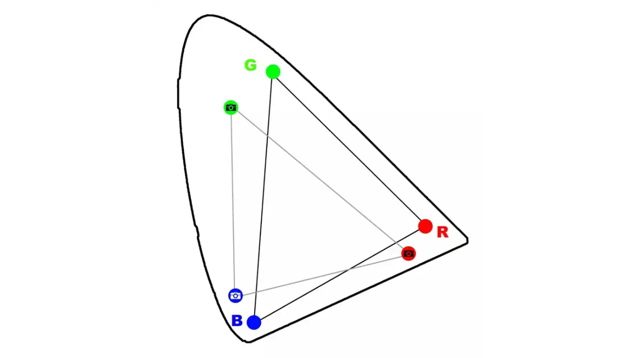
While cameras are precise instruments, they often encounter issues with color capture; specifically, the colors captured may not match the true colors or may differ from what is seen.
In terms of color space, this means there are deviations between the coordinates of the RGB points and the ideal standard RGB. The camera's interpretation of "red" may not align with the true red in the color space, leading to the scenario in the image below.
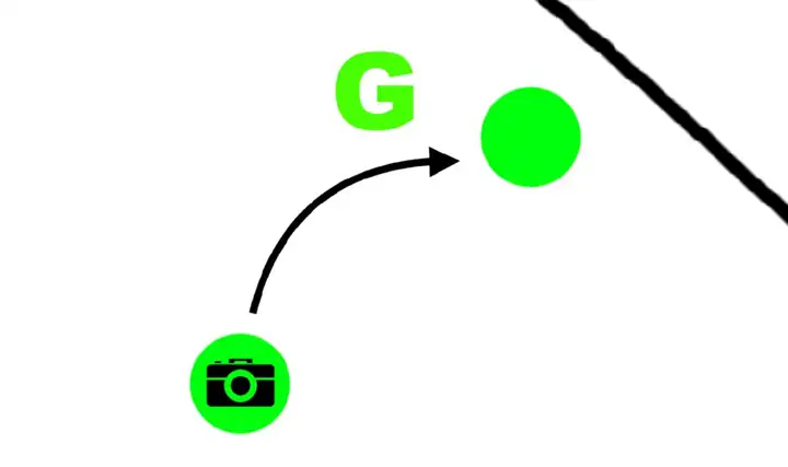
So, what's the solution? Adobe engineers put their heads together and came up with the concept that if clay can be molded, why not manipulate color space too? This train of thought gave birth to the "Calibration" function.
Its purpose is to adjust the RGB information captured by the camera, aiming to align the camera's RGB triangle as closely as possible with the standard RGB triangle.
Therefore, on the Calibration tool panel, you'll find sliders for red primary, green primary, and blue primary, each used to calibrate these three colors accordingly.
You can imagine the flat color space as a coordinate system. When you want one point to align with another, you don't just drag it over; instead, you move it by adjusting horizontally and vertically.
Have you noticed that under each primary color in the Calibration tool, there are precisely two sliders?
Hue represents the color shift tendency, meaning the horizontal movement of points. Saturation indicates color intensity, reflecting the depth of color vertically, which involves the vertical movement of points.
By manipulating these two factors, you can shift the points in the color space, aiming for the closest possible match between the colors captured by the camera and the standard colors.
In conclusion, the purpose of the Calibration tool is to adjust the ratios of the three primary colors in each pixel, correcting the differences between the actual values of the Bayer sensor's filter and the theoretical values.
While the theory sounds beautiful, the actual adjustment process is quite complex. Each photo tends to have its own color bias, and there are no specific values to use as references.
Here, you'll notice that the theory behind the Calibration tool is not very intuitive. Even if you do understand it, it doesn't necessarily help you know how to use it effectively. Why?
Well, because this tool is quite esoteric (involving the essence of color space) and challenging to operate (requiring the use of a ColorChecker during shooting to create color presets in post-processing).
Therefore, photographers have repurposed another function of the Calibration tool: instead of strictly aligning the camera's three points with RGB, why not use the Calibration tool for creative color adjustments?
In essence, the Calibration tool has transformed into a creative color adjustment tool.
Detailed Explanation of the Calibration Tool Panel
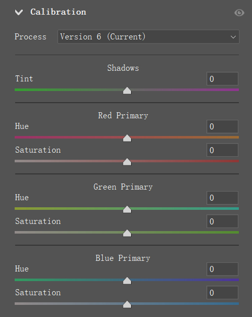
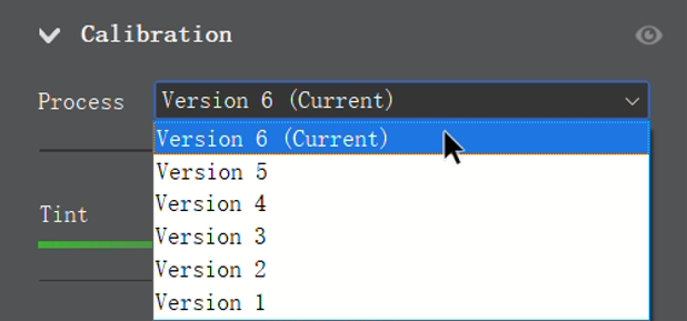
The Calibration tool panel is divided into three main sections: Process, Shadows, and Primary Colors.
1. Process
The Process function allows you to select different versions of the Calibration tool. This feature enables you to switch to older versions of the Calibration tool for editing.
Why would you need to use an older version of the Calibration tool? When working with photos processed many years ago using an older version of the tool, where the sliders and functions were different from the current version, switching to an older interface ensures compatibility.
For example, if you edited a photo back in 2003, the Calibration effect would be different from the current tool's effect (if you can remember). By switching to version 1 or 2, you can process it using the algorithms and methods from that time.
However, it's generally not recommended to adjust this option. It's best to stick with the current version for most cases.
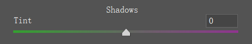
2. Shadows
Shadows refer to the differences in tones between areas in a photo where some parts are in sunlight while others are in shade. Because of the varying light conditions, this issue can easily be addressed using the slider.
In most cases, shadow areas tend to have a greenish or magenta color cast. Therefore, the purpose of this slider is to adjust the tones in the shadow areas. If it leans towards green, move it towards magenta, and if it leans towards magenta, adjust it towards the green side.
This slider is usually used for fine-tuning, so if the shadows look fine, there's no need to adjust this slider.
3. Primary Colors
The Calibration tool features three sets of primary color sliders that allow you to adjust the hue and saturation of a certain primary color contained within each pixel of the image.
Since each pixel contains three primary colors, the adjustment effect is not straightforward. In other words, analyzing it numerically doesn't reveal any consistent patterns or meanings.
Let's revisit the definition: by adjusting the ratios of the three primary colors in each pixel, you correct the differences between the actual values of the Bayer sensor's filter and the theoretical values.
This means that suitable adjustment parameters will vary significantly based on different lighting conditions and camera settings.

So, how should you use this Calibration tool? Here's a suggested approach for photography beginners:
- Process: Stick with the current setting.
- Shadows: Analyze the actual color cast in the shadows or adjust based on creative needs.
- Primary Colors: Experiment with each hue slider; if the result looks good, adjust the saturation for intensity.
These steps are meant to get you started quickly and are not definitive solutions. In the next section, we will share some general adjustment methods for the Calibration tool.
How to Use Calibration Tool?
Understanding the functionality of the Calibration tool poses two major challenges.
The first challenge lies in the nature of color spaces, which are incredibly diverse in their classifications and forms.
For instance, the Adobe RGB color gamut range is a triangle formed by connecting three coordinate points (red, green, blue).
For more information on color space, you can refer to our corresponding tutorials.
Further Reading:
The second challenge arises from the lack of specific patterns between parameters and adjustment effects.
The same parameters can yield vastly different results on different photos, which might leave you thinking, "What is this tool even doing?" after using it a couple of times.
In reality, in terms of versatility and operational efficiency, Calibration tool is an excellent instrument. However, their drawback lies in the complexity of their principles.
In the upcoming sections, we will strive to elucidate the workings of this intriguing color adjustment tool through specific examples.
1. Enhance Color Impact in Landscape Photos
Take this photo, for example. It's not bad to begin with—the weather is clear, colors are decently accurate, but it lacks brightness.
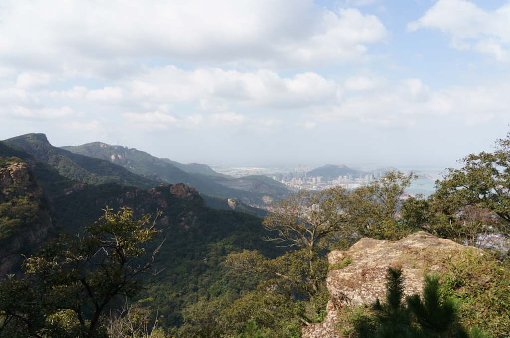
Without adjusting any other parameters, enter the Calibration panel and set the hue of the blue primary color to -15 and increase the saturation by +80 to deepen the blue tones in the sky.
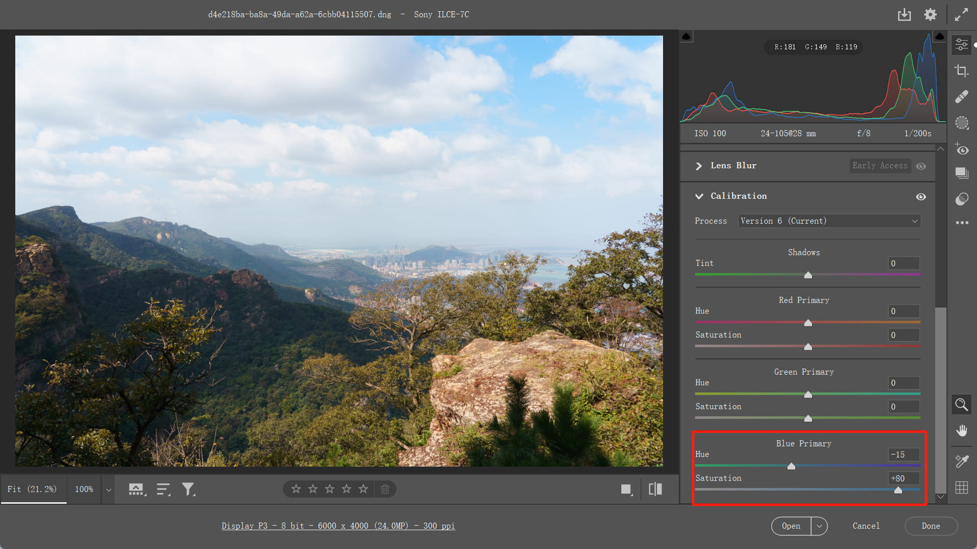
Next, adjust the hue of the green primary color to -60 to make the yellows and greens more vibrant, while also increasing the saturation by +20.
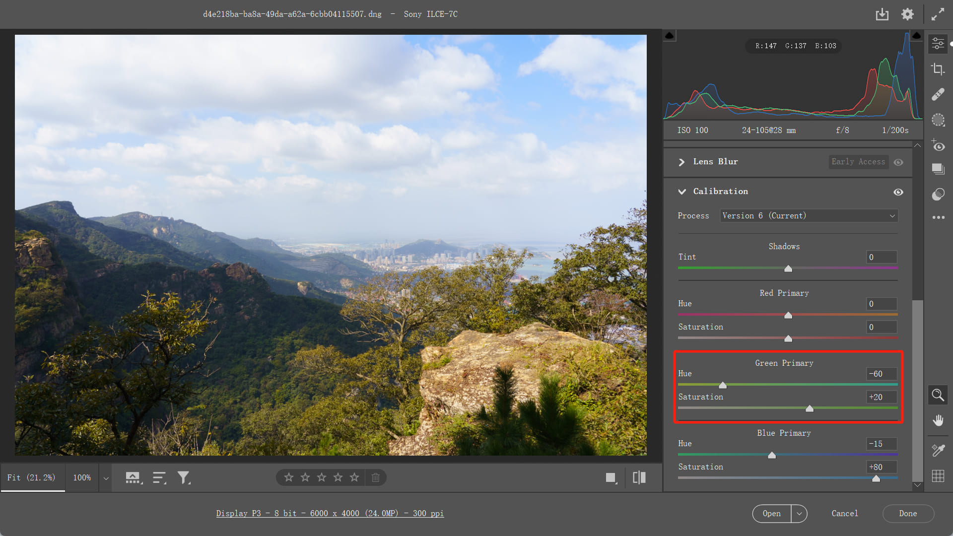
This significantly enhances the color intensity in the forested areas of the photo. Now, the image appears more vibrant and visually striking.
Key Takeaways:
- Lowering the blue primary color to around -10 to -20 effectively enhances the presence of the blue sky, making it appear more transparent and vivid.
- Increasing saturation intensifies colors, making the sky look more beautiful. This method works well for enhancing the blues in the image.
2. Enhance Skin Texture Portrait Photo
Lowering the hue of the blue primary color not only impacts the blues but also imparts a warming effect to yellows. This warming effect on skin tones can make the skin appear rosier, healthier, and more vibrant.
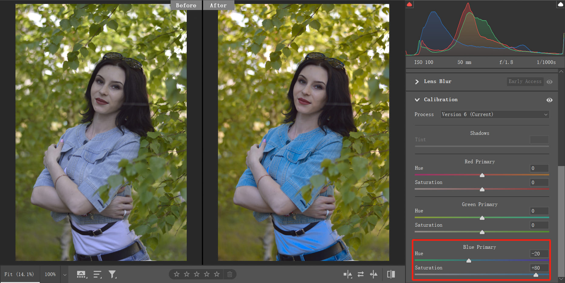
This technique is commonly used in portraits with pale skin or lacking vitality. However, it may not be suitable for individuals with already saturated or darker skin tones.
Key Takeaways:
Adjusting the blue primary color towards yellow or orange-yellow tones warms up the skin, and the degree of warmth can be fine-tuned using saturation.
In the two examples above, the blue primary color stands out as the most frequently adjusted. Not because it's superior, but because its effects on blues and yellows cater well to most everyday photo editing needs.
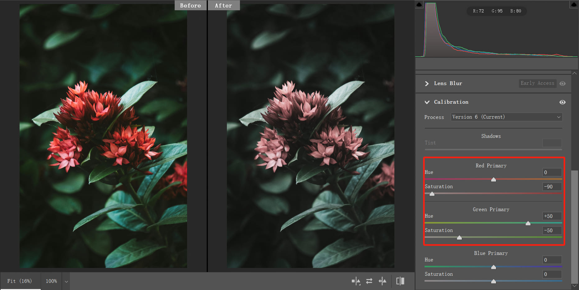
3. Decrease Color Saturation
In the previous examples, we focused on ramping up the vibrancy of colors in images. However, the Calibration tool can also be handy for toning down the saturation, creating a faded or desaturated effect.
Reducing the saturation of the three primary colors in the Calibration panel will noticeably desaturate the image.
The approach here differs from the previous examples. In those cases, we first adjusted the hue to establish the color direction and then fine-tuned the intensity with saturation.
To achieve a faded effect by reducing saturation, you can start by decreasing saturation and then tweak the hue.
For instance, in the photo below, we felt that the red was too bright, so we reduced the saturation of the red primary color by -90. This led to a decrease in the saturation of the red areas in the image, with some minor impact on other regions as well.
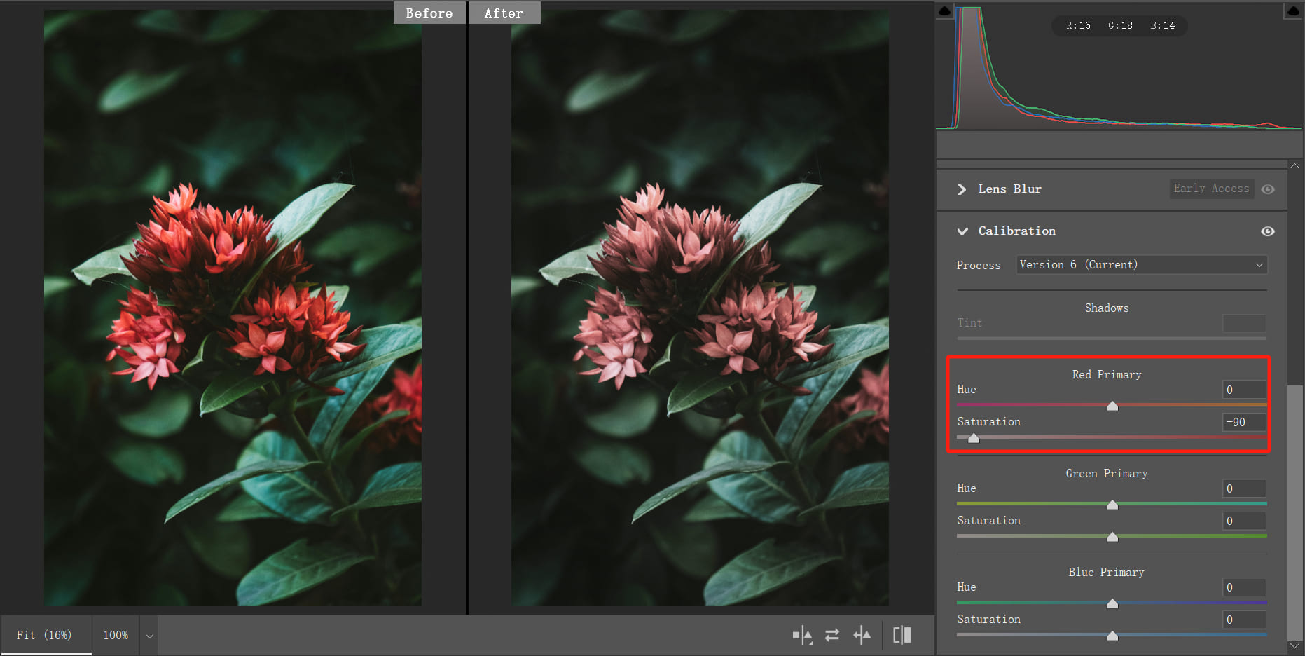
After adjusting the saturation of red, we further reduced the saturation of green to -50. This action diminished the strength of the photo's red and green hues.
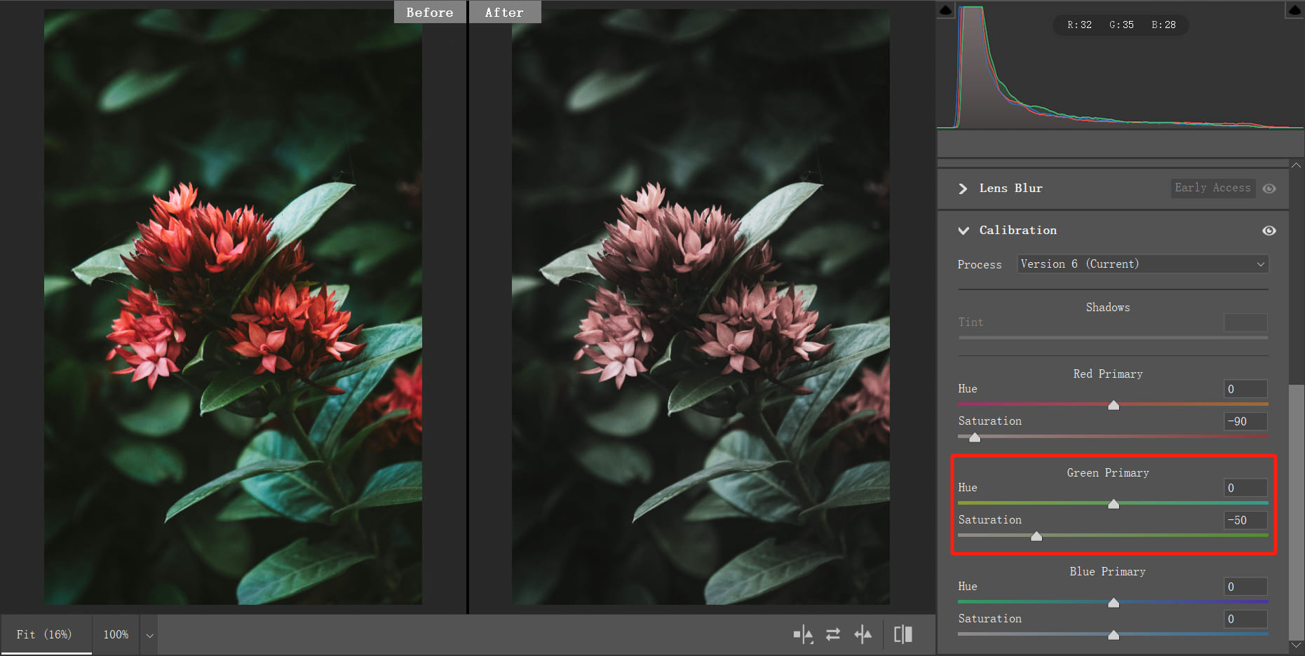
We continued to experiment by adjusting the hue of the green primary color, and when we set it to +50, the result looked quite nice. The greens and blues in the image became more subtle, while the reds took on a slightly faded look, giving the photo a touch of age and nostalgia.
Key Takeaways:
When aiming for a desaturated look, start by reducing saturation in the Calibration tool and then experiment with hue adjustments to find the look that appeals to you.
This effect relies more on your subjective aesthetic preferences rather than specific numerical values.
Why Use Calibration Tool?
As you read through this, you might have noticed that the principles of Calibration tool we introduced at the beginning don't immediately guide you on how to edit using the tool. So, what's the real significance of Calibration tool?
We believe there are two main reasons:
- Understanding the principles of the Calibration tool elevates your knowledge of color space, camera imaging, and post-processing techniques subtly. This knowledge enhancement guides your editing direction over time.
- The Calibration tool doesn't come with any "one-size-fits-all" parameters, but its magic lies in nurturing your color judgment. When using the Calibration tool, you need to consider something unique, adjust settings based on the photo's characteristics, and develop your style.
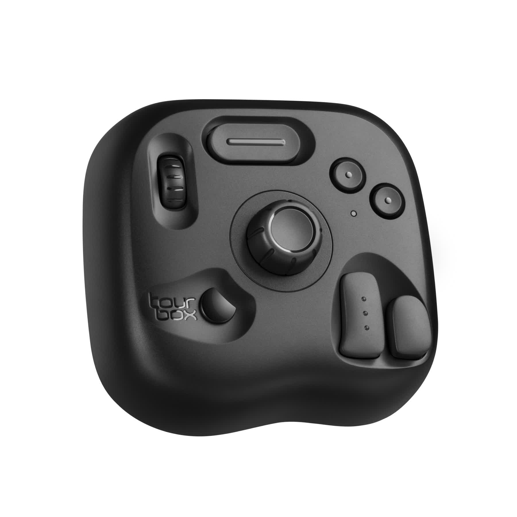
As we've emphasized, the Calibration tool requires you to continually experiment and feel the color changes. In post-processing for photography, if you're looking to experience a more intuitive and efficient editing process, consider trying out TourBox, a creative controller widely adored by photographers and digital artists.
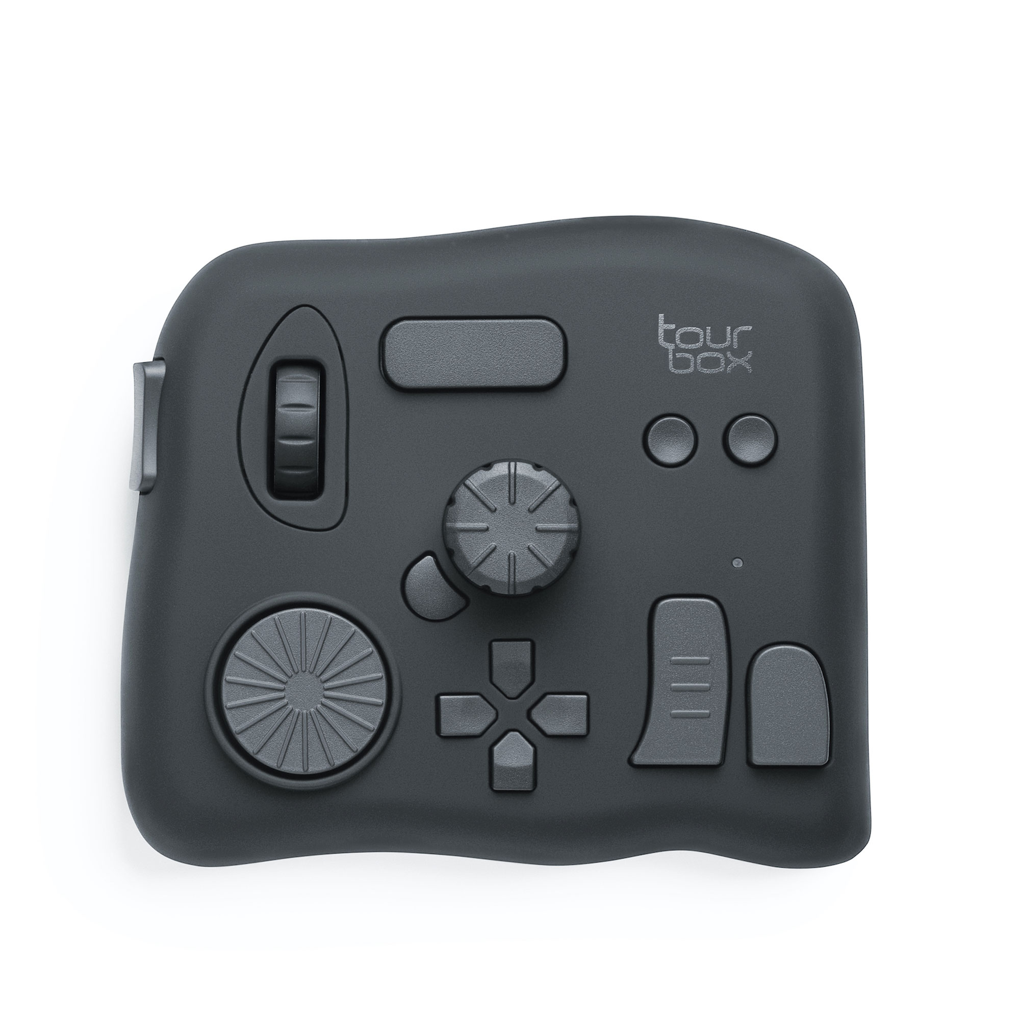
TourBox lets you bid farewell to cumbersome keyboard shortcuts. Just like using a game controller for gaming, TourBox enables you to have a smoother and simpler workflow in any digital software.
Take the Calibration tool, for instance. By simply turning the Dial on TourBox, you can precisely and efficiently control color adjustment parameters with increments of +1 and -1. This level of precision is difficult to achieve through keyboard inputs.
Even better, using TourBox lets you concentrate more on your creativity and the art itself. Check out our photo editing page to see how TourBox simplifies every step of post-processing in photography.
So, returning to the question we posed at the beginning of this article, is the Calibration tool an angel or a demon? We firmly believe it is far from a useless "demon."
Instead, it is like a color-tuning little surprise that started with a misunderstood purpose but successfully transformed into a valuable tool.
Summary of Using the Calibration Tool
If you're a beginner just getting into photo editing, you can experiment more with the blue primary color slider on the Calibration tool.
The blue primary color slider is the most commonly used. Lowering it to -10 or -20 can effectively enhance the transparency of blue areas in the image or make yellow areas warmer, all while maintaining a very natural look. This is the most common usage of the Calibration tool.
When adjusting the Calibration tool, the typical sequence is to first adjust the hue and then move on to saturation once you feel satisfied.
However, if you aim to create a faded, nostalgic feel, you can start by adjusting the saturation to set the mood, and then fine-tune the hue for precise effects.