How to Choose Colors That Look Good in Art?
When you look at a piece of art, have you ever wondered why the artist chose those colors? Could different colors have worked just as well?
In this article, we'll explore how to pick colors that look good. Let's get started.

In this article, you will learn:
- Step 1: Color Schemes
- Step 2: Color Temperature
- Step 3: Natural Color vs. Expressive Color
- How to Choose Colors That Look Good in Art?
- Conclusion
Step 1: Color Schemes
Why does an artist pick this color instead of that one? Besides personal taste, there's another reason: color follows patterns.
These patterns come from how our eyes and minds react to color. They're also shaped by culture, technology, and art traditions. Artists use these "rules" to set a mood, guide the viewer's eye, and build a style.
Further Reading:
From these rules, artists and designers have summarized common color schemes. Here are five you should consider when creating:
1. Analogous Scheme
Choose colors from the same side of the color wheel. This creates unity and harmony in the image. Usually, one color is dominant and the others support it.
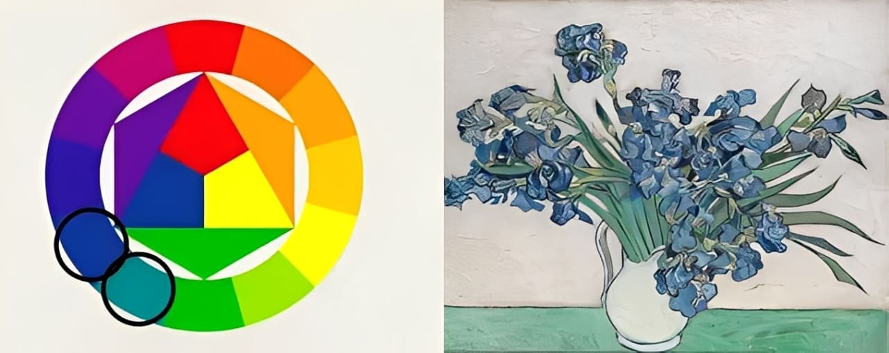
It unifies elements and gives a comfortable visual feel.
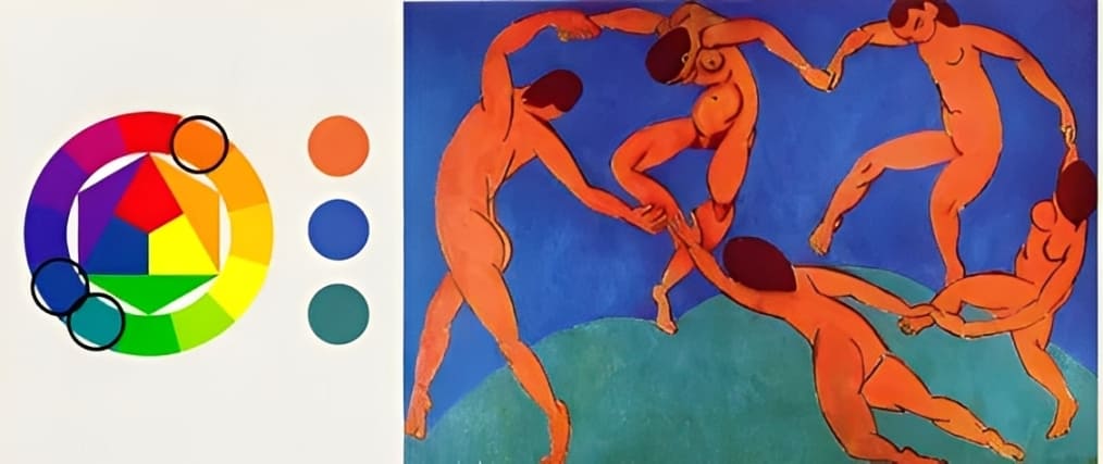
2. Complementary Scheme
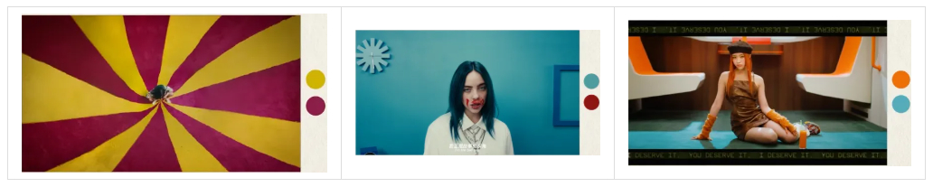
Pick colors that are 180 degrees apart on the color wheel. This pairing creates a strong visual contrast.
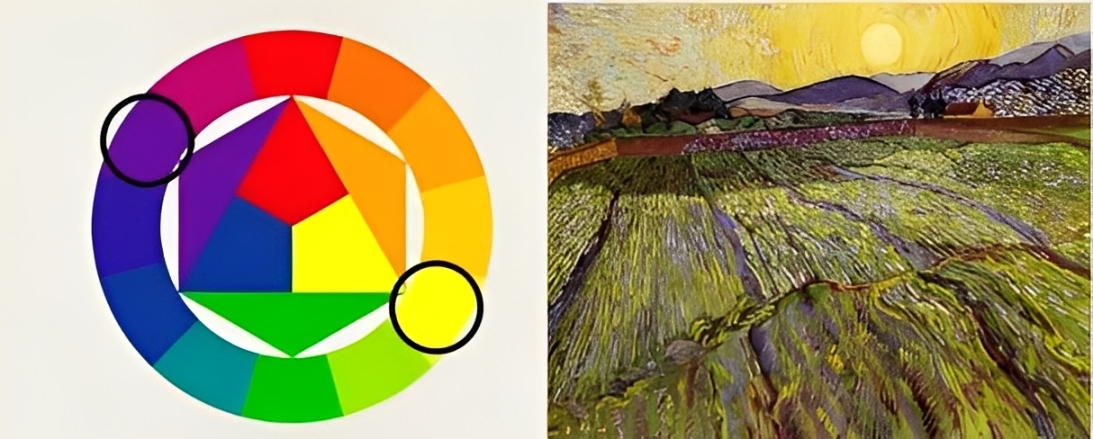
Usually, one color dominates and the other supports, often as a desaturated tone or in the shadows.
Common complements are yellow & purple, red & green, and blue & orange. If you watch music videos, you'll notice many use this scheme because it's the most eye-catching.
3. Split-Complementary Scheme
This is an extension of the complementary scheme. Pick a base color, find its complementary color, then choose the two colors next to that complementary color.
This still gives contrast, but with less visual tension than a straight complementary scheme.
4. Neutral Scheme
Use colors with low saturation. These create a soft, relaxed mood.
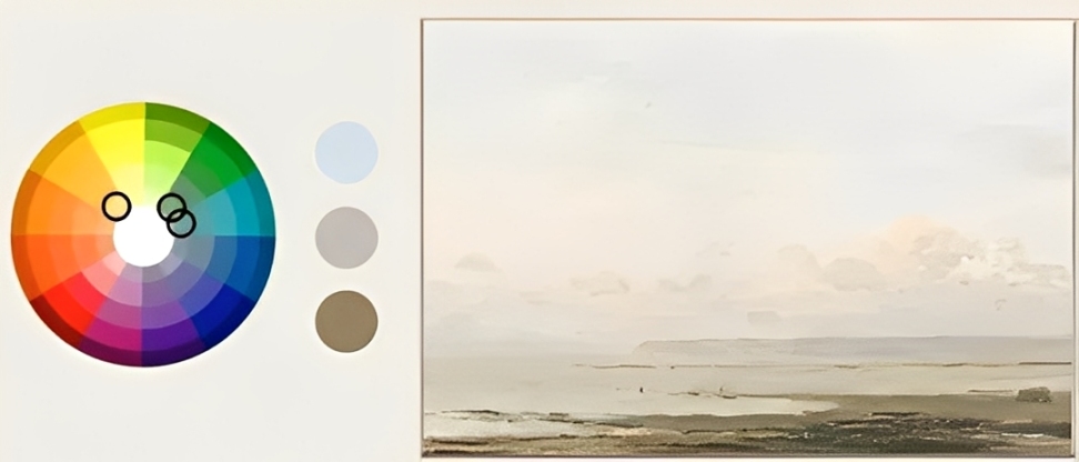
Be careful with extremes like pure black or pure white — they can add tension.
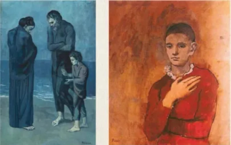
5. Monochromatic Scheme
Use one hue and make three usable variations by:
- Adding white to lighten it
- Adding black to darken it
- Adding neutral gray to lower its saturation
Artists use this scheme to heighten emotions like joy or sadness.
Step 2: Color Temperature
Simply put, color temperature is the idea that colors can feel warm or cool.
Further Reading:
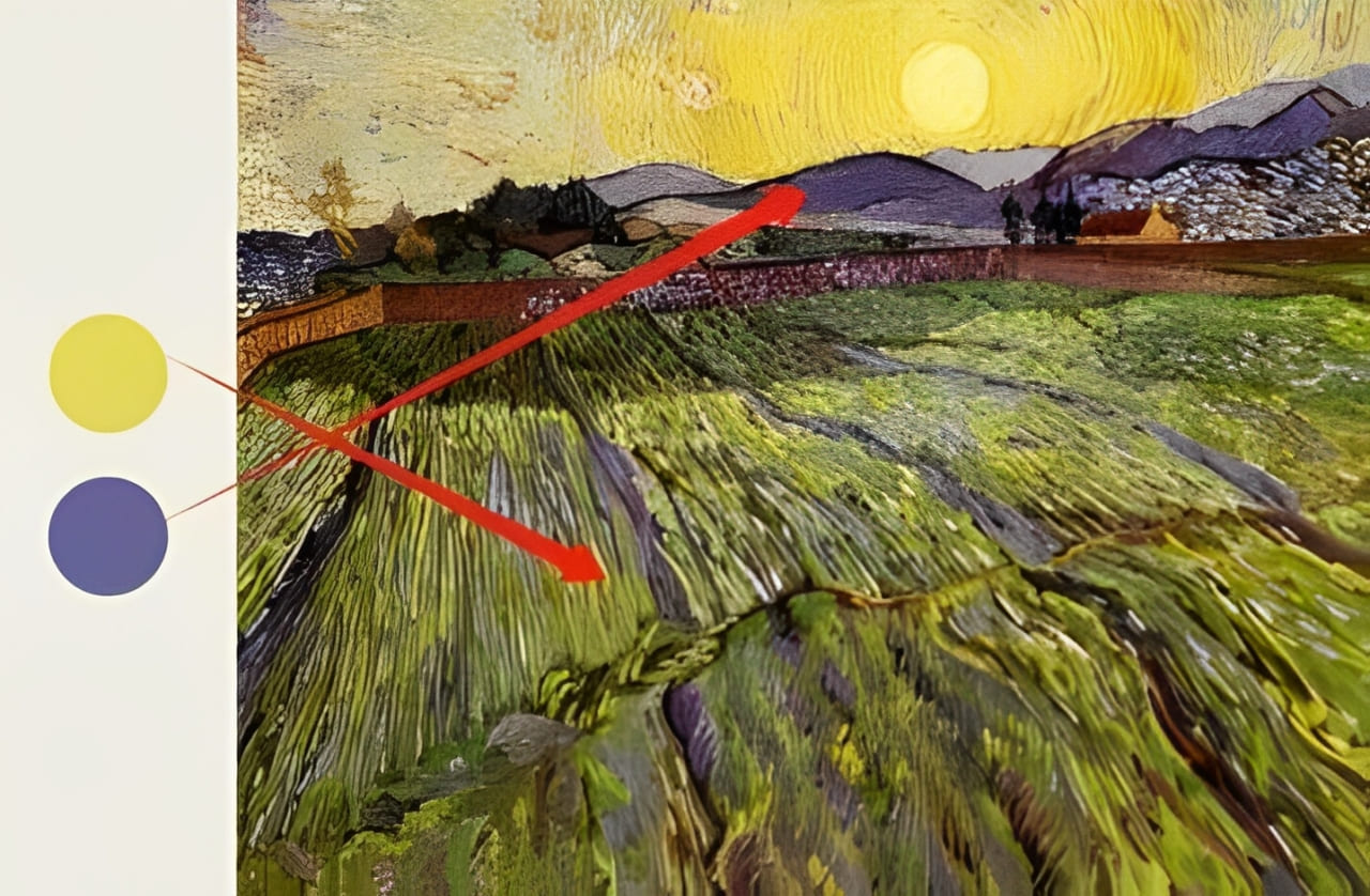
Warm colors tend to come forward. They look closer to the viewer. Cool colors usually recede. They feel farther away.
If you learned art in school, your teacher probably told you to paint warm colors for the near parts and cool colors for the distant parts.
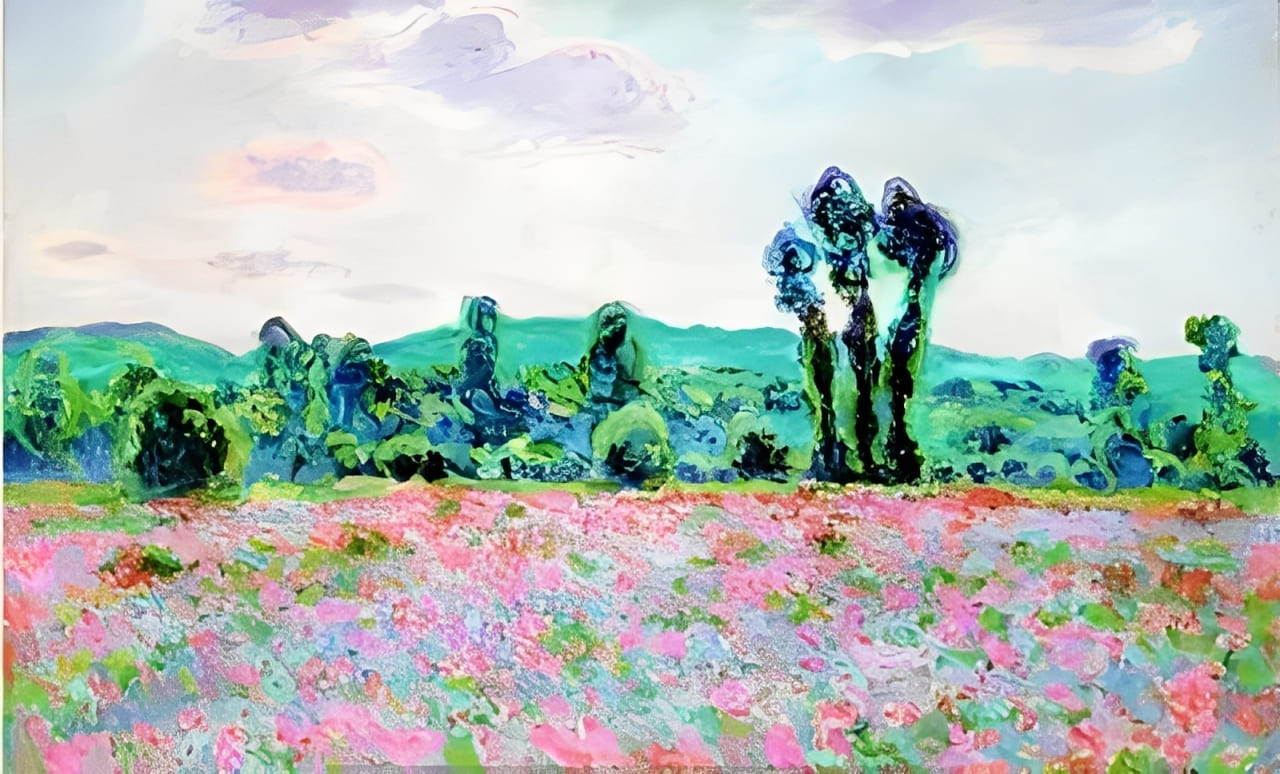
In the artwork below, warm colors fill the foreground and create a sense of depth.
Color temperature also changes how people feel. Warm tones can make a scene feel joyful or excited.
Cool tones often suggest calm or sadness.
Step 3: Natural Color vs. Expressive Color
Natural color focuses on optical reality. These descriptive colors make a work easy to read and relatable. They help the viewer follow the story the artist is telling. Before the mid-1800s, artists tried to copy nature, so natural color schemes were very popular.
When Western artists saw art from other cultures, they started to use colors that don't match real life. These are expressive colors.
Expressive color uses color symbolically to show the artist's personal view of the world. Artists pick colors freely to boost mood or meaning. For example, the Fauves used bright colors to spark an emotional response.
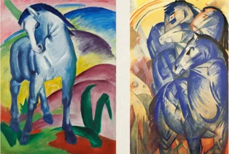
Franz Marc painted horses blue because he felt blue was a spiritual color.
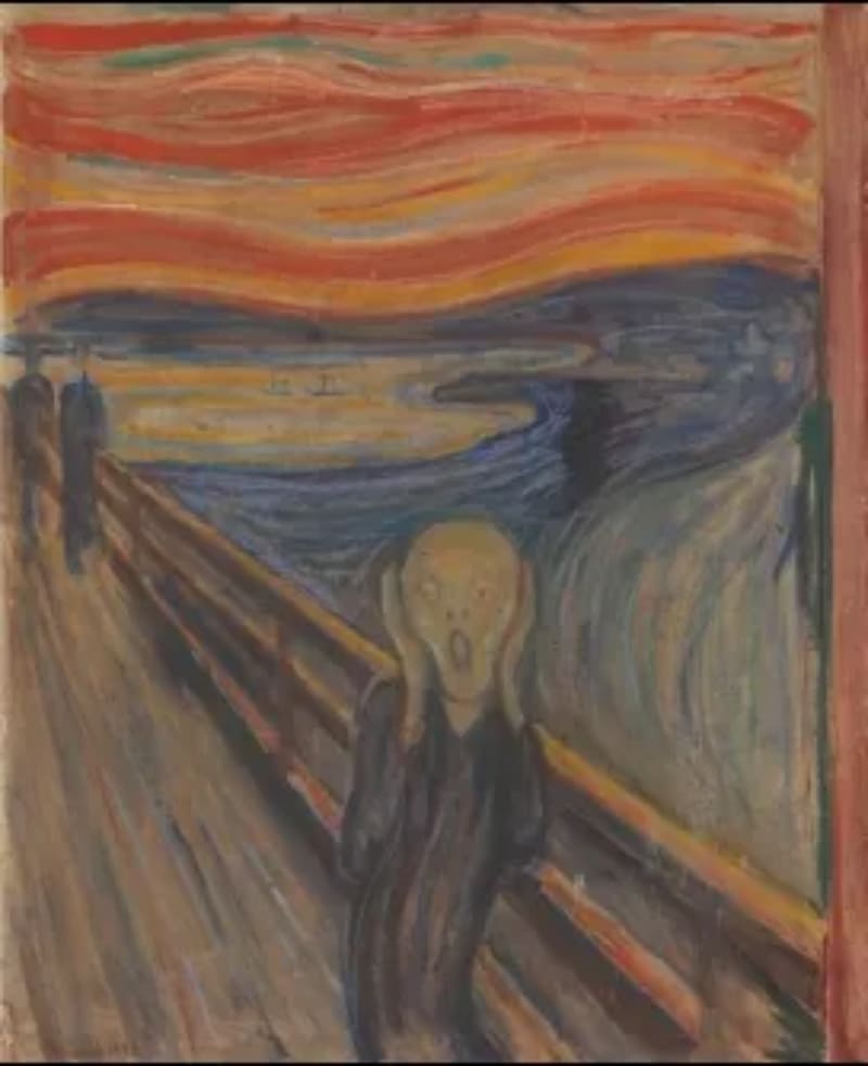
Edvard Munch's The Scream uses jarring reds and oranges to convey anger and panic.
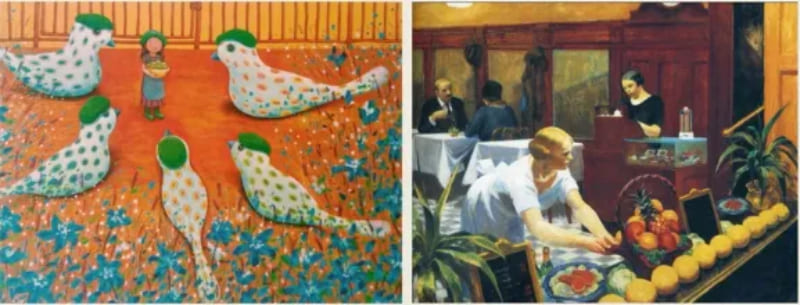
How to Choose Colors That Look Good in Art?
The three steps above give a simple framework for analyzing a work's colors or for choosing the colors in your own work. Now let's use those steps to look at the Edward Hopper painting below.
In Hopper's painting, a complementary color scheme is easy to see. The green wall and the pink dress play off each other. That subtle contrast draws your eye to the woman in the scene.
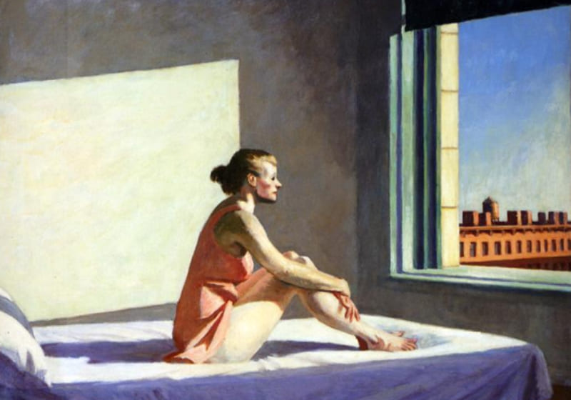
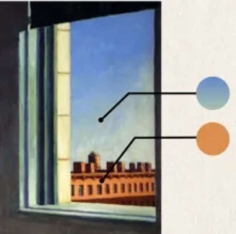
Hopper uses a different, split-complementary idea around the window. The bluish-green sky contrasts with the plain tones of the building.
Overall, the painting leans cool. The green wall, pale blue sheets, and cool skin tones deepen the space. The woman's warm pink dress makes her feel closer to us, while the cool background slides back.
Those cool tones also give the scene a tense mood. Warm sunlight fills the room, but it can't chase away the chill. The air seems to hold a quiet loneliness.
Finally, Hopper keeps the colors mostly natural, which makes the story easy to read: a warm but lonely morning. He places us close to the woman's point of view and lets us remember the last time we felt like her.
This is just one color-based reading of the painting. But by tracing Hopper's color choices, you should feel more confident choosing colors that look good in your next piece.
Conclusion
In this article, we pulled together color theory and laid out three simple steps for choosing colors in your art. Next time you're not sure what colors to pick, try these steps. They should help your work look better.
Finally, we'd like to introduce TourBox, a creative controller loved by digital artists. With TourBox, common repetitive tasks in digital painting — switching brushes, adjusting brush settings, zooming the canvas, and switching layers — can all be done easily with one hand.

TourBox speeds up your workflow, and its ergonomic design feels great in your hand. It's like using a game controller: no menu diving, no memorizing complex shortcuts. Just twist a knob or press a button.

If you're interested in TourBox, visit our Digital Painting page to learn more.