Color Blocks in Design: Six Tips for Creating Visual Impact
Color blocks, artistic compositions made up of different colors, are widely used in art and design. They can be found in various design projects such as poster design, brochure design, slideshow design, and artwork creation.
In this article, we will share six tips for using color blocks in your designs. These techniques can be applied to enhance the visual impact of your graphic designs.
Without further ado, let's get started!

In this article, you will learn:
- Create Contrast in Size for Color Blocks
- Add Details to Color Blocks
- Limit the Number of Colors in Color Blocks
- Proper Color Pairing for Color Blocks
- Breaking the Color Blocks
- Avoid Sticking to Conventional Design and Creating Monotony
- Mastering the Use of Color Blocks in Design
Create Contrast in Size for Color Blocks
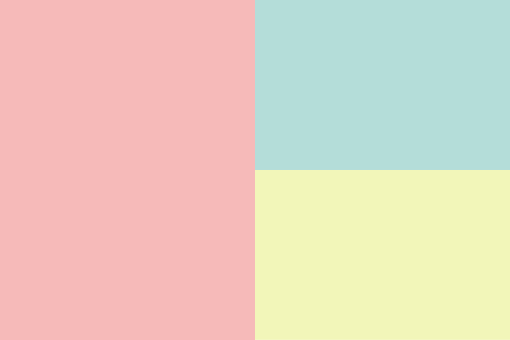
When incorporating multiple color blocks into a design, if possible, it is recommended to differentiate their sizes rather than having them all the same or similar.
In the image below, the three color blocks evenly divide the entire image. While this design is not necessarily bad, it lacks depth and visual appeal, resulting in a somewhat mediocre composition.
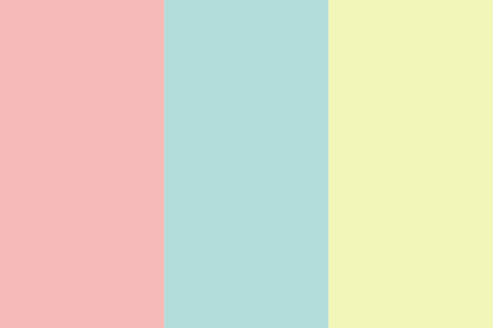
To enhance the composition, consider adjusting the sizes of the color blocks to create a more balanced and visually engaging image.
Add Details to Color Blocks
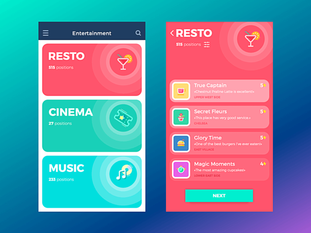
Many designers mistakenly believe that cramming information into color blocks is enough to create a successful design. However, each color block is like a mini-layout, and the arrangement of elements within it requires careful attention.
Avoid overcrowding the color block, create contrast in text sizes, and consider adding decorative elements.
Paying attention to the details within each color block can elevate your overall design. It requires some thought and effort on your part, but the result will be a more refined composition.
Limit the Number of Colors in Color Blocks
When using multiple color blocks in a design, it is important to control the number of colors used. Having too many colors can make it difficult for viewers to grasp the focal point of your design.
In general, it is best to keep the color palette within four shades or less (variations within the same color family are allowed).
For example, in the image below, there are too many colors, all with high saturation, which can be overwhelming to the eyes.

By reducing the color palette to just white and yellow, as shown in the following image, the composition becomes much more harmonious.

Proper Color Pairing for Color Blocks
In design, there are various techniques for color combinations. Here, we share three color pairing experiences for your reference:
- Complementary colors: Complementary color combinations are commonly used, but try not to fill all color blocks with highly saturated complementary colors. It is safer to pair highly saturated colors with low-saturation complementary colors or colors with significant differences in brightness.
- Monochromatic with black, white, and gray: Combining black, white, and gray with a single color is versatile. It avoids overwhelming the composition while creating contrast and highlighting the colored blocks.
- Analogous colors: Whether using similar hues or colors with the same hue but varying saturation or brightness, analogous color combinations tend to create harmony when paired together.
For more insights into color schemes and basic tips for color combinations, check out this tutorial: Seven Color Schemes to Make Your Designs More Appealing.
Breaking the Color Blocks
While placing all elements inside color blocks can create a neat and unified look, it can also appear rigid. To add more dynamism and flexibility to your design, consider breaking the boundaries of certain color block elements.
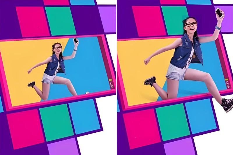
Let's take a look at the example below. In the left image, we have distorted the color blocks to create a sense of perspective, which is visually interesting. However, since all elements are contained within the color blocks, the overall composition lacks impact and tension.
On the other hand, in the right image, we have enlarged and allowed the central figure to break out of the color block, resulting in a stronger visual impact.
By strategically breaking the color blocks, you can infuse your design with more energy and excitement.
Avoid Sticking to Conventional Design and Creating Monotony
While consistency is an important principle in design, relying solely on uniformity can result in a dull and lifeless composition. Here are two suggestions for using color blocks in your design:
- Embrace Variation in Color Blocks: When designing with color blocks, it's crucial to maintain diversity. Avoid confining all content strictly within the color blocks. Instead, consider incorporating variations in the direction, size, outline, and spatial arrangement of the color blocks.
- Break the Boundaries of Imagination: Experiment with unconventional shapes for your color blocks or use simple graphics as color blocks to inject liveliness into your layout. By pushing the boundaries of your imagination, you can create a more dynamic composition.
Mastering the Use of Color Blocks in Design
Color blocks play a vital role in design, serving purposes such as content division, information highlighting, visual impact enhancement, and decoration.
However, utilizing color blocks in design is not as simple as it may seem. You might have come across designs that incorporated color blocks but still fell short in terms of effectiveness. This tutorial merely scratches the surface, aiming to inspire further exploration.
To truly grasp the potential of color blocks, it is essential to experiment and experience their application firsthand in your own designs and creations. As you delve deeper into the world of design, you will discover the limitless possibilities that color blocks offer.
Before concluding, we would like to recommend a valuable tool to aid you in your design journey – TourBox. This innovative device serves as an excellent companion for color adjustments and various design tasks, making your creative process even more seamless and efficient.
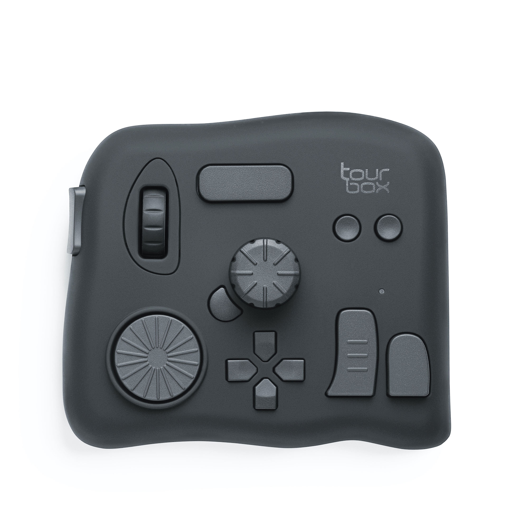
By integrating TourBox into your editing workflow, you can access essential color adjustment tools at your fingertips, eliminating the need for excessive mouse clicks or keyboard shortcuts.
This intuitive device empowers you to focus on your creative vision, enabling smoother and more immersive color manipulation.
As you continue honing your design skills, remember that mastering the use of color blocks requires practice, experimentation, and a keen eye for aesthetics. Embrace the versatility of color blocks, and let your creativity soar.