9 Ways to Find Color Inspiration When You're Stuck
Color is a key ingredient in any great design or artwork. Different hues can spark different emotions, thoughts, and reactions in viewers, shaping how they see your work. We could say that choosing the right colors can make or break a design.
That's why sorting through color palettes can feel tricky for designers and artists. Inspiration to pick the perfect mix doesn't always strike when you need it. In this article, we've gathered 9 tips for finding fresh color inspiration so you can land on the ideal palette every time.

In this article, you will learn:
9 Tips for Finding Color Inspiration
In this section, we will share nine tips to help you find color inspiration. We hope these ideas give you plenty of new methods and inspiration. Pick your favorite tip and get started!
1. Capture Inspiration Anywhere
The best color inspiration comes from nature. Our eyes are used to natural palettes, and you can always find ideas around you. There are endless color combinations outdoors.
Nature is the real color master, so borrowing its palettes can really boost your designs.
When you're out traveling or just walking around, snap photos of beautiful scenes, like a sunrise or a patch of flowers. Then sample those colors in Photoshop to build your own stunning palette.

2. Use a Color Wheel
A color wheel is a designer's best friend. You can pick colors that are complementary, analogous, or part of a triadic scheme right from the wheel.
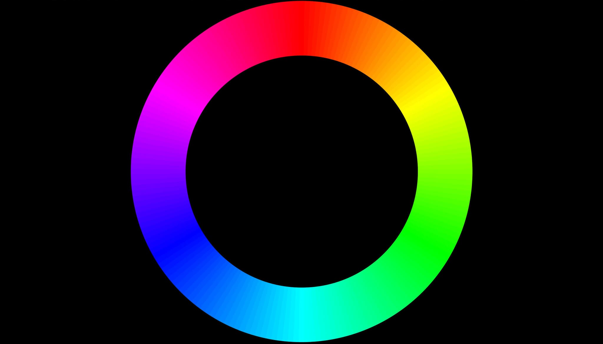
Not sure what the color wheel is? Click the link below to learn more.
Further Reading:
Or if you want to learn how to use the color wheel to find a great color scheme, click the link below.
Further Reading:
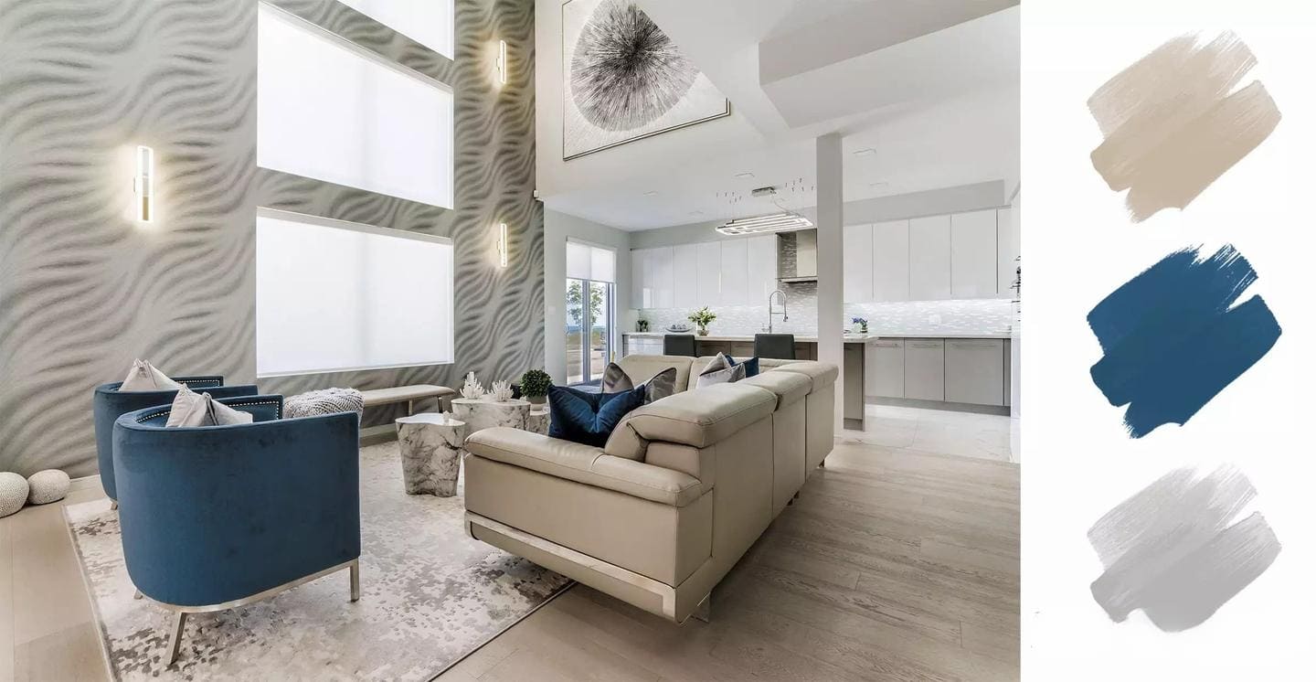
3. Look to Interior Design
Yes, really. Graphic designers can learn a lot from interior designers. They mix textures, objects, and color schemes to make a room look harmonious. If you love how a space is styled, its color palette is probably on point.
Also, dive into other creative fields and see how they use color. Keep your eyes open, and you'll spot plenty of fresh ideas.
4. Make Your Own Color Mood Board
When you spot a photo or image with colors you love, screenshot it and save it. Keep all your inspiration pictures in one folder so you can find them later.
When you need a fresh palette, just open that folder and browse. You'll quickly spot the perfect combo.
You can use any photo-organizing software, or even simpler, upload your shots to Google Photos. They'll stay in the cloud and be ready whenever you need them.
Further Reading:
5 Photo Management Software Solutions to Banish Organizing Stress
Pinterest is another super handy tool. You can save and organize all kinds of digital color palettes there.
5. Use Pantone Color Guides
Picking colors on a color wheel can feel abstract. That's why many designers like a physical swatch — Pantone Color Guides.
What's the upside? With real color chips in your hand, you instantly see how shades pair up. And if a client needs a super-specific tone and wants a real sample, Pantone has you covered.
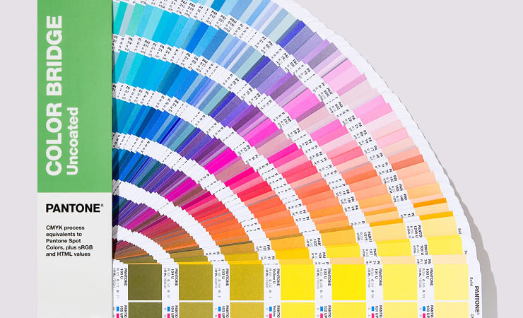
Pantone also standardizes every color. If you're designing anything for print, these guides are a no-brainer. Knowing exactly how your colors will look on paper saves tons of time, money, and headaches.
Further Reading:
6. More Colors Aren't Always Better
Unless you're going for a full-rainbow look, don't mix too many hues.
If your design is simple, stick to three colors. That keeps things clean and stops one color from taking over. If you need extra shades, add texture to soften them.
Using just a few main colors also makes it easier to find inspiration. Often, trying to cram in every shade only makes things messy.
Less is more. Try cutting back on your palette. You might spark fresh color ideas.
7. Match Colors to Your Theme's Mood
Think about what your design is about. Is it sports, fashion, or business? What feeling do you want — bright and fun, serious, or elegant?
Colors usually carry certain vibes. Purple can feel romantic. Pink can feel cute.
A simple way to pick colors is to learn basic color theory. Find out how common colors affect people's moods. Then pick a main color that fits your theme. Build your palette around that color.
Further Reading:
8. Search Color Palettes on Pinterest
Pinterest is packed with awesome color palettes that creators from all over the world share.
Just type in something like "summer palette" and you'll see tons of ready-made schemes you can use right away.
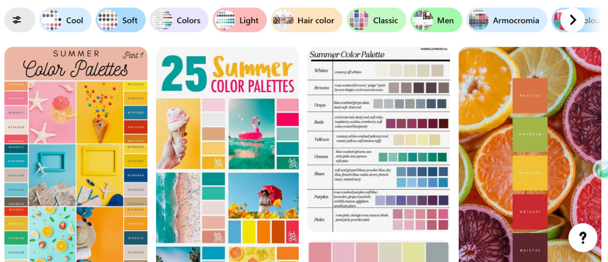
You'll find color ideas from all kinds of design — home decor, fashion, graphics, and more.
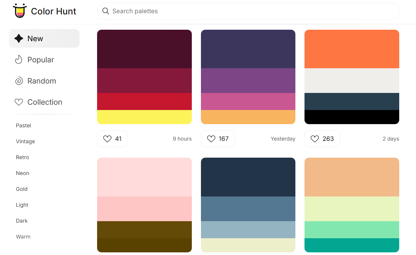
9. Check Out Color Palette Sites
This is the fastest way. There are tons of easy, cool palette sites online, like Color Hunt. When you're stuck, just grab a ready-made scheme.
Bookmark a few of these sites and you'll save a ton of time. If you want to see more handy palette tools, click the link below.
Further Reading:
5 Handy Color Tools: Helping You Solve Your Color Matching Dilemmas
How to Train Your Color Sense?
Theory is useful, but real growth comes from practice. Only by creating again and again will you learn to "hear" and "see" color. Mixing hues, adjusting saturation, and tweaking brightness over time builds a clear picture of color in your mind.
This takes steady work. Copy a master's palette or do a quick color sketch every day. Each exercise lays another brick in your color foundation. Once your sense of color is strong, inspiration won't run dry. Good palettes will come to you naturally.
Here's how to get started:
1. Set Up a Color Challenge Routine
- Daily Swatch: Pick a photo or illustration you love. Pull its color palette, mix those exact shades by hand, and use them in a small piece.
- Limited Palette: Choose just 3–5 colors and make a tiny artwork. Working with a few shades forces you to find balance.
- Review & Record: After each session, note down your mood, theme, and color choices. Over weeks, you'll see your own style and progress unfold.
2. Add TourBox to Your Workflow
To make your color-sense practice faster and more hands-on, try using the TourBox Creative Controller when you paint or adjust colors.

Its small knobs, buttons, and wheels speed up your workflow, so what your mind imagines matches right away with your hands and eyes, giving you quicker feedback on color choices.
For example, you can twist a TourBox knob to change the hue. You don't need to click or drag with a mouse. Just move your finger, and you'll land on the perfect hue in an instant.
This "what you see is what you get" feel not only cuts down on fiddling around, but also helps you sharpen your color instincts faster through simple trial and error.

By looking closely, practicing daily, and reflecting on your results, you'll build a deep, reliable color sense, and you'll tell richer visual stories with confidence.