Four Essential Color Modes in Photoshop: Optimize Your Designs
In this tutorial, we will delve into the four fundamental color modes in Photoshop. Understanding these color modes is essential for mastering the art of digital image editing.
By the end of this tutorial, you will have a solid foundation in utilizing the appropriate color mode for your specific design needs. So let's dive in and unlock the power of color in Photoshop!

In this article, you will learn:
- What Are Color Modes?
- What Is the RGB Color Mode?
- What Is the CMYK Color Mode?
- What Is the HSB Color Mode?
- What Is the Lab Color Mode?
- How to Change Color Mode in Photoshop?
What Are Color Modes?
Color modes are algorithms used in the digital world to represent colors. In the digital realm, colors are typically divided into several components to accurately depict a wide range of hues.
Due to variations in color principles, there are differences in how color devices like monitors, projectors, and scanners, which rely on additive color synthesis, generate colors compared to printing devices like printers and presses, which rely on the use of pigments.
There are four fundamental and commonly used color modes: RGB, CMYK, HSB, and Lab color modes. Each of these color modes plays a crucial role in how you perceive and work with colors in your designs.
In the following sections, we will provide a simple explanation of these four basic color modes in Photoshop.
What Is the RGB Color Mode?
1. Definition
RGB, which stands for Red, Green, and Blue, is a color mode based on the principle of color emission. By combining these three primary colors through additive mixing, a wide range of colors can be produced.
The RGB color mode is primarily used in display devices such as screens and does not exist in printed materials. It is the most widely applied color system, originating from an industry-standard color model and being the most commonly used color mode in everyday life and design.
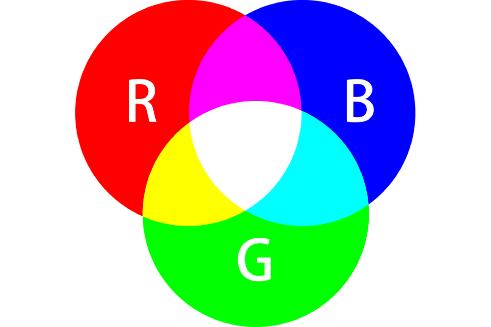
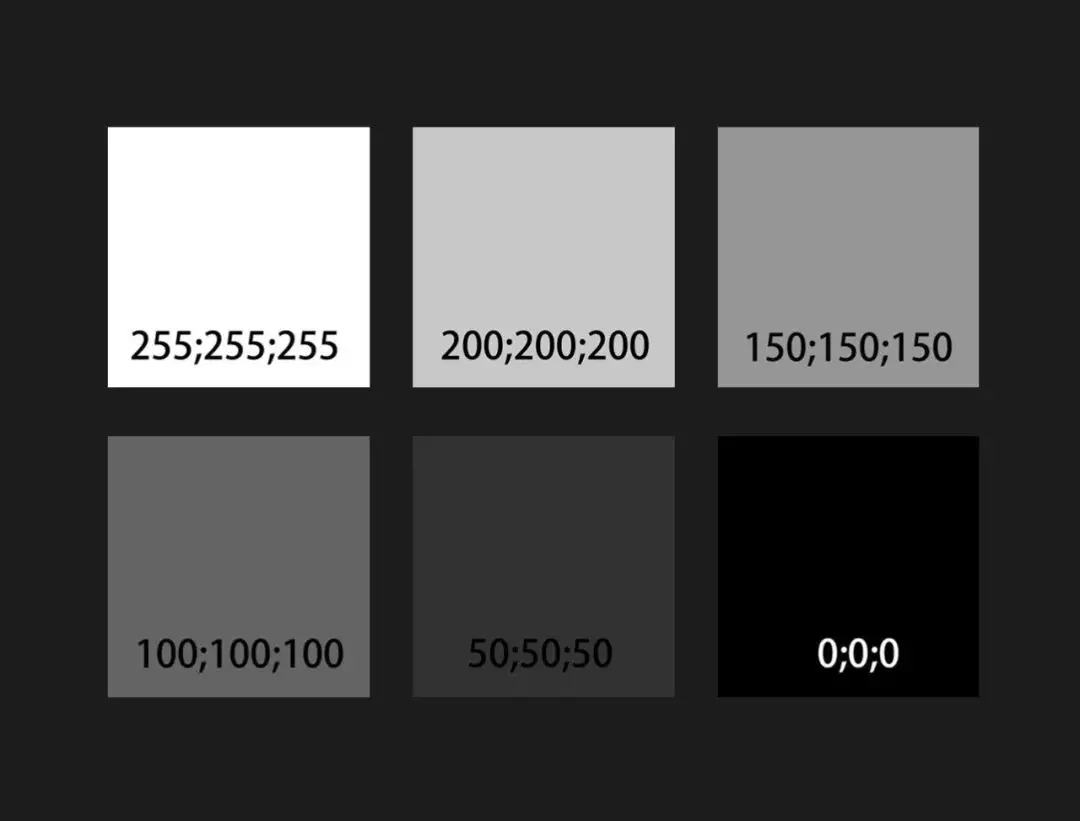
In the RGB color mode, the color values range from 0 to 255. When the RGB values are equal, it creates shades of gray, known as grayscale. The lower the values, the higher the grayscale intensity.
2. Applications
The RGB color mode finds extensive applications, particularly in the LED industry, screen displays, and video output. It is commonly seen in electronic devices such as digital screens, projectors, digital cameras, scanners, and heavily relies on electronic equipment.

What Is the CMYK Color Mode?
1. Definition
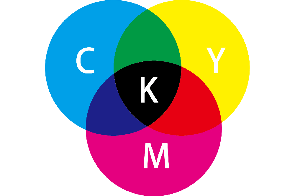
The CMYK color mode is based on the principle of color reflection and involves the mixing of three primary colors to create four colors: Cyan (C), Magenta (M), Yellow (Y), and BlacK (K).
Extra Tip:
In the CMYK color mode, black is not abbreviated as B (Black), to distinguish it from the B in RGB.
So why choose K as the abbreviation? Some people say K stands for “Key Part”. This indicates that the K plate plays a key role in printing.
In the CMYK color mode, subtractive mixing is used, where colors are absorbed, and white light reflected by the light source is filtered through to create the CMYK colors that we perceive.
If your design looks vibrant on the computer screen but has significant color differences when printed, it's actually due to the use of different color modes.
Therefore, when your design needs to be presented in a printed format, it's important to convert color modes such as Lab or RGB, which have a wider color range than CMYK, to the CMYK color mode. This helps prevent color loss during printing and ensures the desired visual impact of the colors.
2. Applications
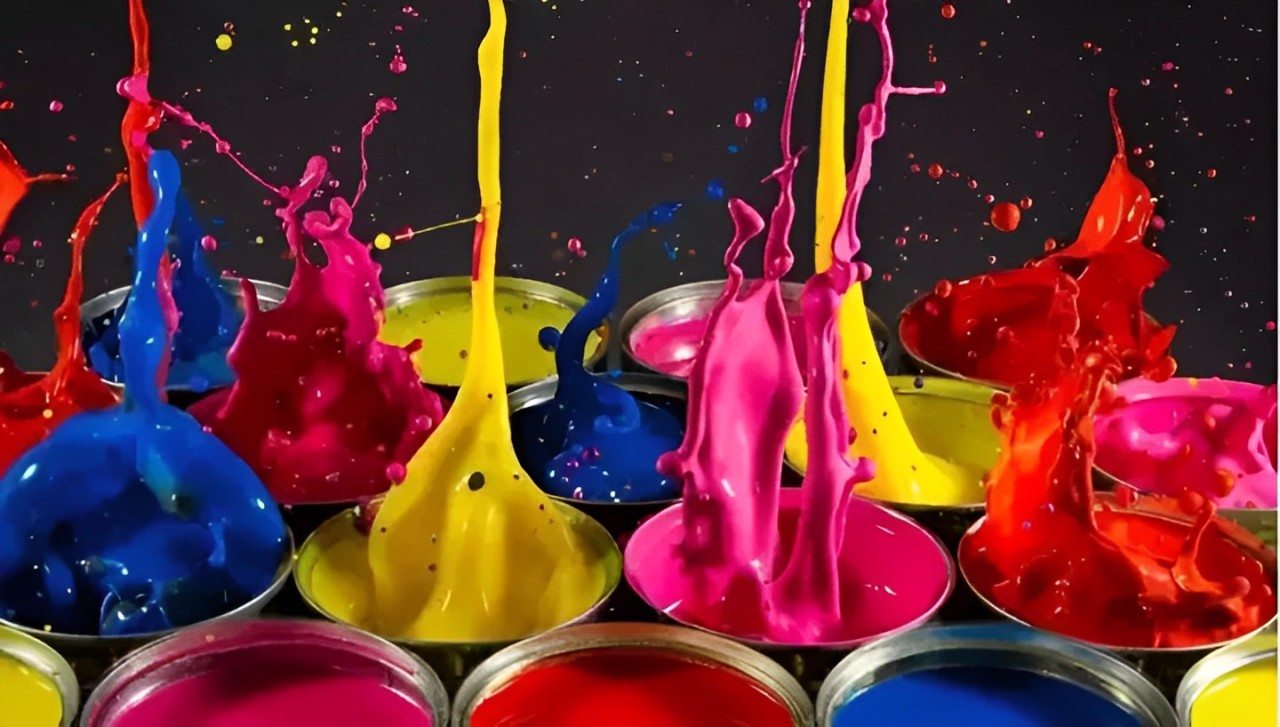
Since CMYK is primarily used in printing, it is commonly seen in printing equipment such as printers and presses, and is widely applied in printed materials such as brochures, packaging, and posters.
3. Difference Between CMYK and Spot Colors
CMYK refers to the four colors: cyan, magenta, yellow, and black, which can be mixed to reproduce thousands of colors in printing.
Spot colors, on the other hand, are pre-mixed specific ink colors used to replace or supplement the CMYK inks. Examples include bright orange, green, fluorescent colors, metallic gold, and silver.
To achieve higher design and print quality, spot colors are often used to ensure color consistency and meet specific requirements.
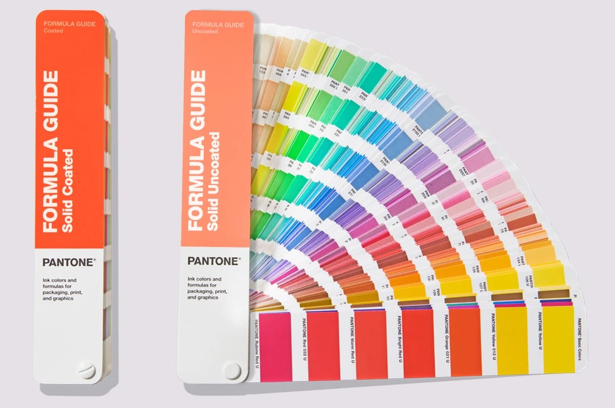
If your design project involves printing, it is recommended to use a Pantone formula guide to minimize color distortion and ensure color accuracy.
Further Reading:
We have written a detailed article on RGB vs CMYK, which you can check out if you're interested: "RGB VS CMYK: An Ultimate Guide to Mastering Color Models."
What Is the HSB Color Mode?
1. Definition
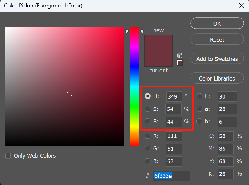
In the HSB color mode, H stands for Hue, S stands for Saturation, and B stands for Brightness. This color mode is based on how the human eye perceives colors.
HSB is commonly found in color adjustment sections of design software. Higher values of H and S result in higher saturation and more vibrant colors.
2. Applications
Most of the color elements we see, such as saturation and brightness, are derived from the HSB color mode. The color picker in Photoshop, for example, uses the HSB color mode.
When choosing colors in design, you can use color schemes based on the same brightness or the same saturation. The HSB color mode makes it convenient and accurate to select colors.
For example, if you want to use colors with the same hue but different brightness and saturation, you can open the color picker interface, select the HSB sliders, and choose the H (hue) first. If you want vibrant colors, adjust the S (saturation). If you want darker colors, then adjust the B (brightness).
This easy process helps you find the desired colors.
Further Reading:
We have an article that provides a detailed guide on how to use the HSB color mode for color grading. If you're interested, you can check it out: Understanding the HSB Color Mode.
What Is the Lab Color Mode?
1. Definition
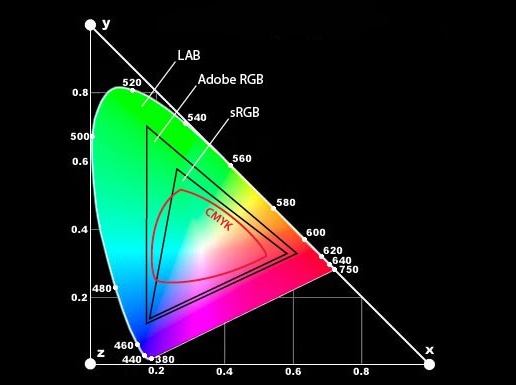
The Lab color mode represents all the colors that we can see. Lab stands for Luminosity (L), the range from magenta to green (a), and the range from yellow to blue (b).
Lab is device-independent and encompasses all the color spaces of RGB and CMYK. It can depict colors that RGB and CMYK cannot. Lab can represent any color that the human eye can perceive.
2. Applications
It's important to understand that the order of color gamut size is as follows: Lab > RGB > CMYK.
In design projects, you can start by designing in the Lab color mode and then convert it to RGB (for display) or CMYK (for print) based on the output requirements.
The greatest advantage of using Lab is that it allows you to achieve superior color quality in your final design compared to any other color mode.
How to Change Color Mode in Photoshop?
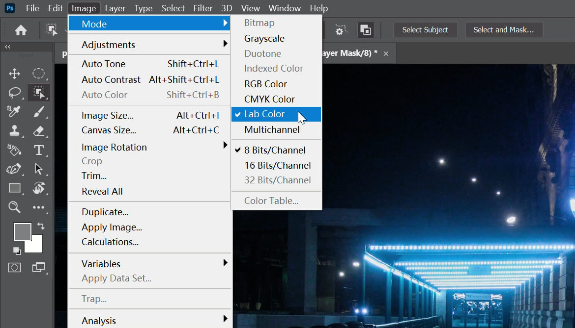
To change the color mode of an image in Photoshop, you can follow these steps:
- Select "Image" from the top menu bar in Photoshop.
- Choose the "Mode" submenu.
- Click on the desired color mode you want to switch to.
Before changing the color mode, it's a good idea to do the following:
- To avoid color distortion, you can edit the image in Lab mode and then convert it to RGB mode for display or CMYK mode for printing.
- Save a backup copy in case any data is lost or unable to be recovered during the conversion process.
- If the image has layers, it's best to merge them first because different color modes can affect layer blending modes and effects. However, be aware that converting layers with vector text will rasterize the text.
- Some color modes, such as bitmap and duotone mode, require conversion to grayscale mode before use. These modes can only have two colors, so all color information needs to be removed first.
Product Recommendation:
As we've explored the four essential color modes and their significance in design, it's important to have the right tools to streamline your workflow. That's where TourBox comes in.

TourBox is a revolutionary creative controller that significantly boosts your efficiency and productivity. With its ergonomic design and customizable buttons, TourBox provides a seamless experience for operating and adjusting in creative software like Photoshop.
By incorporating TourBox into your design process, you can effortlessly switch color modes, adjust color values, and fine-tune your designs without the need for complex keyboard shortcuts or menu navigation. It's like having a dedicated color mode controller at your fingertips.

And that concludes our tutorial on Color Modes. We hope that it has been helpful for your design and creative journey.