Seven Color Schemes to Make Your Designs More Appealing
In the world of design, creating a color palette is crucial to the design process.
If you search for "Color Palette" on Google, you'll find numerous palette generation tools. Once you've determined the primary color, these tools will generate a complete color palette for you.
Before using these tools, it's important to understand the various types of color palettes and the effects each type can produce.
This allows us to use the tools more effectively, helping us define and use colors with greater precision.
In this tutorial, we will introduce seven color palette schemes and the principles of color coordination. Without further ado, let's get started.

In this article, you will learn:
- The 7 Color Palette Schemes in Design
- Negative Examples of Color Combinations
- Color Matching Rules: How to Color Match in Design?
- Final Thoughts About Color Palette in Design
The 7 Color Palette Schemes in Design
In this section, we'll explore seven different color palette schemes. By the end of this, you'll be well-versed in various types of color palettes.
1. Monochromatic Color Palette
A monochromatic color palette uses only one hue for its color scheme. It's a relatively safe choice, but the contrast in a monochromatic palette is lower than in other types, which may result in a design that appears dull or lackluster.

2. Analogous Color Palette
Analogous colors are a group of colors that sit next to each other on the color wheel. This palette is a stable choice that offers a range of suitable hues for your design.
However, the contrast between analogous colors is weaker than in other types of palettes.
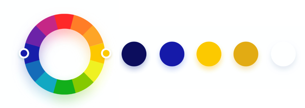
3. Complementary Color Palette
A complementary color palette uses colors that are directly opposite each other on the color wheel, providing a strong contrast that can draw the user's attention.
These colors should be used carefully, ideally choosing colors with a saturation of less than 85% to avoid causing visual fatigue due to strong color contrast.
Also, it's important to control the use of the main color and its complementary color to maintain harmony in your design.
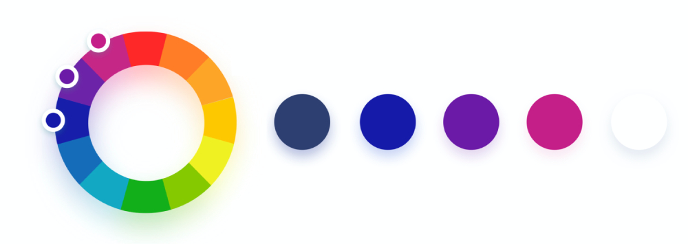
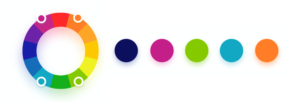
4. Triadic Color Palette
Triadic colors are three colors evenly spaced on the color wheel, forming an equilateral triangle. Triadic color schemes are richer and create better visual effects.
When creating a triadic palette, ensure a balance between colors by first establishing a dominant color that occupies 60% of the palette, then choose two accent colors that make up 30% and 10%, maintaining balance in your design.
5. Split-Complementary Color Palette
The split-complementary color scheme is a variant of the complementary color palette. It uses a base color and two adjacent colors to its complement on the color wheel, forming an isosceles triangle.
The split-complementary palette has a weaker contrast than the complementary color scheme, making it a popular choice for beginners aiming for a simple yet outstanding design.
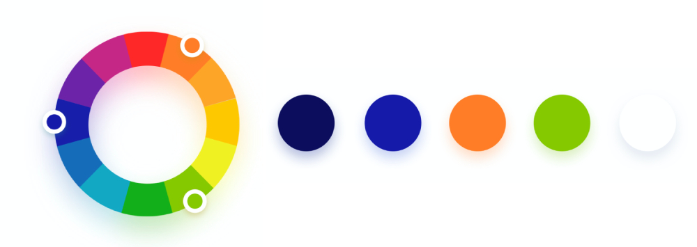
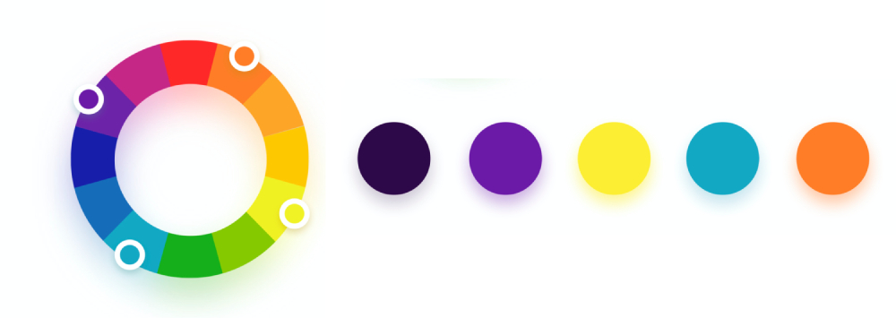
6. Tetradic Color Palette
Tetradic, or rectangular, color scheme involves four colors arranged into two complementary pairs. Since it's composed of two pairs of complementary colors, this scheme can bring a sense of vitality to your design.
When creating a tetradic color scheme, it's best to determine a dominant color first, with the other three colors serving as accents. The balance between warm and cool tones should be maintained for optimal effect.
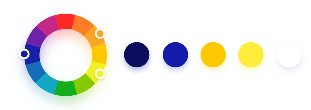
7. Square Color Palette
The square color scheme is a variation of the tetradic palette. The main difference is that the four colors in a square palette are evenly spaced on the color wheel, forming a perfect square.
Just like the tetradic palette, try using one color as the dominant color and control the proportion of the other colors.
Negative Examples of Color Combinations
Some colors individually look pleasant, but when combined, they can produce undesired results, potentially reducing readability or creating discomfort, and thus impacting the user experience.
Let's consider a few negative examples of color combinations. For instance, pairing two very bright colors, as shown in the image below, can lead to a peculiar and weird color mix that is best avoided in design.

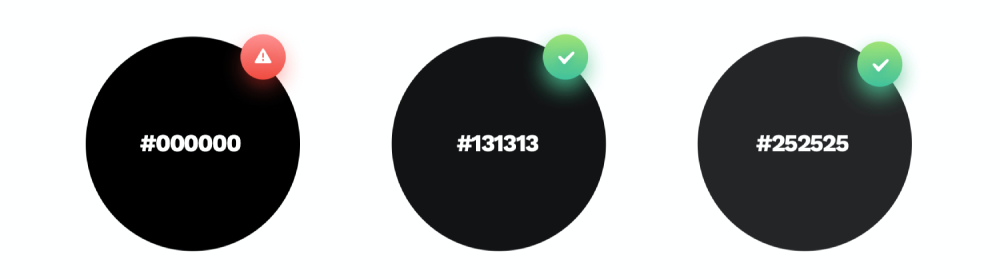
In addition, the use of pure black (#000000) in design has always been a topic of debate. Do you think pure black should be used in the design?
While pure black offers the highest contrast (especially against a white background), it isn't necessarily the best color choice for digital designs as high contrast can negatively impact readability.
Given that screens emit light, pure black can create an "unlit" effect, which can appear very unnatural. It's best to avoid using pure black in design.
When aiming to maintain contrast within a safe range, it's preferable to use deep gray instead of pure black.
Color Matching Rules: How to Color Match in Design?
As we embark on the journey of color matching in design, it's crucial to grasp the importance of color in communicating the right message and setting the appropriate mood.
Colors have the power to evoke emotions, draw attention, and make a design aesthetically appealing.
In this section, we will delve into the nuances of color matching, providing practical insights and guidelines to ensure your designs are not only visually stunning but also effectively convey your intended message.
1. Incorporate Gray in the Color Palette
When creating a color palette, it's a good idea to incorporate a touch of gray into your primary color. This kind of color combination can blend more seamlessly into the design, enhancing the sophistication of the page.
For example, if you take the base color #2F51D2 and reduce the brightness and saturation to around 30, you'll get a deep gray shadow that blends perfectly with the primary color.
If you increase the brightness of the base color to 90 and decrease the saturation by 10, you'll get a medium gray.
By further increasing the brightness to 95 from the medium gray, you can obtain a light gray. This color is often used as the background color of a product.

2. The Golden Ratio in Color Matching
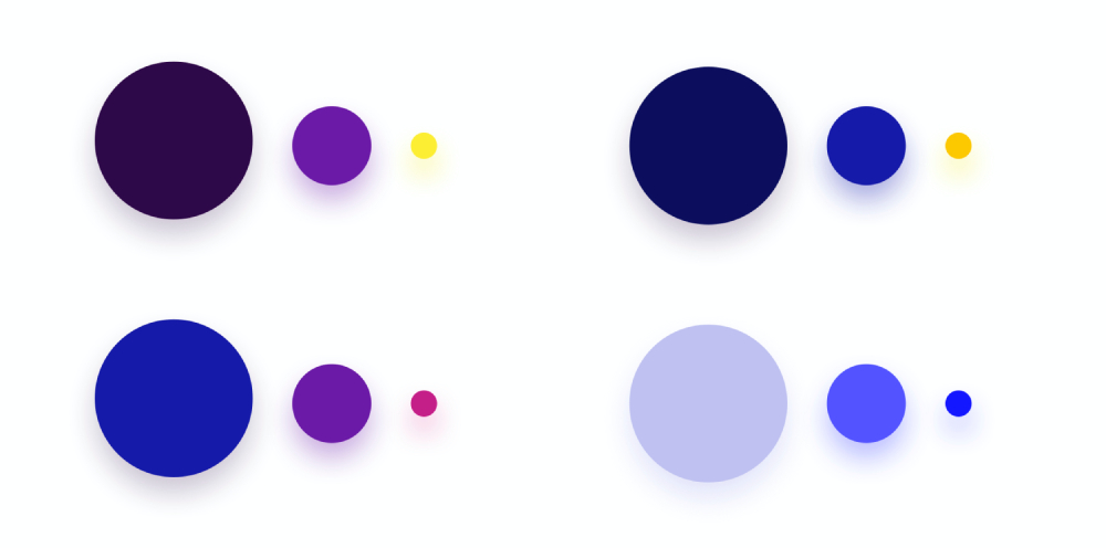
When creating a color palette, it's also important to balance the proportions of the colors used. One of the best methods is to apply the golden ratio of color matching, which is 60/30/10.
For example, use 60% dark blue, 30% purple, and 10% pink. Dark blue is the base color, and variations of darker and lighter blues are used as the background and for low-priority elements, occupying approximately 60% of the design.
Purple is the secondary color, suitable for higher hierarchy elements. To ensure adequate visibility, the use of purple should be around 30%.
Pink is the accent color and the color for the "Call to Action" buttons. Therefore, a usage area of 10% is best, highlighting the most important elements.
3. Control Saturation in Design
Contrast is one of the most fundamental indicators of readability. However, if the brightness of our phone or computer screen is high, the appearance of high-contrast colors on the screen can easily cause eye fatigue.
So, if you want to use highly saturated, high-contrast colors in your design, it's crucial to first consider the purpose of this design choice, ensuring that your design plan is user-friendly.
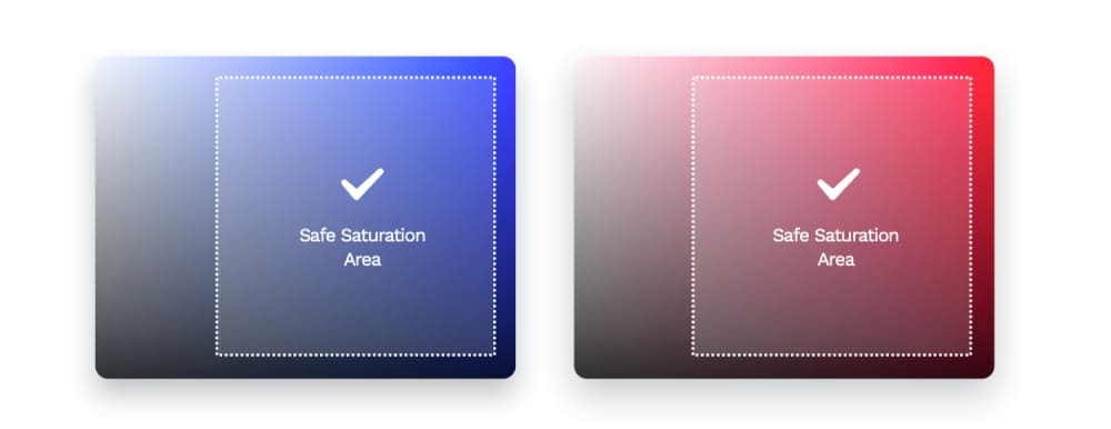
A common practice is to avoid using colors with a saturation exceeding 90%. It's safer to choose colors from areas that are typically deemed safe, as marked in the image below until the correct color combination is created.
Final Thoughts About Color Palette in Design
When working with colors in design software, it's all about precision and ease of use. You need to be able to select and adjust colors quickly and accurately, ensuring that your final design aligns with your color palette.
This is where the TourBox comes into play. As a designer, you're well aware that the right tools can make a world of difference in your workflow, and the TourBox is a game-changer.
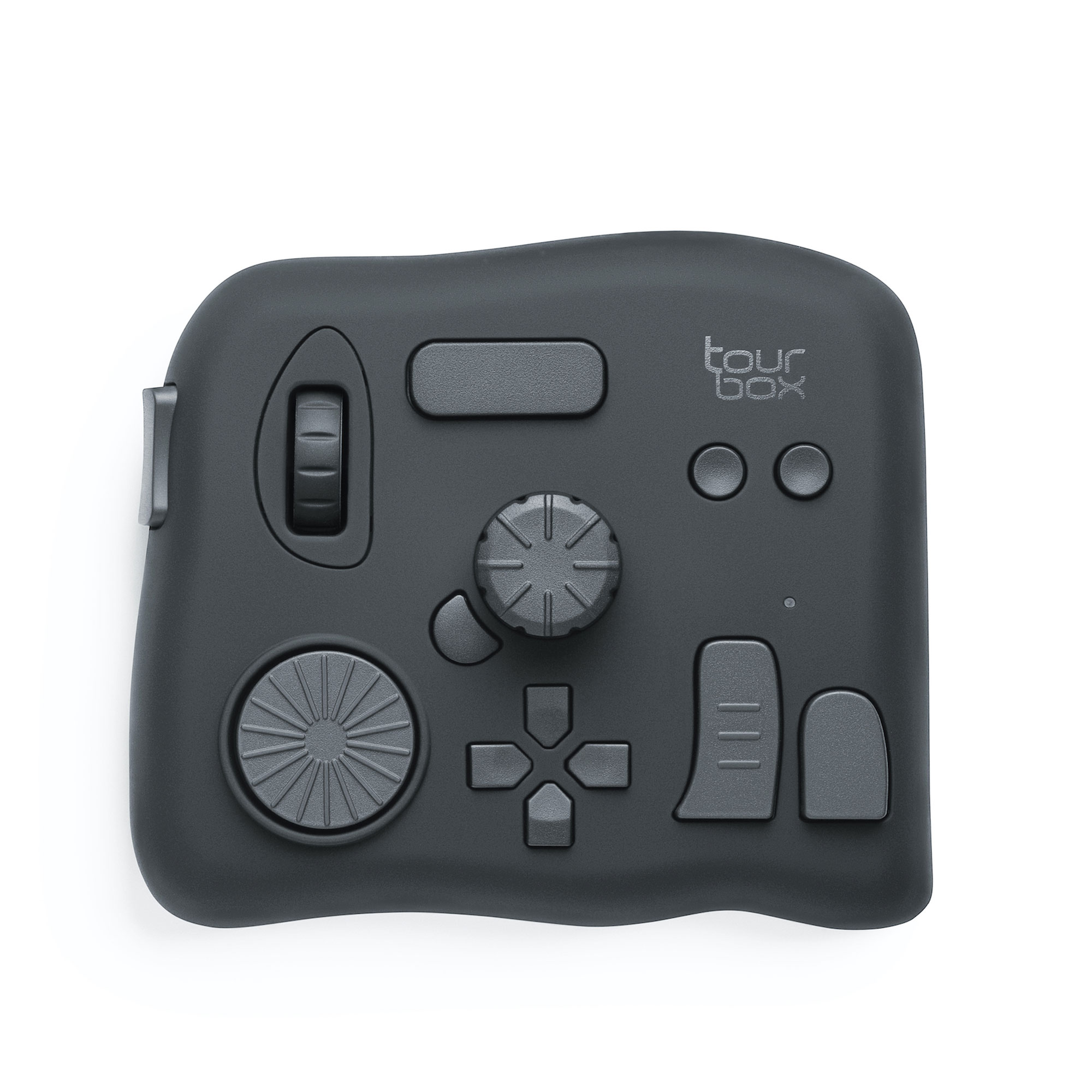
With TourBox, you can effortlessly tweak the colors in your designs on the fly, making it easier than ever to achieve the perfect color match.
Imagine being able to adjust hue, saturation, and brightness with a simple twist of a knob or press of a button. It's not just about speed, but also about maintaining a state of creative flow, without interruptions.
So, for designers seeking to master the art of color matching, the TourBox is an invaluable companion. It doesn't just make color adjustment easier – it transforms it into a seamless part of the design process.