Color Psychology: How Does It Influence Your Emotions?
Have you ever wondered how colors influence our emotions and decisions? Why does red often evoke passion while blue brings a sense of calm?
In this article, we will delve into the fascinating world of color psychology, revealing how different hues affect our mood, perception, and behavior.
Especially for photographers and digital artists, understanding the associative tendencies of different colors can help you better express the emotions or feelings you want to convey through color in your creations.
In this article, you will learn:
- What Is Color Psychology?
- Why Do Different Colors Evoke Different Feelings?
- The Psychological Impact of Three Color Properties
- How to Utilize Color Psychology in Your Creative Work?
- Does Color Psychology Really Have Such a Big Impact?
What Is Color Psychology?
Color psychology examines how colors influence human emotions and behavior. It delves into how colors impact our mental state and decision-making processes through visual stimuli.
In the field of color psychology, there are several key areas of study:
- Emotional Response: How colors affect individual emotions.
- Brand Perception: How businesses use colors to establish brand identity.
- Cultural Variances: Different interpretations of colors across various cultural backgrounds.
- Environmental Design: The application of color in architecture and interior design.
- Consumer Behavior: How color influences consumer choices.
Different colors have varying psychological effects on people. This kind of "feeling" may seem mysterious, but it's actually based on evidence: there's a general consensus on how people tend to react to colors.
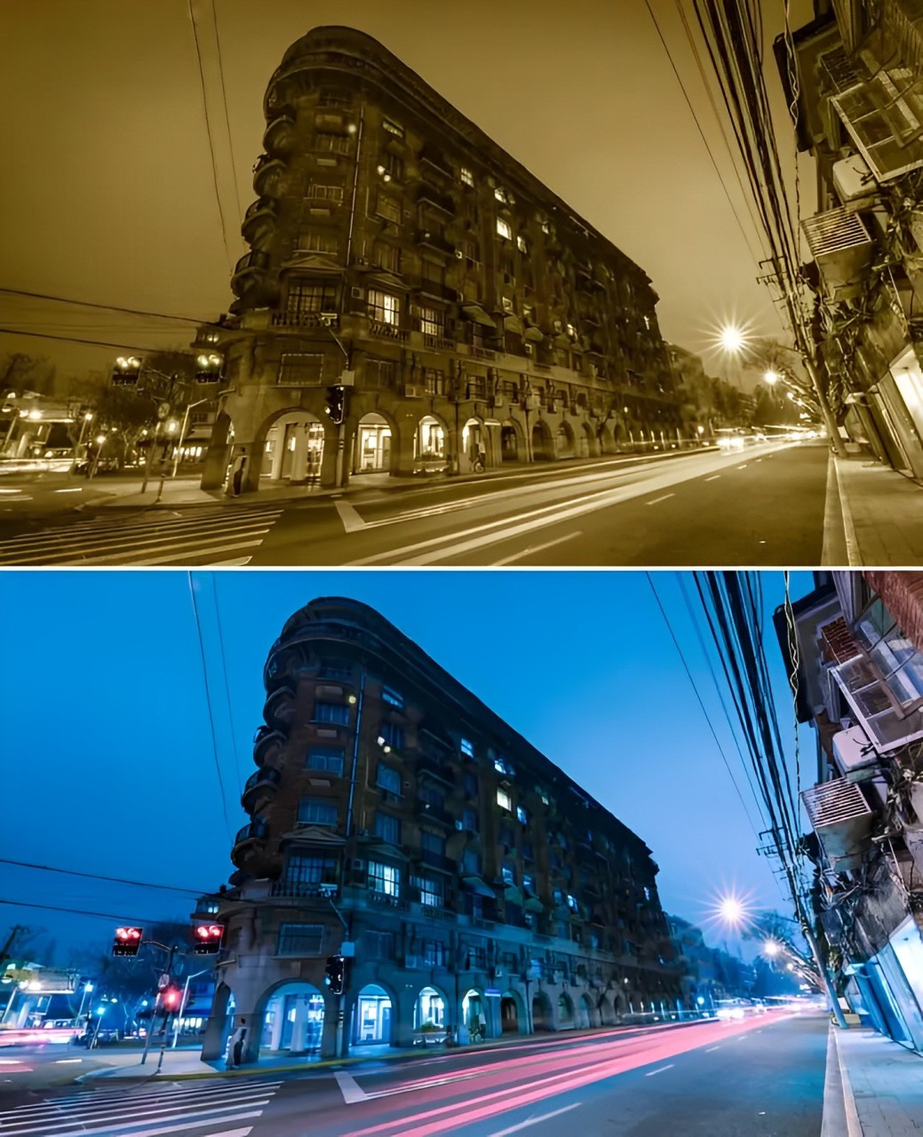
For instance, when we talk about "yellow," a mustard yellow can feel vintage, bringing to mind yellowed old photos; a bright yellow is sunny and fresh, making you think of lemons; and an orange-yellow is like a sunset, evoking a nostalgic, old-fashioned feeling.
Consider these two photos of the same scene but with different color tones. They are bound to evoke different feelings in you.
Research has confirmed that there are common subjective perceptions of colors among most people:
- Red: Often associated with passion and excitement. Studies indicate that 68% of participants believe that red can ignite energy and attention.
- Blue: Linked to calmness and trust. Surveys show that over 60% of individuals consider blue the most soothing color.
- Green: Symbolizes nature and health. 45% of people feel that green brings a sense of balance and comfort.
- Yellow: Typically associated with optimism and joy but can also trigger anxiety. Around 35% of individuals see yellow as an energizing color.
- Black: Related to power and mystery. 51% of respondents associate black with sadness.
- White: Symbolizes purity and simplicity. Approximately 48% of individuals believe that white brings clarity and neatness.
Why Do Different Colors Evoke Different Feelings?
There isn't a definitive answer to this question, but a common theory is that we have inherent associations with each color.
For example, green. If your impression of green is leaves, you might think of nature and eco-friendliness. If it's traffic lights, then it's about safety. But if it's mold on food? That's just gross.
So, when we see a color, we establish a connection between the color and real-world objects, which then triggers a feeling within us.
When we see the same color, everyone's reaction can be vastly different. For instance, if a thousand people see red, they might conjure up tens of thousands of different images.
However, amidst this chaotic and personalized world, there are still some commonalities.
Take photography, for example. A photo with light blue and pink tones may appear sweet and delicate. On the other hand, a photo with deep, heavy blues or greens, with warm tones slightly subdued, and rich hues, might give off a traditional Leica camera vibe.
The Psychological Impact of Three Color Properties
How do our eyes perceive color in the world around us? We often say things like "the sky looks so blue," "your outfit is very vibrant today," or "those dark clouds are so gloomy and oppressive," rather than "your hair color is RGB(145,120,86) today, it looks great."
So, the way our eyes observe color is actually based on three aspects: hue, saturation, and luminance, which are known as the three properties of color:
- Hue: This is essentially the appearance of color, like red, green, blue, and so on. It's the primary characteristic that distinguishes one color from another.
- Saturation: This refers to the intensity of color. In our eyes, saturation describes how vivid a color is. The more vibrant a color is, the higher its saturation, and conversely, less vibrant colors have lower saturation.
- Luminance: This indicates how light or dark a color is, such as light red versus dark red.
Further Reading:
An Ultimate Guide to Understanding Hue & Saturation & Luminance
So, how do these three color properties affect human emotions in color psychology?
1. Psychological Effects of Different Hue
Hue, being the most noticeable color attribute to our eyes, can have a direct and significant impact on our psychology. Throughout our long evolutionary history, humans have developed specific psychological responses to certain hues.
For instance, when we see a photo with cool tones, we instinctively feel that the environment in the picture is cold; conversely, warm-toned photos make us assume the environment was warm when the picture was taken.
A classic example is if we were to change a red apple to blue, you would likely think the apple is inedible. This is because subconsciously when blue is associated with food, it triggers a sense of toxicity.
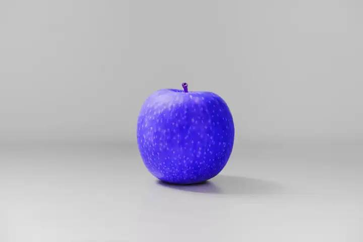
Therefore, when you're editing photos or creating digital art, make use of the different psychological effects that come with various hues to express the emotional tone of your work.
You don't actually need to memorize the psychological responses to different hues deliberately because, for the most part, our responses to hues are somewhat universal.
2. Psychological Effects of Different Saturation Levels
Highly saturated colors often evoke a vivid, bright, and lively psychological response, but excessively high saturation can also feel overwhelming, nauseating, or overly stimulating.
On the other hand, desaturated colors tend to create a calm, gentle, and relaxing psychological impact. However, extremely low saturation can lead to feelings of melancholy, emptiness, or dullness.
Therefore, we can't simply say that high saturation is better than low saturation. Both high and low saturation have their own emotional values and suitable contexts for use. The best approach is to carefully adjust the saturation based on the visual emotions you want to convey.
3. Psychological Effects of Different Luminance Levels
High-luminance colors can evoke feelings of freshness, brightness, and lightness, while low-luminance colors can create a sense of heaviness, texture, and oppression.
You can effectively control the emotional tone of your visuals by managing the brightness of colors appropriately.
How to Utilize Color Psychology in Your Creative Work?
By now, as you've read up to this point, you likely have a basic but somewhat vague idea of color psychology. At the very least, you must have realized that the same piece of art, presented in two different color tones, can evoke entirely different feelings.
In this section, we will provide some suggestions on color tendencies to assist you in effectively incorporating color psychology into your post-processing in photography and digital art creation.
1. Apply a Single Color Tone
What does it mean to apply a single color tone? It's about giving a photo/artwork a bias towards a particular color, similar to adjusting the white balance.
A single color tone directs associations very clearly. Though different people may feel differently, there are also commonalities.
For example, when you see orange, at least you won't think of it as cold. The sunset photo below should evoke a warm feeling in you.

The principle behind color bias is this: the stronger the bias, the more pronounced the emotional expression.
Here, we'd like to share what most people associate with certain colors in color psychology:
- Red: Passion, danger, love, pressure
- Orange: Warmth, nostalgia, tranquility, brightness
- Yellow: Youth, caution, brightness, liveliness
- Green: Peace, freshness, safety, health
- Blue: Rationality, calmness, coolness, trust
- Purple: Nobility, charm, magic, comfort
Here are two points to keep in mind:
- In color psychology, color preferences are not fixed. People from different countries, cultures, and beliefs have varied feelings about colors. So, you may (or definitely) have other associations.
- We're not telling you to "think this way" here because your associations may differ from most people. However, you can use this to analyze your unique associations with colors, thereby creating your own style.
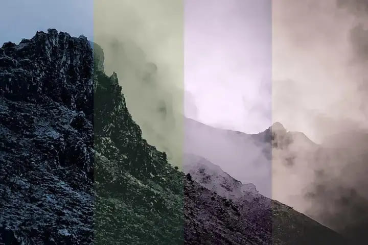
2. Adjust Saturation and Luminance
Generally speaking, darker colors create a more profound atmosphere, while lighter colors evoke a lighter mood. Higher color saturation brings about more energy and direct associations, while lower saturation is more subtle and calming.
These simple color psychology conclusions are something you can easily deduce with a bit of analysis. Now, the question arises: how should you apply these in post-processing for photography and digital art?
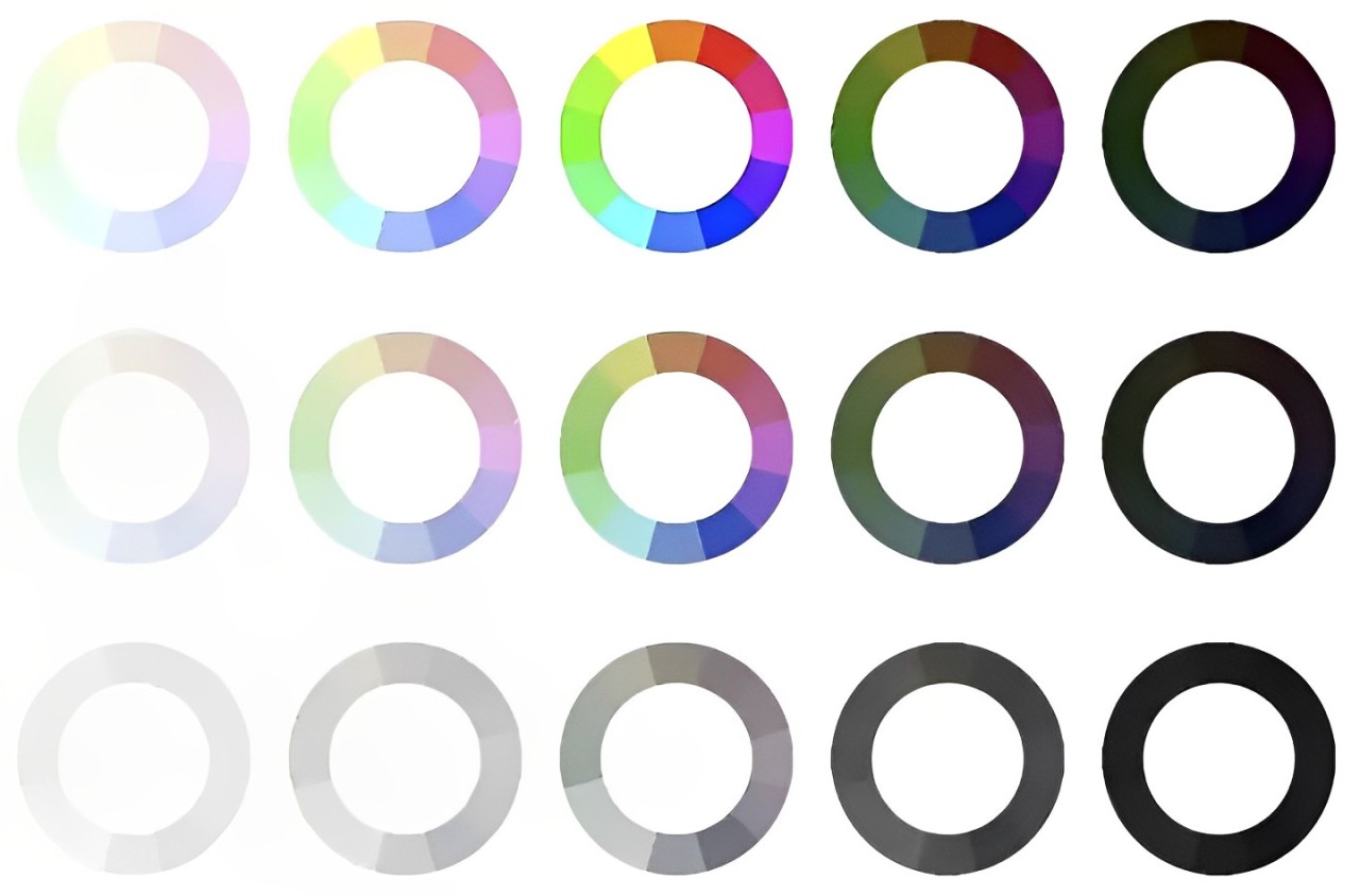
Our suggestion is: to start with saturation and then move on to luminance.
- If you want a striking piece of work (just considering color tones), boost the saturation first and then fine-tune the luminance.
- On the other hand, if you aim to convey a warm atmosphere, you can opt to brighten the colors (luminance). If you want to express power or deep emotions (suppression, intense feelings), you might consider lowering the luminance of the colors.
For example, take a look at this pair of photos. The photo on the left was taken during the day, with a striking expanse of blue but lacking some depth. On the right is a photo taken at sunrise, where we reduced the saturation slightly, giving the image a more subtle color tone.
It's clear that different color treatments can imbue your photos/digital artworks with entirely different emotions.

3. Add Duotone/Multitone
Once you have a good grasp of color psychology, you can experiment with adding duotone or multitone effects to your work. This is highly subjective and there isn't a set rule for it.
Most importantly, your control over colors should serve the essence of your work. There are two main approaches you can consider: analogous colors and complementary colors.
Analogous colors add layers of emotion, while complementary colors introduce contrast to your work.
Further Reading:
Does Color Psychology Really Have Such a Big Impact?
Despite the attention color psychology receives in many fields, most psychologists approach it with skepticism. They argue that the effects of color are often exaggerated and lack empirical support. Here are some key points:
- Cultural Differences: Colors hold different meanings in various cultures. For instance, white symbolizes purity in Western culture, but it may be associated with mourning in some East Asian cultures. This suggests that the influence of color is not universally applicable.
- Individual Variances: The impact of colors on individuals varies based on personal backgrounds and experiences. For example, someone may have specific emotional responses to a particular color due to past experiences.
- Limitations in Research: Many studies on color effects have methodological flaws, such as oversimplifying cause-and-effect relationships and not considering complex variables. Furthermore, many studies rely on subjective reports rather than objective measurements.
- Environmental Factors: The perception and effects of colors are also influenced by the environment and context. The same color may evoke different emotional responses in various settings.
For example, a study found that the color red can enhance attention during exams but may increase anxiety in a waiting room. These examples illustrate that the influence of color is complex and multifaceted.
While colors can indeed affect our feelings and behavior, this impact is regulated by various factors. To better comprehend color psychology, more rigorous scientific research is still needed.
From these analyses, we can see that while color psychology holds significant influence, it is also important to approach it with a rational understanding of its limitations.
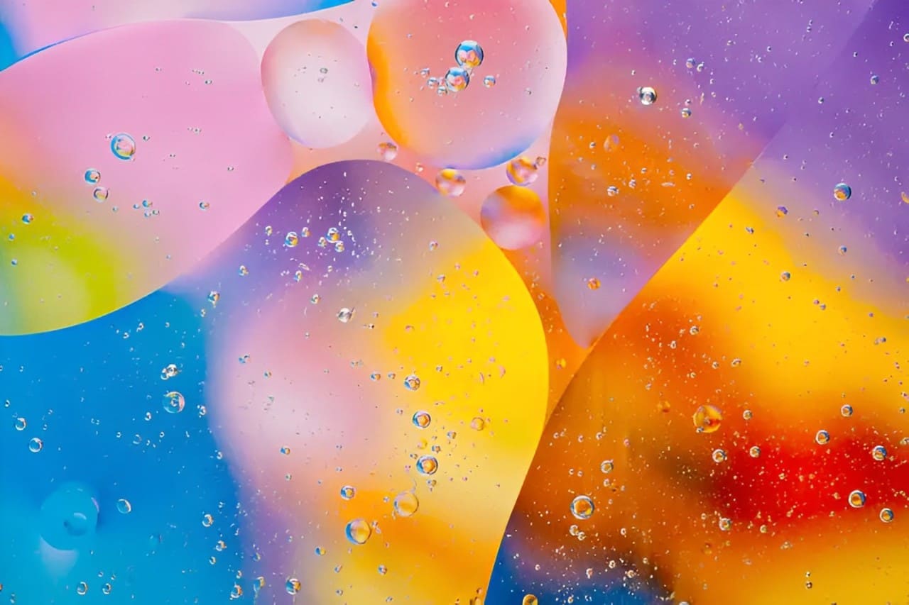
That being said, for photographers and digital artists, having some understanding of color psychology can undoubtedly infuse soul into your work.
If you're looking for a more efficient, streamlined creative process, then you'll love the TourBox creative controller.
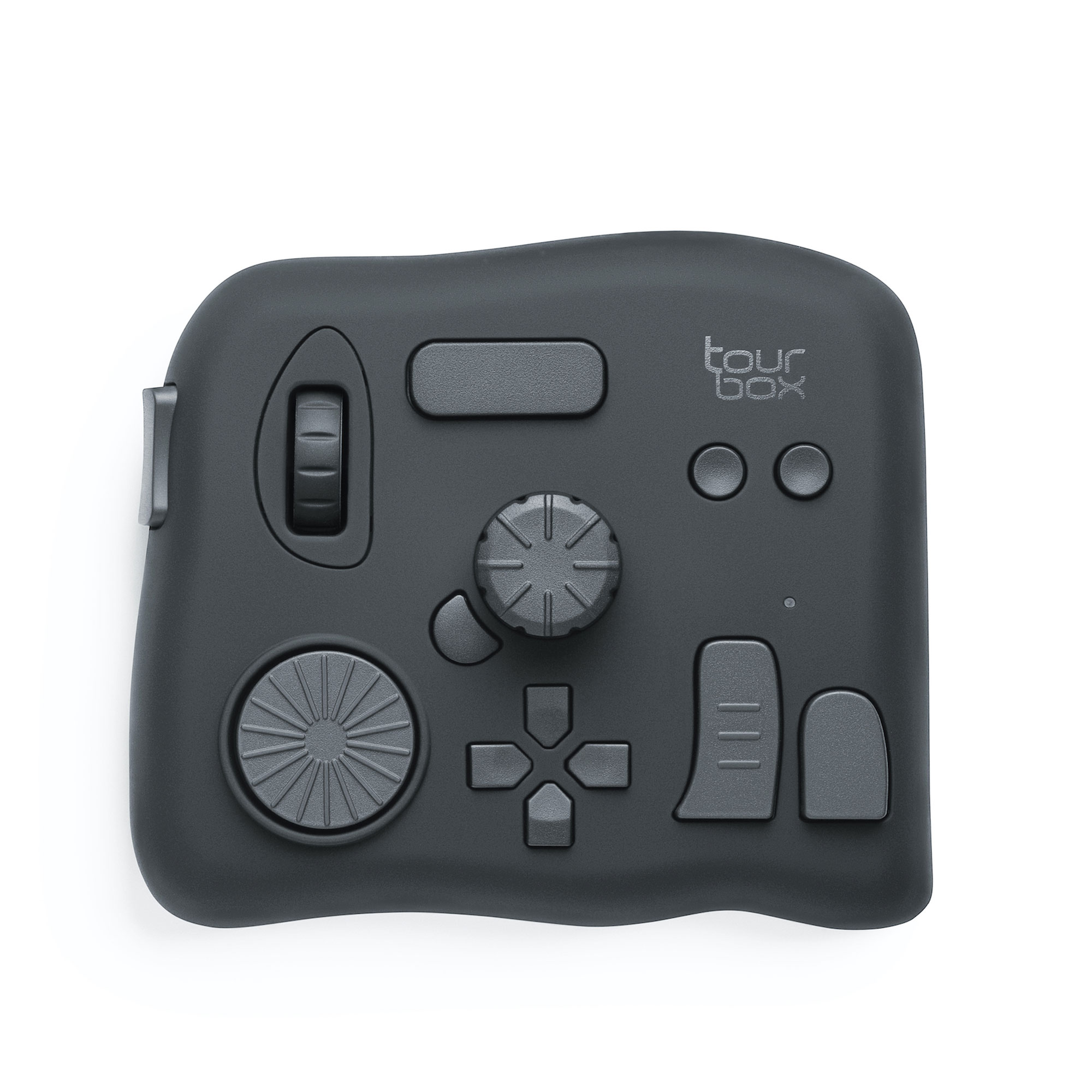
Whether you're color grading photos in post-production or changing brush colors in digital painting, TourBox makes it easier for you to accomplish these tasks.
With TourBox, you can say goodbye to cumbersome keyboard shortcuts. Just like using a game controller for gaming, TourBox provides you with a better operating experience.

Check out our photo editing and digital painting page to see how TourBox can revolutionize your workflow.