Color Wheel | What Is it & How to Use it?
In this article, we'll delve into something you may have heard of but aren't quite familiar with: the color wheel.
We'll explore the history of the color wheel and discuss how it should be used in photography and design. Get ready to discover the secrets of the color wheel and learn how to leverage it in your creative endeavors.

In this article, you will learn:
- What Is a Color Wheel?
- Why Are There So Many Different Color Wheels?
- How to Use a Color Wheel?
- Final Thoughts About Color Wheel
What Is a Color Wheel?
The color wheel is a circular tool that helps us understand the relationships between colors. So, what exactly is a color wheel? Let's start from its origins.
1. Who Invented the Color Wheel?
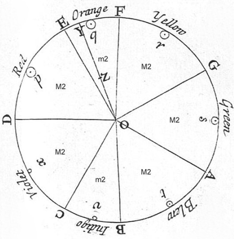
In 1666, Sir Isaac Newton conducted an experiment using a prism to separate white light into red, orange, yellow, green, blue, indigo, and violet. He arranged these seven spectral colors at regular intervals on a circle, which was the earliest application of a color wheel.
Newton formally presented the concept of using a color wheel to illustrate the relationships between colors in his 1704 work, "Opticks."

2. The Asymmetrical Color Wheel
The color wheel created by Newton was asymmetrical and consisted of seven colors. However, it is not the color wheel commonly used today.
This color wheel primarily focused on the colors of light spectra, which are the seven colors separated from light.
3. The Symmetrical Color Wheel
In 1810, Johann Wolfgang von Goethe developed a symmetrical color wheel with only six colors, excluding indigo.
This symmetrical color wheel is closer to the one we commonly use today, including red, orange, yellow, green, blue, and violet.
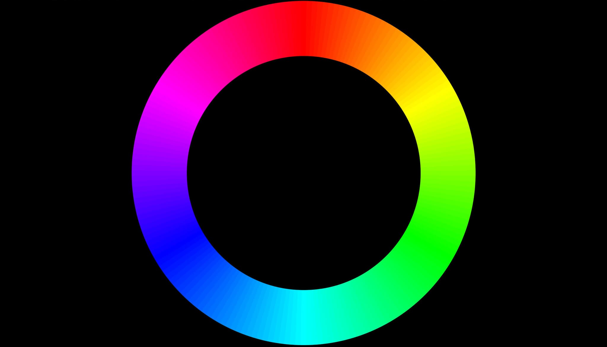
4. The RGB Color Wheel
The color wheel we frequently use today is based on the additive color mixing model of light and is commonly known as the RGB color wheel.
In the RGB color wheel, we use the primary colors of red, green, and blue to create other colors.
Therefore, when we talk about the color wheel, we usually refer to the RGB color wheel. It has wide applications in science, art, and design.
Why Are There So Many Different Color Wheels?
What is the complementary color of red? In other words, what color is opposite of red on the color wheel?
Some might say it's cyan, while others might say it's green.
The so-called complementary color is defined as the color opposite to another color on the color wheel, with a 180° separation. So why are there two different answers?
The reason is that various color wheels are based on different color theories, resulting in different answers.
Let's take an example of creating a color wheel. You need to start with three colors, which are the primary colors.
However, the primary colors can vary in different fields. For example, the primary colors of light are RGB (red, green, blue), the primary colors of printing are CMY (cyan, magenta, yellow), and the primary colors in traditional art are RYB (red, yellow, blue).
In summary, there are two distinct styles of color wheels:
- Light-based color wheel: Colors are distributed scientifically based on the different wavelengths of light.
- Pigment-based color wheel: Colors are subjectively and evenly distributed by human perception.
Now, here comes the question: designers and photographers need to refer to a standard color wheel, right?
In reality, the individuals who create color wheels already have a subjective bias when making them, so don't worry too much about it.
The color wheel has been somewhat "sanctified," with people believing that everything will be fine as long as they adhere to it. While the color wheel does play an important role as a reference in color adjustment, just like a histogram, it is not the ultimate determinant.
The only things that truly determine your design and photos are your ideas and skills, not any specific rules.
How to Use a Color Wheel?
If you search for a color wheel online, you'll find that most of them are colorful circles. However, if you look closely, you'll notice many different variations. This is what we discussed in the previous section—there are various standards for color wheels.
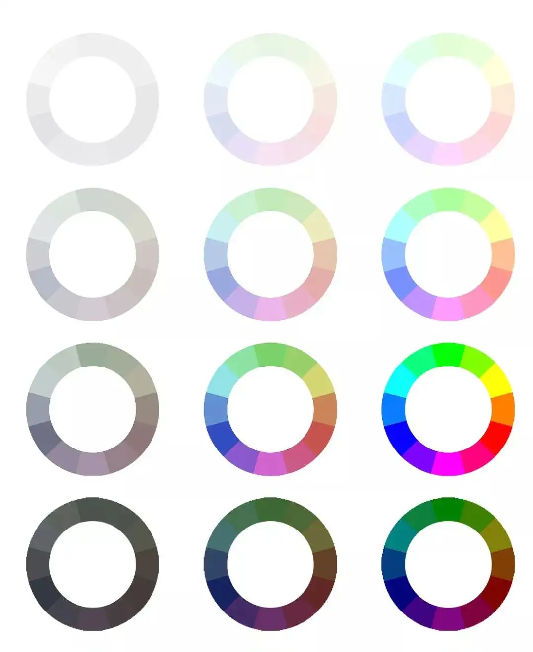
In post-processing for photography, since image editing software uses the RGB color space, let's take the example of the most common "RGB 12-Hue Color Wheel." The image below represents a 12-hue color wheel in the RGB color space.
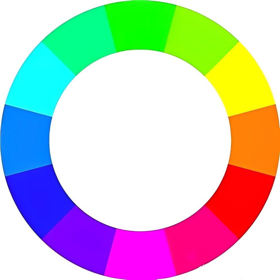
The colors on the color wheel may not appear as simple as they seem. Each color has its own significance.
The two colors adjacent to each other are called "analogous colors," while the opposite color is known as the "complementary color." Additionally, there are "contrast colors," which are the analogous colors of the complementary color.
Further Reading:
In image editing software, various color adjustment tools like channels and curves adhere to the definition of complementary colors on the color wheel. For instance, adjusting the blue curve can make a photo appear more blue or yellow.
In other words, the color wheel serves as a guide for color grading, and it can evolve into many different variations.
For example, in the image below, when different levels of brightness and saturation are applied to the color wheel, it produces various color combinations like vibrant, muted, intense, or soft.
At this point, you can apply these color combinations to photo editing.
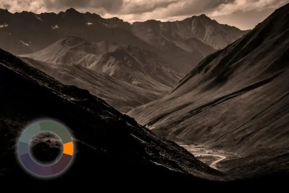
You can add one or multiple colors to a photo to evoke different feelings. For example, adding orange can create a warm and nostalgic atmosphere, while blue can convey a sense of rationality and tranquility.
If analogous colors are used in the composition, the overall effect will be softer, suitable for conveying subtle emotions. On the other hand, using contrast or complementary colors will make the photo more visually striking.
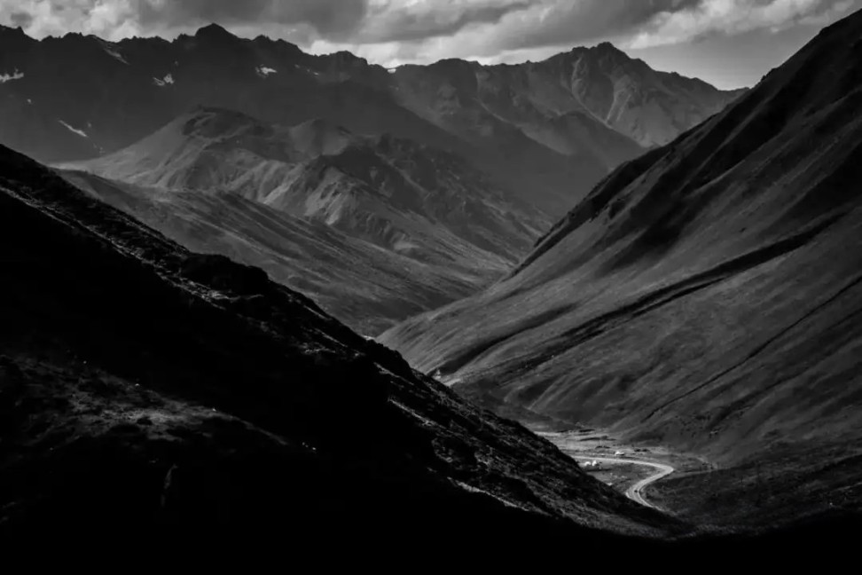
In this case, we have chosen a black-and-white photo. The image represents the layers of mountains and has a predominantly dark tone.
Adding a color like warm orange to the photo, it immediately brings a sense of warmth and conveys a more positive emotion.
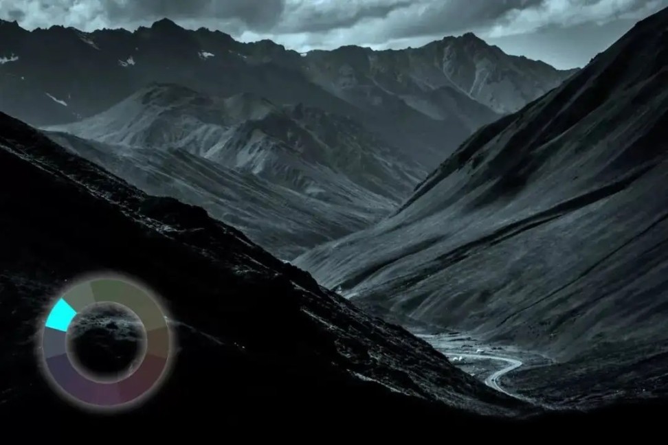
If you switch to a shade of cyan, you'll immediately notice a change in the atmosphere of the photo. Cyan evokes various feelings like mystery, repression, and coolness.
This is the application of monochromatic colors, where different colors on the color wheel can convey specific meanings.
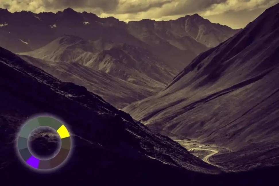
Now, don't you feel a difference if you add a pair of contrast colors to the photo, the most common being purple and yellow (or orange)?
At this point, you may not have an overtly obvious initial reaction, but instead, you'll experience a comprehensive impression of the composition: vastness, mystery, gloominess, and so on.
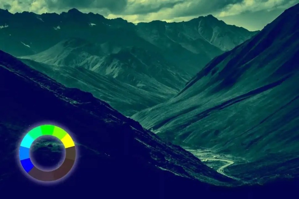
What would be the effect if you use a sequence of analogous colors, such as blue, cyan, green, and yellow, to render the scene?
Why not experience it for yourself? Plenty of combinations are waiting for you to explore, like the combination of analogous and complementary colors to create a sense of contrast.
Further Reading:
Whether it's photo editing or graphic design, having control over colors is crucial.
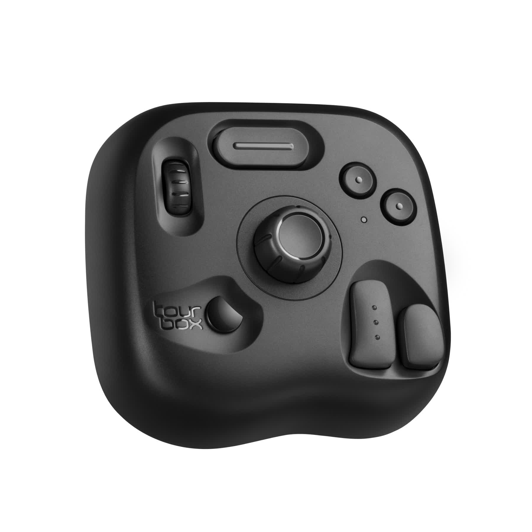
You're probably tired of dragging sliders in editing software to make color adjustments. That's why we want to introduce you to a creative tool loved by digital artists and photographers: TourBox.
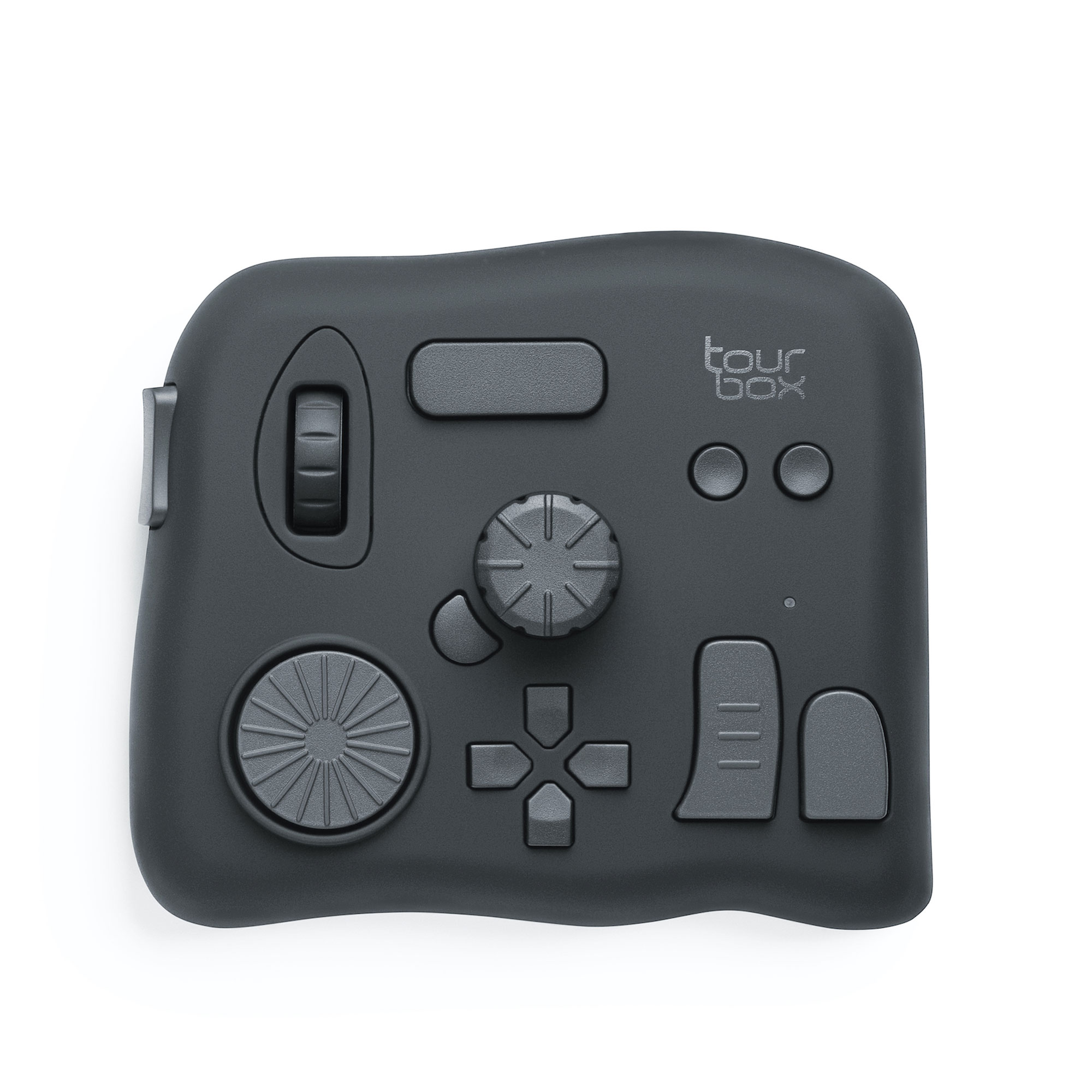
With simple settings, you can use TourBox single-handedly to make precise color grading.
Thanks to its tactile feedback and ergonomic design, TourBox allows you to execute complex commands with fewer actions and keeps you feeling energized during long work sessions.
Check out our photo editing page to see how TourBox simplifies and revolutionizes everything in photo editing.
Final Thoughts About Color Wheel
In this tutorial, we've covered what a color wheel is and how to use it. In photo editing and graphic design, we typically use the 12-hue color wheel in the RGB color space. This color wheel provides essential guidance for color adjustments.
Not only beginners but also many skilled and professional designers refer to it for color grading because it allows convenient access to analogous colors, complementary colors, and contrast colors.
While using it as a reference, feel free to unleash your creativity and create your desired color combinations.
However, as mentioned earlier, the color wheel is just a tool for reference. Most importantly, add your own creativity and ideas to your photography or design work.
Product Recommendation:
If you are hearing about TourBox for the first time, consider trying our latest product, TourBox Lite. It offers excellent value for your money and is especially suitable for first-time TourBox users.