Why Do Colors Look Different on Different Screens?
For photographers and designers, color space is probably a familiar concept. You may have read plenty of tutorials explaining how it works, and you likely know that choosing the right color space when exporting an image is important. The usual advice is simple: use the correct settings, and your colors should display properly. But in practice, things aren't always that straightforward.
You spend time editing a photo on your computer, making sure the colors look right, and export it in sRGB. Everything looks great on your monitor. Then you open the same image on your phone, and something feels off. The photo looks a little darker, the colors seem less vibrant, or the skin tones appear slightly different. Open it on another computer, and you might notice yet another difference.
It's natural to wonder whether something went wrong during editing or if you missed a setting when exporting the file.
In reality, even when you use the correct color space, the same image can look different across devices. Color space defines how colors are described, but it doesn't guarantee that every screen will reproduce those colors in exactly the same way. A screen's color gamut, brightness, calibration, and even the lighting in your viewing environment can all affect how you perceive an image.
Understanding these differences doesn't mean you need to make every device display colors perfectly. What's more important is knowing what causes these variations and how to minimize them in your everyday workflow.
5. How Can Photographers and Designers Manage Color Across Devices?
6. You Can't Control Every Screen, but You Can Make Your Workflow More Reliable
Different Screens Have Different Color Gamut Coverage
One of the main reasons colors look different across devices is that not all screens can display the same range of colors.
In simple terms, a color gamut describes the range of colors a device can reproduce. Some budget laptop screens cover only part of the sRGB color space, while professional monitors may cover the entire sRGB gamut or offer wider coverage of color spaces such as Adobe RGB and DCI-P3. Smartphones vary as well, with significant differences in display capabilities between models.
This means that even when two devices open the same image file, they may not be able to reproduce all its colors in the same way.
Imagine you're editing a photo of red flowers. You increase the saturation slightly to make the flowers stand out, then finish editing on a monitor with a wide color gamut. The reds look rich and vibrant, with subtle differences in tone and saturation that give the petals depth.
Now open the same photo on a screen with a narrower color gamut. Some of those reds may look less vibrant, and the subtle differences between similar shades may become harder to see. The image itself hasn't changed, but the screen may not be able to reproduce the full range of colors in the original image.
That doesn't necessarily mean the screen simply cuts off every color outside its gamut. The actual result depends on several factors, including the operating system, color management system, and how the application maps image colors to the range the screen can display. Some colors may appear less saturated, while differences between certain colors may become less noticeable.
This is why you shouldn't assume that a photo will look equally vibrant on every device just because it looks great on your own monitor.
It's also worth remembering that a wider color gamut doesn't automatically mean better color accuracy. A monitor that can display a broader range of colors may still show them inaccurately if it isn't properly calibrated.
Color gamut determines the range of colors a screen can reproduce, while color accuracy describes how closely those displayed colors match the intended values. The two are related, but they're not the same thing.
Screen Brightness and Contrast Affect How You See Colors
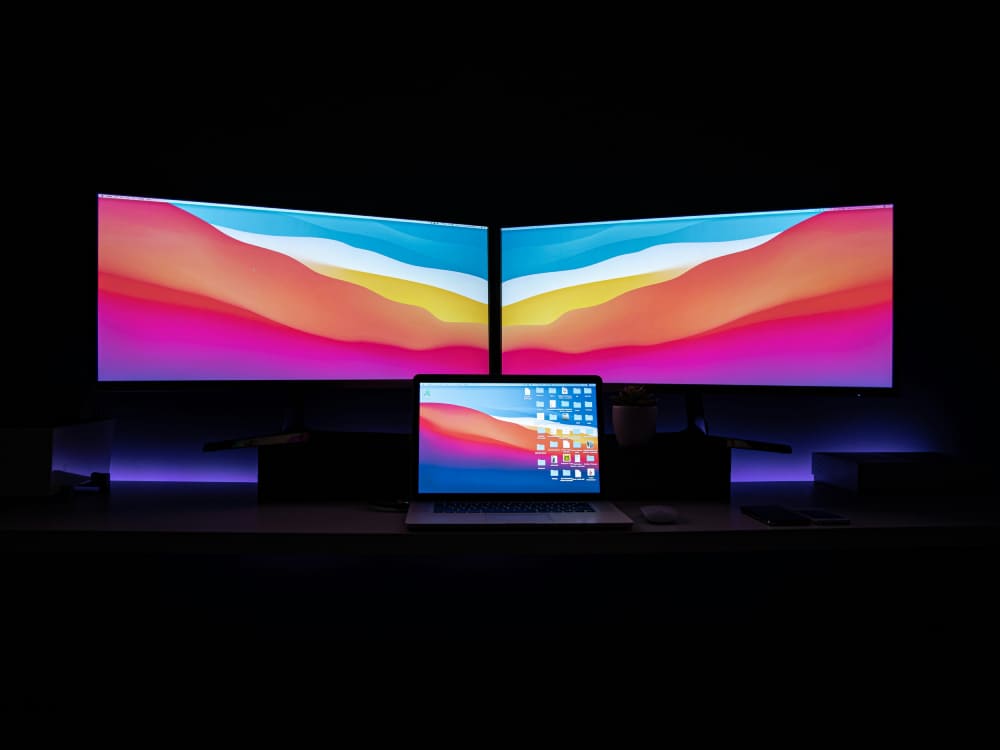
Color gamut isn't the only factor that matters. Screen brightness and contrast can also make a noticeable difference in how an image looks.
Imagine you've finished editing a photo on your computer. The exposure feels right, and you can see plenty of detail in the shadows. But when you open the same image on your phone, it looks darker, and some of the details in the darker areas are harder to make out. Your first instinct might be to go back to your editing software and increase the exposure.
Before you do that, take a look at the brightness settings on both screens.
If your computer monitor is set to a high brightness level while your phone's screen is much dimmer, the same image can look noticeably different. Screen brightness affects how you perceive the overall exposure, shadow detail, and contrast. Differences in contrast performance can also change how highlights and shadows appear.
Automatic brightness adjustment on smartphones adds another variable. A photo might look fine when you're viewing it indoors, but once you step outside, your phone increases its screen brightness to compensate for the sunlight. The image may suddenly look different. When you return indoors and the screen dims again, your impression of the photo can change once more.
It's important to understand that changing screen brightness doesn't necessarily change the color values in your image file. Instead, it changes the light coming from the screen, which in turn affects how your eyes perceive the image.
So if a photo looks too dark on your phone, or the highlights don't look quite right, don't immediately assume you need to adjust the exposure. Check the brightness and contrast of the screen first. Otherwise, you may end up repeatedly editing a photo to compensate for one display, only to make it look less balanced on other devices.
Monitor Calibration Makes a Difference
You might expect two monitors of the same model to display colors in roughly the same way. In reality, even identical monitors can have noticeable differences in color reproduction.
Manufacturing variations can affect how individual displays perform. Their settings, panel characteristics, and usage history can also influence color accuracy. Some screens may have a noticeable color cast from the start, while others may drift over time. Without proper calibration, it's difficult to know how accurately your monitor is displaying the colors in your images.
For example, imagine you're editing a portrait for a client. The skin tones look natural on your monitor, but when the client opens the file, they think the person's face looks too yellow. You're both looking at the same image, and neither of you has changed the file, yet you see the colors differently.
The problem may not be the photo itself. It could be the display each of you is using.
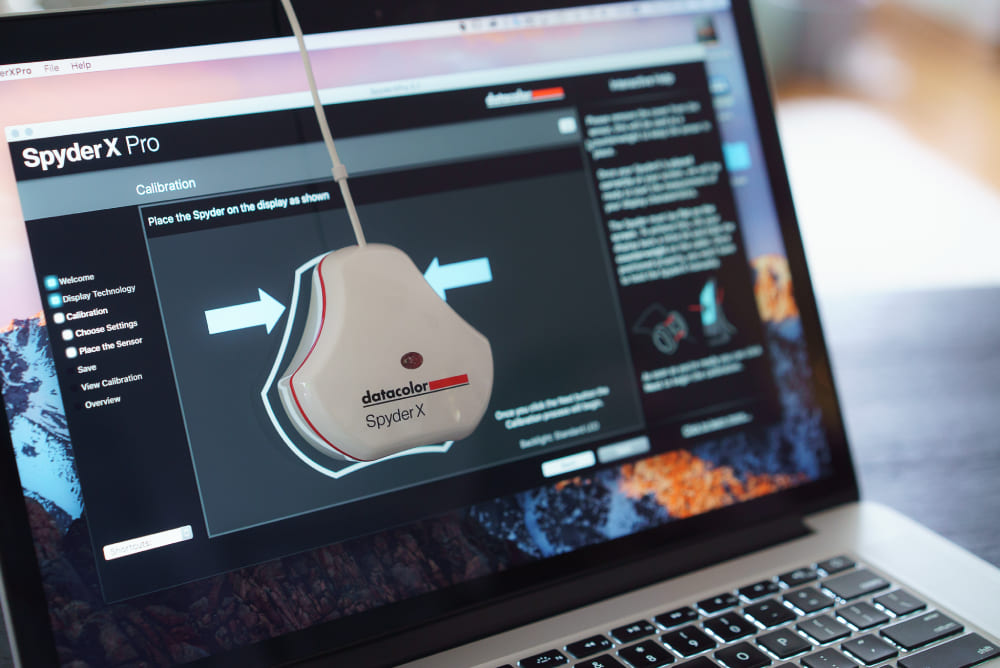
For photographers and designers who need reliable color reproduction, monitor calibration is an important part of the workflow. A calibration device, often called a colorimeter, measures how the monitor actually displays colors and helps bring it closer to a defined target. The resulting monitor profile allows color-managed operating systems and applications to interpret and display colors more accurately.
You may also come across a measurement called Delta E in monitor specifications. It describes the difference between two colors, and a smaller value generally indicates a smaller measured color difference under the conditions of the test. However, the results depend on the color difference formula and measurement method used, so a single number doesn't tell the whole story about a monitor's accuracy in every situation.
It's also worth distinguishing factory calibration from ongoing accuracy. A factory-calibrated monitor may offer a more reliable starting point, but that doesn't mean it will remain perfectly accurate forever.
If you regularly edit photos, work with color grading, or prepare brand assets, periodically checking and recalibrating your monitor is more useful than relying solely on the manufacturer's color accuracy claims.
Of course, if you only edit photos occasionally, you don't necessarily need to invest in expensive equipment right away. Understanding your screen's limitations, checking for obvious color casts, and working in a consistent viewing environment can already help you avoid many unnecessary adjustments.
Ambient Lighting Can Change How You Perceive Colors
Sometimes, your screen hasn't changed, and neither has your photo, but the colors look different to you.
For example, you might edit a photo during the day while sitting near a window, with plenty of natural light in the room. Later that evening, you open the same image under a warm desk lamp. Suddenly, the whites don't look as clean, the blues feel less natural, and you start wondering whether the entire photo is too warm.
This is more common than you might think because our perception of color is influenced by the environment around us.
Our eyes and brains have a visual adaptation ability known as color constancy. It helps us perceive familiar objects as having relatively consistent colors even when the color of the surrounding light changes. However, this adaptation isn't perfect. The color temperature and brightness of ambient light, along with the colors of nearby objects, can all influence how we perceive what's on a screen.
For instance, after spending a long time working under warm indoor lighting, you may gradually adapt to the yellowish light around you. As a result, neutral colors on your monitor might look different than they did during the day.
You may instinctively adjust the white balance or color temperature to make the photo look more natural. When you review it the next morning in daylight, those adjustments may suddenly seem excessive.
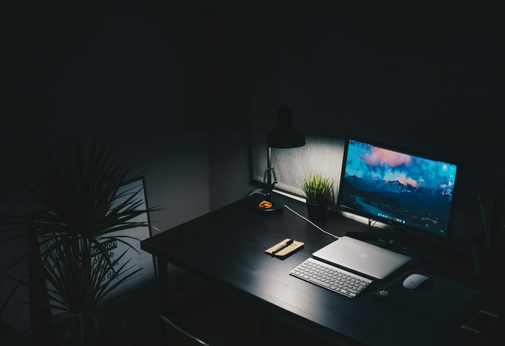
This is one reason why professional photo editing often emphasizes a consistent viewing environment. You don't need to turn your room into a professional studio, but avoiding frequent color adjustments under dramatically different lighting conditions can help you make more consistent decisions.
If possible, work in a space with relatively neutral, stable lighting, and avoid strong colored light falling directly on your screen or dominating your field of view.
These details can matter more than you might expect. Even if your monitor is displaying colors accurately, your own visual judgment can still be affected by the environment.
How Can Photographers and Designers Manage Color Across Devices?
Now that we've looked at the reasons behind these differences, the practical question is: what can you do to make your workflow more reliable?
Start by making sure your primary editing display is reasonably accurate and consistent. If your work involves skin tones, product photography, or brand colors, consider using a monitor with suitable color gamut coverage and calibration support. You can then use a colorimeter to calibrate it periodically, depending on how often you work with color and how critical accuracy is to your projects.
You don't necessarily need a monitor with the widest possible gamut. What's more important is understanding what your display can reproduce and making sure it represents those colors accurately.
Next, choose your export color space based on how the image will be used. For most photos intended for websites, social media, and general sharing, sRGB is a reliable choice because it's widely supported. It can help reduce display issues caused by applications or devices with limited color management, but it can't guarantee that every screen will show exactly the same colors.
If you're preparing images for print, don't assume Adobe RGB is always the better option. The appropriate color space depends on the printer, paper, print service, and overall output workflow.
Some print providers accept Adobe RGB files, while others may request specific RGB or CMYK profiles. Following the requirements of the actual print workflow is more important than choosing a wider color space simply because it sounds better.
It's also worth checking that your exported files have the correct color profile embedded. Whenever possible, view them in applications that support color management. Even if the image file is prepared correctly, software that doesn't handle color profiles properly may display it differently than expected.
Before delivering or publishing a photo, you can also preview the exported file on a few common devices. Open it on your computer and phone, for example, and check whether the overall exposure, skin tones, and saturation still look reasonable. The goal isn't to make every device look identical. It's to catch obvious problems with the export or display process and make sure the image still communicates what you intended.
If you need to discuss colors with a client or team, it helps to establish a clear reference. For projects where color accuracy is critical, you might agree to use a calibrated monitor, a specified color profile, or an approved physical proof as the reference point.
Instead of going back and forth over whether an image looks too warm or too cool, first make sure everyone is evaluating it under comparable conditions.
None of this means you need to follow a full professional color management workflow every time you edit a photo. You can adjust the process to fit your needs. Sharing vacation photos online and preparing product images for commercial printing have very different requirements, and there's no reason to treat every situation as if the stakes were the same.
Once your display and color settings are under control, the way you work through your edits can make a difference, too. For photographers who spend a lot of time adjusting exposure, white balance, saturation, and other color settings in Lightroom or Lightroom Classic, TourBox Creative Console offers a more hands-on way to work with these adjustments.
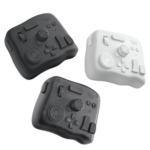
You can assign frequently used editing parameters to its physical dials and buttons, making it easier to fine-tune settings without constantly reaching for sliders with your mouse.
It won't eliminate differences between screens, but it can make the editing process more comfortable and give you a more direct way to work through the adjustments that shape the final look of your photos.

You Can't Control Every Screen, but You Can Make Your Workflow More Reliable
Whether you're a photographer or a designer, completely eliminating color differences across devices isn't realistic. Someone might view your work on an older laptop with limited color gamut coverage, while someone else might use a smartphone with a bright, wide-gamut display.
You can't expect everyone to calibrate their screens, and you can't guarantee that every application they use will handle color correctly.
The goal of editing, then, isn't to make every person see exactly the same colors. It's to work under reliable conditions, make informed decisions, and create images that look natural and visually consistent across a range of common devices.
For most photographers and designers sharing work online, a properly calibrated monitor, an appropriate color space, and a stable viewing environment provide a solid foundation. Exporting in sRGB is also a sensible starting point for general sharing because of its broad compatibility.
So the next time a photo looks different on another screen, don't immediately assume you've made a mistake during editing. Check the display, the software, and the viewing environment before changing the image itself. Sometimes, the problem isn't the photo. It's the way you're viewing it.
Color management won't make every screen look the same, but it can help you understand what's happening and make more confident editing decisions, without endlessly tweaking an image to compensate for differences you can't control.


