Mastering Duotone Effects in Photoshop: A Step-by-Step Tutorial
The duotone style is a popular trend often seen on various websites and apps. This captivating design approach exudes a sense of fashion and sophistication that easily captivates the viewer.
By combining two distinct colors, duotone design creates a visually striking and impactful aesthetic.
In this tutorial, we will explore how to achieve stunning duotone effects using Adobe Photoshop.
Whether you're a digital artist, graphic designer, or simply curious about this trend, this guide will provide you with the knowledge and techniques to create your own captivating duotone designs.
Let's dive into the world of duotone and unlock its creative possibilities in Photoshop!

In this article, you will learn:
- What Is Duotone?
- What Are the Features of Duotone Design?
- How to Duotone in Photoshop?
- How to Choose the Right Colors for Duotone Design?
- Final Thoughts About Duotone Design
What Is Duotone?
When it comes to design, duotone is a captivating technique that involves the combination of two colors to create visually striking images.
This dynamic style has evolved over time, giving birth to a wide range of vibrant and expressive color schemes.
Duotone designs are not limited to bold and vivid tones. You have the freedom to explore more subtle, highly expressive, or even bold and assertive color combinations to achieve your desired design effect.
Historically, duotone design traces its roots back to the printing industry, where it was initially used to reproduce photographs using only two ink colors. This technique allowed for cost-effective printing while still producing visually impactful images.
During the 1960s and 1970s, duotone design gained popularity in the realm of concert posters, where designers embraced quirky and high-contrast duotone styles to enhance the psychedelic and mesmerizing effects.
Over time, duotone design migrated into the digital realm, gaining popularity in various creative fields such as graphic design, advertising, and web design.
The evolution of duotone design has expanded its possibilities and unleashed a world of creativity. With advancements in digital software like Adobe Photoshop, designers now have greater control and flexibility in manipulating colors to achieve stunning duotone effects.
By carefully selecting and combining colors, designers can evoke specific moods, enhance visual impact, and create captivating visuals that leave a lasting impression.
What Are the Features of Duotone Design?
In design, duotone creates a unique visual appeal by altering the original image's color tones and combining two different colors to evoke distinct atmospheres. The strong visual allure of duotone designs makes them highly individualistic and impactful.
So, what makes duotone design so enchanting? Let's explore through specific examples.
1. Atmosphere
Compared to ordinary designs, duotone design can effectively convey a specific atmosphere.
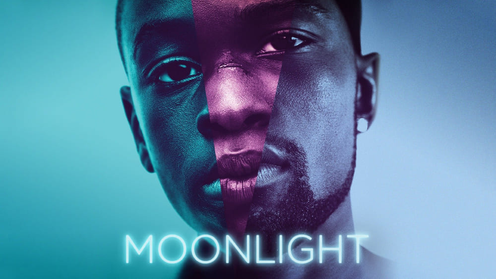
Take movie posters, for instance. Designers use color choices to emphasize the desired effect of the poster, immersing viewers in a particular mood that conveys the emotions of the film.
A classic example of duotone design can be seen in the movie poster for "Moonlight," the Academy Award-winning film. It successfully captures the essence of duotone design.
It's important to note that when we refer to duotone in design, it encompasses monotone, tritone, quadtone, as well as duotone itself.
Duotone is a broad concept, and what truly matters is how you incorporate the duotone style to create your own designs.
2. Allure
Duotone design possesses a strong color intensity and visual impact, often achieved by reducing the depth of the image to enhance contrast. This design technique excels in capturing viewers' attention in various graphic designs.
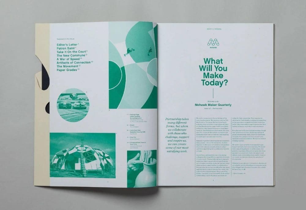
For example, compared to traditional black-and-white designs in books and magazines, duotone creates a more compelling visual appeal, making the design more distinctive and intriguing.
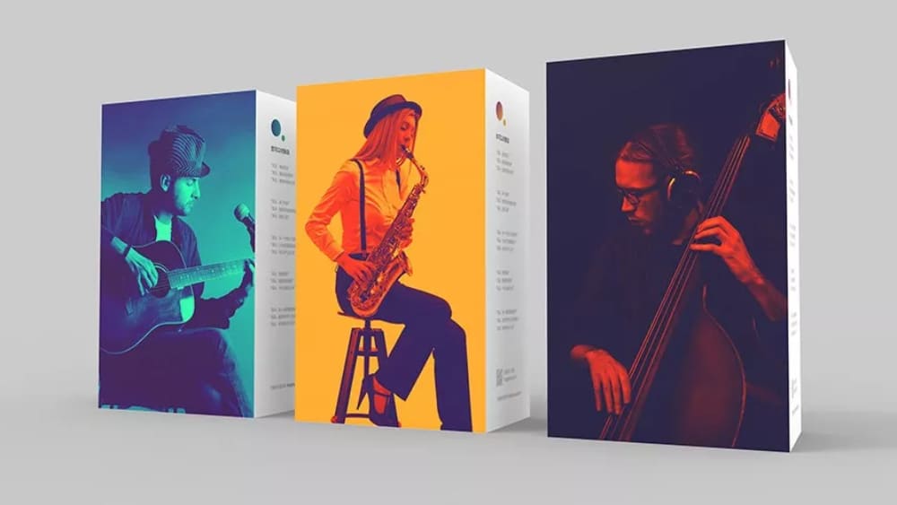
3. Versatility
Duotone design finds its place in various fields, including print media, web design, interfaces, illustration, and photography. It is a unique visual style that exhibits remarkable versatility.
For instance, duotone is a popular design style in web design, where its application is widespread and well-received.

How to Duotone in Photoshop?
Creating a duotone effect in design involves replacing the original colors of an image with two selected colors based on the image's brightness values.
The darker areas of the image are colored with the first chosen color, while the brighter areas are filled with the second chosen color.
This effect resembles black-and-white photography but with the added flexibility of using any desired colors, not just black and white.
In Photoshop, creating a duotone effect is an excellent method to add a modern and dramatic touch to your images.
There are multiple approaches to achieving duotone effects in Photoshop, and in this guide, we will explore various techniques for creating stunning duotone effects.
Method 1: Using Gradient Map
The Gradient Map adjustment layer is one of the easiest and most effective ways to create a duotone effect. Here's how:
Open your image in Photoshop and create a new Gradient Map adjustment layer. You can do this by clicking on the "Create new fill or adjustment layer" icon at the bottom of the Layers panel and selecting "Gradient Map" from the options.
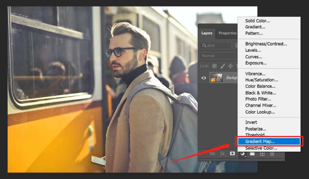
Once the Gradient Map layer is created, the Properties panel will open, displaying the Gradient Map settings. In the Properties panel, you'll find a small thumbnail of the gradient, along with an icon that looks like a small gradient bar. Click on this icon to open the Gradient Editor.
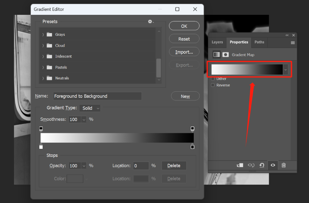
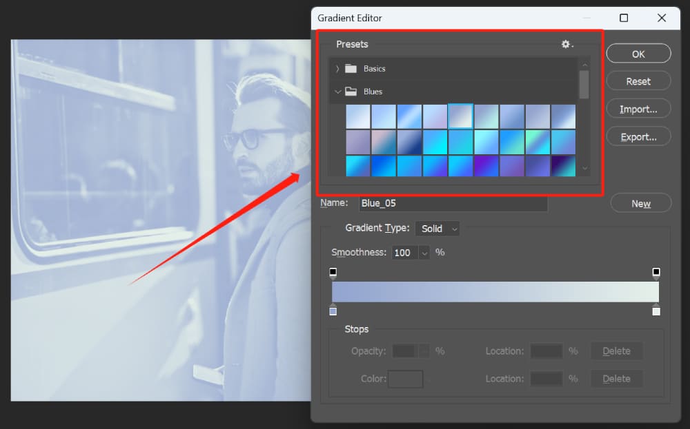
The Gradient Editor window will appear, showing a range of preset gradients. These presets are provided by Photoshop and offer various color combinations.
You can click on different presets to preview their effects on your image and choose the one that best suits your desired look.
If you want to create a custom gradient, you can do so by adjusting the colors in the Gradient Editor. Below the gradient bar, you'll see stop points that represent the colors in the gradient.
The leftmost stop point represents the shadows, and the rightmost stop point represents the highlights.
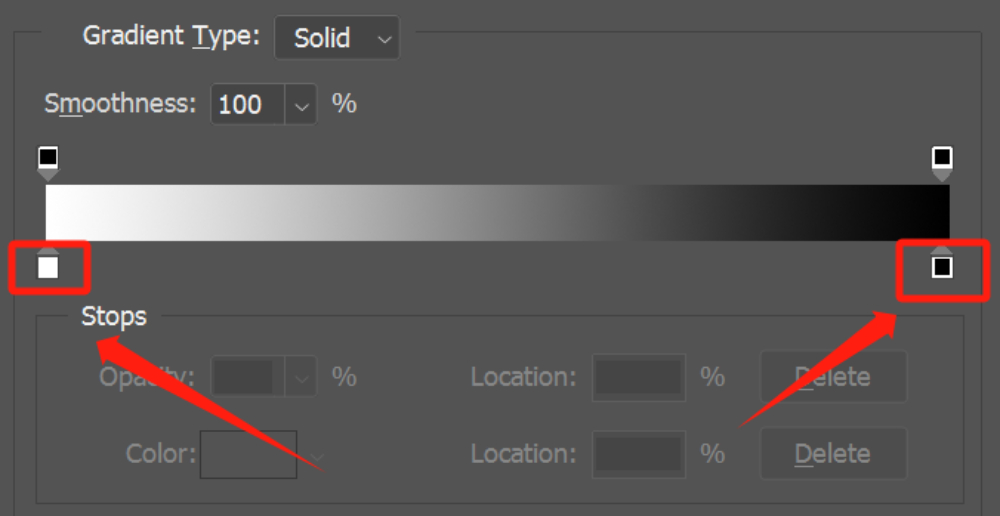
To change the color of a stop point, click on it, and a color picker will appear. You can select a color from the picker or input specific color values to customize it according to your preference. This allows you to create unique and personalized gradient effects.
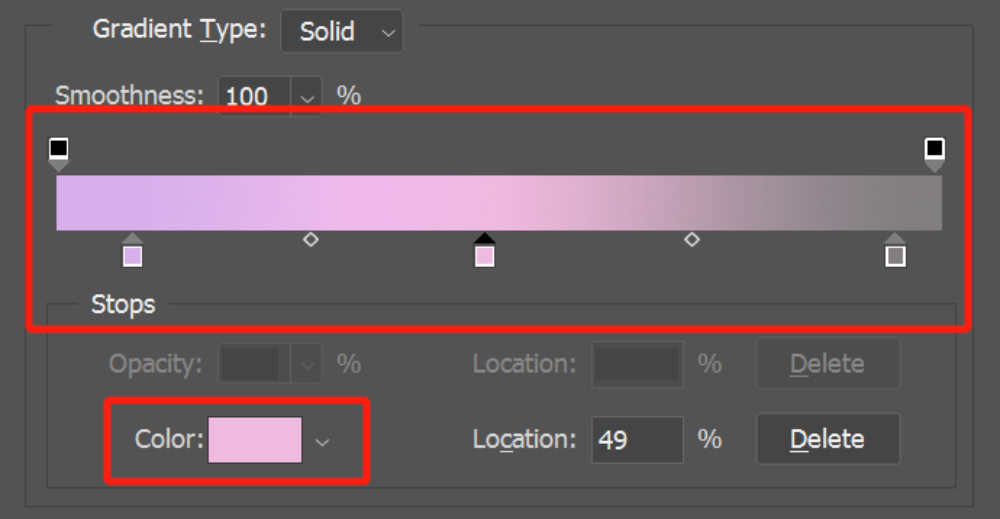
You can add additional stop points to the gradient by clicking anywhere on the gradient bar. This allows you to introduce more colors and further refine the gradient mapping.
To adjust the position of a stop point, click and drag it along the gradient bar. This controls the transition between colors and allows you to fine-tune the gradient effect.
Above the gradient bar, you'll find the Opacity Stops for the gradient colors. The concept behind setting Opacity Stops is similar to that of Color Stops, and you can manipulate them to adjust the opacity of the gradient.
Once you're satisfied with the gradient settings, click the OK button to apply the changes and return to the Properties panel. You can further adjust the opacity or blending mode of the Gradient Map layer to fine-tune the overall effect.
Method 2: Using the Duotone Mode
Photoshop's Duotone Mode offers a more traditional approach to creating a duotone effect.
Open your image in Photoshop. Convert your image to Grayscale by going to Image > Mode > Grayscale. Confirm the change.
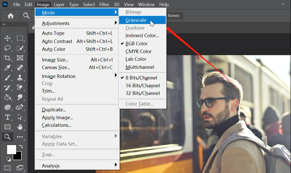
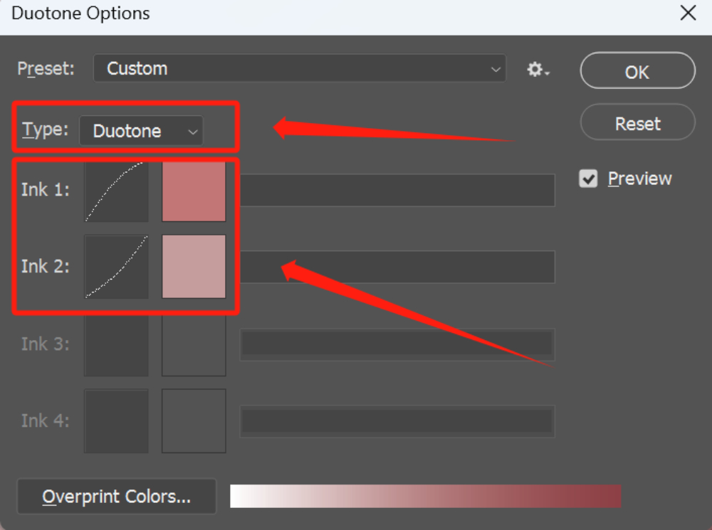
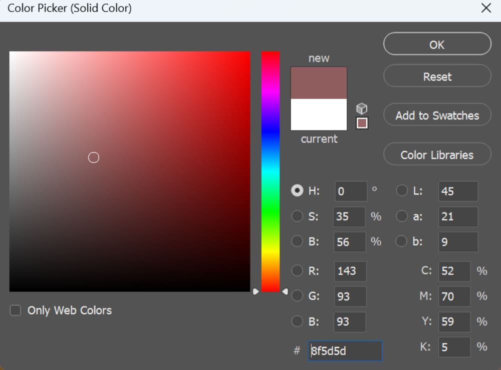
Now go to Image > Mode > Duotone. After selecting Duotone Mode, a new dialog box will appear. This is the Duotone Options dialog box, where you can customize your duotone effect.
In the Duotone Options dialog box, you'll see a preview of your image along with various settings and controls. The default setting is usually "Monotone", which means a single color will be applied to your image.
To create a duotone effect, click on the color swatch next to the "Type" dropdown menu. This will open the Color Picker window, where you can choose the two colors you want to use for your duotone effect.
In the Color Picker window, you can either select a color from the spectrum or enter specific color values. Experiment with different color combinations until you achieve the desired effect.
In the Duotone Options dialog box, you can further adjust the curves for each color by clicking on the curve icons next to the color swatches. This allows you to fine-tune the tonal range and contrast of each color in the duotone effect.
When you're satisfied with the duotone settings, click "OK" in the Duotone Options dialog box to apply the duotone effect to your image.
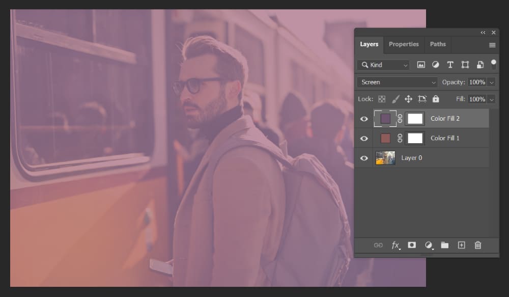
Method 3: Using Blending Modes
This method involves layering two different solid color layers and using blending modes to create a duotone effect.
Open your image in Photoshop. Go to Layer > New Fill Layer > Solid Color. 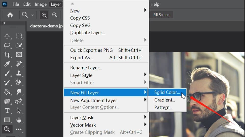
In the popped-up New Layer dialog box, leave the Color setting blank for now and instead set the blend mode of the layer to "Multiply".
This blending mode allows the colors of the layer to interact with the underlying layers, creating a blended effect.
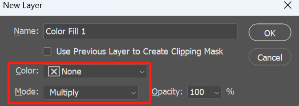
Afterward, click OK, and this will open the Color Picker. In Color Picker, choose your first color and click OK.
Create another new layer using the same process as before.
Set the blending mode of this new layer to "Screen". The Screen blending mode lightens the image by allowing the colors of the layer to interact with the underlying layers.
Adjust the opacity of both color layers to fine-tune the duotone effect. You can reduce or increase the opacity to control the intensity of the colors blending with the image.
If needed, you can further refine the duotone effect by adding adjustment layers, such as Levels or Curves, to adjust the overall brightness and contrast of the image.
How to Choose the Right Colors for Duotone Design?
As we mentioned above, duotone involves using two colors to change the tone of the original image.
When it comes to color selection, it's always important to consider color relationships. Color relationships require the presence of two or more colors to create a harmonious combination.
For duotone design, complementary colors (colors opposite each other on the color wheel) often work well together, as do analogous colors (colors next to each other on the color wheel).
(To learn more about color schemes, you can refer to this article: Seven Color Schemes to Make Your Designs More Appealing)
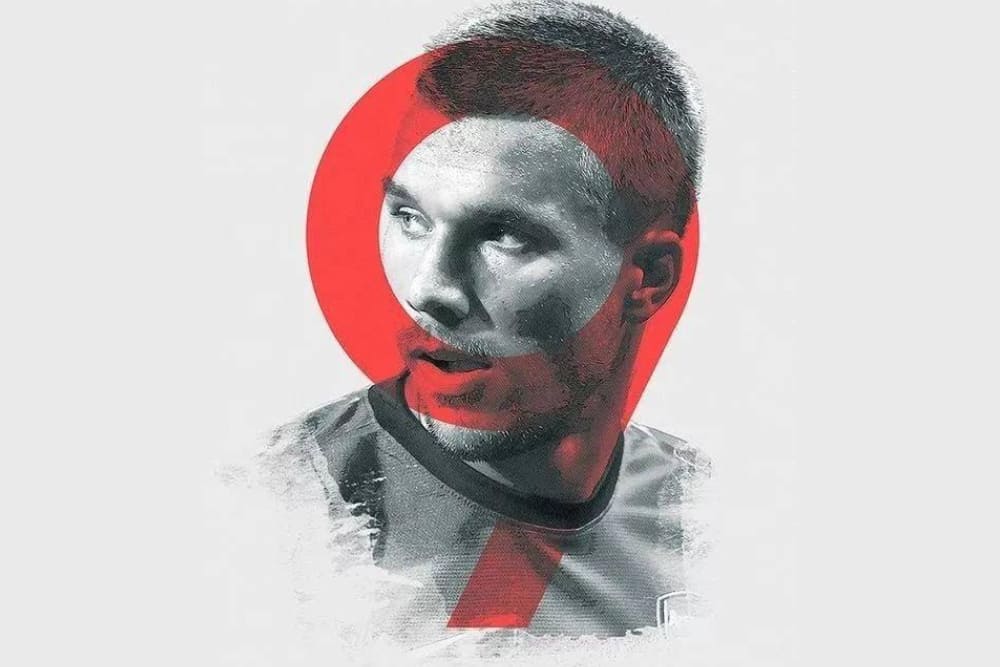
Regarding the area of duotone treatment, you can choose between large-scale and small-scale approaches.
In this tutorial, we are using the large-scale duotone treatment available in Photoshop. Applying duotone treatment on a large scale helps simplify the image, removing unnecessary details, and conveying the overall atmosphere and emotions.
If you prefer a small-scale duotone treatment, you can apply it to elements such as text or shapes for decorative purposes.
This can help reshape the color relationships of the image or graphic, providing a new visual experience and attracting the viewer's attention. In the example below, we have created a simple small-scale duotone treatment.
Final Thoughts About Duotone Design
As we wrap up this tutorial on creating duotone color pairings in Photoshop, it's worthwhile to mention there are many resources on the internet that can inspire and simplify your color grading process.
For instance, two great tools for generating duotone images are:
Both of these websites allow you to upload your own image or choose from their selections, then apply a range of duotone color pairings. They're perfect for quickly producing stylish duotone images when you're crunched for time.
However, if your goal is to become a master of color, taking the shortcut with preset color schemes won't get you there. This is where the TourBox comes into play.
TourBox is a game-changing tool designed for precision control in digital creation. It's especially useful for finessing your color grading in post-production software like Photoshop.
TourBox allows for precise adjustments, helping you master the subtleties of color grading far beyond pre-set schemes. To truly master the art of color, you need both inspiration and the right tools.