Mastering Color Theory: Exploring the 8 Fundamental Concepts
As designers and creative professionals, color is an essential element we cannot overlook. While you may be familiar with various color adjustment tools, do you truly possess the skills to master color manipulation?
Understanding the fundamental principles of color theory can greatly enhance your design and creative endeavors.
In this tutorial, we will unveil the secrets of color theory by exploring eight core concepts that will revolutionize your understanding and application of color. Get ready to unlock the full potential of color in your designs!

In this article, you will learn:
- The Essence of Color: Light
- What Is Visible Light?
- How to Change the Source Color?
- The Number of Colors
- Munsell Color System
- The Psychological Function of Colors
- RGB and CMYK
- Cool Colors and Warm Colors
- Product Recommendation: A Good Assistant for Color Grading
The Essence of Color: Light
When it comes to color, think of it as "light." Colors exist because there is light. In a dimly lit room or complete darkness, colors cease to exist. A pitch-black space lacks any color, but in the presence of light, all colors come to life. Therefore, you can understand color as a manifestation of "light."
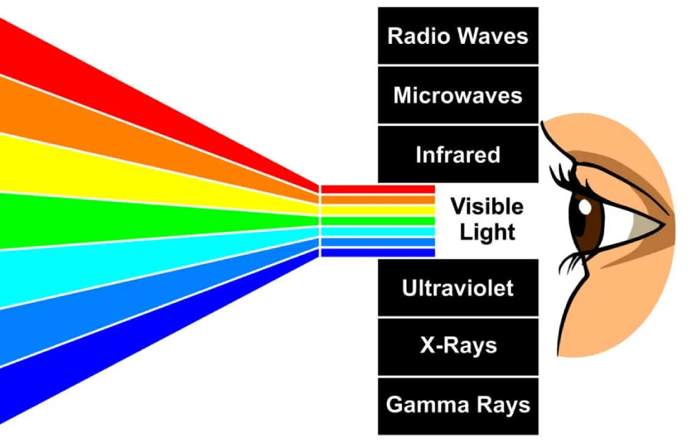
So, what exactly is light? Essentially, light is a part of the electromagnetic spectrum. This spectrum encompasses everything from long waves used in radio broadcasts and television to ultraviolet, x-rays, and even short waves known as gamma rays, which are invisible to our eyes.
However, there is one type of wave that we can see, and that is "visible light."
What Is Visible Light?
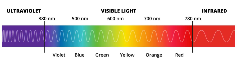
Visible light can be further classified as a combination of different colors. The longest wavelength corresponds to the color red, followed by green in the middle, and the shortest wavelength represents shades of blue.
Notice something familiar? It's actually the composition of red, orange, yellow, green, blue, indigo, and violet. This composition is what we call "visible light."
It instantly feels familiar, doesn't it? During your childhood, you might have played with a prism, a tool that can separate sunlight into its component colors. And through a prism, you can witness the magic of these vibrant colors.
Here, we will share some information about visible light:
- The range of visible light (wavelength): Electromagnetic waves ranging from 390nm to 780nm.
- The typical range of light visible to the human eye is 312nm to 1050nm.
- Within a light spectrum, red light has the longest wavelength (640nm to 780nm), while violet light has the shortest (380nm to 470nm).
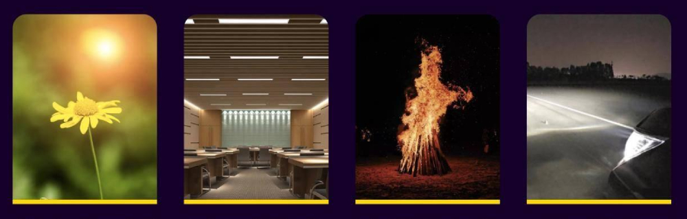
So, where does visible light come from? It comes from the sun, of course. The sunlight emitted by the sun contains a range of rays, including gamma rays, x-rays, ultraviolet, visible light, infrared, and more. The portion of light that can be refracted by a prism and seen with the naked eye is known as the "source color."
If you want to transform the source color into your preferred shade, all you need to do is place a layer of transparent material in front of the light source in your desired color.
This resulting color is what we call "transmitted light." For example, when light passes through a red transparent card, the resulting red light that we see is the "transmitted light."
However, it's crucial to understand that almost everything around us doesn't emit light on its own. In reality, we can hardly perceive the color of light itself. We can only see objects when they are illuminated by sunlight or artificial light sources.
This perceptual way of observing colors is referred to as the "reflected color."
Due to objects being coated with paint, ink, or having inherent color properties, when light shines upon them, the object absorbs almost all wavelengths.
Among these absorbed wavelengths, the ones that are reflected and can be perceived by the human eye are the colors we observe in our surroundings.
How to Change the Source Color?
Source colors are not fixed and unchangeable. Let's take a few examples. Source colors can include sunlight, fluorescent lights, incandescent bulbs, flames, LED lights, and many more. Even a single source color like sunlight can vary depending on whether it's a sunny or cloudy day.
Therefore, if the source color changes, the colors we perceive as "reflected color" will also change accordingly.
The Number of Colors
In color theory, it is estimated that there are approximately 7.5 million different colors that humans can calculate. However, the number of colors that can be recognized and named in color language is not as many.
Currently, there are about 269 colors that can be distinguished and have names, and you may use less than 100 of them in your everyday design.
But here's something you may not know - even though we don't use a large number of colors in our daily lives, our eyes are quite remarkable. The average person's untrained eye can distinguish approximately 3,000 to 5,000 colors.
According to a conclusion from a survey conducted by the US Department of Science, humans have the ability to distinguish millions of colors.
Now, you might be wondering - why are there so many colors, and how we perceive them. The answer lies in the fact that colors can change due to variations in light sources and environmental factors. As a result, the colors you perceive can also change accordingly.
Munsell Color System
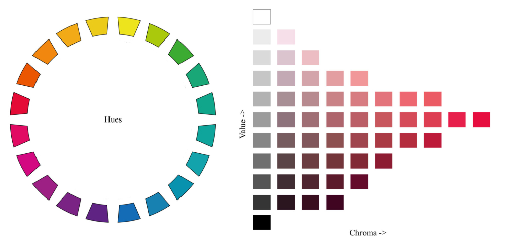
Among the 269 colors that we are familiar with, color classification and expression may sound complex. However, in color theory, there is a concept called the "Munsell Color System," which may sound sophisticated but is essentially what we commonly refer to as the "color wheel."
However, the "Munsell Color System" goes beyond just the color wheel concept. It breaks down the basic elements of color into three components: hue, chroma, and value. In color picker tools in editing software (such as Photoshop), hue, chroma, and value are represented as H, S, and L respectively.
Let's briefly explain these three components:
- "Hue" refers to the names we give to colors, such as red or blue. In the Munsell Color System (color wheel), there are a total of ten basic hues.
- "Chroma" refers to the intensity of a color, such as "vibrant" or "dull." It represents the purity of a color. Logically, the higher the chroma, the more vibrant the color, and the lower the chroma, the closer it is to gray. In the color wheel, regardless of the color, if its chroma is low, it will be closer to gray.
- Finally, "Value" refers to the brightness of a color. Similar to chroma, it can be expressed as high or low. The highest value is white, while the lowest value is black.
The concepts mentioned above may be difficult to grasp all at once. But don't worry! Just take a look at the image below, and everything will become clear at a glance.
The Psychological Function of Colors
As a designer, you probably already know that colors can have an impact on people's moods. For example, yellow can evoke a sense of togetherness, red can make one feel more positive and upbeat, and blue can reduce appetite and lower blood pressure, among other effects.
The psychological effects of colors on our minds are truly fascinating. Therefore, it's important for you to have a basic understanding of some of the simple psychological effects of colors, as they play a crucial role in your color choices during the design process.
For instance, if you are designing a high-end business website, the first colors that may come to mind are black and blue, which convey a technological and sophisticated feel. On the other hand, if you need to design a food menu, you might consider using black and orange.
Of course, different colors can also create different perceptions of weight and distance. For example, if you have two boxes of the same size, one black and one white, we tend to perceive the black one as heavier.

This is the magic of proper color combinations. If you want your interface or clickable elements to immediately catch the user's attention, it's important to have a rough understanding of how colors can affect people's psychological responses and emotional connections.
If you want to learn more about the psychological impact of colors, we highly recommend checking out the classic book "Color Psychology and Color Therapy" written by Faber Birren. It provides valuable insights into the subject.
RGB and CMYK
You may have noticed that the colors on a screen and the colors produced in print are not the same at all. So, when you're designing, it's crucial to pay special attention.
Designing solely based on colors displayed on a screen carries some risk. It's best to use a dedicated color chart for color selection. This way, when you create your design on a computer, the printed version will have colors that match the visual color scheme.
To learn more about RGB and CMYK, please refer to this article: RGB VS CMYK: An Ultimate Guide to Mastering Color Models.
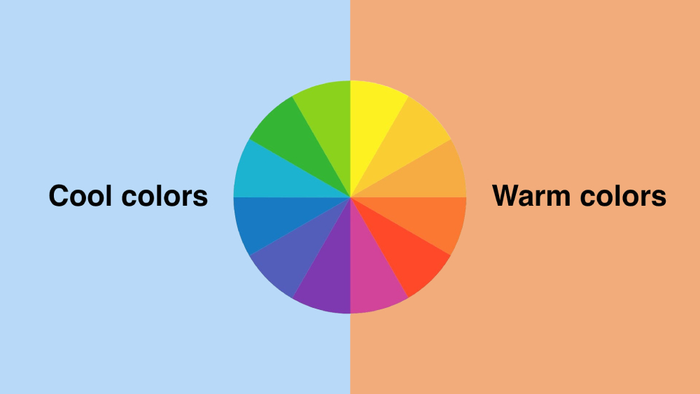
Cool Colors and Warm Colors
Everyone perceives colors as either cool or warm, regardless of their geographical location. So, when designing, you don't need to worry about regional differences. Instead, focus on whether the colors of your designs match the preferences of your target audience.
In the Munsell Color System (color wheel), colors centered around red and yellow are referred to as warm colors, while colors centered around blue and purple are referred to as cool colors. The surrounding color blocks of warm and cool colors are known as the warm color zone and cool color zone, respectively.
Once you have identified the cool and warm color zones, you can select colors based on their respective areas. The choice of cool and warm colors in your design determines the overall tone and style of your work. It directly influences the initial visual and psychological perception of your audience.
Product Recommendation: A Good Assistant for Color Grading
Throughout this article, we have explored the fundamental concepts of color theory and how colors can influence emotions, convey messages, and create visual harmony.
Understanding these concepts is crucial for effective design, as color plays a significant role in capturing attention and evoking desired responses from your audience.
Now that we have a solid foundation in color theory, let's explore a tool that can take your design process to the next level: TourBox.

Designed specifically for creative professionals, TourBox is a versatile and intuitive device that enhances your workflow by providing seamless control over various design elements, including color adjustment.
With TourBox, you can effortlessly manipulate color settings, allowing you to fine-tune hues, saturation, and brightness with precision.
Its ergonomic design and customizable buttons make it a breeze to navigate through color palettes, switch between brushes, or adjust color layers seamlessly. This level of control empowers you to bring your creative vision to life with ease and efficiency.
Incorporating TourBox into your design process will not only enhance your color adjustments but also elevate your overall creative output. Say goodbye to tedious and time-consuming color manipulations; instead, embrace a more intuitive and efficient approach with TourBox.
And with that, we come to the end of our article covering the fundamental concepts of color theory. We hope that this article has been helpful to you, especially if you have a passion for colors.