How to Color Grade in Premiere Pro: A Step-by-Step Tutorial
Color grading—an indispensable step in the post-production process—has the ability to transform your footage, create captivating moods, and add that polished, professional touch to your work.
With Adobe Premiere Pro, a powerhouse video editing tool, you have access to a wealth of robust color grading options.
In this comprehensive guide, we'll take you by the hand and guide you through the fundamentals, empowering you to master the art of how to color grade in Premiere Pro and elevate your videos to new heights of visual excellence.

In this article, you will learn:
- What Is Color Grading in Video?
- What You Should Know Before Color Grading in Premiere?
- How to Color Grade in Premiere?
- Final Thoughts About Color Grading in Premiere
What Is Color Grading in Video?
Essentially, color grading in videos can be simplified into two key elements: light and color.
Light, for instance, involves adjusting the brightness or darkness of our footage, known as exposure, or fine-tuning the brightness in specific areas to enhance contrast.
Color, on the other hand, encompasses correcting any color cast in our footage. Sometimes our visuals may appear too yellow, blue, green, or even purple, and our primary goal is to restore their true colors.
However, while true-to-life colors may be familiar, they might lack that premium touch. That's where adding various color styles comes into play. It's akin to applying filters on Instagram, but with much greater control and precision.
In essence, color grading revolves around these two straightforward aspects: manipulating light and crafting captivating color styles.
What You Should Know Before Color Grading in Premiere?
Before we dive into the step-by-step tutorial on how to color grade in Premiere, there are two key aspects that we need to have a clear understanding of:
- Color Grading Software
- The Steps Involved in Color Grading
Color Grading Software
There are numerous color grading software options available, with DaVinci Resolve being widely used in large-scale film and television projects, while Premiere and Final Cut Pro are more commonly used for general video editing.
However, in reality, the specific software you use is not as important because the tools within these programs are remarkably similar, often identical.
The color grading tools you can access in Premiere can also be found in Final Cut Pro or DaVinci Resolve.
The key factor is not the tools themselves but rather your aesthetic judgment.
The Steps Involved in Color Grading
Color grading generally consists of two steps:
- Color Correction
- Stylization
Color Correction
The first step is called color correction, which involves adjusting the brightness and color to achieve accuracy.
If your footage is too bright or too dark, you need to adjust it to the optimal brightness level. This is correcting the light.
Color correction also involves correcting any color casts, and restoring the footage to its most natural and realistic colors.
So, color correction is simply about bringing everything back to normal.
Stylization
The second step is stylization, similar to applying filters to your footage. This is where you can experiment with various creative styles.
At this stage, there is no right or wrong. Everyone has different aesthetics, so you can adjust the colors to your personal preference.
In the next section, we will explore the specific color grading techniques in Premiere.
How to Color Grade in Premiere?
In this chapter, we will provide a step-by-step guide on how to color grade in Premiere.
However, it's important to note that color is a highly subjective aspect, and color grading is not a one-size-fits-all process.
So, while following our foundational guide, feel free to unleash your creativity and embark on your artistic journey.
Step 1: Opening the Lumetri Color Panel
The Lumetri Color panel is your color grading workstation in Premiere Pro. You can find it by going to Window > Lumetri Color.
This panel includes several sections: Basic Correction, Creative, Curves, Color Wheels & Match, HSL Secondary, and Vignette. Each section allows for different types of color adjustments.

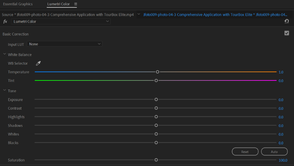
Step 2: Basic Correction
The Basic Correction section is where you make initial corrections to your footage.
This can include adjusting the temperature (making the image cooler or warmer), tint (adding green or magenta), and exposure (how light or dark your image is).
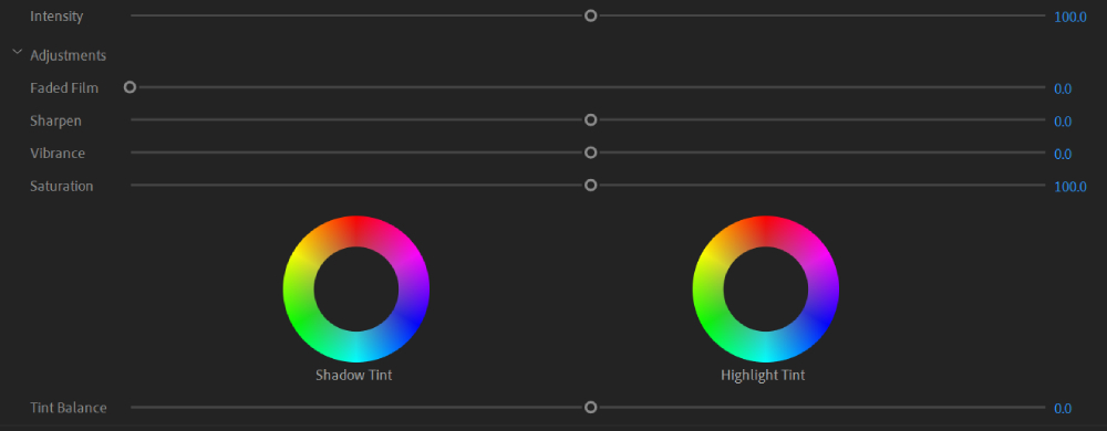
Step 3: Creative
The creative section of the Lumetri Color panel offers a variety of looks that allow you to quickly adjust the color of your clips using pre-existing presets.
Premiere Pro includes numerous creative looks for you to choose from. Additionally, you have the option to create and save your own custom LUTs (Look-Up Tables) for easy access within the panel.
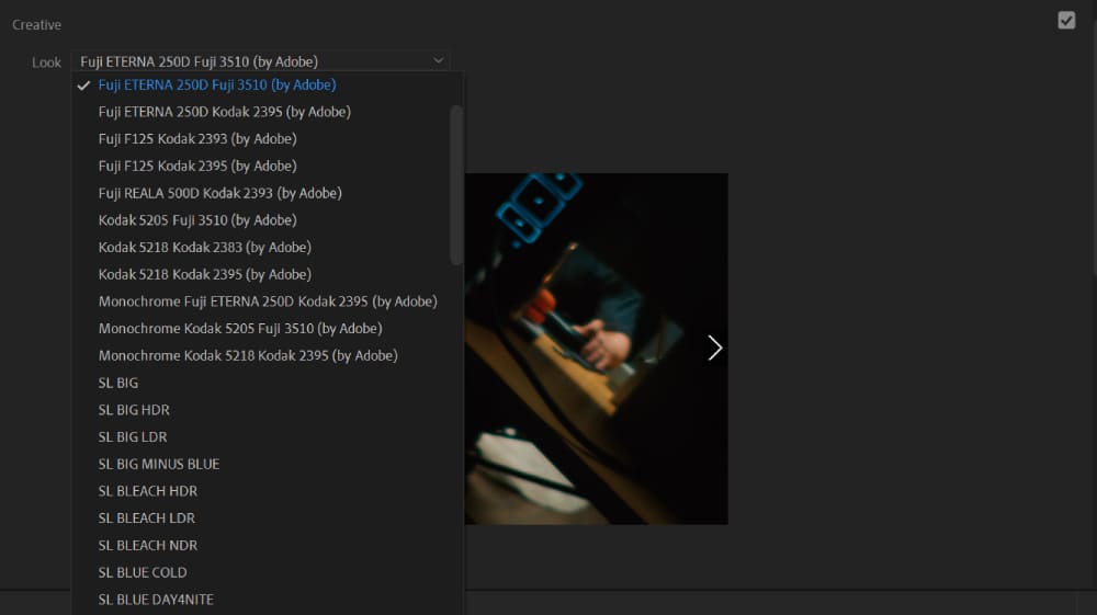
Once you apply a look, you can further adjust parameters such as intensity, saturation, and vibrance. Saturation affects the intensity of all colors equally, while vibrance increases the intensity of more muted colors.
Step 4: Curves
The Curves section is one of the most powerful tools for color grading. Here's a quick guide on how to use them.
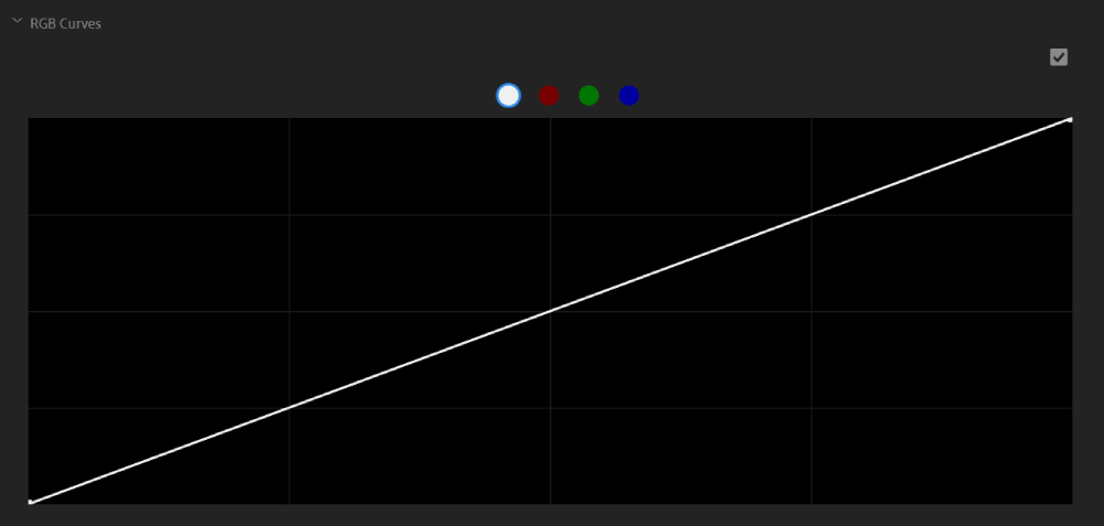
1. Adjust the RGB Curves
Here you'll see a diagonal line across a square box - this is your RGB Curve. The bottom of this line represents the shadows, the middle represents the midtones, and the top represents the highlights.
By clicking and adding points along this line, you can adjust the brightness and contrast of your footage.
To increase contrast, create an 'S' shape by dragging the shadows down and the highlights up. To decrease contrast, do the opposite.
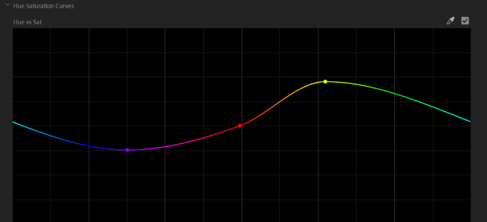
2. Adjust the Hue Saturation Curves
Below the RGB Curves, you'll find Hue Saturation Curves. These curves allow you to adjust the saturation of specific colors in your footage:
- Hue vs Sat: Choose a range of hues and adjust their saturation levels.
- Hue vs Hue: Select a range of hues and change them to another hue.
- Hue vs Luma: Choose a range of hues and adjust their luma.
- Luma vs Sat: Select a range of luma and adjust their saturation.
- Sat vs Sat: Choose a range of saturation levels and increase or decrease their saturation.
To use them, select a color you want to adjust by clicking on the colored dot of the curve, and then add points to the line to make curve-based color adjustments to your clips. Pulling the line up increases output value while pulling it down decreases it.
Remember, less is more when it comes to color correction. Subtle adjustments can have a big impact, so take it slow.
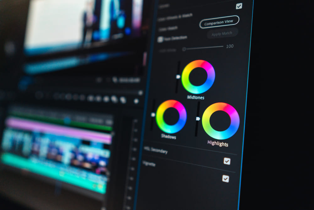
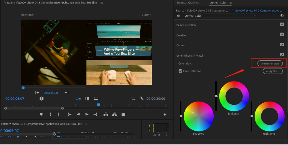
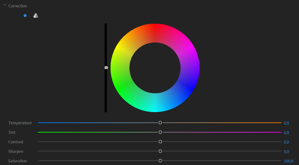
Step 5: Color Wheels & Match
The Color Wheels section allows you to adjust the shadows (dark parts), midtones (middle range), and highlights (bright parts) of your image.
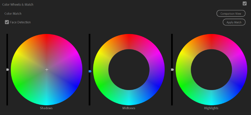
This feature is commonly used to compare the appearance of two different shots (frames) within the current sequence.
It ensures that the colors and lighting of a single scene or multiple scenes match each other. It can also be employed for color matching or color grading in video editing.
The clip (frame) that we want to compare in this case is referred to as the "reference," while the clip that we want to change the color of is called the "current." Both should be visible on the same timeline panel.
To enter the comparison view, we click on the "Comparison View" button in the Lumetri Color panel. In the comparison view, we select the reference frame and the "current" clip. We can also drag the playback indicator on the timeline panel to choose the "current" clip.
Additional Tips:
- The selected "current" clip frame should be one that adequately represents the overall color and brightness variations of the target clip.
- If there are faces in the shot, the "Face Detection" option in the Lumetri Color panel should be checked.
After selecting the target clip on the timeline panel, we click the "Apply Match" button in the Lumetri Color panel. Premiere will automatically apply Lumetri settings using the "Color Wheel" and "Saturation Controls" to match the color of the reference frame to the "current" clip.
More Tips:
- If you are not satisfied with the result, you can select another frame as the reference frame and match the color again. Premiere will override the previous changes and match the color to the new reference frame.
- If you want to match the color across the entire sequence, it is recommended to create an adjustment layer on a track below the reference frame clip, with the same duration as the sequence. Then, select the adjustment layer before applying the match.
- After applying the match, you can continue adjusting the Lumetri Color of the target clip to achieve your desired effect or a unique style.
- Once the adjustments are complete, remember to close the "Comparison View" promptly.
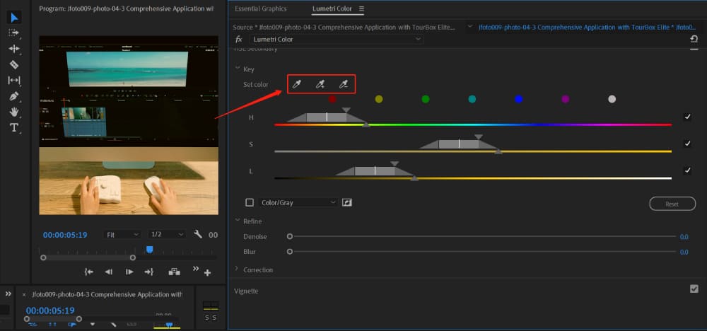
Step 6: HSL Secondary
The HSL Secondary section in the Lumetri panel is a tool that lets you change specific colors in your video. HSL stands for Hue (the color itself), Saturation (the intensity of the color), and Luminance (how light or dark the color is).
For example, let's say you want to make the blue sky in your video pop. You can use the HSL Secondary tool to select just the blue colors and make them brighter or more vibrant, without changing the rest of the image.
In short, you'll need to finish your primary color correction first - that's when you adjust the colors for the whole clip. After that, you can use the HSL Secondary tool to fine-tune specific colors.
Here's a step-by-step guide on how to do it:
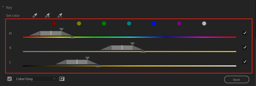
Under the HSL Secondary section, click on the "Set Color" tool. Then click on the color in the video you want to change, like the blue sky.
Additional Tips:
- If you want to select a bigger area of color, hold the Ctrl or Cmd key while using the "Set Color" tool.
- You can also select a color from the color swatches, which are pre-set colors you can use as a starting point.
You'll see sliders for Hue, Saturation, and Luminance. These sliders show the range of colors you've selected. You can adjust them to add or remove colors from your selection.
If you want to reset your color selection, click on the "Reset" button below the sliders.
If you want to see only the colors you've selected, check the box next to "Color/Gray." You can also choose "Color/Black" or "White/Black" from the dropdown menu.
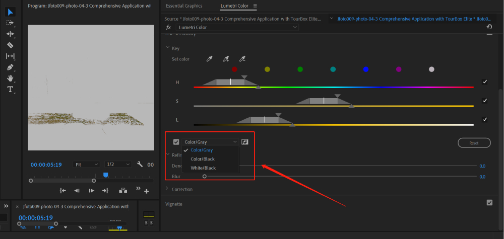
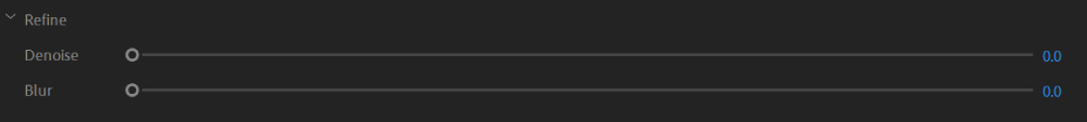
After you've selected your color, you can refine your selection using the "Refine" section below:
- Denoise: Smooth out color transitions and remove unwanted color artifacts within the selection using the Denoise slider. It ensures a consistent adjustment across the clip.
- Blur: Blend the edges of the mask by adjusting the "Blur" slider. This creates a seamless transition between the selected and non-selected areas, making it look more natural.
Lastly, under the "Correction" section, you can change the color using the color wheels and sliders.
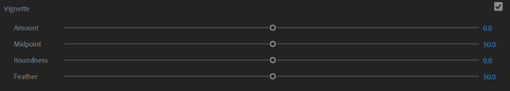
Step 7: Vignette
The Vignette effect is a commonly used tool to add a subtle or dramatic darkening around the edges of a video clip or frame. This effect helps draw attention to the center of the frame or create a specific mood or focus within the shot.
In the Effects Control panel, you'll find the settings for the Vignette effect. Adjust the following parameters to achieve the desired look:
- Amount: Controls the strength of the vignette effect. Increase the value for a stronger vignette or decrease it for a subtler effect.
- Midpoint: Adjust the position of the vignette. Moving it to the left or right shifts the center of the vignette.
- Roundness: Changes the shape of the vignette from round to oval. Increase the value for a more elliptical shape.
- Feather: Controls the softness of the vignette's edges. Higher values create a smoother transition between the vignette and the rest of the frame.
Step 8: Exporting Your Video
Once you're happy with your color grade, you can export your video by going to File > Export > Media.
Let's review how to color grade in Premiere through the following YouTube video (made by Zac Watson).
Final Thoughts About Color Grading in Premiere
As we reach the end of our comprehensive guide on how to color grade in Premiere, it's essential to address the challenges that can hinder our creative process.
Repetitive color grading adjustments can often distract us from focusing on the art of storytelling itself. This is where TourBox comes to the rescue, providing a seamless solution to enhance your color grading workflow.
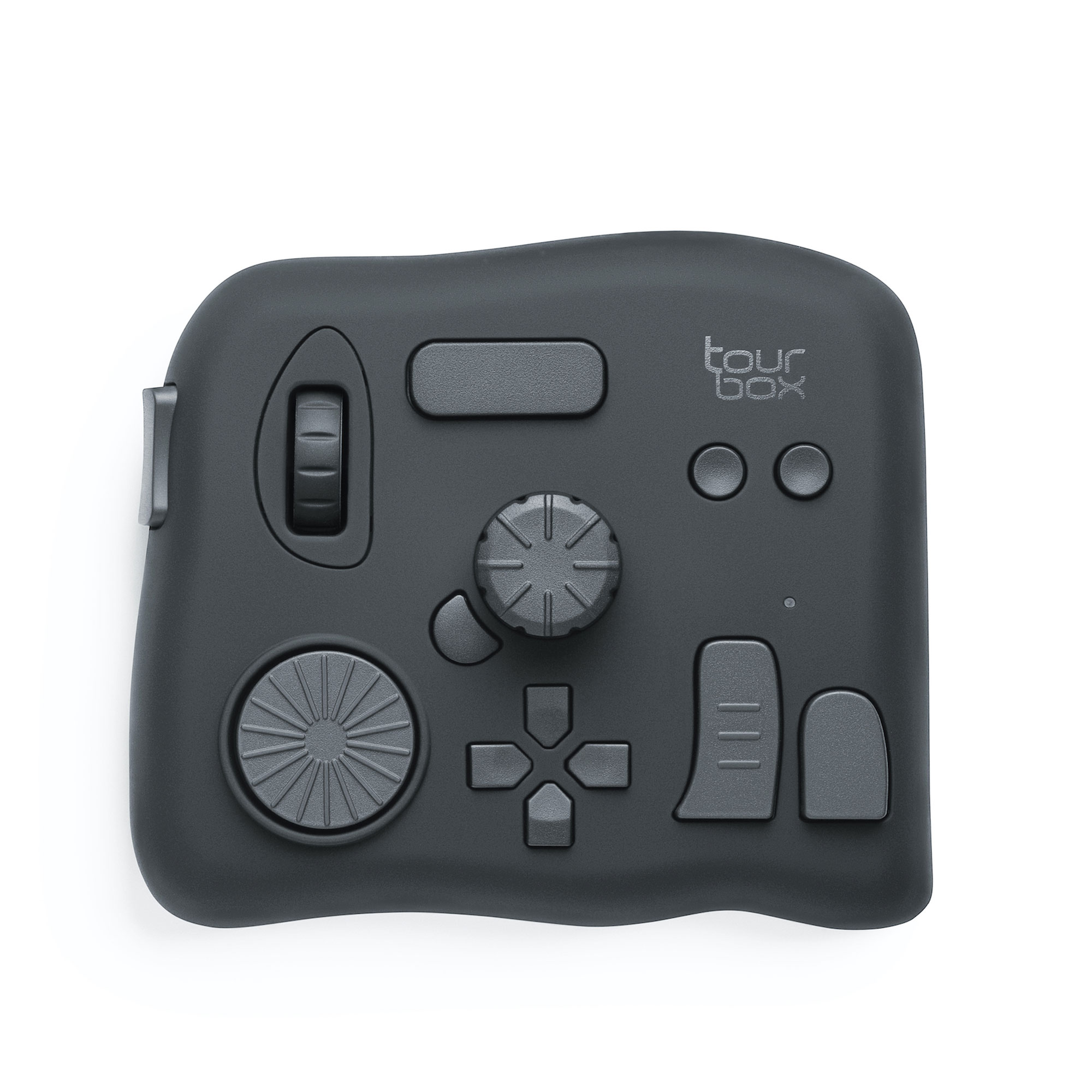
With its intuitive layout and customizable buttons, TourBox empowers us to take control of our color grading process with remarkable efficiency.
By mapping essential color grading functions to TourBox's buttons and dials, we can swiftly adjust parameters, fine-tune color curves, and experiment with various grading techniques.
Whether you're a seasoned colorist or just starting to delve into the world of color grading, integrating TourBox into your workflow can elevate your editing experience to new heights.
By effortlessly accessing essential color grading functions, you can dedicate more time and energy to perfecting your artistic vision, resulting in visually stunning and captivating storytelling.