Mastering Levels in Photoshop: Enhance Your Editing Skills
Are you truly harnessing the full potential of the Levels tool in Photoshop? In this tutorial, we will delve into the intricacies of this frequently utilized feature, equipping you with invaluable techniques to master the art of color adjustment in Photoshop.
So, let's dive right in and explore the incredible capabilities of Photoshop's Levels tool. Get ready to unleash your creativity and bring your visions to life in vibrant and breathtaking ways.

In this article, you will learn:
- Key Terms in Photoshop's Levels Tool
- How to Determine Image Brightness Using the Histogram in Levels?
- How to Use Levels in Photoshop?
- Enhance Your Editing Workflow in Photoshop
Key Terms in Photoshop's Levels Tool
Before delving into the practical application of Photoshop's Levels tool, it is essential to familiarize yourself with some of the key terms found in the Levels panel.
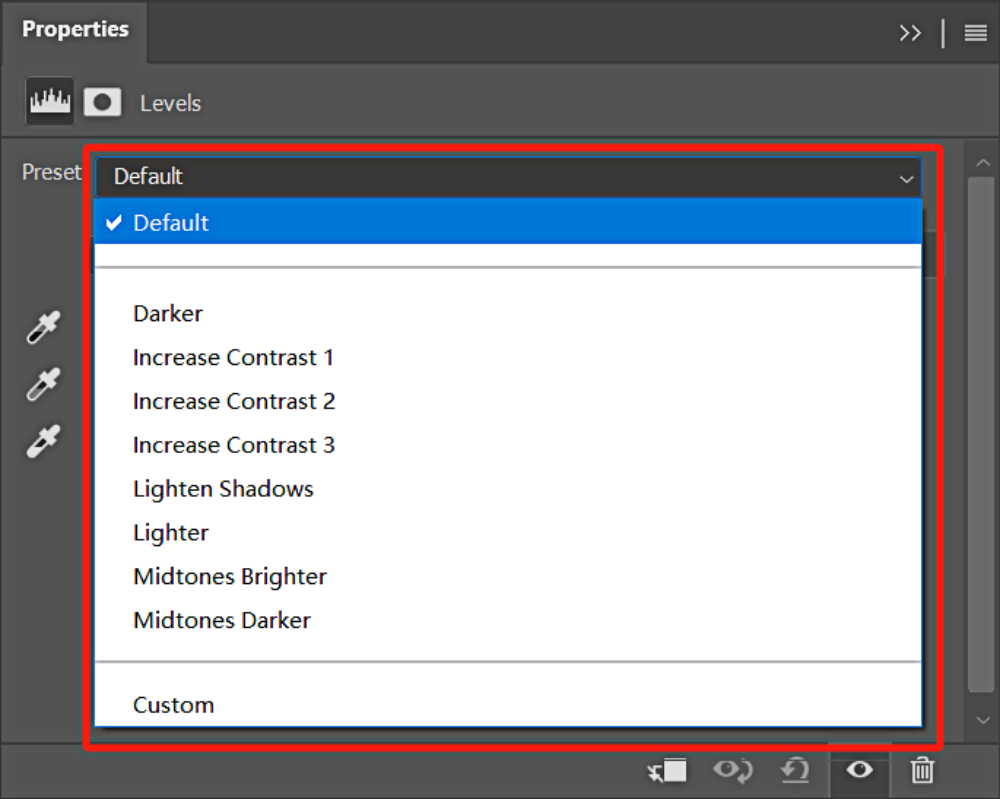
1. Presets
Presets in Levels are pre-established effects that are rarely used in actual color adjustment. While you can experiment with these presets, it is generally recommended to stick with the Custom option for more precise control.
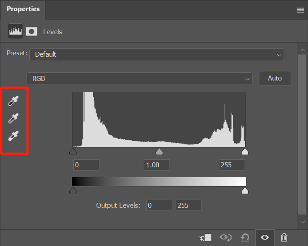
2. Black, Gray, and White Point Eyedropper Tools
When using the Black Point eyedropper tool to sample a specific point in the image, Photoshop replaces the color information at that point with black. Any color with a value greater than or equal to that point will be replaced with black throughout the entire image.
The same principle applies to the White Point tool. The Gray Point is a neutral midpoint between the black and white points and is typically not utilized during the color adjustment process.
Practical Example
By using the White Point tool, you can click on a point in the image where you believe the color should be white (preferably in an area close to white). For example, if the RGB values of that area are (230,255,255), clicking on it will adjust the area to (255,255,255).
These three eyedropper tools primarily serve to define the brightest and darkest points in the image, correcting color contrast and enhancing overall color fidelity.
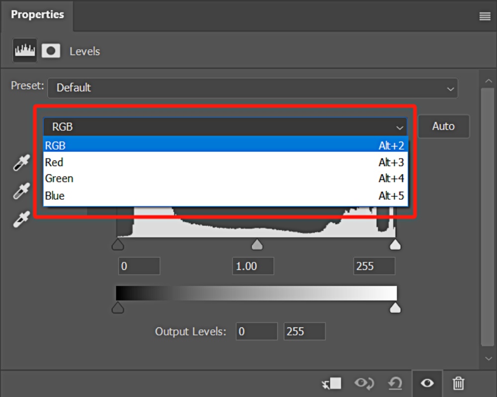
3. Channels
The RGB channels primarily adjust the brightness and contrast of the image, while the red, green, and blue channels specifically target the hue and color adjustments of the image.
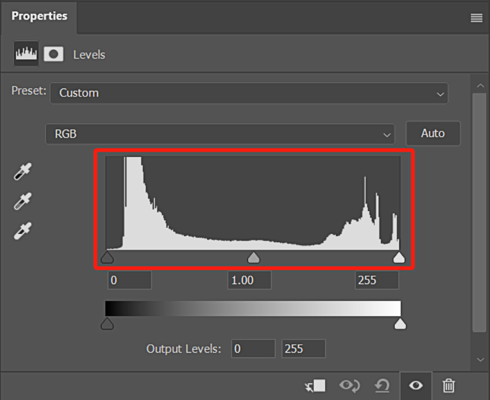
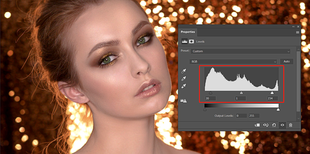
4. Histogram
The histogram in the Levels workspace primarily informs you about the distribution of pixel brightness in the image.
The black slider on the left represents the shadows, the middle slider represents the midtones, and the white slider on the right represents the highlights. You can adjust the values by dragging the corresponding sliders to change the distribution of brightness in the image.
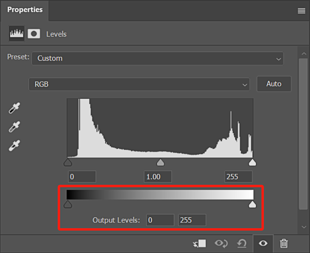
5. Output Levels
In Levels, there is also a slider setting called "Output Levels". By holding down the black slider on the left side of this slider and dragging it to the right, the image becomes brighter.
On the other hand, dragging the white slider on the right side of the slider to the left will darken the image. (You can also directly input values below)
The Output Levels differ from the histogram above. Adjusting the black and white sliders in the histogram will make the bright areas brighter and the dark areas darker. In contrast, adjusting the black and white sliders in the Output Levels affects the overall image.
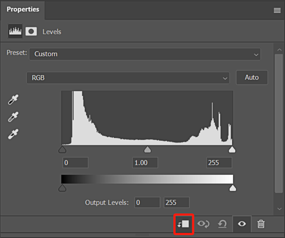
6. Creating a Clipping Mask
By clicking on the first button at the bottom of the Levels workspace, you can toggle the clipping mask on or off. When you create a clipping mask, the adjustments made with the Levels tool will only affect the layer directly below it, rather than all the layers.
For more information on how to use clipping masks in Photoshop, please refer to this article: The Complete Guide to Clipping Masks in Photoshop.
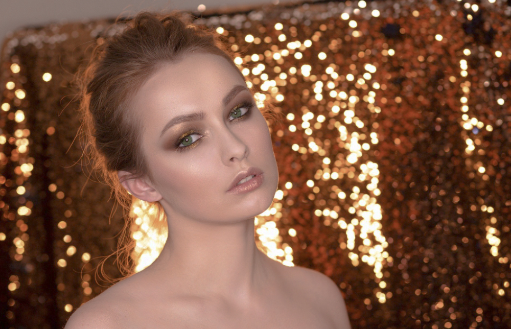
How to Determine Image Brightness Using the Histogram in Levels?
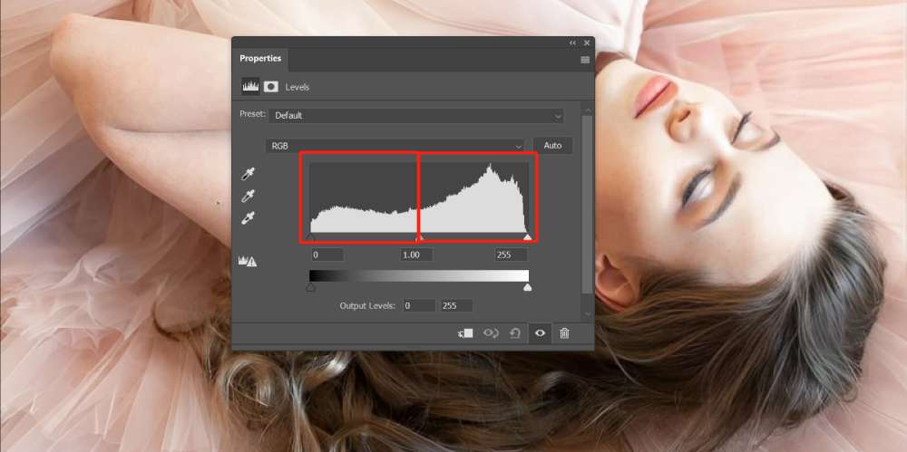
In the image below, we can determine the brightness and tonal range of the image based on the white areas within the black, gray, and white sliders of the histogram.
It is evident that the white area within the gray and white sliders is larger than the black slider's area. Therefore, we can conclude that this image has a bright color tone.
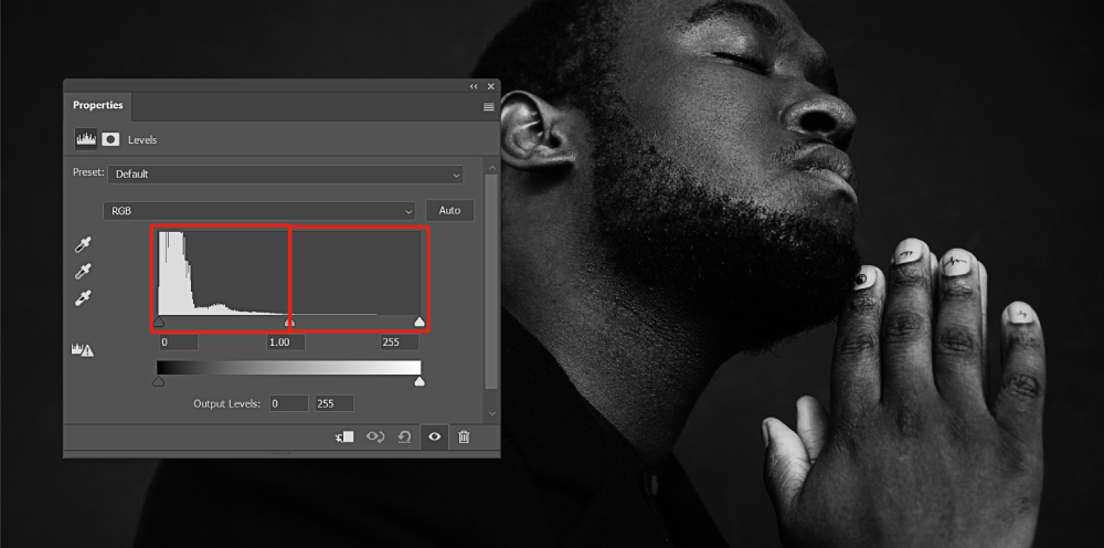
In contrast, in the image below, there is a significant portion of the histogram occupied by the black slider, indicating a predominance of darker tones. Therefore, we can conclude that this image has a dark color tone.
How to Use Levels in Photoshop?
Now that you have a basic understanding of Levels in Photoshop, it's time to put this tool into action and adjust the contrast of your images.
Take a look at the image below. What do you notice? That's right, it appears to have a hazy or foggy layer over it. In reality, the issue lies in the lack of contrast in the image.
Let's import this image into Photoshop and navigate to the Layers panel. Click on "Create new fill or adjustment layer" at the bottom of the Layers panel and select "Levels" from the menu that appears.
What Is Image Contrast?
Image contrast refers to the measurement of the difference in brightness levels between the brightest and darkest areas of an image. A larger difference range indicates higher contrast, while a smaller difference range indicates lower contrast.
Combining the basic knowledge of the Levels mentioned above with the concept of image contrast, you can effectively increase the contrast of a photo by making the highlights brighter and the shadows darker.
Tips for Using the Sliders:
- The black slider represents the shadows. Moving it to the right will expand the shadow details.
- The middle gray slider represents the midtones. Moving it to the right increases the shadows, and moving it to the left increases the highlights.
- The white slider represents the highlights. Moving it to the left increases the bright areas.
By adjusting these sliders accordingly, we can achieve the desired contrast in our photo.
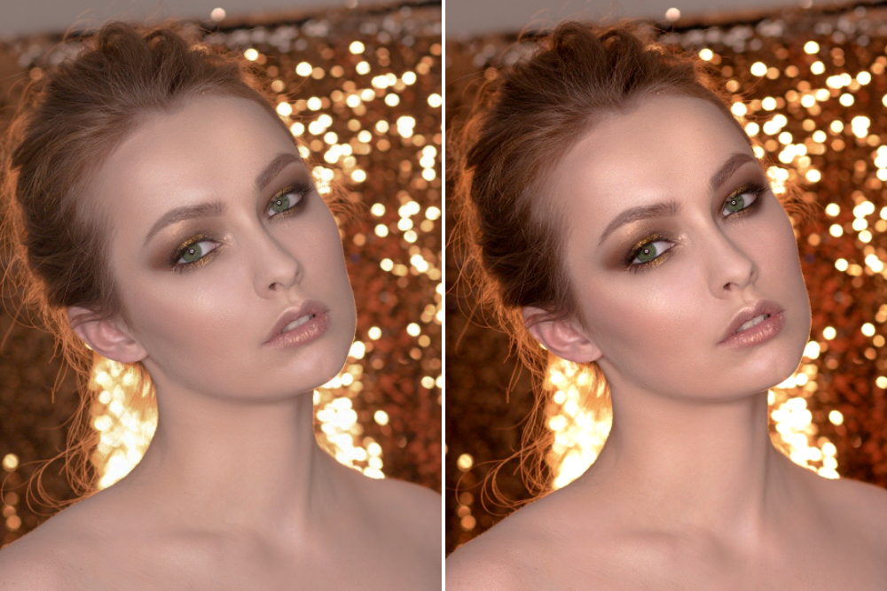
Let's take a look at the before and after comparison of the photo after adjusting the Levels. Notice how the photo on the right, after the adjustment, has a clearer contrast and the subject appears more vibrant.
Can Levels be used for color grading in addition to adjusting image contrast in Photoshop? The answer is yes.
Many color adjustments in Photoshop are performed within the red, green, and blue channels. Tools like Levels, Curves, Hue/Saturation, Channel Mixer, and more are commonly used for color correction.
The principles of color grading are similar across these tools. Here, we will share using Levels for color grading on a photo.
First, let's import the image below into Photoshop.
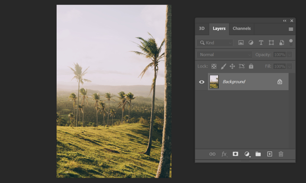
Here, we want to make the grass and trees appear greener. To achieve this, we simply need to increase the green color information in the green channel.
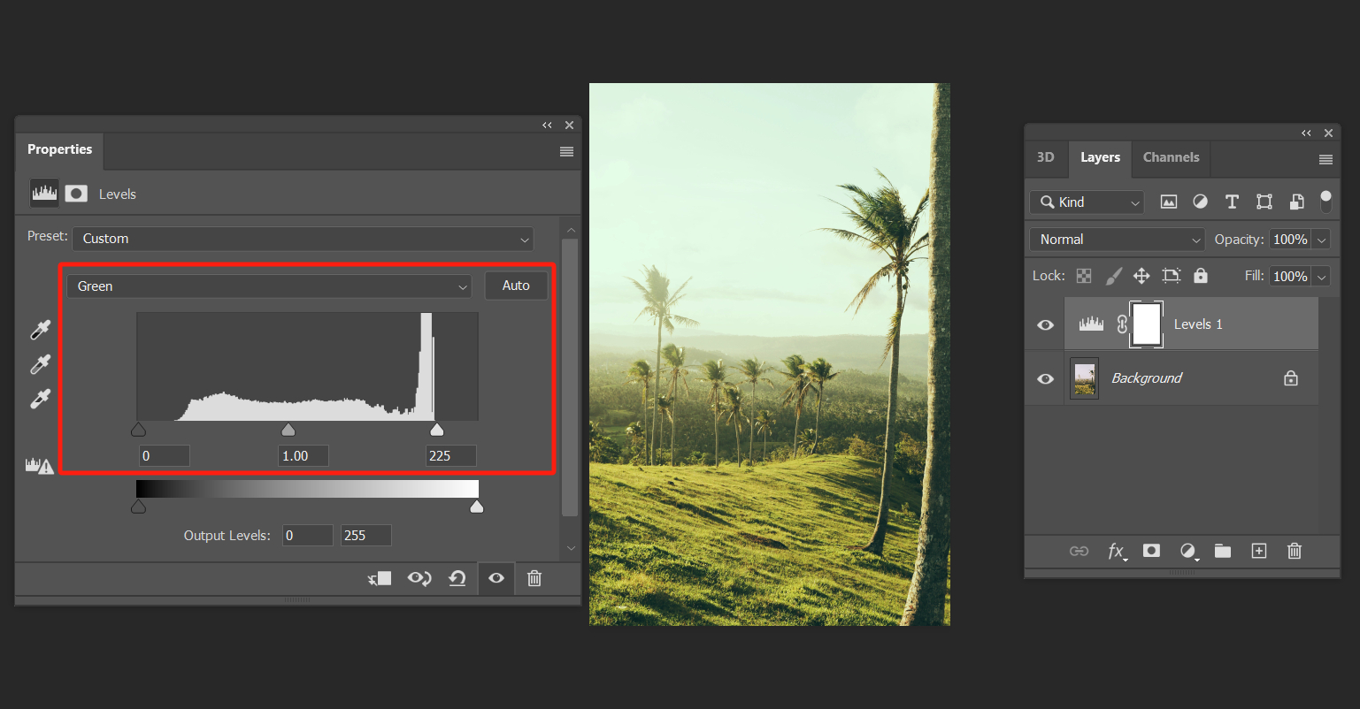
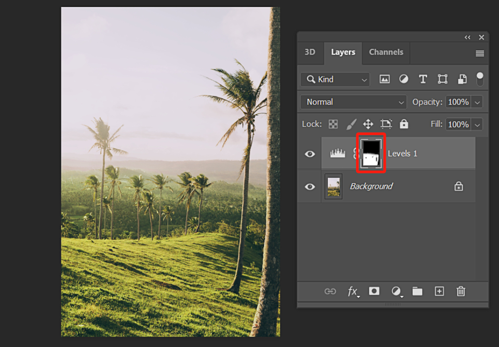
But here's the issue: the color of the sky has also changed and turned into a strange green color, which doesn't look good at all. Fortunately, this problem is easily solvable. You just need to use a black brush to paint over the sky area on the mask of the Levels adjustment layer.
Of course, don't forget to adjust the color of the tree trunks and the fine details along the edges of the photo.
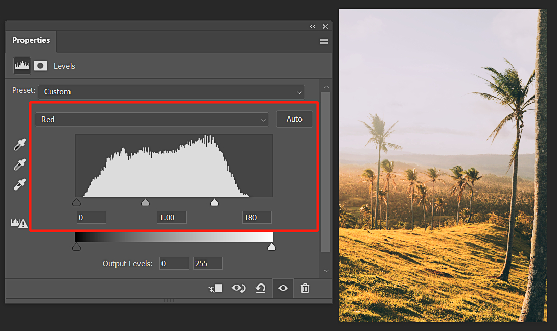
However, if we want to add a sunset-like feeling to this image, what should we do? Sunset is characterized by a yellow color tone, but there is no specific yellow channel option within the RGB channels. Here, we simply need to increase the values in the red channel, as shown in the image below, to achieve the effect of a sunset.
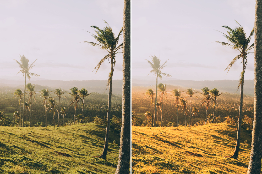
Let's take a look at the before and after comparison of using Photoshop Levels for color grading:
But why does adjusting the red channel turn the image yellow? The reason is that when red and green are combined, they create yellow.
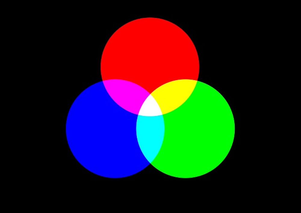
We know that the color mode of an image in digital design is generally RGB, which stands for red, green, and blue - the primary colors of light.
In this case, when red and blue are combined, they create magenta. When red and green are combined, they create yellow. And when blue and green are combined, they create cyan. Therefore, color grading in an image involves the overlapping of different hues to create various color effects.
Enhance Your Editing Workflow in Photoshop
In this final section of our tutorial on using Levels in Photoshop, we want to take your color grading experience to the next level by seamlessly integrating TourBox into your workflow.
When it comes to creating a Levels adjustment layer in Photoshop, instead of searching through menus for a specific adjustment layer, TourBox simplifies the process. With TourBox, a simple press of a button swiftly generates a Levels adjustment layer.
TourBox offers a range of additional features to enhance your editing experience. For instance, you can create macros to automate a series of actions, saving you time and effort.
By significantly improving your creative efficiency, TourBox boosts productivity and enhances your overall operating experience. Explore our photo editing page to discover more about the versatile applications of TourBox.
Now, give Photoshop's Levels adjustment tool a try in your project. It's time to unleash your creativity and embark on your creative journey.