7 Beautiful Purple Shades for Stunning Color Palettes
Purple is a very unique color. It carries the calm and logic of blue, while also blending in the passion and feeling of red. That is why it often gives people a mysterious, elegant, and artistic impression. In brand design, digital painting, UI design, illustration, and interior design, purple can be very powerful.
But purple is not just one color. Different shades of purple can create very different moods and atmospheres. Some look noble and mature, some feel soft and calming, and others feel futuristic and creative.
If you are looking for purple ideas for your work, you can start with these seven classic and practical shades.

In this article, you will learn:
- Wine Purple
- Twilight Purple
- Lavender Smoke Purple
- Midnight Purple
- Aster Purple
- Rhythm Purple
- Champagne Purple
- Conclusion
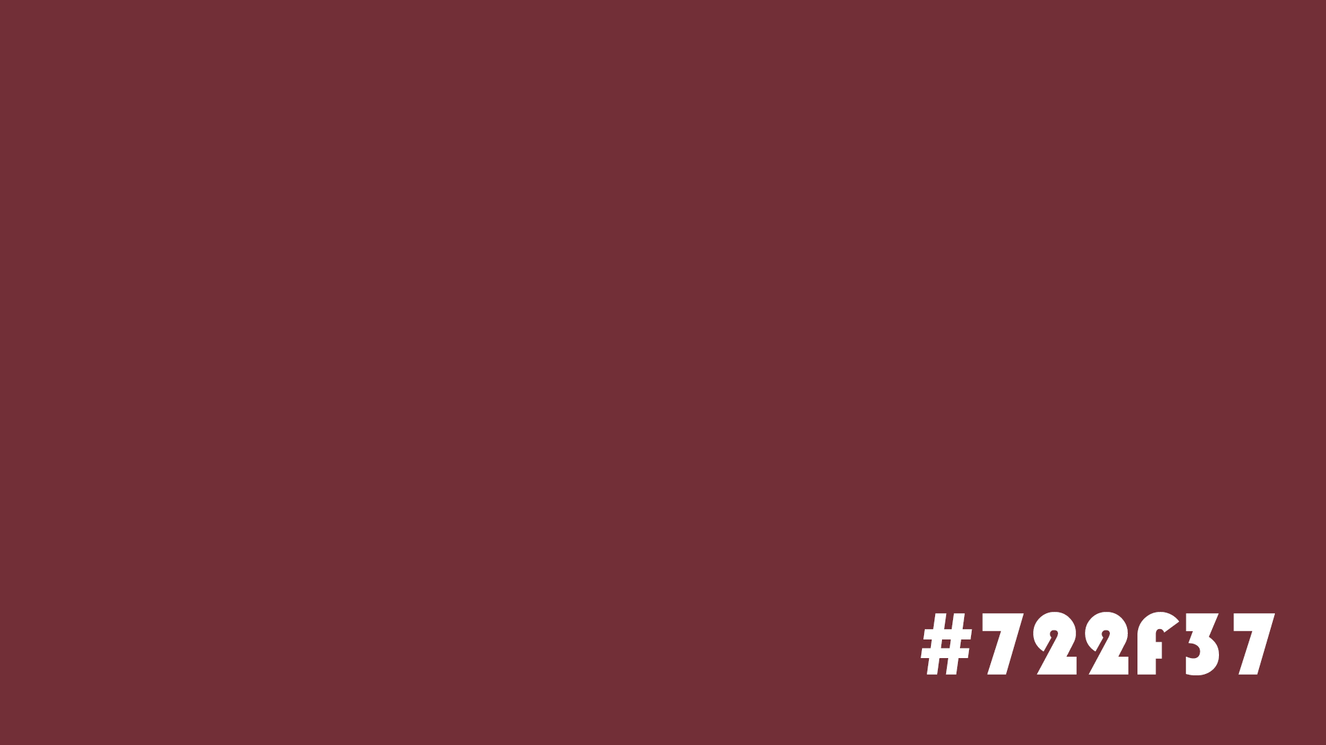
Wine Purple
Color value: #722F37
Keywords: mature, elegant, deep
Wine Purple is a rich, layered, deep purple inspired by the color of aged red wine. It sits between burgundy and purple, keeping the mysterious feel of purple while also carrying the mature charm of red.
This color often appears in high-end fashion brands, luxury packaging, and boutique hotel design. It can easily create a sense of class and quality.
Best uses:
- High-end brand visuals
- Luxury packaging design
- Character costume color palettes
- Vintage-style illustration
Color pairing tips:
Wine Purple looks especially refined when paired with gold, off-white, or dark gray. If you want a more dramatic look, you can also pair it with deep green or black.
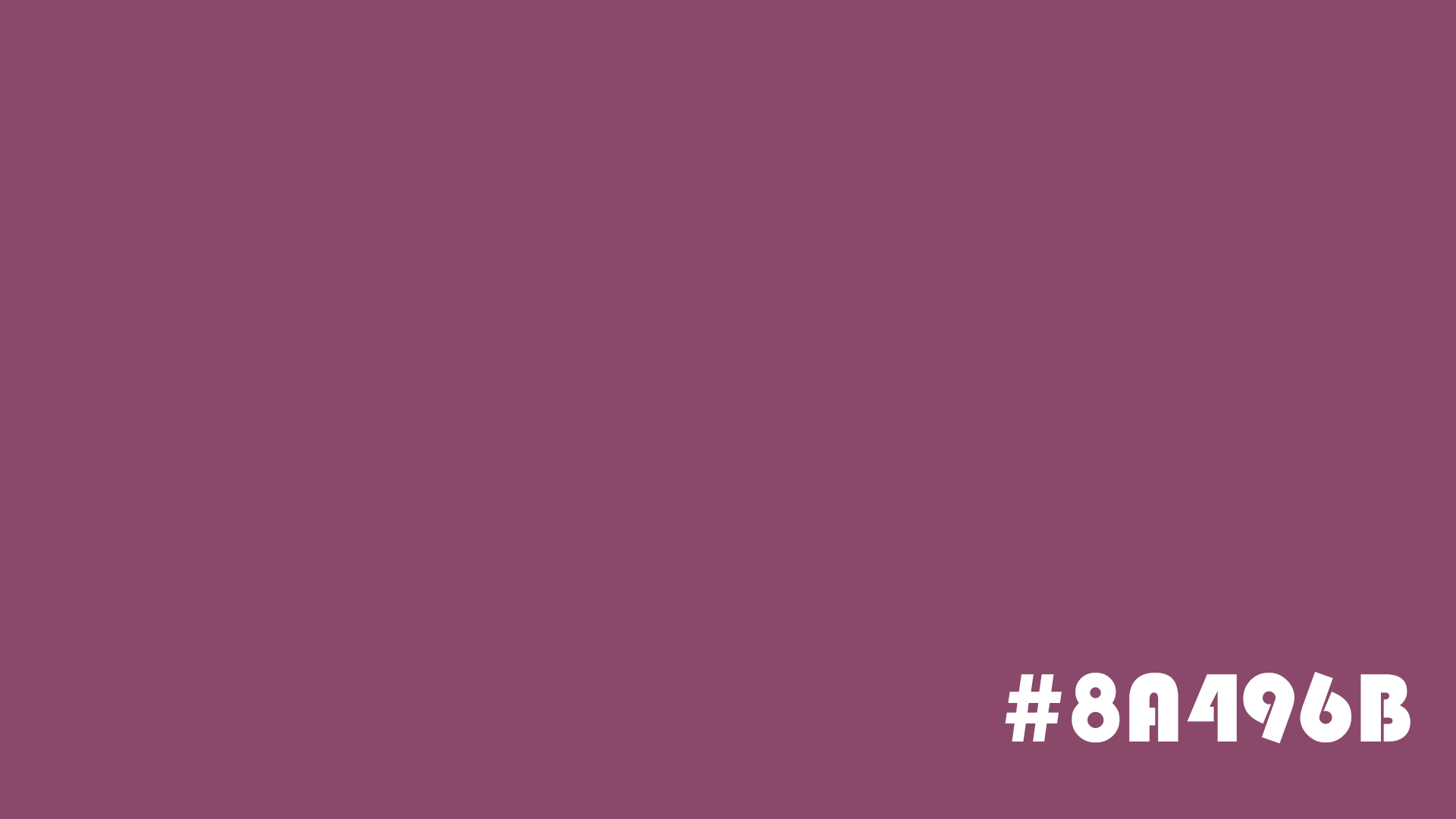
Twilight Purple
Color value: #8A496B
Keywords: calm, romantic, mysterious
Twilight Purple feels like the last glow of sunset blending into the night sky.
Compared with stronger purples, it feels softer and more restrained. It is neither too bold nor too dull. It naturally carries a dreamy and romantic mood, making it a great choice for emotions, fantasy, and story-driven scenes.
Best uses:
- Concept art
- Romantic posters
- Fantasy-style illustrations
- Novel cover design
Color pairing tips:
Paired with pink, light orange, or warm gray, it can create a soft gradient feel. It works especially well for sunset, dusk, or dreamlike scenes.
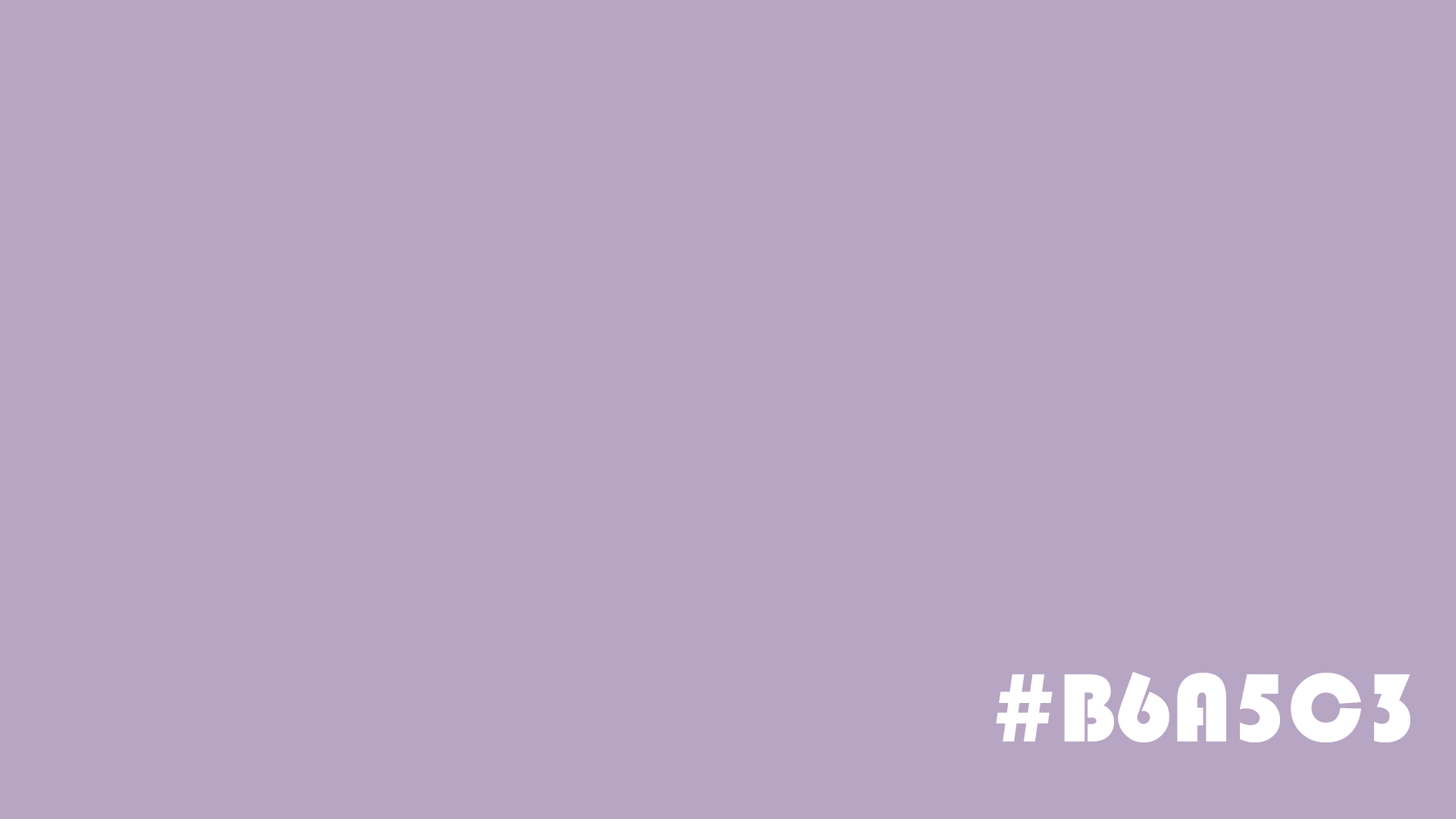
Lavender Smoke Purple
Color value: #B6A5C3
Keywords: soothing, calm, gentle
Lavender Smoke Purple is a light purple with a gray tone, like the faint scent of lavender drifting through the air.
Compared with more saturated purples, it feels softer and more restrained. It can help reduce visual tension, which is why it often appears in wellness brands, lifestyle products, and home design.
For digital artists, this kind of low-saturation purple is also a useful way to create a more refined atmosphere.
Best uses:
- UI design
- Visuals for women's brands
- Home space design
- Healing-style illustrations
Color pairing tips:
Pair it with white, cream, light gray, or sage green to create a relaxed and comfortable visual feel.
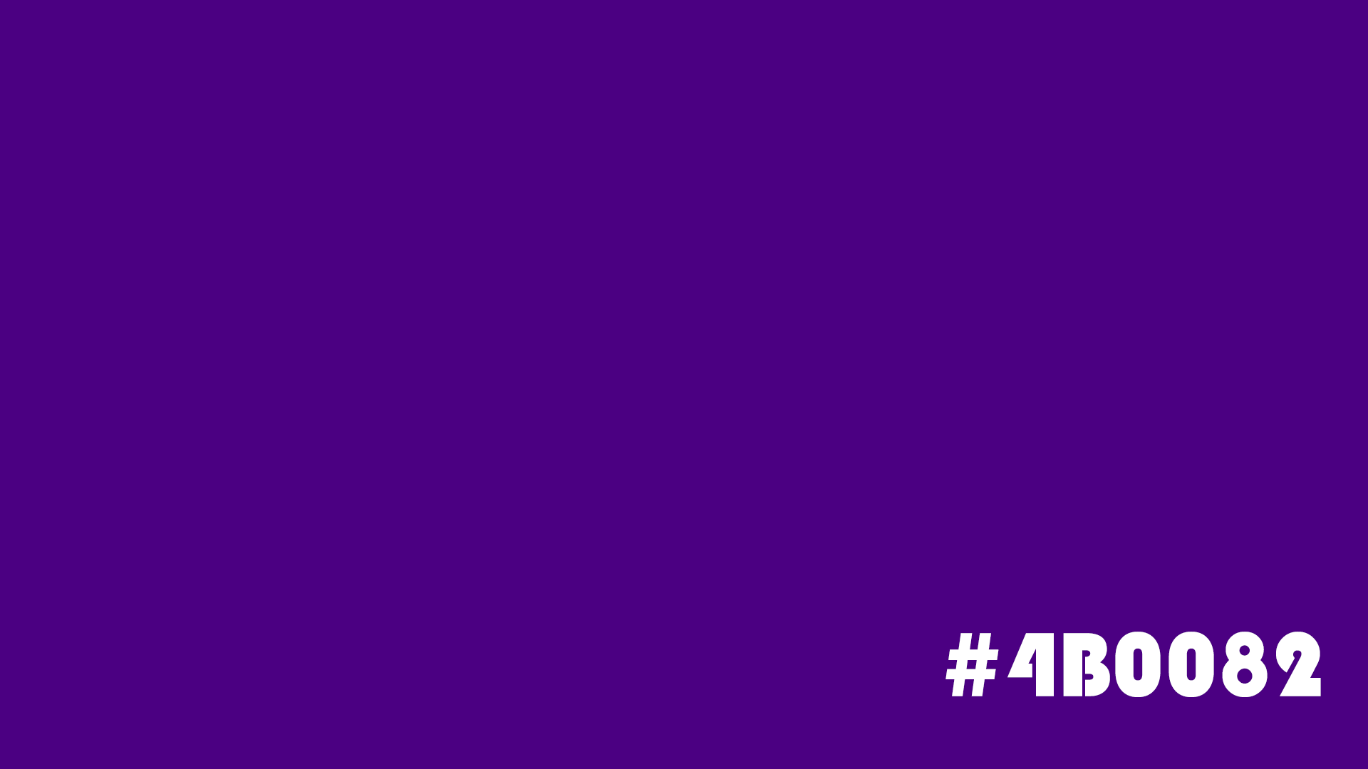
Midnight Purple
Color value: #4B0082
Keywords: mysterious, powerful, deep
Midnight Purple is a deep purple that is close to black.
It feels as deep and quiet as a starry sky at midnight, yet it still carries a strong sense of energy. Compared with regular dark blue, Midnight Purple feels more mysterious and is better at creating a futuristic and premium look.
Many high-end tech products, esports brands, and luxury car color schemes use this shade.
Best uses:
- Tech product design
- Esports visuals
- Game UI design
- Sci-fi illustrations
Color pairing tips:
Pair it with silver, electric blue, or white to create a futuristic feel. Pair it with gold to show a more luxurious and mysterious look.
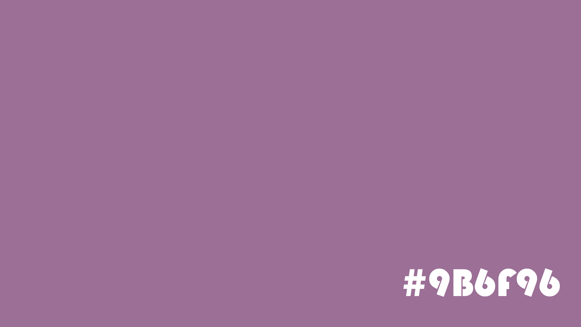
Aster Purple
Color value: #9B6F96
Keywords: warm, balanced, elegant
Aster Purple comes from the soft petal color of aster flowers.
It is not as serious as deep purple, and not as sweet as light purple. It sits in a very balanced middle. It keeps the elegance of purple, while also bringing a comfortable warmth.
This color is especially good for design work that needs both a friendly feel and an artistic touch.
Best uses:
- Cultural and creative brand design
- Fall and winter fashion palettes
- Packaging design
- Lifestyle illustrations
Color pairing tips:
Pair it with beige, caramel, or warm gray for a warm and comfortable look. It works especially well for autumn-themed projects.
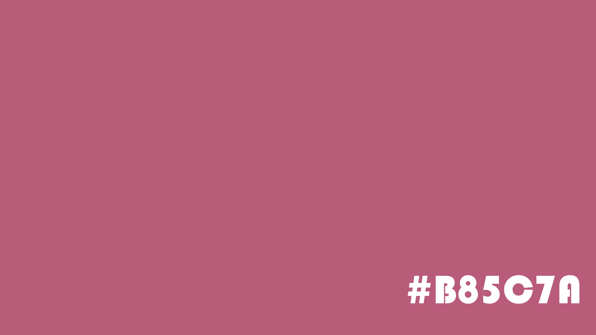
Rhythm Purple
Color value: #B85C7A
Keywords: passionate, creative, lively
Rhythm Purple is a purple with a strong red tone.
Compared with traditional purple, it feels more lively and expressive. It keeps the artistic feel of purple, while also mixing in the emotional energy of red. That makes it a great choice for designs that want to highlight creativity and personality.
If your work needs to catch attention, but you do not want to use a red that feels too direct, Rhythm Purple is a very good option.
Best uses:
- Trendy brand design
- Digital art
- Music event posters
- Social media visuals
Color pairing tips:
Pair it with coral orange, bright pink, or deep purple to create a style that feels energetic and modern.
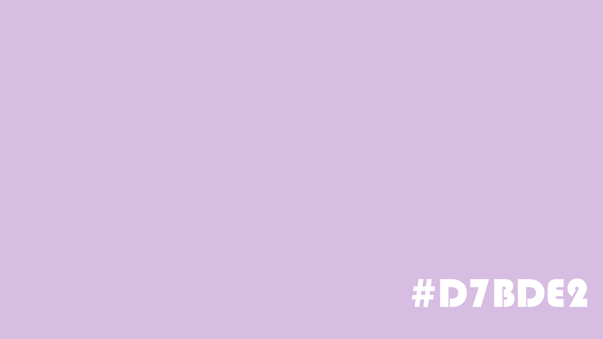
Champagne Purple
Color value: #D7BDE2
Keywords: celebration, joy, romance
Champagne Purple is a light purple with a pink tint.
It has the romantic feel of purple, while also bringing in the refined and celebratory mood of champagne. As a result, it feels light, dreamy, and elegant.
This color often appears in wedding design, holiday events, and women-focused consumer brands.
Best uses:
- Wedding visuals
- Holiday event posters
- Cosmetics packaging
- Dreamy-style illustrations
Color pairing tips:
It looks best with champagne gold, pearl white, or light pink. These combinations create an elegant and romantic mood.
Conclusion
Purple is one of the most expressive colors in design. In this blog, we shared seven beautiful shades of purple, and each one has its own mood and visual character.
For designers and digital artists, it is more important to understand the feeling behind each shade of purple than to just remember the color values. Next time you create, try adding these purples to your color palette. They may bring a surprising sense of elegance and artistic style to your work.
For designers and digital artists, choosing and pairing colors well has always been one of the key factors in whether a piece works or not. That is why, if you have a tool that helps you pick colors more freely and adjust them faster, the whole workflow often feels much better.

So, at the end of this blog, we would also like to recommend TourBox's built-in Dynamic Color Picker. You can call it up with one press of a TourBox button. It shows the Color Wheel and the Luma-Based Palette right near your brush tip, so you can pick and fine-tune colors without breaking your creative flow. The whole process feels smoother, and color selection becomes more direct and more efficient.

If you want a smoother creative workflow and a more comfortable way to work, TourBox is worth trying. Feel free to take a closer look.