Vibrance Vs Saturation: What's the Difference?
In post-processing, photographers often aim to make their photos more vibrant, which is why photo editing software like Lightroom Classic includes Saturation tools. By increasing the saturation of a photo, you can make it appear more vibrant
If you're observant, you may have noticed that in addition to saturation, there is usually a tool called "Vibrance." With a simple adjustment, it seems like the Vibrance tool does the same thing as the Saturation tool – making the photo more vibrant.
So, what exactly is the difference between vibrance and saturation? In this article, we will provide you with the answer and help you avoid confusion when color grading.

In this article, you will learn:
- Vibrance Vs Saturation: What's the Difference?
- Vibrance Vs Saturation: Which One Should You Use?
- Vibrance Vs Saturation: Frequently Asked Questions
Vibrance Vs Saturation: What's the Difference?
Saturation refers to the level of color purity and represents how vibrant a color appears. Taking Lightroom Classic as an example, both the Vibrance and Saturation tools can be found in the Basic panel.

The saturation tool adjusts all colors in an image. So, when you increase saturation, all colors in the photo become more vibrant.
However, this poses a problem. If there is a significant amount of yellow in the photo, increasing saturation would make the yellow color overly vibrant, resulting in an unnatural-looking image.
Take, for example, a photo with a person in it. If the person's skin has a slight yellowish tone, increasing saturation too much would make the skin appear excessively yellow, which is unflattering.
Without the Vibrance tool, you would need to use the hue saturation tool or tools like Lightroom Classic's HSL tool to individually control specific colors. This can be quite cumbersome.
Think of the Vibrance tool as an intelligent version of the Saturation tool. It prioritizes increasing the saturation of moderately or less saturated colors while preventing certain colors from becoming overly saturated.
Furthermore, it filters out the yellow tones in the photo, ensuring that the increase in saturation doesn't make the yellow color look too extreme. This way, it maintains a balance where the overall saturation is enhanced without causing excessive yellowing of the person's face.
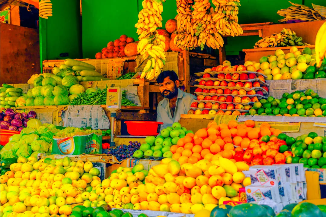
Let's use the following photo as a simple demonstration to understand the difference between saturation and vibrance visually.
First, we'll increase the saturation of the photo to 100% and observe the changes.
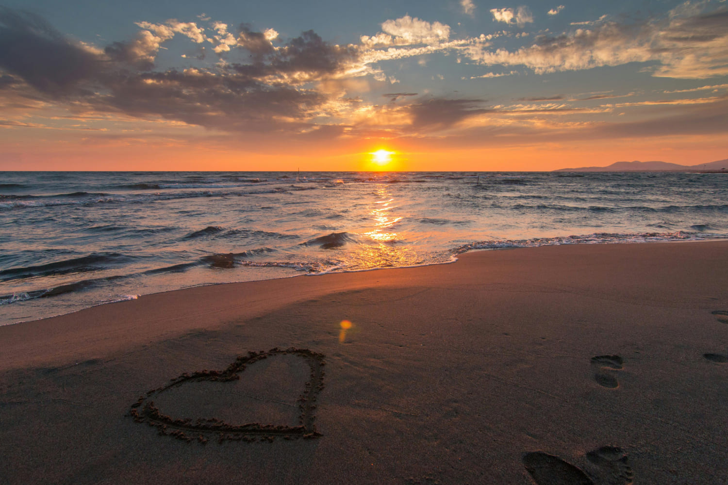
Next, we'll reset the saturation and increase the vibrance to 100% to see the changes.
Clearly, when using the Vibrance tool, the increase in yellow tones is not as pronounced as with the Saturation tool. In fact, some areas may even see a decrease. The overall color saturation of the photo also doesn't become as exaggerated as it does with the Saturation tool.
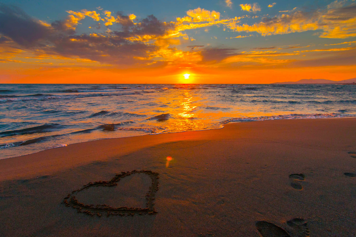
Now, let's reset the saturation and vibrance values and decrease them to -100% separately.
We'll notice that when saturation is set to -100%, the photo becomes completely devoid of color, turning into a black-and-white image.
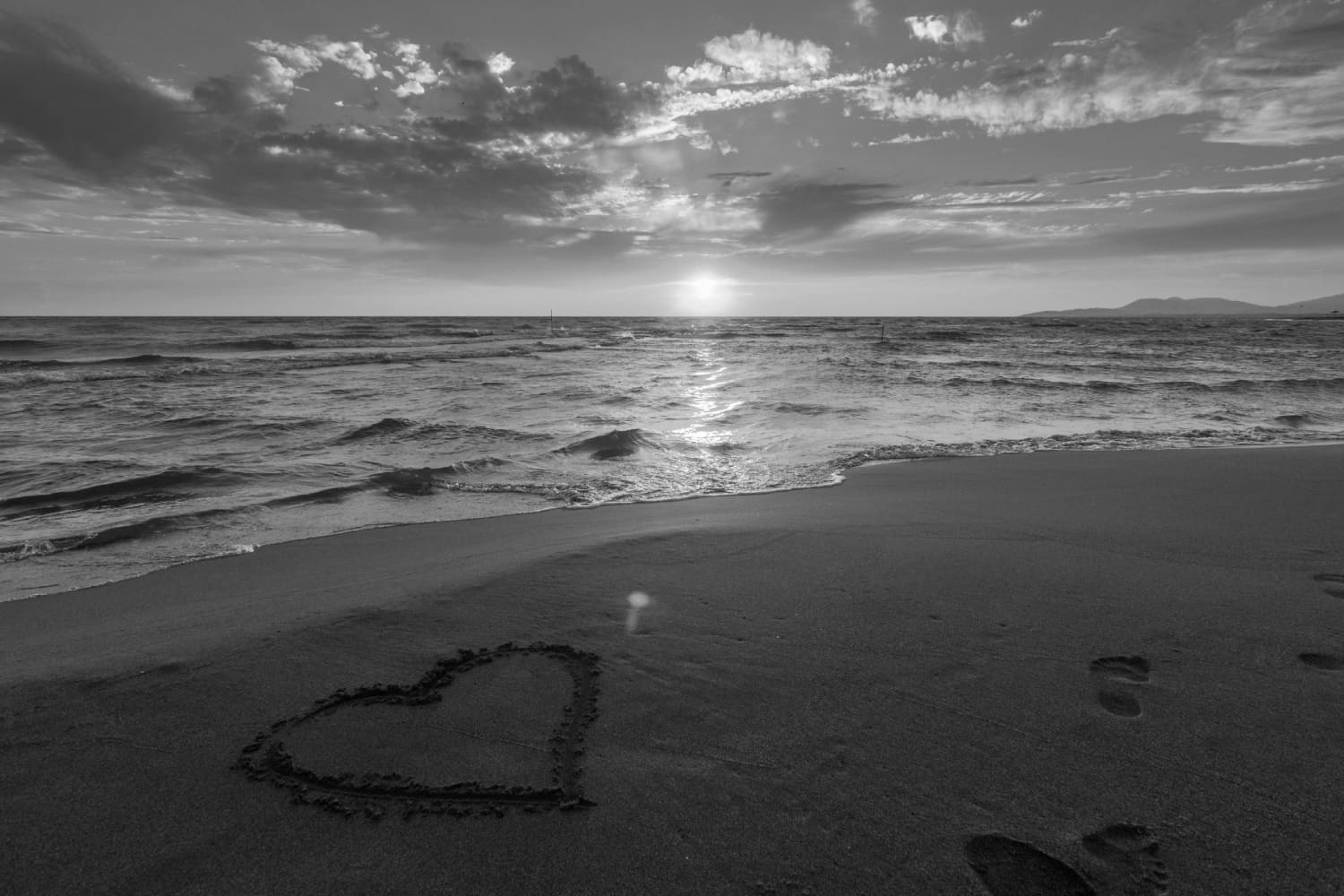
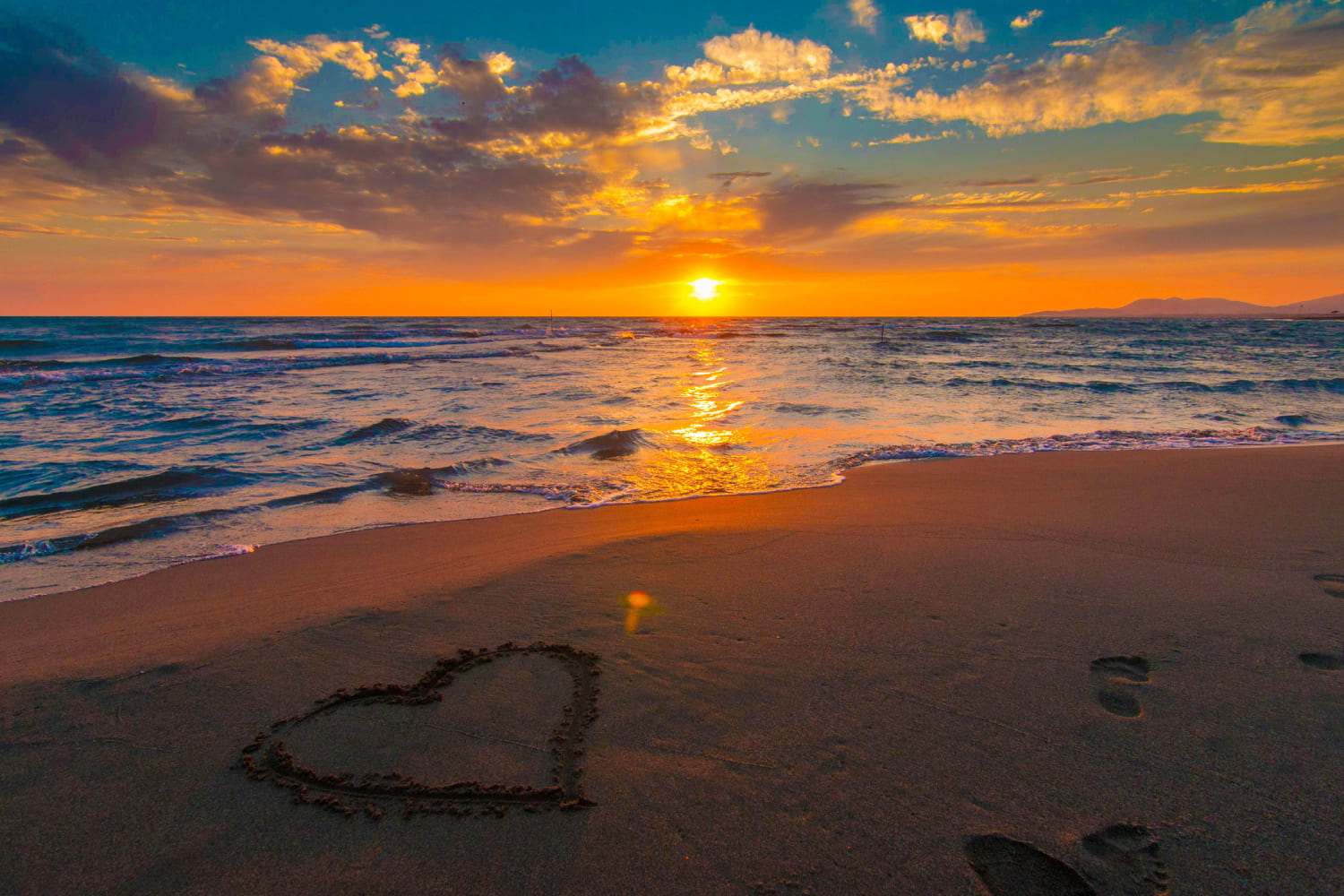
However, when the vibrance is set to -100%, we can still see some faint colors in the photo.
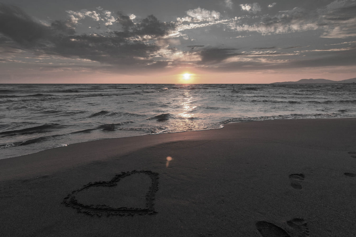
This indicates that the vibrance adjustment doesn't uniformly affect all colors but intelligently processes certain colors. Therefore, some colors may undergo more adjustment while others are affected to a lesser extent.
Vibrance Vs Saturation: Which One Should You Use?
Both saturation and vibrance can make your photos more vibrant. However, vibrance does a better job of controlling the yellow tones, resulting in a more natural overall enhancement of colors.
On the other hand, saturation can quickly and directly boost the intensity of all colors, but it may look less natural when increased too much.
In practical photo editing, you can use a combination of saturation and vibrance to leverage their respective advantages.
It's important to note that when increasing the vibrancy of a photo, try not to push the saturation and vibrance to extreme levels. Otherwise, the photo may end up with saturated color blocks or even color banding, resulting in an unnatural appearance.
Vibrance Vs Saturation: Frequently Asked Questions
Question: What Is Saturation?
Saturation refers to the purity of a color and represents how much gray component is present in the color. Higher saturation means a more pure color with less gray.
Question: What Is Vibrance?
Vibrance refers to the saturation of colors in a natural environment. It is a relative concept because the saturation of an object's color may vary under different lighting conditions.
Question: What's the Difference Between Saturation and Vibrance?
Saturation is an absolute concept that relates solely to the color itself, while vibrance is relative and influenced by lighting conditions.
Question: What Are Saturation and Vibrance Used For?
Saturation and vibrance are crucial concepts in fields such as art design, photography, television, and computer display technology.
They help you understand and control colors better, allowing you to create visually appealing images and designs that are in line with human perception.
Product Recommendation:
You can find saturation and vibrance adjustment tools in most image editing and video editing software. However, adjusting these parameters can sometimes be unintuitive and inconvenient.
That's where you may need a tool like TourBox, designed to greatly enhance the workflow and user experience for photographers, digital artists, and content creators.
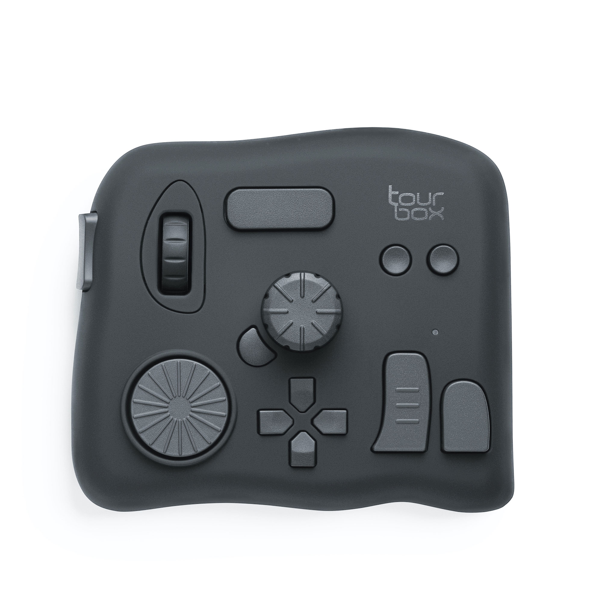
With simple settings, you can easily adjust those tedious parameter adjustments by simply rotating TourBox's controls with one hand. This process is effortless and, according to our tests, can boost your productivity by 270%.
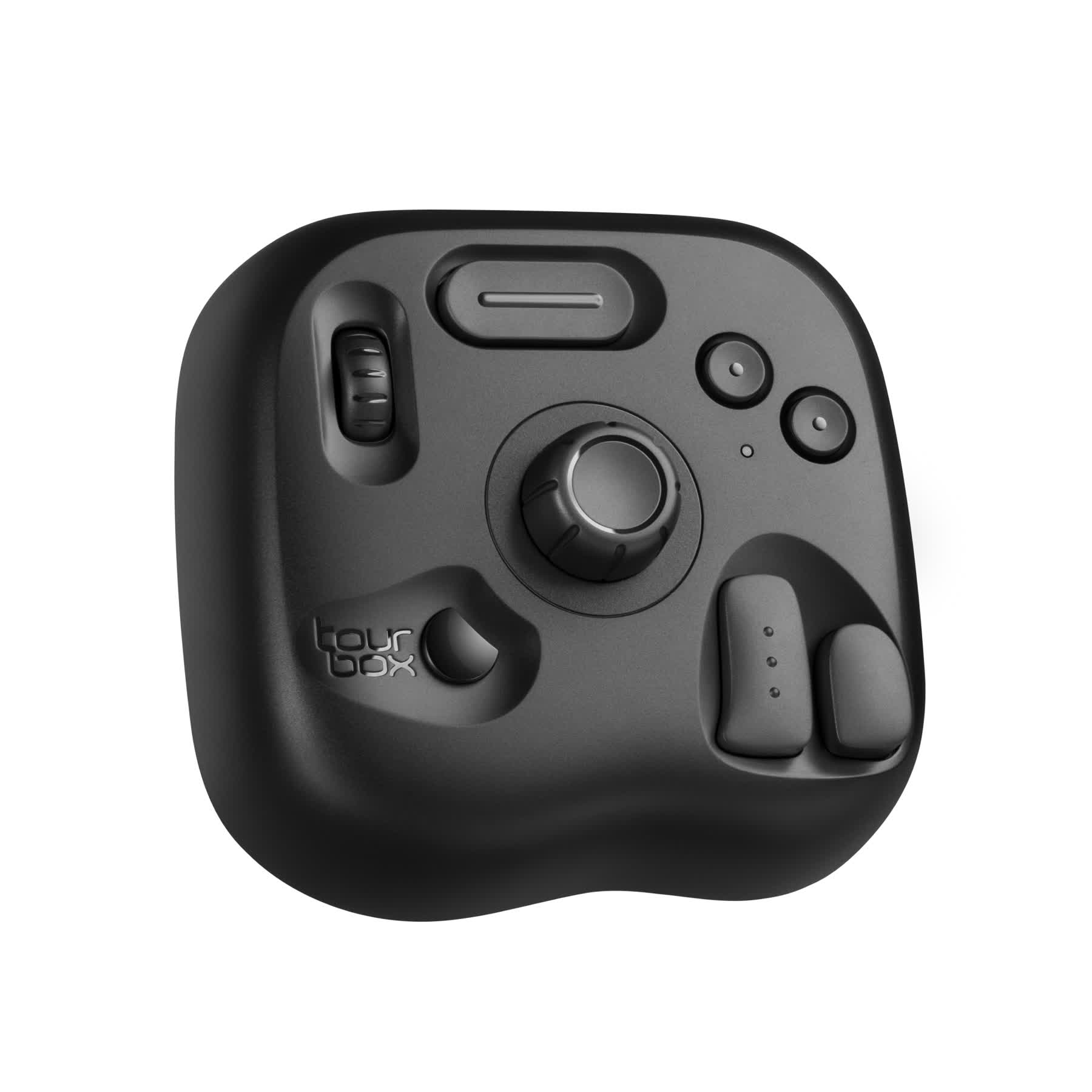
If you haven't tried TourBox yet, consider checking out our latest product, TourBox Lite. It offers even better value for money and is perfect for first-time users of TourBox.
That concludes our article on vibrance vs saturation. We hope this simple explanation has answered your questions about saturation and vibrance.