What Colors Go Well with Purple: Perfect Pairings for Your Design
When you think of purple, what comes to mind? Is it the romance under a starry sky or the blooming lavender in a garden?
Purple always carries a unique charm, both mysterious and elegant, yet it often leaves us puzzled: What colors go well with purple to truly showcase its beauty?
If you have these questions too, don't worry. In this article, we will explore various combinations of purple with other colors to help inspire you in design and color matching.

In this article, you will learn:
The Color Psychology of Purple
Purple is a blend of warm red and calm blue, striking a balance between the two. It's softer than red yet warmer than blue, making it a truly unique color.
Further Reading:
Like green, purple is also considered a neutral tone, hovering somewhere between warm and cool without fully committing to either side.
The vibe purple gives off can change drastically depending on its brightness. Deep, dark shades of purple feel rich and mysterious, while lighter, brighter purples exude a sense of romance and elegance.
1. Nobility and Luxury
Purple has long been linked to symbols of nobility and elegance. In traditional Eastern cultures, purple is considered a color of dignity. For example, the Forbidden City in Beijing is known as the "Purple Forbidden City," where the color purple symbolizes auspiciousness and honor.
In Western cultures, purple also represents power and status. Because purple dye was rare and expensive in ancient times, only kings, nobles, and high-ranking clergy were allowed to wear it, with royal purple signifying supreme authority.
Because of these historical associations, purple is often used in modern design to convey luxury and sophistication. Whether in jewelry, perfume, or fashion items, purple subtly enhances the aristocratic appeal of a product.
For example, the renowned Italian football team Fiorentina is often called "Viola" because of its purple team kit. This team originated from royalty, and the purple color symbolizes this history.
![]()
2. Mystery and Sensuality
Purple naturally carries an air of mystery and dreaminess, especially deeper shades of purple, which can feel like mist in the dark of night—captivating and full of intrigue.
It's often associated with the unknown, exploration, and spirituality, and this mysterious quality is widely used in art and design.
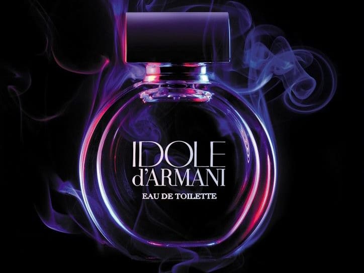
At the same time, purple's mysterious vibe also has a hint of sensuality. Dark purple is especially effective at conveying a mature, alluring aura, making it perfect for high-end, seductive products like luxury perfumes, premium cosmetics, and evening gowns.
 (2)_241127155402.jpg)
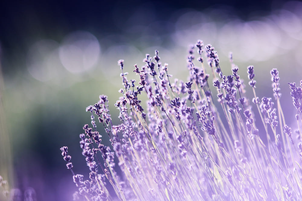
3. Romance and Elegance
Light purple evokes a soft, romantic visual appeal, often bringing to mind fields of lavender or a dreamy sunset. It carries an innate sense of elegance, sparking thoughts of grace and poetic beauty.
In design, light purple is frequently used to create a romantic atmosphere, making it a popular choice for wedding decor, date-night themes, or packaging for products aimed at women.
From makeup to floral arrangements to wedding invitations, light purple effortlessly sets a dreamy and refined tone, leaving a delicate and enchanting impression.
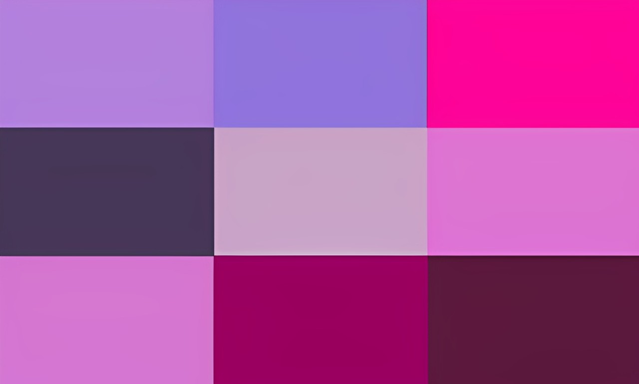
What Colors Go Well with Purple?
When incorporating purple into our designs, finding the perfect colors that complement it often becomes a fascinating challenge.
Different color combinations not only give purple new meanings but also create visually stunning effects that can captivate the eye.
1. Purple + Black: Sophistication and Luxury
Purple and black colors evoke a sense of luxury and sophistication. They create an opulent and dramatic look that feels regal and high-end when paired together.
This combination is often seen in premium branding, upscale fashion, and evening events where elegance and grandeur are key.
The deep, rich tones of purple harmonize beautifully with the timelessness of black, making the duo perfect for designs that exude power and refinement.
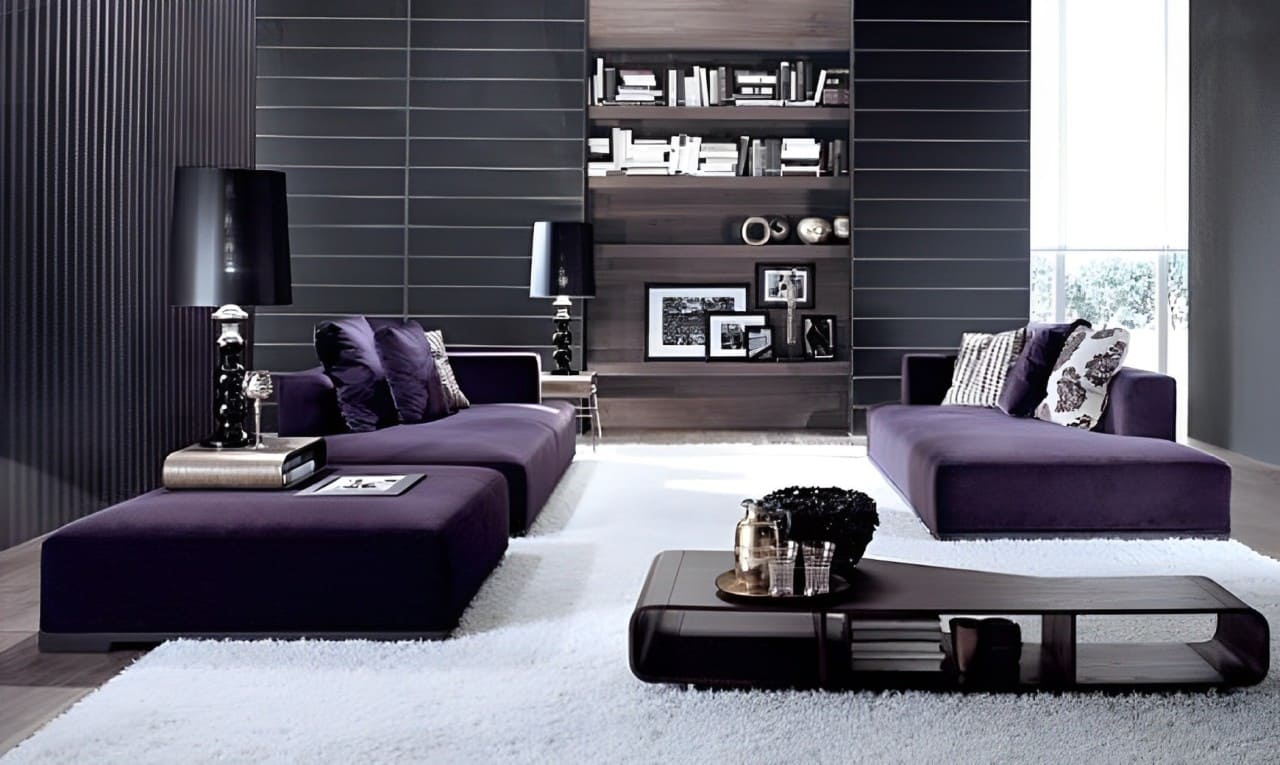
2. Purple + Gray: Subtle Elegance
Gray's understated elegance blends seamlessly with purple's bold coolness, creating a refined and sophisticated palette. This pairing is perfect for minimalist or modern designs where subtle beauty is desired.
A soft lavender paired with a medium or charcoal gray can create a dreamy, serene aesthetic, while deeper purples with light gray offer a classy, balanced look.
This combination is particularly popular in interior design, where it lends a timeless and tasteful appeal.
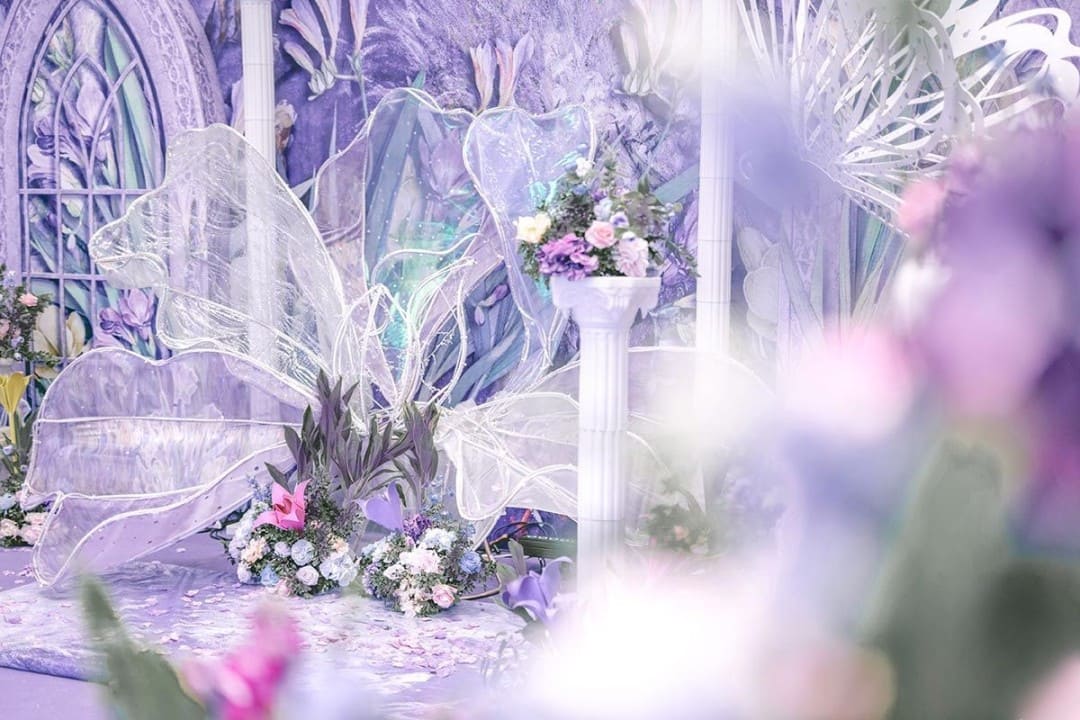
3. Purple + White: Soft and Delicate
Adding white to purple introduces a lightness that softens purple's naturally intense characteristics. The result is a palette that feels fresh, gentle, and feminine.
Lavender and white are particularly popular in designs centered around romance or elegance, such as weddings, floral arrangements, or feminine product packaging.
This pairing works beautifully to create a sense of purity and harmony, making it ideal for both classic and modern styles.
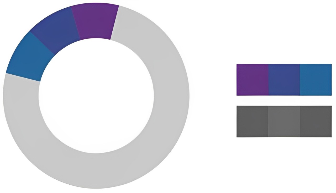
4. Purple + Blue: Dreamy and Futuristic
Purple and blue, being neighboring colors on the color wheel, create a harmonious and smooth visual flow. Their similar tones make for a pairing that feels cohesive and easy on the eyes.
Darker purples paired with bright or electric blues can evoke a sense of mystery and technology, giving off a modern, futuristic vibe.
This combination is often used in digital designs, gaming, or branding that aims to be bold yet approachable.
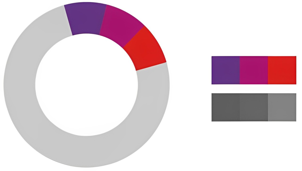
5. Purple + Red: Bold and Passionate
On the color wheel, red is another analogous neighbor to purple
This pairing is warm and intense, perfect for bold, high-saturation designs. Deep, moody shades of red and purple together create a dramatic and sophisticated look, while lighter purples and reds can feel romantic and youthful.
To balance their inherent intensity, it's a good idea to either lighten the tones for softer contrasts or incorporate other bright colors to add layers and depth to the design.
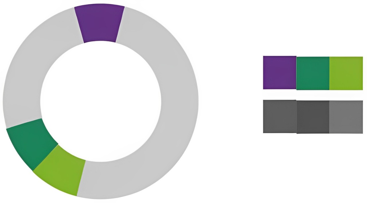
6. Purple + Green: Vibrant and Natural
Purple and green are contrasting colors, meaning they sit opposite each other on the color wheel. Their contrast makes for a striking combination that feels dynamic and lively.
By adjusting the brightness or saturation, this pairing can be tailored for different moods—soft lilacs with mint greens feel light and airy, while rich purples and emerald greens are dramatic and luxurious.
Because green is often associated with nature, adding it to purple brings a sense of balance and freshness to the composition.
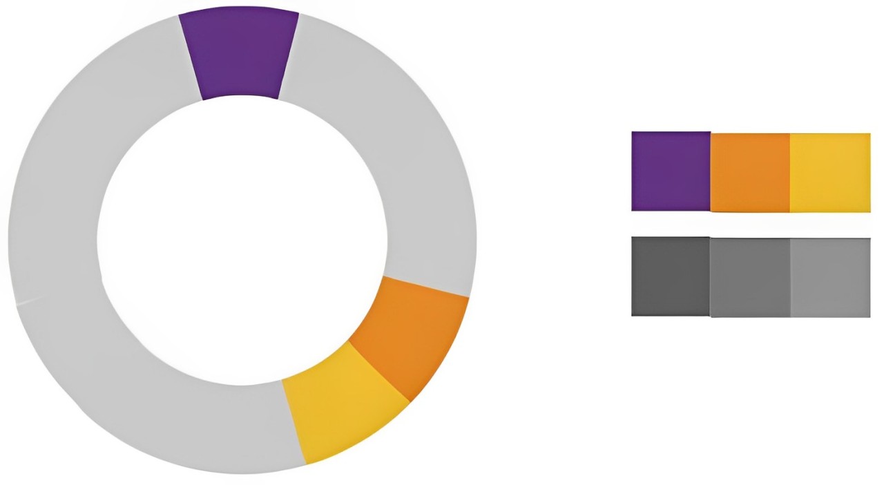
7. Purple + Orange: Bold and Energetic
Purple and orange are another pair of contrasting colors, creating a strong contrast that grabs attention. This duo works well in vibrant, high-energy designs where a sense of playfulness or creativity is desired.
Bright orange accents on a deep purple background can create a striking, modern look, making it an ideal choice for youth-focused branding or dynamic product packaging.
This pairing also works well when aiming to stand out in digital or advertising spaces.
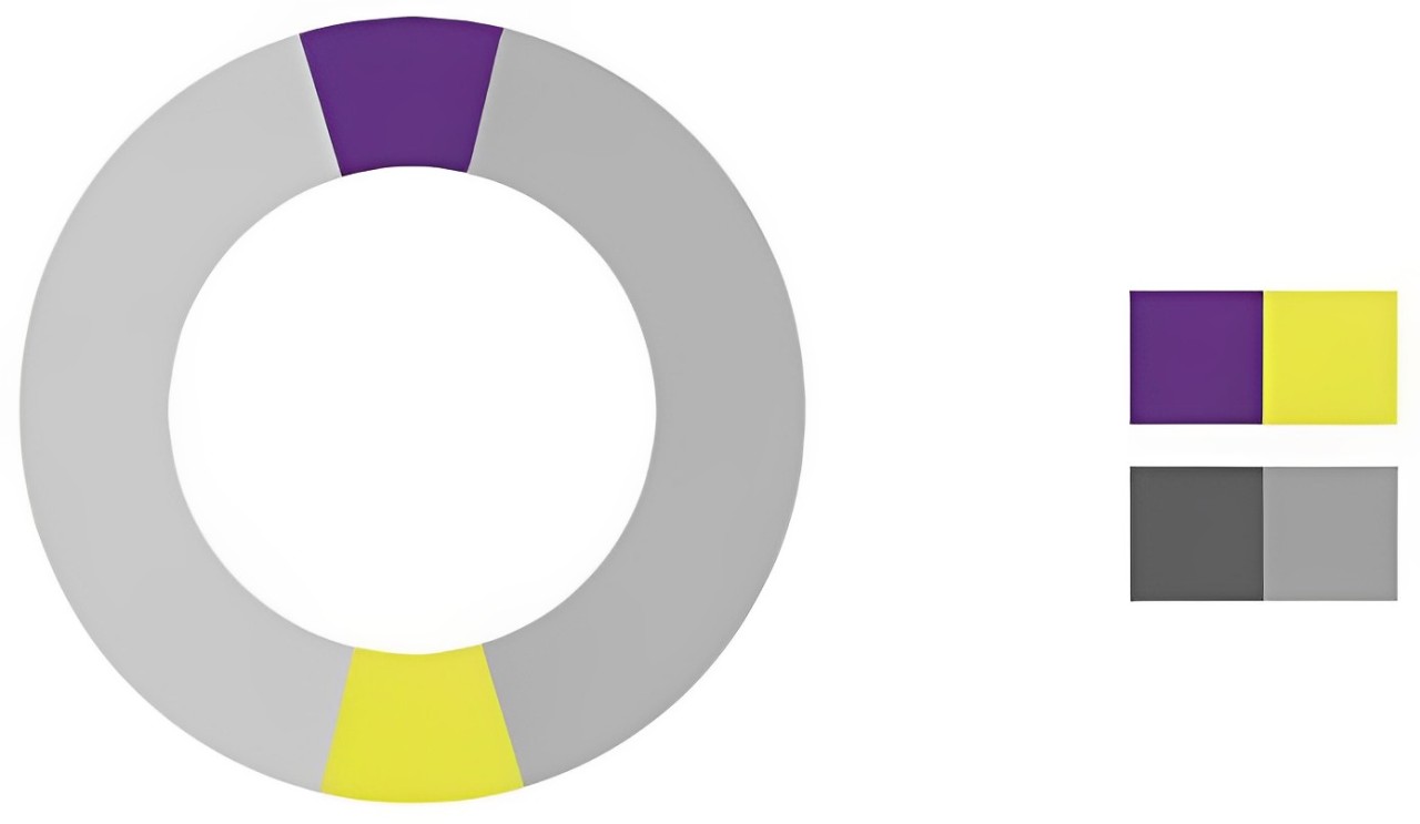
8. Purple + Yellow: High-Contrast and Eye-Catching
Purple and yellow are a classic complementary pair, offering maximum contrast in both hue and brightness. This combination creates a high-energy, visually striking effect that demands attention.
Yellow's warmth and brightness perfectly balance purple's cool, mysterious undertones, making the pairing feel vibrant and dynamic.
This duo is especially effective in bold branding, artistic designs, or whenever a strong visual impact is needed.
Conclusion
In this article, we have explored what colors go well with purple, discovering that the charm of purple lies not only in its uniqueness but also in its interactions with other colors.
Whether it's the luxury of black or the elegance of gray, purple can showcase different facets, bringing forth various emotions and visual effects.
Of course, there are no strict rules in color pairing. The most important aspect is to choose colors that suit the atmosphere and emotions you want to convey.
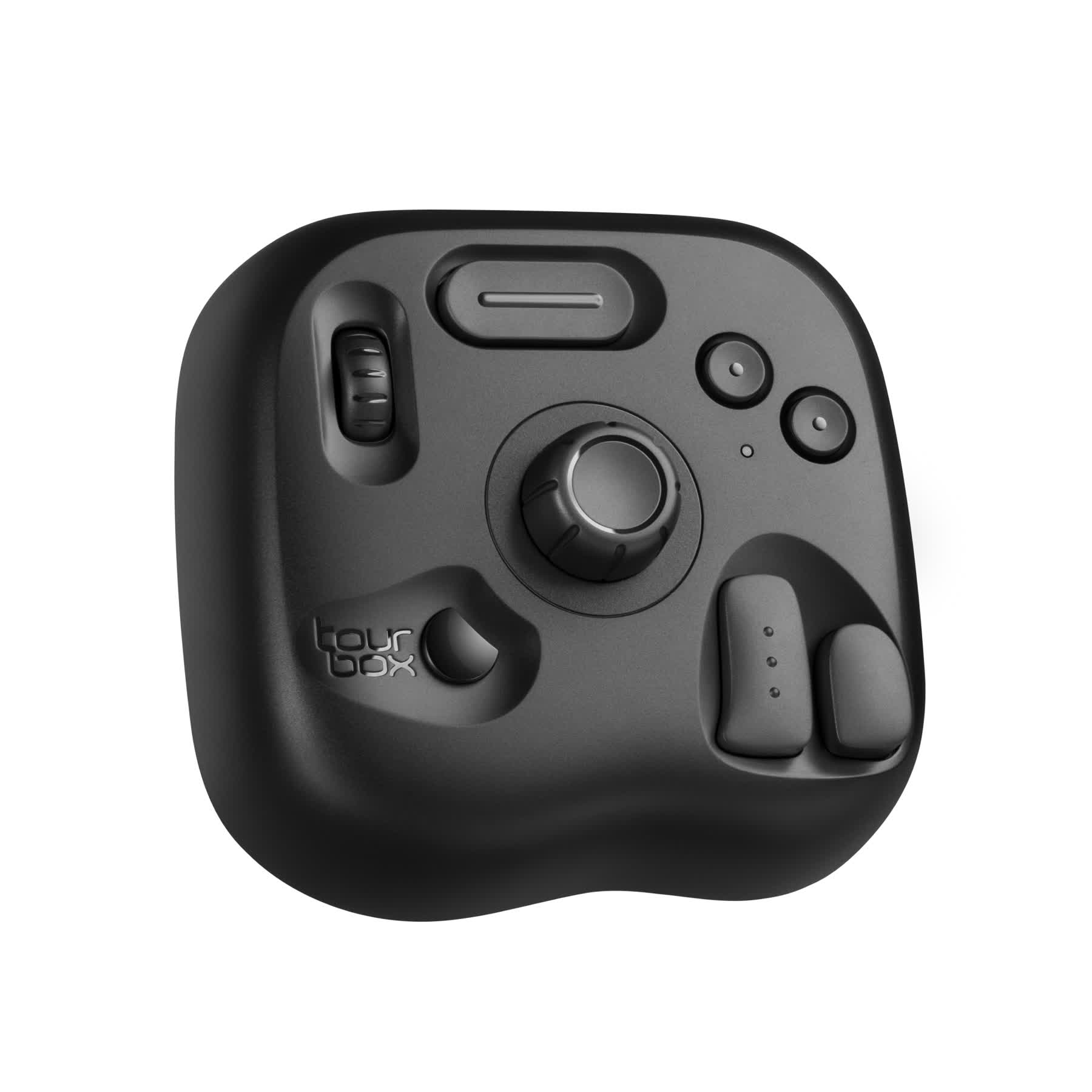
As a designer or digital artist, mastering efficient creative tools is equally important. If you're still looking for a tool to enhance your workflow, TourBox might be the indispensable assistant you need.
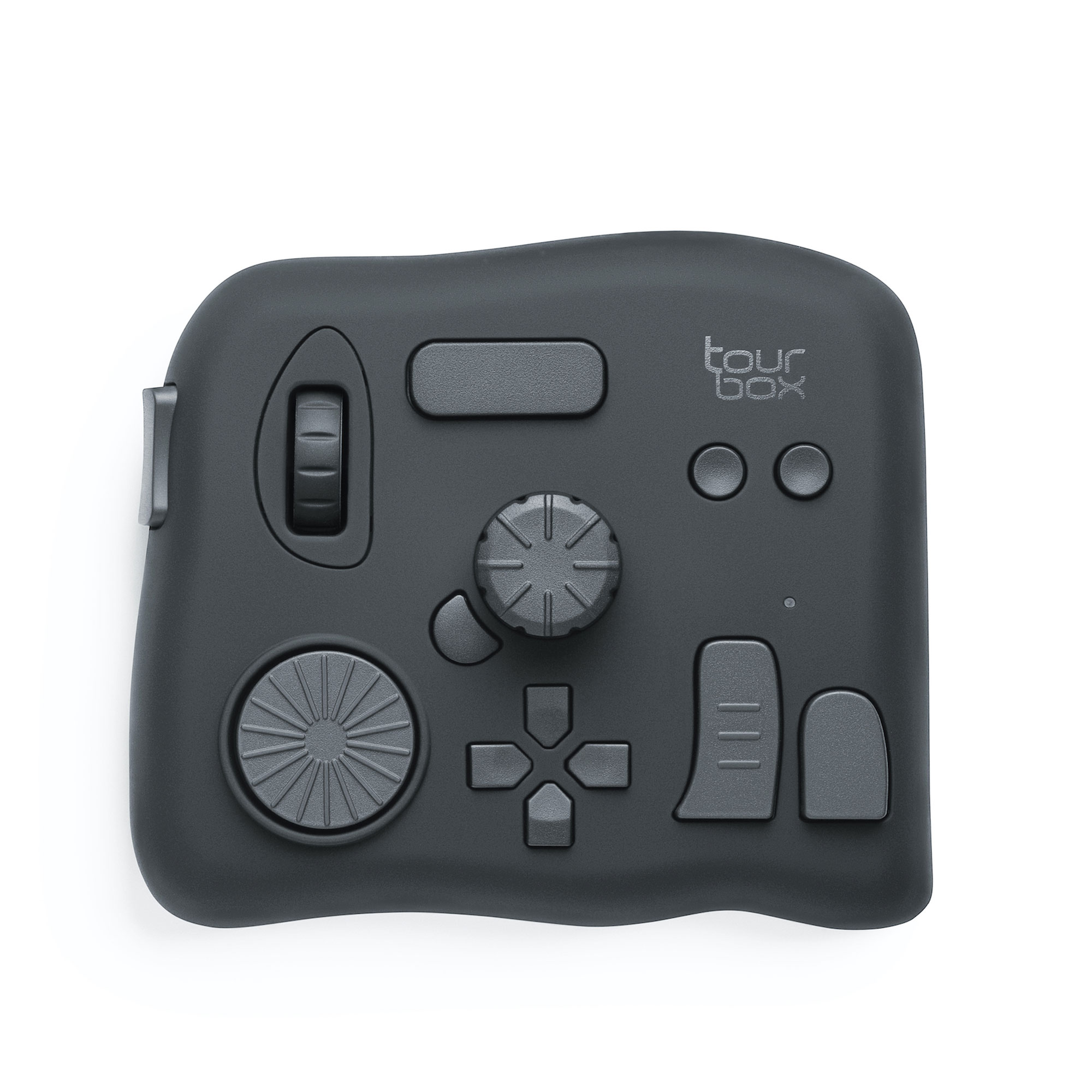
It enables you to stay focused during the design process, swiftly switch tools, and easily adjust settings, making the flow of creativity smoother.
Whether you're working in Photoshop, Illustrator, or DaVinci Resolve, TourBox can help you complete your creations more efficiently, unleashing more creativity.

Be brave, experiment with colors, and find the perfect color schemes that suit your style! And don't forget to enhance your creative experience with TourBox for a more convenient and enjoyable workflow.