What Colors Go Well with Red: Color Matching Tips
Red is a color full of energy and passion, often seen as a visual focal point that instantly grabs attention.
In design, red can serve as a primary color, creating a strong visual impact, or be used as an accent to add vitality and warmth to a piece.
So, what colors go well with red, showcasing a unique sense of beauty and style?

In this article, you will learn:
The Psychology of Red Color
Before designers and artists use a particular color, they need to fully understand the emotional imagery associated with that color and the associations and symbols it evokes in specific contexts.
For instance, red carries different meanings in various cultural backgrounds. This is an important factor to consider when incorporating red into works.
In Eastern cultures, red symbolizes joy and auspiciousness, stemming from the worship of the sun and fire. In Western cultures, red is often associated with hell and demons in myths, representing the unknown, and in some countries, red is even considered taboo.
Despite cultural variations in associations with red, there are common themes:
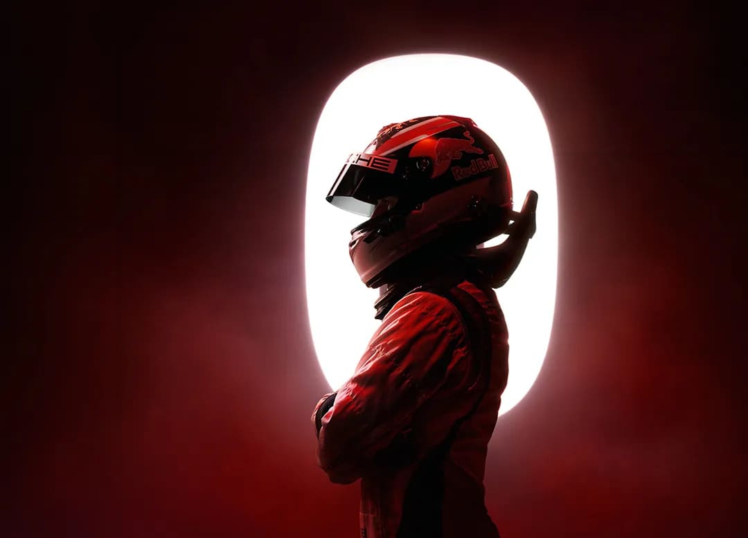
1. Passion and Energy
Among many colors, bright red is the most intense, evoking fire, light, and hope. When aiming to convey passion and energy in design, bright red is a top choice.
2. Nobility and Grandeur
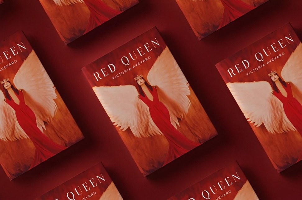
Deep red exudes a mature sense of luxury and is often used to represent nobility, dignity, and power. It frequently appears in royal attire and classic fashion design, symbolizing refinement and elegance.
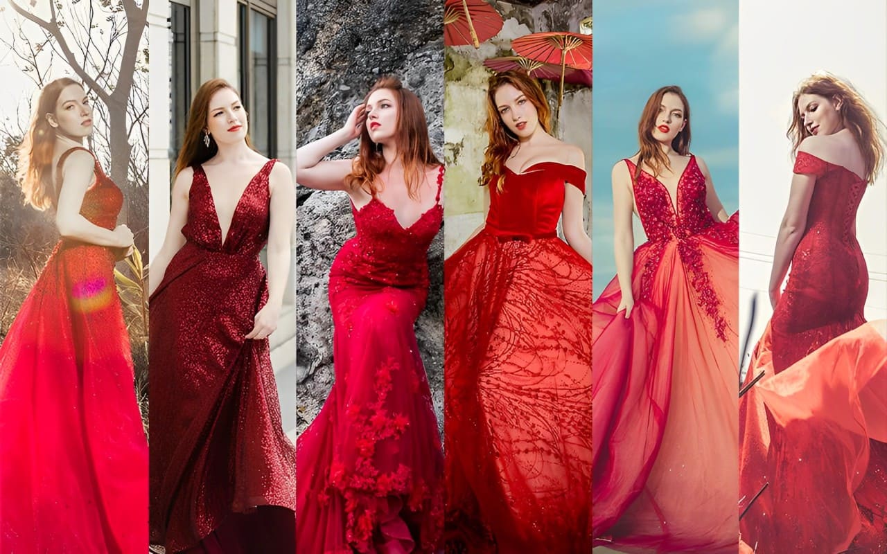
3. Femininity and Fashion
Red is an eternal classic in the fashion industry, representing the charm and confidence of women.
From classic red lips to elegant red dresses, red always stands out in fashion, showcasing boldness and personality.
4. Promotion and Attraction
Due to its strong visual impact, red is widely used in commercial promotions and advertising design.
It quickly grabs attention, stimulates shopping impulses, and is commonly used in promotions for discounts, clearance sales, and limited-time offers.
5. Warning and Alert
Red not only symbolizes positive energy but also carries connotations of warning and deterrence.
In traffic signals, warning signs, and danger alerts, red alerts people to potential dangers and emergencies, creating a strong visual warning effect.
What Colors Go Well with Red?
Whether used to express passion and romance or to signal danger and urgency, red is one of the most dynamic and impactful colors in design.
When used effectively, red can add strong visual appeal and convey powerful emotions in a design.
But what colors go well with red? Let's explore some popular color combinations through specific examples.
1. Red + Neutral Colors
Neutral colors like black, white, and gray are versatile and timeless. They balance red's intensity while enhancing its impact in different ways.
By thoughtfully combining red with neutral tones, designers can create visually compelling, stylish, and emotionally powerful designs.
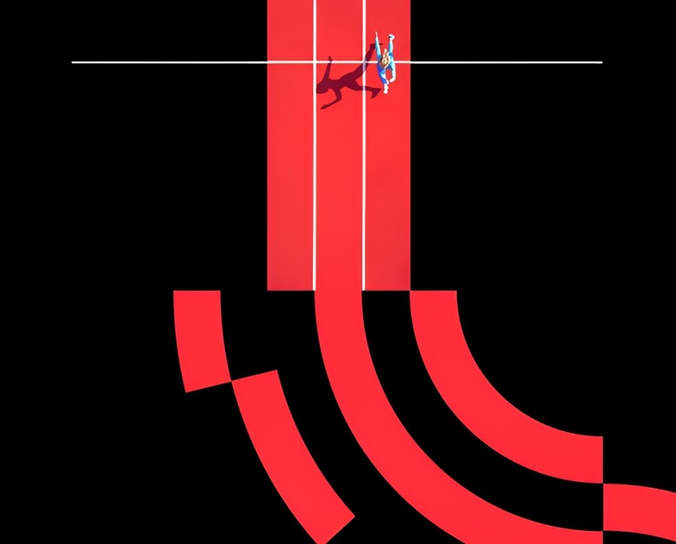
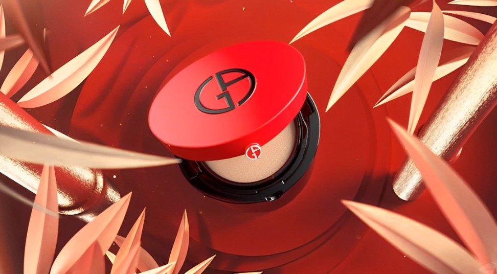
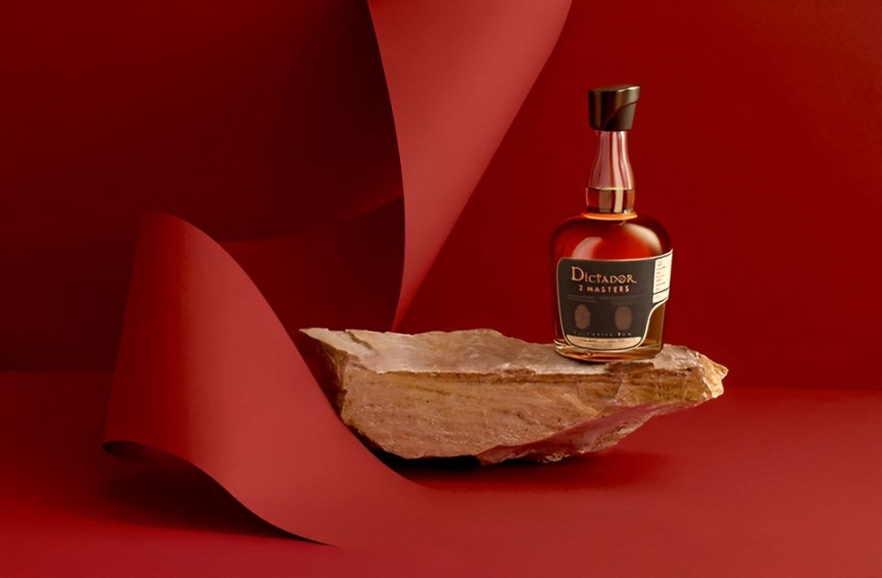
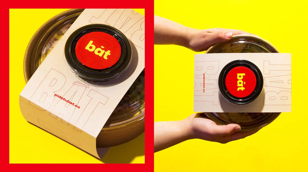
① Red + Black
Black absorbs all colors of light, making it the most inclusive and grounding color. Pairing red with black creates a dramatic, bold contrast.
The red stands out with unparalleled strength, making this combo ideal for designs that demand attention and power.
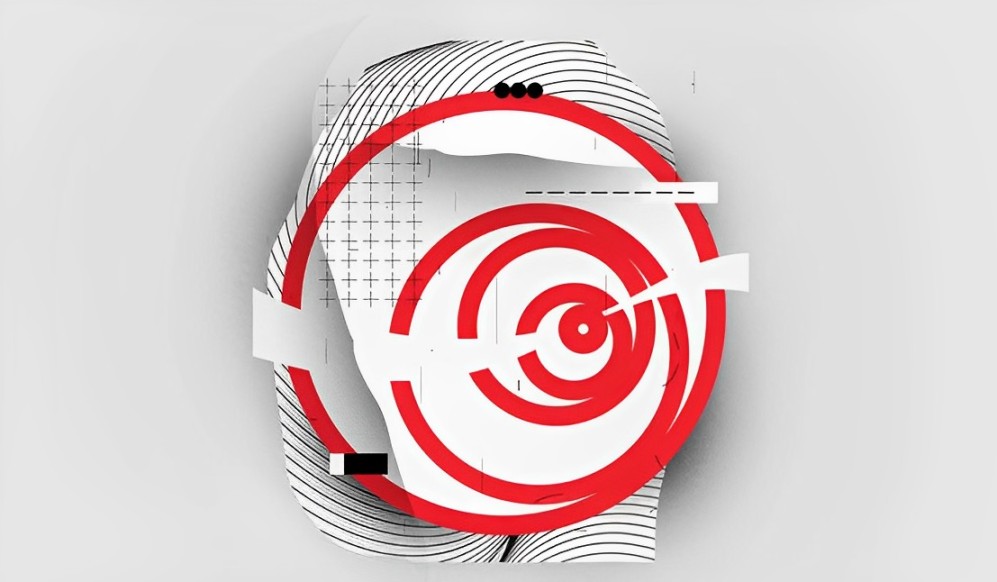
② Red + White
White reflects all light and has the highest brightness, symbolizing purity, simplicity, and clarity.
Since red has a relatively low brightness, combining red and white creates a striking contrast. Red looks even more vivid against a white background, making designs appear clean, energetic, and full of life.
③ Red + Gray
Gray is often considered the ultimate neutral, able to pair well with any color. It softens red's intensity, adding a sense of balance and refinement.
Red and gray together convey sophistication, elegance, and modern style, making this combination perfect for designs that aim for understated luxury.
2. Red + Other Colors
Color matching is part art, part science. One of the best tools for understanding color relationships is the color wheel. It helps designers create harmonious or striking color combinations by showing how different hues relate to each other.
Further Reading:
The standard color wheel includes 12 basic colors. It starts with the three primary colors: red, blue, and yellow. Mixing primary colors creates secondary colors, and blending those results in tertiary colors.
Here is how colors relate on the color wheel:
- Adjacent Colors (30° Apart): These colors sit close to each other on the color wheel, offering a subtle contrast that feels natural and pleasing.
- Analogous Colors (60° Apart): These hues create a soft, harmonious look. They're great for designs that need a calming or cohesive feel.
- Intermediate Colors (90° Apart): These colors provide moderate contrast, making the design visually interesting without being too intense.
- Contrasting Colors (120° Apart): This pairing delivers a strong visual impact, perfect for designs that need to stand out.
- Complementary Colors (180° Apart): These colors sit directly opposite each other on the wheel, offering the highest level of contrast. This combination is bold and eye-catching, ideal for grabbing attention.
① Red + Orange
Red and orange are adjacent colors on the color wheel, creating a soft, harmonious contrast with a low level of intensity.
This warm and energetic combination is commonly used in designs that need a lively yet balanced look.
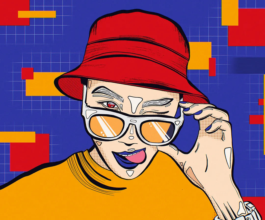
② Red + Yellow
Yellow is one of the best colors to pair with red. They are analogous colors, sharing similar hues on the color wheel.
Since yellow has a high brightness while red is darker, combining the two creates a striking yet harmonious contrast. This pairing feels bold, cheerful, and dynamic.
③ Red + Purple
On the color wheel, purple sits near red. This pairing offers a high-saturation, low-brightness combo that can feel deep and intense.
To avoid a design that looks too dark or heavy, consider adding lighter shades or brighter accents to create more visual depth and balance.

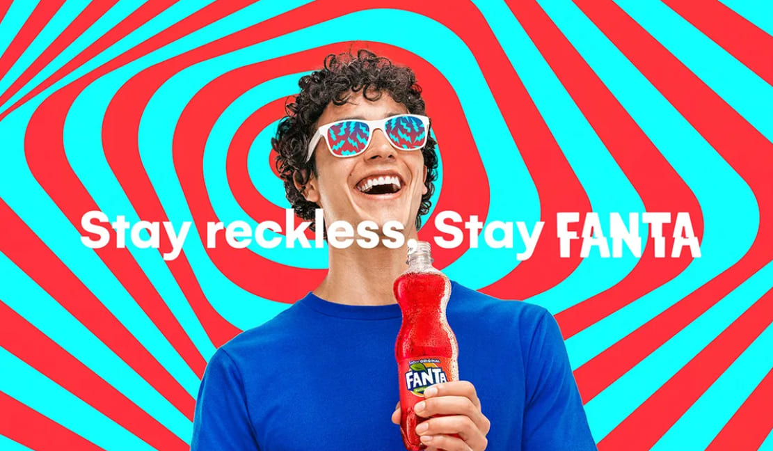
④ Red + Blue
Red and blue are contrasting colors. Red is the warmest color, while blue is the coolest. This pairing creates a strong contrast that feels both dynamic and intense.
The two hues balance and amplify each other, making both shades appear more vivid.
Further Reading:
This combo is perfect for designs that need energy, power, and a dramatic visual punch.
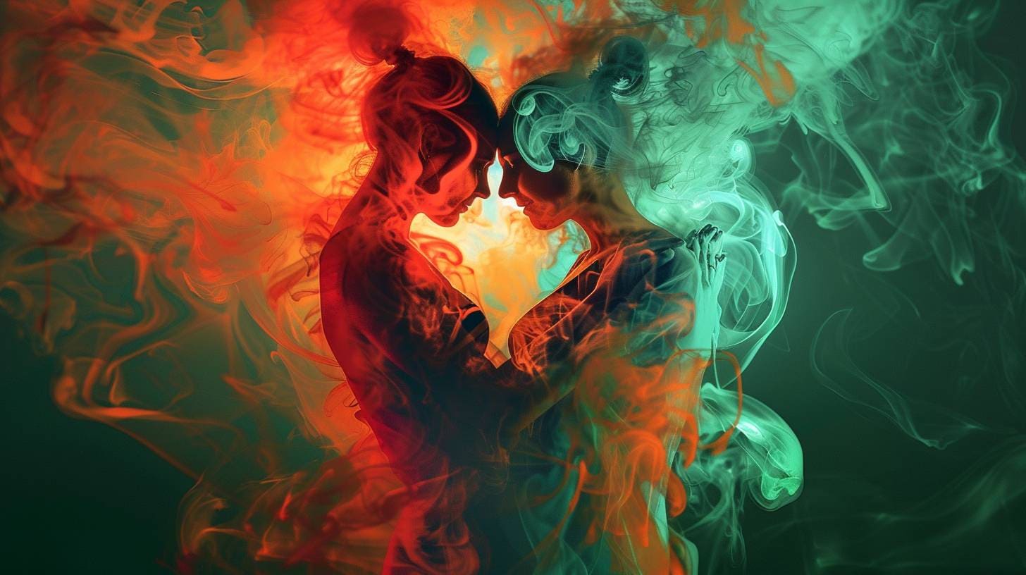
⑤ Red + Green
Red and green are complementary colors, meaning they sit directly opposite each other on the color wheel. This creates the strongest contrast possible, making the combination visually striking but also challenging to balance.
To make this pairing work, adjust the size ratio of the two colors, lower their saturation, or add neutral tones like black, white, or gray to soften the intensity and reduce visual tension.
Conclusion
In both graphic design and digital art creation, skillfully incorporating red can significantly enhance the impact, expressiveness, thematic representation, and depth of the work.
However, this depends on our ability to thoroughly understand and research which colors go well with red and to use red flexibly.
In art creation and design, color combinations are crucial for conveying emotions and messages. Whether in digital painting or layout design, adjusting colors and tools frequently is a common practice in the creative process.
If you are a digital art enthusiast or designer, we recommend using the TourBox creative console to significantly enhance your creative efficiency and work experience.

For example, in digital painting software like Clip Studio Paint, the Color Wheel is a fundamental tool for color selection. By customizing TourBox's buttons, you can easily access the Color Wheel, precisely choose colors, and swiftly switch between different brushes and tools.
Further Reading:
[TourBox Tips] How to Call the Color Wheel in Clip Studio Paint?
If you prefer designing and creating on an iPad and are looking for a creative tool to boost your work efficiency and creative experience, then the TourBox Elite Plus is undoubtedly an ideal choice.

Our article on what colors go well with red concludes here. We hope it has been helpful for your creative journey. If you are interested in TourBox, feel free to check out the YouTube video below to discover more about the wonder of TourBox.