Why Do People Favor Red and Blue Together?
The 2024 U.S. presidential election captured global attention, as Donald Trump emerged victorious and became the 47th President of the United States.

In this article, we steer clear of political discussions. Instead, we explore a design perspective stemming from the U.S. election: why is it a red-blue battle and not a red-green or blue-yellow showdown?
What's the magic behind red and blue? Let's delve into it from a color perspective.

In this article, you will learn:
- Why Do People Favor Red and Blue Together?
- Applications of Red and Blue in Different Fields
- Final Thoughts About Red and Blue
Why Do People Favor Red and Blue Together?
In reality, not just in the U.S. elections, anything related to the American national image predominantly features the red-blue color scheme.
Even in Hollywood movies, superheroes often sport the classic American red-blue colors. For instance, Captain America's shield, Superman's costume and cape, and Spider-Man's suit all exhibit the iconic red-blue pairing.
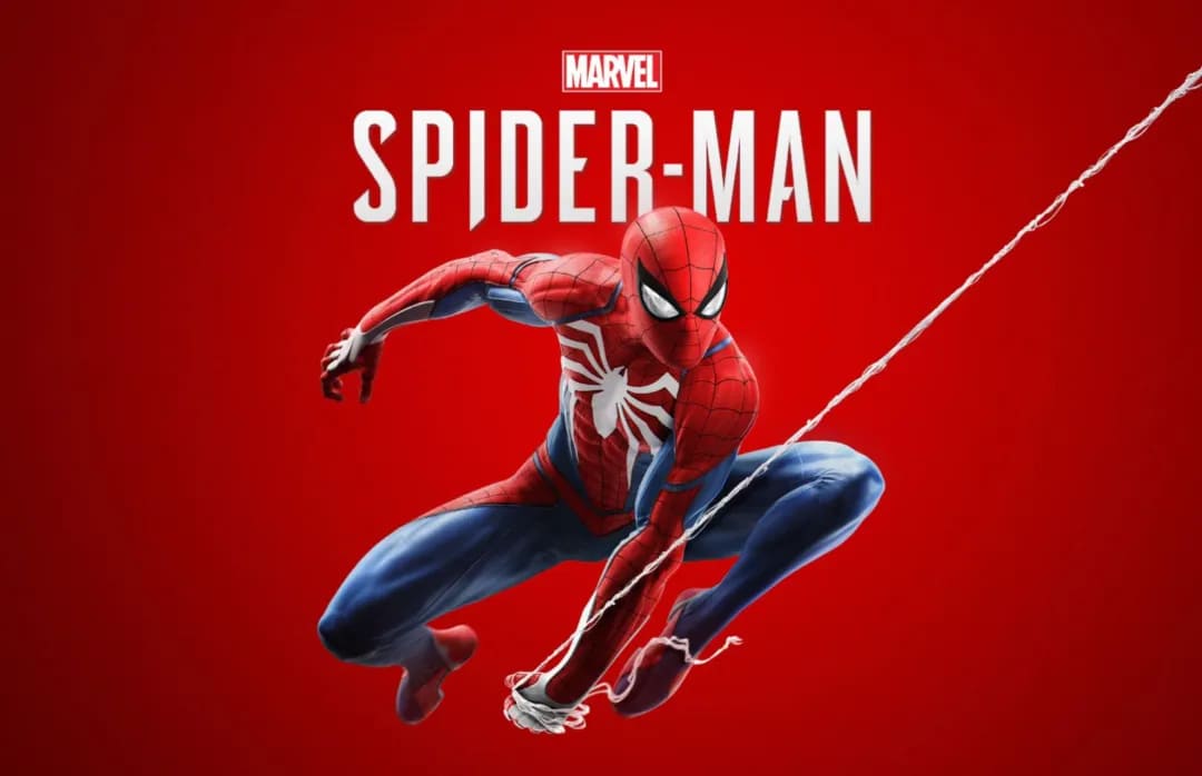
The reason behind this is quite straightforward. Superheroes symbolize the American national image, making audiences perceive these superheroes as embodiments of America.
Therefore, if we consider the United States as a business or brand, without a doubt, its flagship colors are red and blue, just like its national flag.
Now, the question arises: what is the magic behind red and blue that led the U.S. to adopt these colors as part of its national image? To unravel this, we need to start from the spectrum.
The image below illustrates a simple spectrum. It shows that red light has the longest wavelength at 700nm, while blue light has the shortest at only 400nm.
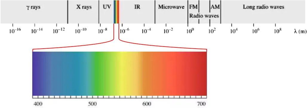
Being at the extremes of the visible light spectrum, red and blue are the most visually distinct colors, leaving a lasting impact on human memory.
In other words, red and blue are the most easily remembered colors.
Now, let's consider this from the perspective of human color cognition.
When our early human ancestors sat idly under trees, their daily activities were limited to observing the night sky, gazing at the stars, trying to understand nature from the vast expanse above.
During these moments, they noticed that the sky's color was not constant but ever-changing. From the deep red of sunrise to the brilliant blue of midday, and back to red at sunset, humans were immersed daily in the color wash of red and blue hues.
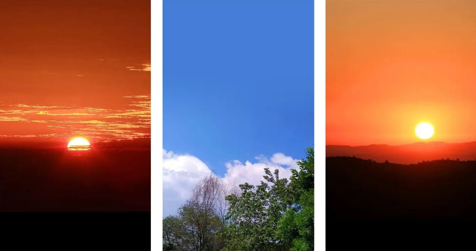
Our ancestors also observed that red and blue colors often blend together. This color transition from one extreme to the other became deeply ingrained in the human subconscious.
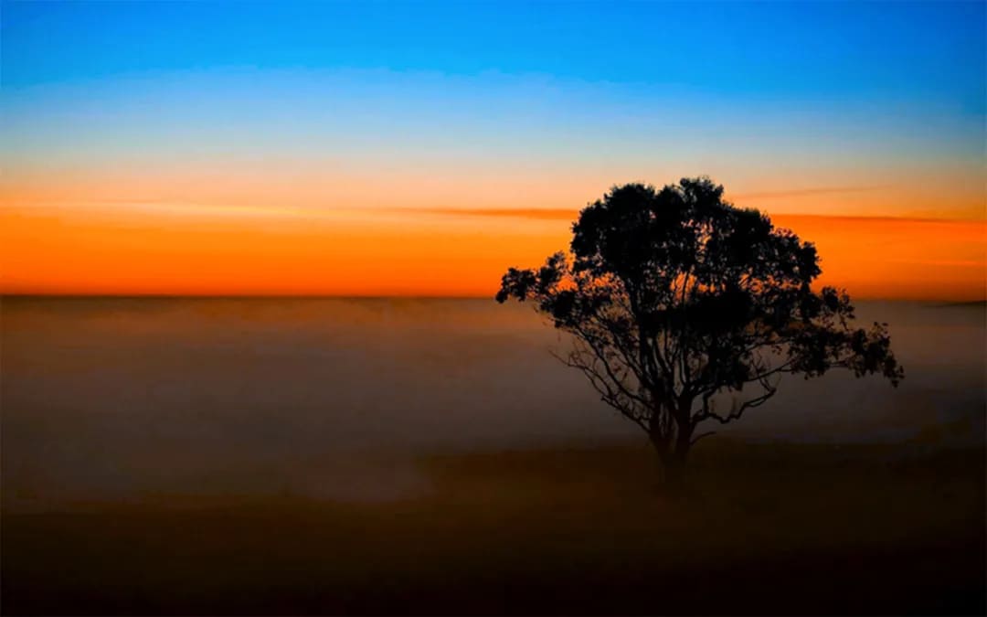
Therefore, red and blue are not only the colors of the sky but also the two most influential colors on humans, as well as the most intense hues found in nature.
It is precisely because the pairing of red and blue naturally evokes a strong impression that the United States has designated them as representatives of its national image.
When these two colors collide and merge, they create a powerful visual impact with high recognition value. Their application is incredibly widespread in various types of designs.
In the next section, we will show you how the red-blue color pairing is utilized across different fields.
Applications of Red and Blue in Different Fields
1. Brand Logos
Choosing colors for a brand logo is not just about aesthetics; it's also a marketing strategy.
Further Reading:
Elevate Your Logo Design: Color Palette Tips to Break the Monotony
If you want users to perceive your brand as powerful, then the red-blue color combination is definitely a top choice.
A logo in red and blue colors can quickly catch the user's attention. Well-known examples include logos of brands like Pepsi and the NBA, both featuring the red-blue color scheme.
2. Red and Blue in Photography
In photography, there's a lighting technique known as red-blue lighting.
With the intense clash of red and blue lights, subjects can appear highly surreal.
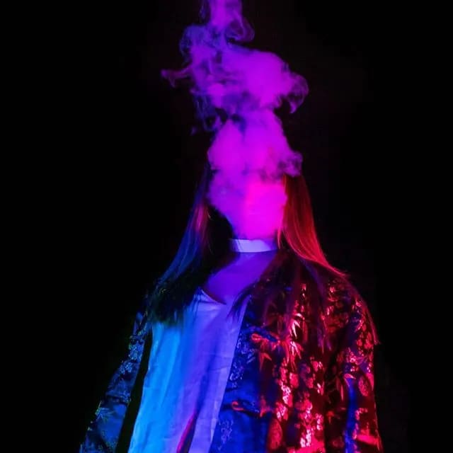
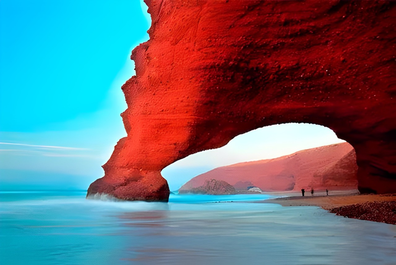
In terms of photography themes, any scenes featuring a contrast of red and blue colors tend to produce striking results.
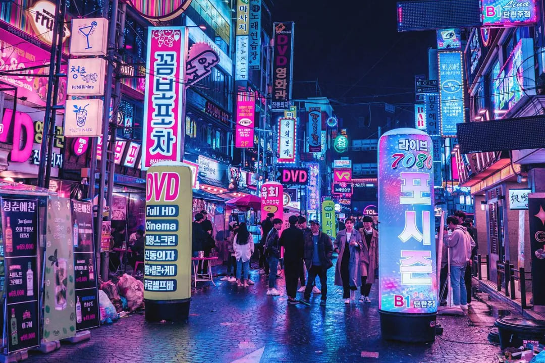
In post-processing, the popular cyberpunk style often seen on social media predominantly incorporates a blend of red and blue tones.
Further Reading:
Creating Cyberpunk Color Grading in Photoshop: A Step-by-Step Guide
3. Movie Posters
Movie posters need to convey a strong sense of storytelling, so it's best if the design can create a sense of conflict. And what better way to create conflict than using the classic red-blue color combination!
For example, in Star Wars, the red-blue duel symbolizes opposing sides, each color representing a faction.
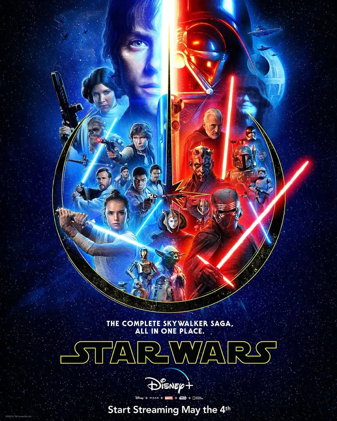
Of course, some movie posters use red and blue to convey tension in the atmosphere. Or sometimes, it's just for a visually striking effect.
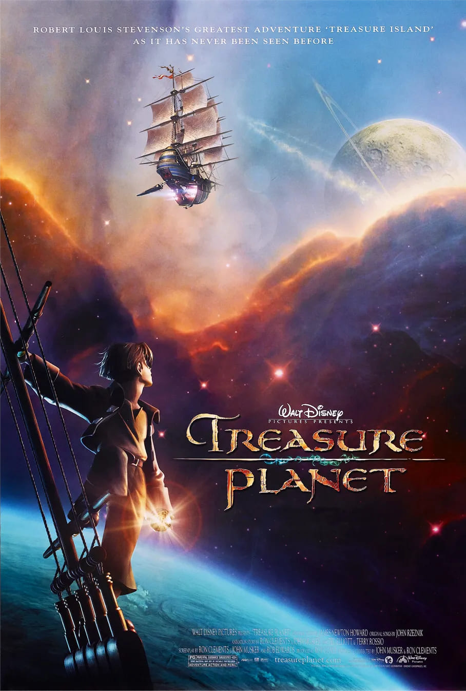
4. Illustration Design
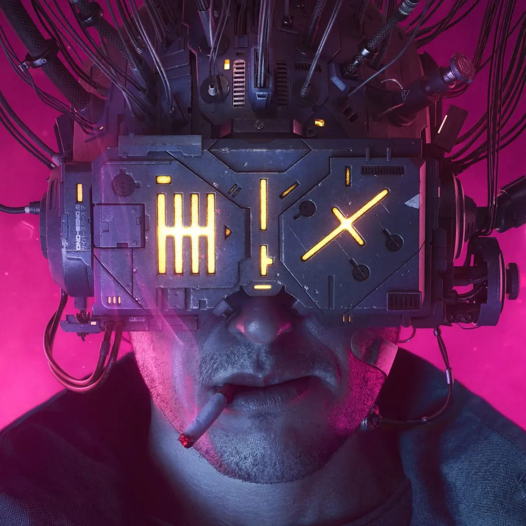
When it comes to the trendiest color style in recent years, nothing beats Cyberpunk! From photography to illustration and even movies, Cyberpunk vibes are everywhere.
The defining visual characteristic of Cyberpunk-style illustrations is the unique red-blue color combination.
5. User Interface Design
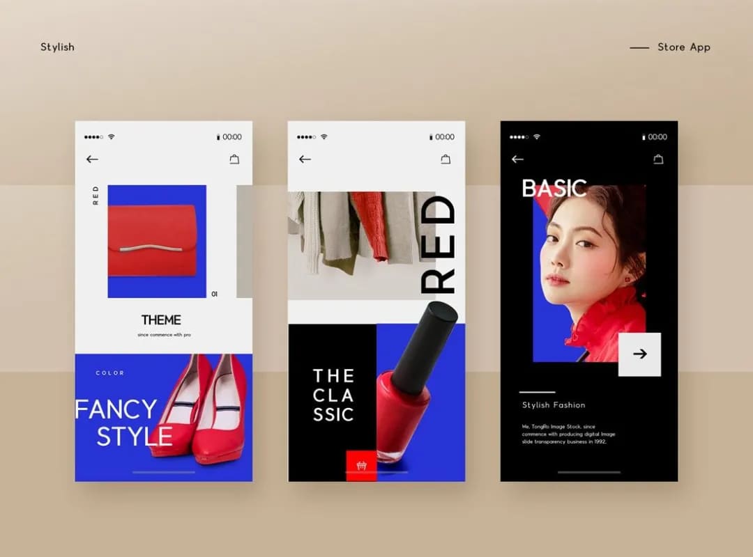
Due to the strong impact of the red-blue color combination, it's not ideal for prolonged viewing by users. Therefore, it is mostly used in interface designs where visual attention is brief.
For instance, the main page banners on brand websites are designed to leave a strong visual impression.
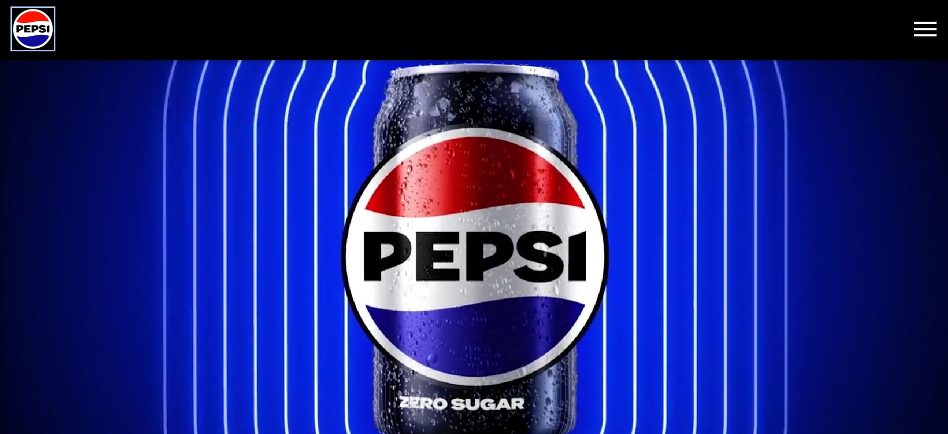
In theory, in designs for platforms or tools that require prolonged engagement, extensive use of red-blue contrasting colors might not be suitable.
However, nothing is set in stone. Adding a moderate amount of red-blue contrast to a dull user interface can effectively break the monotony and grab the user's attention.
Final Thoughts About Red and Blue
The colors red and blue are both conflicting and complementary, appearing completely different yet creating the most magical chemical reaction when paired together.
That's the wonder of this world. The warmest red and the coldest blue, when combined, can evoke intense visual experiences and emotional resonance.
Whether in post-processing photography, video production, or digital art, color control is a crucial aspect. TourBox is a tool that significantly enhances the efficiency of creative individuals who love working with colors.
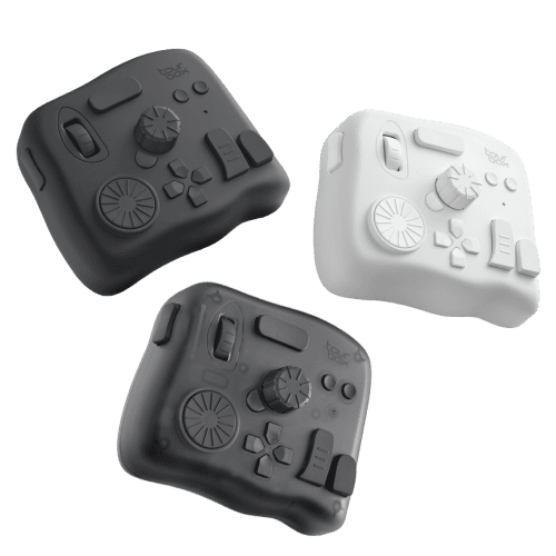
With just one hand on TourBox, you can easily perform any color-related tasks (like color grading, changing brush colors, etc.). It's like using a game controller for playing video games—effortless, enjoyable, and efficient.

We hope this article sparks your passion for colors, encouraging you to explore more possibilities in your creations and produce unforgettable works. If you're keen on delving deeper into the magic of color, consider TourBox as your helpful companion.