A Guide to Color Saturation: Definition and Practical Applications
In post-processing for photography, color saturation stands as a pivotal concept, significantly influencing our ability to manage and enhance colors.
So, what exactly is color saturation, and how can we grasp and utilize it? Keep reading for a quick and straightforward guide that should offer you the insights you need.

In this article, you will learn:
- What Is Saturation in Color?
- Impact of Color Saturation on Visual Perception
- How to Adjust Color Saturation?
- What Is the Difference Between Saturation and Vibrance?
- Applications of Color Saturation
- Final Thoughts About Color Saturation
What Is Saturation in Color?
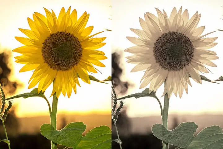
Color saturation refers to the purity of a color. The higher the saturation of a color, the more vibrant it appears. Conversely, the lower the saturation of a color, the closer it is to appearing gray.
For example, the left image has high saturation in the images below, resulting in vibrant colors overall. On the other hand, the right image has relatively lower saturation, making the colors lean more towards gray tones.
Impact of Color Saturation on Visual Perception
The saturation level of a photo directly influences its visual impact. Higher saturation can make an image more "aggressive" and attention-grabbing, although excessive saturation may evoke negative emotions.
Conversely, lower saturation creates a more "calm" atmosphere, offering viewers a tranquil and comfortable visual experience. However, excessively desaturated images can sometimes feel dull or lack transparency.
How to Adjust Color Saturation?
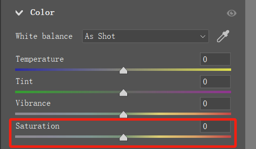
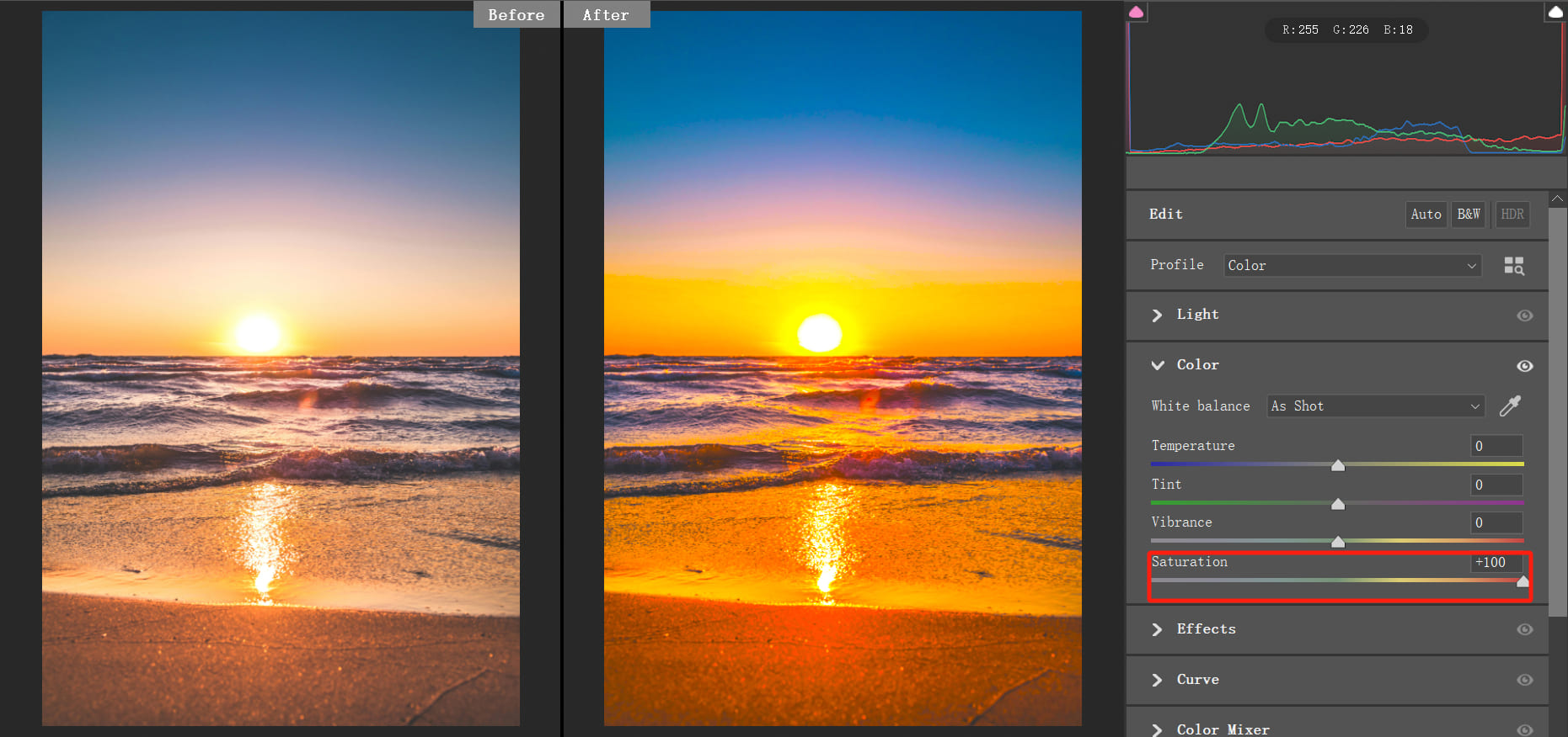
Adjusting color saturation is easily done in any photo editing software. Locate the saturation adjustment tool and either drag the saturation slider or input specific values to alter the saturation of the image.
Increasing the saturation value makes colors appear more vibrant. However, excessively high values can lead to color clipping and other unnatural effects.
For example, in the example below, when we increase the Saturation tool to 100, we notice that some details are lost, and the colors become overly vibrant, making it uncomfortable for viewers.
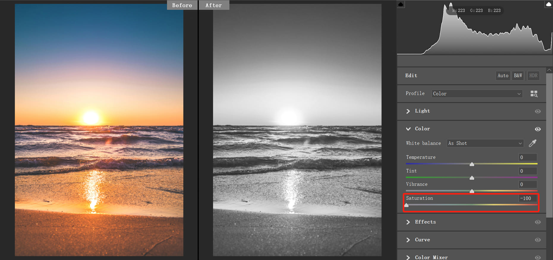
Decreasing the saturation value shifts the image towards grayscale. Lowering the value to the minimum turns the image into black and white.
In the example below, reducing the saturation to -100 transforms the image into black and white.
In photo editing, adjusting the color saturation isn't just about setting it to +100 or -100. More often, you'll find yourself making small adjustments like +1 or -1, carefully observing the changes in the image until you achieve the desired color balance.
However, using a keyboard and mouse to make these fine-tuned adjustments can be quite challenging as it's hard to focus solely on the color changes in the image. The complex operations of a keyboard and mouse can easily distract your attention.
That's why we recommend the TourBox controller. It simplifies every step of your photo editing process and allows for precise control that a keyboard alone can't provide.
Visit our photo editing page to see how TourBox can significantly enhance your workflow and creativity.
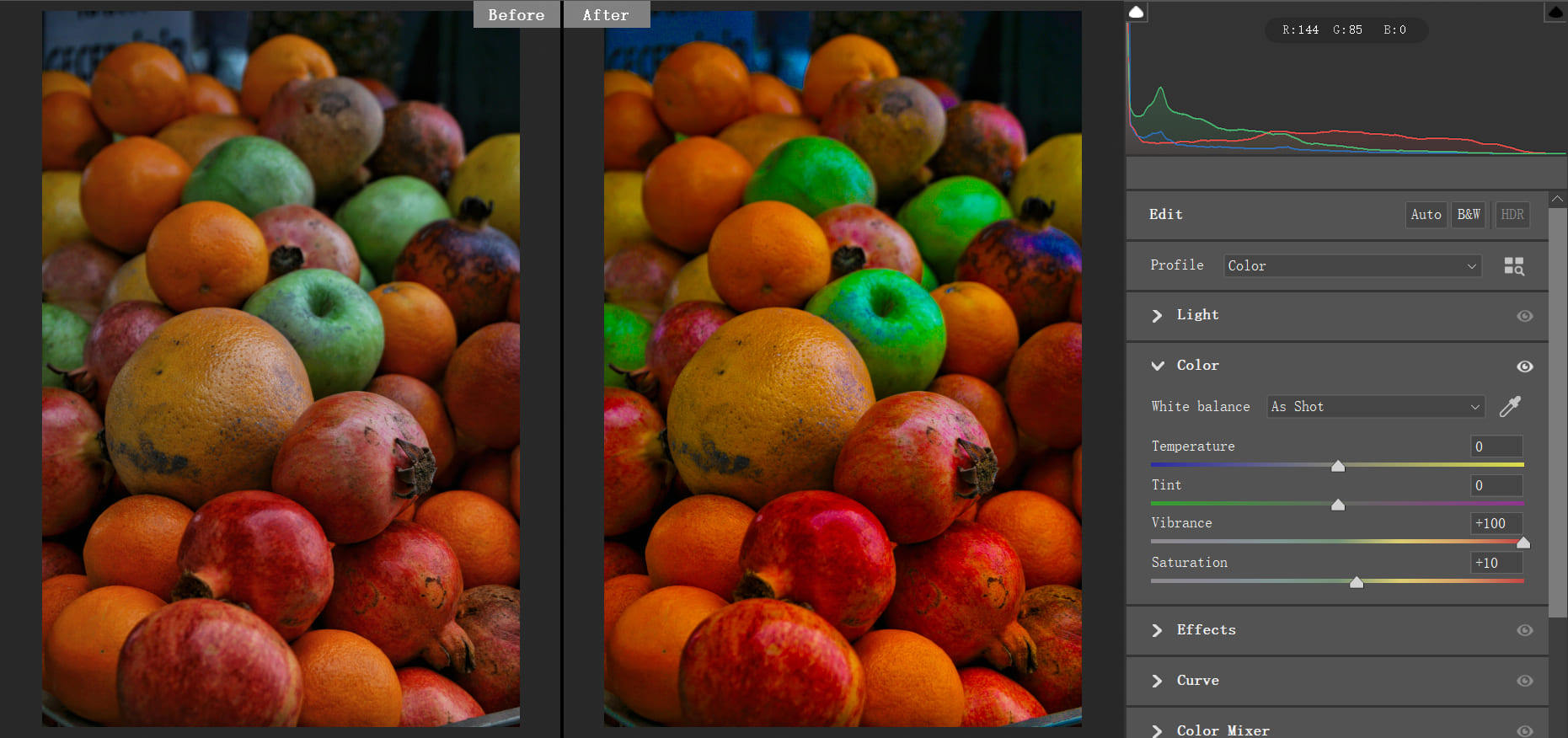
What Is the Difference Between Saturation and Vibrance?
In photo editing software, there are two similar tools: the Saturation tool and the Vibrance tool. What sets these two tools apart?
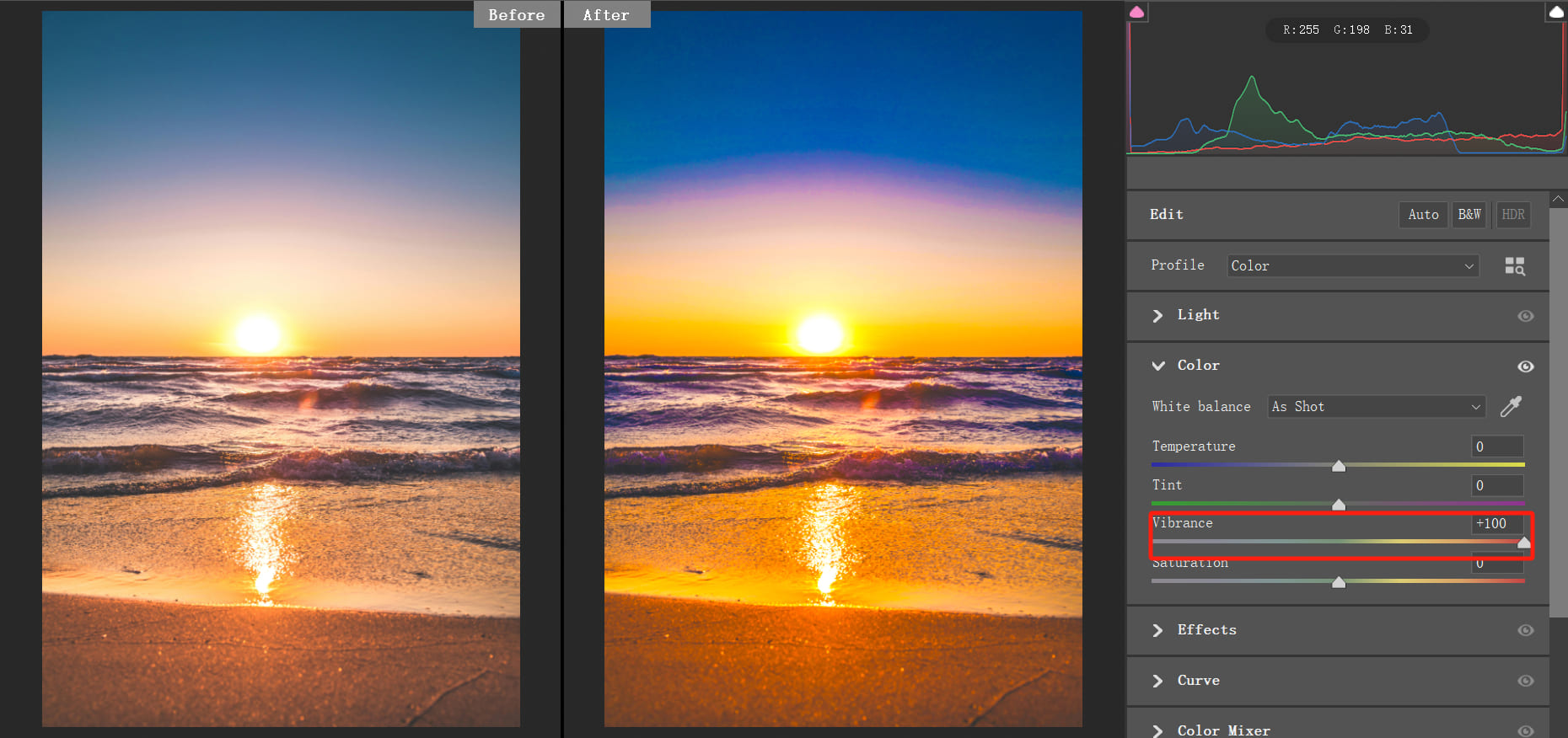
Simply put, the Vibrance tool is like the "smart" version of the Saturation tool. It controls the saturation of the image without oversaturating it.
Vibrance protects areas that are already highly saturated. When you increase vibrance, highly saturated areas are affected less, while low-saturation areas are boosted more. On the other hand, increasing saturation affects all colors equally.
In the example below, even when we increase the vibrance to 100, the image doesn't become overly saturated, and details are still preserved.
Decreasing vibrance to -100 doesn't turn the image into black and white but maintains some color.
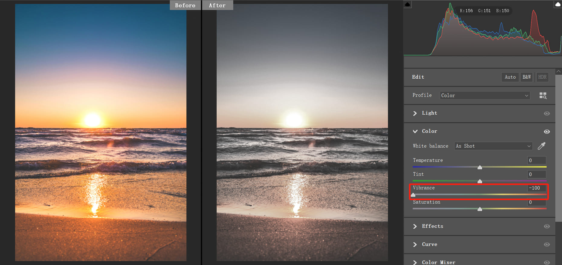
This is the distinction between the Vibrance tool and the Saturation tool.
Therefore, when making adjustments, especially for landscape photos, consider using the Vibrance tool more to adjust colors. This approach helps prevent issues with excessive saturation.
Further Reading:
Applications of Color Saturation
1. Enhance Visual Impact
If you feel that an image appears dull, increasing the saturation can make colors more vibrant, enhancing the visual appeal and expression of the image.
For example, in the image below, the original photo has low color saturation, giving it a somewhat dull look. By increasing the saturation, the colors become more vivid, highlighting the different shades and layers in the image.
2. Soften Color Intensity
When the color saturation in an image is too high, it amplifies the "aggressiveness" of colors. Excessive saturation can be overly stimulating for viewers, sometimes making the image appear heavy or chaotic.
In such cases, reducing the color saturation can help soften the impact of colors and tone down their aggressiveness.
3. Convert to Black and White
By reducing the saturation of an image to the minimum, the image will turn into a black and white photo. So, if you want to quickly convert a photo to black and white, try setting the color saturation to 0.
Further Reading:
4. Adjust the Saturation of Specific Colors
In addition to adjusting the overall saturation of an image, you can also lower the saturation of specific areas using tools like the HSL tool or brush tool.
This technique allows you to create a balance of high and low saturation in different parts of the image, enhancing the visual impact and creating a more dynamic visual effect.
Further Reading:
How to Use HSL in Lightroom Classic: A Guide to Color Adjustment
Final Thoughts About Color Saturation
Understanding color saturation is crucial for every photography enthusiast looking to elevate their work. By mastering the impact of saturation on emotions and perception, you can create photographs that truly resonate with viewers.
Experiment with varying levels of saturation to see how subtle changes can transform an image. As you delve deeper into your photography journey, let color saturation become a powerful tool in your artistic arsenal, helping you capture and convey the essence of your subjects.

Continue exploring and refining your skills to infuse your photography with vibrant expressiveness!