3 Essential Techniques: How to Design a Logo?
Welcome to our comprehensive guide on how to design a logo! In this tutorial, we will share three essential techniques that will empower you to create impressive and visually captivating logos.
Whether you're a beginner venturing into the world of graphic design or an experienced designer looking to refine your skills, this tutorial is for you.
Note: As we progress through the tutorial, feel free to apply the techniques to your own logo design project or follow along with our examples to gain a deeper understanding of the concepts presented.
Without further ado, let's get started!

In this article, you will learn:
- Technique 1: Designing an Open Circle
- Technique 2: Creating Contradictory Spaces
- Technique 3: Adding 3D Gradient Effects
- Best Practices in Logo Design
- Exploring Essential Tools for Logo Design
Technique 1: Designing an Open Circle
The circle is the epitome of perfection, making many elements look visually appealing when designed in a circular shape, including logos.
However, designing a closed circle may give a sense of rigidity and lack of variation. To add flexibility and visual interest, we can explore designing logos with an open circle.
This can be achieved by creating a semi-enclosed circle or an incomplete circle, as exemplified in the image below.
![]()
Designing a logo with an open circle offers several advantages:
- Visual Balance: The inherent symmetry of a circle creates visual equilibrium.
- Visual Focus: The circular shape naturally draws the viewer's attention towards the center.
- Design Aesthetics: Designing a shape as a circle often requires simplification and standardization, resulting in enhanced design aesthetics.
For example, let's say we want to create a logo design centered around the letter "S." We can start by incorporating a circular shape as the foundation, as shown in the image below.
![]()
As you can see, the two design options clearly demonstrate that using an open-circle approach results in a more dynamic and aesthetically pleasing logo compared to a closed-circle design.
However, we can take it a step further and refine the open-circle logo design. Once we add colors to the design, a set of logo variations based on the open-circle concept is complete.
By employing these techniques, we can create captivating and visually appealing logo designs that effectively convey the desired message.
![]()
Technique 2: Creating Contradictory Spaces
Contradictory space is a phenomenon that does not exist in the three-dimensional world but is represented in a two-dimensional image.
It is achieved through the manipulation of viewpoints and alternating perspectives, showcasing three-dimensional forms on a flat plane.
Designing contradictory spaces is, in essence, an art of visual illusion. One notable exponent of this art form is the Dutch artist Maurits Cornelis Escher.

M. C. Escher utilized graphic techniques and perspective to create objects that appear impossible and defy intuition. These objects exhibit distinct contradictions and violate the laws of physics.
Two of his renowned works, "Ascending and Descending" and "Waterfall," exemplify this artistic approach.
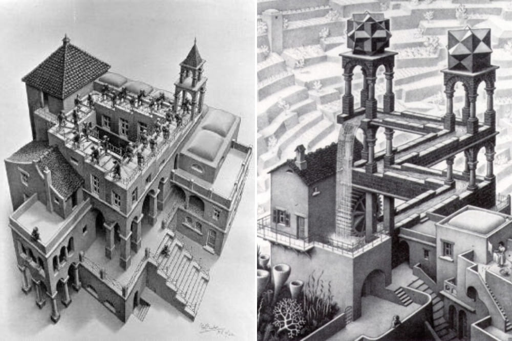
You can explore a collection of M. C. Escher's works through the YouTube video below, created by LearnFromMasters.
This technique of defying logical order is also commonly employed in logo design. By incorporating contradictory spaces, designers can add a touch of intrigue and captivate viewers with an element of visual surprise.
Designing a logo using contradictory spaces offers several advantages:
- Intriguing: Logos with visual illusions capture attention and make people want to take a closer look.
- Artistic Impact and Creativity: Creating such logos evokes a sense of spatial perception and imagination, adding an artistic touch to the design.
- Meaningful Symbolism: Logos utilizing contradictory spaces can convey concepts such as infinity, boundlessness, sustainability, and more, providing deeper symbolism and resonating with the audience on a symbolic level.
You can draw inspiration from the logo designs shown in the image below and incorporate some elements of disordered space and contradictions into your own logo design.
![]()
Let's create a simple design. Suppose we want to use the letter "F" and evoke a sense of spatial disarray. We can arrange two mirrored "F" letters symmetrically, with the space in between forming a three-dimensional "T" shape.
This contradictory spatial arrangement not only adds depth to your design but also sparks endless imaginative possibilities.
![]()
Technique 3: Adding 3D Gradient Effects
This technique involves using gradient colors to create a three-dimensional effect in logo design, which is both prevalent and highly popular. An example of this style is the logo of Microsoft's Edge browser.
![]()
The advantages of this style of logo design are evident:
- Aesthetic Appeal: These graphics exhibit delicate color transitions and depth, resulting in visually stunning effects that captivate the viewer.
- Enhanced Quality Perception: Such designs typically rely on curves, coupled with gradient colors and three-dimensional effects, resulting in rich detailing that conveys a sense of high quality.
- Strong Visual Impact: The abundant color variations and contrasting elements greatly enhance the visual impact of the logo.
Further reading: Mastering Gradients: 8 Photoshop Techniques You Can't Afford to Miss.
Let's take a look at the logo design below. Although we added a blue fill, it feels a bit plain and ordinary for a logo. If a brand were to use such a logo, it might give the impression of being outdated and lacking in freshness.
![]()
To enhance the design, we decided to divide the original shape into three parts using curved lines.
![]()
Each section of the graphic is filled with a gradient color, transitioning from light to dark, creating a three-dimensional effect. We used three gradient colors: blue to cyan, green to yellow, and yellow to orange. The final result is shown in the image below.
![]()
Best Practices in Logo Design
In the previous three chapters, we explored three essential techniques for designing logos. Now, let's delve into the key principles and best practices that can guide us in creating impactful and successful logo designs.
Understanding and applying these principles will help ensure that your logos effectively communicate brand identity and leave a lasting impression on your target audience.
1. Simplicity
One of the fundamental principles of logo design is simplicity. A simple and clean design allows for easy recognition and enhances memorability.
Avoid clutter and excessive elements that can distract from the core message. Strive for a design that is visually balanced, uncluttered, and easily comprehensible at a glance.
2. Memorability
A memorable logo is crucial for brand recognition and recall. Aim for a design that is unique, distinctive, and stands out from competitors.
Consider using clever visual metaphors, unique typography, or creative graphical elements that leave a lasting impression in the viewer's mind.
3. Versatility
A versatile logo is adaptable and can be effectively used across various mediums and sizes. Ensure that your logo retains its visual impact and legibility when scaled down or reproduced in different formats, such as print, digital, or merchandise.
It should be recognizable and retain its essence regardless of size or color variations.
4. Consistency
Consistency is vital in establishing a strong brand identity. Ensure that your logo aligns with the overall brand image, including the brand's tone, values, and target audience.
5. Meaningful and Relevant
A logo should reflect the essence and values of the brand it represents. Consider the target audience, industry, and brand positioning when designing a logo.
Incorporate elements that convey the brand's personality, purpose, or unique selling points.
![]()
Exploring Essential Tools for Logo Design
In this section, we will explore five essential tools that are well-suited for logo design. These tools offer key features and functionalities to assist designers in creating professional and visually appealing logos.
1. Adobe Illustrator
Adobe Illustrator is widely regarded as the industry standard for logo design. It provides a comprehensive set of vector editing tools, allowing designers to create scalable and high-quality logos.
With its precise control over shapes, paths, and typography, Illustrator enables the creation of intricate and detailed logo designs. Additionally, it offers a wide range of color palettes, gradients, and effects to enhance the visual impact of your logos.
![]()
2. Sketch
Sketch is a popular vector-based design tool specifically crafted for digital design, including logo creation. It offers an intuitive interface and a diverse set of powerful features.
With Sketch, designers can easily create and manipulate vector shapes, apply gradients and shadows, and experiment with typography.
It also provides extensive plugin support, allowing users to extend its functionality and customize their workflow according to their needs.
3. Canva
Canva is a user-friendly online design platform that caters to both beginners and non-designers. It offers a wide range of pre-designed logo templates, allowing users to start with a solid foundation and customize them to suit their brand.
Canva provides a drag-and-drop interface, making it easy to add elements, adjust colors and typography, and experiment with different layouts.
With its intuitive design tools and extensive library of graphics and fonts, Canva provides a convenient and accessible option for logo design.
4. Affinity Designer
Affinity Designer is a powerful vector design tool that offers a robust set of features for logo creation. It combines the precision and flexibility of vector editing with a user-friendly interface.
Affinity Designer allows designers to create and edit complex shapes, apply gradients and textures, and experiment with different blending modes.
It also supports non-destructive editing, enabling easy modifications and iterations throughout the design process.
![]()
5. TourBox
TourBox is a versatile device designed to enhance your creative workflow, making it an ideal companion for logo designers. Its ergonomic design and intuitive controls provide a seamless and efficient experience.
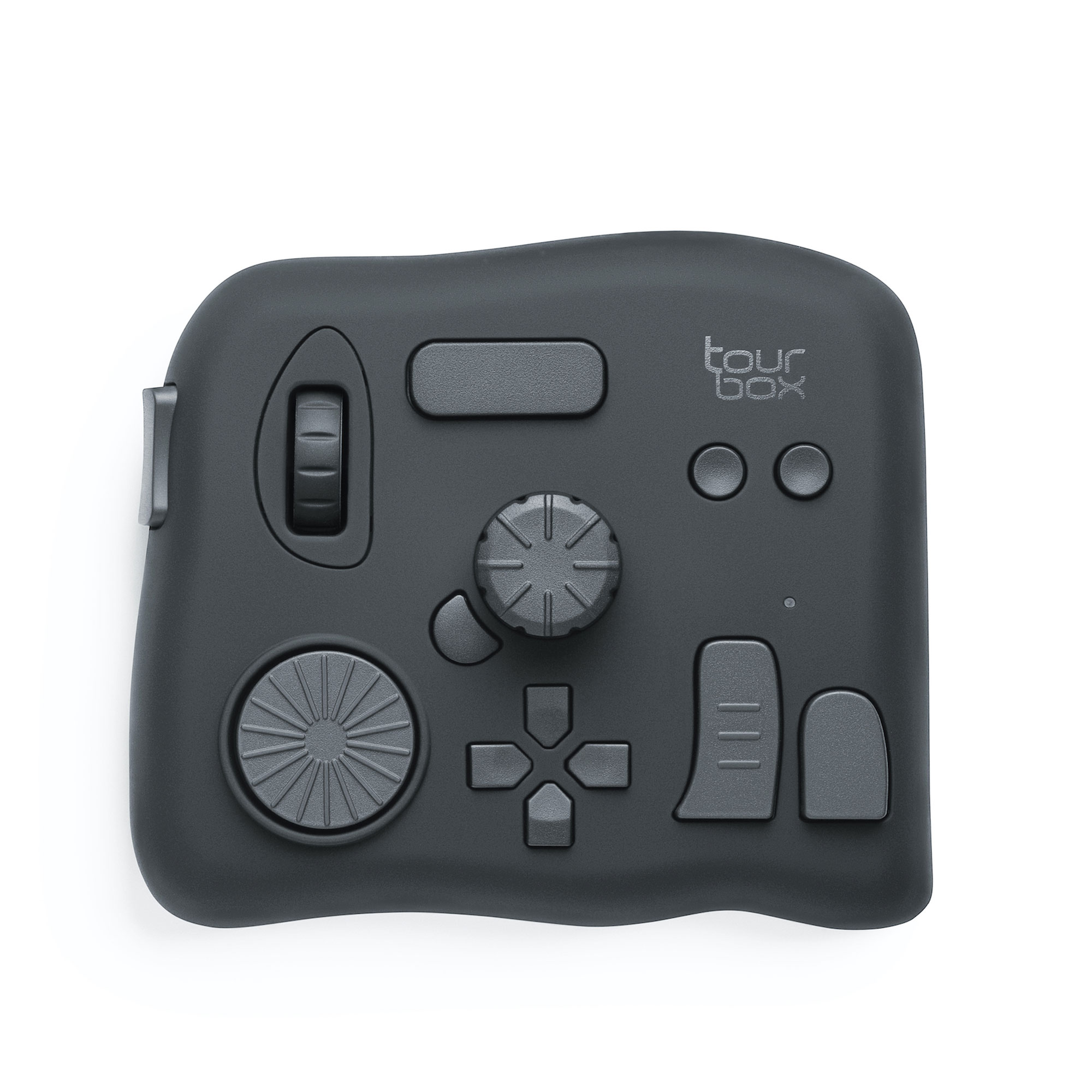
With TourBox, you can easily access frequently used functions and tools, allowing for quicker and more precise adjustments during the logo design process.
The TourBox Menu feature is the centerpiece of this remarkable tool. It empowers users to personalize their workflow by assigning custom shortcuts, creating macros, and utilizing built-in functions.
By configuring TourBox to your specific preferences, you can streamline repetitive tasks, navigate through design software effortlessly, and unleash your creativity without interruptions.
As we wrap up our logo design tutorial, we invite you to explore the incredible capabilities of TourBox. Once you try TourBox, you'll discover how effortlessly your artistic vision can come to life when your sole focus is on creativity.
With our tutorial on how to design a logo coming to a close, we hope that the three techniques we've shared have been helpful in your logo design endeavors.
Now, let your creativity flow freely, unencumbered by technical barriers. The possibilities are endless, and your artistic journey is just beginning.