How to Read a Histogram: A Must-Read for Photography Enthusiasts
The histogram is a fundamental tool in digital photography, often referred to as the "photographer's X-ray." Regardless of which photo editing software you prefer to use, understanding histograms is a must-have skill for becoming a photography expert.
Once you understand how to read a histogram, you can free yourself from the complexities of metering modes and avoid being misled by the display screen, ambient lighting, or personal preferences. Instead, you'll be able to achieve scientifically accurate exposure and precise post-processing.
In this tutorial, we will share how to read a histogram. So without further ado, let's get started.

In this article, you will learn:
- What Is a Histogram?
- How to Read a Histogram in Photography?
- How to Read a Histogram in Post-Processing Editing?
- Frequently Asked Questions About Histograms in Photography
What Is a Histogram?
In the digital photography era, histograms are everywhere. Whether it's on the camera's display screen or in post-processing software like Photoshop, Lightroom, or Camera Raw, you'll find histograms popping up in various windows, even in tools like levels and curves.
To understand histograms, we can't avoid the concept of "luminance." People divide the luminance of a photo into 256 values, ranging from 0 to 255.
The higher the value, the brighter the luminance. Zero represents the darkest area of pure black, while 255 represents the brightest pure white. The numbers in between represent different shades of gray.
People further divide these luminance values into five zones: black, shadows, mid-tones, highlights, and white.
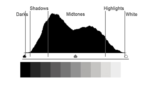
To make the luminance and color information of an image more visual, people use the horizontal axis to represent the luminance values from 0 to 255 and the vertical axis to represent the number of pixels corresponding to each luminance value in the photo. This graphical representation is what we call a histogram.
The height of the bars in a histogram represents how many pixels in the image have that particular luminance value, showing us the distribution and proportion of luminance in the image.
For example, in the histogram below, the peak is located towards the left side (shadow area), indicating that there are many dark gray or dark areas in the image.
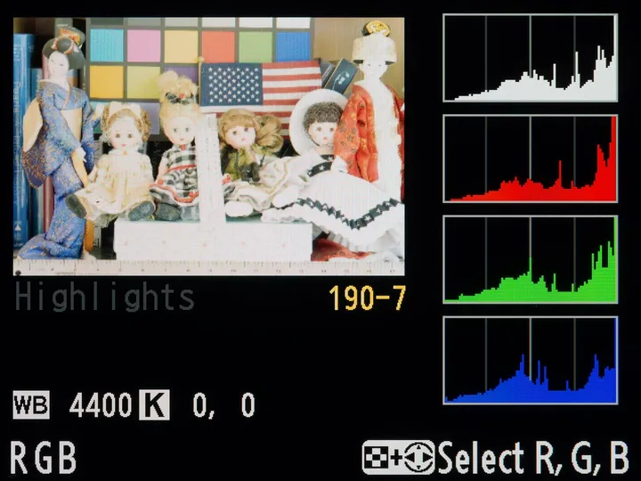
We know that colors are created by mixing the primary colors of red, green, and blue. When a camera captures a photo, it records the information for each of these "channels" separately - red, green, and blue - and then combines them to create a colorful image.
In the preview mode of a camera, you can see the histograms for each channel: R (red), G (green), and B (blue), as well as the combined RGB histogram at the top.
Extra Tip:
The RGB histogram is created by overlaying and averaging the histograms of the red, green, and blue channels.
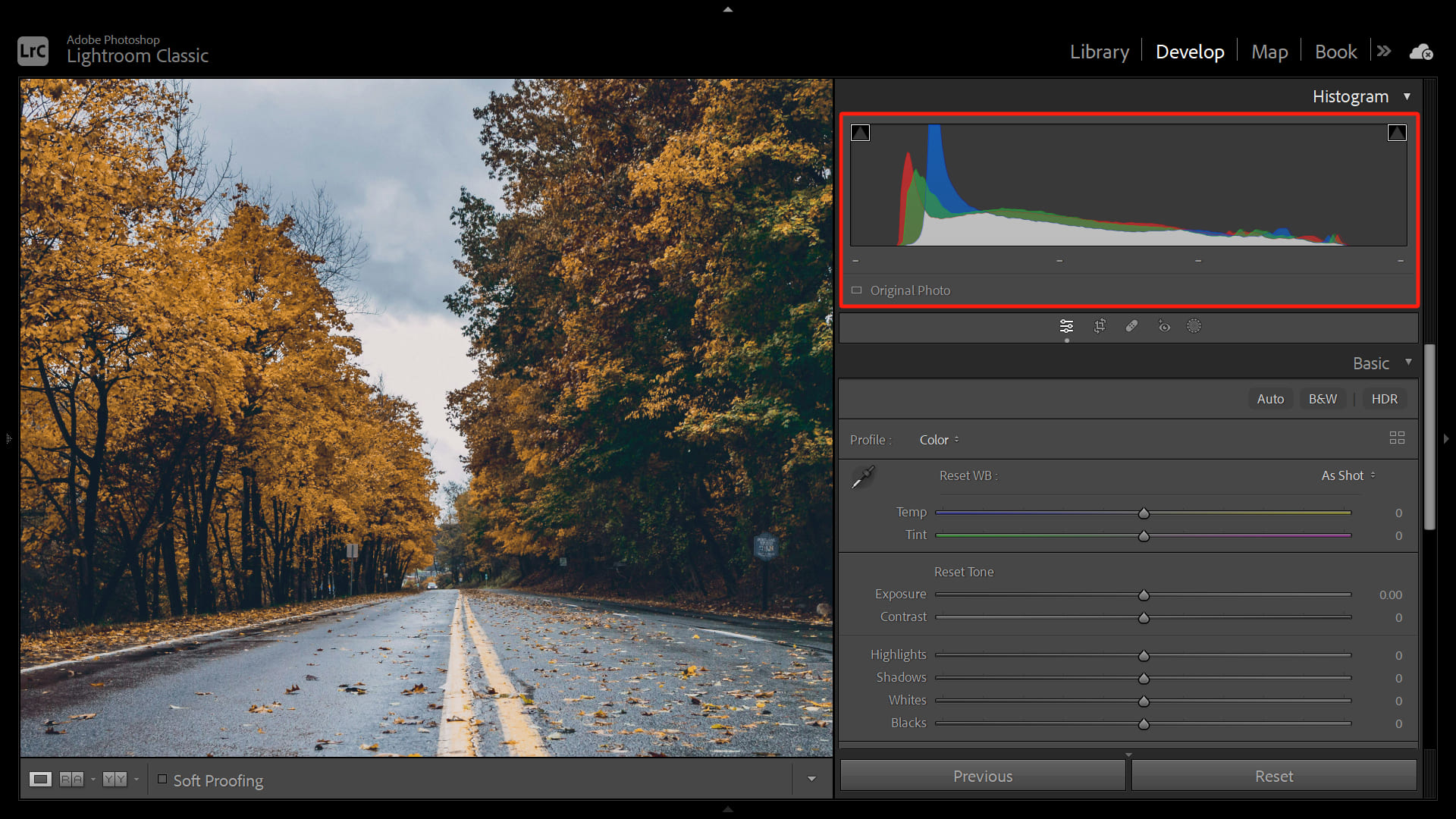
In Camera Raw and Lightroom's histogram panels, the representation is even more intuitive. The histograms for the R, G, and B channels are displayed together using different colors.
The gray area represents the portion where the histograms of all three RGB channels overlap, while the corresponding red area represents only the histogram of the red channel. And so on for the other colors.
How to Read a Histogram in Photography?
Histograms serve several purposes in photography, and in this section, we will delve into the details to help you understand histograms better. With this knowledge, you won't feel confused when using your camera to take photos and read the histograms.
1. Determine Overexposure and Underexposure in Photos
When you capture a photo, the camera exposes the actual luminance of the scene onto the 0 to 255 range of the photo's recording interval.
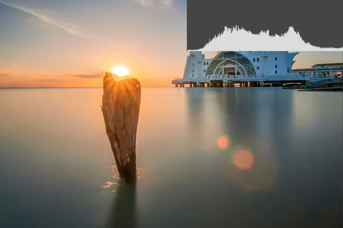
An ideally exposed photo should have a histogram stacked in the middle, with no significant pixel accumulation or overflow at the far left or right.
If your exposure settings are incorrect, the photo can be underexposed or overexposed. This is reflected in the histogram as a significant pixel accumulation on one side as if it has been cut off.
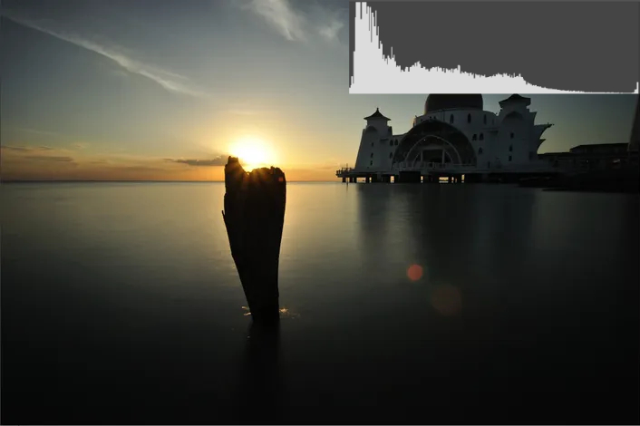
A heavily overexposed photo's histogram would look like the image below, with a pronounced pixel accumulation on the far right. This indicates that the luminance value of 255, representing pure white, contains a significant number of pixels.
This means that the highly bright area in the sky, due to limitations of the camera hardware, can only be recorded as pure white in the photo, resulting in a loss of detail.
At the same time, the photo's shadows have very few pixels, indicating that we haven't fully utilized the space for recording information in the photo. In this case, we need to reduce exposure compensation, close down the aperture, lower the ISO, or increase the shutter speed to decrease the exposure time.
Similarly, an underexposed image would have a significant presence of pixels in the pure black area around the 0 value on the histogram. This requires us to increase the exposure when capturing the photo.
2. Determining If the Exposure Exceeds the Camera's Dynamic Range
If there is pixel accumulation on both the left and right sides of the histogram, it indicates overexposure and underexposure, as mentioned earlier.
Alternatively, if one side of the histogram lacks pixels while the other side has pixel accumulation, it means that there is a significant difference in luminance in the environment, and the camera struggles to capture all the information.
In such cases, the histogram reminds you to use techniques like Exposure Bracketing with post-processing blending to balance the dynamic range.
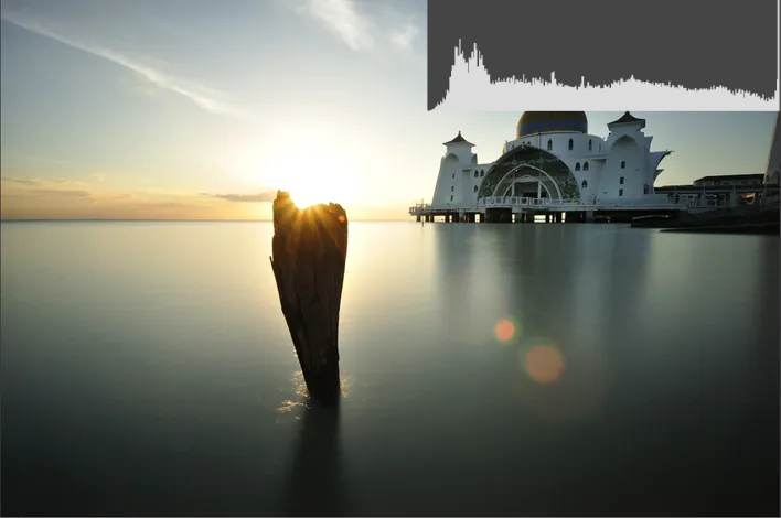
For example, in the photo below, if you want to capture details in the shadow area, the highlight area becomes completely overexposed.
Looking at the histogram, there are no pixels on the left side, and the pixels on the right side are accumulated or even overflowing. It is evident that the dynamic range of the scene exceeds the camera's capacity, and it is impossible to capture all the details in a single photo.
On the other hand, if you want to capture details in the highlight area, there will be a significant accumulation of pixels in the shadow area, resulting in the loss of all the shadow details.
In such situations, the only solution is to use exposure bracketing to capture multiple images—one exposing for the highlights and another for the shadows. Then, in post-processing software, you can blend these images to create a new composite image that incorporates both highlight and shadow information.
To learn more about exposure bracketing techniques and post-processing blending in the pre-photography stage, you can refer to the YouTube video shared by Photo Genius.
3. Exposing to the Right
When the camera captures information, it also generates noise. In brighter areas, the presence of light is more prominent, so the noise is not as noticeable. However, in darker areas, where the camera captures less light signal, the noise becomes much more apparent.
Especially when you brighten the shadows in post-processing, the noise becomes even more pronounced. This is referred to as having a low "Signal-to-noise Ratio" (the ratio of the light signal received by the sensor to the amount of noise produced by the sensor itself).
To improve the "signal-to-noise ratio" in photos, photographer Michael Reichmann introduced the concept of "Exposing to the Right" in 2003.
It means that, while ensuring that the highlights in the photo are not blown out, you should try to capture the pixels in brighter areas as much as possible. In other words, the histogram should be pushed towards the right, ensuring that there are always some pixels in the highlight white area.
Due to the limitations of the camera's display and the human eye's sensitivity to highlights, photos exposed to the right often appear overexposed at first glance, making it difficult to distinguish them from severely overexposed images that are beyond recovery.
In such cases, only the histogram can help you accurately grasp the exposure information. As long as there is not a significant accumulation of pixels in the pure white area on the far right of the histogram, the photo is considered to be "exposed to the right," rather than being severely overexposed with irrecoverable details.
To learn more about the techniques of exposing to the right, you can watch the YouTube video shared by DPReview TV below.
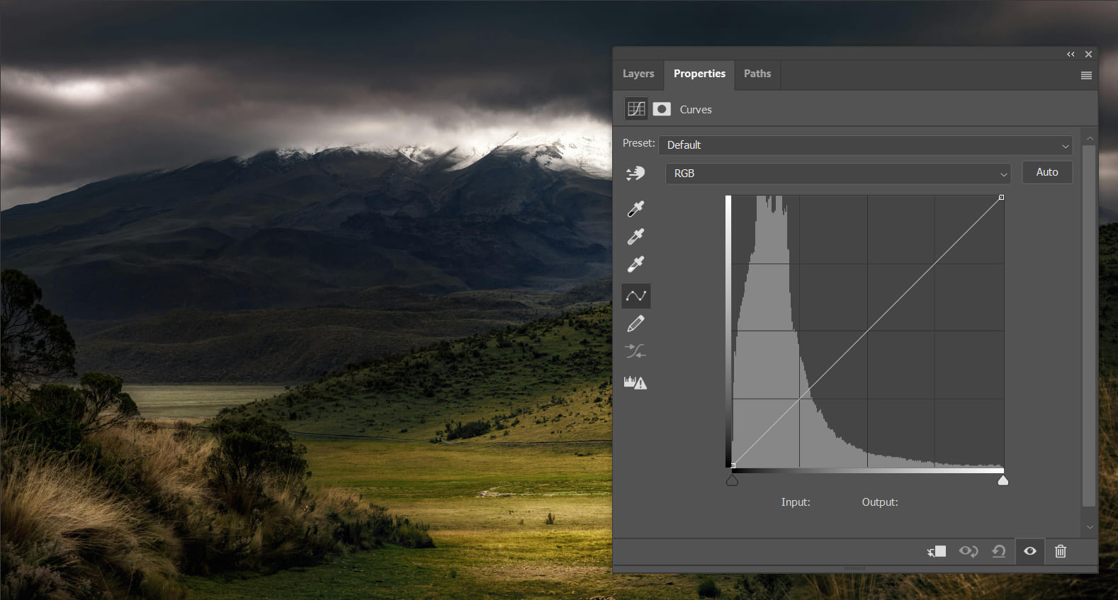
How to Read a Histogram in Post-Processing Editing?
The brightness and darkness of a photo can be interpreted from two perspectives. One is the scientific approach, which refers to the exposure mentioned above. The other is the artistic approach, which focuses on the tonality.
Tonality refers to the levels, variations, and atmosphere of brightness and darkness in a photo.
While you may describe a photo as underexposed from a scientific standpoint, you can also say that it has a low-tone and moody tonality from an artistic perspective. For example, the photo below evokes a sense of deep and ever-changing natural beauty.
The tonality of a photo is closely related to its histogram. In the following sections, we will share histograms and adjustment methods corresponding to different tonal categories.
Before we dive into our method introductions, we would like to recommend a creative tool, TourBox, that can greatly enhance your efficiency in post-processing editing.

TourBox simplifies every step of your photo editing process. Taking Lightroom as an example, when managing your photos, you typically need one hand for keyboard inputs, and one hand for mouse clicks, and you have to navigate and adjust settings one by one. With TourBox, you can accomplish all of this with just one hand.
TourBox also revolutionizes the workflow for color grading. You can build custom work panels on TourBox, select parameter sliders, and make quick adjustments. It's effortless for beginners, as the parameter changes are immediately visible.
Furthermore, you can easily apply presets, batch edit, and perform other operations with just one hand on TourBox. This allows you to focus on your creative process rather than tedious and repetitive tasks.
1. Low-Tone, Mid-Tone, and High-Tone Styles
The low-tone, mid-tone, and high-tone styles primarily refer to the overall luminance of a photo. By looking at the histogram and identifying where the pixel clusters are located in terms of luminance, you can determine whether a photo has a low-tone or high-tone style.
In a low-tone photo, dark and black areas dominate the composition, while light and white areas are minimal, creating a deep and intense tonality. When examining the histogram, you would expect the pixel clusters to accumulate in the shadow and black regions, with only a few pixels in the highlights and white areas.
Conversely, a high-tone photo is predominantly bright with white tones, giving a sunny and bright impression. On the histogram, the pixel clusters would primarily accumulate in the right side's highlight and white areas.
The mid-tone style is the most common, featuring a balance of black and white areas, with most pixels distributed in the middle range of the histogram, creating a normal and neutral feel.
Different tonal styles correspond to different atmospheres, and there is no definitive "best" style. When referencing the histogram in post-processing, the goal is to adjust the luminance distribution of the photo based on the histogram to achieve the desired mood.
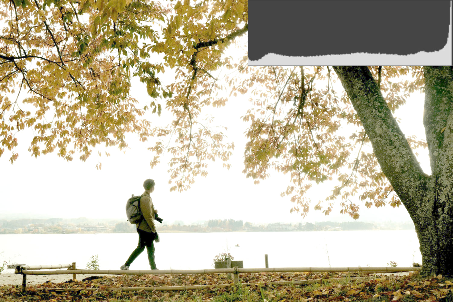
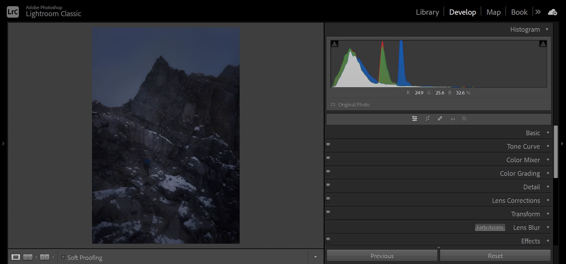
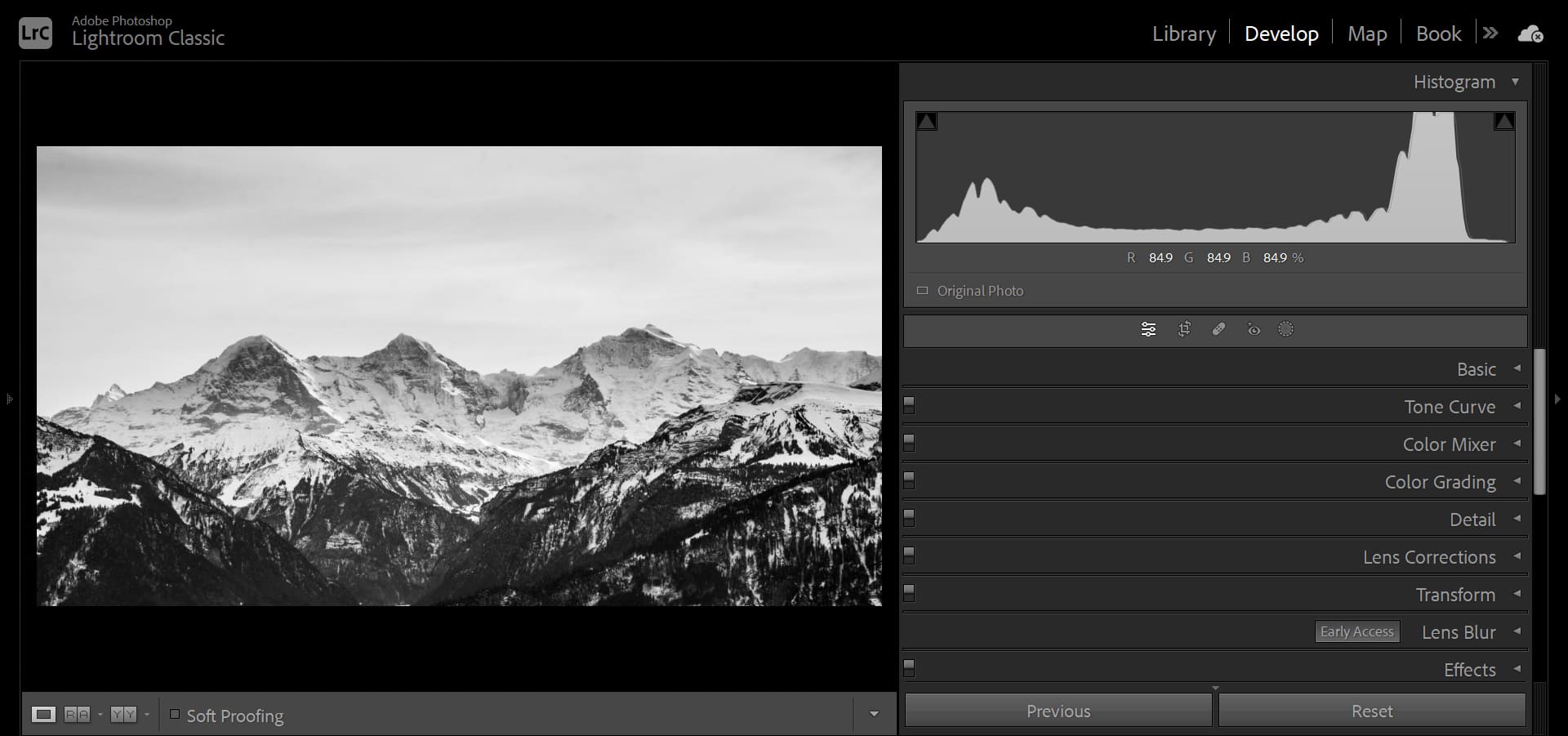
For example, in the photo below, the white glacier and sky result in pixel clusters concentrated in the highlight area, making it a typical high-tone photo.
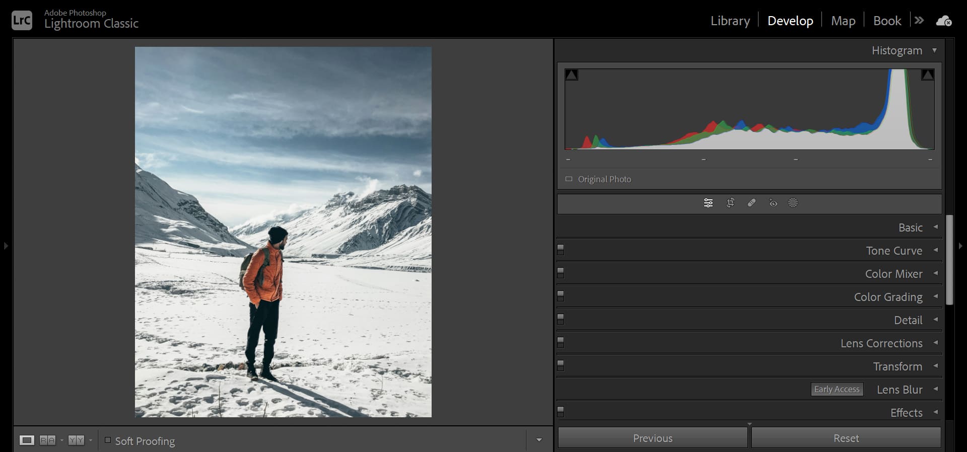
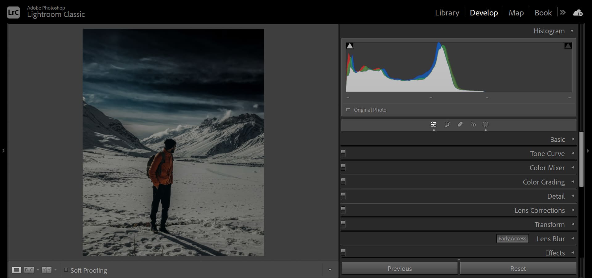
But if you want to give the hiker in the photo a sense of solitude and insignificance in the vast wilderness, you can directly decrease the exposure value to -2 and decrease the highlights to -100 in Lightroom. Then, apply the Storm Clouds preset available in Lightroom.
By doing this, the pixel clusters in the histogram will be pushed towards the shadow area. Instantly, the style of the photo changes from high-key to low-key, evoking a feeling of oppression, gloominess, and the end of the world.
Further Reading:
You might be interested in: "Basic Panel in Lightroom Classic".
2. Long-Tone, Mid-Tone, and Short-Tone Styles
Long-tone, mid-tone, and short-tone styles refer to the distribution of luminance in a photo. From the histogram, it can be observed as the difference in distance from the far left to the far right.
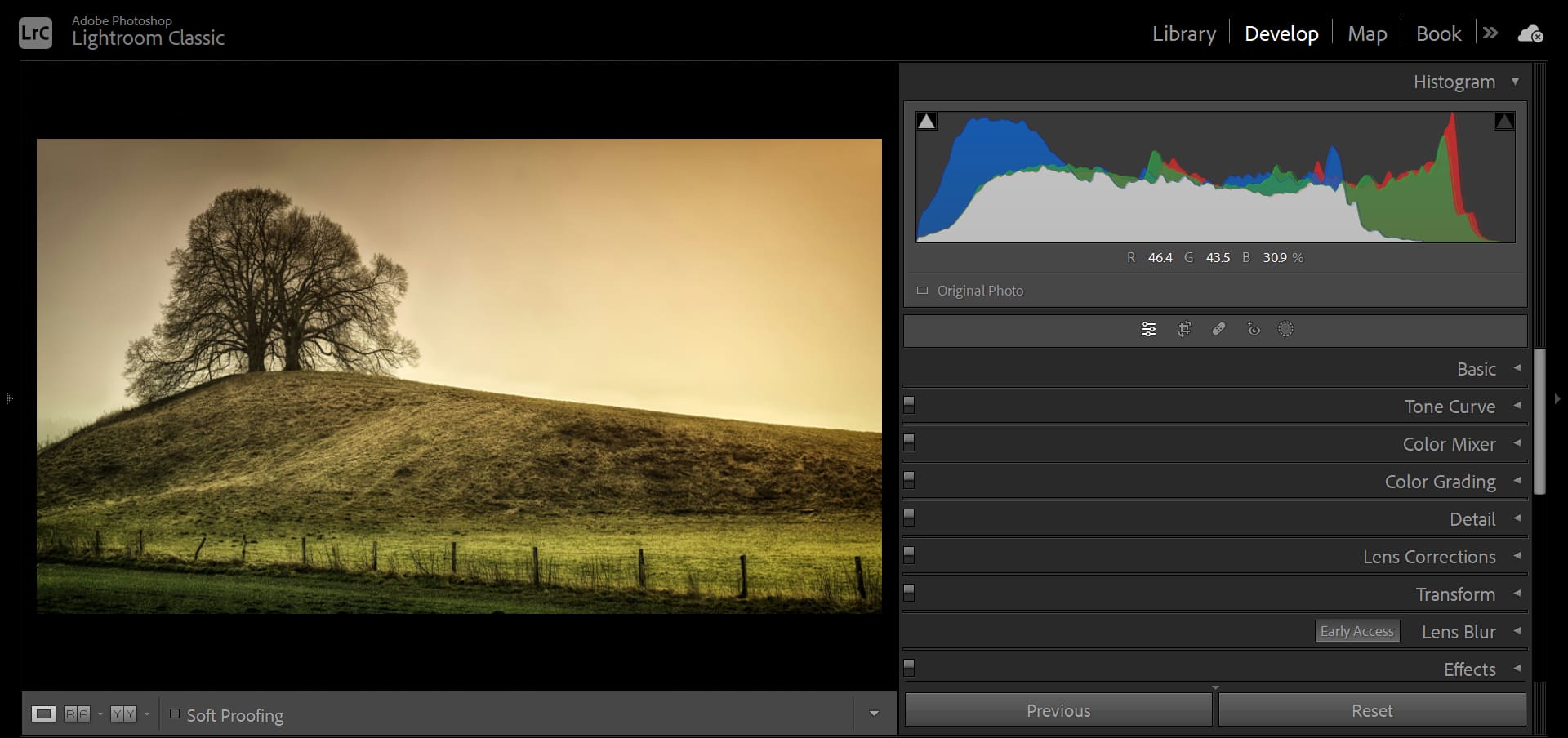
Long-tone photos are the most common, with brightness ranging from the darkest black areas to the brightest white areas. Due to the wide range of brightness, long-tone photos often have a strong sense of depth and dimension.
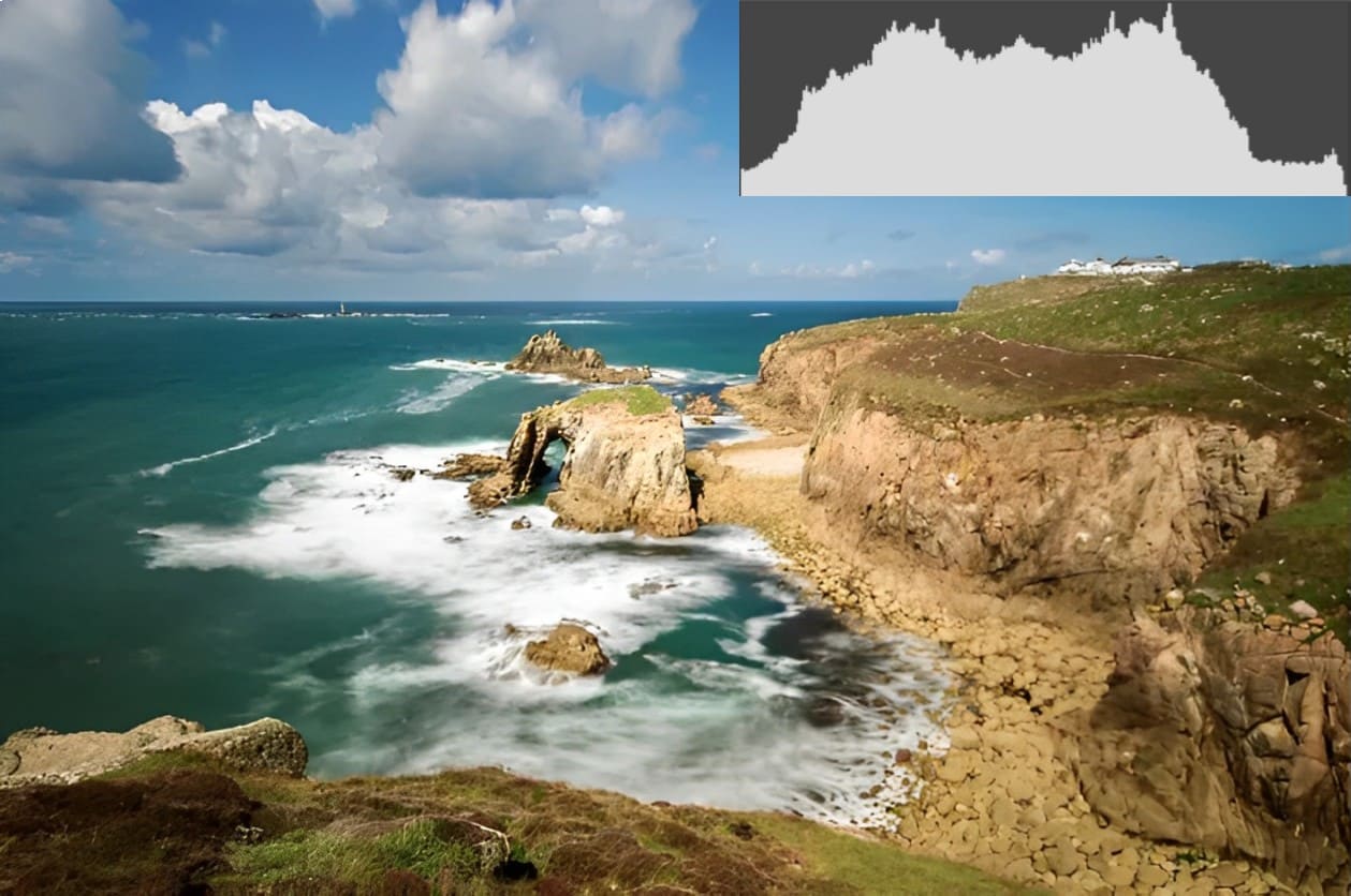
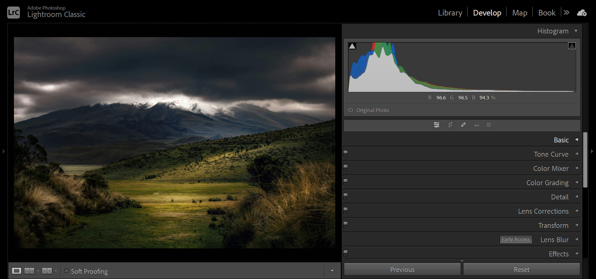
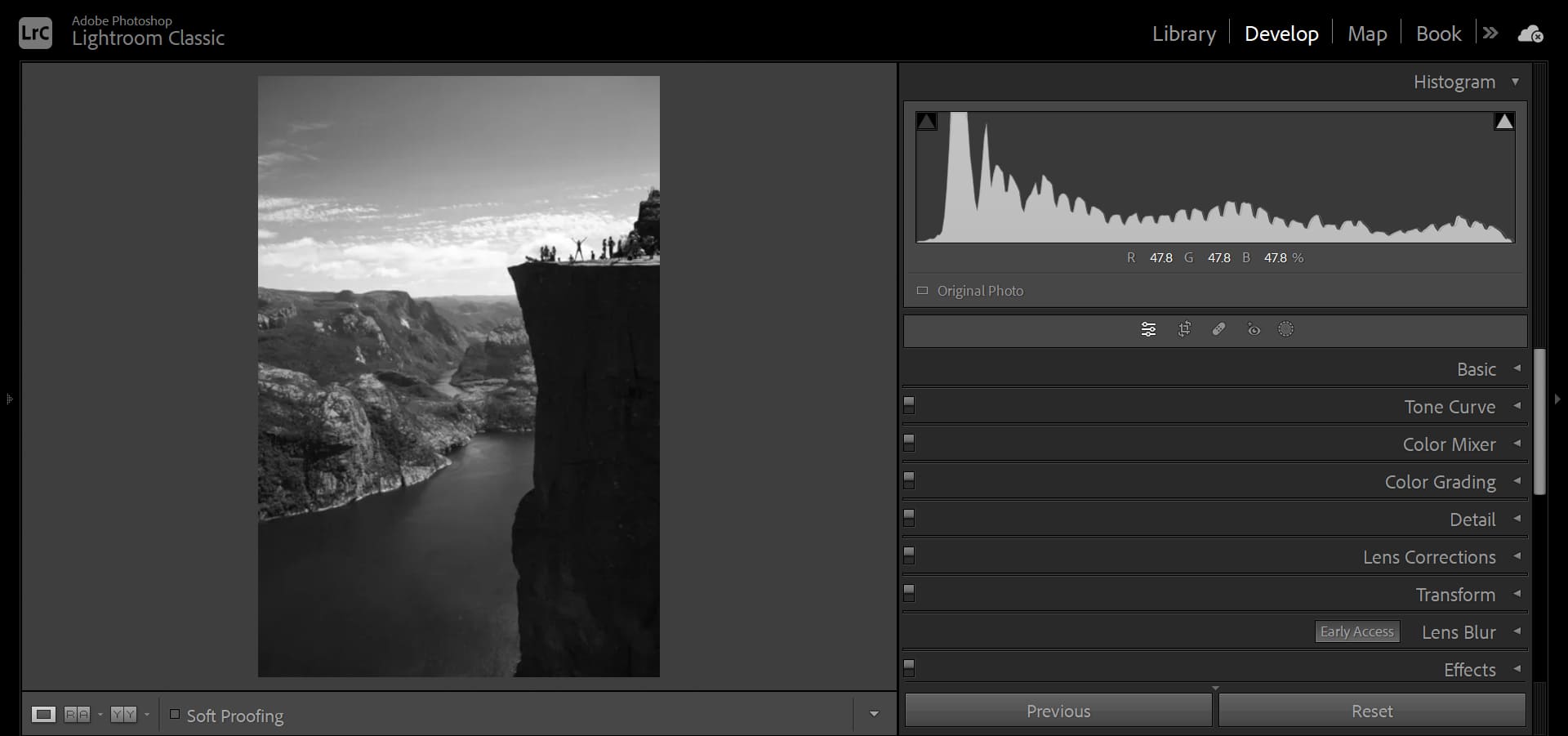
For example, in the photo below, the deep black of the foreground cliff, the mid-gray of the canyon in the middle ground, and the bright white of the sky in the background are separated in terms of brightness, creating a distinct layering effect.
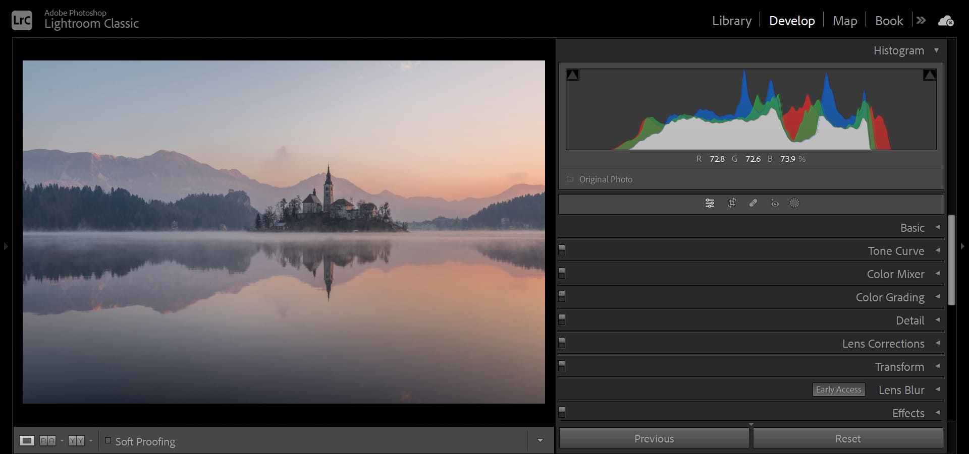
Mid-tone photos tend to have a more hazy and subtle elegance. From the histogram, the length from the far left to the far right is only about two-thirds of the entire range.
Many night-time photos fall into the mid-tone category. The darkness of the night naturally gives a feeling of dim lighting. If there are too many highlights or excessive contrast in the photo, it can lose this atmosphere. Many cases of adjusting night-time photos to look like daytime photos make mistakes in tonality.
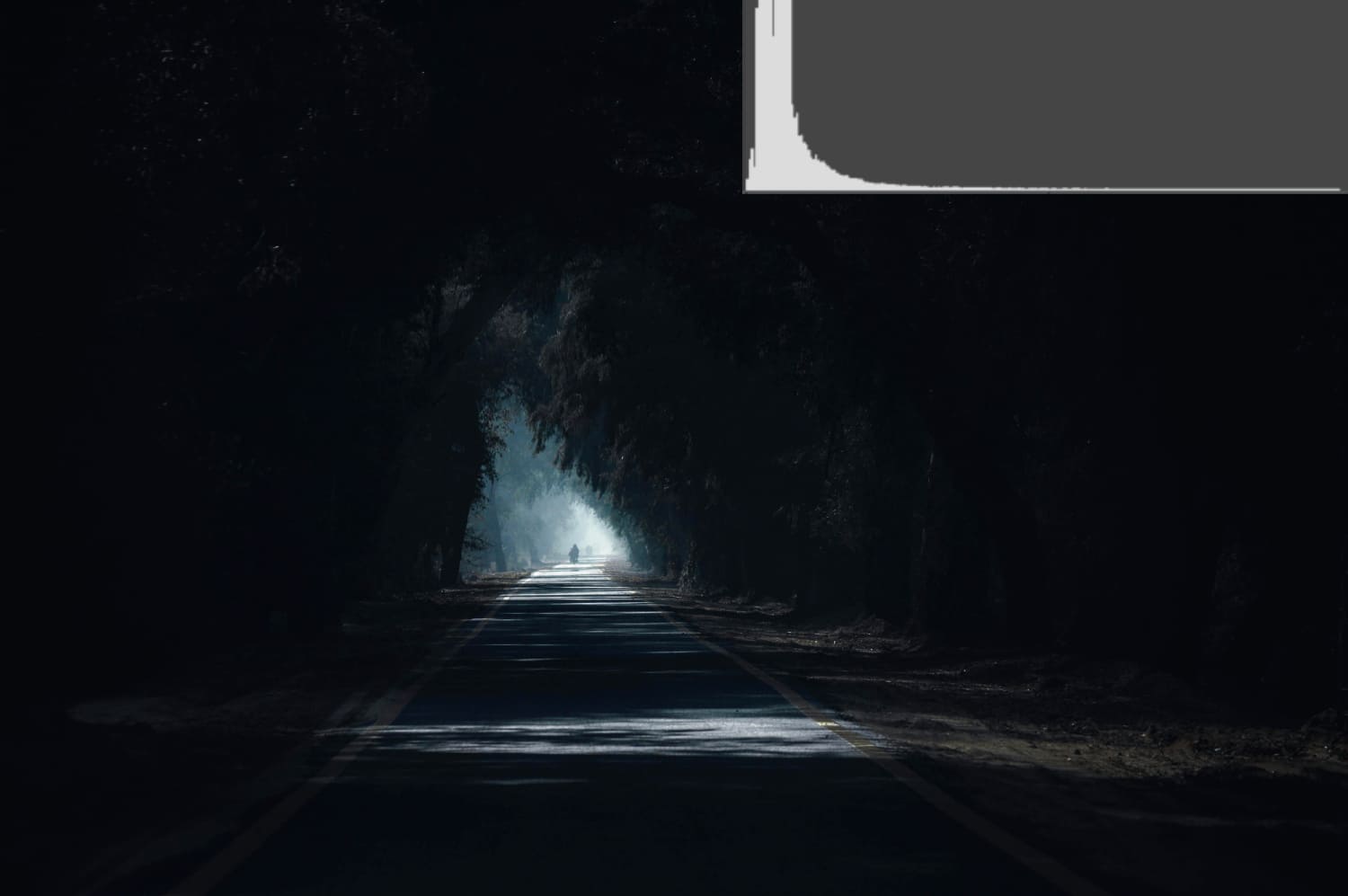
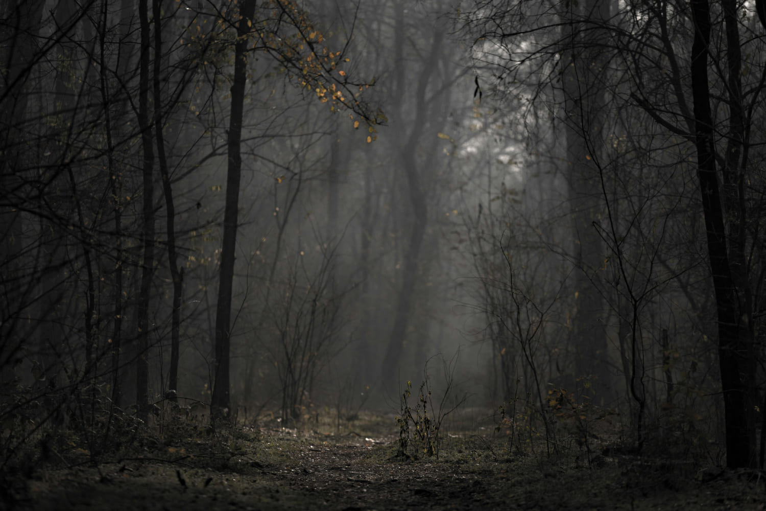
Short-tone photos are very rare and challenging to capture. The distance from the far left to the far right on the histogram is less than one-third of the entire range, resulting in a strong sense of haze and oppression.
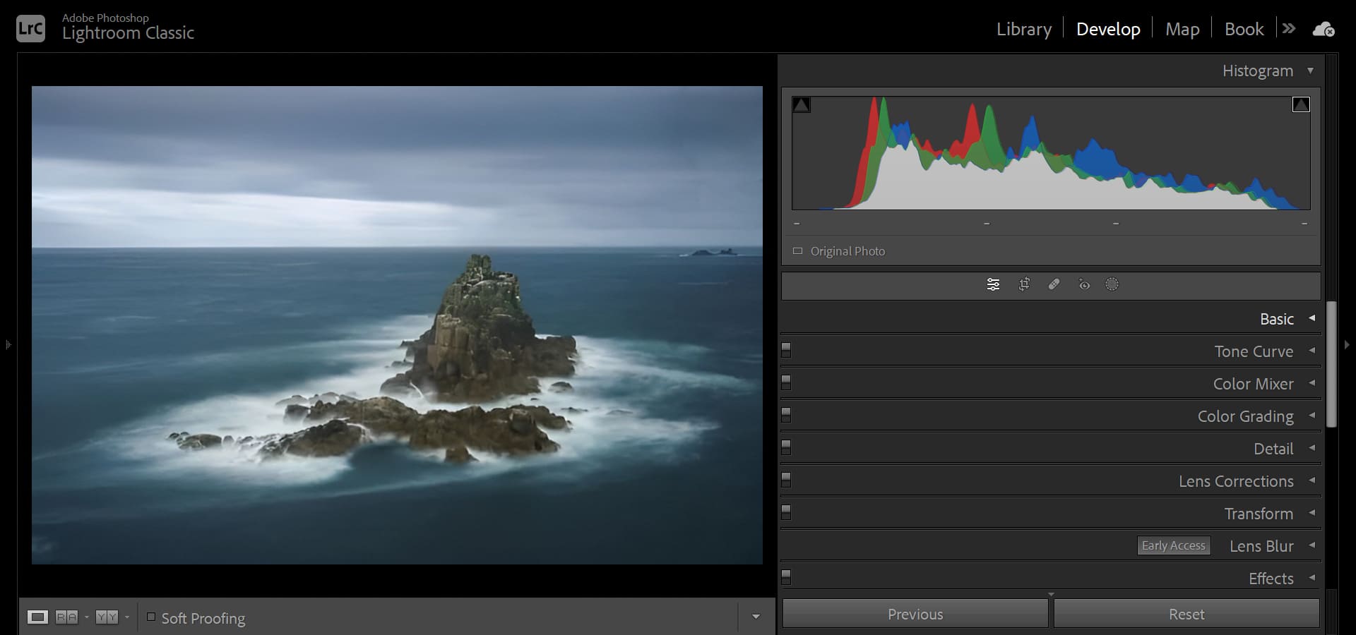
The longer the tonality, the more layered the photo appears, while shorter tonality creates a more oppressive atmosphere. In the photo below, the image appears hazy.
By looking at the histogram, it becomes clear why this is the case. The white and black areas on the histogram lack pixels, and the brightness of the photo is compressed in the middle, making it a mid-tone photo.
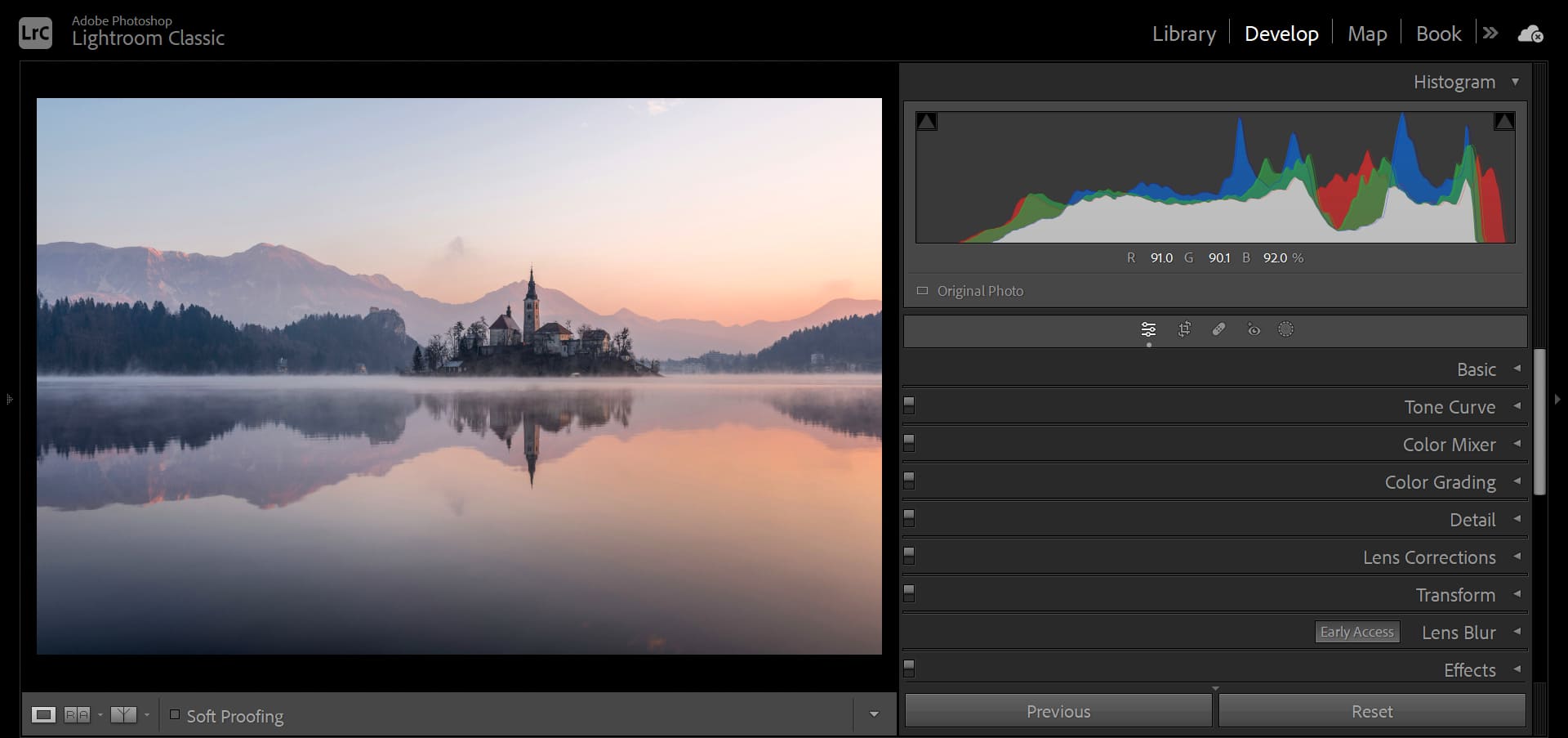
At this point, in Lightroom, you can increase the White level to +56 and decrease the Black level to -37, allowing the pixels to fill the pure black and white areas, thus filling the entire histogram.
After transforming the photo from a mid-tone to a long-tone style, the sense of depth and dimension in the photo becomes apparent.
3. Hard-Tone and Soft-Tone Styles
Soft-tone photos have a hazy and fresh quality, creating a serene atmosphere as if bathed in soft light. These photos are rich in detail.
From the histogram, soft-tone photos have a relatively even distribution of pixel brightness, resembling a trapezoid shape, resulting in smooth and delicate transitions of details.
On the other hand, hard-tone photos have strong contrast and high emphasis on the subject by eliminating unnecessary details.
From the histogram, hard-tone photos have peaks in both the highlight and shadow areas, with pixels concentrated in the brighter and darker parts, creating a wider contrast in the photo.
Therefore, you can adjust the values of highlights and shadows according to the style you desire.
If you want a photo with rich details and delicate tonal transitions, you can aim for a histogram that resembles a trapezoid shape. Conversely, if you want a photo with strong contrast, you can further widen the gap between the peaks in the brighter and darker parts of the histogram.
Frequently Asked Questions About Histograms in Photography
The brightness and darkness of a photo can be interpreted from two perspectives. One is the scientific approach, which is exposure. The other is the artistic approach, which is tonality.
Whether it's exposure or tonality, we need a tool to help us judge, and that tool is the histogram.
In this tutorial, we shared how to read a histogram. In the final section of this tutorial, we want to share some common questions and answers about histograms in photography.
Question: What Is a Histogram?
A histogram is a chart that displays the distribution of various brightness levels in an image. It can help you understand the exposure of the image.
Question: How to View the Histogram on Camera?
Most modern cameras have a histogram display feature. You can find and enable it in the camera's menu settings.
Question: What Do the Left and Right Sides of the Histogram Represent?
The left side of the histogram represents the shadows (dark areas), and the right side represents the highlights (bright areas). The middle section represents the mid-tones.
Question: What Should the Shape of the Histogram Be Like?
The ideal shape of the histogram depends on the effect you want to achieve. Generally, a good exposure should distribute the histogram across the entire range without touching the extremes.
Question: What to Do If the Histogram Is Skewed to One Side?
If the histogram is skewed to one side, it may indicate overexposure or underexposure of the image. You can correct it by adjusting the exposure compensation.
Question: How to Use the Histogram in Post-Processing?
In post-processing, the histogram can help you adjust brightness and contrast more accurately. By observing the changes in the histogram, you can judge whether your adjustments have achieved the desired effect.
Product Recommendation:
If you're interested in how TourBox can improve your workflow, why not start by trying our latest product, TourBox Lite? With a lower price and easy setup, it's perfect for first-time users of TourBox, allowing you to experience its benefits right away.

That concludes our tutorial on how to read a histogram. Thank you for reading, and we hope it helps you on your creative journey.