HSB Color Mode: Achieve Harmonious Color Palettes With Ease
If you're a designer or aspiring to become one, you inevitably deal with colors every day. However, sometimes you may struggle with accurately grasping the feel of colors, resulting in color combinations that just don't seem to work.
You may already have some understanding of color principles like Primary Colors, RGB, and CMYK. In this tutorial, we'll delve into the theory and techniques of color schemes using the HSB (HSV) color mode.
By mastering the skills of utilizing the HSB color, you'll no longer feel lost or confused when it comes to color combinations. Let's dive in and unlock the secrets of effective color coordination!

In this article, you will learn:
- What Are the Color Modes?
- What Is the HSB Color?
- How to Apply the HSB Color Mode in Design?
- How to Use HSB Color Mode in Color Grading
- Final Thoughts About HSB Color
What Are the Color Modes?
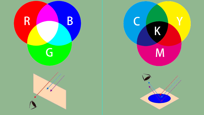
The colors we perceive in our daily lives can be divided into the "transmissive colors" that are emitted when light passes through and interacts with colors, and the "reflective colors" that are reflected when light shines on objects.
Transmissive colors are created through "additive color mixing," combining red, green, and blue (RGB) to display a wide range of colors. This is the color mode used by our computer screens.
Reflective colors, on the other hand, are represented using pigments, dyes, inks, or other color materials. In printing, basic colors are created by mixing cyan, magenta, yellow, and black (CMYK). Colors in this mode are displayed through "subtractive color mixing."
RGB and CMYK are the two most fundamental color modes in design. However, in practical design, we rarely directly use RGB or CMYK for color adjustments.
What Is the HSB Color?
When it comes to perceiving color, humans often start with hue, which refers to one of the colors in the spectrum of red, orange, yellow, green, cyan, blue, or purple. Then comes the question of whether the color is vibrant or muted, and whether it appears bright or dark.
HSB color mode is based on the human eye and aims to describe color in a way that aligns with our sensory intuition. It breaks down color into three components: hue, saturation, and brightness.
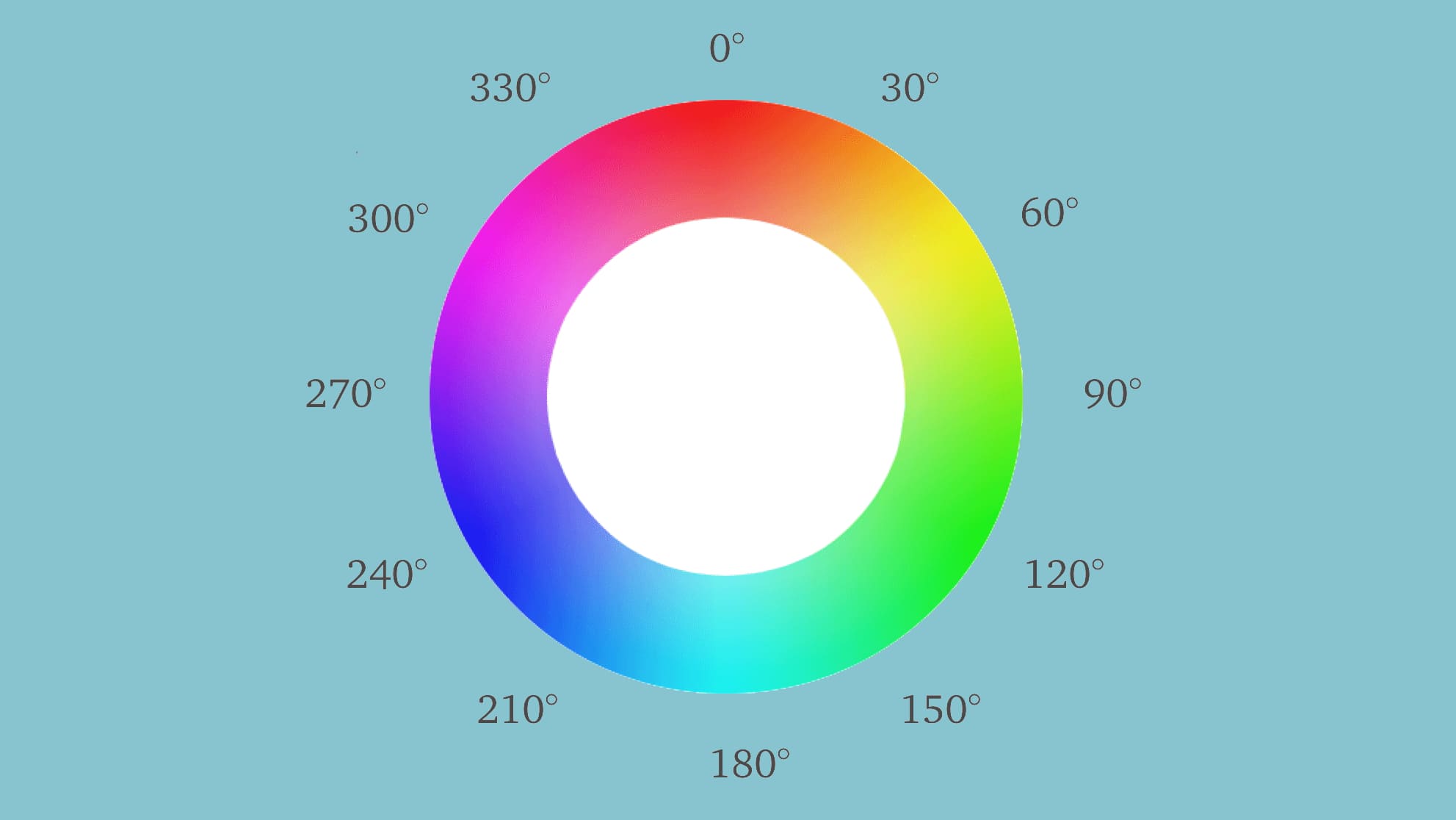
Hue (H): Think of hue as the appearance or tonality of color. On the standard color wheel, hue is measured by position and ranges from 0 to 360 degrees (with black and white having no specific hue).
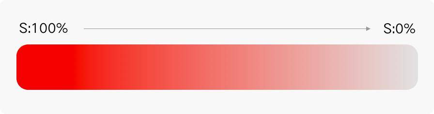
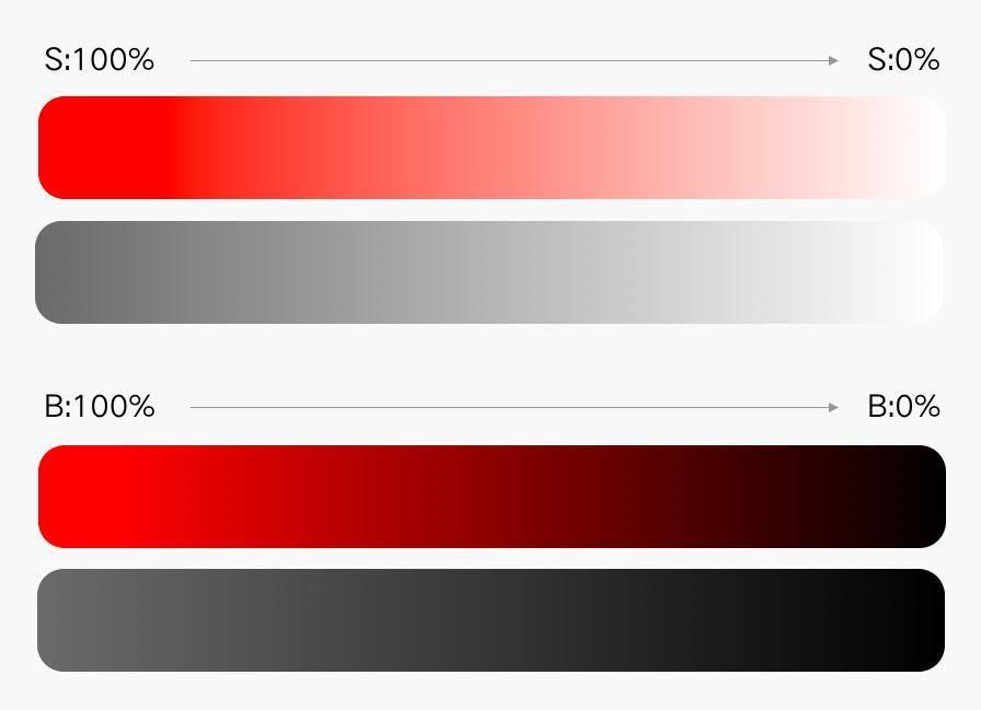
Saturation (S): Saturation refers to the purity or intensity of a color and is measured on a scale from 0 to 100. Higher saturation values indicate more vibrant colors, while lower saturation values result in colors that are closer to grayscale.
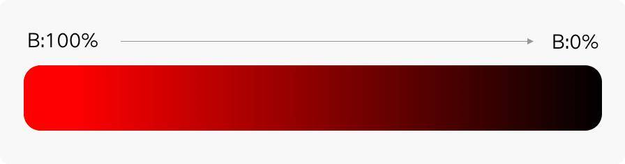
Brightness (B): It indicates the level of brightness or darkness in a color. The values range from 0 to 100. Higher brightness values result in brighter colors, while lower brightness values create darker shades. The maximum brightness corresponds to pure white, while the minimum brightness represents pure black.
Taking Photoshop as an example, which is a commonly used design software, we can use the color picker tool to select the desired colors.
The color picker generally follows the logic of the HSB mode, which includes hue, saturation, and brightness. When choosing colors in design, you first determine the hue and then select the desired brightness and opacity within that hue dimension.
As shown in the image below, when you are picking colors in the Photoshop color picker, you are actually selecting colors based on the variations in HSB values, even if you're not consciously aware of it.
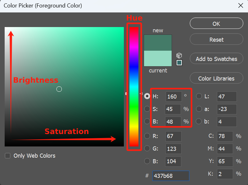
HSB mode allows you to fix one parameter within HSB while adjusting the other two, or even change only one of the parameters.
This perfectly aligns with our intuitive understanding of color and is something that only HSB can achieve, unlike RGB and CMYK, which affect all parameters simultaneously.
With the HSB mode, you can make subtle adjustments to the saturation and brightness of an existing color.
Extra Tip:
You can fine-tune the hue by increasing or decreasing its numerical value to choose suitable colors. For example, complementary colors are 180° apart, contrasting colors are between 120° and 150°, analogous colors are 90° apart, adjacent colors are 60° apart, and analogous colors are 15° apart.
How to Apply the HSB Color Mode in Design?
After briefly explaining the principles and characteristics of HSB, we believe you now have a basic understanding of it. Now let's explore how HSB is practically applied in design through specific examples.
When designing a webpage, for instance, if we need a similar color to complement the main color, we can utilize the HSB color mode.
As shown in the image below, without understanding the HSB principles, we would have to rely solely on our intuition to select a similar color. However, with knowledge of the HSB color mode, we can adjust the saturation and brightness to obtain a range of lighter or darker shades.
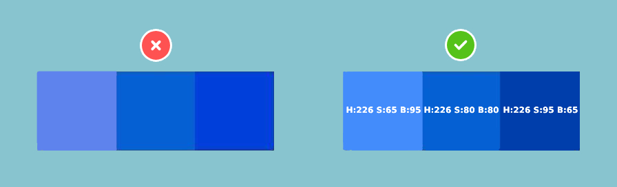
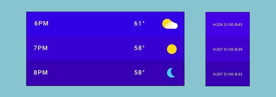
By looking at the image, you can see that the colors on the right side create a more harmonious and comfortable visual effect. In interface design, designers often encounter the need to differentiate different states of the same type using colors, as shown in the image below.
Based on the aforementioned examples and the patterns of saturation and brightness variations, we can establish two important principles under the premise of not altering the hue:
- Lighter shades = Decreased saturation + increased brightness
- Darker shades = Increased saturation + decreased brightness
When using the HSB color mode, you can refer to these principles to effortlessly customize the most suitable colors.
How to Use HSB Color Mode in Color Grading
When it comes to color grading in digital photo post-processing, we often rely on the HSB logic. That's why you need to familiarize yourself with this color mode.
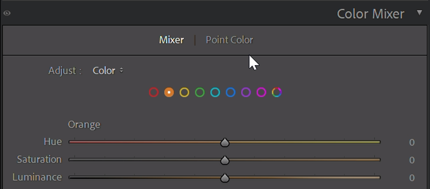
In Lightroom Classic's Color Mixer panel, you can find the HSL tool.
Lightroom Classic provides 9 different sliders, corresponding to the primary hues: Red (0 degrees), Orange (30 degrees), Yellow (60 degrees), Green (120 degrees), Aqua (light green, 180 degrees), Blue (240 degrees), Purple (270 degrees), Magenta (300 degrees) and All.
For each hue range, Lightroom Classic offers hue, saturation, and brightness (or lightness) adjustment sliders, allowing you to modify the color of the corresponding hue in your photo by adjusting the H, S, and B/L values.
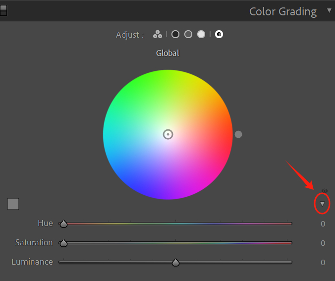
Another aspect of Lightroom Classic closely related to the HSB logic, and often favored by many designers and photographers, is Color Grading.
Color grading allows you to individually adjust the hue, saturation, and brightness of highlights, shadows, midtones, and the global image.
In the Color Grading panel, you can toggle between Highlights, Shadows, Midtones, and the Global using the mode switch at the top.
The corresponding HSL adjustment sliders are initially hidden in the default view. You need to click the small arrow on the right to reveal the HSL sliders.
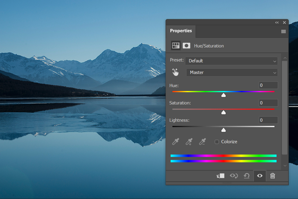
In Photoshop, the Hue/Saturation adjustment is the go-to mode for color grading. With this command, you can easily change the hue, saturation, and brightness of colors globally or in specific areas. It's a prime example of how the HSB logic is applied in practice.
Once you enter the design field, such as doing some simple layout work or adding layer styles to text, the power of HSB becomes more prominent. For instance, when adding text shadows on a colored background, using shadows with the same hue or complementary hue often yields better results than using plain black.
Choosing colors can be challenging when determining the values of R, G, and B, but HSB makes it simple.
Just use the color picker to select the color from the background, obtain the hue (H) value, and then adjust the brightness (B, usually between 10-25%) and saturation (S) according to your needs. It's a highly practical technique.
By adopting the HSB color blending mode, which separates colors into hue, saturation, and brightness, it provides a more user-friendly color memory and practical solution for both photographers and designers compared to RGB.
Final Thoughts About HSB Color
The application of HSB color goes beyond what was mentioned above. For example, in web design, we often use different shades of gray (#000000, #333333, #666666, #999999) to differentiate text at various hierarchy levels, and this is also done using the HSB color mode.
When we have more than four hierarchy levels to design, there's no need to get stuck in the color palette. Just follow the aforementioned principles and vary the brightness levels.
If you observe closely, you'll notice that many outstanding designs achieve harmonious color combinations through consistency or contrast in hue, saturation, and brightness.
In photo editing, you can also leverage your perception and understanding of colors to select a specific hue, and then quickly choose the corresponding color palette using HSB for color adjustments in your photos.
Product Recommendation:
As we conclude this tutorial on the HSB color mode, we want to share with you a powerful tool that can elevate your design and photo editing experience. Enter TourBox, a game-changing device that seamlessly integrates with your creative workflow.
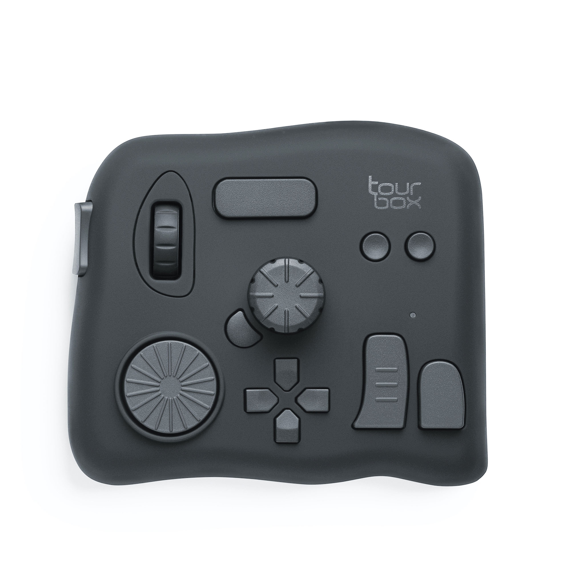
TourBox is designed with designers and photographers in mind, offering intuitive controls and customizable shortcuts to enhance efficiency and creativity.
With its ergonomic design and responsive buttons, TourBox provides a tactile and natural way to navigate and make adjustments in your favorite design software, including Photoshop, Lightroom, and more.
With just a few clicks and twists, you can effortlessly adjust the hue, saturation, and brightness of colors in your designs or photos. Whether you're fine-tuning the color balance of an image or creating captivating color gradients, TourBox enhances your ability to work fluidly and precisely with the HSB color mode.
And with that, we have come to the end of this tutorial on the HSB color mode. We hope this tutorial has been informative and beneficial to you.