How to Use the Color Balance Tool in Photoshop?
In this tutorial, we will guide you on using the Color Balance tool in Photoshop to adjust your images and help you grasp the core concepts and techniques of Color Balance.
Without further ado, let's get started!

In this article, you will learn:
- What Is Color Balance?
- The 3 Workspaces of the Color Balance Panel
- How to Use the Color Balance Tool in Photoshop?
- Frequently Asked Questions About Color Balance
What Is Color Balance?
According to Adobe, the Color Balance command controls an image's color distribution, achieving a balanced color effect. In simple terms, Color Balance is a technique that resolves color cast issues using the principles of the color wheel.
We all know that the color spaces used for displays (RGB) and printing (CMYK) are different, and there can be variations during the conversion process, resulting in inconsistent colors. In other words, what you see on the screen may not match what you get when printed.
In such cases, after converting the color space, you need to adjust the image to make the colors as close as possible to the original.
The Color Balance tool's original purpose was to fine-tune an image's colors after converting the color space. However, it has become a popular color grading tool, even more intuitive than Curves or Levels adjustments.
You'll notice that many color adjustment tools are based on these six colors: Red, Green, Blue, Cyan, Magenta, and Yellow. In fact, they represent the RGB and CMY (K represents the brightness dimension), which are the primary colors used in color spaces.
Hence, many color adjustment tools are designed based on color space conversions.
In the "Color Balance" tool, there are three adjustment options: the primary colors of light, which are Red, Green, and Blue. All other colors are created by mixing these three primary colors.
The other three colors, Cyan, Magenta, and Yellow, are complementary to the primary colors and are part of the CMY color model used in four-color printing.
By using Photoshop's Color Balance tool, you can achieve the desired effect for your artwork.
The 3 Workspaces of the Color Balance Panel
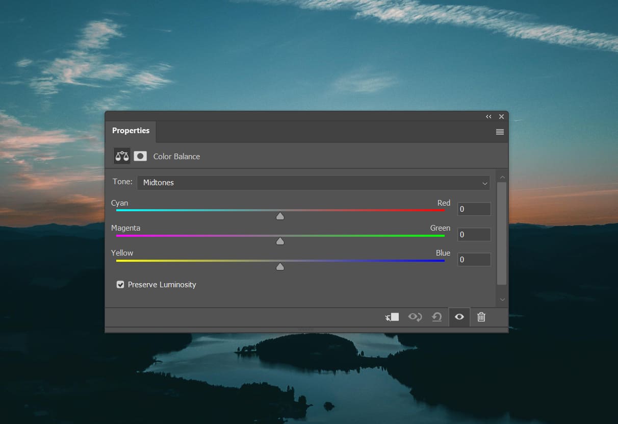
The Color Balance panel consists of 3 main workspaces: 1 dropdown menu, 3 sliders, and 1 option. Before diving into how to use the Color Balance tool, let's take a moment to understand these 3 workspaces.
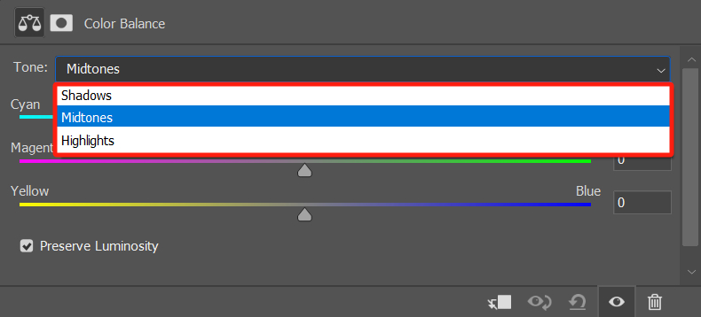
1. Tone Menu: Shadows, Midtones, Highlights
This dropdown menu allows you to select the tonal range for adjustment based on brightness. It's important to note that when you choose Midtones, it doesn't mean that the highlights and shadows are completely unaffected. They will be influenced but to a lesser extent.
This option provides a way to apply a trend-like adjustment. If other areas were completely unaffected, it would create unnatural variations in brightness across the image.
Further Reading:
In our tutorial on "How to Read a Histogram," we share more information about shadows, midtones, and highlights. Feel free to check it out if you're interested.
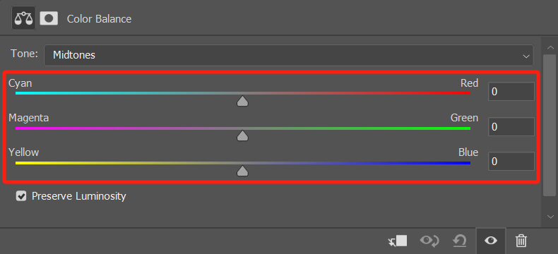
2. Sliders: Cyan/Red, Magenta/Green, Yellow/Blue
These 3 sliders control the color bias in the image. When you slide the first slider to the left, the image becomes more cyan. Slide it to the right, and it becomes more red. The same principle applies to the other two sliders.
These sliders directly modify the color tone of the image. In combination with the "Tone" dropdown menu, you can make adjustments to a specific color in a particular tonal range.
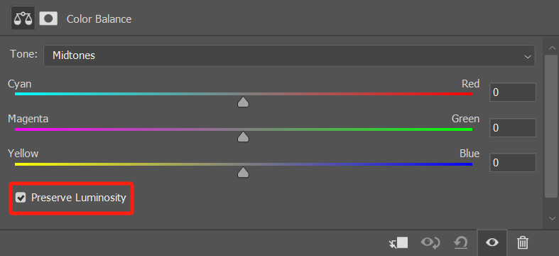
3. Preserve Luminosity
In the bottom left corner of the Color Balance dialog box, there is a checkbox labeled "Preserve Luminosity," which is selected by default. We recommend keeping this option selected.
Red, green, and blue are the primary colors of light, and they follow an additive color model, meaning that when colors are mixed, they increase in brightness.
On the other hand, cyan, magenta, and yellow are the primary colors of print, and they follow a subtractive color model, where color mixing reduces brightness.
If you don't select "Preserve Luminosity," when you drag one or more sliders to the right, you'll notice that the image tends to become brighter, even leaning towards white. This is because the colors on the right side of the sliders are based on the additive color model
Conversely, dragging one or more sliders to the left will make the image darker, tending towards black. This is because the colors on the right side of the sliders are based on the subtractive color model.
By selecting the "Preserve Luminosity" option, your adjustments will only affect the color of the image without altering its overall luminosity.
In most cases, when retouching images, it's advisable to keep "Preserve Luminosity" selected to maintain the overall brightness of the image. However, there may be a few specific situations where unchecking "Preserve Luminosity" can be beneficial for adjusting tones.
How to Use the Color Balance Tool in Photoshop?
In Photoshop, there are three ways you can access the Color Balance panel:
- Convert the photo layer into a smart object, then click on the "Image" option in the top menu bar, followed by "Adjustments," and select "Color Balance" from the submenu.
- In the Layers panel, click on the "Create new fill or adjustment layer" option at the bottom, and choose "Color Balance" from the pop-up menu.
- In the Adjustments panel, select "Color Balance." If you can't find the Adjustments panel, you can locate it under the "Windows" drop-down menu in the top menu bar.
If you find the above three methods a bit cumbersome, consider giving TourBox a try. It's a creative tool beloved by photographers and digital artists.

TourBox's configuration software, TourBox Console, comes with all of Photoshop's adjustment layers built-in, including Color Balance. With a simple setup, you can press a button on TourBox to quickly create a Color Balance adjustment layer.
Imagine controlling TourBox with one hand, effortlessly creating various adjustment layers, and swiftly adjusting parameters using the Knob control on TourBox. This process is not only direct and efficient but also offers an excellent user experience that you're sure to love.
Check out our photo editing page for more information about TourBox.
Once you have opened the Color Balance panel, using the tool should not be a problem. Next, we'll share a few scenarios to help you quickly grasp this color adjustment tool.
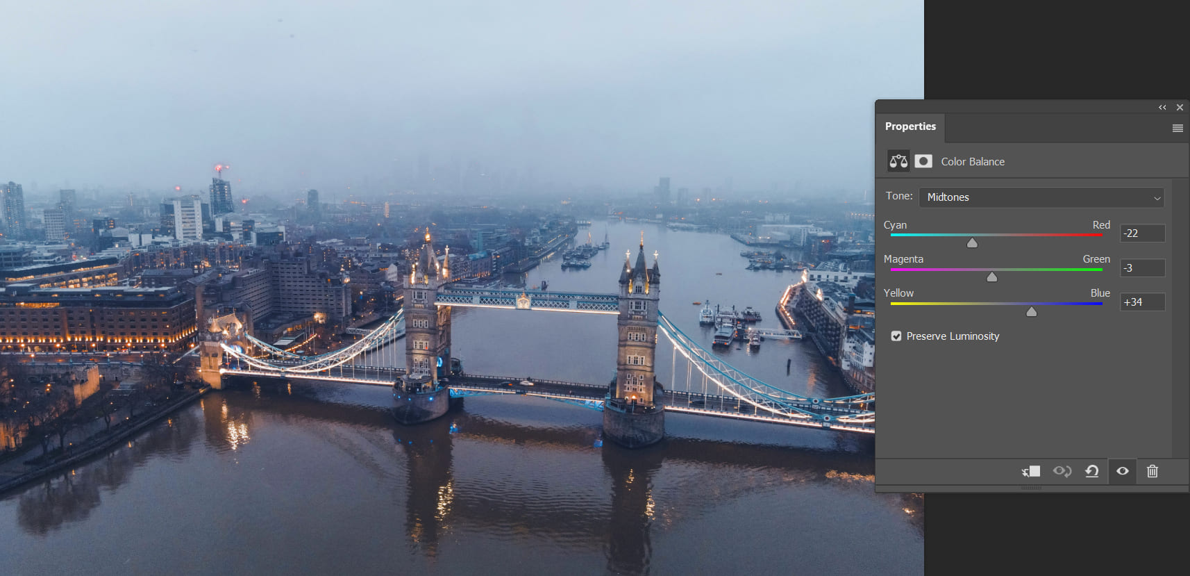
1. Correct a Color Cast and Improve Clarity
Cityscape photos often suffer from a yellowish color cast due to light pollution or haze. 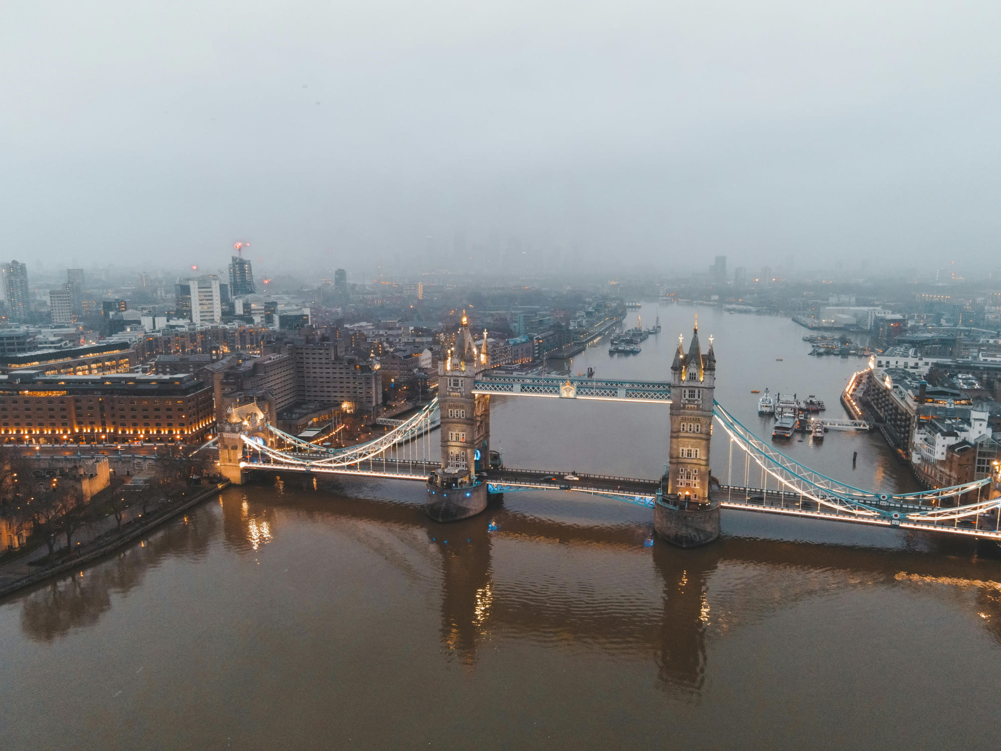
In such cases, you can use the Color Balance tool to adjust the image towards a bluish tone, instantly making it more vibrant and clear.
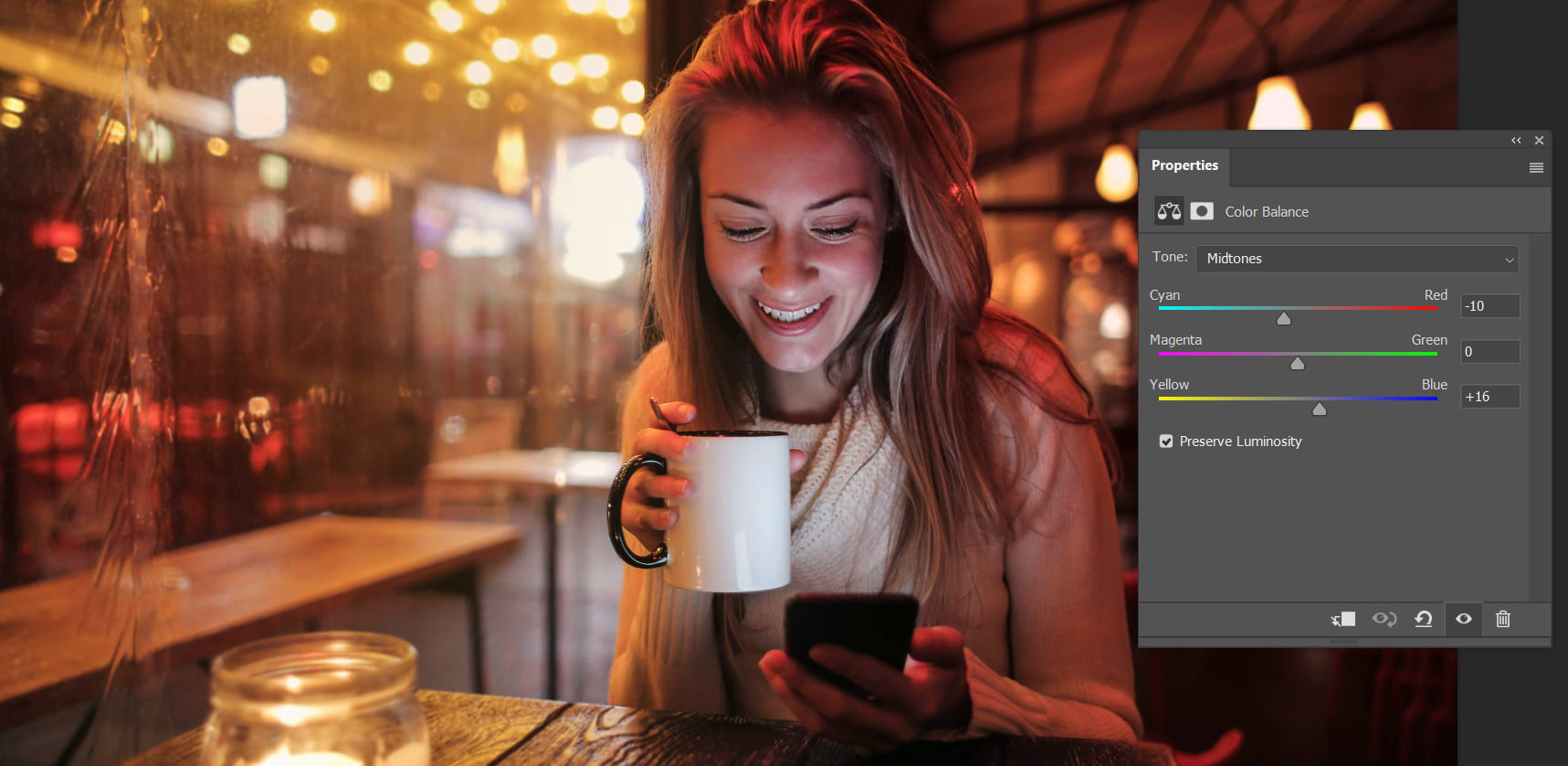
When photographing portraits, especially indoors like in a café, the dim yellowish lighting can give the skin a dull, yellowish appearance.

This is where the Color Balance tool becomes crucial for adjustments. Since the original photo appears reddish or yellowish, adding cyan and blue can help correct the color cast and restore natural skin tones.
2. Adjust Color Balance for Shadows, Midtones, and Highlights
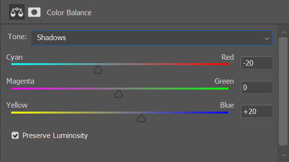
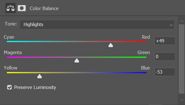
Simply adjusting the color sliders won't fully unleash the magic of Color Balance. In the Color Balance panel, there is a Tone Menu with three options in the dropdown: Shadows, Highlights, and Midtones.
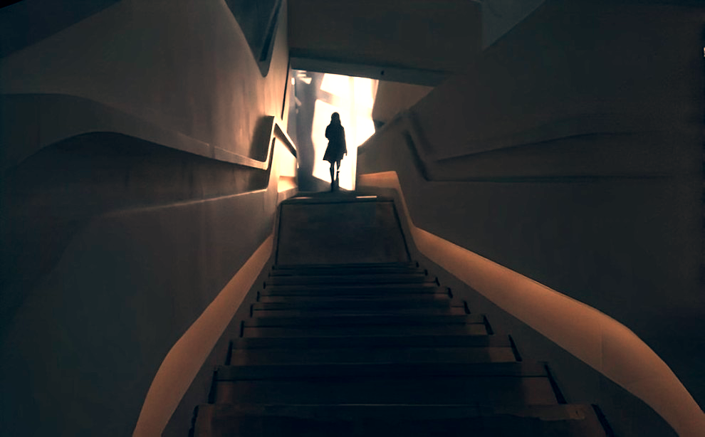
You can choose different brightness levels to adjust the Color Balance. For example, take a look at the photo below. It has a yellowish tint and appears flat, lacking any color contrast.
You can start by selecting the Shadows tone and adjusting it towards the cool color range by adding more blue and cyan.
Next, choose the Highlights tone and adjust it towards the warm color range, making the highlights yellow or reddish.
Now, let's take a look at the final result with a noticeable contrast between cool and warm tones. This method of adjusting Color Balance separately for shadows, midtones, and highlights works well for images with significant contrast between light and dark areas.
Frequently Asked Questions About Color Balance
Question: What Is the Difference Between Shadows, Midtones, and Highlights in Color Balance?
Shadows, midtones, and highlights correspond to the darker areas, middle-toned areas, and brighter areas of an image, respectively. Adjusting them individually in Color Balance allows you to change the colors of these three parts separately.
Question: What Should I Do If I'm Not Satisfied with the Results of Color Balance?
You can try resetting the Color Balance settings and then readjusting them. Each image is unique and may require different settings to achieve the desired outcome. Additionally, Photoshop provides an undo function that you can use to revert your most recent changes.
Question: Is Color Balance Useful for Black and White Photos?
Absolutely! You can use Color Balance to add color to black-and-white photos!
Question: Can Color Balance Be Used on Specific Areas of an Image?
Yes, you can use selection tools to choose the specific area you want to adjust and then apply Color Balance to that selected area.