What Color Goes Well with Green?
Green is a captivating color cherished for its versatility. It can be both warm and soothing, displaying a range of emotions and visual effects.
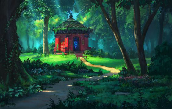
As a representative of nature, green pairs create rich visual experiences. Green with a touch of yellow exudes warmth, akin to tender shoots under sunlight. On the other hand, green with hints of blue evokes calmness, reminiscent of the tranquility of a lake.
For digital artists and designers, skillful use of green and its complementary colors can establish diverse atmospheres and styles.
This article delves into what color goes with green and how to harmonize colors with green, aiding you in better-expressing emotions and themes in your creations.

In this article, you will learn:
- What Emotions Does the Color Green Convey?
- Why Should You Avoid Using 100% Green?
- What Color Goes with Green?
- Final Thoughts About Color Goes with Green
What Emotions Does the Color Green Convey?
While people may have varying associations with colors for various reasons, there are common threads that run through these interpretations.
Before incorporating a specific color into your project, it's crucial to fully understand and grasp the emotional imagery associated with that color and the associations and symbols it evokes in specific contexts.
Taking green as an example, here are a few emotional expressions it conveys:
- Life: Green, being one of the most prevalent colors in nature, symbolizes the nurturing of life, giving a sense of vitality and rejuvenation.
- Calmness: When seeking a sense of tranquility and peace, reconnecting with nature is often the best approach. Therefore, green can evoke feelings of relaxation and serenity. Due to its soothing nature, green effectively reduces visual fatigue. If a piece of work aims to convey a sense of peaceful comfort, green is the top choice.
- Safety: Green is also a color associated with safety and health. For designs related to food, healthcare, organic products, and the like, green is the ideal color choice.
Why Should You Avoid Using 100% Green?
Green is one of the primary colors of light. While pure green gives a sense of comfort, it's also super "intense." It struggles to complement other colors in a palette and doesn't contribute much to the overall atmosphere.

Further Reading:
Because pure green is so overpowering, it's challenging to blend with other colors. Many experienced designers and digital artists carefully steer clear of pure green and opt for other greens that lean towards yellow or blue.

Therefore, pure, highly saturated green at 100% is a color you should use with caution, as it can create a strange sensation. Unless for a specific theme, it's not recommended to use it directly.
So, here is how you can avoid using pure green effectively:
- In your actual design work, determine in advance the feeling you want the green to convey. This way, you can avoid disrupting the overall color harmony due to the intensity of pure green.
- Additionally, you can reduce the saturation, increase the brightness, or introduce adjacent colors (like teal) or neutral tones (such as dark yellow, black, white, or gray) into pure green to achieve better results.
What Color Goes with Green?
The primary characteristic of green, as a dominant color, can evoke a wide range of color sensations. Even without an accent color, green can stand on its own and be considered a "universal" primary color.
If you wish to introduce an accent color, any shade within the green spectrum can diversify your color palette, showcasing the greatest advantage of green.
Moreover, green can spark visually dynamic combinations with colors from other color families. So, what color goes well with green? Here are some suggested color combinations to consider.
1. Combination of Green and Neutral Colors
Green + Black
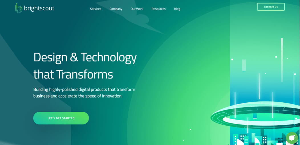
Combining deep green with black creates a sophisticated and classy feel.
Bright and saturated shades of green appear vibrant and lively against a black backdrop, breaking the monotony of large black areas. This pairing exudes a strong sense of tech and modernity.

Green + Gray
Pairing a moderate and elegant gray with a gentle green exudes a sense of intellectual beauty, conveying a high-end quality and an elegant taste.
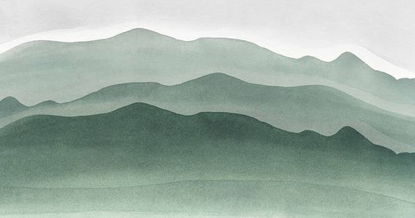
Green + White
Pairing light green with pure and elegant white creates an elegant and gentle look, exuding a sense of artistic charm and a fresh and clean feeling.
However, both white and green tend to be light and airy, so it's usually advisable to add some deeper colors as accents to balance out the overall palette.

2. Combination of Green and Colorful Colors
Green + Blue

Green and blue are analogous colors that, when paired together, create a soft and harmonious contrast, making it easy to establish a coordinated and unified theme.
The color combination of green and blue evokes images of blue skies and green landscapes, providing a refreshing and comfortable feeling.
Green + Yellow
Green and yellow are also analogous colors, creating a soft and harmonious contrast when combined. They exude a natural and inviting vibe, appearing fresh, clear, and full of vitality.
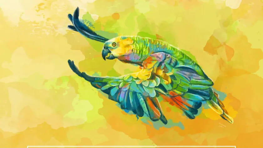
Green + Orange

Due to the contrasting nature of green and orange, their combination creates a strong visual impact. However, since green is a highly expressive color, it can easily dominate when paired with orange, resulting in a visually chaotic and unharmonious composition.
In such cases, you might want to consider the following approach:
- Using orange as an accent color against a green background can enhance the liveliness of the composition, infusing a sunny and lively vibe.
- Opt for a bluish-green shade (like icy green). This cooler-toned green creates a contrast with the warm orange, adding vibrancy to the scene while softening the overall visual impact.

Green + Purple

Purple and green make a magical pairing. Purple is mysterious and mature, while green symbolizes hope and freshness, creating a dreamy color scheme.
Both purple and green are deep-toned colors, and when combined, they can give off a somewhat muddy or dull impression.
To enhance the combination of green and purple, consider the following tips:
- Increase the brightness and saturation of both colors slightly, and introduce brighter hues as accents.
- Opt for a slightly yellowish green (like apple green) to add warmth. Also, enhance the brightness of the green to introduce lighter areas in the composition. This adjustment will create a harmonious and balanced visual effect.

Green + Red

Green and red are complementary colors, which means they have a high color contrast, making them one of the most challenging combinations to coordinate.
In reality, pairing red with green isn't necessarily an unattractive choice. It just requires some color-matching finesse:
- Tip 1: When combining red and green, consider using one as the main color and the other as an accent. It's also advisable to introduce neutral colors like black, white, or gray to balance the vividness, preventing an overly harsh look.
- Tip 2: Maintaining the right balance is key. Adjusting the saturation and brightness of pure green can reduce conflict while preserving the visual contrast between the two color families.
Final Thoughts About Color Goes with Green
Green belongs to the natural color palette and is one of the most common colors. It often brings to mind freshness, health, youth, vitality, life, and hope, qualities that are unmatched by any other color.
It is precisely because of these characteristics that designers and digital artists extensively incorporate green into their works. If you can use green appropriately in your designs or artworks, it can significantly enhance the impact and expressiveness of your creations.
In this article about what color goes with green, we share some practical tips on color combinations within the green color palette.
For digital artists and designers, having some knowledge about colors can make you feel more at ease when choosing color combinations, rather than relying solely on intuition.
Further Reading:
When exploring what color goes well with green, the choice of tools is equally crucial. For a more efficient realization of your creative ideas, consider trying out TourBox, a controller designed specifically for creative professionals.
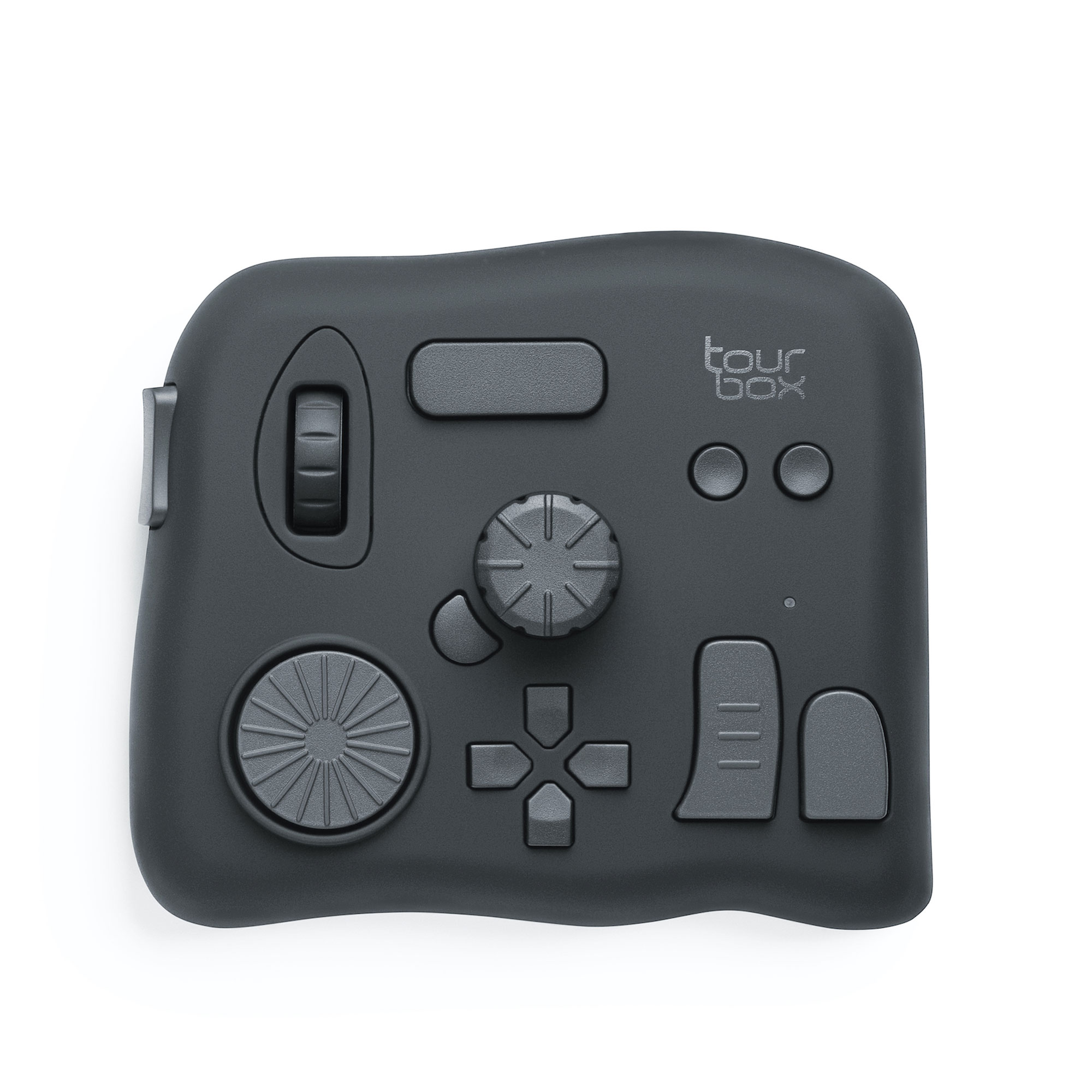
It seamlessly integrates with your commonly used software, allowing you to navigate color combinations and design processes with customized buttons and dials, making your workflow smoother.
Whether it's precise color adjustments, complex image editing, or imaginative digital drawing, TourBox enables you to execute intricate operations with fewer actions, enhancing your efficiency and unleashing more creative potential.

You're sure to appreciate the exceptional tactile feel and experience that TourBox provides. Check out our photo editing and digital painting pages for more information about TourBox.