What Colors Make Red: A Simple Guide to Mixing Red
Red is often seen as a color full of passion and power. But what exactly makes up the color red? Check out this article to find out.

In this article, you will learn:
- What Colors Make Red?
- How to Mix Red in Photoshop?
- How to Mix Red with Paint?
- Complementary and Analogous Colors of Red
- Conclusion
What Colors Make Red?
Different color models and media get red from different places. That means the red you see on a digital screen, in print, or on an artist's palette all work in different ways.
In the RGB color mode (additive), pure red is defined as R=255, G=0, B=0. In the CMYK print mode (subtractive), red usually comes from a 100% mix of magenta and yellow.
Red has a dual identity: it's both a primary light color and a mixed pigment color.
1. Red in RGB
On devices that emit light, such as screens, projectors, or camera sensors, we use the additive model. The additive color model mixes colors by adding light.
Red, green, and blue combine in different ways to create all other colors. These three are the primary colors of light. You can't make them by mixing other light colors.
So, in RGB, red is one of the three primaries. It exists on its own as a basic light channel. You can't get it by blending any other colors.
Further Reading:
2. Red in CMYK
In a print shop, you see inks instead of light beams. There, you use the subtractive model.
The subtractive model works by pigments or inks absorbing certain wavelengths of light. Cyan (C), magenta (M), yellow (Y), and black (K) are the usual inks.
In theory, mixing CMY inks would make black. But real-world inks aren't pure enough, so CMY alone gives a dark gray. To get a true black, printers add K (black) ink.
Here, cyan, magenta, and yellow each "subtract" one of the light primaries. They absorb red, green, or blue light. The light they don't absorb is what we see.
In CMYK, red is a secondary color made by mixing magenta and yellow. When magenta ink absorbs green light and yellow ink absorbs blue light, the remaining light is bright red.
Further Reading:
3. Why Does Red Mean Different Things in the Two Models?
- Additive red focuses on light. Only when a screen emits light around 620–750 nm do we see red. In RGB, you can't mix other colors to make red.
- Subtractive red focuses on pigments. When you mix magenta and yellow, magenta soaks up green light and yellow soaks up blue light. The leftover light that reflects back is red. In CMYK, you create red by blending magenta and yellow.
How to Mix Red in Photoshop?
In digital drawing tools like Photoshop, the default is RGB mode, the additive model we talked about. In these programs, you mix red by adjusting the RGB channels. Just set the R channel to its highest value and lower G and B, and you'll get different reds.
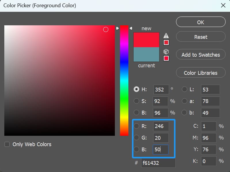
For example, Adobe's official docs show a bright red: R=246, G=20, B=50. That means if green and blue stay very low while red is pushed way up, you get a vivid, pure red.
If you drop red a bit and raise green and blue slightly — say RGB(230, 20, 20) — you get a darker, heavier red. Simply put, by balancing the light levels in each RGB channel, you can create reds from deep burgundy to soft pink.
In practice, artists open the Color Picker, drag the red slider up, and pull down green and blue. That lets you dial in exactly the red shade you want.
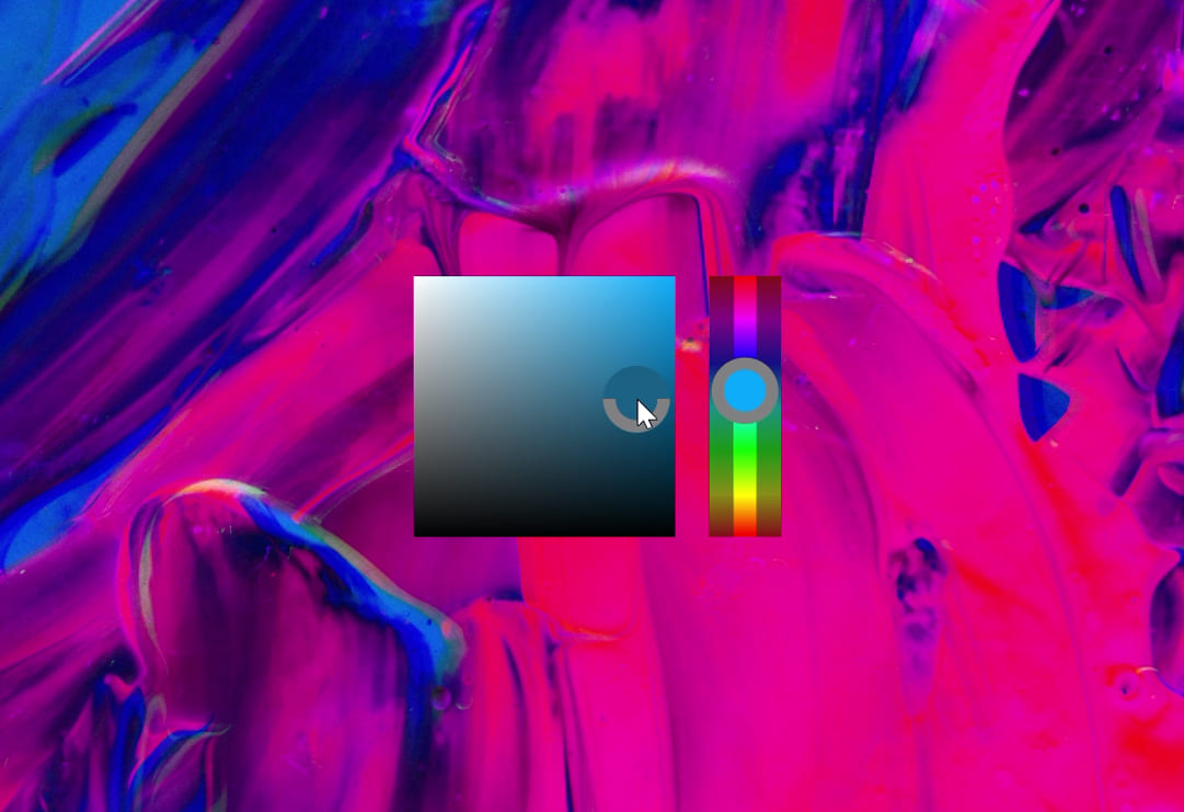
For digital artists, changing your brush color in Photoshop is a common task. Sure, you can open the Color Picker panel and pick a new hue. But if you do that over and over, it interrupts your flow and gets tedious.
That's when you might try TourBox, a creative controller, to set up a simple shortcut. You can have a small Color Picker pop up right under your mouse (or pen), like in the image below, so you can choose colors in a flash.
On top of that, you can map your most-used tools and commands to TourBox and tap into its exclusive features to speed up your workflow. It's like using a gamepad for video games. It takes your creative experience to the next level.

How to Mix Red with Paint?
In traditional art, people once used the red‑yellow‑blue primary system. Today, color theory leans toward the CMYK subtractive model.
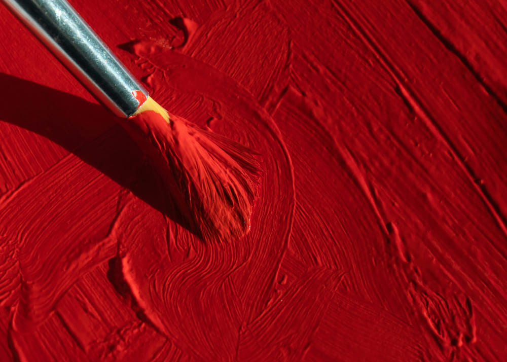
In oil painting or watercolor, you get red by mixing pigments. Blend magenta and yellow to create a true red.
To change red's lightness and strength, add white or black. White makes a lighter red. Black makes a darker, shadow red.
For example, adding black to pure red gives you a deep burgundy. Adding white turns it into pink or a skin‑tone red. On your palette, you can see every shade. You just adjust how much white or black you mix in.
When you add other colors, you shift red's hue. A bit of blue moves it toward purple‑red. A bit of yellow pushes it toward orange‑red.
Complementary and Analogous Colors of Red
For digital artists and designers, knowing what makes up red also helps with color matching. In modern RGB/CMYK theory, red's complementary color is cyan. Pairing red with cyan in a layout or poster creates a strong contrast and makes the red really pop.
Red's analogous (neighboring) colors are orange-red and magenta-red. For example, a warm red tweaked with yellow or a purple-leaning red tweaked with magenta can work nicely in gradient backgrounds or smooth color transitions.
In design software, you'll often use complementary colors to highlight a main element, and analogous gradients to create a softer look.
So, by understanding which "lights" or "pigments" make up red, you can choose matching colors more wisely and get the visual effect you want.
Further Reading:
Conclusion
From the analysis above, what colors make red really depends on the color system you're using: on a screen, red is one of the three RGB primaries and can't be mixed from other colors. But in printing or on an artist's palette, it usually comes from blending magenta and yellow.

Whether you're working digitally or painting by hand, knowing what goes into red and how it shifts lets you use it more flexibly and create a richer range of expressive effects.
By combining these ideas with hands‑on practice, you'll make red appear in your work with greater precision and vibrancy.